Accesso
Construye Tu Sitio
Mobile Website Design Best Practices for 2025
Master mobile website design with 2025's best practices. Explore Mobile Web Design Inspiration and tools to Revolutionize Your Mobile Website Design without coding.
With mobile devices now dominating internet access, the quality of your mobile website design can make or break user experience, brand perception, and conversion rates. For brands looking for mobile web design inspiration, adopting mobile-first strategies ensures engagement and conversions in 2025.
This guide covers everything from core design principles to hands-on technical tactics, giving you the tools to create a mobile website that loads fast, adapts seamlessly, grabs attention, and keeps data usage low—all while delivering a polished, engaging experience for your users. For teams aiming to stand out, exploring Mobile Web Design Inspiration and strategies to Revolutionize Your Mobile Website Design is no longer optional—it's a core competitive edge.
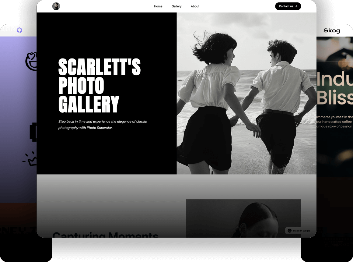
Click here to design your site👇

Why Mobile Website Design Matters More Than Ever in 2025
In the last decade, mobile traffic has skyrocketed, now making up over half of all global web traffic. Today's consumers don't just browse on their phones; they shop, explore content, and engage with brands almost entirely through mobile. In this new reality, mobile website design isn't just about adding responsive layouts—it's a full-scale shift in design philosophy.
With Google and other major search engines fully embracing "Mobile-First Indexing," any site that doesn't deliver a seamless, high-quality mobile experience risks plummeting in search rankings. On the flip side, a polished mobile experience can dramatically boost conversion rates, user retention, and overall brand trust.
This guide is built for designers, developers, and product teams who want to future-proof their brands. It lays out a practical mobile-first strategy for building pages that are fast, intuitive, and conversion-focused. We'll break it down into four key areas:
- Mobile-first and responsive design
- Clean layouts and easy navigation
- Performance optimization and fast loading
- Touch-friendly interactions and micro-interactions
We'll also showcase real-world examples of mobile sites getting it right—and show how Wegic can help you launch modern, mobile-optimized pages in a fraction of the time.
Mobile Design Today & the Trends Shaping 2025
1.The Rise of Mobile-First Thinking
For years, most websites were built with a "desktop-first, mobile-second" mindset—shrinking layouts down for phones as an afterthought. By 2025, that approach simply doesn't cut it. Mobile users bring unique behaviors, from one-handed scrolling and variable screen sizes to inconsistent network speeds and touch-driven interactions.
Mobile-first design flips the process: start with the smallest screen and build upward. Every decision—layout, content prioritization, interaction flow, typography, and loading strategy—begins with the mobile experience, then scales gracefully to tablets and desktops.
The payoff? Clearer focus on what matters most, cleaner visuals, easier multi-device adaptability, and lower long-term maintenance costs. By adopting this philosophy, your mobile website design will naturally stay future-proof and fully optimized for search engines and conversions.
2.Accessibility & Inclusive UX
Modern mobile websites must work for everyone, including users with low vision, seniors, those on slow networks, and people who rely on assistive tech. A professional, inclusive design checks these boxes:
- Tap targets at least 48px for effortless finger taps
- High-contrast color palettes for readability
- Minimum 16px body text, optimized for Retina and high-DPI screens
- ARIA labels and screen reader-friendly markup
- Energy-saving options like dark mode or system-adaptive themes
Accessibility isn't just compliance—it's now a benchmark for mobile design quality. Sites with the best UX designer portfolio that nail it earn broader reach, higher user trust, and better engagement.
3.Minimalism Meets Micro-Interactions
On mobile, every byte counts. Lean, lightweight pages paired with subtle motion can create a polished experience without wasting bandwidth. Key tactics include:
- Lazy-loading images and deferring non-critical elements
- Adding tactile feedback, smooth swipe transitions, and soft fade-ins
- Using understated pop-ups and interactive toggles to bring pages to life
The visual trend for 2025 is clear: cleaner layouts, tightly controlled content density, muted color palettes, and small, purposeful animations that enhance flow. Rather than heavy graphics or flashy effects, the best mobile sites rely on micro-interactions—swipes, smooth transitions, and elastic gestures—to make users feel in control and keep them engaged.
For designers seeking Mobile Web Design Inspiration, subtle animations and micro-interactions have become central to Revolutionize Your Mobile Website Design, balancing engagement with performance.
The Essential Guide to Building a Standout Mobile Website
Creating a great site with exceptional mobile website design is not just about shrinking a desktop version. It requires applying lessons from Mobile Web Design Inspiration and techniques to Revolutionize Your Mobile Website Design for performance, usability, and conversions. It's about rethinking everything—from structure and navigation to speed and interactivity—to deliver a seamless, user-friendly experience. A successful mobile website in 2025 must be visually engaging, intuitive, fast, and effortless to use.

Here, we break down modern mobile web design into three pillars: mobile-first layouts, optimized navigation and content flow, and performance-driven, touch-friendly interactions.
1.Embracing Mobile-First, Not Just Responsive
For years, "responsive" websites were the norm, adapting layouts for smaller screens after building for desktop. But responsive alone often feels like a compromise.
Mobile-first flips that script: design for phones first, then scale up. Starting with small screens forces teams to identify what matters most, keep content focused, streamline navigation, and build efficient load times from the ground up.
To nail mobile-first design, focus on:
- Highlighting only the content mobile users truly need
- Presenting it clearly within a limited space
- Avoiding information overload, clunky interactions, and slow performance
From 2025 onward, this mindset isn't optional—it's the baseline for competitive web design.
2.Smart Structure with Flexible Grids
Good mobile layouts follow "less is more." Build around core content using single-column pages and modular grids. Treat each block, banner, product card, and review as a self-contained unit that can collapse, swipe, or redirect.
Best practices:
- Break pages into horizontal sections, each serving one purpose
- Use 1–3 column grids that auto-adjust by screen width
- Maintain generous white space to reduce visual fatigue and tap errors
- Ensure elements scale and align cleanly across all devices
A well-planned structure keeps users engaged longer and helps them find what they need effortlessly.
3.Responsive Breakpoints Done Right
With devices ranging from 320px iPhones to 900px Androids, clear breakpoints prevent awkward layouts. Standard benchmarks:
- ≤375px for compact phones
- 375px–768px for most smartphones
- 768px–1024px for tablets and small laptops
- 1025px+ for desktops
At each breakpoint, tweak button sizes, text wrapping, and image ratios to keep everything smooth and consistent.
4.Optimized Media Handling
Images can make or break mobile performance. Use device-specific image sizes, modern formats like WebP or AVIF, lazy-load anything below the fold, and show static placeholders for videos until playback starts. Crisp visuals on Retina screens should never come at the cost of slow loads.
4.1 Navigation & Content Flow That Works on Mobile
Single-Column, Card-Based Design
Small screens demand clarity. A single-column, card-driven layout keeps content easy to scan and swipe:
- Each module stands on its own with a title, image, copy, and CTA
- White space between cards reduces clutter
- Content flows top-to-bottom in a logical, digestible order
This rhythm not only improves readability but also keeps users scrolling.
4.2 Buttons & Tap Targets That Drive Action
Touch demands more space and feedback than clicks. Follow these rules:
- Buttons should cover at least one-third of the screen width and be 48px in height
- Use high-contrast colors for CTAs
- Add tactile feedback (color changes, scaling, loaders) for every tap
- void cramming buttons together to prevent accidental taps
Sticky CTAs—like a "Book Now" button fixed to the screen edge—are proven conversion boosters on mobile.
5.Streamlined Menus & Smarter Search
Complex navigation trees frustrate mobile users. Instead:
- Keep the primary menu behind a hamburger icon
- Use collapsible panels for secondary categories
- Add a bottom tab bar (4–5 items) for fast access to essentials
- Put the search bar at the top of the first screen
- Offer predictive suggestions, history, and trending searches
Clear navigation is the difference between a quick bounce and a new customer.
5.1 Readable, Layered Information Architecture
Make complex content easy to digest by modularizing and layering it:
- Use a clear hierarchy with varied font sizes and weights
- Stick to one main idea per section
- Add anchor-linked content for quick jumps
- Use expand/collapse toggles for long reads
Well-layered content keeps users engaged and boosts time on site.
5.2 Performance & Touch-Centric Interactions
Speed Is the First Impression
Slow sites lose visitors instantly. Optimize by:
- Compressing images to under 500KB each
- Leveraging caching for returning users
- Lazy-loading non-critical elements
- Stripping unused CSS/JS and using lightweight frameworks
Even shaving off one second can lift conversion rates by double digits.
6.Skeleton Screens & Progressive Loading
Nobody likes a blank white screen. Skeleton screens—light placeholder frames of the page layout—show users something is happening while content loads. Paired with progressive loading, they:
- Reduce perceived wait times
- Keep layouts stable and avoid content jumps
- Prioritize above-the-fold speed
These techniques are now standard for top-performing mobile sites.
6.1 Micro-Interactions That Feel Alive
With no hover state, feedback matters. Smooth, subtle animations—button highlights, scroll transitions, fade-ins—make every tap feel satisfying. Show success/failure alerts after forms, and animate elements as they enter view to create a sense of flow.
6.2 Details That Build Trust
Modern mobile sites should:
- Support swipe gestures for content browsing
- Offer auto-switching dark mode for comfort
- Display clear status indicators (Loading, Error, No Data)
- Include a "Back to Top" button to ease long scrolls
It's these small touches that separate a functional site from one that feels polished and trustworthy.
Best Practices of Mobile Websites
Theory can only go so far—sometimes the best way to learn what works is by seeing it in action. Here are five standout examples of mobile website design from across industries, each demonstrating how smart layouts, smooth interactions, and optimized performance combine to create exceptional user experiences.
Case 1: Jereshia Hawk (Personal Brand & Coaching)
Industry: Education & Entrepreneurship Coaching
Why It Works: Clean, simple, and built to convert.

Jereshia Hawk's mobile site follows a "less is more" philosophy. A pared-down header with a logo and three menu items keeps things light, while the main screen focuses squarely on her value proposition. A prominent "Book Now" button stays fixed at the bottom, so users can act no matter where they are on the page.
With fast-loading, high-quality images and tightly packaged content (no unnecessary animations), the site feels fast, focused, and highly conversion-friendly.
Case 2: Mattia Studio (Creative Design Portfolio)
Industry: Visual Design & Creative Services
Why It Works: Immersive visuals with fluid, touch-first motion.
Mattia Studio's site makes the most of mobile's interactive potential. Users swipe smoothly through a horizontally scrolling showcase of projects, enhanced by subtle gradients and motion effects. A floating bottom menu offers easy navigation without breaking immersion.
Micro-animations—like images fading in, text sliding up, and cards gently scaling—add a tactile, dynamic feel that keeps users engaged, making it a model for creative-focused brands.
Case 3: Everlane (Sustainable Fashion E-Commerce)
Industry: Fashion Retail & E-Commerce
Why It Works: Optimized for speed and effortless shopping.

Everlane's mobile experience is built for shoppers on the go. Product pages feature a single-column card layout, with bold, clear images and simple price and color selectors. Shoppers can preview multiple items without reloading pages and quickly add favorites to their cart.
Top-level navigation keeps search and categories within easy reach, while a floating "View Bag" button makes checkout seamless. Combined with lazy loading and aggressive caching, the site loads fast and feels frictionless.
Case 4: Notion (SaaS Productivity Tool)
Industry: Collaboration & Productivity Software
Why It Works: Structured, accessible, and easy to explore.

Notion's mobile site is all about clarity and control. Service details and use cases are organized into collapsible sections, so users can dive deeper only when they choose. Icons, tables, and modular cards add visual clarity, while consistent spacing and sizing create a smooth reading rhythm.
Support for system dark mode ensures comfort for late-night users, and its polished, no-nonsense aesthetic appeals perfectly to Notion's productivity-focused audience.
Case 5: Mailchimp (Digital Marketing SaaS)
Industry: Marketing Automation & SaaS
Why It Works: Brand-forward and action-driven.
Mailchimp stays true to its bold, colorful identity with striking color blocks and strong contrasts. Each screen is designed to guide the user through specific tasks, with clear headlines ("Create a Contact List," "Set Up Automated Emails"), concise copy, and one obvious action button per section.
Every interaction feels deliberate—feedback cues like loaders and status icons prevent confusion, while content is broken into digestible screens so nothing feels overwhelming. The result is a mobile site that feels both playful and highly functional.
These examples not only serve as Mobile Web Design Inspiration but also show how brands can Revolutionize Your Mobile Website Design by using clean navigation, fast loading, and touch-friendly interactions as core principles.
Build a High-Performance Mobile Website in Minutes with Wegic
Creating a mobile site as polished as the five examples above usually means hiring a full team—designers, developers, content specialists, performance experts, and SEO consultants. It's costly, time-consuming, and often out of reach for small businesses and independent brands.
Wegic changes that. It's a fully automated AI website builder designed to help anyone, no matter their skill level, launch a professional-grade mobile website quickly and easily. Here's how Wegic makes it possible:
1.Mobile-First Templates
Every template starts with mobile in mind. With card-based content blocks, floating action buttons, and fully responsive layouts, your site looks great on any screen, from compact phones to tablets.
2.AI-Driven Structure and Content
Just tell Wegic what you need, like "I want a consulting website for my courses," and it will automatically plan your site's structure, create the layout, choose imagery, and write the copy for both your homepage and inner pages.
3.Built-In Performance Boosts
Your site is optimized out of the box with compressed images, lazy loading, global CDN acceleration, and smart caching—so it loads fast everywhere, right from launch.
4.SEO-Ready from the Start
Wegic generates SEO-friendly code, metadata, title hierarchies, and sitemaps automatically, ensuring your site meets Google's mobile-first indexing standards and ranks better in search results.
5.Zero Coding, One-Click Launch
No technical skills? No problem. You can publish your site instantly to your domain or Wegic's hosting platform with a single click.
Wegic simplifies mobile website design by combining automation, speed, and inspiration, making it the ultimate tool for brands ready to revolutionize their mobile website design without coding or delays. With Wegic, you don't need to know design or coding. In just a few minutes, you can have a sleek, professional mobile website ready to engage customers and grow your business.
Click here to build your site👇

Conclusion
The digital world of 2025 is all about mobile-first. A great website is no longer judged solely by how it looks—it's about speed, simplicity, seamless usability, and the ability to deliver a flawless experience across every screen size and user need. In this guide, we dive deep into mobile website design, covering the latest design trends, structural best practices, navigation flow, performance optimization, and interactive experiences. We also highlight five real-world examples from around the globe that showcase what a truly modern mobile site can achieve.
Finally, we introduce Wegic, the AI-powered website builder that helps businesses of any size bring these capabilities to life quickly, affordably, and without a line of code. In 2025, a website isn't just a container for content. It's your brand's first impression, your primary touchpoint, and often the deciding factor in whether visitors convert into customers.
Is your site ready for the mobile-first era? If you want to launch a high-quality, future-ready mobile site fast, Wegic is your AI-powered partner to make it happen.
Escrito por
Kimmy
Publicado el
Aug 11, 2025
Compartir artículo
Leer más
Nuestro último blog
¡Páginas web en un minuto, impulsadas por Wegic!
Con Wegic, transforma tus necesidades en sitios web impresionantes y funcionales con AI avanzada
Prueba gratuita con Wegic, ¡construye tu sitio en un clic!