Log in
Build Your Site
Dashboard Design for Better UX: How to Create User-Friendly Interfaces
Master dashboard design for optimal UX with proven principles, tips, and real-world examples. Transform data into actionable insights effortlessly.

In today's digital world, dashboards have become important tools for both businesses and individuals. They provide a centralized view of key information that can help make appropriate decisions quickly. However, not all dashboards are the same. If not designed properly, the dashboard may lead you to make confusing, time-consuming, and poor decisions. So, how can you ensure your dashboard design enhances user experience (UX)? In this article, we will explore the key principles of effective dashboard design, provide practical examples, and offer valuable tips to help you design user-friendly interfaces that users will love.

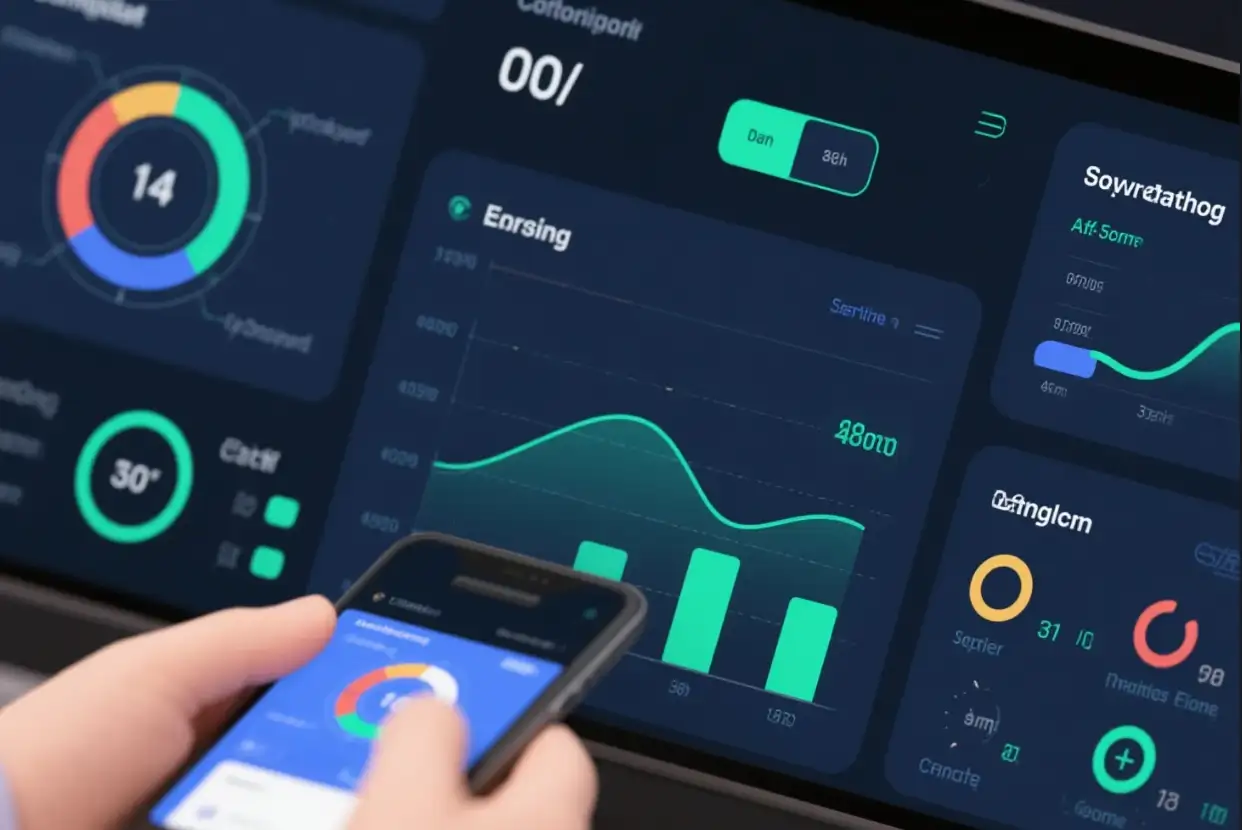
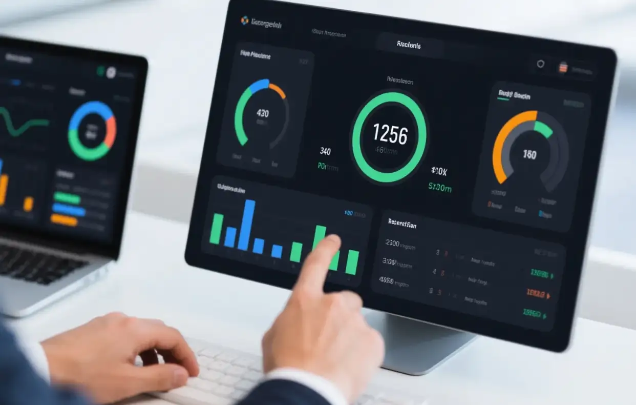
The Importance of Dashboard Design
The dashboard is the first door for most users and businesses to obtain valuable data, playing a crucial role in how users interact with and analyze data. A well-designed dashboard can transform complex information into actionable suggestions, while a poorly designed dashboard may confuse and distract users. The goal of designing a dashboard is to present information clearly, intuitively, and visually appealingly, enabling users to easily access the necessary data.
Core principles of effective dashboard design
Understand users and their needs
Understanding your target audience is the foundation of a well-designed dashboard. Different users have different goals and requirements. For example, executive dashboards may focus more on advanced KPIs, while operations personnel may focus more on real-time process monitoring because they need to conduct user research based on data.
Prioritize the placement of key indicators
Not all data on the dashboard is equally important. If you are designing, you need to prioritize the most critical metrics that align with user and business goals. This way, there won't be too much useless information on your dashboard, and users can also grasp key information at a glance. A best practice is to limit the display data of the dashboard, as too much data is not visible, as human memory can effectively process about seven visual effects at once.
Create a clear visual hierarchy
A clear visual hierarchy can guide users to focus on the most critical elements. Use size, color, and position to establish visual hierarchy. For example, you can place key data at the top of the dashboard and highlight it with larger fonts or contrasting colors. This makes it easier for users to view and understand data at a glance.
Moderate use of visualization
Based on the data you provide, select the correct type of chart and graph. Bar charts are very suitable for comparing categories, line charts can effectively display trends over time, and pie charts can effectively display proportions. The goal of visualization should be to enhance data understanding rather than complicate it.
Maintain consistency
If the design elements, such as color, font, buttons, and layout, are consistent, it can help users use the dashboard intuitively. The same color palette not only enhances aesthetics, but also helps users understand the data. For example, if you use red to represent negative situations and green to represent positive situations, users can quickly understand the meanings defined by different indicators.
Subtract from the dashboard
When designing a dashboard, you need to keep the dashboard interface clean and tidy. For example, removing unnecessary elements, decorations, or data that is not valuable.

Incorporating interactive elements
Although keeping it concise is important, integrating interactive features can increase user engagement and allow for deeper data exploration.
Ensure the ability to respond promptly
When you are on the dashboard, you need to enable users to use the dashboard on various devices. Responsive design ensures that the layout can adapt to different screen sizes, so no matter which device you use, you can provide users with the ultimate user experience.
5 Effective Dashboard Design Examples
1.TextMagic CRM Dashboard
This dashboard is specifically designed for managers to monitor chats. It uses tabs to separate different types of data and maintain a clean and concise interface. It also utilizes clear visual hierarchy, color coding, and appropriate charts to present information effectively.
2. MyInterview Video Interview Platform Dashboard
This dashboard features a clean layout with tabs for different data perspectives, allowing users to easily switch between list view, kanban view, scorecard, dialogue, and analysis. Clear visual cues and simple charts can help users make efficient data-driven decisions.
3. Job seeker's tracking system dashboard
This dashboard mainly provides some key information about job seekers, as well as information about daily tasks and agendas. By dividing the data into tabs and ensuring appropriate spacing and font hierarchy, it can present a large amount of information in different situations.
4.Financial Services Dashboard
A good financial dashboard will cover most of the basic information, such as account status, recent expenses, and planned payments. It has a concise and clear layout, as well as buttons for remittance and automatic payment, making it powerful for financial managers.
5.Media and Telecommunications Dashboard
This dashboard combines financial information with industry analysis, using maximum contrast colors and easy navigation to important sections.
Tools and Templates for Dashboard Design
1. Wegic: Your best design assistant
If you are a person full of ideas and creativity, then Wegic suits you. Why? Because Wegic is a very awesome website. You can use it to help you design websites of different types and styles. As long as you have interesting ideas and tell Wegic your ideas, it only takes 1 minute to help you generate the website you like, and the generated effect is no less than that of an intermediate designer. After you generate the website for the first time, Wegic will continue to polish the website according to your secondary needs until you create a website that best suits your needs. After the website design is completed, you can use it directly. If you want to find a website to design a dashboard, you must try it!
Click on the image to start creating your own website👇
https://wegic.ai/

2.Power BI: Advanced Data Visualization Tool for Creating Interactive Dashboards
Power BI has powerful data visualization and dashboard creation tools. But its dashboard design principles focus on simplicity, interactivity, and storytelling. It also has visualization options and integration features, making it ideal for creating operational and analytical dashboards.
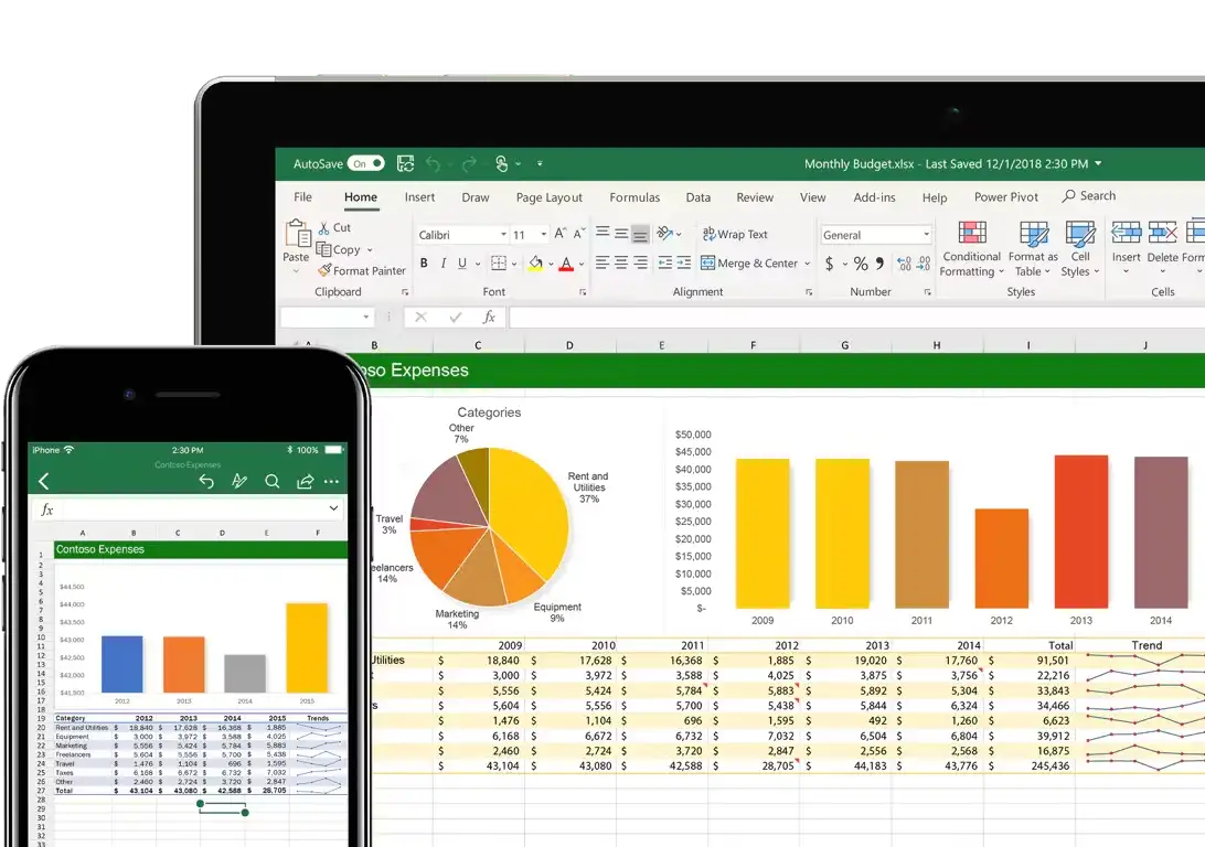
3. Excel: Effective Dashboard Creation with Pivot Tables and Charts
Although our impression of Excel mostly stays on multidimensional spreadsheets, did you know it can also be used to create efficient dashboards? Its dashboard design uses pivot tables, charts, and conditional formatting to clearly present data. So, for small businesses and individuals who do not want to use complex tools, Excel is a very cost-effective choice.
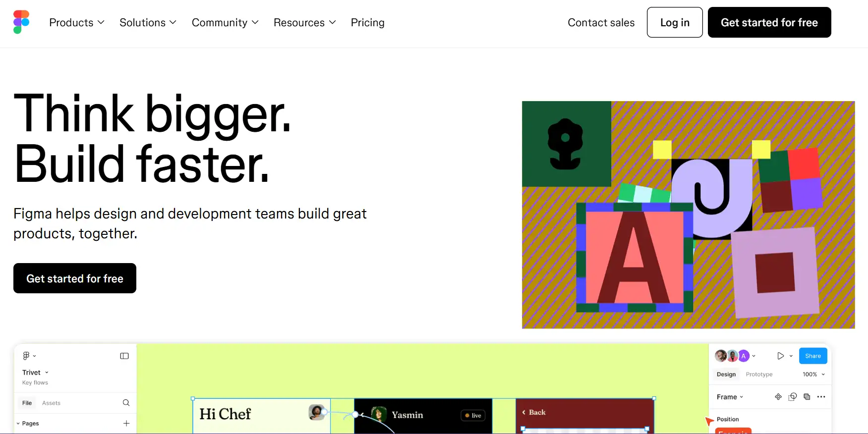
4. Figma: Collaborative Dashboard Design Tool with Templates and Resources
Figma is a collaborative interface design tool that has become popular recently. It also provides templates and resources for designing a dashboard. The examples show how to create user-friendly interfaces. Figma's collaborative features also make collecting feedback and iterating on designs easy and convenient.
Common Pitfalls to Avoid in Dashboard Design
Improper Use of Color
Improper use of color can confuse users. So you need to avoid using too many low-contrast colors.
Information Overload
One of the most common mistakes when designing dashboards is that designers try to cram too much data into one dashboard, but too much information is not good. This can make it difficult for users to find relevant information. Instead, you should use tabs or multiple dashboards to segment data according to user needs.

Ignoring Visual Hierarchy
If you don't set a clear visual hierarchy on your dashboard, it may be difficult for users to determine which data is important. So, when designing, you need to ensure that the key options can be displayed first and that the information is logical from top to bottom.
Future trends in dashboard design
As technology continues to develop, dashboard building will have more possibilities, such as AI-driven insights, enhanced interactivity, and better personalization. However, core principles such as understanding user needs, prioritizing key indicators, and creating a clear visual hierarchy will remain critical. Designers must balance innovation and usability to ensure that dashboards remain an effective tool for improving user experience.
Conclusion
To sum up, creating a user-friendly dashboard is about being beautiful and ensuring that users can quickly and easily get the information they need to make informed decisions. By following the core principles of dashboard design, drawing on real-world cases, and avoiding common pitfalls, you can create an interface that enhances the user experience and leads to better results. But you need to remember that the best-designed dashboard is a perfect blend of functionality and beauty. So, are you ready? If you are interested, you can try the suggestions given in the article. Practice is better than anything!
FAQs
What is Power BI and how can it help in designing a dashboard?
Power BI is a powerful data visualization tool that offers extensive dashboard creation features. Its dashboard design principles focus on simplicity, interactivity, and storytelling, making it easier for users to understand and engage with the data.
Can Excel really be used for dashboard making, and how?
Yes, Excel is not just limited to spreadsheets. It can be effectively used to design a dashboard. Utilizing features like pivot tables, charts, and conditional formatting, Excel allows for the clear presentation of data in a dashboard format.
What makes Figma a good choice for designing a dashboard?
Figma is a collaborative interface design tool that has gained popularity for its comprehensive features. It provides a variety of templates and resources specifically for dashboard building. The dashboard design examples in Figma demonstrate how to create user-friendly interfaces with a focus on visual hierarchy, consistency, and interactivity.
Written by
Kimmy
Published on
Mar 17, 2026
Share article
Read more
Our latest blog
Webpages in a minute, powered by Wegic!
With Wegic, transform your needs into stunning, functional websites with advanced AI
Free trial with Wegic, build your site in a click!
What kind of website do you want to build?