Log in
Build Your Site
Top 16 Tips to Make Your Website Accessible (Updated 2025)
Updated for 2025. Make your website accessible with 16 top tips (4 categories). In this blog, you will get practical advice about your website.
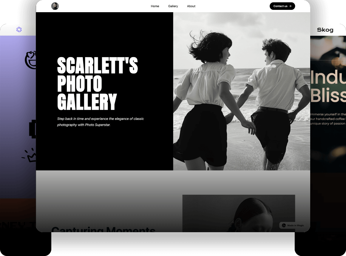
Nowadays, nearly 5 billion people are active online! This makes up 60.6% of the population all over the world. But how do people with disabilities or impairments visit websites? This leads us to an essential topic: website accessibility.
Today in this article we will show you the top 16 tips to make your website fully accessible for visitors regardless of whether they have disability and impairment or not! Let's dive into today's sharing!
Things Need to Know About Web Accessibility
What does website accessibility mean: Website accessibility means creating online spaces open to all without barriers, including those with physical or cognitive defections. Imagine a world where every website and tool is thoughtfully designed so that everyone can u:se them comfortably! Unfortunately, many sites are developed without this in mind, leaving some users facing unnecessary hurdles.
Why do you need to do so: Website accessibility enhances the user experience for everyone through clear navigation and readable design elements. It expands your audience by making your site usable for individuals with disabilities. At the same time, accessible websites won't cost too much money to maintain and revise later.
The Top 16 Tips to Improve Website Accessibility
To make it easier for you to digest all 16 tips, we’ve grouped them into four main categories: Navigation and Communication, Contents, Technologies as well as Visitors.
Overview(4 categories)
Navigation and Communication
-
Ensure User-friendly Experience
-
Offer Keyboard-friendly Navigation
-
Support Multiple Interactive Ways
Contents
-
Adopt Well-structured Headings
-
Use Concise and Direct Language
-
Pick Readable Fonts
-
Use Relatively High-contrast Colors
-
Add Textual Materials for Audio and Videos
-
Offer Reasonable Forms
-
Limit the Use of Dynamic Content
-
Use On-Page Content Instead of PDFs
-
Enable Adjustable Content Size
Technologies
-
Attach Alt Text to Non-decorative Images
-
Craft Informative URLs and Link Text
-
Adopt Responsive Design
Visitors
-
Gather Feedback from Visitors for Improvement
Navigation and Communication
Ensure User-friendly Experience
A user-friendly navigation involves maintaining a consistent structure and layout across all pages of your website. This helps users anticipate where to find information and improves the overall user experience. Navigational consistency is especially important for users with cognitive disabilities, who may find navigational changes confusing. Below is an example of the Wegic website to illustrate navigational consistency:

If the “Best Practices” tab appears on the first tab from the left above, it must appear in that location throughout the site. This also applies to the CTA (Call to Action) that appears in the drop-down menu when you are hovering or clicking on a tab.
One of the easiest ways to make your website accessible is to use a template following WCAG(Web Content Accessibility Guidelines). By the way, you can see designers' best practices at Wegic!
Offer Keyboard-friendly Navigation
Installing keyboard navigation requires ensuring that all interactive elements on the site can be accessed and manipulated via keyboard only. This includes navigation menus, forms, and other interactive components.
We sometimes use the keyboard when we get tired of using the mouse. And this function\ is even more important for people with certain cognitive disabilities who have to rely only on the keyboard to navigate a website.
To be keyboard-friendly, users should be allowed to navigate the site using the tab key and other interactive elements. It is important that the order of the tabs is rational and follows the visual order of the page. There should be a visible focus indicator to highlight the selected element.
It is important to provide users with a focus indicator when they are navigating the site using only the keyboard. It is a visual cue that highlights the element currently in focus on the web page. A focus indicator is usually represented as a visible outline, border, or change in background color around the focused element. Some common interactive elements that should have focus indicators include links, form fields, buttons, and other actionable items.
You can try navigating a web page and controlling all its functions using the tab keys on your keyboard without touching the mouse, and thus test the accessibility of the site.
Support Multiple Interactive Ways
People with visual impairments often prefer to talk on the phone, while people with hearing impairments may be more likely to communicate via email, chat, or written text. So remember to provide multiple ways to communicate.
Blind people and those with low vision, rely on assistive technology to access websites and other digital platforms. One of the most commonly used tools is a screen reader, which interprets and vocalizes web content for the user. In order to ensure that screen readers effectively translate the website content, it is important to ensure that websites are compatible with assistive technologies.
Some users may be colorblind or visually impaired, so visual elements shouldn't be limited to just color. Use additional visual cues, such as icons, to convey information. This ensures that all users can understand the content without relying on color alone.
Contents
Adopt Well-structured Headings

The clear structure of each page allows people who use keyboard navigation or screen readers to scan your content. People with dyslexia, ADD or memory disorders will also be more comfortable when reading.
To build a well-organized website, you need to organize website content into descriptive headings. This is especially helpful for people with visual impairments using screen readers. A clear heading structure allows users to navigate easily and understand how different parts of the page are related.
It is important to stick to structured headings. At the same time, you should be aware of the difference between actual heading tags and bold text. When creating navigation menus, as mentioned above, you need to ask questions such as: can this menu be operated by the keyboard? Can this menu be operated by keyboard only?
It is important to know that a good content structure is not only good for accessibility, but it is also very important for SEO!
Use Concise and Direct Language
Describing information in florid language can turn away people with learning disabilities. People usually skim through online information, so using plain language can avoid misunderstandings.
Using simple language means presenting information in a clear, direct, and readable way. This helps users with cognitive disabilities and those who are not fluent in the language of the website. Avoiding professional words and complex language can improve accessibility.
Complex language is difficult to understand for part of visitors, so you need to try to keep your language simple and clear.
Pick Readable Fonts
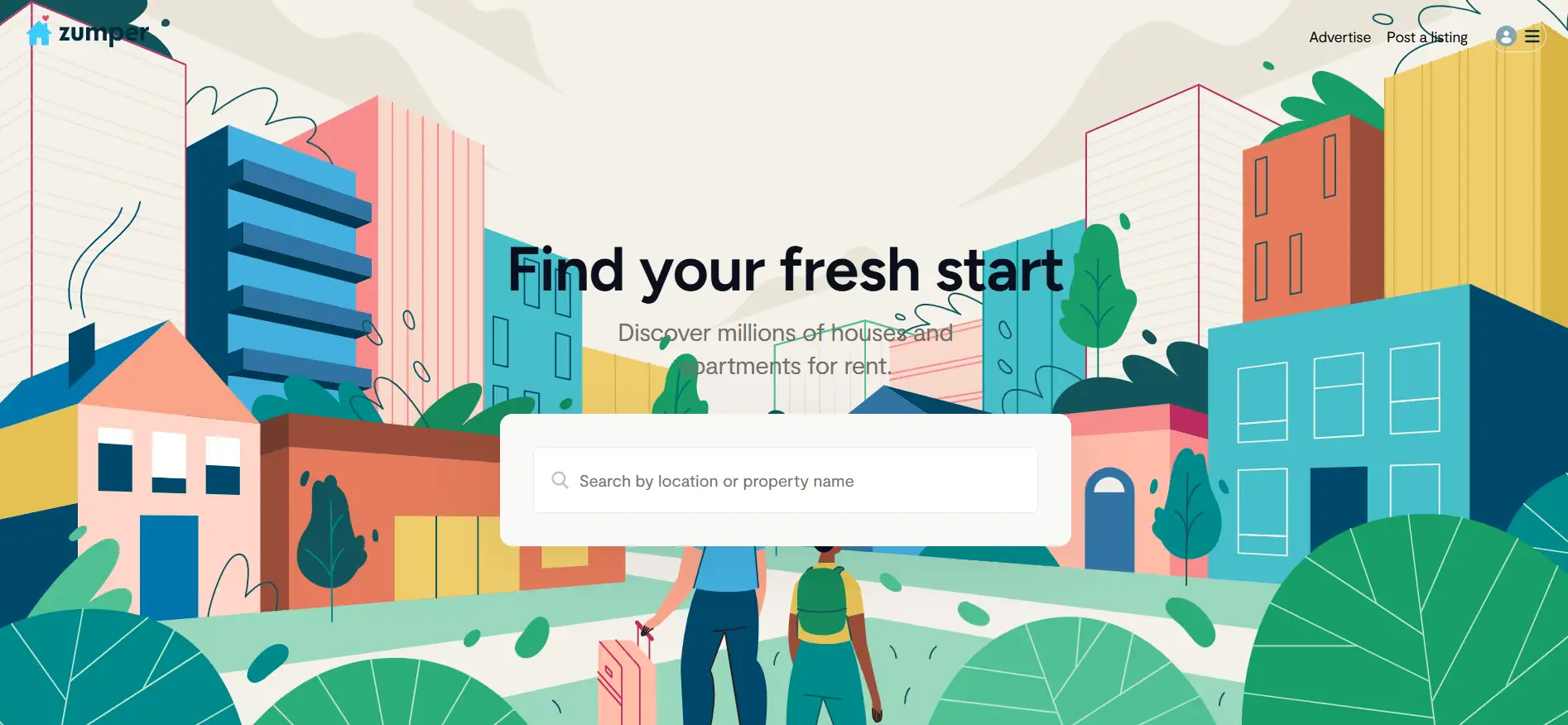
Since the font choices are limitless, it's tempting to design elaborate fonts on your website. However, the more decorative the font, the less recognizable it will be to visitors. People with dyslexia, learning disabilities, aphasia and poor vision will have an easier to read clear fonts. This includes 4 areas:
-
Style. People with visual impairments also struggle to read italics, capital letters and other stylistic approaches. Instead of relying too heavily on these font styles, use a larger font size or a second font to format headings.
-
Typeface. Using more than two fonts on a page can make the page look cluttered and slow down reading. Standard fonts are the easiest to read.
-
White space. Leave plenty of white space between the lines. This helps many users track text more easily horizontally and makes text easier to read.
-
Size. Since users may not realize that they can use browser hotkeys to increase the font size, a reasonably large font should be used by default; users can then make the font smaller as needed. Note the size of the font.
Use Relatively High-contrast Colors
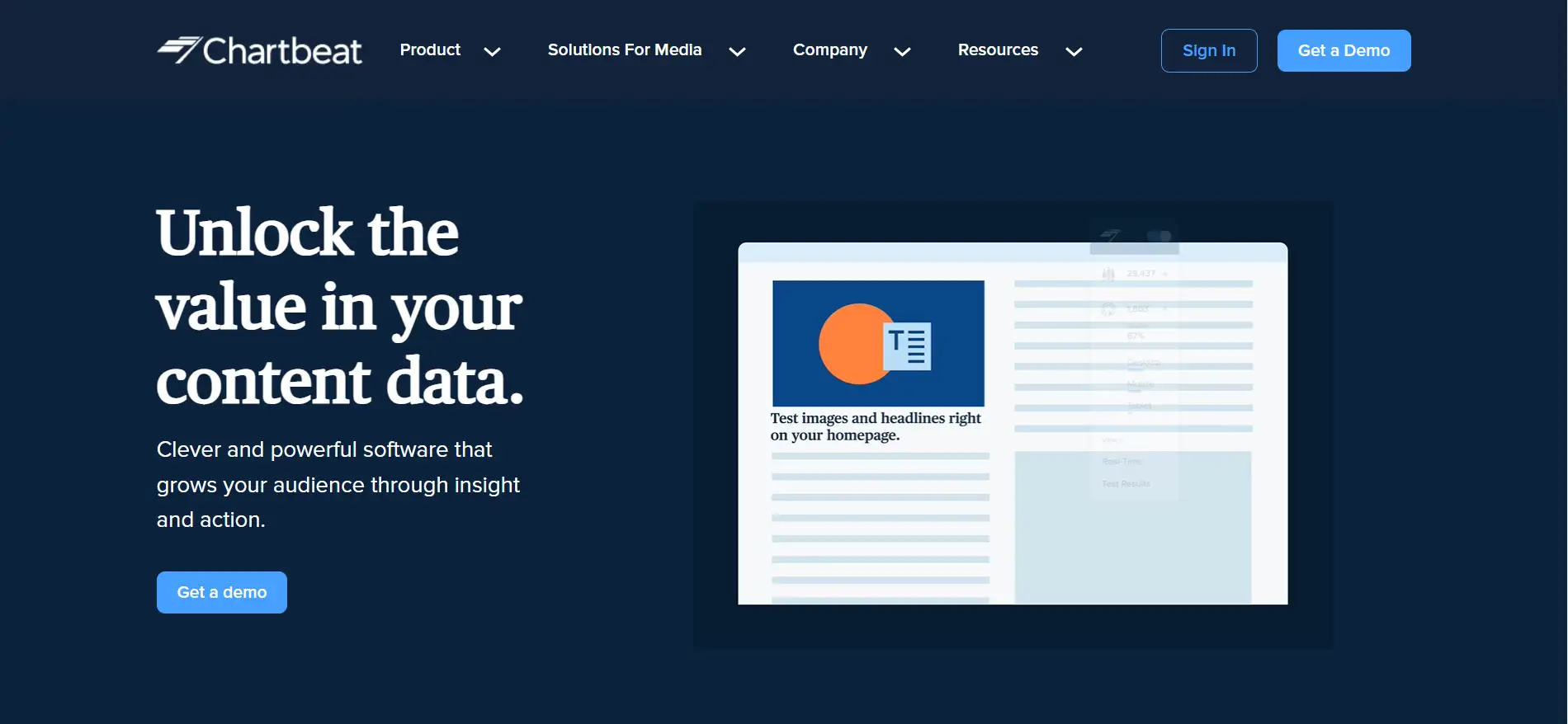
Website designers prefer an attractive color scheme in their websites, but this may affect the usability of your site.
People with visual impairments, especially those with color blindness, find it difficult to read text if the color of the text does not contrast well with the background. WCAG requires a contrast ratio of at least 4.5:1 for text and 3:1 for headings to the background.
High contrast is key. While low-contrast text is the most common accessibility issue, unfortunately, too much contrast can cause problems for people with dyslexia. Pure black text on a pure white background can create a swirling and blurry effect. To keep it simple, choose an off-white background with dark gray text and use brand colors elsewhere.
While you can make requests to Wegic's AI assistant, you'll want to think about these factors in advance.
Add Textual Materials for Audios and Videos

You may want to utilize the insertion of audio and video to bring your website to life. But remember to provide transcripts for video and audio so that people who are deaf-blind and have low internet bandwidth can access the content.
Transcripts are written copies of the audio content and are helpful for users who wish to read the content at their own pace. Transcripts are comprehensive written versions of the entire audio content, allowing users to choose to read the information rather than relying solely on the audio playback.
As for captions, there are many free, easy-to-use tools that support video transcription and subtitling. If you're relying on automatically generated captions, you'll need to review them and confirm that they're completely accurate.
Here are a few things you need to care about videos:
-
Provide closed caption option: Note that while captioning is beneficial to most users, many of today's consumers actually prefer to watch content with hidden captions, and some even turn off the sound when watching audio or video on the go.
-
Ensure the media player supports accessibility: When choosing a media player, ask the following questions: Does the player support closed captioning? Does it support descriptions? Can it be used without a mouse?
-
Avoid auto-replaying media: Automatic media, such as auto playing videos or slideshows, can be disruptive for some users. Providing controls to stop or pause automatic media ensures that users have the choice to interact with such content.
Offer Reasonable Forms
To create an accessible website, it is important to include user-friendly website forms. This is especially important for people who rely on screen readers. Often, it is difficult for people with disabilities to access form websites. Therefore, forms are a key feature.
Accessible forms include clear and concise labeling, strategic grouping of relevant form fields, and validation information that is not only informative but presented in an easy-to-understand manner.
When implemented properly, accessibility forms will ensure that users who use assistive technology have an easy experience when navigating, filling out, and submitting website forms.
Check your website forms from these aspects:
-
Clear Guidance: Use clear labels and instructions to guide users in filling out the form.
-
Color Visibility: Ensure there’s enough contrast, especially when highlighting selected options.
-
User-Friendly Controls: Prefer textboxes and checkboxes over drop-down menus with sliders to improve accessibility.
Limit the Use of Dynamic Content
Dynamic content changes based on user behavior, preferences, or actions, as well as external factors such as time, location, or device used. Examples include pop-ups, screen overlays, auto-playing videos and customized messages. It is widely used on modern websites to add a layer of interactivity, add a personal touch and adapt content to the user's actions. However, when flashy graphics, features and effects are certainly fun, they also could introduce new levels of accessibility and predispose to disease.
When content is dynamically updated without refreshing the page, it can lead to accessibility issues. Users with visual or cognitive impairments who rely on predictable and consistent content layout and structure may have difficulty using the site.
In addition, content such as rapidly flashing lights can induce seizures. Even if you warn about such content in advance, website visitors can easily ignore it, so these warnings are not enough.
Use On-Page Content Instead of PDFs
Uploading beautifully designed PDFs to your website can seem like fun, but it's important to consider the impact of doing so on accessibility and SEO.
Viewing PDFs on a device can be inconvenient for the average user and challenging for the visually impaired who rely on screen readers.
To ensure inclusivity and improve the user experience, create accessible digital content rather than relying solely on PDFs. Alternatively, you can provide links to PDF versions for those who prefer to read or print the information to ensure that different preferences are met.
Also, use text, not text images. Use text, not text images, and use CSS to control its appearance. Text images become blurry when enlarged, take longer to download, and are not as efficient for website authors to edit.
If you still want to use PDF documents, make sure your online documents are accessible. You can make these documents accessible in 3 ways. Consider implementing the following practices:
-
Add alt text to meaningful images
-
Apply an appropriate heading structure
-
Use appropriate color contrast
Enable Adjustable Content Size
Another point that is easily overlooked is that website visitors need to be able to increase or decrease the text by 200% without losing content or functionality. This is critical for people with visual impairments who may need larger text to improve readability.
In this case, responsive design principles should be used to ensure that the text remains legible at different zoom levels.
Technologies
Attach Alt Text to Non-decorative Images
Alt text serves to provide descriptions of images in HTML code. It can help those who can’t see images and use a screen reader. Because screen readers can’t interpret visuals, so it’s essential that there should be text-based descriptions of images.
Alt text should be accurate, concise, and relevant to the image's context. It is best in 80 to 100 characters. However, correctly interpreting meaningful image content is more important than the requirement for length.
Additionally, alt text should not contain the phrase “of the image,” but should use correct punctuation and include any relevant text that appears in the image. Please note that images with only aesthetic value do not require alt text, so mark the image as decorative.
The process of adding alt text to images varies depending on the content management system or website builder tool you use.
Additionally, Google takes alt text into account when determining a site's ranking on relevant search results pages.
Craft Informative URLs and Link Text
A URL (Uniform Resource Locator) is the web address to your site, and link text is the clickable text within a link. Using descriptive URLs and link text helps users know the content of a website.
Avoid vague phrases like “click here,”. This kind of phrase doesn’t inform users about the link's content, especially for visually impaired users. Instead, better to use clear link text, such as “Learn more about adding link text in the Wegic website builder.” This kind of link text helps users with screen readers understand the content of the website, which the link text will lead to. And they can decide if they want to click.
Descriptive link text also can boost SEO by providing context and keywords that search engines can easily grasp and understand.
Adopt Responsive Design
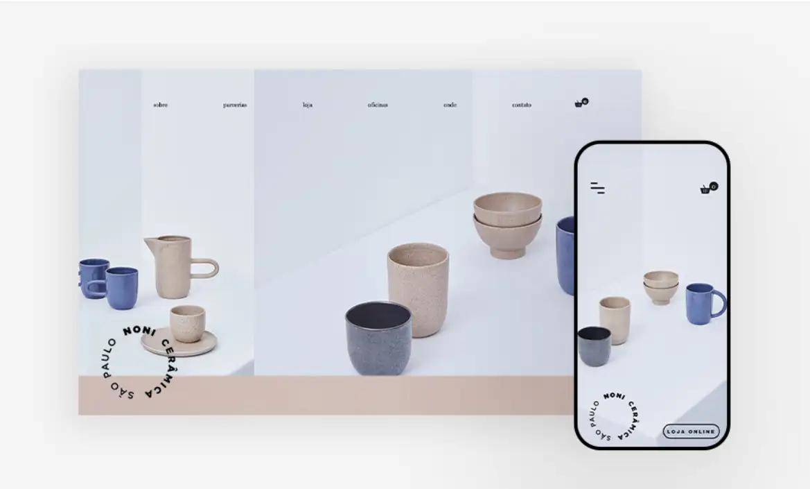
More and more users are surfing online via smartphones, tablets, and other mobile devices. That’s why responsive design is essential. It ensures your website looks great and functions well even on different devices and screen sizes.
Responsive design relies on flexible grids, layouts, images and so on. Wegic, a top AI-powered website builder, can help you build a responsive website.
Make sure your content is accessible on any screen size. Log in to your website using a mobile device and check for accessibility.
Visitors
Gather Feedback from Visitors for Improvement
Websites require constant updates and maintenance at a later stage, as does website accessibility. Regular monitoring and updating of the website is essential to respond to emerging issues, incorporate technical improvements and comply with WCAG. However, unexpected problems can still occur.
Just like a good consultant asks clients about their goals, you should actively seek feedback from your visitors to make necessary improvements.
Consider adding an accessibility statement to your website. This shows your commitment to visitors with disabilities. Make sure visitors can find details about your site's accessibility features and find channels to send you their feedback.
Wrapping Up and Getting Started
Yeah, we understand so many tips may make you feel overwhelmed. But don't worry! Making your website accessible is a journey, not a sprint! Just start with one or two tips that resonate with you, and gradually integrate more.
Every little improvement counts and brings you closer to creating an inclusive space for all users. And we have also mentioned some ways to check this. Don't forget them in the process of promoting website accessibility.
If you are ready to make your website accessible, remember to make full use of Wegic. Wegic is always by your side like a friend! So why wait? Let’s make your website a more welcoming place!
Written by
Kimmy
Published on
Mar 17, 2026
Share article
Read more
Our latest blog
Webpages in a minute, powered by Wegic!
With Wegic, transform your needs into stunning, functional websites with advanced AI
Free trial with Wegic, build your site in a click!
What kind of website do you want to build?