Log in
Build Your Site
No Experience Needed: Build Your First Reactive Website with Wegic
Learn how to create a reactive website without coding experience using Wegic. Explore step-by-step guides, responsive design tips, and tools like CSS and FreeCodeCamp.

In the past, a good reactive web design took a lot of time and manpower, and it was even more difficult for novices without a coding foundation, so generally only professionals with strong abilities could design a relatively good responsive web page. If you are a novice, will you also feel scared and incredulous about building a responsive website from scratch? This is normal. Many beginners find it very difficult to have complex coding frameworks, unclear design principles, and provide real-time user interaction. Because traditional web design tools usually require expertise in JavaScript or CSS.
However, have you ever thought that you may not need to write any code to create a dynamic reactive web design? How can you achieve this goal? Wegic is a website design platform that can help you simplify responsive web design so that even non-professional novices can easily design it. In this guide, you will learn how to use Wegic to build your first website, understand the importance of responsive web design, and use tools such as FreeCodeCamp and CSS frameworks to improve your website-building skills. Surprise? If you are interested, keep reading!

What is Reactive Web Design?
Reactive web design is a way to dynamically build websites that adapt to user actions, device conditions, and real-time data. Unlike static or basic responsive web design, which focuses on screen size adjustment, responsive websites prioritize interactivity and user experience.
For example, real-time chat widgets, automatically updated product dynamics, and personalized content switching are all obvious signs of responsive web design. (For example, when a user opens the weather app on their phone and detects a storm, the screen will show an animation of a rainy day.)
This approach combines cross-device compatibility with real-time responsiveness. So, now is the era of AI, and you can also use some AI interactive website design tools to make websites that could only be made before. For example, AI website builders like Wegic don’t require you to know too much about CSS optimization, as it can help you make an automated responsive web design. From now on, beginners can also create fast and interactive websites.
Pro tip: After the website is designed, you can try to verify your website with responsive web design testing tools such as Google Lighthouse to find problems, such as slow animations or broken grid, before publishing.
Step-by-Step Guide: Building Your First Reactive Website with Wegic
Wegicis a website generation tool that can help you generate websites of various types and purposes. Chat with it, and it will help you generate a responsive web design after receiving your instructions. It's really simple! Its generation speed is breakneck, and it can help you do everything within one minute at its fastest.
Here is a demonstration of how to use Wegic to help you build your first reactive website:
Step 1: Register a personal account and click to start
You can search Wegic on your browser, then click on the homepage to register for a Wegic account.
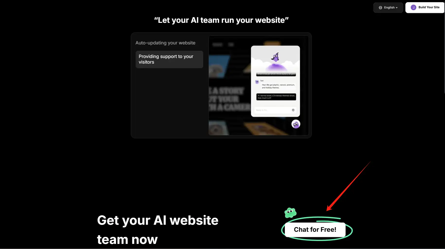
Click on the image to try building your first reactive website with Wegic👇
https://wegic.ai/

Then you can keep scrolling down to this page, where there is a "chat for free." Click here to start a free conversation with Wegic.
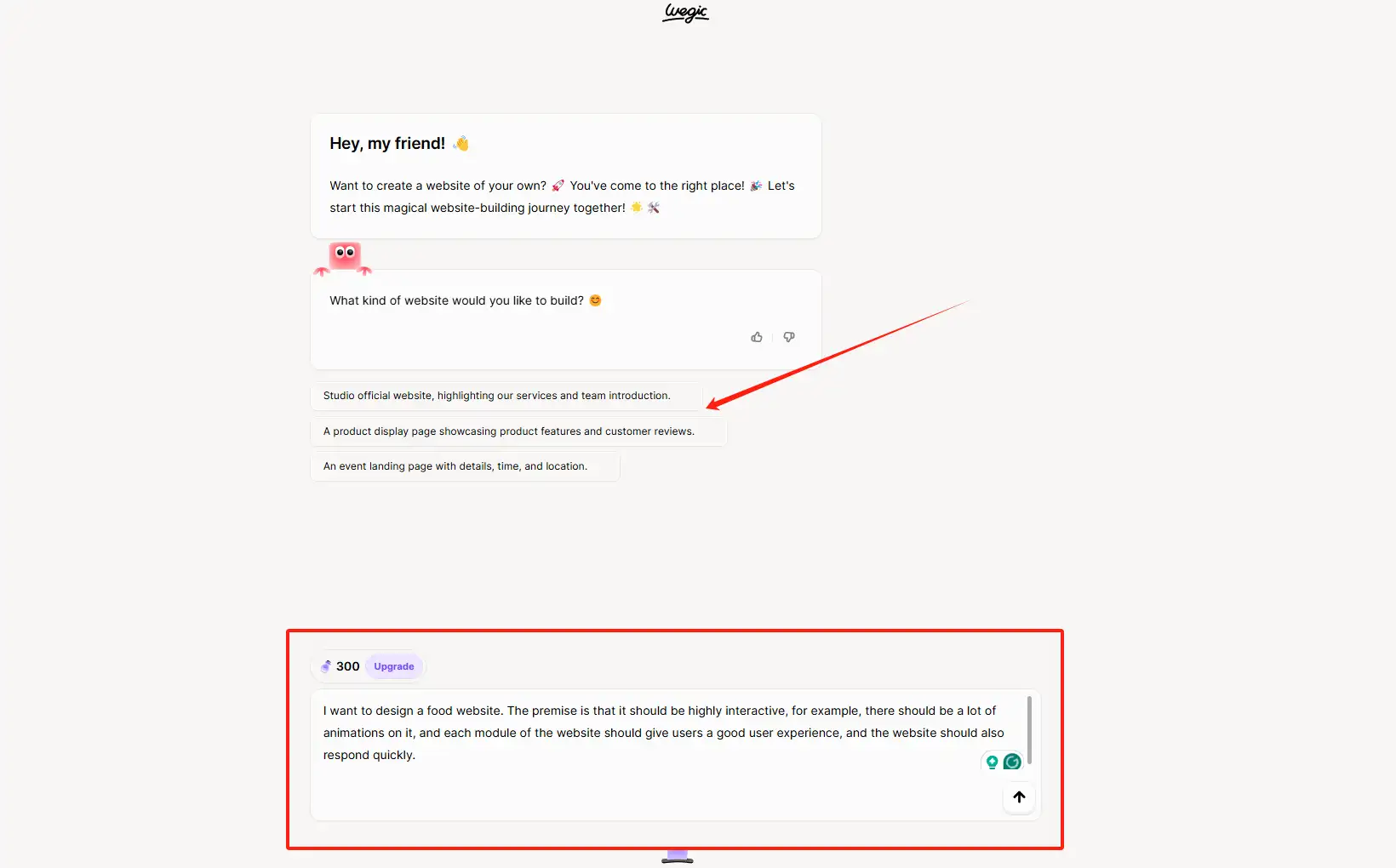
Step 2: Enter your reactive web design requirements
You can enter your reactive web design requirements in the box below. Please be as detailed as possible. If you don’t have a clear idea for now, there are also special prompts above to give you some tips for website design. After you enter your requirements, you can click the small arrow in the lower right corner, and Wegic will further analyze your requirements based on your instructions.
Step 3: Enter your further requirements in Wegic
After you enter the command, Kimmy, the AI wizard in Wegic, will provide you with more detailed tips to help you improve your needs to make a more accurate website. Generally, Kimmy will give you 2-3 tips, and you just need to follow its process.

Step 4: Enter your further requirements in Wegic
Then, you just need to follow the instructions of Wegic and click "Generate". Then, it will help you generate a website with fast response speed and strong interactivity in the background. It will take about 1 minute.

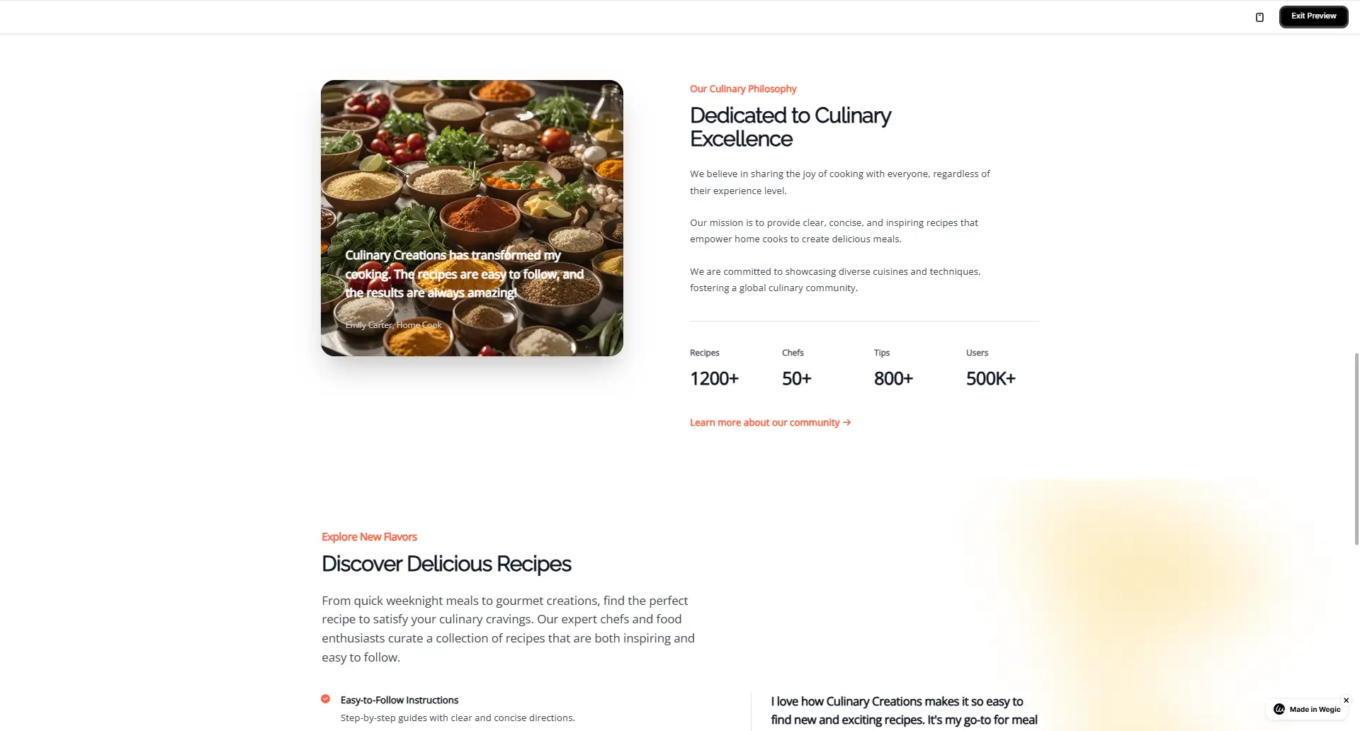
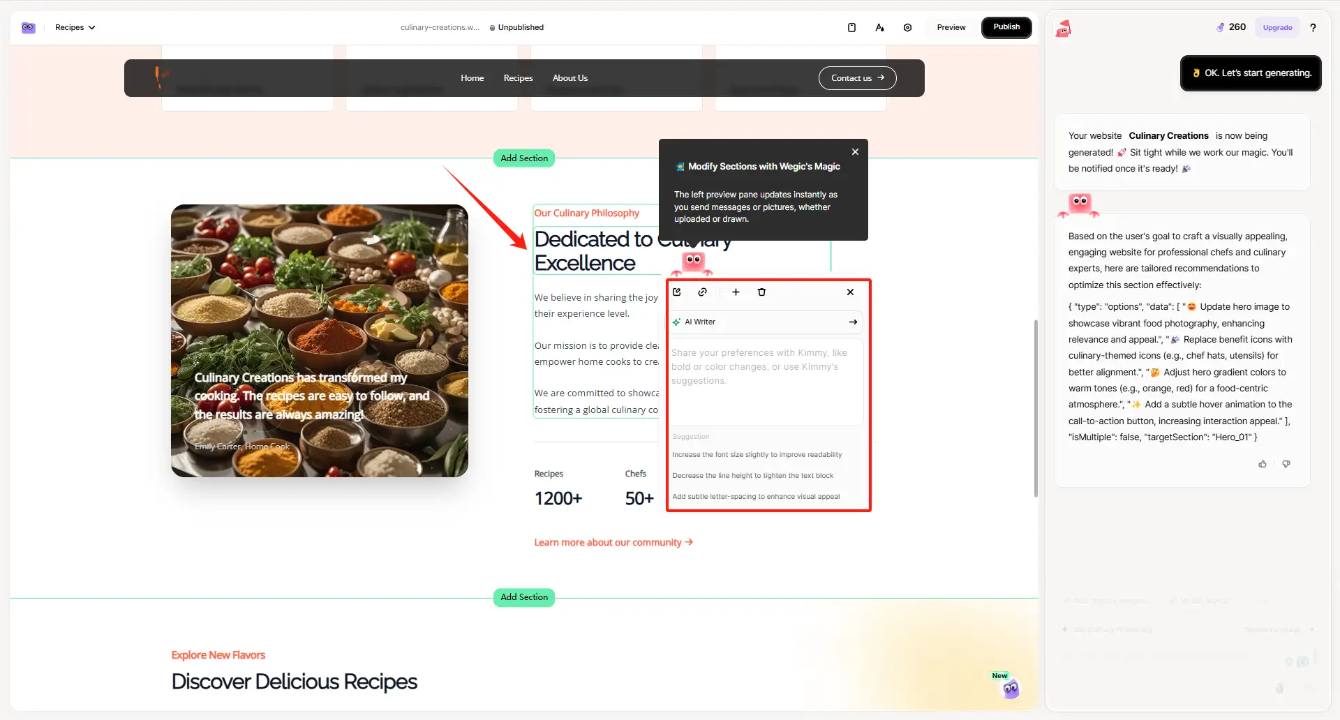
For example, this is a responsive food website I generated. Each section is very clear, and when you click on different modules, different animations will be displayed on it, so the user experience and interaction are also very good.

This is the recipe module of the website. When I click on this module, it immediately displays all the information on the website. It does not take too much time to load, and its display speed is also very fast.
Step 5: Polish your reactive web design
You can open the polishing area on the right and enter your suggestions for modification, such as changing the website's color, the cover, adding XX modules, etc. Put your suggestions in the box on the lower right, and Wegic will help you modify it according to your requirements.
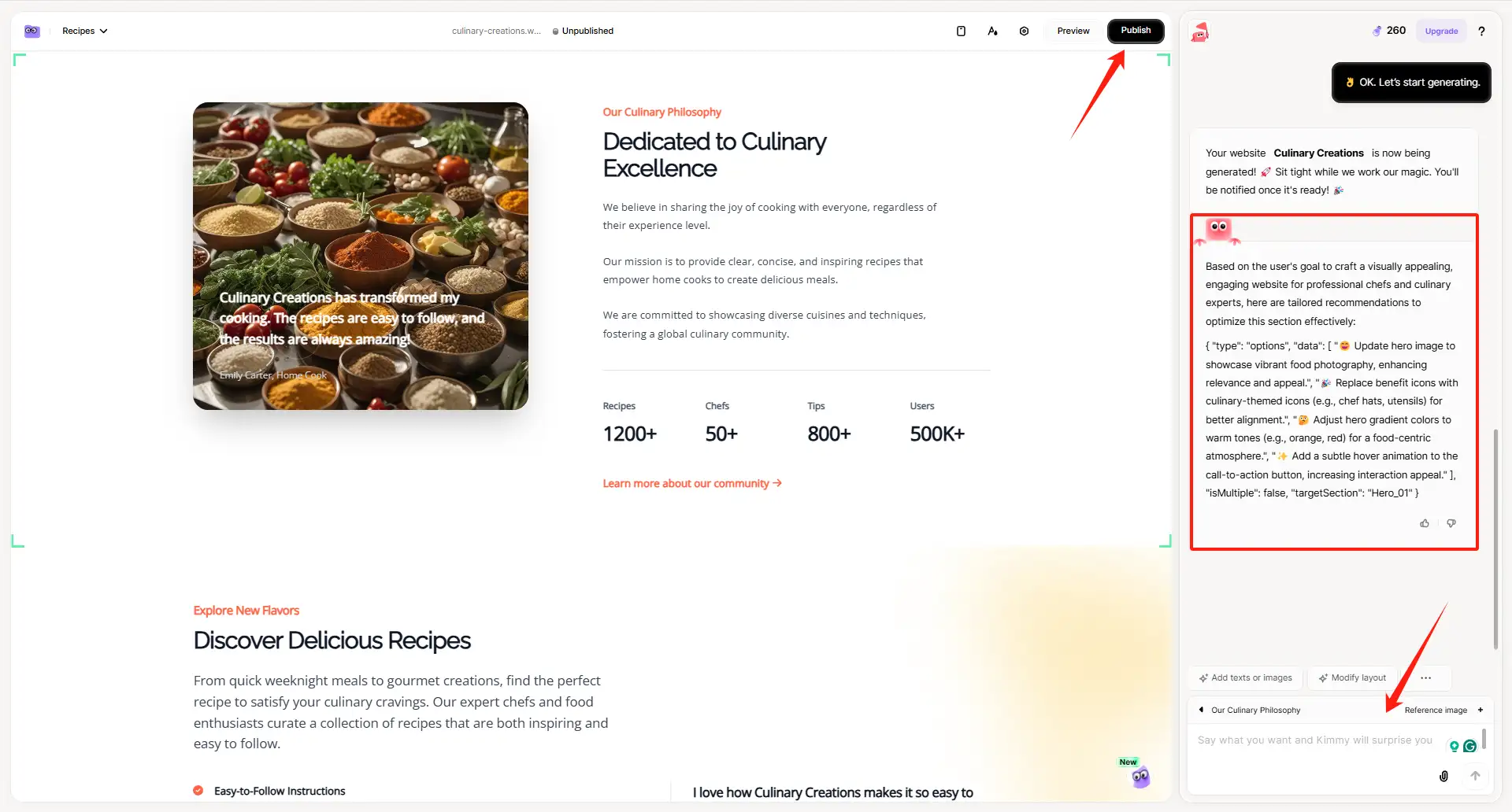
You can also click on the left side of the page to start editing, such as changing the text, etc., and Kimmy will give you thoughtful tips, so it is still very detailed.
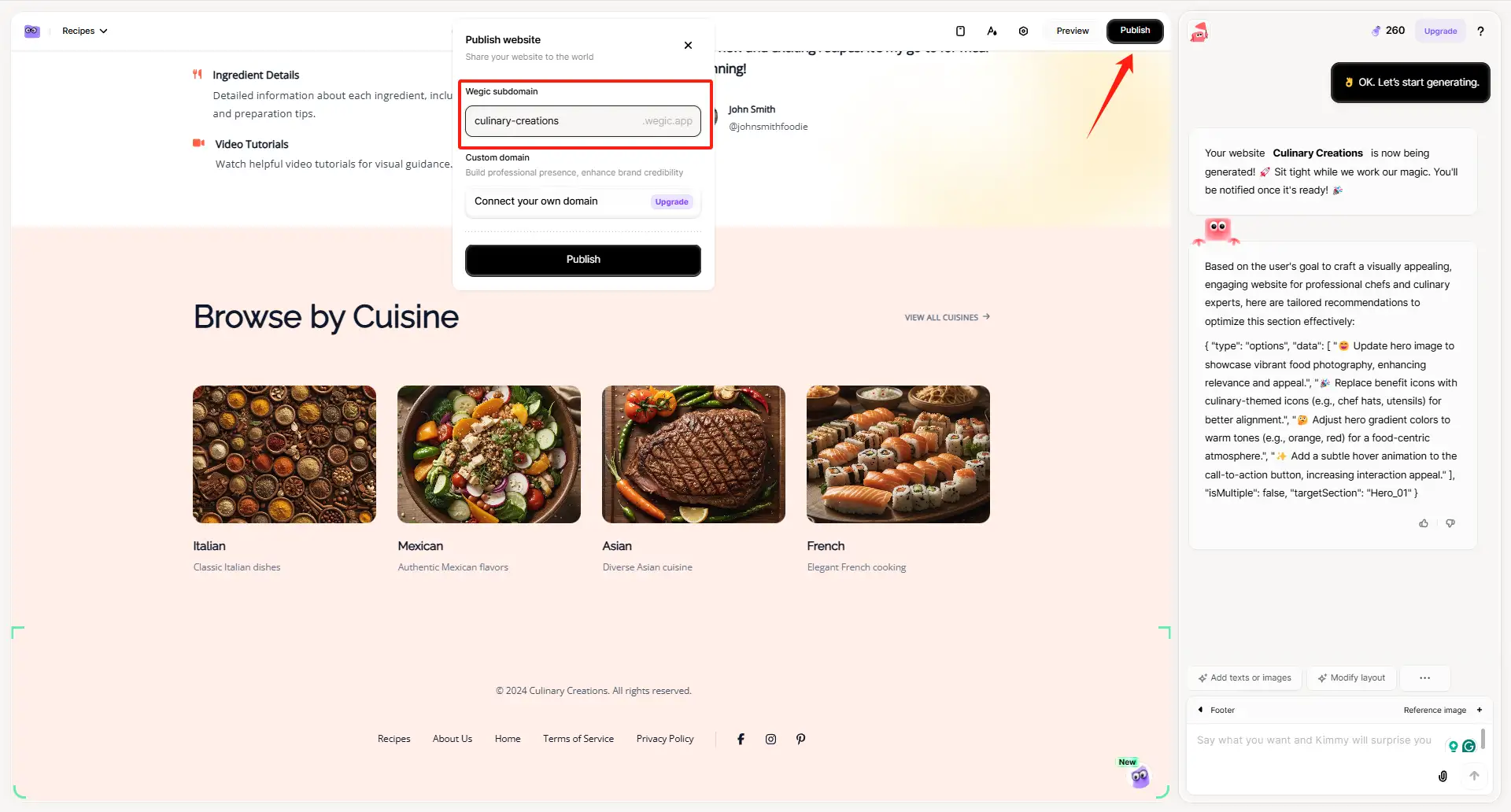
Step 6: Export the website
After you have modified your page, you can click "publish" in the upper right corner to export the website directly. Remember to edit your website name. You can use it directly at this time. You can also choose to share it with your friends, relatives, etc., and let them try your website! You can also run your site through a responsive web design tester like Google Mobile-Friendly Test to fix issues.
The above are the steps on how to use Wegic to help you build your first reactive website. If you are interested, you may click Wegic to try it for free now!
Top Tools to Improve Responsive Websites
To design an excellent responsive website, you must use useful tools, such as Wegic, which can help you create and design the website you want. However, Wegic alone is not enough. You also need more professional website optimization tools because they can help you optimize the performance of your website.
-
CSS Course
You can start with the responsive web design CSS course provided by FreeCodeCamp. These free practical tutorials can teach you how to lay out the pages of your website. Coupled with Wegic's automatic generation function, you can make a more beautiful website on Wegic.
-
Google Lighthouse
Google Lighthouse is a must-have for performance optimization. It is integrated in Chrome DevTools and can help you detect a website's running speed, accessibility, and SEO, identifying problems such as large images or redundant code.
- BrowserStack
If you want to perform cross-device testing, BrowserStack will simulate your website on over 2,000 real devices, such as button misalignment on old iPhones. You can use it with responsive web design testing tools such as Responsinator.
Common Mistakes and How to Avoid Them
Building a reactive web design is great, but if you don’t do it right, you can make common mistakes that can hurt the user experience. Ignoring mobile-first design is the first and foremost problem.
Many websites generate more than 60% of their traffic from mobile devices. However, many designers prioritize the layout of the PC side, which results in some buttons being hidden and making the website very messy when users open it on their mobile phones. So, this point must be paid attention to and improved.
Another problem is too many animated elements. Although responsive web design focuses on interactivity, too many animation effects, like scrolling, can reduce the website's performance. So, tools like Google Lighthouse can help you identify unresponsive elements, but a simpler method is to set a focus animation on each page: for example, add a smooth hover effect to the key call-to-action button.
Finally, try not to skip cross-device testing. Reactive web design testing tools like BrowserStack can help you find some problems, such as broken grids on older Android devices or font glitches in Safari browsers.
So, if you have the same problem as above, you can try the corresponding tool.
The Secret to Success: Continuous Monitoring and Optimization
When you create and publish your reactive website, it’s just the beginning. If you want your website to stand out, you must have a continuous improvement mindset.
For example, you can use tools such as Google Analytics to track user behavior. Identify pages with high bounce rates or slow loading times and optimize them accordingly.
Also, it’s best to regularly audit your website using responsive web design testing tools such as LambdaTest so that you can find problems on different devices and browsers and continue to optimize.
Conclusion
Reactive web design is no longer a technically demanding thing. Now, everyone can design their responsive website, not just developers. Using Wegic, you can create dynamic, responsive websites that adapt to any device. Imagine making a cafe website with a real-time updating menu or a photo website that seamlessly switches between mobile and desktop.
Moreover, you can add custom animations on Wegic by leveraging the responsive web design CSS skills in FreeCodeCamp's free tutorial.
In addition, tools like Google Lighthouse can speed up your website's loading time, while BrowserStack can test cross-device compatibility.
So, after reading the above content, are you excited? Do you know how to do reactive web design? If you want to try it, you can choose a Wegic template immediately and use the strategies and methods mentioned in the article. At this moment, mastering responsive web design in just a few hours is no longer a difficult task.
FAQs
Can I build a website with no experience?
Someone with no experience can build their own website using website builders like Wix, Squarespace, or WordPress with pre-designed templates. These platforms offer user-friendly interfaces and step-by-step guides. Online tutorials and courses can also provide additional guidance.
Is Wegic AI worth it?
Wegic is a revolutionary AI web design and development tool that democratizes website creation through its user-friendly, chat-based interface. It's an excellent choice for individuals and small businesses looking to establish an online presence without diving deep into coding or web development.
Can a normal person create a website?
If you're looking to create a stunning website, fast — there are several ways you can go about it. A website builder, like Wix is a great place to start, you can choose from over 900 pre-designed, customizable website templates to easily build a website.
Can ChatGPT build a website?
ChatGPT can be used for website building, without a doubt. It understands commands and delivers a certain level of quality, and with some knowledge and manual work from your end, you can enjoy pretty good results.
Can I build a website myself?
If all you need is a basic one-page website with an email address, phone number and maybe your business address, you can absolutely do that yourself. There are many website builders and one-page templates you can use to get up and running quickly.
Written by
Kimmy
Published on
Mar 17, 2026
Share article
Read more
Our latest blog
Webpages in a minute, powered by Wegic!
With Wegic, transform your needs into stunning, functional websites with advanced AI
Free trial with Wegic, build your site in a click!
What kind of website do you want to build?