Log in
Build Your Site
9 Amazing Multilingual Website Practices & Examples
You will learn 9 multilingual website best practices and examples, and how to build a website available to all languages and localized to different regions.
Are you ready to expand your audience beyond borders? In our latest article, we delve into 9 best practices for multilingual websites, showcasing inspiring examples that illustrate effective design and user experience.
It's simple to understand that a multilingual website is any website that offers content in more than one language. Speaking of multi-language, many of you may think of a term language localization.
Localization involves adapting a product’s translation to a specific country or region. This process is part of a larger effort known as internationalization and localization, which includes translating and culturally adapting products to suit different markets, regions, cultures, or groups.
If you want your product or service to resonate with diverse cultures and audiences, localizing your website is a key step in expanding globally. Whether you’re a business owner, marketer, or web developer, you can explore impressive examples of website localization to successfully enter new markets and create a truly inclusive online presence.
9 Amazing Multilingual Website Practices & Examples
A multilingual website can attract more global visitors, increasing their interest and trust in your products and services. Additionally, a multi-language website will enhance your brand identity and improve SEO rankings.
1.Airbnb
-
Available languages: 50+
-
Target Audience: Travelers and hosts all over the world
-
Category: travel and tourism
-
Category Rank: 3
-
Visits: 111.71M
-
Revenue (2023): USD 9.92B
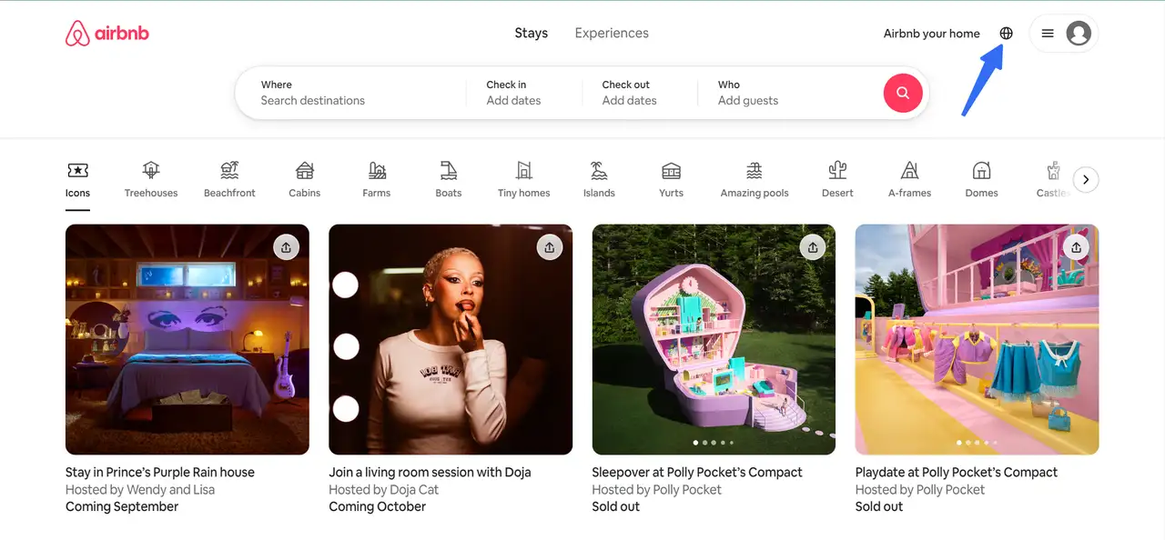
Founded in 2008, Airbnb is an online marketplace that connects individuals looking to rent out their homes with those seeking accommodations in various locations. To attract a global audience, both Airbnb and its hosts need a multi-language website. Such a platform can capture the attention of users from different countries who speak diverse languages.
Things I love:
Massive languages Available: Airbnb supports over 50 languages, enhancing communication, reducing misunderstandings, and creating a more enjoyable experience for guests. The website automatically adjusts the language based on the user’s browser preferences.
Visible Language & Currency Switcher: Airbnb provides a globe icon in both the top-right corner and the footer of the website. This ensures users can easily modify their language or currency at any time.
Temporary Language Selection: For users wanting to browse in a different language temporarily, they can simply click the language icon, and select their preferred language, and Airbnb will save the choice for future visits—offering a personalized experience.
Flexibility for Global Audiences: The options to change language, region, and currency remain accessible throughout the site, empowering users to switch settings whenever necessary.
2.Cakemail
-
Available Languages: 4+
-
Target Audience: Freelancers, non-technical users, small businesses, and enterprises
-
Category: Computers electronics and technology
-
Visits: 19.8K
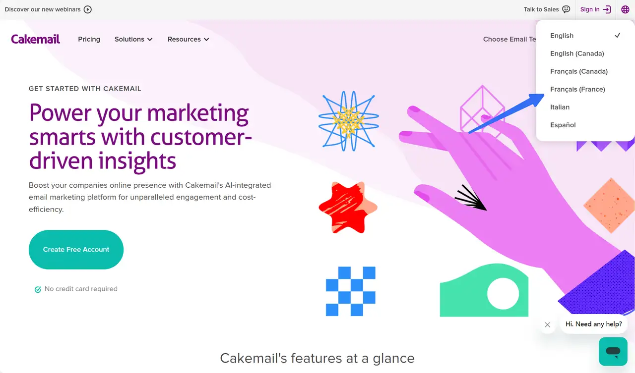
Founded in 2007 and based in Montréal, Canada, Cakemail is revolutionizing email and transactional marketing for small businesses.
Things I love:
Easy Language Switching: Cakemail’s website is available in four languages—English, Français (France & Canada), Italian, and Español—making it a stellar example of effective multi-language design. Users can seamlessly switch languages, ensuring the site is accessible and user-friendly for a diverse audience.
Tailored Content for Cultural Preferences: Cakemail speaks directly to the needs of its audience by adapting its content to different cultural contexts. This personalized experience makes visitors feel at home, helping to build trust and a strong connection.
Intuitive Interface & Visual Engagement: The site’s intuitive design, with visually engaging statistics and personalized configurations, encourages users to explore further. These design elements also make it easier for users to navigate the site in any language, offering a smooth, consistent experience.
Comprehensive Support: Cakemail goes the extra mile with thorough support, ensuring users feel guided throughout their experience, no matter the language they choose. This is key to building long-term relationships with global users.
3.Canva
-
Available Languages: 50+
-
Target Audience: Small businesses, marketers, educators, nonprofit organizations, and individuals
-
Category: Graphic design platform
-
Annual Revenue: $2 billion
Launched in Australia in 2013, Canva has quickly become a global leader in online design and visual communication.
Things I love:
Commitment to Global Accessibility: Canva supports over 50 languages, ensuring that users from all over the world can easily interact with their platform. By offering this wide range of languages, Canva demonstrates its dedication to serving a global community and meeting diverse user needs.
Simple Language Selection for New Users: If users haven’t logged in, they can simply scroll to the 'globe' icon at the bottom of the page and select their preferred language. This feature is prominent and easy to find, creating a user-friendly experience from the very start.
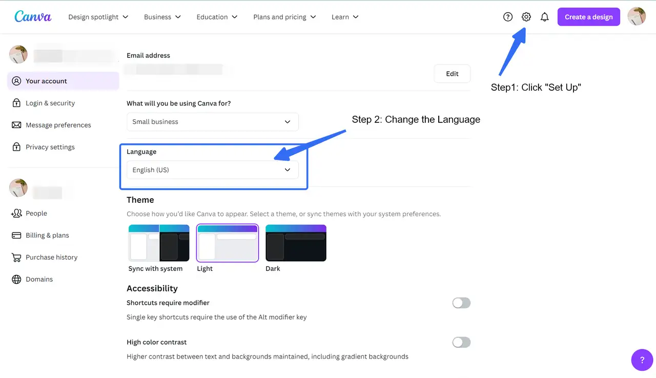
Customizable Language for Logged-In Users: Once logged in, users can go to Settings from the homepage and select their preferred language under the Language dropdown in the "Your account" tab. This allows Canva to save the user's preference for future visits, making it even more convenient for returning users.
4.Edgard & Cooper
-
Available Languages: 6
-
Target Audience: Dog and catowners
-
Category: Pet food
-
Revenue(2023): $110.39M
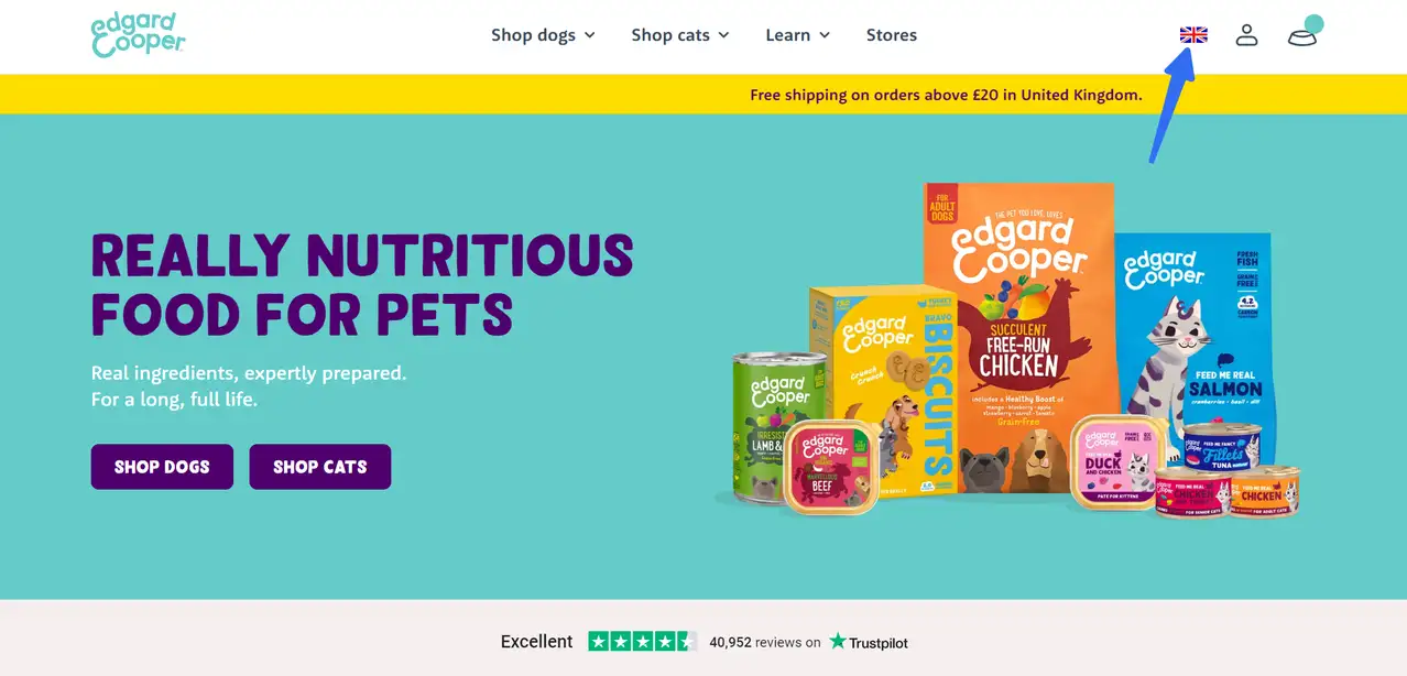
Founded in 2014, Edgard & Cooper sells tasty and healthy dog and cat food in 13 countries produced from lots of fresh, natural ingredients. Besides its products being designed to preserve nutrition and maximize flavor, it also adopts easy-to-recycle packaging and donates 1% of all its sales to dog and cat charities across the globe towards its sustainability goals.
Things I love:
Extensive Language Support: Edgard & Cooper offers content in multiple languages, including English, Dutch, French, German, Italian, Spanish, and Finnish. This broad accessibility ensures users from different markets feel welcomed and valued.
Intuitive Language & Country Switcher: Edgard & Cooper makes it easy for users to switch languages with a well-placed language and country switcher in the top right corner. This allows customers to change the website's language and adjust the content to their region, creating a personalized shopping experience that feels local.
Localization for Pricing & Currencies: The site doesn’t stop at the language; it adjusts prices and currencies based on the user’s location. For example, shoppers in France see prices in euros, while UK customers are presented with prices in pounds. This level of localization helps build trust and makes the shopping experience smoother.
Customizing Content to Fit Preferences: Like the site's adorable design and tailored shopping experience for pets, you can customize your multilingual site to ensure content is engaging and relevant to your audience. From dietary preferences to product types and allergies, every element of Edgard & Cooper’s site is designed with user needs in mind.
5.Moodle
-
Available Languages: 6
-
Target Audience: Educators, organizations and their employees
-
Category: Educational software, social/platform software
-
Revenue: $52.5M
Founded in 1999, Moodle LMS has been at the forefront of creating quality educational experiences online. As an open-source learning management system, it embodies the values of collaboration and accessibility, allowing educators to create, share, and modify content freely.
With over 422 million users across 236 countries and more than 2.4 billion course enrollments, Moodle is a global powerhouse in education. The platform offers an impressive 48 million courses in 42 languages, showcasing its widespread adoption and commitment to inclusivity.
Things I love:
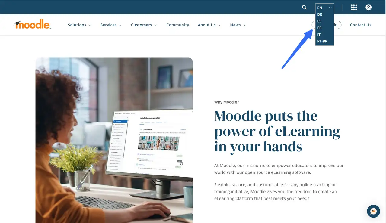
Language Switching Made Simple: Moodle’s website supports six languages—English, German, Spanish, French, Italian, and Portuguese. Users can easily switch between languages using a drop-down menu located in the top-right corner. This accessible design ensures that users from different regions can interact with the platform in their preferred language.
Global Reach and Cultural Sensitivity: With 42 languages available for course content, Moodle highlights the importance of catering to global users. By making the platform widely available in different languages, Moodle allows educators and learners around the world to engage with the platform effortlessly, creating an inclusive and user-friendly experience.
Enhancing Accessibility and Trust: Just like Moodle’s streamlined design, implementing a simple language switcher at a prominent location is key to making your multi-language site approachable. This enhances user trust and signals professionalism, showing that your platform is built for a global audience.
6.Nielsen
-
Available Languages: 13
-
Target Audience: Buyers of marketing information and other services alike
-
Category: Educational software, social/platform software
-
Revenue(2023): $110.39M
Nielsen, a global leader in media audience measurement, operates in over 100 countries with a workforce of approximately 15,000. Known for its trusted Nielsen ratings, the company attempts to provide its clients like CBS with valuable insights into consumer behavior and marketing information by collecting data that measures what consumers watch and what they buy.
Things I love:
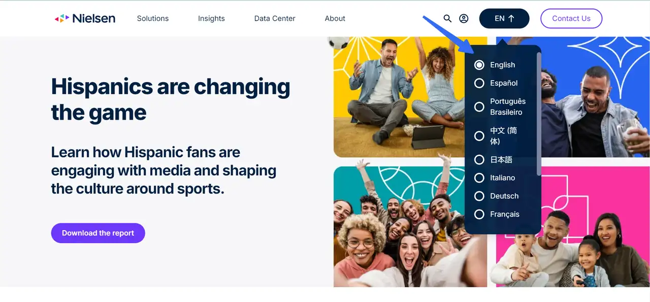
Seamless Language Selection: Nielsen’s website is available in 13 languages, including French, English, Spanish, Chinese, and Japanese. The language menu is placed in the top-right corner, making it simple for users to switch between languages without interrupting their experience. This ensures accessibility for a global audience and streamlines the user journey.
Targeting Global Markets: With a focus on diverse media markets worldwide, Nielsen’s multilingual website ensures it effectively connects with key target audiences in different regions. Offering content in multiple languages makes it easier for users from around the world to engage with the brand.
Bright Visuals and Intuitive Navigation: Nielsen’s site combines colorful visuals and user-friendly navigation to create a welcoming and engaging experience. This design supports easy exploration of their extensive global offerings, which is key to maintaining engagement on a multi-language site.
Building Global Connections: By offering multilingual support, Nielsen enhances its ability to reach clients and audiences across different regions. This strategy can be incredibly valuable for businesses looking to expand their reach and appeal to a broader international market.
7.Nike
-
Available Languages: 20+
-
Target Audience: Brand shoppers worldwide
-
Category: Footwear manufacturing
-
Organic Search Traffic: 70+K
-
Revenue(2024): $51.36B
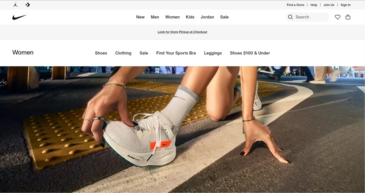
Nike, headquartered near Beaverton, Oregon, is the world’s largest supplier of athletic footwear and apparel, as well as a leading manufacturer of sports equipment. Nike has categorized its products according to gender and group, typically between 15 and 55 years old. In the fiscal fourth quarter of 2024, Nike reported revenue of $12.6 billion, which marked a 2% decline compared to the same period the previous year, falling short of analysts’ expectations as compiled by Visible Alpha.
Things I love:
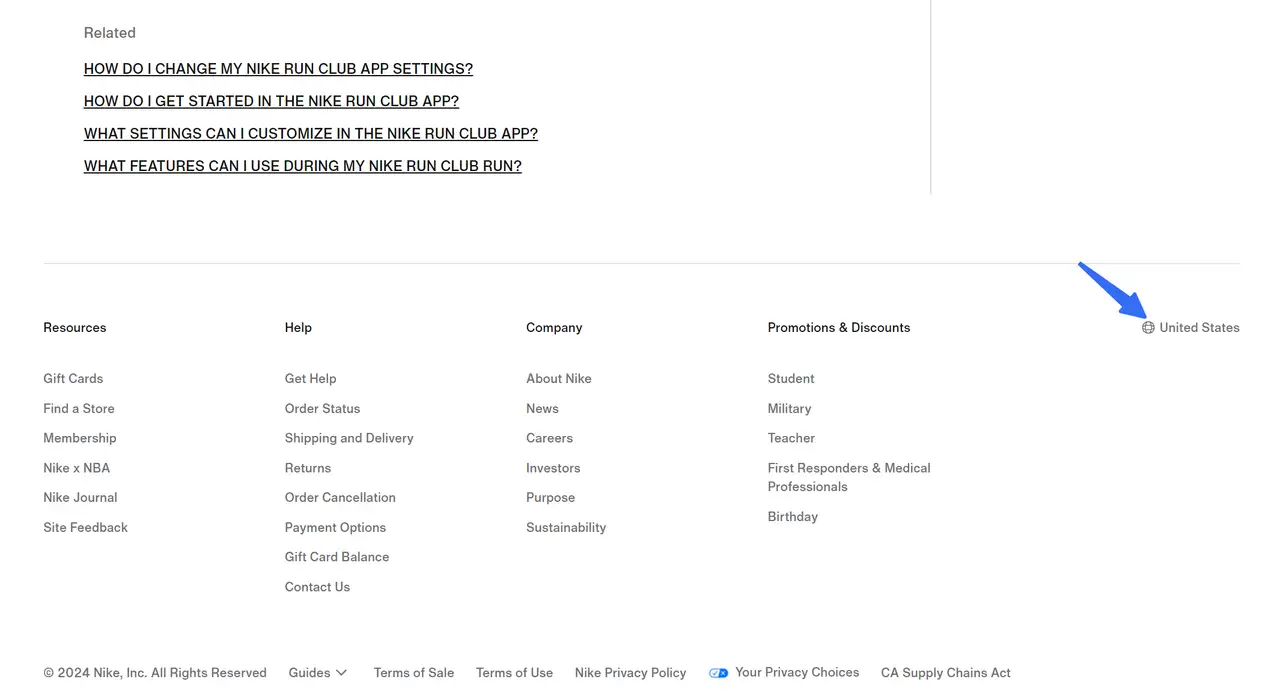
User-Friendly Language Selection: Due to the brand's global popularity, the website supports more than 20 languages and has been customized for over 80 countries. Nike places its language and country selection in an intuitive location—within the website footer, with a recognizable map icon. Make it easy for users to switch languages without interrupting their browsing experience.
Clean Design and Navigation: The minimalist design, clear navigation, and categorized content make it simple for users to find what they need, regardless of language.
Localization: Nike's multilingual website isn't just a translation. It customizes content for each region, reflecting local culture and preferences. You should consider not just translating text but adapting images, offers, and even product suggestions to suit different regions.
Optimize for Performance: High-quality images and a clean design keep the site visually appealing, but it’s also important to balance this with performance. Ensure your multi-language site loads quickly across regions, optimizing content as needed.
8.Nikon Canada
-
Available Languages: Only 2
-
Target Audience: Canadians
-
Category: Manufacturer, marketer, and distributor of optical instruments
-
Organic Search Traffic: 224+K
Founded in Japan more than a century ago in 1917, Nikon now has operations all over the world. Nikon Canada Inc. is involved in a broad spectrum of businesses centered around specializations in imaging products, optics, precision equipment, and instruments. With a range of consumer digital SLR cameras, Nikon also offers enthusiasts and virtually anyone looking to take spectacular pictures the speed, quality and durability of its award-winning digital SLR camera technology.
Things I love:
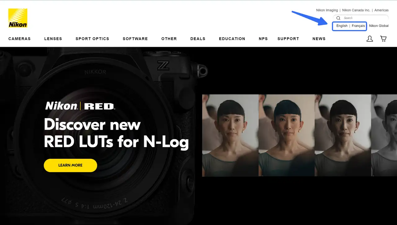
Tailored Language Support: Nikon Canada focuses on its core audience by offering English and French options, reflecting the linguistic diversity of its users. If your business targets a specific region, consider focusing on the primary languages spoken there, ensuring the experience feels personalized and relevant.
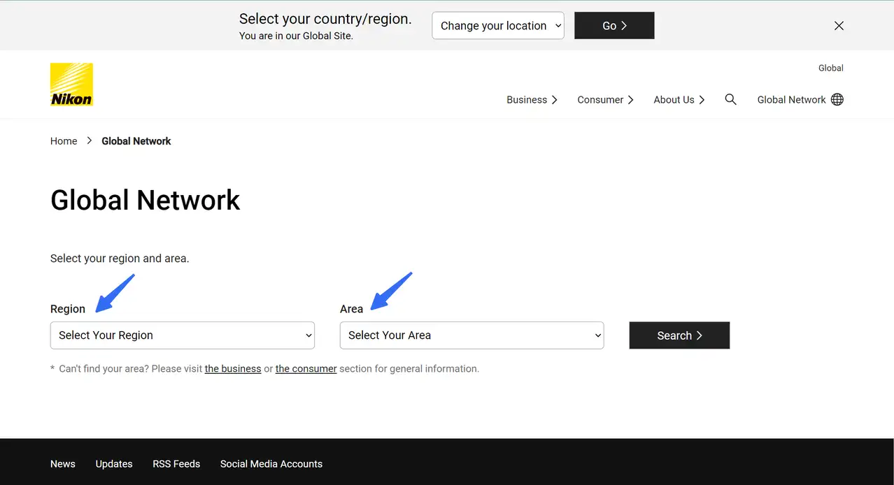
Easy Language Switching: To switch languages on Nikon Canada’s website, users can easily find the option, making it quick and straightforward to toggle between English and French. For your site, ensure the language switcher is easy to find, whether in the header or the footer, so users can access it without frustration.
Visual and UX Excellence: The site features high-resolution, full-width images that highlight the beauty of Nikon's products. This shows that good design goes beyond text—it incorporates visuals that appeal to a multilingual audience. Focus on imagery and layout to transcend language barriers and engage users emotionally.
Simplified Navigation for Different Users: Nikon’s design caters to both seasoned professionals and beginners, with easy-to-follow navigation and clear pathways to discover products. This means your multilingual website should be intuitive and inclusive, offering a seamless browsing experience regardless of user expertise or language preference.
9.WHO
-
Available Languages: 6
-
Target Audience: Global visitors
-
Category: International public health
-
Organic Search Traffic: 49+M
Established on April 7, 1948, the World Health Organization (WHO) is the United Nations agency dedicated to international public health, with its headquarters in Geneva, Switzerland, and a presence in 150 field offices worldwide. WHO is committed to ensuring vital health information is accessible to all, promoting global health and safety through its multilingual website.
Things I love:
Broad-based Language Support: WHO offers its services in six major global languages—English, Arabic, Chinese, Russian, French, and Spanish. This broad language support ensures that users from diverse linguistic backgrounds can easily access important information. If you are designing a multilingual website, aim to cover the languages most relevant to your global or regional audience.
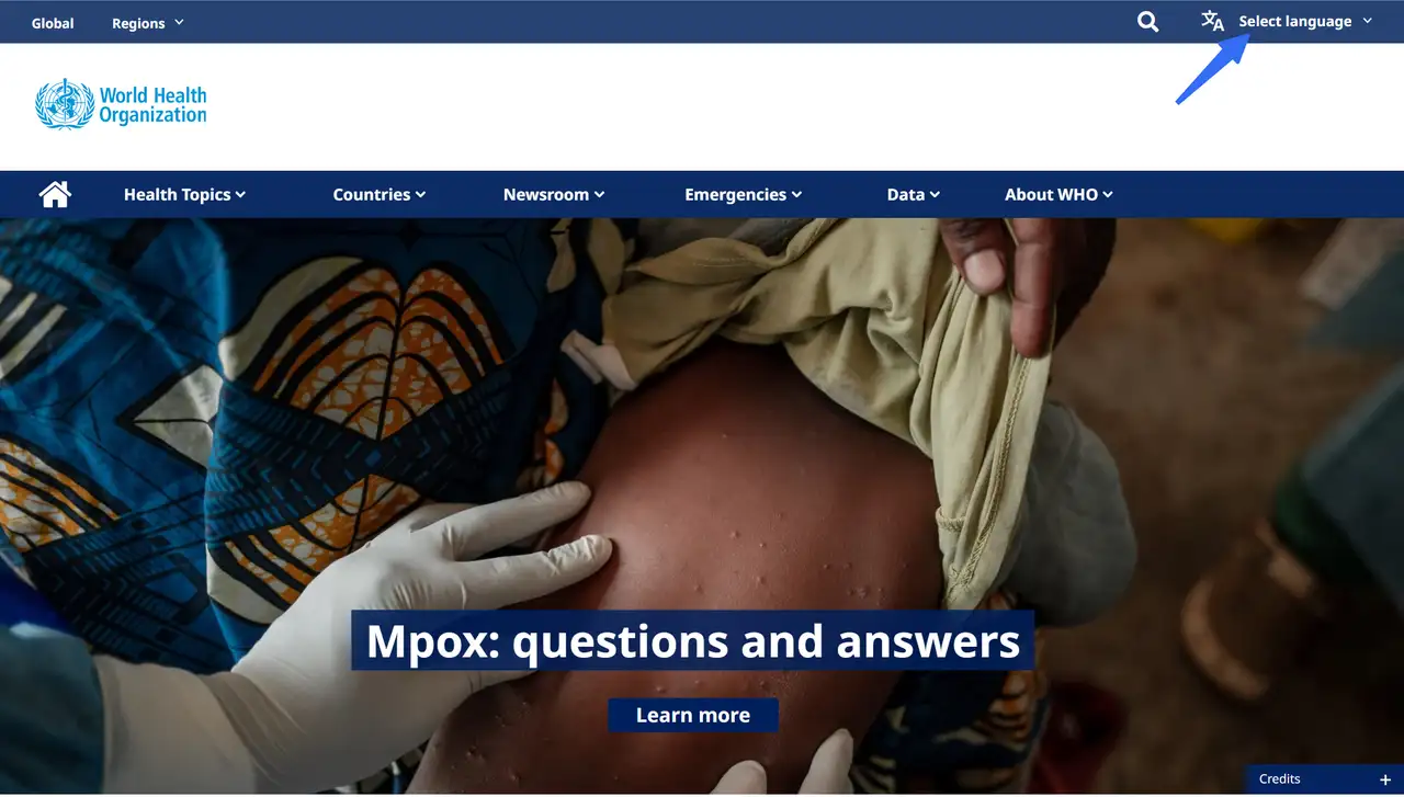
Prominent Language Switcher: On the WHO website, the language switcher is located in the top-right corner of the homepage, making it easy for users to quickly select their preferred language. For a seamless user experience, ensure that the language switcher is prominently placed, highly visible, and accessible from every page.
Clear and Intuitive Navigation: WHO’s website design features a clean and well-organized layout, with clear navigation that makes it easy for users to find the information they need. When building a multi-language site, consider how your navigation structure will work across different languages. Avoid clutter and ensure that the user journey is simple and logical for all language users.
High-Impact Visuals and Content: The WHO website incorporates impactful images that highlight current global health issues. These visuals are universally engaging and help communicate important messages beyond language barriers. For your own multilingual site, remember that powerful imagery can enhance user experience and bridge language gaps.
Regularly Updated and Reliable Content: The WHO site is consistently updated with critical news and health information. If your website serves a global audience, it’s important to maintain accurate, up-to-date content, as this builds trust and relevance for all language versions.
How to design a multi-language website?
Translation vs. Localization: Translation is different from localization, as localization involves adapting messaging and other cultural elements to fit the specific needs of users from different regions or cultures. It is important to consider cultural values, regions, and sensitive topics when localizing a website.
Language-Switching Icon Placement: The language-switching icon should be placed in a prominent position, typically on the upper right of the page, as this is a user-friendly design approach.
Language-Specific URLs for SEO: To ensure each language version of your website ranks in Google, each should have its URL. This helps with online presence and avoids issues with Google crawling dynamically changed content.
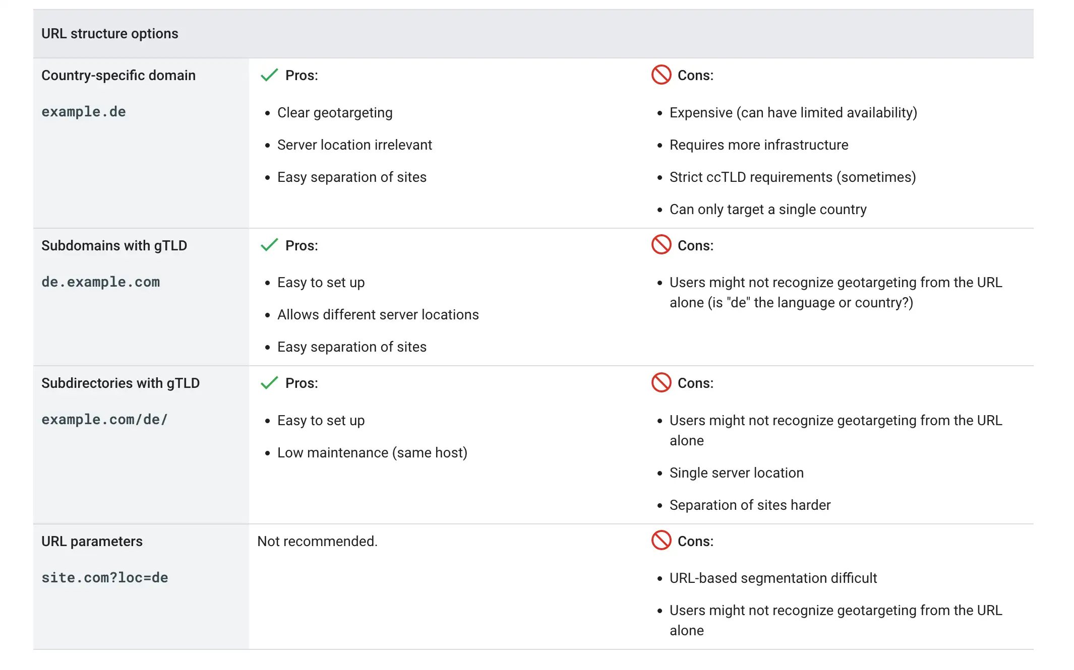
Browser Language and Avoiding Automatic Redirections: Using the browser language setting is recommended, as IP addresses may not match the user’s preferred language. Avoid automatic redirections that might block users or search engines from accessing all versions of your site. Include hyperlinks to other language versions.
Testing Before Publishing: Ensure the website is tested before going live, paying attention to factors like page load time and font readability.
Conclusion
With careful planning, accurate translations, and a keen eye for cultural nuances, you can attract new visitors and expand your reach like never before. Building a compelling multilingual site sets you apart from the competition and also allows you to tailor your web design and brand messaging to resonate with your target market's cultural preferences.
Our comprehensive guide, featuring 9 inspiring examples, equips you with the insights you need to create an effective multilingual website. Whether you’re a small business or a large organization, these strategies will help you connect with diverse audiences and enhance your global presence.
Submit these inspirations to the AI to generate a high-quality multi-lingual website in 3 simple steps.
With Wegic, your AI web design and development companion, you can generate a high-quality multiple-language website within seconds.
Step 1:
Start a conversation with Wegic by expressing your website preferences and requirements. Wegic will guide you through the design process, offering suggestions and adjustments based on your input.
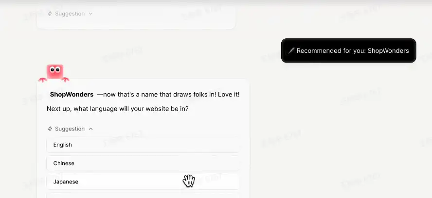
Step 2:
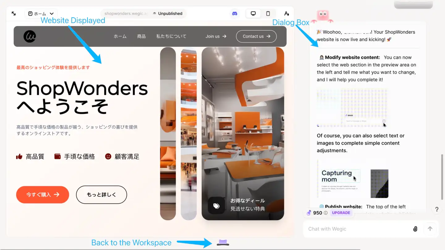
Choose the language for your website—I'll go with "Japanese." In just seconds, a fully functional e-commerce website in Japanese is in sight. Next, simply follow the localization tips outlined above to fine-tune your site for maximum impact in the new market.
Step 3:
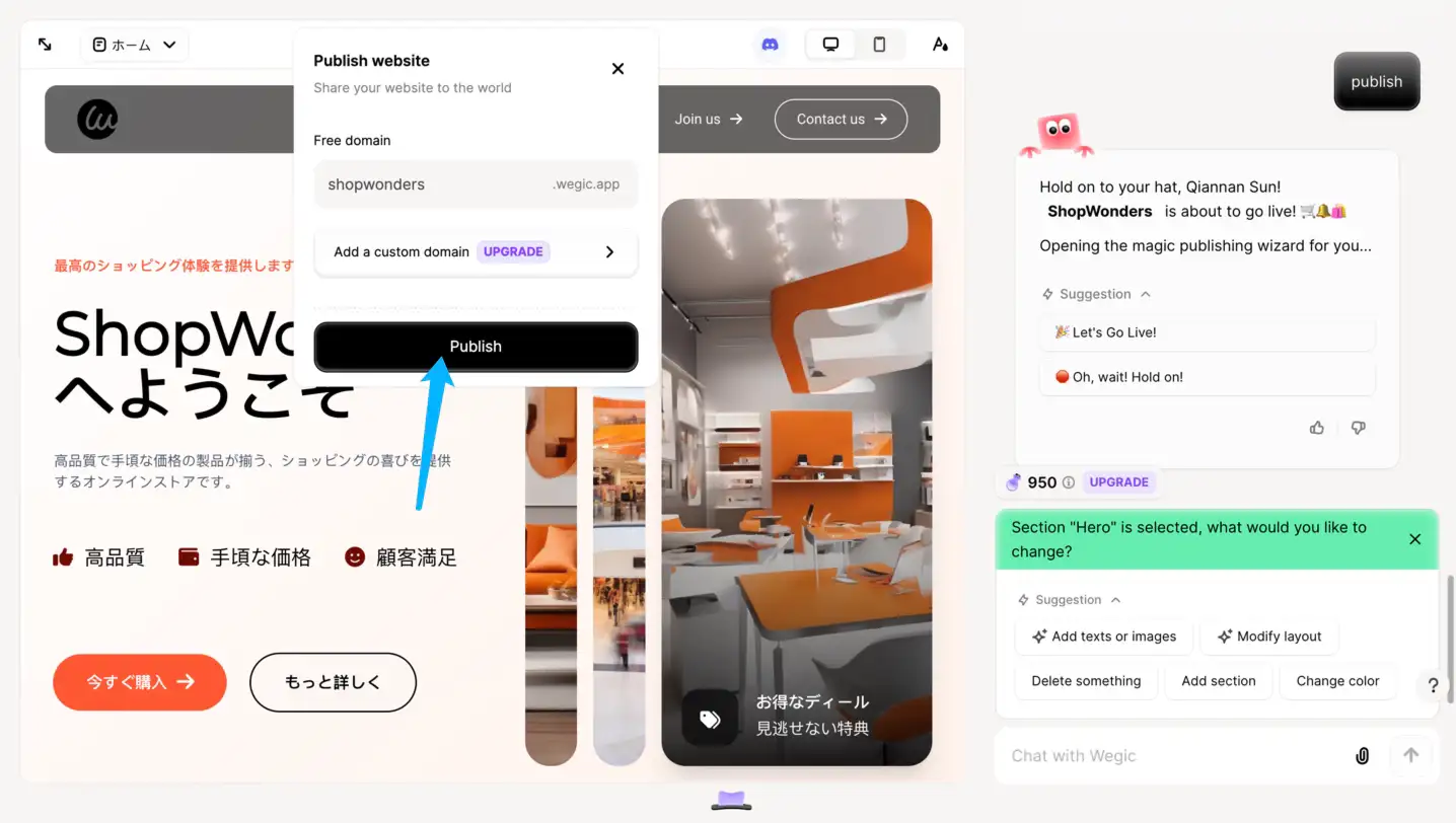
If you're satisfied with your website design, Wegic makes publishing effortless, ensuring your site reaches your target audience in the specific market!
Tip: Explore these helpful articles to learn more about website building.
Written by
Kimmy
Published on
Mar 17, 2026
Share article
Read more
Our latest blog
Webpages in a minute, powered by Wegic!
With Wegic, transform your needs into stunning, functional websites with advanced AI
Free trial with Wegic, build your site in a click!
What kind of website do you want to build?