Log in
Build Your Site
A/B Testing for Landing Pages: A Beginner’s Guide
Want to optimize your landing pages? Learn how to A/B test them effectively using free A/B testing tools and proven strategies.

Has it ever happened to you that you put in a lot of effort to create a landing page, brought in a lot of traffic, yet the conversion rate did not improve? The percentage of people who finish the form is low, and few people click the button or stay on the page for a long time. You are concerned about the data, but you do not know what caused the problem.
This issue is something that marketing teams, product managers, and small website owners commonly face. Rather than guessing, you should verify this by testing your landing page with users. This article explains A/B testing for landing pages in an easy-to-follow manner. We will explain the main steps, the free A/B testing tools available, and the typical errors people run into. With data, you can optimize your landing page to perform better.
What is A/B Testing for Landing Pages?
The concept is straightforward: produce two versions of the page, labeled version A and version B. After that, test the versions with real customers and check which one provides the best results. While testing, users are not given the same version every time. Every person could notice small changes, such as new headlines, photographs, button colors, or page designs. It helps website owners learn about user preferences without disrupting the user experience.
The idea behind an A/B(Alpha/Beta) test landing page is to send different groups of users to different versions and compare how they act. The system directs visitors to one of the available versions when they access a page. After that, it tracks things like button clicks, submitting forms, and how much time is spent on the page. Often, people use A/B testing to evaluate minor yet important changes. Is the headline attractive enough? Is it simple to grasp what the button is asking you to do? Are the product images easy to see? Is there anything in the form that seems too long? By reviewing these points, sites can enhance the user experience and raise the number of conversions.
To learn more testing methods, click the article: ⬇️
Why Do You Need Landing Pages A/B Testing?
For example, “I think the color of this button is more enjoyable,” and “our boss prefers this picture over others,” so the whole page is based on these feelings. But what users really think and feel may not align with these predictions. A/B testing for landing pages helps you to tell which variant is more effective by showing the actual results based on user data. Data should be used to guide decisions rather than proving who is right, and this reduces trial and error. A/B testing helps make every user count by identifying which pages are worth investing in.
Click on the image to design your landing page! ⬇️
https://wegic.ai/
Image by Istock
Furthermore, what users do and like can change over time. People might view your page differently. They arrive at different moments, on different devices, and from different places. They can react in many different ways. A/B testing for landing pages allows you to enhance your page regularly. It allows you to try out headlines, images, the length of your form, and the button text. It allows you to respond to changes in what users want. Minor improvements over time will lead to a higher conversion rate. They make you more competitive in the market.
How to Do A/B Testing for Landing Pages?
A/B testing for landing pages is a simple, step-by-step method to improve landing pages. It uses information to assist you in making the best decisions. What matters most is planning your work well and carrying it out, not the tools at your disposal. We will explain step by step how you can run an A/B test on your landing page. It will allow you to work on your project by yourself.
Step 1: Clarify the Test Goal
If you are unaware of what you are testing, the results you get may not hold much value. Make sure your goal is easy to understand. For instance, you might wish to have more signups, keep people on your site for longer, or gather more filled-out forms. Avoid using such a vague statement as “make the user experience better.” It is difficult to measure and verify. Having a clear goal will guide you in creating the test. It allows you to review the results more easily.

It is often best to concentrate on only one main objective for each test. Doing too much at one time can make things difficult to manage. If you want more people to sign up, focus on that. Ignore the number of clicks or the amount of time visitors spend on the page.
Step 2: Select Test Variables
The process continues with picking a variable for your test. Variables are the parts that can be changed from one page to another. You can use these for titles, buttons, page designs, form sizes, slogans, images, and anything else. Always modify only one main aspect when performing a test. This means the results are because of the change you made. If you alter many things at the same time, it will be hard to identify the cause.

Meanwhile, the variables you pick should be strongly connected to what you are testing. It can help to change the button’s appearance or its wording to encourage more registrations. If you want to get more clicks, try altering the sequence or top photo in the menu. Try not to experiment with things randomly. It is important to select the right things to test for good results.
Step 3: Design A/B Versions
Now it’s time to make two versions of the page using the variables you decided upon. Version A was the first one to be created. Version B is the one that has been altered. While you design, it’s not necessary to change the entire page. Ensure that both versions are different enough so that you can make a comparison. If you want to test the effect of the headline on conversions, keep all other elements the same and only modify the headline. As a result, the analysis of the test is more focused.

We should note that version B is not the better version, but the one used to compare. You can try something you’ve never done before. Consistency in style should remain a priority while designing for a brand. Ensure that there are no huge differences between the different pages. Arrange the page so that it is straightforward for users to grasp. Ensure that all pages are loading at about the same pace. Avoid data issues that come from technical issues.
Step 4: Set the Audience and Traffic Distribution
When the page version design is ready, you should decide on the method of distributing users to the two pages. In most cases, we share the roadways equally. Therefore, 50% of users get version A and the other 50% get version B. It can help avoid mistakes in the test. Should you believe one is more accurate, you can adjust how the data is shared. An example would be 70% to 30%. Ensure the number of users is sufficient for you to believe in the outcomes.

You should also confirm the process for assigning users. Each user should only have access to one version. Make a decision on whether to filter out users who have already converted in the past. You could begin by testing out new visitors. These details play a role in the accuracy of your test. In most cases, software tools will adjust this for you. You should decide on the rules before you begin.
Step 5: Start the Test and Collect Data
After the test settings are finished, you can begin the test. At this stage, the main aim is to collect data that is accurate and complete. The system should be set up so that every main action (such as clicks, sign-ups, and leaving the page) is monitored. You can get the information using Google Analytics, Mixpanel or the features available in your testing tool. A test with incorrect tracking will have no relevance.

Image by Google Analytics
The test should last for at least one week. You should take data on days and weekends and gather enough information from users. During the entire test, try not to change the page or introduce new marketing activities to avoid interfering with the results.
If you want to analyze your competitors, click the article: ⬇️
Step 6: Analyze the Test Results
When the test is complete and you have collected enough information, you should start analyzing the results. To begin, compare the main impact, such as the one that gets more people to sign up or purchase. Notice if the gap between the two is significant. Be wary of focusing only on the figures. Verify the reliability of the results using statistics. Confidence intervals and p-values can be shown using some tools to assist you. In most cases, if a version proves to be better with a 95% chance, it is the winner.

Other points to consider are how long people spend on your page, where they arrive from and the device they are using. Such tests can tell you the reasons behind your preferred outcome. Do not rely on one statistic to make your decision. Look at various aspects to ensure the results are correct.
Step 7: Apply the Results and Continue to Optimize
After you receive the test results, that does not mean everything is finished. When the test favors version B, you may want to use it as the new standard page. Optimization should be ongoing, and every new improvement can lead to more tests. As an example, you can check the title for the first round, the button wording next time, and the number of form fields in the following round. The only way to see lasting improvements in conversions is through continuous testing.
If the difference between the two is not easy to see or they have the same results, don’t lose hope. It does not show that the test has failed, only that the variable does not affect users’ actions very much. Change your strategy and focus on different powerful elements. The main goal of A/B test landing page is to experiment, gain experience bit by bit, and learn how users like to express themselves. Check AI in marketing to get useful marketing methods.
3 Free A/B Testing Tools for Landing Pages
You don’t have to spend a lot of money or use a complicated system for A/B test landing page. It is possible to use many tools for free and test them with either small or medium-sized projects. Listed below are 3 free A/B testing tools that you can use for free. They are all designed differently and can be used in different situations.
Crazy Egg
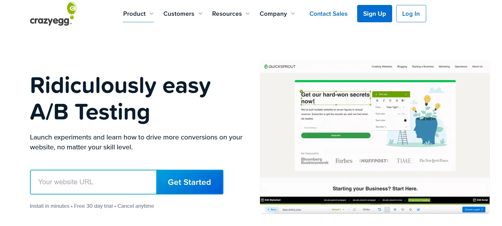
Heatmaps and recording how users behave are the fundamentals of Crazy Egg. It also provides landing page A/B testing and is a good choice for users who wish to examine visual data with the results of their tests.
Benefits:
-
Intuitive heatmap function, you can view user clicks, scrolls, and stay areas.
-
Enables changing page elements and doing simple version checks.
-
Free A/B testing tools can be easily added to popular CMS choices (such as WordPress).
How to use:
After registering, put the Crazy Egg script on your website and then prepare a test plan using the background. For example, if you change the button color or title copy, the system will randomly assign visitors to different versions of the page in proportion and continuously record user interactions.
Contentsquare
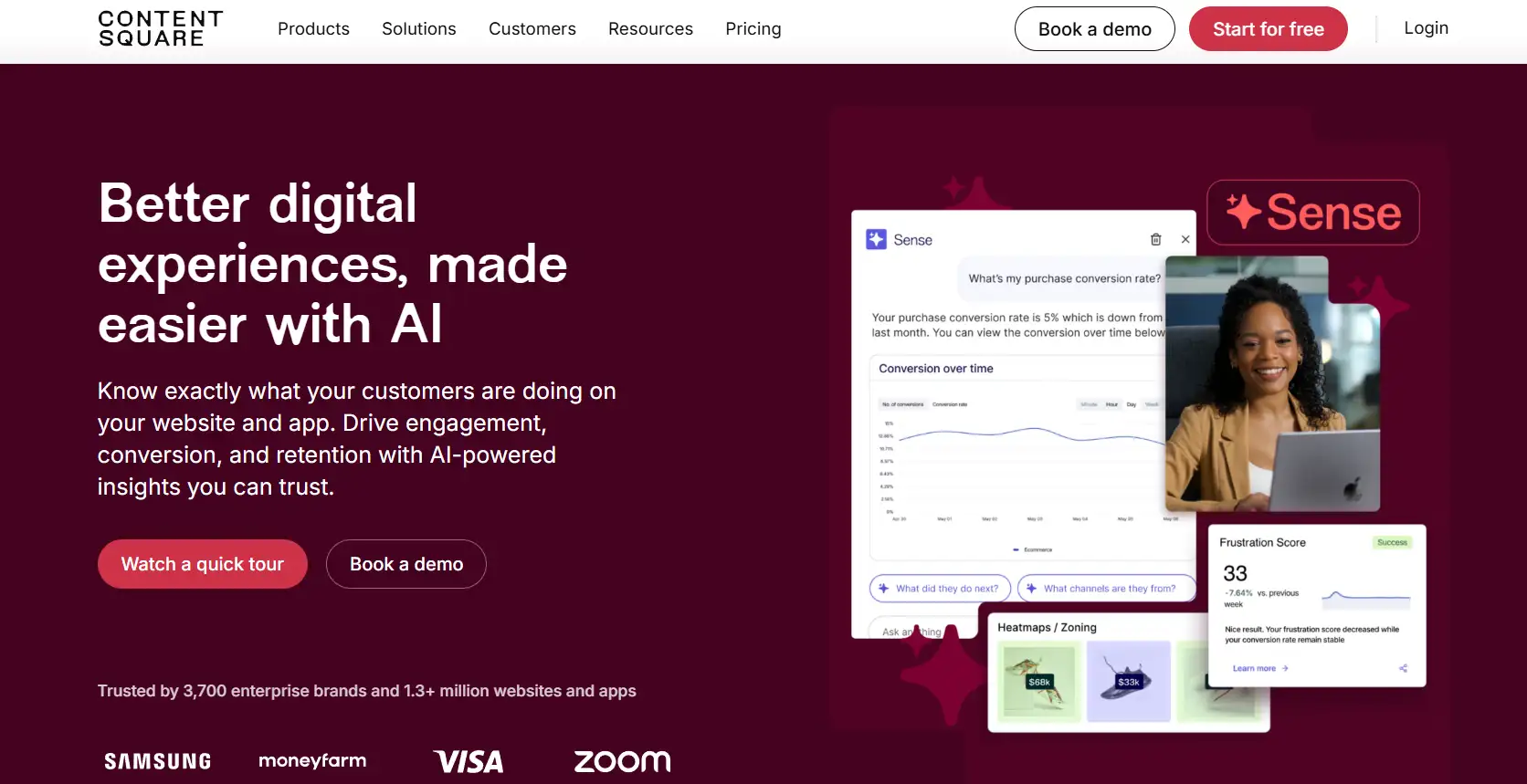
Contentsquare is a tool that helps enterprises understand user experiences online. While the complete version of the tool can be pricey, it does offer some complimentary features (such as the CS Digital Experience Score) and helps implement landing page A/B testing plug-ins.
Benefits:
-
User behavior on the site can be seen and understood from start to finish.
-
Present the data in detailed reports and easy-to-understand charts.
-
Improve how visitors interact with a website at all touchpoints, not just on one page.
How to use:
Go to the official website, apply for a trial, and include it on your website. When a page is being tested, users can build different paths, send traffic to each one, and use Contentsquare’s measures to find out which path is preferred.
Unbounce
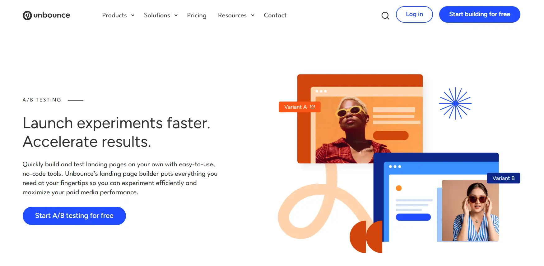
Unbounce is software that helps users create and improve landing pages graphically. The A/B testing tool is included, making it a good choice for anyone who needs to release various landing pages quickly.
Benefits:
-
By simply dragging and dropping, you can easily make different versions of pages.
-
Thelanding page A/B testing function is already included in the tool and does not need to be set up separately.
-
This analysis report is self-explanatory and easy for newcomers to use.
How to use:
Build a couple of landing pages in Unbounce and determine the ratio of traffic going to each page when you launch the test. The system will automatically divert visitors to each version in proportion, and generate comparative reports such as conversion rate and click-through rate to help you clearly understand which page is more effective.
Common Mistakes in A/B Testing for Landing Pages
Many companies or people frequently slip up when doing landing page A/B testing. If these errors happen, the test results may be wrong, and your time is wasted on unnecessary improvements. Avoiding these mistakes helps ensure that your data is accurate and the results are beneficial. Here, I will explain four typical mistakes students make.
-
Not testing a large number of people is a significant error. If the landing page is shown to a small group (for example, just 100), the data results may be affected by luck alone. Because of this, you can’t trust the findings. This can be solved by determining the minimum number of visitors required to get dependable data from your everyday traffic.
-
Another problem is making numerous changes all at the same time. If you change the headline and button at the same time, it takes less time, though you won’t be able to tell which change mattered. Running only one change at a time will provide more accurate information. This allows you to figure out the best methods.
-
A lot of testers overlook the concept of statistical significance. If they like one version, they could decide too fast that it is the best. However, seeing progress where there is none might cause you to make the wrong choices in the future. Before changing anything, verify with a statistical tool or calculator that the results are significant.
-
Testing experiment results for a short time is a frequent mistake. This does not take into account how people’s actions change, which may result in missing data. It is better to run the test for a full cycle, for example, a week. This shows the actual results of how the page functions.
Conclusion
The core value of a/b testing for landing pages is to replace subjective judgment with data, making decisions more scientific and reliable. When different versions are tested, operators can identify which parts of the site are affecting users’ behavior, unlike making guesses simply from their own beliefs. Relying on data prevents making changes that have no positive effect and wastes resources.
Moreover, A/B test landing page is an ongoing method to make improvements. People’s preferences and needs can change as their environment and surroundings change. Landing pages should be tested and improved regularly to maintain their top condition. Regular optimization can make users more satisfied, help companies spend less on attracting new customers, increase the effectiveness of marketing and sustain the stability of a business.
During live operations, testing usually involves many updates and changes to landing pages, so website building tools should be flexible and efficient. Those who are new to programming should try Wegic. It allows people to build websites using an automatic and conversational process. With it, creating and modifying landing pages is simple, and many copies can be launched quickly, which means no additional expenses after testing. Wegic allows operators to concentrate on data analysis, find the best ways to improve, design landing pages that convert well, and help their business progress.
Written by
Kimmy
Published on
Mar 12, 2026
Share article
Read more
Our latest blog
Webpages in a minute, powered by Wegic!
With Wegic, transform your needs into stunning, functional websites with advanced AI
Free trial with Wegic, build your site in a click!
