Log in
Build Your Site
Google New Logo for 2025: New Features of the Modern “G”
Google’s new logo for 2025 is here—sleek, symbolic, and adaptive. Uncover its history, benefits, and future-facing branding insights.
In 2025, Google launched its first major logo update in nearly a decade, introducing a vibrant "G" logo featuring dynamic gradient design trends. The "G" logo has clean lines, smooth colors, and a design that fits on every type of screen. The new design looks like Google and is more open to different kinds of users and smart tech. As things become more connected in the AI age, Google hopes the logo will reflect its expanding tech-related and user-focused plans.
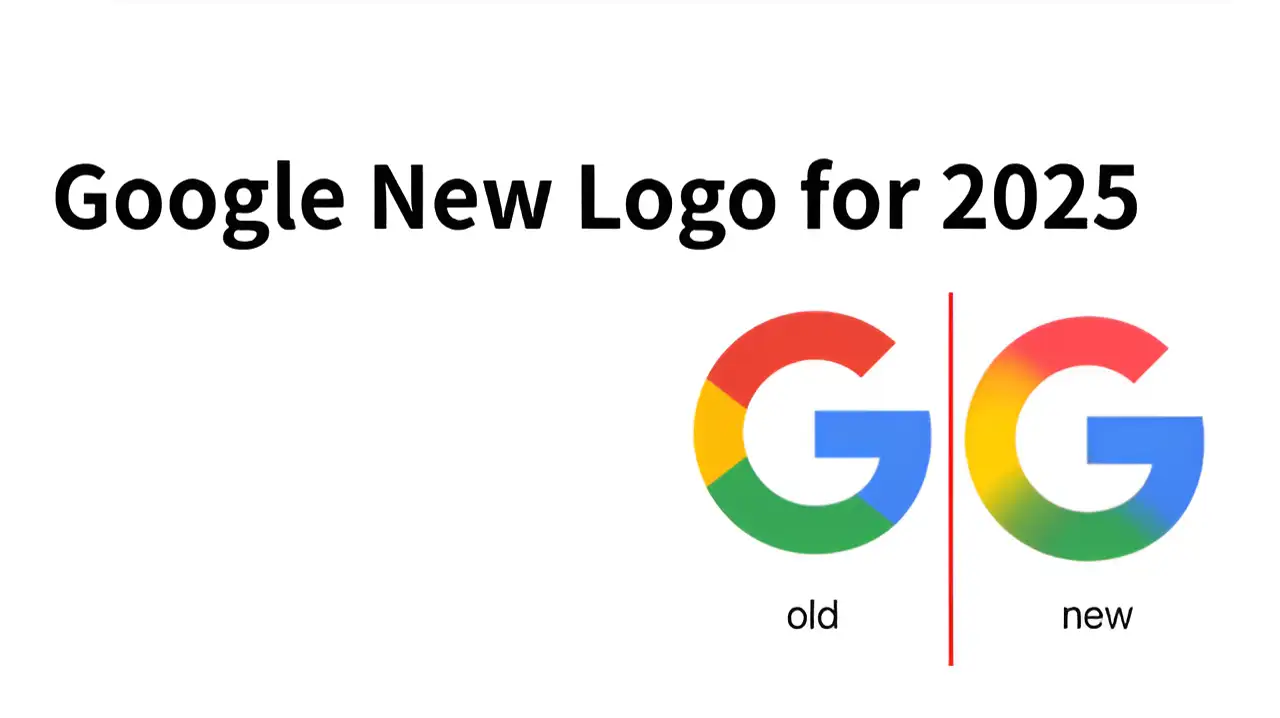
Our guide traces the Google new logo’s evolution, highlighting how its gradient designs inspire branding ideas for 2025’s connected world.
What does G stand for in Google?
In Google’s branding, the letter "G" stands for both "Google" and the company. People across the globe recognize it as one of Google’s main symbols. This simple letter logo is found on browser tabs (favicon), mobile app icons, Google search pages, and smart device screens. You can see it in the browser tab (favicon), on mobile apps, Google search, and smart devices. The letter "G" helps form Google’s brand by showing togetherness and faith in technology. It is designed so that it is easy to recognize everywhere. The Google new logo looks great on all kinds of digital displays.
In 2025, Google came up with a new version of its logo. It now represents Google as well as Global, Genius, Growth, and Green. The "G" now means Google, as well as Global, Genius, Growth, and Green technology. The new "G" logo uses color gradients and improved shapes, and shows up better on high-definition and animated screens. The new "G" is simple but very recognizable. It reflects Google's innovation, technical strength, and focus on users in the AI era.
If you want to rank the website on Google, click the article: ⬇️
Google Logo History Review
Since its founding in 1997, Google has transformed how people search for information. Following new trends in technology and design, Google’s brand image has changed over the years.
You can see the Google logo anywhere and its development over the years. Every time the logo changes, the fonts and colors are updated. These changes reveal that Google cares about technology, its users' experience, and what defines the brand.
Click on the image to design a website! ⬇️
https://wegic.ai/
Image by Istock
Here, you'll find a history of the Google logo. You’re about to see the journey of Google’s logo from its first basic version to the colorful style it has now. We’ll show you the reasons for each design change, the technology used, and what the new logos reflect in the company.
First Generation Logo: 1997–1998
Google’s first logo came into existence during the "Backrub" project. It was a simple design, made with a simple serif font, to help people know that this was a preview version of a search engine. At that time, the logo was plain and did not look like a big brand logo. Google kept the logo for only a brief period. This logo appeared as Google went from being a school project to a major tech company.
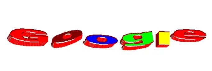
Image by Google
Colored Serif Logo Era: 1998–2010
In 1998, Larry Page and Sergey Brin named the company “Google.” They replaced the first logo with a new one. It used the classic Times New Roman font with serifs. For the first time, they gave the logo special colors to express the brand’s essential values. The brand colors were blue, red, yellow, green, and red. The colors chosen by Google were meant to express its special values. They wanted the colors to display Google’s creative and unique approach. It didn't take much to recognize the logo. The logo traveled with Google from its launch as a small company to becoming a recognized worldwide name. Eventually, it was recognized by internet users all over the world.
Image by Google
To know about the logo, click the article below: ⬇️
Gradient and Shadow Optimization: 2010–2013
In these years, designs on the internet became more colorful and realistic. In 2010, Google made some minor changes to its old Google icon. Google included color gradients in the letters, shadows beneath the text, and lightened the colors. They updated the logo to make it look better on modern, high-quality computers. This new design kept up with internet users asking for cleaner and more modern designs.
Image by Google
Flat Design: 2013–2015
In 2013, Google made a new Google icon. It clearly demonstrates the design industry’s move towards Flat Design. There were no shadows or gradients anymore. The letters were made with brighter and stronger colors. They made the design as simple and neat as possible. Because of the flat design, the logo now stands out better on mobile screens. It improved the logo’s speed and performance for users. The change was part of Google’s new focus on mobile phones.
Check responsive design principles to make your website perform well on all devices.
Image by Google
Sans-serif "Product Sans" Logo: (2015.9-2024)
The biggest change in Google's logo in over ten years came in September 2015. It uses a new, simple font called “Product Sans,” which was created by Google. The Google new logo looks clear and simple to spot. The new design is straightforward and adaptable to all kinds of devices. Now, Google has added a new "Dynamic G" icon to its logo. It’s just the letter "G" created using four colors, called the "Dynamic G" icon. This icon is used as a simple name for Google apps like Chrome, Gmail, and Google Maps. This design marks Google's successful transformation from a traditional search engine to a digital ecosystem integrating AI, cloud computing, and smart devices.
Check the best seo practices for seo optimization.
Gradient Logo: 2025 (First Major Update in a Decade)
In 2025, Google made its most remarkable logo update in years, as the digital world was changing. Google new logo in 2025 was made while still keeping the original structure of the Product Sans font. The font has become more uniform, the letters are closer together, and it looks clearer in mobile and voice interfaces. In addition, the new logo has a new color scheme. Google has used softer and more modern gradient colors to make the logo look better in high contrast and dark modes.
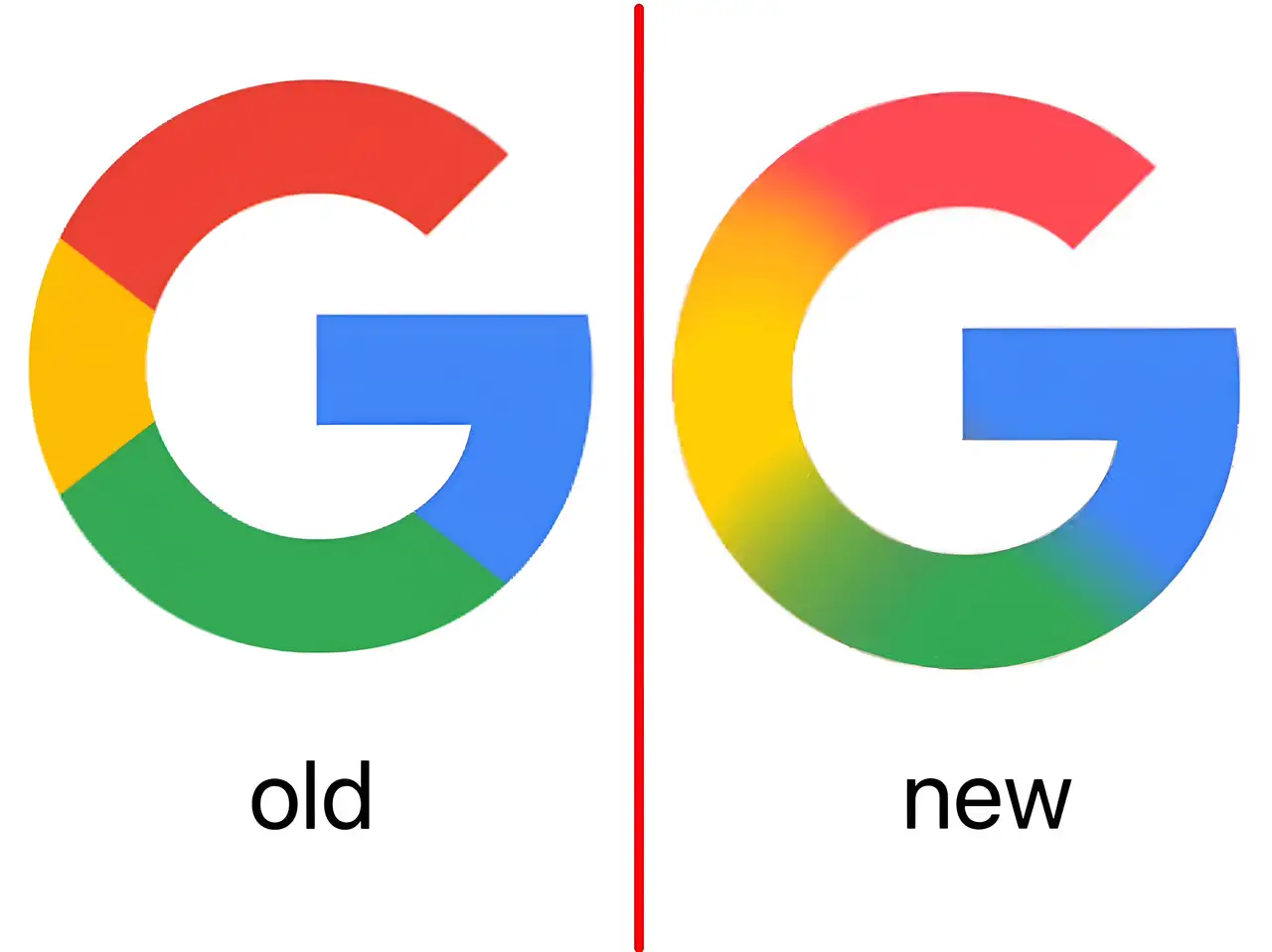
In addition, the Google new logo has been designed to work well with different types of devices and languages. The logo is now able to adapt itself in AI voice assistants, wearable devices, and multilingual search interfaces to improve the user’s experience. It represents how Google wants to develop its AI-first strategy and also shows that it cares about sustainable design, inclusiveness, and making things accessible for everyone.
Why Did the Google Icon Change Today?
The change wasn’t limited to making the logo look different. People now rely on brands like Google to look and function consistently in various digital platforms, so Google needed a new logo to fit all these settings. Because technology and platforms are changing so much, Google new logo had to be able to work across all digital devices.
Google changed the colors in its logo to give it a fresh, modern appearance. This is a lot more than a logo change, as it reflects where Google is headed with its brand. As a global tech leader, this update highlights Google’s vision and responsibility in the modern world.
The Inspiration Behind Google New Logo
Google’s new logo in 2025 is a reflection of how important artificial intelligence has become for them. AI is at the heart of Google’s recent actions. Their goal is for the logo to change, so it works well on different devices and in different situations. Google wants its new logo to be able to change based on the device and circumstances. The new logo’s colors are designed to blend continuously.This move shows that Google wants to use technology to support its products and prepare for the future.
The update at Google sends a message to all companies about the future of logos. Because technology is progressing, Google's new logo has to keep up. A good logo these days does more than just appear attractive—it also tells people what the brand is about. As technology evolves, a website logo needs to be flexible.
Making a website logo flexible and modern is useful for the brand's long-term development. Here comes Wegic, which allows users to build and manage their websites without any coding.A logo can be easily changed on Wegic to keep the brand’s identity looking the same. Since users’ interests and needs are constantly changing, a flexible website tool allows brands to keep up and prosper online.
Change Website Logo Instantly With Wegic
Today, having a good logo on a website is key to a brand’s identity. Traditionally, updating a logo requires the help of developers or designers and can be difficult and time-consuming. Thanks to Wegic, users can easily update their logos and a website’s look. You don’t need to code to make changes with Wegic; it’s simple and efficient.
What is Wegic AI?
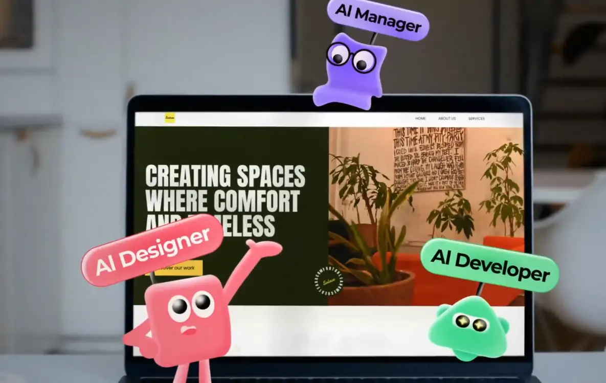
Wegic AI, powered by GPT-4o, is a web design tool that lets users work on their website using simple language. Wegic was launched and has since helped people from over 220 countries and regions make and manage more than 500,000 websites. In honor of these past achievements, the tool includes Easter eggs related to the three early innovators in websites, visual website editors, and AI. Tim, Kim, and Turing are the IPs that you see on the Wegic website.
-
Timmy pays tribute to Tim Berners-Lee, who invented the Internet and the first website.
-
Kimmy was named after Spencer Kim, who introduced the world to ViolaWWW, the original visual website editor.
-
Alan Turing, the inventor of the Turing test, is the inspiration behind Wegic’s Turi.
They work as website developers, designers, and managers, all rolled into one. Kimmy asks users for information about their needs. These three IPs act as website developers, designers, and managers.
Steps to Effortless Logo Updates Online
Changing the logo on Wegic only takes a few simple steps:
Step 1: Open the Wegic website editor
Visit Wegic website and log in to your account. The editing interface comes up after you log in to your existing website project. If you are just getting started, log in to Wegic and select the option to create a new project, and the site will help you with the basics.

Step 2: Click Action to upload a new logo
Usually, the website logo appears at the top of the page in the editor interface. Click on the logo to open the upload window, load the new logo image, and keep it as you like on the page.
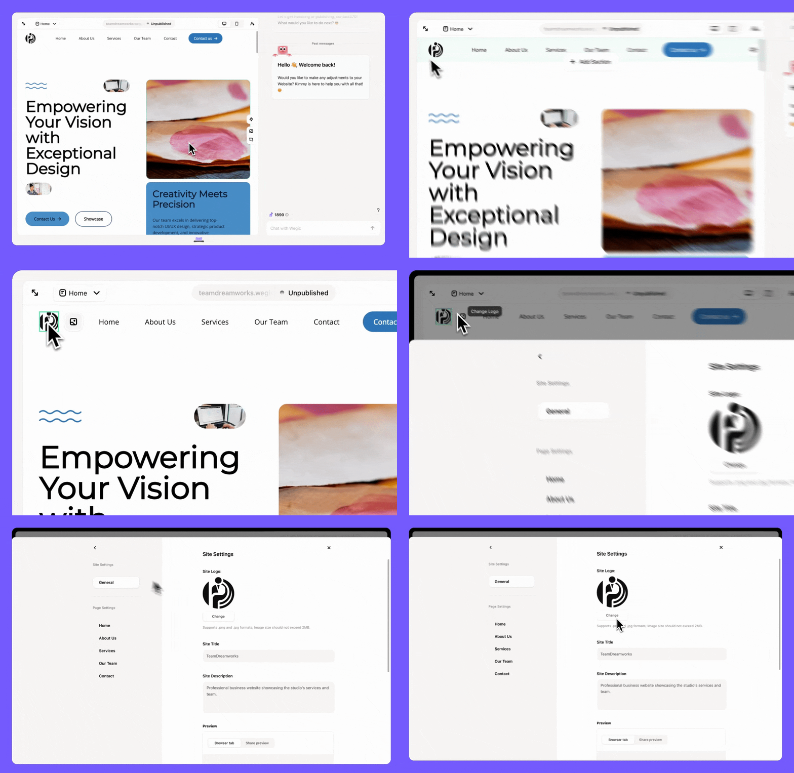
Step 3: Customize the logo position
After adding the logo, you may wish to relocate it or make it the correct size for your website’s design. The position of your logo can be adjusted in the Wegic navigation bar to get a desired layout without changing anything else. Wegic lets you change the logo’s place on the page for a more accurate design.
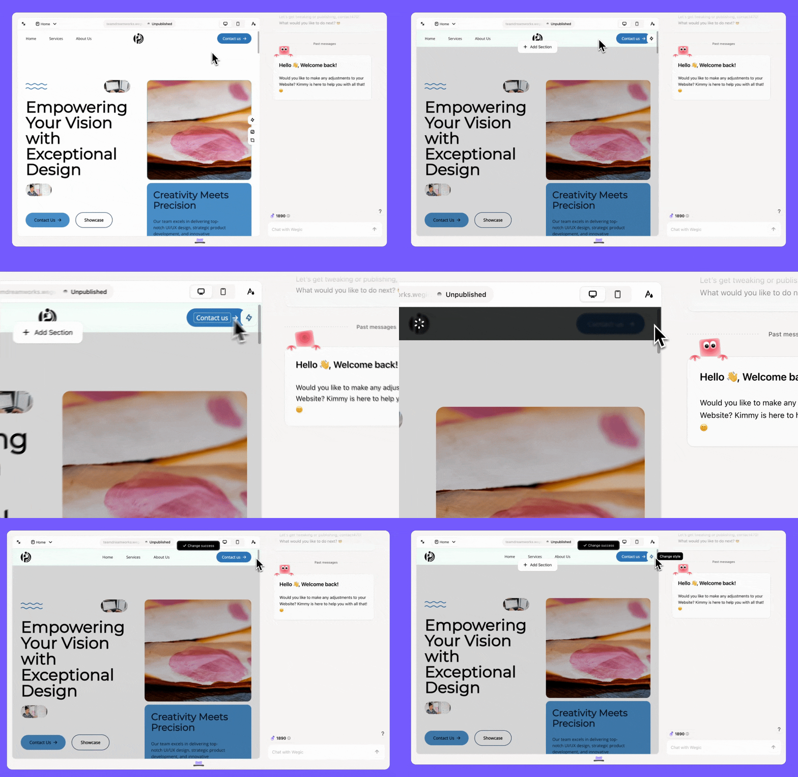
Step 4: Real-time preview and save
Wegic will instantly update your page to let you check the changes you’ve made. Switching the screens lets you see the logo on desktop, tablet, or phone views.
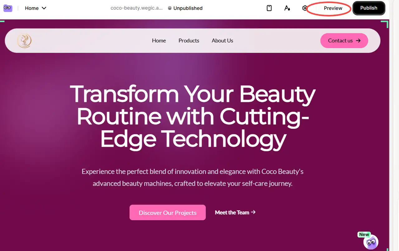
As soon as you’re satisfied, you can click on "Save" or publish your changes straight away. Once you’ve completed the change, your logo will show up for visitors immediately.
Conclusion
Google’s logo update in 2025 is about more than looks. It demonstrates how Google’s approach to branding and technology is changing. The logo can change according to the screen you use and the type of device. Because of this, users can easily find Google new logo on all kinds of screens. Companies worldwide can find inspiration in Google’s new logo.
As things get more digital, businesses should update their logos and website designs. Companies and individuals need logos and websites to look good and function on any device. Wegic helps people and companies make websites and update logos quickly, without coding. As a result, companies can handle user needs more efficiently.
FAQs
What font does Google's new logo use?
The design is based on a modified Product Sans typeface. Google’s in-house brand team worked with UX designers to develop a Product Sans version that is slightly wider and less sharp.
Who designed the 2025 Google new logo?
Google’s brand team, along with UX designers, created the logo. It was designed with the same principles as Material You.
How do users feel about the 2025 logo change?
Some enjoy the fresh new design, but others wish the older one would stay. Swiftly and intelligently, Google has gone from one style to another.
What does the new logo say about Google’s brand direction?
There’s now a focus on simple, clear, and inclusive design. Google now wants to be seen as both easy-to-use and progressive.
Does Google's new logo reflect Google’s AI focus in 2025?
The new design demonstrates intelligence, speed, and adaptability. Google has updated its branding guidelines for everyone using its APIs or sign-in to fit the new look.
Will Google keep updating its logo regularly?
Yes, but the changes are mostly small. They prefer to change their branding slightly rather than completely change everything.
Will third-party apps using the Google API need to update branding?
The updated branding guidelines from Google are now available to all developers. Google expects all developers to change their branding within 6 months.
Written by
Kimmy
Published on
Mar 17, 2026
Share article
Read more
Our latest blog
Webpages in a minute, powered by Wegic!
With Wegic, transform your needs into stunning, functional websites with advanced AI
Free trial with Wegic, build your site in a click!
What kind of website do you want to build?