Log in
Build Your Site
Inside Google New Logo: Gradient Trends Designers Can Master in 2025
Google's logo has been updated recently. What's the design secret behind this trend? In this article, we will take you to explore.
In 2025, gradient design trends are transforming branding, and Google’s revamped "G" logo is a stunning example. Updated in May 2025, the Google logo 2025 features vibrant, flowing gradients that blend seamless color transitions, creating a modern aesthetic that captivates across all devices. Displayed boldly on Google’s search page, this gradient-driven design combines smooth hues, transparent tones, and balanced proportions to feel fresh, approachable, and innovative.
These gradients not only redefine Google’s brand identity but also set a benchmark for 2025 design trends, inspiring brands to design for standout websites, ads, and social media campaigns. Our guide discovers Google new logo’s gradient-focused redesign, revealing how to leverage these vibrant design trends to elevate your brand’s visual impact globally.
#01 Introduction to the Google New Logo
1. Evolution of the Google Logo
Google's logo has undergone a fascinating journey since its earliest days. The image below illustrates the significant changes from BackRub (1996–1997) to the simplified Product Sans design introduced in 2015, which is still in use today.
1996–1997: The brand started as "BackRub" with a bold red wordmark, then shifted to a 3D-styled logo with coloured blocks—fun but chaotic.
1997–1998: The official name "Google" appeared in a serif font with the now-iconic primary colours. The 1998 version even had an exclamation mark!
1999–2010: Ruth Kedar's refined serif version became the face of Google for over a decade, with added shadowing and cleaner colour balance.
2010–2013: A sleeker look emerged—shadows softened, and gradients were introduced.
2013–2015: The company simplified the look by removing shadows but kept the same serif typeface.
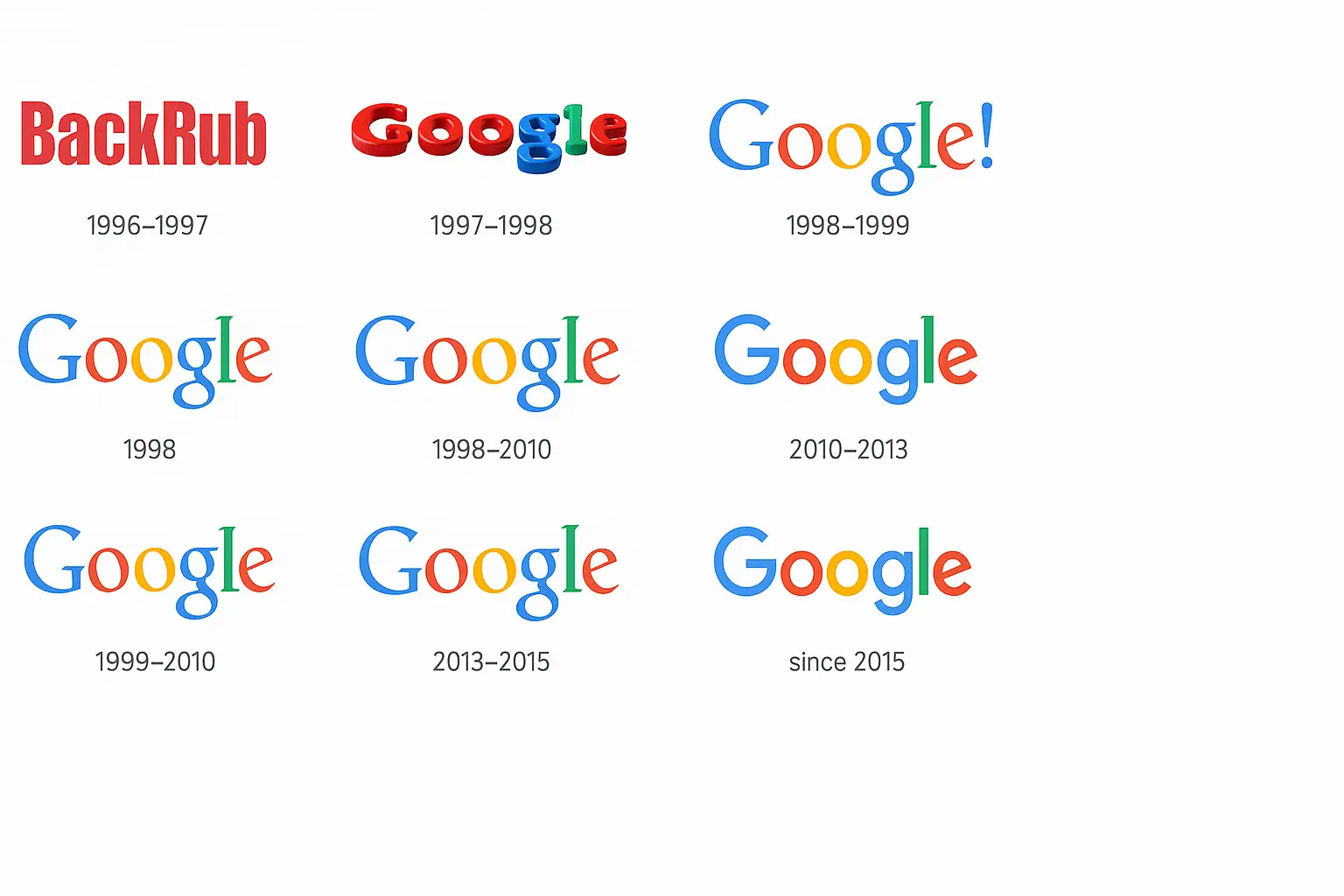
2015–2025: Google new logo was introduced using Product Sans—a custom, geometric sans-serif typeface. It's clean, modern, and mobile-friendly.
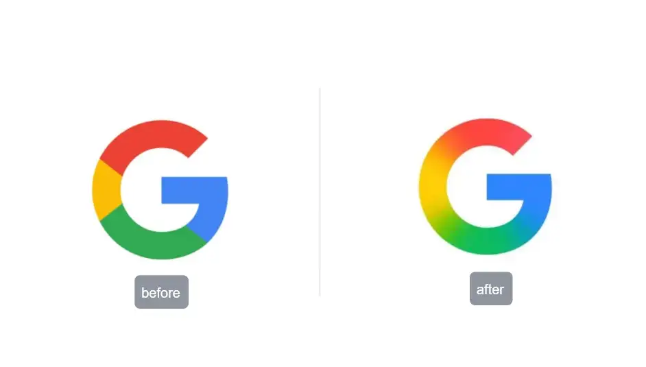
2025: The new Google "G" icon is different from the old one. Before, each colour had its own area—red, yellow, green, and blue were all in separate parts. Now, the colours blend into each other. Red slowly changes into yellow, then green, and finally blue.
This new style looks more colourful and smooth. It also matches the look of Google's new AI brand called Gemini, which uses similar colour gradients. Plus, the new "G" icon helps you find the AImode faster when using Google Search.
This timeline shows how the new Google logo adapts to trends and technologies. The logo change isn't just about looks—it reflects changes in user habits, screen sizes, and even branding strategy.
2. Why the New Google Logo Matters for Marketers
When users land on Google Search, the first element they see is the logo, so the Google logo change directly shapes brand perception at Indiatimes. By introducing gradient effects, the new Google logo injects a sense of motion and modernity that aligns with user expectations of cutting-edge technology and AI services.
From an SEO (Search Engine Optimization) perspective, Google's new logo can help increase the number of people who click on the brand. A bright and eye-catching icon stands out more in search results.
Marketers can also learn from Google's new logo design. They can update their logos to match the latest style. At the same time, they should check how users feel about the changes and update their designs on different platforms. Google new logo shows us that in 2025, more and more companies care about how things look to users. Making plans by thinking about what users want is now an important part of brand marketing.
#02 Breaking Down the New Google Logo
The update of Google's new logo shows the new trend of logo design in 2025.
1. Anatomy of the New Google Logo
The new logo of Google looks simple, but a lot of innovative designs went into it. It still shows the big "G," but now it uses a smooth colour gradient instead of solid colour blocks. The red, yellow, green, and blue now blend into each other, making the new Google logo 2025 look softer and more modern.
The shape of the letter "G" stays the same, so people can still recognize it right away. But the new colours give it a fresh feeling. This change makes the logo feel more alive and fun. It's also easier to notice in Google search results, which helps more people click on it. That's why the Google logo change is also suitable for user experience.
2. The Power of Gradient in the New Google Logo
One big part of Google new logo design is the use of a gradient. A gradient is when colours slowly change from one to another. In the new logo of Google, red turns yellow, then green, and then blue. This smooth colour change makes the logo look like it's moving or glowing.
This design feels more modern than the old flat colours. Before, the colours were split into clear sections. Now, they flow into each other. Many new logos use gradients today because they look cool, fresh, and friendly. That's why Google chose it for their new Google logo 2025.
In short, the new logo is not just about looks—it also helps with branding and user experience. It fits today's style and keeps users interested during their Google search.
#03 Gradient Trends for 2025
1. A Big New Look for Brands
In 2025, gradients are everywhere! More brands are using smooth colour changes in their logos, websites, and ads. Just like the Google new logo, many companies now want their designs to look modern and fun. The new Google logo 2025 shows how powerful a bright gradient can be. The colours flow smoothly and catch the eye, which helps with Google search results. This Google logo change gives great ideas to new brand marketers.
2. Bright Colors and Smooth Changes
Big brands now love using vivid duotones (two bright colours together) and soft colour blends. The new logo of Google uses red, yellow, green, and blue, which smoothly mix into each other. These fluid transitions make designs feel fresh and high-tech. Some companies even use shiny metallic looks in their logos and apps. From fashion to tech, many industries are joining this style. Following Google new logo design can help your brand feel current and cool.
Wondering more about the color combination for brand and website design? Check these posts:
3 . Small Tricks to Make a Big Impact
Marketers and designers can use simple tricks like layered gradients (one on top of another), animated gradients (colours that move), and hover effects (colours change when the mouse moves over them). These little touches make logos and websites more fun. Free tools like Figma, Canva, or plugins for Photoshop can help create these effects easily. You don't need to be a pro!
The new Google logo is not just a small change—it's a smart move for 2025. Google's new logo design shows us that using smooth, moving colours helps logos stand out. New brands can learn from this. Try gradients in your logos and web design to grab attention and look modern in every Google search.
#04 Step-by-Step Guide to Creating a Website with Google-Style Gradients
Want your website to look modern, like the new logo of Google? Here's an easy guide to help you create a colourful website with gradients, just like the Google new logo!
Step 1: Pick Your Colors
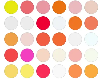
Start by choosing colours that go well together. The new Google logo 2025 uses red, blue, green, and yellow. You can use bright and fun colours, but make sure they have good contrast so words are easy to read. Tip: Don't use too many colours! Two or three is a good start.
Step 2: Use Design Tools
You can use free tools to design your logo and website. Some easy tools are:
-
Canva – great for beginners
-
Figma – suitable for teamwork
-
Adobe Express – fun for fast design
Try making a logo like Google's new design. These tools can help you copy the colour scheme of the Google logo change.

Step 3: Add Google-Style Gradients
Use CSS (a website code) to create a gradient background. Here's a simple example:
background: linear-gradient(90deg, red, yellow, green, blue);
This code gives you a smooth rainbow background, like theGoogle logo.

Step 4: Build Your Website with Wegic
Now it's time to make your website! Wegic is an innovative tool that helps you build websites fast, even if you're just starting.
-
People from over 220 countries use it.
-
It's easy for beginners — 80% of users are new.
-
You can chat in your language — 95% of people do!
-
Most users start from zero and still build great sites.
-
Wegic has helped build over 500,000 websites!
Click to start the experience👇
https://wegic.ai/best-practices
Just upload your design — like your version of the new logo of Google — and Wegic helps you turn it into a complete website with buttons, images, and text. It's like magic!
Wegic also lets you change your design anytime, so you can keep improving as you learn more. This tool is excellent if you want to follow big trends, like the colorful new logo of Google, and use those ideas for your brand.
Ready? Let Wegic help you make your website look amazing, just like Google.
Step 5: Check Your Website on Google
When your site is live, find it on Google search. A lovely look (like the Google new logo) can help more people click your link!

#05 SEO Benefits of Embracing Gradient-Forward Design
1. Improved Engagement and Click-Through Rates
People love looking at bright and beautiful things. That's why colourful websites with smooth gradient designs grab more attention. When your site looks fun and fresh, more people click on it. This is called a higher click-through rate (CTR).
Take Google new logo, for example. The soft colours blend together smoothly, making the logo look modern and friendly. The same trick works for websites, too! If your page uses bright colors like Google's new logo, people will stay longer and enjoy reading, which will help your website look better to Google.
2. Staying Ahead in Google Search Rankings
Google loves websites that people enjoy using. So, if your site looks good and feels easy to use, it might move higher in Google search results.
Using gradient designs like those in Google's new logo helps your site feel updated. It shows that you care about modern trends. This is important because Google updates its system often, just like it changed the new Google logo in 2025.
Also, if your design is smooth, loads fast, and is mobile-friendly, your site will perform better in search. Google will see that people are happy with your site and reward you with better rankings.
By following the design trend of the Google logo change, you can improve how your brand looks and how it performs online. You'll get more visitors and more success!
Conclusion
Google's new logo shows us the latest logo design style in 2025. This can help your brand stand out and look fresh. You can also try using parts of the new Google logo style on your own website. Look at how the colours mix and how the logo feels bright and alive. This can give you new ideas for designing your brand or website. Don't be afraid to try new things! You can test different styles, use colour tools, and create innovative designs. These things can help new people find your website through Google search.
Let's follow the cool trend of Google new logo design and make something amazing together!
Written by
Kimmy
Published on
Mar 17, 2026
Share article
Read more
Our latest blog
Webpages in a minute, powered by Wegic!
With Wegic, transform your needs into stunning, functional websites with advanced AI
Free trial with Wegic, build your site in a click!
What kind of website do you want to build?
