Log in
Build Your Site
Mastering Google Colors: Design Tips from the Logo Palette
Unlock the secrets of Google’s iconic color scheme! Learn how to use Google colors, hex codes, and palette strategies to elevate your designs—with actionable tips, tools, and real-world examples.

Have you ever wondered why Google's logo colors are so easy to recognize and can effectively attract attention? The different combinations of blue, red, yellow, and green are not just random combinations of color tones. These Google color choices are also carefully selected based on user psychological influence and visual appeal, which is of great significance and can greatly enhance your design project. In this article, we will delve into the layout of Google colors, exploring their origins, the psychology behind each color, and practical design techniques for incorporating them into your work. By understanding and mastering Google's color palette logic, you can create designs that resonate with users and effectively convey your brand message.
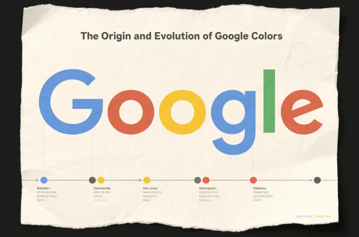
The Origin and Evolution of Google Colors
Since its establishment in 1998, Google has been using a four-color scheme consisting of blue, red, yellow, and green. Although Google's core colors have remained the same for such a long time, its color palette has also undergone several minor modifications to align with contemporary design trends. At first, the Google logo had a three-dimensional appearance, but later evolved into a flatter two-dimensional design to achieve a modern and streamlined appearance. This evolution also reflects Google's constantly changing and up-to-date attitude, while Google also respects its iconic brand identity. Some people say that Google's color choices were inspired by the colors of LEGO bricks, as the founder of Google used oversized LEGO bricks to build their first server.
Google Gradient Colors: The Innovative Design Element
Google is known for its innovative use of colors, and now it has added many dynamic and modern gradient colors. These gradient colors blend multiple colors and are visually more appealing, evoking different emotions and capturing users' attention. For example, the gradient from Google Blue to Google Purple can be used to convey innovation and creativity, while the transition from Google Yellow to Google Orange can add warmth and vitality to the design. Google is also using these gradient colors in various applications and interfaces, such as the Google toolbar, which enhances button interactivity and makes the user experience more appealing. In data visualization, gradient colors can increase the depth of charts and graphs, making complex information easier to understand at a glance. But when using Google gradients, you need to ensure that they can enhance the overall design level.
The Psychology behind Google Colors
Each color in the Google logo carries a specific psychological connotation. For example, blue is a symbol of professionalism and trust, often used in company logos to demonstrate reliability and safety. This color also indicates that Google is committed to providing users with a safe and reliable online experience. In addition, there is red, which gives a feeling of being hot and can evoke excitement, vitality, and passion in people's hearts. It symbolizes Google's innovative spirit and the driving force that constantly pushes the boundaries of the technology industry. There is also yellow, which brings a sense of optimism, wisdom, and clarity to people. It reflects Google's values, providing accurate and insightful information that enables users to make informed decisions. Finally, green represents growth, sustainability, and harmony. It emphasizes Google's commitment to environmental responsibility and its commitment to developing sustainable technologies for the benefit of humanity and the planet.
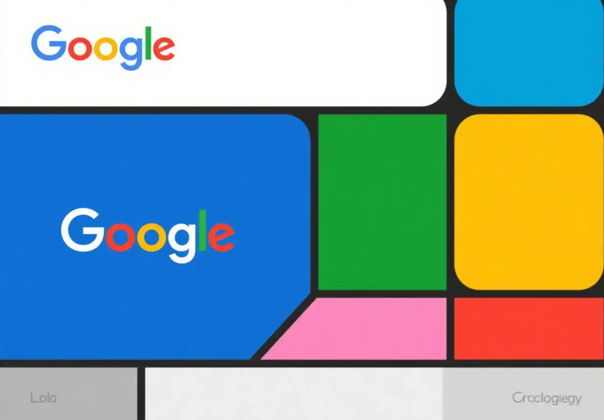
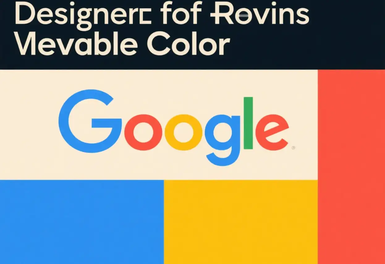
Google Color Palette and Hex Codes
To incorporate Google colors accurately into your designs, it's essential to know their exact hex codes. The official Google colors and their corresponding hex codes are as follows:
-
Google Blue: #4285F4 (RGB: 66, 133, 244; CMYK: 88, 50, 0, 0; Pantone: PMS 660 C)
-
Google Red: #DB4437 (RGB: 219, 68, 55; CMYK: 0, 78, 85, 12; Pantone: PMS 7619 C)
-
Google Yellow: #F4B400 (RGB: 244, 180, 0; CMYK: 0, 20, 90, 0; Pantone: PMS 123 C)
-
Google Green: #0F9D58 (RGB: 15, 157, 88; CMYK: 82, 0, 67, 11; Pantone: PMS 7724 C)
Design Tips for Using Google Colors
Create a visual hierarchy
Using Google colors also requires certain skills, as you need to establish clear visual layers in your design. For example, you can use primary colors to highlight important elements such as buttons, links, and calls to action. For example, Google Blue is commonly used for main buttons and links to attract users' attention to key operations. Meanwhile, secondary colors such as gray and white can serve as the foundation for the background and supporting elements, ensuring that your design is easy to navigate.
Ensure accessibility
When using Google Colors, it is also important to consider accessibility. You need to ensure that the color combination provides sufficient contrast and is easy to distinguish for users with visual impairments. The Google Materials Design Guide recommends that for regular text, it is best to set a minimum contrast ratio of 4.5:1. For lengthy texts, you need to maintain a minimum contrast ratio of 3:1. This helps make your design more inclusive and accessible to a wider audience.
Maintain consistency
Consistency is the key to creating a cohesive brand identity. You can record specific Google color values and proportions used in style guides or design systems. This ensures that colors can be evenly used on different pages, screens, and components of the design. This way, users can easily identify and recognize the visual elements of your brand.
Considering the design background and purpose
In addition to the above points, you can also customize Google colors based on your design background and purpose. Different color combinations may be more suitable for various types of content or functions. For example, data visualization tools may rely more on blue and green to convey trust and accuracy, while social media applications can utilize red and yellow more to look lively and fashionable.
Practical Applications and Examples of Google Colors
Website design
Of course, website design cannot do without color layout. You can incorporate Google colors into your website's color scheme to create a vibrant and user-friendly experience. For example, the navigation bar of a website can have Google blue as the background color and Google red for activity links or call-to-action buttons. This creates a visually appealing and cohesive design that is consistent with Google's brand identity. So, for website designers, we really want to recommend a particularly useful website design tool to everyone, and that is Wegic!
If you are a person full of ideas and creativity, then Wegic is perfect for you. Why? Because Wegic is a very practical website. You can design websites of different types and styles on it. As long as you have interesting ideas and tell Wegic your thoughts, it can help you generate your favorite website within 1 minute, and the effect of the website it generates is no less than that of most intermediate designers. And, after your first website generation, Timmy will help you create and modify the website design, and its color scheme also supports adjustment. So you can design the website according to the Google color scheme mentioned above! After the website design is completed, you can use it directly and share your website with your friends. It also supports free trials. If you are interested, click on the image below to try it out!
Click on the image to start creating your own fun website👇
https://wegic.ai/

Mobile application design
When designing mobile applications, you use Google Colors to improve app usability and engagement. For example, you use Google blue as the main operating button and Google red as the error message or emergency notification. This helps users quickly identify and use important operations in the application. In addition, you need to be cautious when using Google yellow and green to highlight specific features or content sections, guiding users to focus on key information.
Brand and marketing materials
You can also apply this solution to branding and marketing materials such as logos, business cards, and advertisements, using Google colors to create a strong visual effect. For example, you can incorporate the four main colors into your logo design to evoke trust, vitality, optimism, and a sense of growth associated with the Google brand. And, you can use Google color code combinations in your marketing materials to maintain brand consistency.
Tools and Resources for using Google Colors
Google Material Design Color Tool
The Google Material Design Color Tool is a valuable resource for creating color palettes and applying them to UI design. This tool allows you to generate color schemes that include darker and lighter variations of primary and secondary colors. You can also preview your color scheme using editable HTML, CSS, or JavaScript in Codepen. This also helps ensure that your design is visually appealing.
Palette Generator
Several online color palette generators can help you create custom color palettes inspired by Google Colors. These tools provide options for generating complementary, similar, and triple color schemes based on Google Palette. You can try different color combinations.
Common mistakes to avoid
Excessive use of bright colors
Although Google's colors are vibrant and attractive, they can also createchaotic designsif not used correctly. You need to remember to use primary colors as accent colors with caution and rely on secondary colors as background and auxiliary elements, which can create a balanced and harmonious visual experience for users.
Neglecting color psychology
Each Google color carries a special psychological meaning, and you should fully consider the meaning of these colors when applying them to your design. If colors are used in a way that contradicts the expected psychological impact, it may confuse users and dilute your brand message.
Neglecting accessibility
If sufficient color contrast cannot be ensured, it may prevent visually impaired users from using your design. So it's best to regularly test the accessibility of your color combinations and make adjustments as necessary to meet the recommended contrast. This ensures that your design is inclusive and useful for everyone.
Conclusion
Mastering Google colors and effectively incorporating them into your design projects can help you create a more perfect work and establish a stronger connection with your users. By understanding the psychology behind each color, using the correct hexadecimal code, and following practical design techniques, you can harness the power of Google's iconic color palette. Whether you are designing websites, mobile applications, or branded materials, Google Colors can help you create visually appealing and effective designs that resonate with users and convey your brand values. So, you can start trying Google colors in your next design project now! Action is better than excitement!
FAQs
Q: Why are Google colors so influential in design?
A: Google colors are influential in design because they are carefully chosen and tested for their psychological impact and visual appeal. They have become instantly recognizable and associated with Google's brand values of reliability, innovation, optimism, and sustainability. Over the years, these colors have been proven effective in capturing users' attention and conveying complex messages in a simple and visually pleasing way. Their widespread use and success have made them a valuable reference for designers looking to create engaging and effective designs.
Q: Can I use Google colors for my personal branding project?
A: Yes, you can use Google colors for your personal branding project. However, it's essential to consider the context and your brand's identity. Google colors can bring a sense of familiarity and trust to your design, but they should align with your brand's values and message. If your personal brand shares similar qualities with Google, such as innovation and reliability, incorporating these colors can be beneficial. Just remember to use them appropriately, following design best practices for color usage and accessibility.
Q: How can I ensure my design with Google colors is accessible?
A: To ensure your design with Google colors is accessible, you should follow accessibility guidelines such as maintaining sufficient color contrast. The recommended contrast ratio is at least 4.5:1 for normal text and 3:1 for large text. You can use tools like the Google Material Design Color Tool or other online contrast checkers to verify that your color combinations meet these standards. Additionally, consider users with color vision deficiencies by avoiding color combinations that are difficult for them to distinguish, such as red-green or blue-yellow.
Q: What are some common mistakes when using Google colors in design?
A: Some common mistakes when using Google colors include overusing the bright primary colors, which can make the design look cluttered and overwhelming. Another mistake is ignoring the psychological meanings of the colors and using them in contexts that contradict their intended impact. For example, using Google red in a section meant to convey calmness and stability would be inappropriate. Also, neglecting accessibility by using color combinations with insufficient contrast can make your design inaccessible to a portion of your audience.
Q: Where can I find the exact Google color codes for my design project?
A: You can find the exact Google color codes in the article, which provides the official hex codes for Google Blue (#4285F4), Google Red (#DB4437), Google Yellow (#F4B400), and Google Green (#0F9D58). These codes ensure accurate color reproduction in your design project. For more detailed color information and guidelines, you can also refer to the Google Material Design website, which offers comprehensive resources on colors, including recommended combinations and usage scenarios.
Written by
Kimmy
Published on
Mar 17, 2026
Share article
Read more
Our latest blog
Webpages in a minute, powered by Wegic!
With Wegic, transform your needs into stunning, functional websites with advanced AI
Free trial with Wegic, build your site in a click!
What kind of website do you want to build?