Log in
Build Your Site
Sans Serif vs Serif Fonts for Web: Which Converts Better?
Optimize your web design with the right font. Explore sans serif vs serif fonts to boost readability web and elevate your brand's user experience.
Web design is now more complex than it once was, and each element has its contribution to the user experience and ultimately the increasing conversion rate. In that category, typography is a silent reason for the engagement of brand content, and any visitor starts seeing a company in a different light. The basic arguments usually relate to the old concept of sans serif vs serif fonts. The inquiry around this stylistic dualism shall demonstrate which of the font variations is more applicable in terms of readability web, branding fonts web, and web typography. Every woman or man who is ready to go digital should appreciate the fine differences between those design fonts.
Why the Right Font Matters: Offering More Than Just Words
Selecting the appropriate font family, for instance, sans serif or serif, connotes more than just personal taste. It is a carefully thought-out action, most importantly, to either enhance or demolish the operations of your website. A legible font improves the user experience as the fun in consuming the information is increased this enhancing the readability web. Aside from the clarity of reading, fonts portray visual characteristics that enhance the perception of a brand, its offerings, and the interest in innovations. This concept grounds branding fonts' web strategy, since the selected fonts can communicate as the secondary level language of choosing visual identity elements. An objective web typography means achieving the right relation between a design and visual constructiveness within the standards that they have established. It means engineering the space with rational proportions rather than planting colors arbitrarily. Enhanced capacity for engagement is always a favorable result, and the importance of design fonts within the conversion funnel cannot be overemphasized.
Deciphering the Difference: Sans Serif vs. Serif Fonts
The core distinction between these two font families lies in a small but significant detail: serifs. These are the small lines or "feet" that extend from the end of strokes in letters.
Serif Fonts
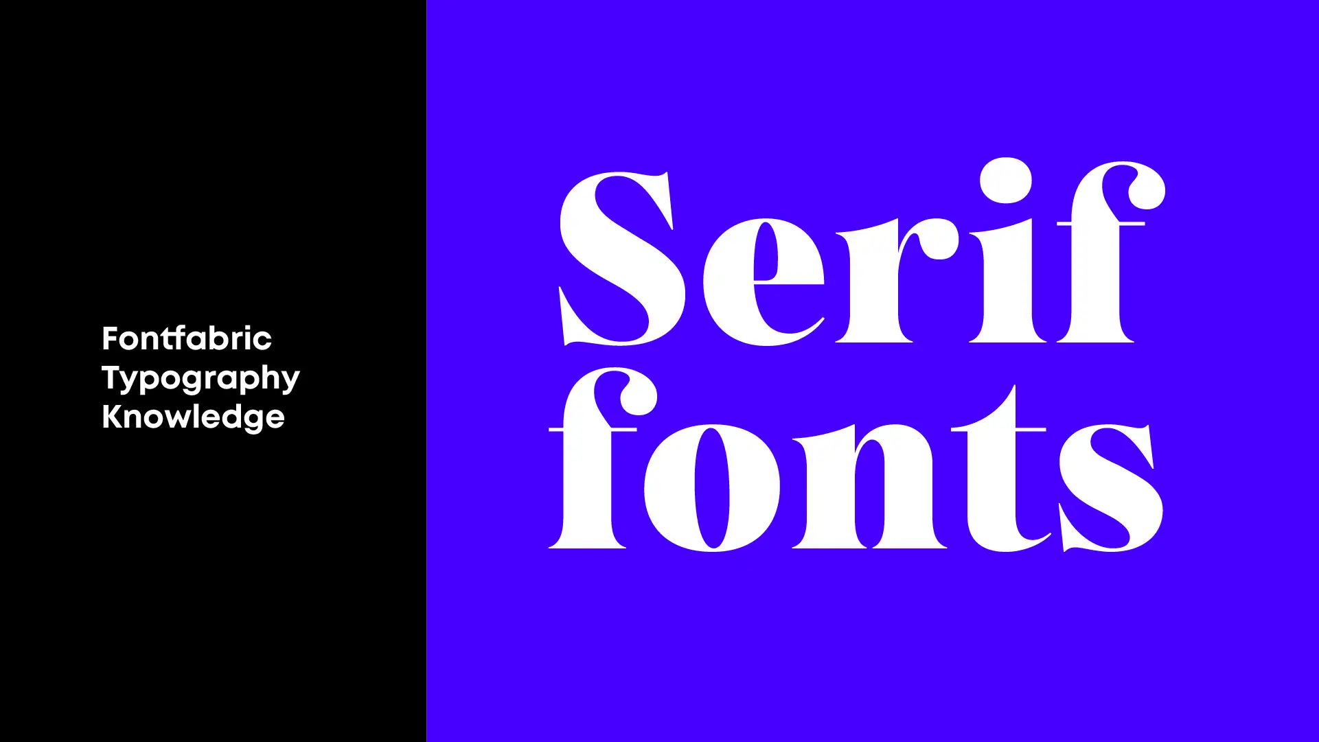
Decorative flourishes are characteristic of serif fonts, which tend to create a traditional, elegant, and even powerful look. In the past, serif fonts were the foremost in print work from books through newspapers to documents, among others, and this lent a classical and established image to such media. It is, therefore, not surprising that content in serif fonts typography evokes a feeling of seriousness, reliability, and class. Some examples include Times New Roman, Georgia, italic Garamond, etc. Even though such subtleties can lend a hand in reducing monotony in appearance, those very adornments prove sometimes detrimental as they affect the legibility and readability web, most especially when the texts become thinner or the resolution smaller, and this in turn affects the user experience. But brands that are bent on emphasizing their ancestry, history, or class shall find serif fonts excellent branding fonts web, supporting them with their brand image that has typography unlike any other.
Sans Serif Fonts
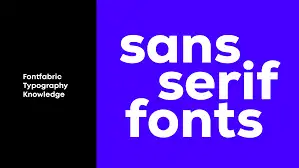
Alternatively, sans serif fonts (where "sans" is a French word for "without"), in contrast to the previous examples, have no such extended features, and are neat, simple, and fresh. Such simple shapes ensure their readability is very high, even in digital media where sharpness and clearness play an indispensable role. Due to their modern look and feel, and their understanding of simple, effective, and friendly communication, there is a trend to use sans serif fonts. Arial, Helvetica, and Open Sans are some of these. These fonts work best in ensuring effective communication with the user and encourage focus in a user experience. With such identities aimed at modern brands, projecting cleverness and refreshment, easy access is control, and most use sans serif fonts as their branding fonts web, since their web typography is clean and stresses modern design principles.
How Sans Serif vs Serif Fonts Shape Brand Perception
The choice between sans serif and serif fonts profoundly impacts how your brand is perceived. It's a fundamental aspect of design principles that can evoke specific emotions and associations in your audience.
Serif fonts have that age-old charm and have a classical backdrop to them. And this charm is often considered by many to convey prestige, history, and reliability. Imagine an established institution, a luxury brand, or an academic publication- they all tend to put their stake on serif fonts to really communicate the bigger idea of authority and probably of something that stands the test of time. In the case of a business wooing its target market with aspirations of being believable, chic, or traceable to a deep-rooted culture, branding fonts that employ serif could cause a lasting impact. This style gives a more formal and historical look to your web content, and this has an impact on user experience and makes it seem more serious and significant. This won’t be too much of an issue for business sectors that deal mostly with credibility. The enhanced readability web, in cases where long pieces of work are printed, is more often than not brought about by the same in cases where it is applicable to the web; however, this is only applicable where size and contrast are keenly taken care of.
These types of design fonts are a great choice when we want to deliver straightforward messages that indicate efficiency. If a brand is going for a minimalist, modern, or even youthful look, choosing sans serif branding fonts web will always be appropriate, as they always help the user experience to be more flowing and intuitive. They are highly used for writing headlines, calls to action, and other interfaces where readability is of utmost importance due to their nature. This is because the utilization of sans serif web typography is very characteristic of most of the designers preferring to work with a minimalistic approach, believing in the slogan of functional design aesthetics. The justification of the inclusion of sans serif vs serif fonts is addressed using brand meaning.
Strategic Font Application: Best Practices for Web Design
When faced with choosing sans serif or serif fonts for a website, the decision should be based on a number of factors. Optimizing the readability web pages and user experience is important. The choice between two is not always forced; it is often the ability to seamlessly combine both that results in great design principles.
1. Context and Hierarchy
Considering the body text that appears on high-resolution screens, both serif and sans serif fonts may be reasonable to use in terms of web readability. Nevertheless, in the case of smaller text, like captions and footnotes, sans serif fonts are more prevailing in terms of legibility. On the contrary, serif fonts may be more beautiful focal points for the headings as far as web typography is concerned. A serif heading against a sans serif body text and the other way round may allow for visual hierarchy, looking at the text, thus helping in the user experience. This care and consideration in design is one of the key effective design principles.
2. Brand Identity and Emotion
Your font choice, as we already discussed, represents a critical aspect of branding fonts web. You may use serif fonts if you want your brand to be or appear to be historical or luxurious. Brands called modern or innovative, or minimalist brands, look better with sans serif fonts. Think about the feelings that you are intending to bring out. Is it warmth and comfort or cold efficiency with stark contrast? All the design fonts you will go for have a deep connection with such feelings. The deliberation of the applicability of sans serif vs serif fonts is about the customer’s assessment of the brand.

3. Responsiveness and Device Compatibility
Considering the number of screen resolutions and size variations that exist, it is imperative to check how fonts look on different platforms. Small mobile devices might not display the decorative elements of plenty of serif fonts designed for such devices, and thus it alters the readability web and creates a bad user experience at the end of it all. Few, if any, clear conclusions can be drawn from the studies of these phenomena regarding sans serif fonts due to their inclination to be generally properly adaptable to all devices for typography. However, this detail is not given much attention since most people appreciate the argument on sans serif vs serif fonts.

4. Line Height, Letter Spacing, and Contrast
No matter if you pick sans serif vs serif fonts or not, choosing and using adequate line height/letter spacing/contrast are extremely important for the purpose of readability web. Less amount of line height may suffocate the text, while an excessive line height interrupts the flow. The right amount of space between letters, kerning, makes the type characters neither look crowded nor too far apart. Lack of high color contrast between the text and its background is inconceivable as it makes it difficult to look at the text easily, even reading itself will not be possible, which will affect the user experience directly. Such design principles are basic and cut across the board to any web typography.
Wegic: "your best website builder"
When you are learning about web typography, including the decision of using one of the sans serif vs serif fonts, a website builder capable of doing everything like Wegic can come in handy, and it makes sure that all the design fonts are incorporated without difficulty. Wegic can be referred to as an AI-based website team that functions as your AI designer, developer, and AI manager. It facilitates the designing of websites which are graphically complete in under one minute with the use of a chat application, while at the same time does not need any coding on the part of the client. As a result, people are encouraged to explore the changes in different branding fonts web without any barriers, and this is a game changer for usability.
Key features of Wegic that directly benefit your font choices and overall design principles include:
- AI Manager: Your site is continuously updated thanks to the automatic updating feature of the AI Manager, so that the web typography you have chosen is deployable and remains optimized for any new addition of content and design changes. This makes web readability possible without added stress.
- Conversational Brilliance: Wegic’s native communication platform requires no jargon when it comes to design fonts. You can express your preference in terms of sans serif and serif fonts without knowing the exact terms. This platform also confirms your design expectations as it creates a website that will include the branding fonts web you’ve envisaged.
- Effortless Deployment: With custom-domain support, your elegantly crafted website, employing your chosen typography, can be published with just a click, ensuring that the whole branding message, including the impact of the particular design fonts used, reaches the users very quickly.
- Tailored Personalization: Wegic is very customizable in the sense that it fine-tunes your online typographic structures and design principles to fit the exact needs of your brand. What this refers to is that you determine how and when the sans serif font and serif font will look.
- Adaptive Design: Wegic guarantees the adaptability of the website and the chosen design fonts across all available devices. This ensures that the readability web and usability remain the same across the desktop, tablet, or smartphone.
Magic your site with Wegic and build your best profile website today!👇
Wegic lets you take care of the design principles promoting branding fonts web, and design principles which are to be approached strategically, whereas its AI takes care of the technical work itself, thus making the features of web typography not only stupendous, but also accessible. The platform has served at least 300,000 websites from over 220 countries and territories already, thus proving its dependability and usefulness in creating functional, effective, and visually appealing pages with the right places for sans and serif fonts.
Conclusion: The Art of Conversion Through Typography
The argument of sans serif vs serif typefaces is not about proclaiming one as better than the other, but about analyzing the strengths of each style and appropriately utilizing such strengths to achieve the desired objectives. Both typefaces present distinct features that have major implications on web readability and branding fonts web, and in extension, conversion rate optimization through enhancement of the user’s experience. Proper web typography incorporates both the art and the science, which requires an in-depth knowledge of the intricacies of outlined design principles and, more importantly, their influence.
One of the most important things you need to do to make the right selections of design fonts is to consider the view of the image of your company, the clients you aim at, and the situation in which one is placed. One may prefer a serif typeface because it is very traditional and comes off as sophisticated, the other within one of sans serif because of how easy it is to read, while some will opt for a beautiful mixture of both where they can balance both sides, however one has to ensure that the web one is creating is readable and functional on any platform said web may be access from.
While starting your career as a web designer, it should always be noted that the appropriate resources play a pertinent role in the field. As for Wegic, its advanced AI simplifies the production processes, making it feasible for the user to try out even variegated styles- sans serif vs serif fonts and let everything so much more advanced as sophisticated web typography, be implemented. It invites you to create a well-performing, beautiful site, and really, there’s no better website builder than Wegic, which makes sure you never mess up the branding fonts web and adhere to every possible rule of design.
Written by
Kimmy
Published on
Mar 17, 2026
Share article
Read more
Our latest blog
Webpages in a minute, powered by Wegic!
With Wegic, transform your needs into stunning, functional websites with advanced AI
Free trial with Wegic, build your site in a click!
