Log in
Build Your Site
Best Table Design Examples in Website CSS (With Code Snippets)
Discover the best table designs website CSS with CSS Tables, Custom CSS for tables, and CSS & HTML Table Templates to build responsive, stylish web tables effortlessly.

In modern web design, CSS Tables remain essential for presenting data across dashboards, pricing pages, and product listings. From data dashboards and pricing plans to user lists, product comparisons, appointment schedules, and class timetables, a well-crafted table can significantly enhance a website's professionalism and overall user experience.
While native HTML table structures are semantically clear, they often fall short in terms of visual appeal and mobile responsiveness. As a result, designing tables that are visually engaging, fully responsive, and highly functional using CSS has become a key focus for front-end developers and web designers alike.

To achieve truly standout results, this guide explores the best table designs website CSS, including tips on Custom CSS for tables and ready-to-use CSS & HTML Table Templates for every use case. We break down the principles of great table design across semantic structure, foundational styling, visual enhancements, responsive layouts, and interactive elements. You'll also find ready-to-use code snippets to help you quickly build polished, high-quality table components for your web projects.
Core Elements of CSS Table Design

1.HTML Semantic Structure
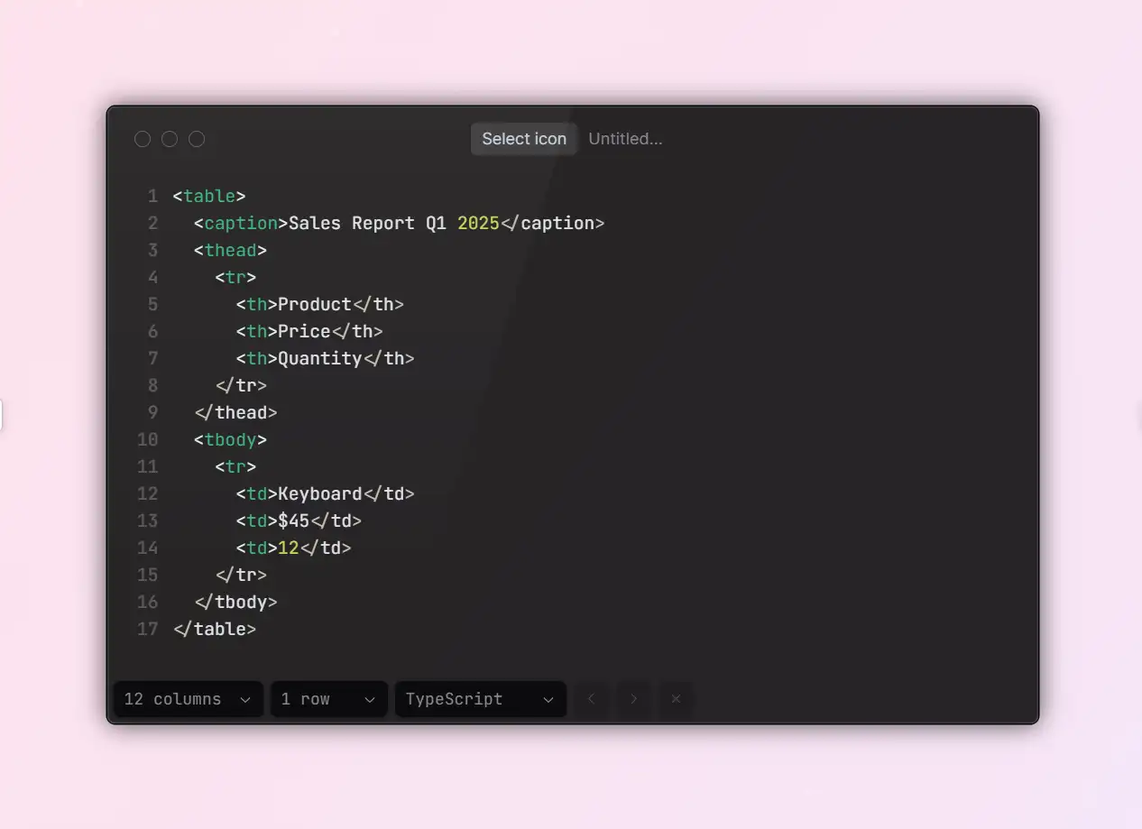
A strong, well-built web table starts with clean, semantic HTML. Many beginners skip important supporting tags like
<caption>, <thead>, <tbody>, and <tfoot>, relying only on <table> with <tr> and <td> to display content. While that works visually, it often results in poor performance when it comes to parsing structure, accessibility for screen readers, and SEO optimization.Using
<thead> to define the header row helps browsers and assistive technologies understand the table's columns. Adding a <caption> provides an overall description, improving accessibility. Separating content with <tbody> and <tfoot> makes it possible to implement features like fixed headers and scrollable content. In short: prioritize structure before styling, and semantics before layout.A properly structured HTML table lays the groundwork for any styling you apply. Whenever possible, use the following standard semantic tags:
2.Key Points of Basic Styling
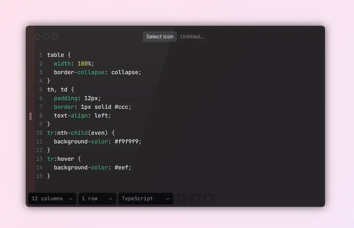
When designing the base style for a table using Custom CSS for tables, prioritize simplicity, clarity, and readability. These CSS Tables examples show how to make clean, responsive components that enhance user experience. Key CSS properties often include
border-collapse, text-align, padding, line-height, and font-size.For instance, using
border-collapse: collapse creates a seamless border appearance by eliminating double borders. Appropriate padding and line-height ensure comfortable row spacing and improve overall readability. Maintaining consistent font sizes and complementary colors also reduces visual clutter, helping users focus on the content itself.It's also best to style
<th> and <td> differently. header cells (<th>) should stand out with stronger contrast, bold text, or distinct background colors to signal their role as column headers, making it easier for users to scan and locate information quickly.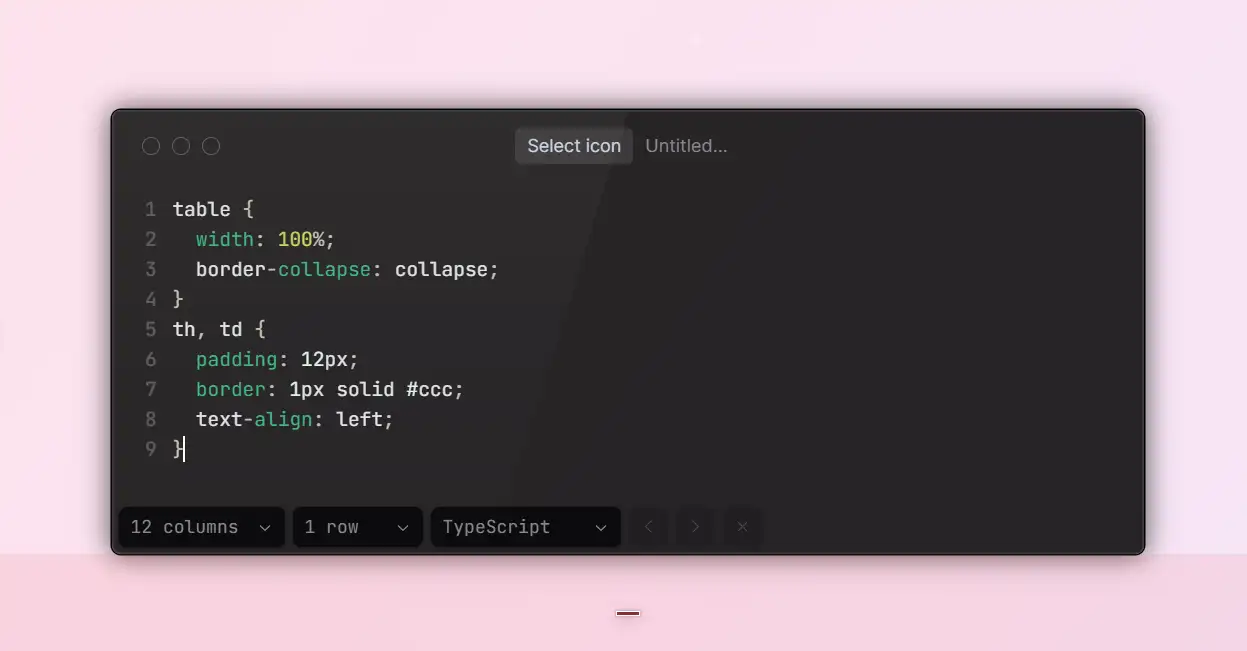
3.Techniques to Enhance Readability
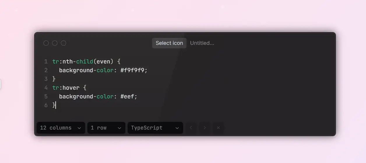
Well-designed tables naturally guide users through the data. Beyond standard styling, consider these simple but effective techniques:
- Apply zebra striping to table rows. Alternating background colors make large datasets easier to scan and help reduce visual fatigue.
- Add hover highlights so users can quickly identify which row or cell they're interacting with.
- Use consistent spacing and subtle dividers to group related content, maintaining a clear visual hierarchy.
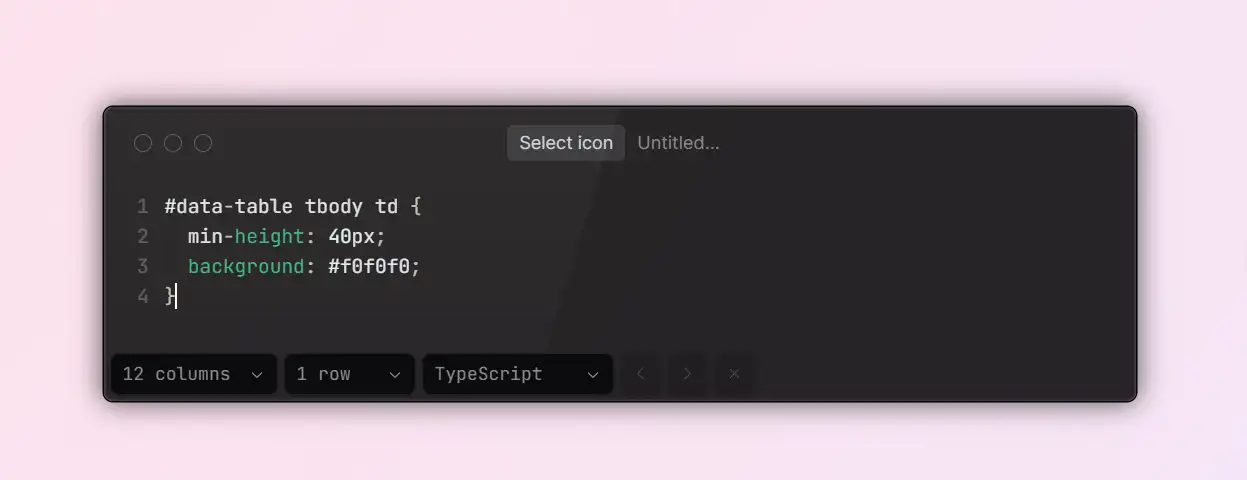
- Set minimum height and width for rows and columns to prevent overcrowded layouts and improve legibility.
These enhancements are simple to implement but can significantly improve the overall user experience of any table design.
Inspiring Examples of Stylish and Functional CSS Table Designs
1.Applicables and Design Concept of Modern Minimalist Style
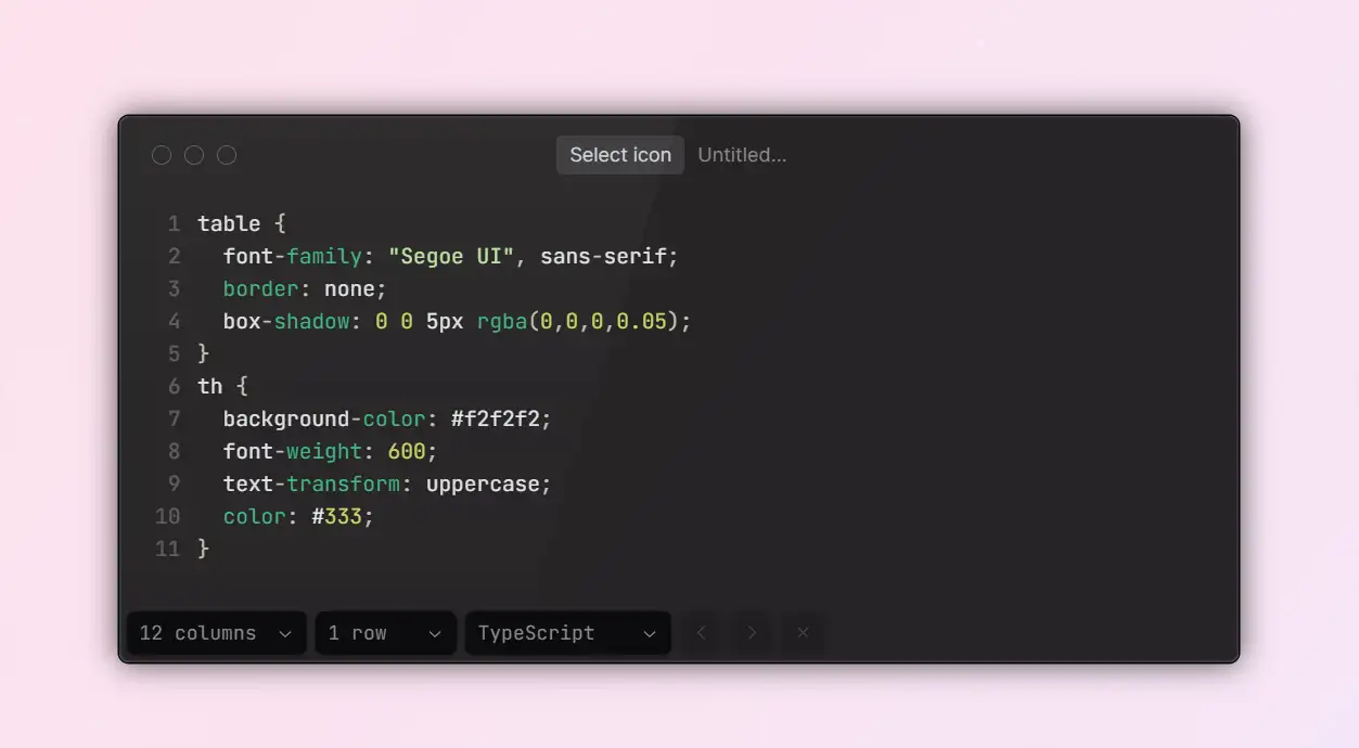
Minimalism has become one of the most dominant trends in today's web UI design. In data-heavy modules, overly decorative tables can distract users and take attention away from the core information they need.
A modern minimalist table focuses on clarity and structure: a clear visual hierarchy, consistent typography, balanced white space, and soft, low-saturation colors. Light gray backgrounds, crisp high-contrast borders, and subtle shadows add refinement to the interface without overpowering the data itself.
This clean and professional style is ideal for B2B websites, enterprise dashboards, and analytics-driven platforms. Its philosophy isn't "the more styles, the better," but rather "remove the noise and let the data shine." With just a few lines of CSS, you can achieve a sleek, versatile design that feels both elegant and highly functional.
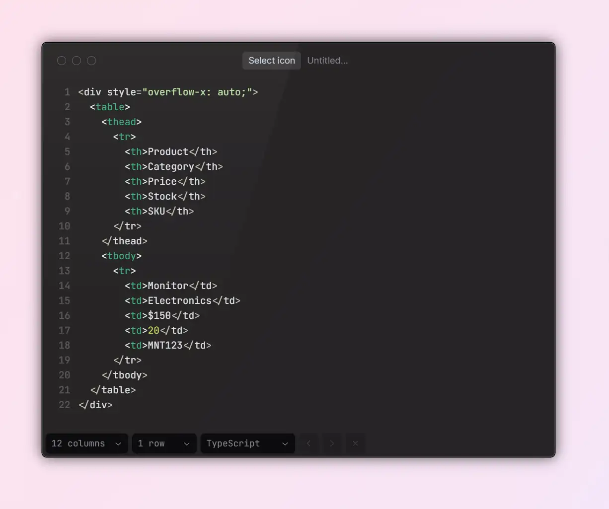
2.Design Logic of Responsive Scrollable Containers
With mobile browsing now the norm, websites must ensure tables remain easy to read on small screens. Traditional fixed-width tables often overflow on phones, making content difficult to view and, in some cases, even breaking the layout entirely.
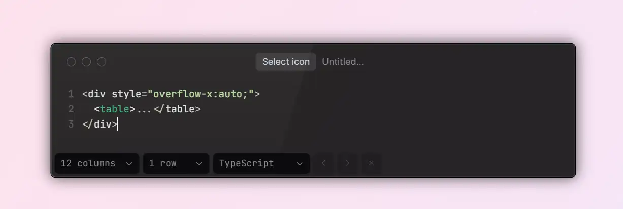
One of the simplest and most reliable solutions is to wrap the table in a scrollable container. By applying
overflow-x: auto to the outer container, the table can scroll horizontally, preserving the readability of its content without squashing or hiding information. This method is lightweight, compatible with all major browsers, and delivers a stable user experience, making it a go-to choice for e-commerce product lists, admin dashboards, and registration systems.For added flexibility, you can combine this approach with media queries to hide non-essential columns, adjust font sizes, or collapse cell content, ensuring the table adapts seamlessly to any screen size.
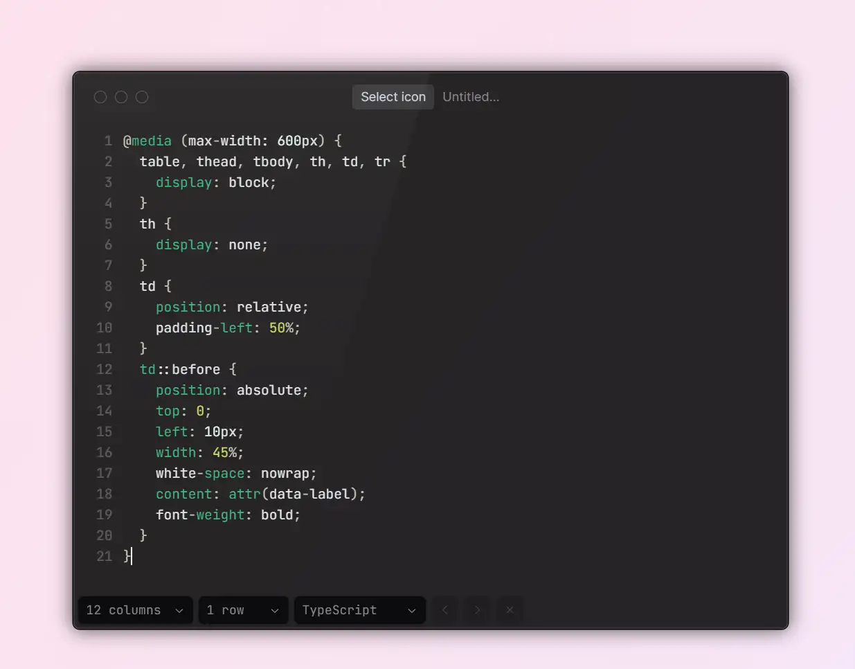
3.Optimization Logic of Collapsible Responsive Design
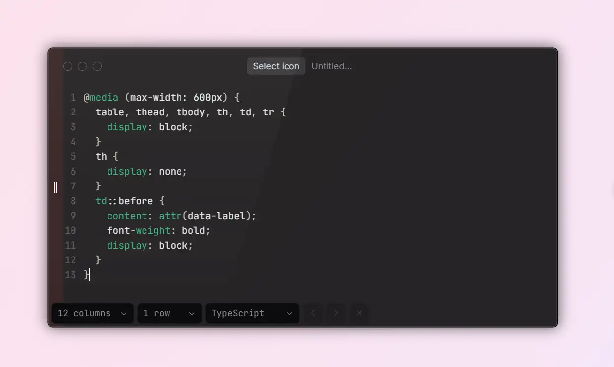
For mobile users, especially those on lower-resolution devices, scrollable tables can still be inconvenient. Horizontal scrolling forces users to swipe back and forth and makes it hard to view all the data at once. To solve this, collapsible responsive tables offer a more natural, mobile-friendly interaction model.
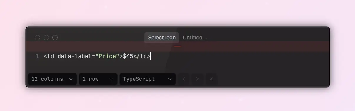
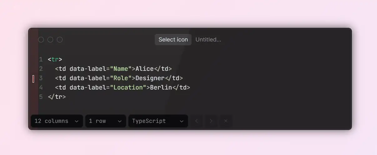
This approach works by adding a
data-label attribute (e.g., <td data-label=" Column Name">) to each table cell and using CSS media queries to stack the columns vertically. Each row then transforms into a card-like layout with labeled data points, allowing the content to adapt smoothly to smaller screens. This design is useful for data-heavy tables in fields such as HR systems and medical records, where each record contains multiple fields.Though a bit more complex to implement, collapsible tables improve readability on small screens and provide a significant boost to mobile usability.
Accessibility and Structural Clarity Recommendations
1.From "Readable" to "Usable"
Many developers focus on styling tables visually but overlook how users with disabilities interact with them. To make tables both accessible and user-friendly, follow the WAI-ARIA and WCAG guidelines and be sure to:
- Add a
<caption>to describe the table's overall purpose or content. - Use
scope="col"orscope="row"so that assistive technologies can correctly identify which headers each cell relates to. - Structure your table with
<thead>and<tbody>to clearly define its logical hierarchy.
These practices not only improve accessibility but also boost SEO performance and simplify automated testing.
2.Readability Detail Optimization
When dealing with tables that contain a lot of information, keeping them easy to read without looking cluttered is crucial. Stick to these best practices:
- Maintain a line height of at least 1.4 for better legibility.
- Ensure each column has a minimum width to avoid text breaking awkwardly.
- Decide how to display empty values in advance (e.g., "—" or "N/A").
- Use subtle color contrast — such as light gray backgrounds with dark gray text — to create clear visual separation without overwhelming the viewer.
Remember, tables are designed to help users scan information. Every design decision should focus on reducing the time it takes for users to find what they need.

Advanced Table Interaction Techniques
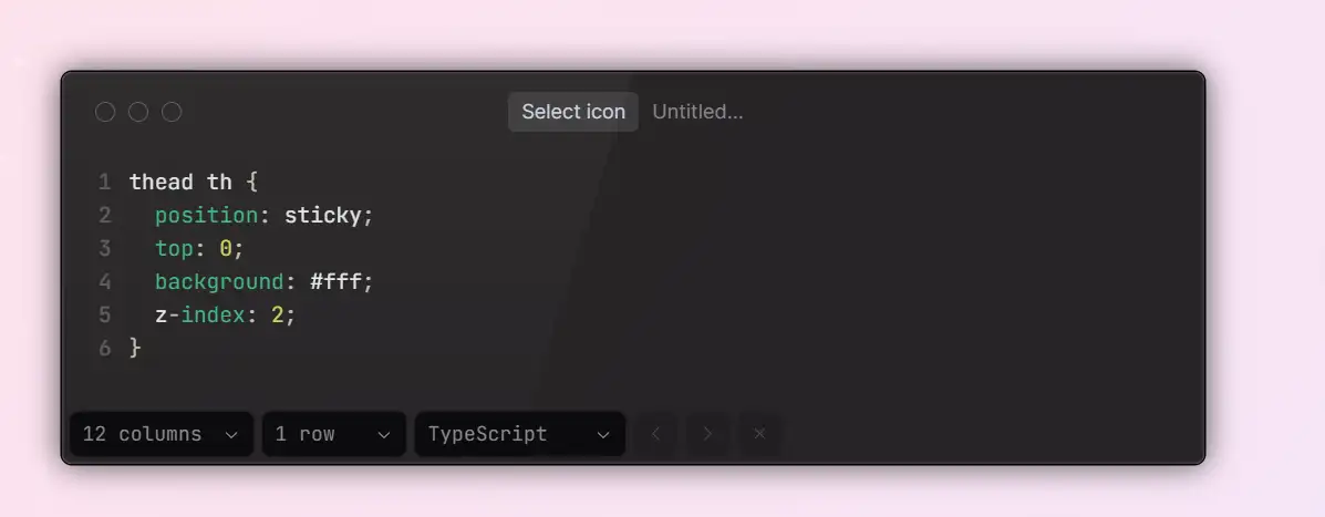
1.Fixed Headers and Frozen Columns
When working with large datasets, like financial reports or inventory logs, users can easily lose track of which column they're viewing as they scroll. That's where fixed headers and frozen columns become essential.
With
position: sticky, you can create a fixed table header using only CSS. For freezing columns, however, JavaScript is often needed, using libraries such as StickyTable or FloatThead.Keep in mind that sticky positioning behaves differently across browsers, so be sure to test thoroughly in your target environment.
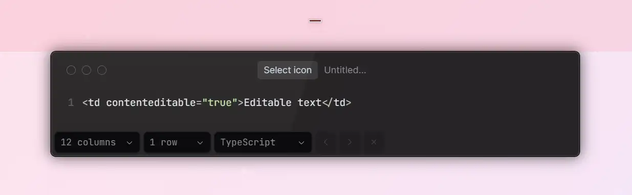
2.Editable Tables and Data Updates
As front-end technology evolves, tables are no longer just static, read-only elements. They're increasingly becoming interactive and editable components. You can quickly enable inline editing by setting
contenteditable="true", or use advanced plugins like Handsontable or Tabulator to create tables with full CRUD (create, read, update, delete) capabilities.That said, building interactive tables requires more development effort, making them best suited for data-driven systems such as CRMs and admin dashboards. For simpler, display-only pages, sticking with static tables is still the best way to maintain fast performance and load times.
Handy HTML + CSS Table Code Snippets
To help you quickly apply these principles, here are five CSS & HTML Table Templates showcasing the best table designs website CSS in action. Each is optimized for speed, responsiveness, and ease of customization. Each snippet works seamlessly with major front-end frameworks and CMS platforms, and all are available in the Wegic template library for one-click deployment and live style customization.
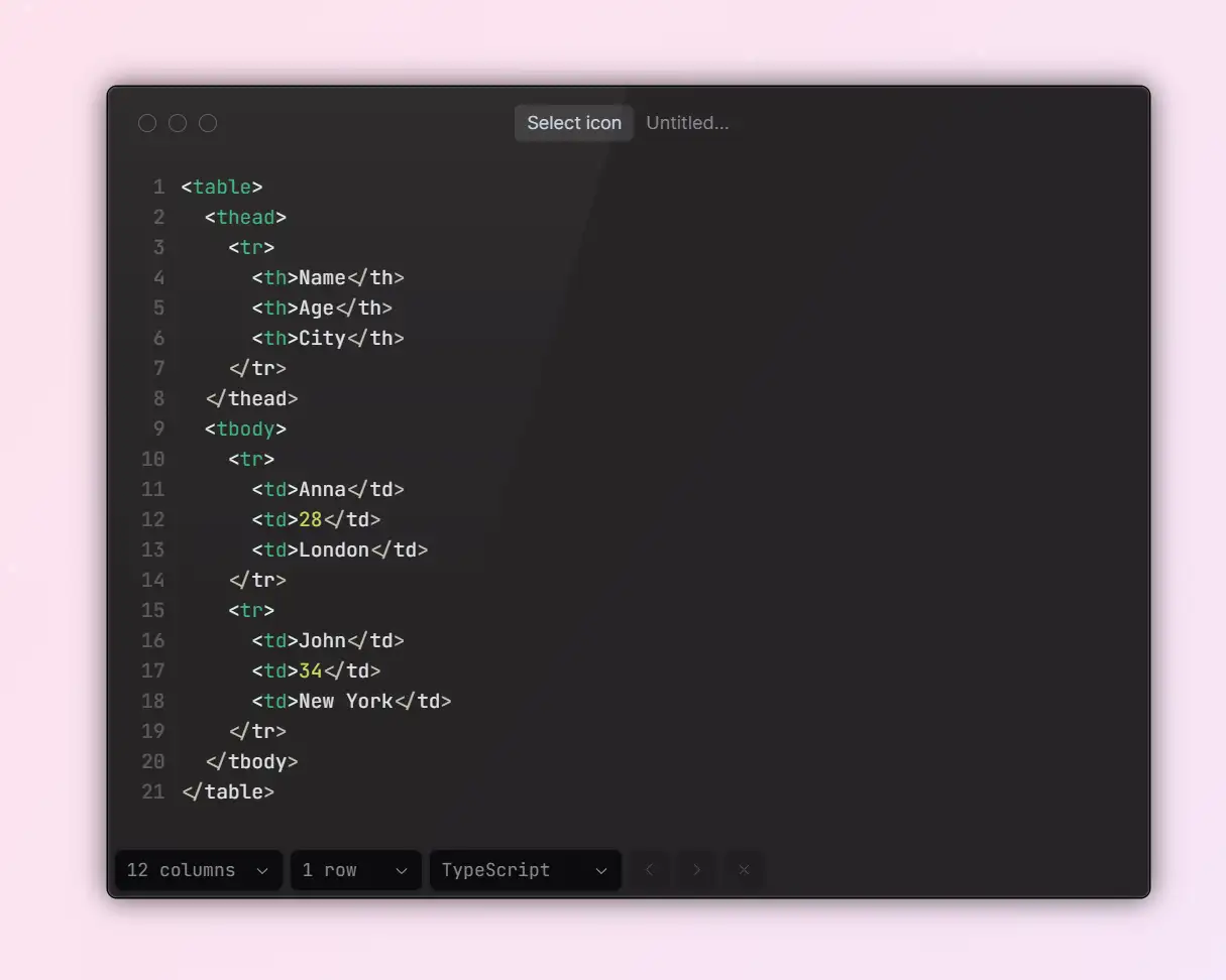
1.General Data Table (Zebra Striping + Hover States)
A straightforward, easy-to-read table template for presenting standard data sets.
- Perfect for: admin dashboards, analytics reports, order summaries
- Style highlights: alternating row stripes, hover effects, and consistent borders for a clean look
2.Responsive Scrollable Table
This layout is one of the best table designs website CSS solutions for handling wide data, ensuring smooth scrolling without breaking the layout. Ensure wide tables stay usable on mobile and tablet devices by wrapping them in a horizontal scroll container.
- Ideal for: e-commerce SKU listings, user profile tables, or any wide-column data set
- Style highlights: pure CSS scrolling with no need to alter your HTML structure
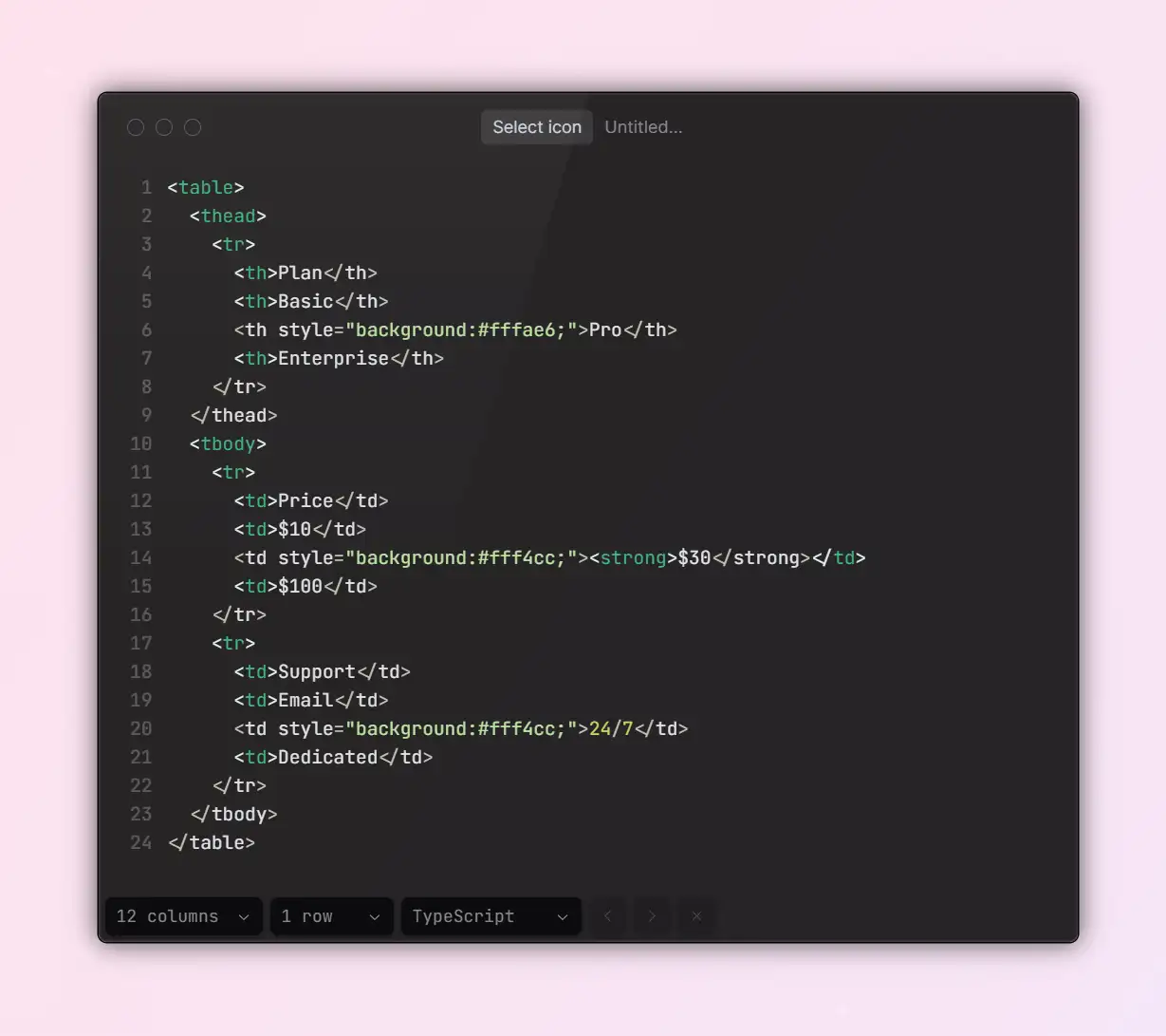
3.Pricing Table (Highlighted Featured Plan)
A conversion-driven table layout designed to showcase pricing tiers and plan benefits.
- Style highlights: bold typography, a highlighted central column, and strong CTA buttons
- High-contrast styling draws users' attention to the recommended plan, boosting conversions.
4.Collapsible Detail Table
This adaptive format is also counted among the best table designs website CSS approaches, perfect for data-rich interfaces like HR systems and medical records. Designed for dense datasets that need to remain readable on small screens, such as HR systems, hospital appointments, or student records.
- How it works: CSS with
data-labelattributes stacks table rows into mobile-friendly, card-style layouts - Style highlights: field labels display above values, rows wrap neatly for an easier reading flow
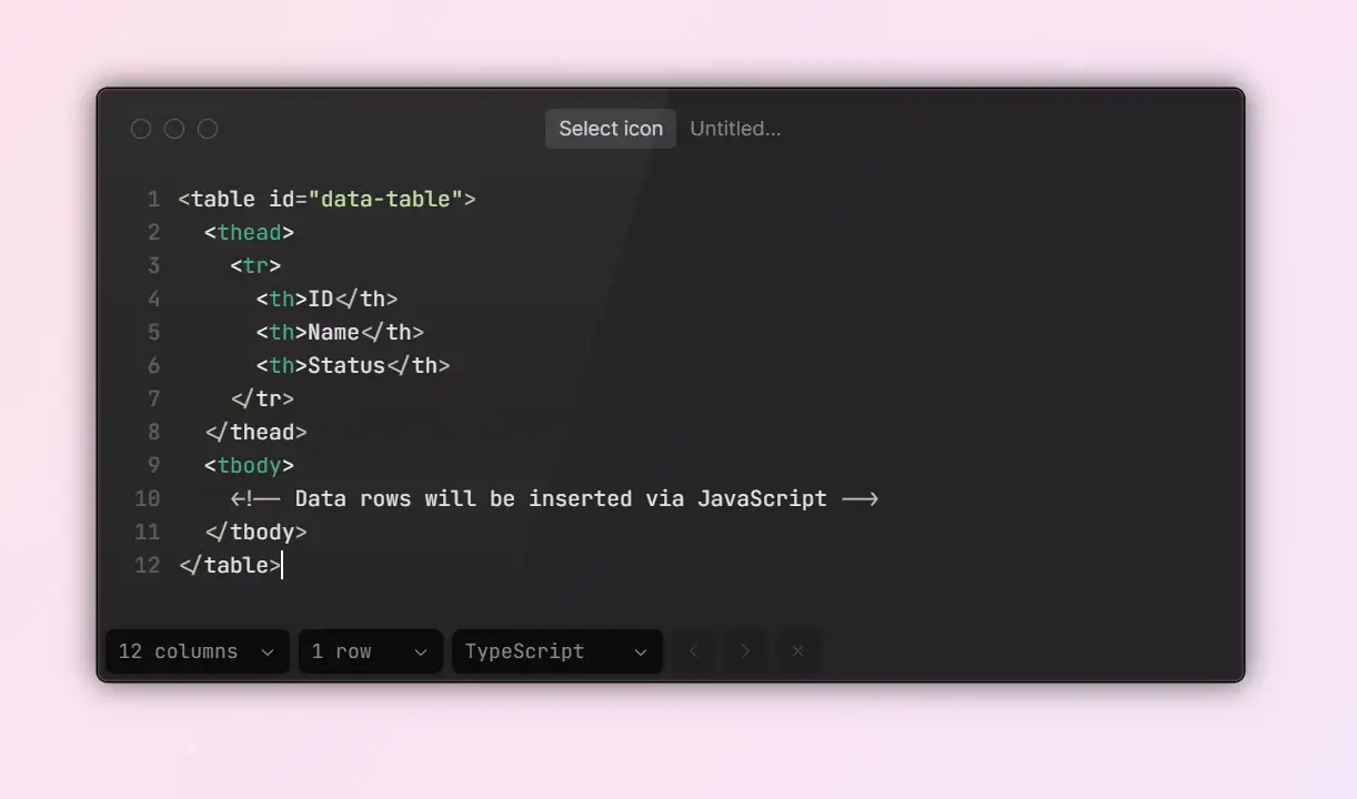
5. High-Performance Dynamic Table Template
For heavy data tables integrated with a backend, this structure combines lightweight styling with dynamic loading.
- Best for: BI dashboards, financial reports, and modular CMS list pages
- Style highlights: supports skeleton loaders, pagination, and lazy loading to speed up initial render times
Each of these templates is available in the Wegic editor, where you can generate them via chat, tweak their styling with drag-and-drop tools, and deploy instantly, saving you hours of front-end work so you can focus on building your core product.
Click here to chat with Wegic👇

Frequently Asked Questions (FAQ)
When working with CSS tables, developers often face a few recurring challenges. Here are practical answers to the most common questions, based on real-world scenarios:
Question 1: Can tables ever be fully responsive?
Answer: Not perfectly, especially when your table has many columns (six or more) or wide content per column. It's almost impossible to fit all that data neatly on a mobile screen. Instead, try one of these approaches:
- Use a standard column layout for desktop, and wrap the table in a horizontal scroll container for mobile.
- Or, convert the table into a card-style layout, turning each
<td>into a block element and adding adata-labelbefore each field for clarity.
Both methods improve mobile usability. The scrollable container is quicker to implement, while the card-style layout offers a better user experience but takes more development effort.
Question 2: Why does my table look misaligned or lose borders in different browsers?
Answer: This typically happens due to:
- Inconsistent
box-sizingsettings can cause unexpected padding or border calculations. - Varying default styles across browsers — fix this with a reset stylesheet (like
reset.css) ornormalize.css. - Layout-breaking properties, like
inline-blockorfloat, applied inside table cells without clearing their effects — useclearfixor Flexbox to restructure.
Quick Fix: Apply
box-sizing: border-box site-wide, use border-collapse for tables, and avoid mixing CSS properties that disrupt layout. These steps will resolve most browser inconsistencies.Question 3: Can I add action buttons to each row?
Answer: Of course. You only need to add a button element inside the
<td> of each table row: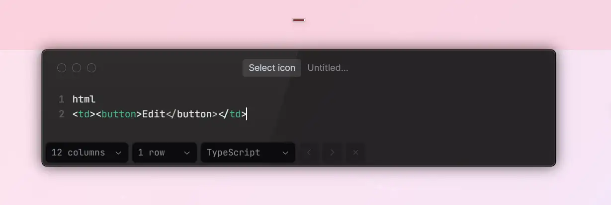
For a better user experience, make sure your buttons are styled with:
- A large enough click area (at least 40px tall)
- Clear feedback states, such as hover and active effects
- Semantic attributes like
aria-labelto improve accessibility
To make these buttons functional, attach JavaScript event listeners to handle actions like inline editing, opening modals, or toggling row states.
Build Stunning Tables in Minutes with Wegic
While this article shares CSS & HTML Table Templates and examples of Custom CSS for tables, many users without front-end skills still find coding daunting. That's where Wegic helps, enabling anyone to generate the best table designs website CSS with AI in minutes, making it effortless to design and launch high-quality, interactive tables.
Using a simple chat interface, you can type something like, "I need a responsive product table with zebra striping," and Wegic instantly generates a polished, fully responsive table and drops it into a complete website template. Compared to traditional code editors or IDEs, Wegic offers major advantages:
- No coding required: Describe what you need — Wegic instantly delivers the code and page structure for you.
- Responsive by default: Every table works seamlessly across mobile, tablet, and desktop screens.
- Customizable styles: Easily tweak headers, add fields, adjust colors, and more with a drag-and-drop visual editor.
- One-click publishing: Launch your site instantly — no server setup or domain purchase required.
- Smart, adaptive updates: Wegic lets you refine table structures on the fly, and even suggests optimizations based on user behavior.
Wegic's table builder supports a wide range of use cases, from data dashboards and pricing comparisons to dynamic analytics and project trackers. It's built for entrepreneurs, educators, content creators, and small business owners alike.
If you want to create a professional, interactive table page without the coding hassle, Wegic is your fastest path forward. Visit https://wegic.ai to start building with AI today.
Click here to build your site👇

Conclusion
Tables can be one of the trickiest elements to get right on a website, striking the perfect balance between functionality and visual appeal. Tables can be challenging, but with the best table designs website CSS, and tools like Wegic, you can create CSS Tables that load fast, adapt to all devices, and convert them better. Explore Custom CSS for tables and pre-built CSS & HTML Table Templates today to elevate your site.
And with tools like Wegic, an AI-powered website builder, you don't need to code by hand to achieve all this. Wegic helps developers and content creators instantly launch beautiful, efficient, and responsive tables that auto-optimize for every device, update content, and let you customize every style element. It turns complex web components into simple, automated, conversion-ready solutions. Start building with Wegic today, and take your website's table design to the next level.
Written by
Kimmy
Published on
Mar 17, 2026
Share article
Read more
Our latest blog
Webpages in a minute, powered by Wegic!
With Wegic, transform your needs into stunning, functional websites with advanced AI
Free trial with Wegic, build your site in a click!
What kind of website do you want to build?