登入
打造你的網站
Aesthetic Websites You’ll Want to Bookmark in 2025
Discover the most stunning aesthetic websites to inspire your creativity in 2025. From minimal design to interactive art, these sites redefine modern web aesthetics.
In 2025, you will see more and more people care about how websites look and feel. No matter if it is a brand website, a personal blog, or a shopping site, people want the page to look good, feel nice, and have a style that stands out. A website is often the first thing a user sees about a brand or a person, so appearance matters. Visual design is not just about pretty pictures anymore. It is about how everything works together to give the first impression to users. In this era of abundant information and numerous choices, a website that is not engaging or visually appealing will quickly lose users. They may close it in just a few seconds and never come back.
This is why aesthetic websites will become a strong trend. They care about beauty in every detail, but also put user experience first. A clear layout helps people know where to go. Smooth actions and fast response make the site feel alive. Natural and well-chosen colors create a comfortable mood. All these things make people stay longer, explore more, and want to return. For a brand, a beautiful and easy website is like the best business card—it shows quality without saying a word.
In this article, we choose the most typical and inspiring aesthetic websites of 2025. Some are very simple and clean, some are fresh and brave with new ideas, and some look almost like art pieces. If you are curious about real-world examples, check out our list of best-designed websites that perfectly show how great aesthetics can drive engagement and loyalty. We hope these examples bring you ideas and show you clearly that a website can be more than just a page—it can be something truly charming and memorable.
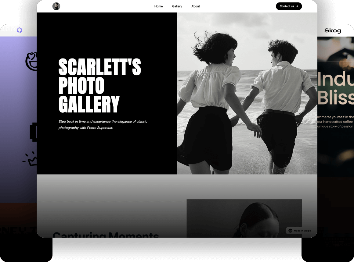
Click on the image to get more inspiration 👇

What Makes a Website Truly Aesthetic?
What is a real aesthetic website? First is visual harmony and simplicity. A good page does not use too many colors. It chooses a few that go well together, so people feel comfortable. The text layout is uniform, the space is proper, and every part seems planned and in the right place. This design helps users find what they want without thinking hard.
Second is an interactive experience. Websites now are not just still pages. Many use small animations, scroll effects, or ways to interact, making browsing more fun. For example, small button feedback or backgrounds that change when you scroll. These details make people want to keep exploring. Some fun websites show how interaction can make design truly engaging and memorable. These details make people want to keep exploring.
Last is emotion and story. A website that shows the brand’s feelings and values through design is easier to remember. It does not just tell you what the product is. It makes you feel what they want to say.
When these three points work together, the page becomes truly attractive. For people who want to study design, these websites are a treasure. When you look for aesthetic websites for studying, you will learn how colors speak, how animation guides focus, and how design connects users and brands. Such aesthetic websites are not just pretty; they teach you how to move people.
Aesthetic Websites You Should Bookmark
Frank Chimero – Minimalist Perfection
Frank Chimero’s personal website is a classic case of simple design. When you open the page, you see a clean layout with no extra decoration. Simple font, soft colors, make the content naturally the visual center. Every detail feels nice, with neat text and enough space, so your eyes do not get tired.
Its special thing is the “less is more” feeling. No fancy animations, but it makes you want to go page by page. It loads fast and feels smooth, so you can focus on the content.

Why is it worth keeping? Because it shows you that good design does not need to be complex. For people looking for aesthetic websites for fun, this is an ideal place. Whether a designer wants a reference or you just want to see pretty pages, it works for you.
Active Theory – Art Meets Technology
Active Theory’s website feels like entering a digital art space. The page is full of immersion, drawing you in from the very first second. 3D animation, smooth interactions, and sound design work seamlessly together to create a dynamic experience that responds as you move. It does not feel like a normal website at all, but more like stepping inside a small, beautifully crafted virtual world where every detail reacts to you.

Its special thing is the perfect mix of art and technology. Each project is like an interactive show, with visuals and motion that evolve as you explore. You can click, swipe, and move through environments that feel alive, whether they showcase brand work or bold experimental ideas. This constant play of creativity and innovation makes every visit feel unique, as if the site itself is a living piece of digital art.
Why keep it? Because it shows the future of digital experience. For people who love strong visuals, it delivers endless surprises that spark inspiration. For anyone searching for aesthetic websites to visit, this one is essential. It demonstrates how technology can amplify design and proves that a well-crafted site can go beyond the screen, engaging multiple senses and leaving a lasting impression.
ETQ – Futuristic E-Commerce
ETQ is a shoe brand from Amsterdam. Their website looks high-class at first sight. The whole page uses a simple layout with no extra decoration. High-quality product pictures take the main place, so you can clearly see every detail. The colors are low-key but feel modern.
The shopping experience is also smooth. Product categories are simple, and checkout is clear, with no extra clicks. You feel this is a beautiful and useful shopping site. It shows that e-commerce does not need to be flashy. Simple can also impress.

Why keep it? Because it shows the balance of business and beauty very well. For people who want to keep ideas, this is a good example of aesthetic websites for notes. If you want to explore more about how design can elevate digital experiences, take a look at this graphic design website that showcases creative yet functional layouts. You can learn how design can grow brand value without hurting user experience. Whether you do e-commerce or just want to see good design, it is worth a look.
Patagonia – Nature-Inspired Aesthetic
Patagonia’s website gives you an immediate sense of nature from the moment you open it. Large, immersive outdoor photographs instantly take you to vast valleys, dense forests, and the endless sea. These images are authentic and powerful, filled with raw beauty that makes you want to step outside and experience the wilderness for yourself. The website’s structure is deliberately simple—no flashy, complex design elements—so that nothing distracts from what truly matters: the brand’s deep connection to the environment and its commitment to sustainability.
What makes it unique is how it weaves ideas seamlessly into design. Every page is filled with stories about protecting the environment, yet it never feels forced or overly didactic. Instead of telling you what to think, it invites you to feel and connect. As you browse products, you naturally encounter these genuine narratives, and they resonate in a way that lingers beyond the screen. This approach highlights not only visual beauty but also underlying value, making the design meaningful on multiple levels.

Why is it worth keeping? Because it proves that aesthetic appeal can go beyond surface-level beauty to carry purpose. For those seeking websites that delight the eye, Patagonia delivers visual pleasure, but it also gives you something deeper to reflect on. It reminds us that design isn’t just decoration—it can forge connections between people and nature, stirring thought and inspiring real action. In a digital landscape crowded with empty visuals, this balance of elegance and meaning feels rare and powerful.
How to Create Your Own Aesthetic Website in 2025
Want to make a really good-looking aesthetic website in 2025? First, focus on user experience and accessibility. A pretty website that is hard to use will still make people leave quickly. It does not matter how nice it looks if visitors cannot find what they need or if some users cannot use it at all. Clear structure, simple navigation, and a design that is friendly to all users, including those with different needs, are the way to last and to build trust. A site that is easy to use will make people stay longer, come back again, and recommend it to others.
Second, invest in high-quality visuals. Pictures, videos, fonts—good ones can make your site look much better right away and show that you care about quality. Do not use blurry photos, stretched images, or cheap elements. They can make your design look unprofessional and harm your brand image. A single strong photo or a clean, well-chosen font can make a big difference. High-quality visuals create a feeling of value, and that feeling will pass on to how people see your brand.
Last, use modern tools like AI and no-code platforms to make the process faster and smarter. Tools like Wegic can help you build a website very quickly. You just tell it what style, look, and functions you want, and it can create a full site in about a minute. It can even keep improving your content and layout as time goes on, so your website does not stay static but grows better over time. This means you spend less time on setup and more on creating great ideas and content.

For creators who want beauty and efficiency at the same time, this way saves both time and effort. With these methods combined—good experience, strong visuals, and modern tools—you can build an aesthetic website that not only looks great but also works smoothly and truly represents your brand in the best possible way. Here is a comprehensive beginner's guide and Wegic web examples for your reference.
Conclusion
The trends of aesthetic websites in 2025 are already clear and easy to see. Minimal design is still popular, but it is no longer plain or dull. It is about finding balance in every small detail and using high-quality visuals to create a polished look. Interactive experience is also becoming more and more important. Users today do not just look at a page; they also take part in it, scroll through smooth effects, click on small animations, and enjoy being part of the process. When emotion and story are added to the design, a website becomes more than just a tool to show information. It turns into a space that connects with people on a deeper level, a place where they can feel the brand’s personality and values. These changes show clearly that design has grown from only being about looking good to giving people a full experience and showing real attitude.
If you want to make your project better, these websites are some of the best sources of inspiration you can find. They can show you how to match colors in a way that feels right, how to tell a story that catches attention, and how to design interactions that make people want to stay and explore more. Find some aesthetic websites for studying, take time to look carefully, and analyze how they work. The more you see and think, the more your eye for design will grow and improve.
Do not stop at ideas or just thinking about them. Go explore these websites now, and bring their good ideas into your own work. Practice what you learn. Take action today. Start making changes and adding improvements, and soon your design will not only look more attractive but also feel stronger and more meaningful to the people who use it.
撰寫者
Kimmy
發布於
Aug 31, 2025
分享文章
閱讀更多
我們的最新博客
Wegic 助你瞬間打造網頁!
透過 Wegic,利用先進的 AI 將你的需求轉化為驚艷且實用的網站
使用Wegic免費試用,一鍵建立你的網站!