Log in
Build Your Site
Top 20 Roofing Websites Design Examples for Inspiration
Find the Top 20 roofing website design examples here, and get the trick to create your own websites with AI.
In this digital age, there are more than 1.93 billion online sites. Thus, making great roofing websites is very important. Creating a professional, attractive, and interactive roofing website can make your company constantly attract potential customers and give you an advantage over your competitors. You need to give your customers the best first impression.
This article will focus on:
-
What are good roofing websites?
-
20 roofing websites recommended
#01. All County Exteriors
#02. ABC Seamless
#03. North American Roofing
#04. Chet's Roofing
#05. Moss Roofing
#06. Retro Roofers
#07. D&L Roofing
#08. Zenith Design + Build
#09. Dynasty Roofing Inc
#10. Quantum Roofing
#11. Bulldog Group Inc.
#12. Tri-State Roofing and General Contractors
#13. Top Roofing Inc.
#14. Baker Roofing
#15. First Quality Roofing & Insulation
#16. Force Field Roofing
#17 S&D Enterprises, Inc
#18. Bay Valley Roofing
#19. A Better Roofing Company
#20 Secured Roofing & Solar
-
Build roofing websites interactively
What are good roofing websites?
Good roofing websites should have the following characteristics:
-
Search engine optimization(SEO)
The first thing you need to focus on is optimizing your SEO for websites. It can make your roofing websites easier to find and get better rankings. So how do you optimize it? First, you need substance. A good piece of content needs to have a well-formatted structure, high quality, and clear images. And there are keywords related to roofs.
Tips: If you emphasize location in your article, it is also important to improve local SEO.
-
Well-designed pages
How to make a good first impression on your customers? That must be a well-designed website. Your roofing websites may need to load faster, have an interactive design, and make it easy for visitors to find what they're looking for. Alternatively, you can tell your clients in a prominent place why your roofing services are better than other roofing companies.
-
Customer conversion
Think about why we build websites. It is because we need customers to understand us, and let them buy your roofing services through the websites. This explains why good roofing websites are so important. It can successfully help you convince your potential customers to buy your services. So on websites, you can add a more prominent logo. For example, they have prominent call-to-action phrases, CTA buttons, and contact forms.
20 roofing websites recommended
#01. All County Exteriors
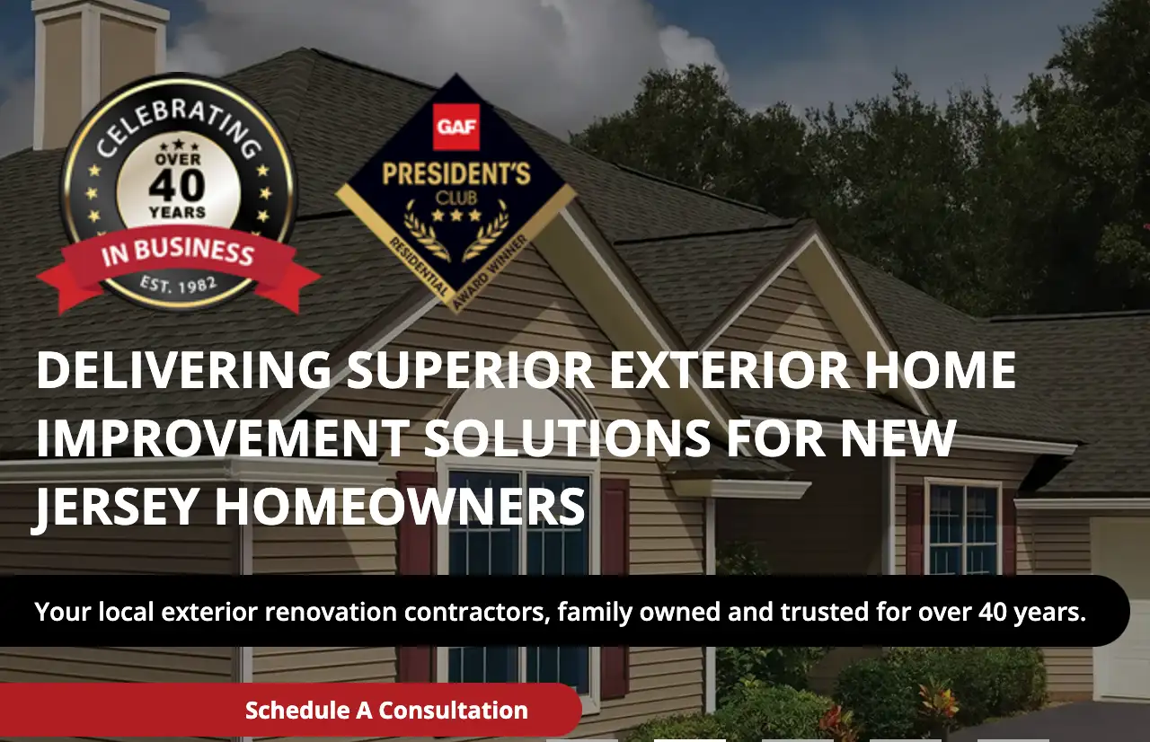
When you visit All County Exteriors, you will see a prominent sign, logos, and how many years they've worked in the industry. Like many other roofing websites, it has to be said that when you look at a company that has been in roofing services for 40 years. You will feel at ease. The company is using this method to attract more customers. Moreover, this roofing company pops up "Request a Free Estimate" on the homepage of the roofing websites, which makes customers more likely to contact them to purchase services.
#02. ABC Seamless
When you click on ABC Seamless, the roofing company contains a lot of content. And the text is paired with videos or pictures to increase the interactivity. You can see all the introductions and highlights about this company. The design of this roofing website has a very uniform color scheme. This makes the site overall look good and have a sense of design. And mention "call" many times on the home page to promote the enthusiasm of users to call them. And at the front of the page is a contact form for people to fill out. This may increase user interaction.ABC Seamless
#03. North American Roofing
When you click on the company's roofing websites, the first thing you see is their phone number and contact form. And then you can see this website about the company North American Roofing and their services and history. All of these can give customers a deeper understanding of the company.
#04. Chet’s Roofing
I think this company's website is one of the best-designed Roofing websites. It uses a lot of beautiful design so that visitors to the website are more easily attracted and stay to improve the detailed browsing. Like other Roofing websites, Chet's Roofing describes the services they offer and their history. But their site looks more concise and comfortable than the others.

#05. Moss Roofing
I have to say that Moss Roofing's website looks very simple and beautiful. It adds a "content us today" button at the beginning. And then put a very warm photo to introduce their team and history. Compared with other roofing websites, this company's roofing websites are more concise and clear. It also introduces the cases of the roofing websites and the working process of the company at the bottom of the website.
#06. Retro Roofers
Compared with other roofing websites, this company's website is more modern and more attractive to customers. The company's use of pictorial styles and typefaces that fit its style has kept the style consistent while also highlighting the company's personality. This website does not use too many words to introduce themselves. They use simple text and video to introduce the company's services.
#07. D & L Roofing
D & L Roofing, like other roofing websites, uses a more designed page to introduce the company. The above section shows high-quality images and slides of various CTAs. At the bottom of the roofing websites, they introduce their company step by step, and each section is designed in detail.
#08. Zenith Design + Build
Zenith Design + Build's roofing website design is more interactive than other roofing websites. The website is shown the video at the beginning and the accolades they have received are described below. Then, Zenith Design + Build introduces their cases in a way that is full of design sense. After a few minutes of browsing, a page will pop up to fill out the relevant form. This way can effectively attract customers to call to inquire.
#09. Dynasty Roofing Inc
Dynasty Roofing, Inc. Uses a concise way to introduce the company. Like previous roofing websites, dynasty Roofing, Inc. uses a small amount of text and videos to introduce the company. The company starts by telling potential customers when the company was founded and the button to fill out the form.
#10. Quantum Roofing
Quantum Roofing provides all the information the prospect needs to know on the page and presents it interactively. In addition, there is a menu button at the beginning of the roofing websites, which makes it easier for users to find the content they need. Although this method is not as modern as roofing websites, it has more information that customers want to know.
#11. Bulldog Group Inc.
I have to say that the website of Bulldog Group Inc. is more well-designed than other roofing websites. Instead of giving potential customers direct contact information, the company used an interactive and modern way to entice customers to continue browsing their roofing websites and see the company's profile and listing. Users can also click on the image to learn more.
#12. Tri-State Roofing and General Contractors
Tri-State Roofing and General Contractors are not as well designed as other roofing websites. However it has designed its roofing websites to look more professional. Visitors can find detailed information about the company as well as contact details on the contact page and the footer of the website. For this roofing company, the design of the website reflects the style and character of the company.
#13. Top Roofing Inc.
Top Roofing Inc. marked its phone number on the roofing websites with prominent colors and contrasted it with the background. For every image or video that follows, they add a hyperlink so users can see more information, as well as a phone number. Such methods differ from other roofing websites, but might encourage customers to make the call. They also provide reviews of their customers. This allows potential customers to get to know them better.
#14. Baker Roofing
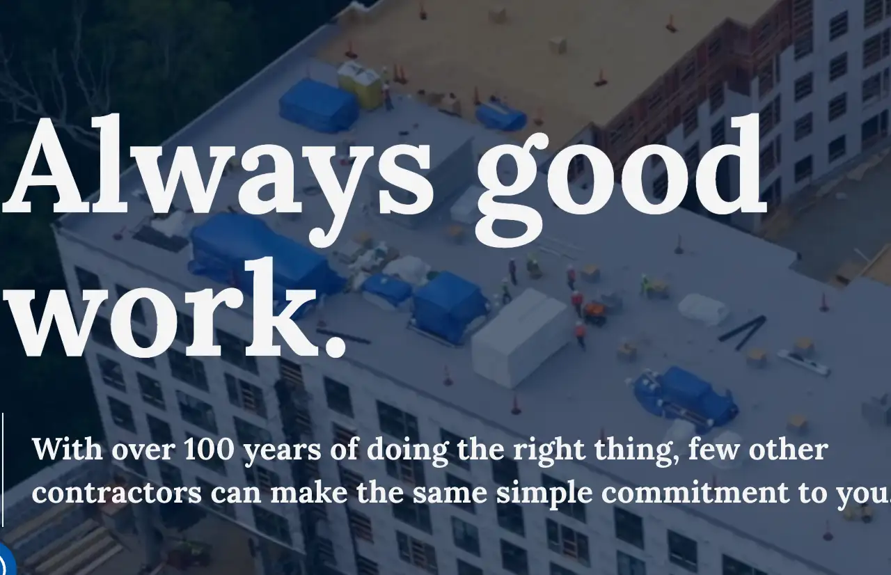
Baker Roofing offers a variety of ways for customers to reach them. And in a prominent place to write "always good work" to deepen the impact of potential customers, and explain that they are a company with more than 100 years of history. The information that various customers might want to know is not described in long text but is added with various buttons. Undoubtedly, this makes this company look more professional and design sense than other roofing websites.
#15. First Quality Roofing & Insulation
First Quality Roofing & Insulation, like other roofing websites, brings their standards of work to the forefront. The slogan reads, "We put quality first." It's the same name as their company. Let potential customers know that this is a quality company. You can find the information you need on this page very well, and it has a clean appearance and a great logo design.
#16. Force Field Roofing
The roofing website design of Force Field Roofing has a good visual effect, like other roofing websites. It is able to seize people's attention. Potential customers can easily find information about services, products, and the company itself. A web page with a sense of design can make potential customers more patient and more willing to look at more information.
#17. S&D Enterprises, Inc
The S&D Enterprises, Inc.'s roofing websites are very nice to look at. They highlight their logo "family-owned platinum preferred roofing contractor" on their roofing websites, and like many other roofing websites with years of history, It wrote about how long they have worked in the industry and added the number of homes they had served.
#18. Bay Valley Roofing
Bay Valley Roofing designed a very impactful page. It clearly describes their service time, place, honor, contact information, and user comments. Exquisite design and detailed content will bring many customers to Bay Valley Roofing. A good-looking page will keep users there longer. But it can also cause users to become distracted. Therefore, the page design such as Bay Valley Roofing is even better. Because it takes into account many aspects of the experiences. It is different from other roofing websites.
#19. A Better Roofing Company
A Better Roofing Company is different from other roofing websites in that they emphasize that they are family-run. This may enhance the user's sense of trust and bring a degree of affinity. This roofing company puts many high-quality images of roofing works on its roofing websites to demonstrate its expertise.
#20. Secured Roofing & Solar
Secured Roofing & Solar, like other roofing websites, emphasizes its brand style many times on its website. The roofing company mentioned prominently that they would keep your home secure and your family safe. The company then provided a form to fill out and an introduction to various services and related information. This obvious style can quickly and accurately target potential customers for them. For example, customers who are browsing may have different needs for roofing services, but some of them are very focused on Security, so Secured Roofing & Solar is their best choice.
Build one roofing website with Wegic!
Seeing the above example, are you also worried about how to build a website for your brand?
Don't worry, Wegic can help you build roofing websites. Whether you want to express your company's professionalism in a simple style or deepen user engagement interactively, you can do it with Wegic. You can click on the beginner's guide to help you learn how to quickly set up your website with Wegic. You can also try to build a website directly through AI conversations. There are also many examples for your reference.
The way to use Wegic is not as complicated as traditional website building. You can talk to AI to build roofing websites that fit your brand image efficiently and quickly. How exciting it is to use AI for design. You can completely follow your ideas to design roofing websites, without all the trouble of communication, but also can try a new thing.
Conclusion
This article introduces you to how to design good roofing websites and also recommends 20 examples of roofing websites so that you can have a better understanding of how to make a website. At the end of the article, I also give you a convincing way to build a website, that is-Wegic.
At the end of the article, I hope these two suggestions can help you better: To build a brand for your company, the first thing you need to know is what style your potential customers may like and what kind of houses you mainly provide roofing services for. Build a company-style website based on these points. Secondly, the user who clicks on your website wants to know more about the company and how a roofing company can help him/her. So you need to highlight your strengths and important information on your website.
I hope my pieces of advice can help you.
Written by
Kimmy
Published on
Mar 12, 2026
Share article
Read more
Our latest blog
Webpages in a minute, powered by Wegic!
With Wegic, transform your needs into stunning, functional websites with advanced AI
Free trial with Wegic, build your site in a click!
