Log in
Build Your Site
12 Stunning Examples of News Website Design
Explore 12 stunning examples of news website design that captivate audiences with sleek layouts, user-friendly navigation, and engaging visuals.

This is especially so when creating news websites since every single aspect of the website matters. Well, if you are like me, then I understand that you must have drowned under the flood of news website examples. You realize that if there is one thing a good news site must have then it is not a simple site that compiles articles; it is about giving readers something with which they can engage and build. But where do you start? If you are lost when it comes to auditioning and taking bookings and doubting whether there are some things you should or shouldn’t do, then you are not alone.
In this article, we’re going to list down some of the best news website designs that not only are visually appealing but also functional and optimized. Finally, in this, you will know what can make a news website to be more effective and ready to apply these ideas to your website. If you are from a start-up and still in the process of constructing your site, or if you simply want to redesign your current site, then you may use any of the mentioned examples as your guide. Check out these informational website examples and build your own websites.
Elements of News Website Design
It is fascinating to create an online newspaper regardless of the type of news it features. It is not about page-filling articles but how the articles are connected in a way such that the reader is constrained and compelled to read. This is perhaps one of the toughest challenges that most, if not all, news websites face when they are designing their home pages. Let me tell you this, a messy format or tortuous menuing on a smartphone’s screen can have readers clicking the back button faster than they shout “Breaking News”.
Classic Tone
Typically, newspapers are known to use black-and-white color schemes and even today this option is a standard in News Website Design. Why? Well, it is not tiring on the eyes and to pass off heavy content this high contrast is required. One may be tempted to be as creative as possible when choosing the colour of an outfit but be careful. Although you may occasionally see white text on a black background, don’t choose something like neon green on blue unless you want to give your users migraines. A good rule of thumb: it is advisable to keep most of the work in grayscale and use various colours only for the headlines or buttons to direct the viewers’ attention. They might ways suggest that your navigation menu could look a little darker or lighter to make it pop without being obnoxious.
Less is More
The design of news websites is all about the content again, and as such the emphasis should be placed more on it rather than the graphics. Using too many graphics on a page can throw your site into a circus troup and it would no longer be taken seriously as a news-distributing site. While designing, it is best to avoid complex shapes and lots of patterns and gradients. This approach minimizes the confounding of the reader by avoiding the complications of garnishing the content with visuals too often, allowing them to focus on the news. A very light paper texture can also do the trick and would be nice to include a connection to the original print magazines of the ’90s with a more contemporary take.
Grid-based Layouts
The organization of correct formats on a grid-based layout is the basis of a good news web design. That is why the focus on structure is vital as the content of news sites is usually quite abundant. This has implications for copywriting particularly when using a grid or multi-column layout: the content is divided into manageable chunks, leading the readers’ optics horizontally across the page. Design guru Mark Boulton once pointed out that a good grid system effectively makes things more beautiful and usable. This way, you make sure that you create a hierarchy of the content where the reader can easily skim through the provided blocks and get to the essence of any section. Regardless of whether the particular structure is multiple columns and many sub-sections in each column or a grid method of including sub-sections for each topic, there should be ample white space between the columns to make the work easy to read.
The Art of the Hook
It is worth stressing that headlines remain one of the most crucial elements for any news website design. These are the first things that catch a reader’s attention and they also influence the readers to read further whole article or not. Every content block should have a headline, which can be in a different size, bold or coloured compared to the rest of the content. But don’t stop there. Even such things as excerpts or short summaries do not go unnoticed. They act as a lure to ensure that the readers are drawn to the story, especially where the story is lengthy, as you may find in some articles. You can regard them as the first bites before the meal; they should provoke the desire for further reading.
Primary vs. Secondary Content
Not all the times the content posted in your news Website is the same, and this may require a few changes. Some of the key aspects to comprehend about the website layout are as follows: Above all, a good news website design should implement an apparent division between the elements of primary and secondary importance. For instance, your homepage may consist of a large banner region for the headline stories, supported by splendid graphics and pictures. Secondary content such as opinions, archives, etc. can be showcased in smaller sections which are usually divided into grids. This distinction, apart from making your site easy to navigate, also ensures that the important stories of the day are well portrayed.
Intuitive and Consistent Navigation
Due to the mostly informational nature of the sites, the navigation has to be as logical as possible. The last element to touch on in the context of news website design and how it’s different from most design types is our navigation menu: it should be minimal and always in the same location, preferably across the top of the page. Users come here for the first time if they know exactly which item they are interested in. It is possible with vertical navigation as well, although it can be better to place them on the left side of the Website as people tend to start there to read. To avoid the density and to overcome the issue that a user might be lost within the component, the content must be easily navigable.
Space for Ads
Now that we’ve been through the broad divisions of a news site, it’s time to discuss ads – the bane and lifeblood of any monetized news website design. However, the last thing you want to do is ‘tag’ everything you see: moderation is the name of the game here. Fixed positions are sidebar, header or footer but avoid placing the Ad within the body or content area. Though it may be beneficial, it may also fuss off the readers and inconvenience the structure of your articles. Its objective is to make advertisements blend with the layout with the aim of not making the users feel as if they are being pushed towards it.
The Power of a Functional Sidebar
Among all the hints of news website design, the properly developed sidebar can be a real ace up the sleeve. It is an ideal place to place the advertisements however it can also contain other components that are of interest such as content folders, latest posts, search bar and social media icons among others. The main thing to bear in mind is that the sidebar should not be larger than the rest of the layout, they should be rather neutral and the fonts readable. When it is positioned on the left side of the page or the right side of the page, it should be able to give a positive experience to the users.
12 Stunning Examples of News Website Design
Let's explore ten stunning examples of news website design that masterfully incorporate these elements.
1. The Guardian
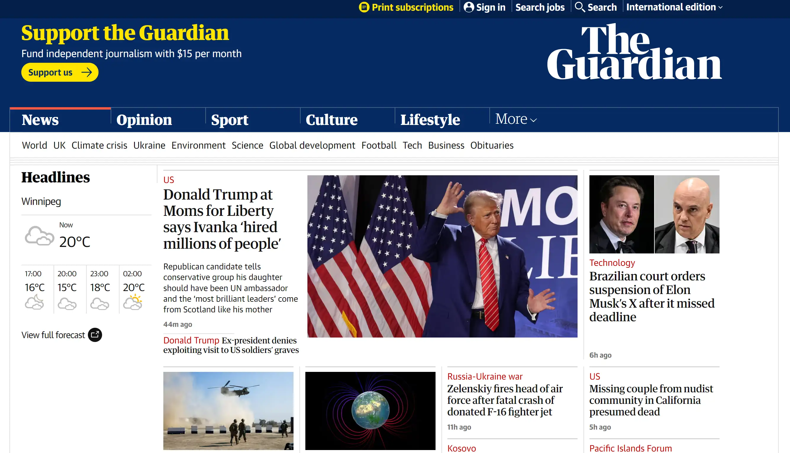
The Guardian’s news website design is a shining example of how simplicity and organization can elevate the reader’s experience. With its minimalist layout, the site prioritizes readability through clear fonts and ample white space, allowing the content to take center stage. Navigating this news website design is a breeze, thanks to user-friendly menus and intuitive structure. The visual hierarchy is thoughtfully executed, guiding the reader’s attention to key headlines and images that enrich the stories without overwhelming them. This approach makes The Guardian a standout in news website design, offering a seamless and engaging reading experience.
2. The New York Times
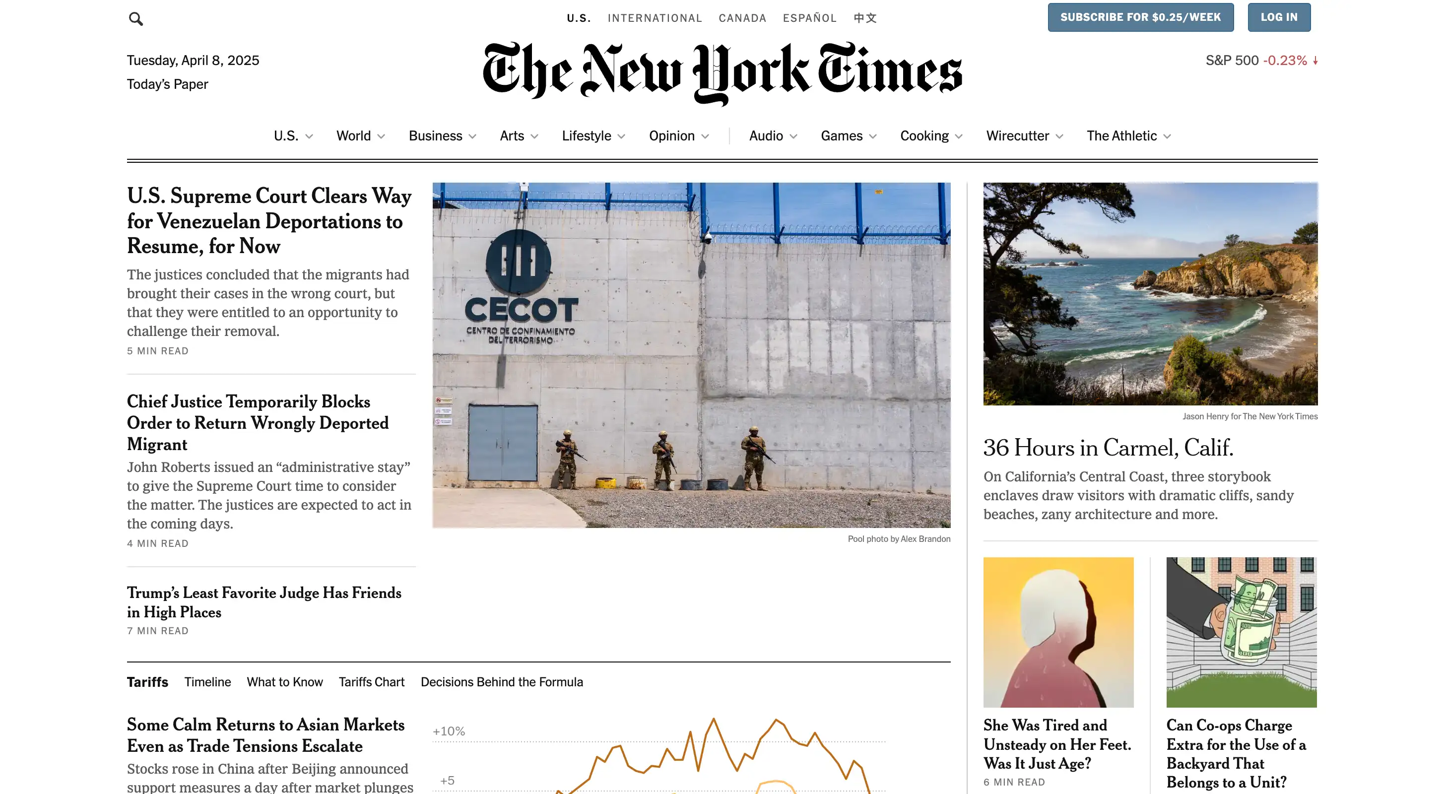
The New York Times demonstrates an exceptional blend of tradition and innovation in its news website design. While the iconic black-and-white aesthetic pays homage to its storied history, the integration of multimedia elements—like videos, podcasts, and interactive graphics—keeps the site fresh and engaging. The responsive design ensures that whether you’re on a desktop or smartphone, the user experience remains consistent and enjoyable. The strategic use of white space and a carefully curated colour palette contribute to an elegant and professional look. This balance of old and new in The New York Times’ news website design makes it a masterclass in maintaining relevance in the digital age.
3. BBC News
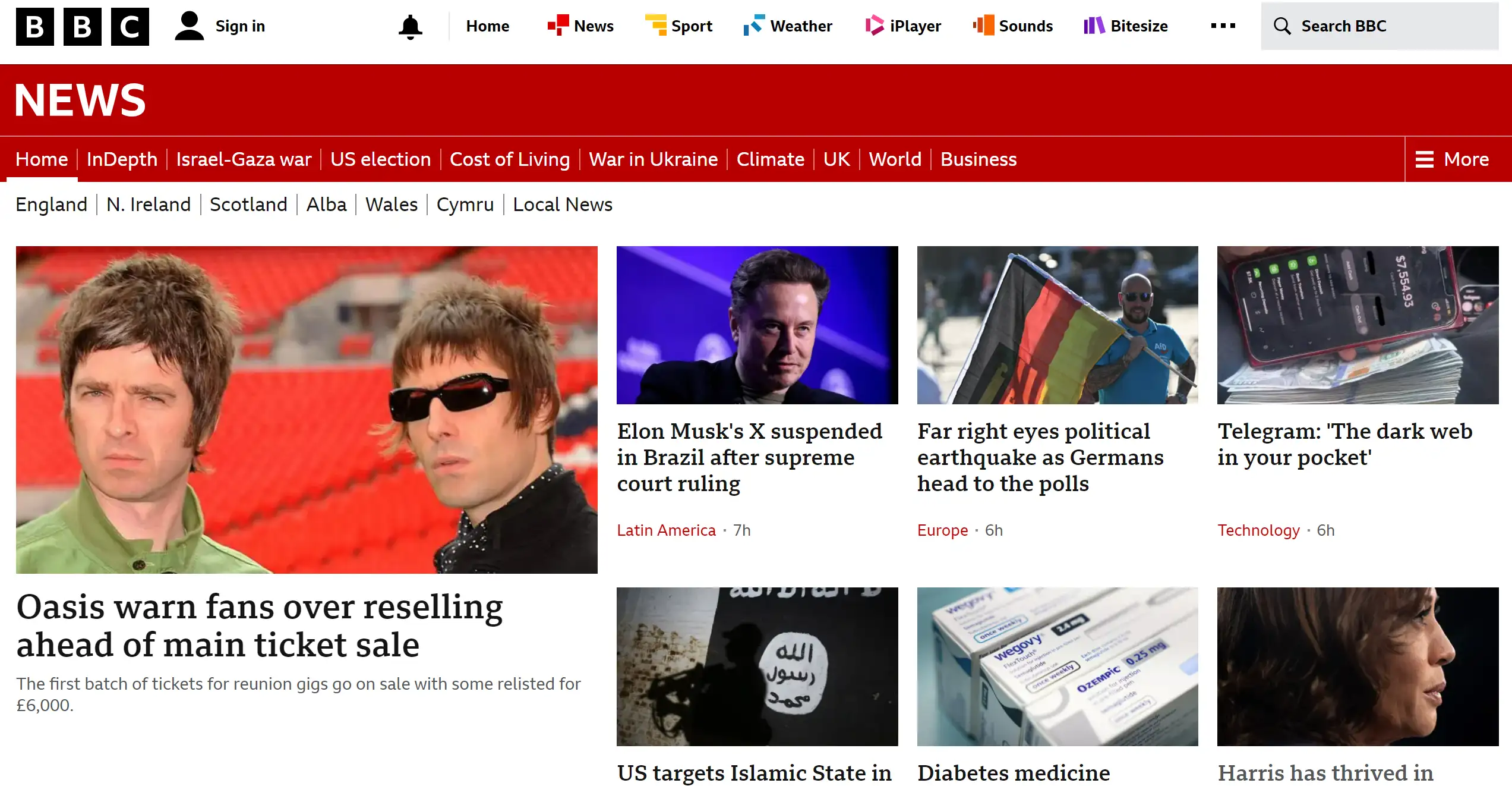
BBC News exemplifies how a global perspective can be delivered through a well-thought-out news website design. The layout is structured to prioritize clarity, with a homepage that efficiently highlights top stories from around the world. Subtle yet effective use of color guides users without overpowering them, ensuring a pleasant and organized browsing experience. The grid-style layout, complete with visually appealing images and clear typography, makes navigating the site straightforward. BBC’s news website design proves that a clean, organized interface can go a long way in delivering comprehensive and accessible news coverage.
4. Los Angeles Times

The Los Angeles Times sets itself apart with a sleek and modern news website design that emphasizes visual storytelling. The homepage’s oversized image slider immediately draws readers in, showcasing the latest headlines with compelling photographs. The minimal use of colour—punctuated by strategic pops of blue and orange—ensures that the content remains the focal point. The clear layout, combined with sections like News, Sports, and Entertainment, allows users to navigate the site effortlessly. This approach to news website design not only enhances the user experience but also reinforces the Los Angeles Times’ commitment to impactful journalism.
5. Forbes
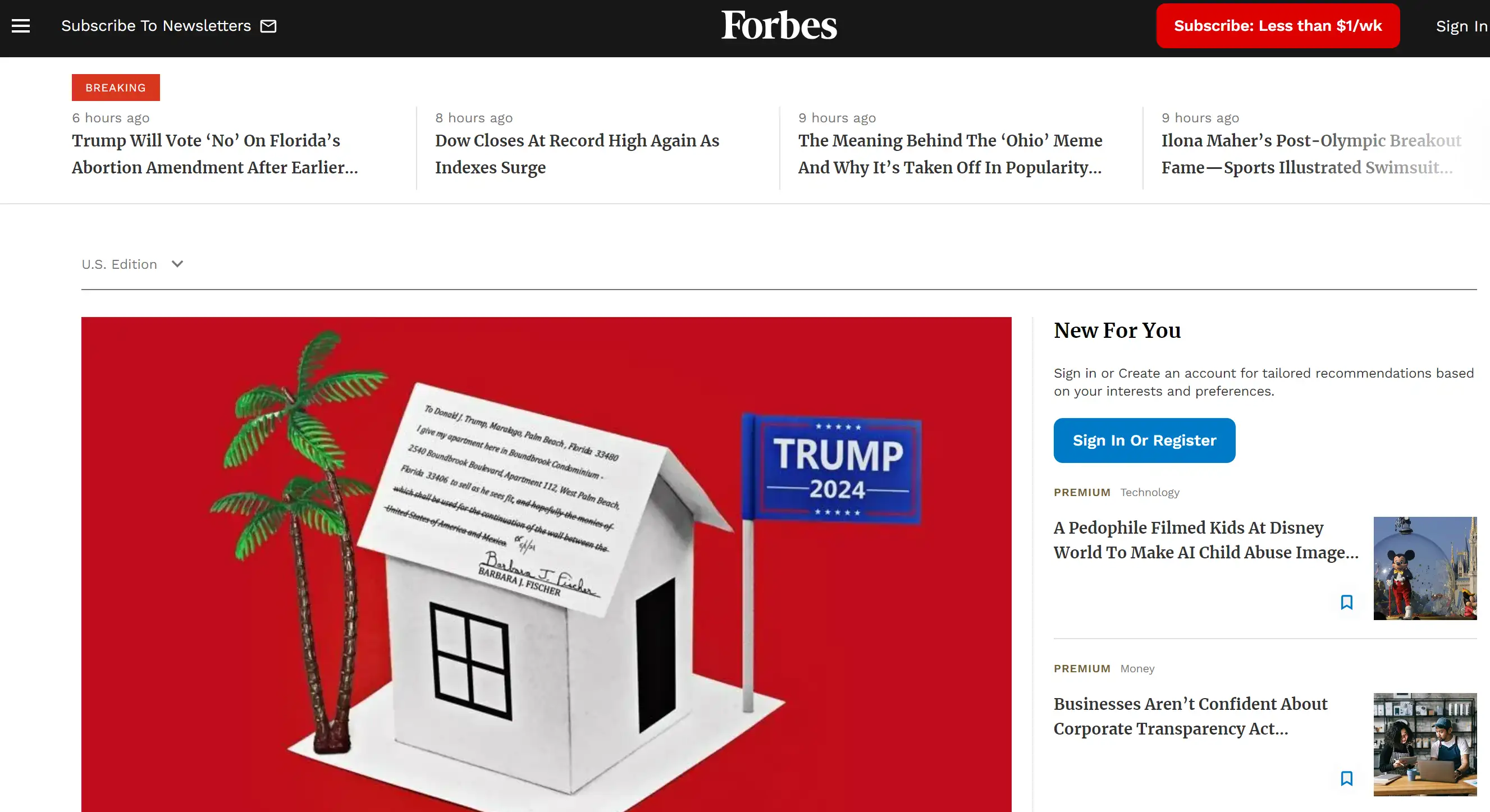
Forbes takes news website design to a new level with a clean yet creative approach that reflects the brand’s prestige. The site welcomes visitors with a high-quality image thumbnail and a sleek banner promoting brand initiatives. The design cleverly incorporates an animated counter to engage users, encouraging them to join Forbes’ vast readership. Social media integration is seamless, making it easy for visitors to share content across platforms. Forbes’ news website design stands out with its smooth, clean layout and subtle animations, proving that simplicity paired with innovation can make a lasting impression.
6. The Washington Post
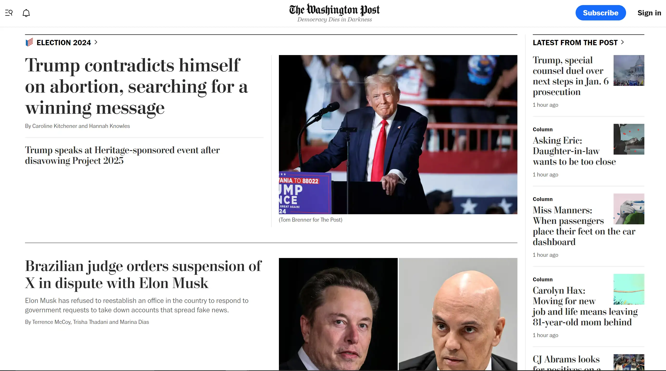
The Washington Post masterfully blends traditional journalism with modern design elements in its news website design. The homepage is a well-balanced mix of text and visuals, with easy-to-read headlines and images that complement the stories. Responsive design ensures the site functions perfectly across all devices, while fast loading times keep readers engaged. The site also features social sharing buttons, encouraging readers to disseminate stories within their networks. This thoughtful news website design preserves the gravitas of traditional journalism while embracing the efficiencies of modern technology.
7. CNN
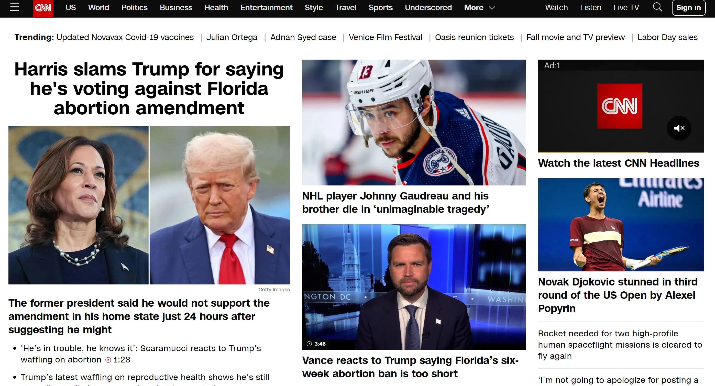
CNN’s news website design is all about keeping readers informed with a dynamic layout that includes headlines, images, and videos. The site is highly interactive, featuring live updates, polls, and comment sections that invite reader participation. The responsive design and fast loading times ensure that CNN remains a top destination for breaking news and in-depth analysis. The design is sleek, with a black background and red accents that give it a bold and modern look. CNN’s commitment to real-time news delivery is reflected in every aspect of its news website design, making it an essential resource for staying updated.
8. Fox News
Fox News delivers a bold and visually striking news website design that resonates with its audience. The homepage is filled with engaging headlines, images, and videos, creating a lively and immersive experience. The site’s design is optimized for speed, ensuring fast loading times that keep users engaged. Clear categories and an intuitive search function make navigating Fox News’ website a breeze. The dynamic layout, with its vibrant colours and eye-catching graphics, is designed to grab attention and convey a sense of urgency, making it a standout example of effective news website design.
9. NPR
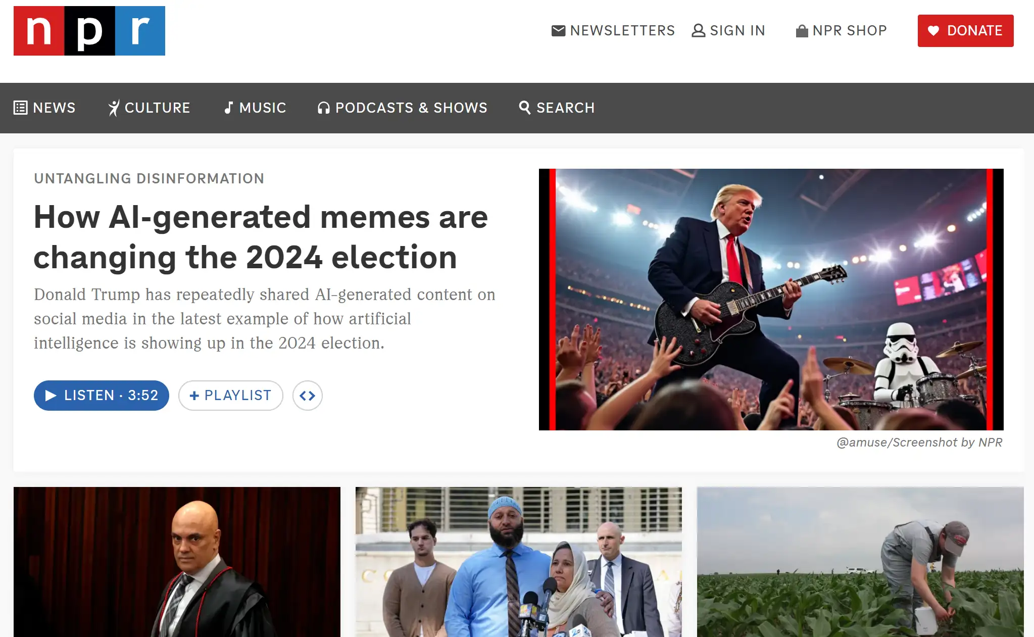
NPR’s news website design is a prime example of how to effectively focus on audio content. The clean and organized layout provides easy access to NPR’s extensive library of podcasts and radio shows, making it a hub for audio journalism. The design is simple but effective, prioritizing usability and accessibility for a wide range of users. Optimized for mobile devices, NPR’s site ensures that users can enjoy content on the go. This thoughtful approach to news website design highlights NPR’s commitment to providing quality audio content in a user-friendly format.
10. ABC News
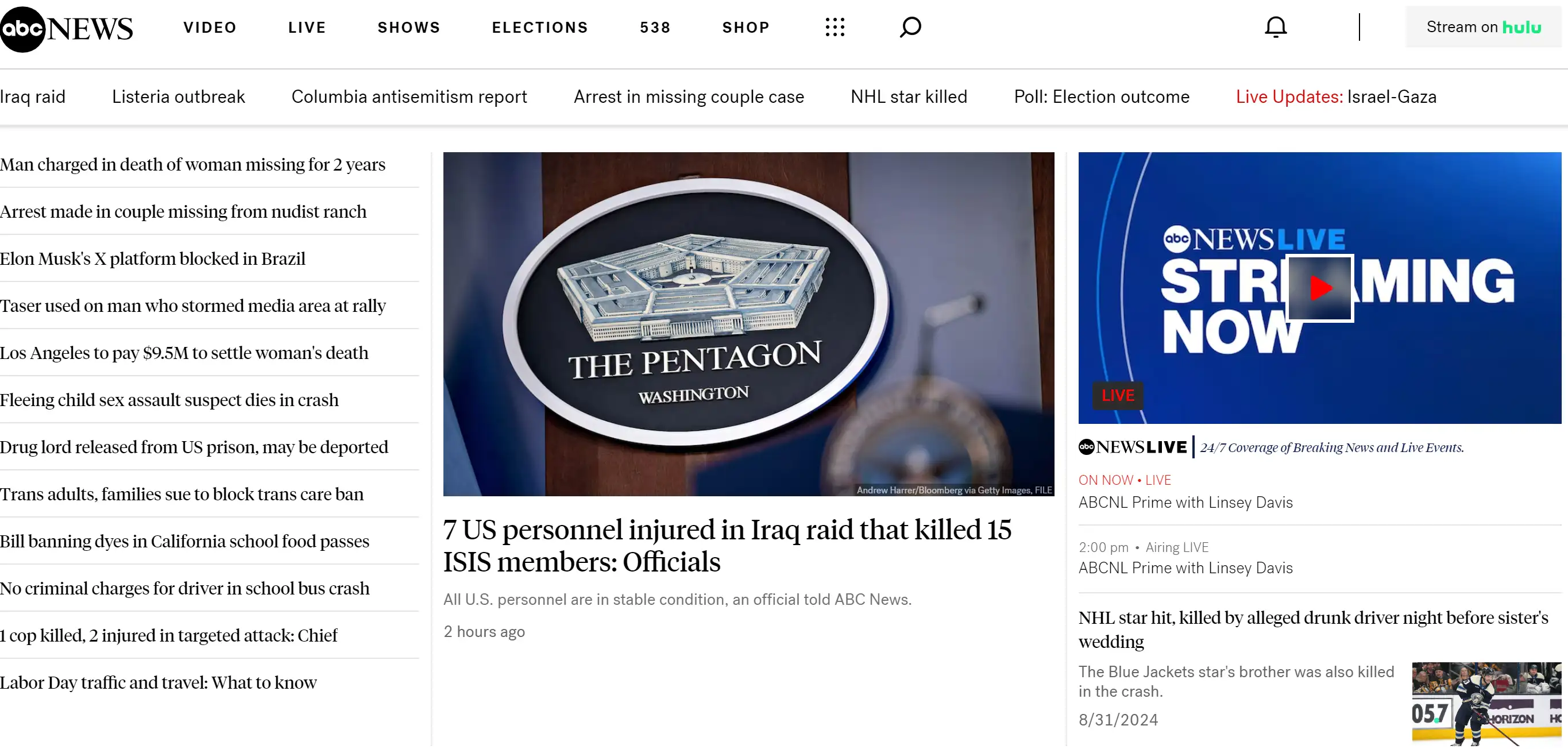
Keeping it as simple as possible, yet easy to navigate appears to be ABC News's main objective when it comes to the design of the news Website. This way of structuring the website is very useful because users do not have to search for the required information longer and are more confused. The primary benefit of a consistent colour palette and typography used in the platform is that it looks better and thus offers a better user experience. The organization of ABC News also ensures that different forms of multimedia can be incorporated into the presentation of the news. Due to this, the simplicity and efficiency that ABC News’ website delivers make the site a reliable, source for news.
11. TIME

Founded in 1923, TIME invented the modern news magazine format by distilling world events into accessible weekly packages. Its distinctive design language - particularly the red-bordered covers featuring influential figures - has become embedded in global media culture. The digital platform extends this legacy with responsive storytelling that respects readers' time.
Why It Stands Out:
TIME doesn’t just report news - it curates understanding. The magazine’s ability to maintain its iconic visual identity while evolving its content delivery (from print to digital to video) demonstrates remarkable brand adaptability in changing media landscapes.
12. Press and Journal

Rognsvoog reimagines traditional news presentation through strategic digital adaptation. By selectively introducing color to a primarily monochrome base, the design creates intuitive reading patterns without compromising the authoritative tone expected from established publications like The Washington Post.
Why This Matters for Digital News:
This prototype demonstrates how legacy media aesthetics can evolve for digital consumption. The thoughtful color coding and dual navigation system solve key UX challenges in news platforms:
- Immediate story prioritization (via color cues)
- Seamless wayfinding (through structured menus)
- Brand consistency (bridging print/digital identities
Crafting the Perfect News Website Design
I am very sure that if you are anything like me, then you know the feeling of being overwhelmed when it comes to designing a news website. Perhaps you have been thinking through what approach to use to make the more beautiful or how to place advertisements without repelling your readers. Believe me, I know how it feels—these are not surprising at all given today’s drive for digital solutions.
But here's the thing: It means that you don’t have to sort everything individually, all by yourself. Looking at year-on-year successful news website case studies will help conclude what works. These examples have set the standard and are used as a reference to show how these elite websites can include design with content in a way that user experience and content strategy do not overpower the design and, at the same time, do not overpower the user interface.
If you're still feeling stuck, consider this: the best news website examples also do not only look good to the eye but get the messages across for the readers to read through them continually. From the user interface to constant branding or fast loading of the flash or any other object used, these sites have provided the best user experience. And guess what? You can too.
Therefore, if you are primed to advance to the next level of your news site design, immerse yourself in Wegic. Wegic can assist you with a much-needed kick-start to build a site that is way beyond your imagination.
Written by
Kimmy
Published on
Mar 17, 2026
Share article
Read more
Our latest blog
Webpages in a minute, powered by Wegic!
With Wegic, transform your needs into stunning, functional websites with advanced AI
Free trial with Wegic, build your site in a click!
What kind of website do you want to build?