Log in
Build Your Site
12+ Lead Capture Page Best Practices & Examples
Discover 12+ best practices and examples for creating high-converting lead capture pages. Enhance your marketing strategy and boost lead generation today!
Did you know that businesses with effective lead capture pages can see conversion rates soar by up to 50%?
This staggering statistic highlights just how crucial these pages are in today's digital marketing landscape. In an age where capturing attention is fleeting, a well-designed lead capture page acts as your digital storefront, inviting potential customers to step inside and engage with your brand.
Lead capture pages are the doorstep to your marketing funnel, transforming curious visitors into valuable leads. They not only collect vital information but also set the stage for building meaningful relationships with your audience.
Understanding how to create compelling lead capture pages isn’t just a technical skill; it’s an essential strategy for anyone looking to thrive in the competitive online business world. Let’s explore best practices that can elevate your lead generation efforts and turn your website into a powerful tool for growth.
Understanding Lead Capture Page
Definition
A lead capture page is essentially a targeted web page crafted to gather information from prospective customers.
Its primary goal is to convert visitors into leads by prompting them to provide their contact details, such as email addresses or phone numbers, often in exchange for valuable offerings like a free eBook, exclusive discounts, or a newsletter subscription. The key is to present a compelling incentive that encourages users to take that crucial next step.
Lead Capture Page vs. Landing Page
While lead capture pages might sound similar to landing pages, they serve distinct functions. A landing page is a more general term for any standalone web page where visitors arrive after clicking a link, and it can be used for various marketing objectives.
In contrast, lead capture pages focus specifically on the process of collecting user information. Whereas landing pages might showcase a product or service, lead capture pages hone in on enticing visitors to fill out a specific form.
Recognizing this difference is essential for creating a marketing strategy that effectively connects with your audience.
Lead Capture Pages: Importance
Integral to the Marketing Funnel
-
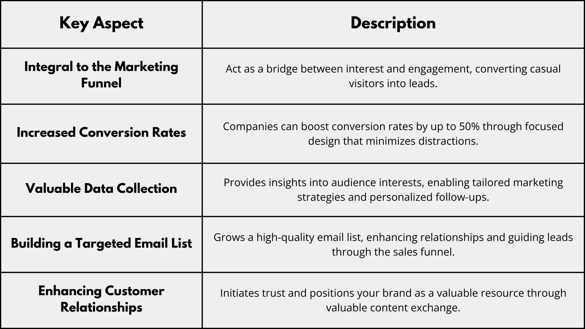
Lead capture pages play a pivotal role in the marketing funnel, acting like a catalyzer between initial interest and actionable engagement. When potential customers land on your website, these pages guide them towards sharing their information, transforming casual visitors into leads who are more likely to convert.
Increased Conversion Rates
-
As mentioned before, companies that excel in lead capture can boost their conversion rates by up to 50%. This increase is largely due to the focused nature of lead capture pages, which minimize distractions and streamline the user experience, encouraging visitors to take the desired action.
Valuable Data Collection
-
Collecting data through lead capture pages provides invaluable insights into your audience. By understanding who your leads are and what interests them, you can tailor your marketing strategies and communications. This data allows for personalized follow-ups, enhancing your chances of converting leads into loyal customers.
Building a Targeted Email List
-
Lead capture pages are instrumental in growing a high-quality email list. This list becomes a powerful asset for nurturing relationships and guiding leads through the sales funnel. Studies show that targeted email campaigns can lead to a 122% return on investment, proving the effectiveness of maintaining a strong connection with your audience.
Enhancing Customer Relationships
-
By encouraging visitors to share their information in exchange for valuable content, you’re not just collecting data--you’re also initiating a relationship that fosters trust and establishes a foundation for future interactions, positioning your brand as a valuable resource in your audience's journey.
Lead Capture Page: 12 Best Effective Practices
Creating an effective lead capture page requires a thoughtful approach that balances design, content, and user experience. Here are over a dozen best practices to help you build compelling pages that convert visitors into leads.
1. Clear and Compelling Headline

-
Explanation
-
Since the title is the first thing visitors will see, it must catch their attention right away, communicate the value proposition clearly, and encourage them to read more.
-
Example
-
Instead of a generic headline like "Start Now," try something more enticing, like "Unlock Designated Tips to Boost Your Marketing Strategy Today!" This approach not only states what the user will get but also invokes a sense of urgency.
2. Engaging Visuals

-
Explanation
-
Visual elements can significantly enhance the appeal of your lead capture page. High-quality images, graphics, or videos can convey your message more effectively than text alone, creating a more engaging experience.
-
Example
-
Use a relevant image, such as a person joyfully reading an eBook, alongside your lead capture form. This visual reinforces the value of what you’re offering and helps visitors envision the benefits.
3. Simple and Intuitive Layout
-
Explanation: A cluttered design can overwhelm visitors and distract them from the primary goal: filling out the form. A clean, intuitive layout guides users toward action without confusion.
-
Example: Organize your content in a single column with clear sections. Keep essential elements—like the form and CTA—above the fold, making them immediately visible when the page loads.
4. Strong Call-to-Action (CTA)

-
Explanation
-
The CTA is a crucial element of your lead capture page, prompting users to take action. It should be clear, compelling, and create a sense of urgency.
-
Example
Instead of a bland button saying "Submit," use a more dynamic phrase like "Get My Free Sample Now!" to create a stronger incentive for visitors to click.
5. Minimal Form Fields

-
Explanation
-
The number of fields in your lead capture form can dramatically affect conversion rates. Too many fields can discourage users from completing the form.
-
Example
-
Aim for the essentials—like name and email address—rather than lengthy forms. You can always collect more information later through follow-up communications.
6. Trust Signals (e.g., testimonials, security badges)

Explanation
-
Trust signals reassure visitors that their information is safe and that they’re not being fooled. Incorporating these elements can significantly increase conversion rates.
-
Example
-
Display customer testimonials alongside your form or add a security badge near the submission button. For instance, a note saying, “Your information is secure with us” accompanied by a recognizable security logo can instill confidence.
7. Mobile Optimization
-
Explanation
-
With a significant portion of web traffic coming from mobile devices, your lead capture page must be optimized for mobile users. This includes responsive design that adapts seamlessly to different screen sizes.
-
Example
-
Ensure that your form fields are easy to fill out on a mobile device. Large buttons and simple navigation can enhance the user experience, leading to higher conversions.
8. A/B Testing Strategies
Source: UX Design Institute
-
Explanation
-
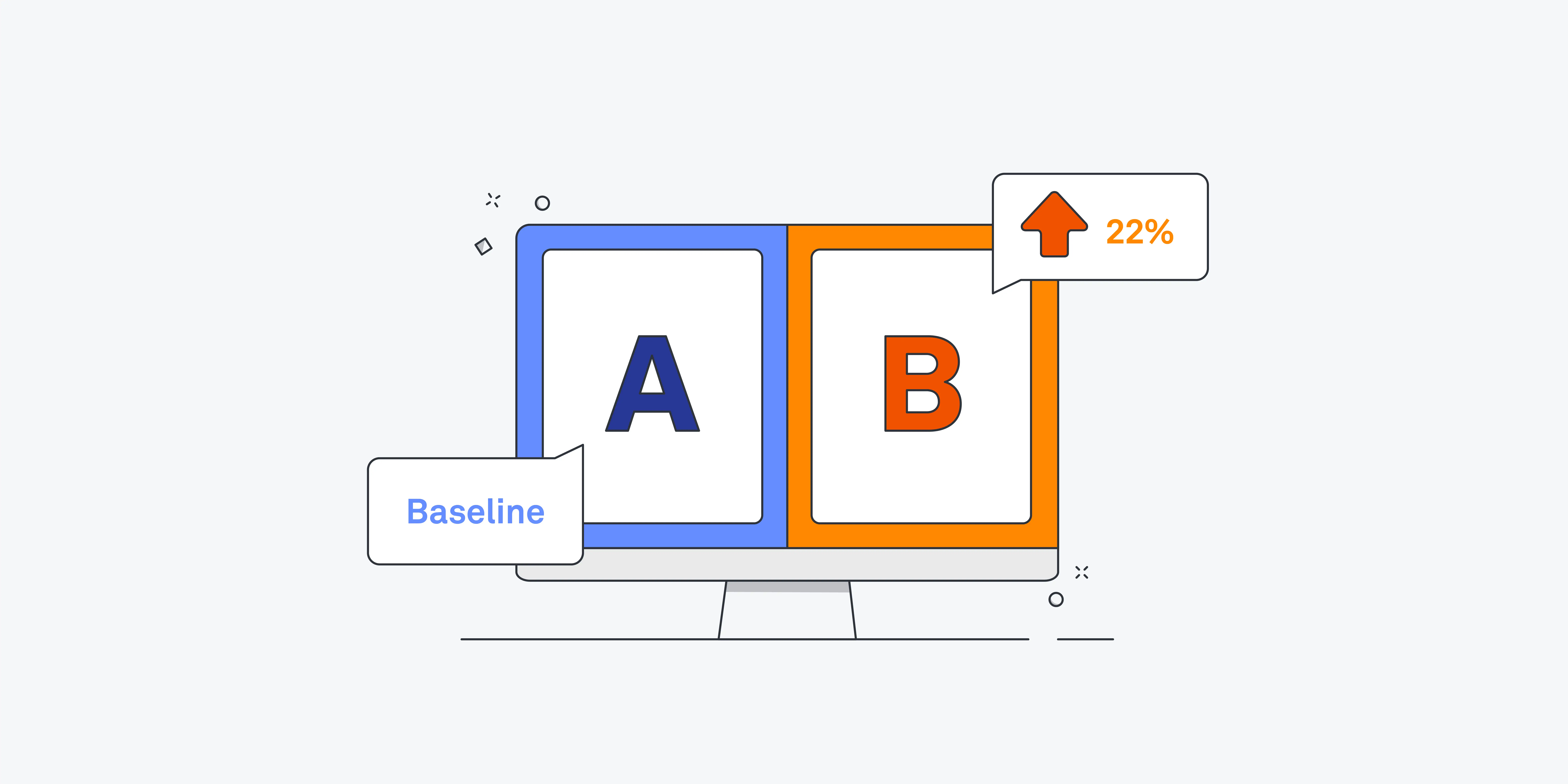
A/B testing compares two iterations of your lead capture page to determine which one works best. A data-driven strategy can help you determine which version of your page your audience responds to the most.
-
Example
-
Test different headlines, visuals, or CTA phrases. For instance, compare a page with “Download Now” versus “Get Instant Access” to see which drives more conversions.
9. Incentives for Users (e.g., free eBooks, discounts)

-
Explanation
-
Offering something of value in exchange for contact information can significantly boost your conversion rates. This incentive should align with your audience’s interests.
-
Example
-
If you’re a marketing consultancy, offering a free eBook on “10 Proven Strategies for Digital Marketing Success” can attract visitors eager to learn and engage with your brand.
10. Relevant Content Alignment

-
Explanation
-
Ensure that the content on your lead capture page aligns with what visitors expect based on where they came from. Mismatched content can lead to confusion and high bounce rates.
-
Example
-
If users clicked on a link about “Improving SEO,” the lead capture page should offer an SEO-related resource rather than something unrelated like a product catalog.
11. Social Proof

-
Explanation
-
Social proof, such as user reviews or case studies, can provide reassurance to potential leads. It shows that others have found value in your offering, making new visitors more likely to engage.
-
Example
-
Feature quotes from satisfied customers or stats like “Join over 10,000 subscribers who love our tips!” to encourage new users to take action.
12. Thank You Page Follow-Up

-
Explanation
-
After a user submits their information, redirecting them to a well-designed thank you page can reinforce their decision and guide them to the next step in the customer journey.
-
Example
-
On the thank you page, express gratitude with a message like “Thank you for signing up! Your free guide is on its way to your inbox.” You can also suggest further actions, like following you on social media or exploring related resources on your site.
Lead Capture Page: 4 Best Examples
Creating effective lead capture pages can significantly enhance your marketing strategy. Here are four standout examples, along with an analysis of what makes each successful.
1. HubSpot’s Free Marketing Tools Page
Overview
-
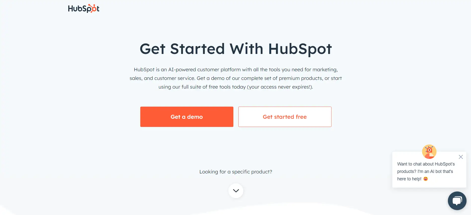
HubSpot offers a dedicated page that promotes its free marketing tools, including email marketing and landing page builders.
Analysis
-
Clear Value Proposition: The headline, “Free Marketing Tools to Grow Your Business,” immediately conveys the benefit, making it clear what users will gain.
-
Minimalist Design: The page is visually clean, with ample white space that directs attention to the sign-up form without distractions.
-
Strong Call-to-Action: The CTA button reads “Get Started Free,” which is action-oriented and emphasizes the no-cost aspect.
-
Trust Signals: HubSpot showcases user testimonials and logos of well-known brands that use their tools, enhancing credibility.
2. Neil Patel’s SEO Analyzer
Overview
-
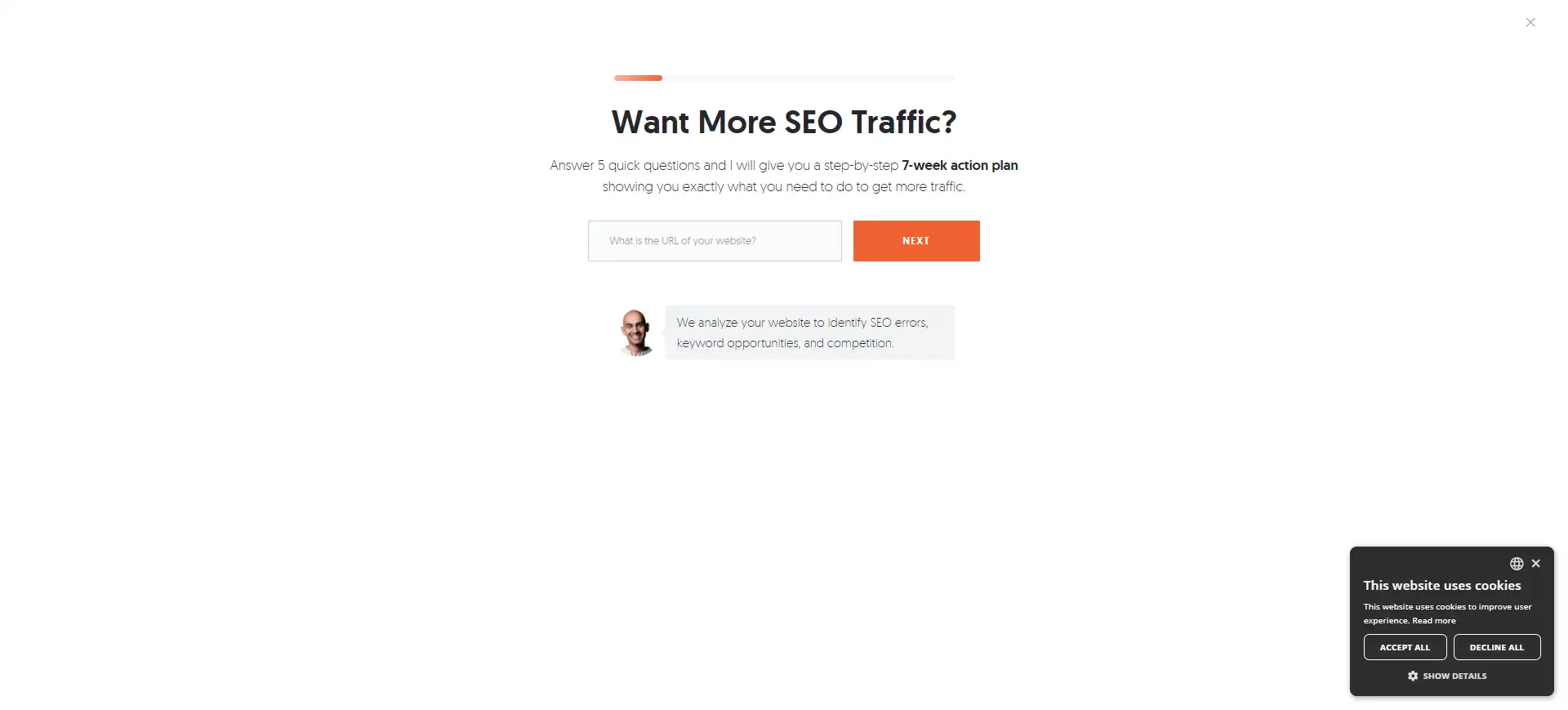
Neil Patel’s SEO Analyzer tool offers a free website analysis to help users understand their SEO performance.
Analysis
-
Engaging Visuals: The page features eye-catching graphics and a video explaining the tool’s benefits, drawing visitors in and enhancing engagement.
-
Focused Form: The form is straightforward, requiring only essential information (name and email), which reduces friction and encourages submissions.
-
Incentives: The page highlights the benefits of the analysis, making it clear what users will gain in return for their information.
-
Clear Instructions: Step-by-step prompts guide users through the process, making it easy for them to understand what to expect.
3. Mailchimp’s Email Marketing Guide
Overview
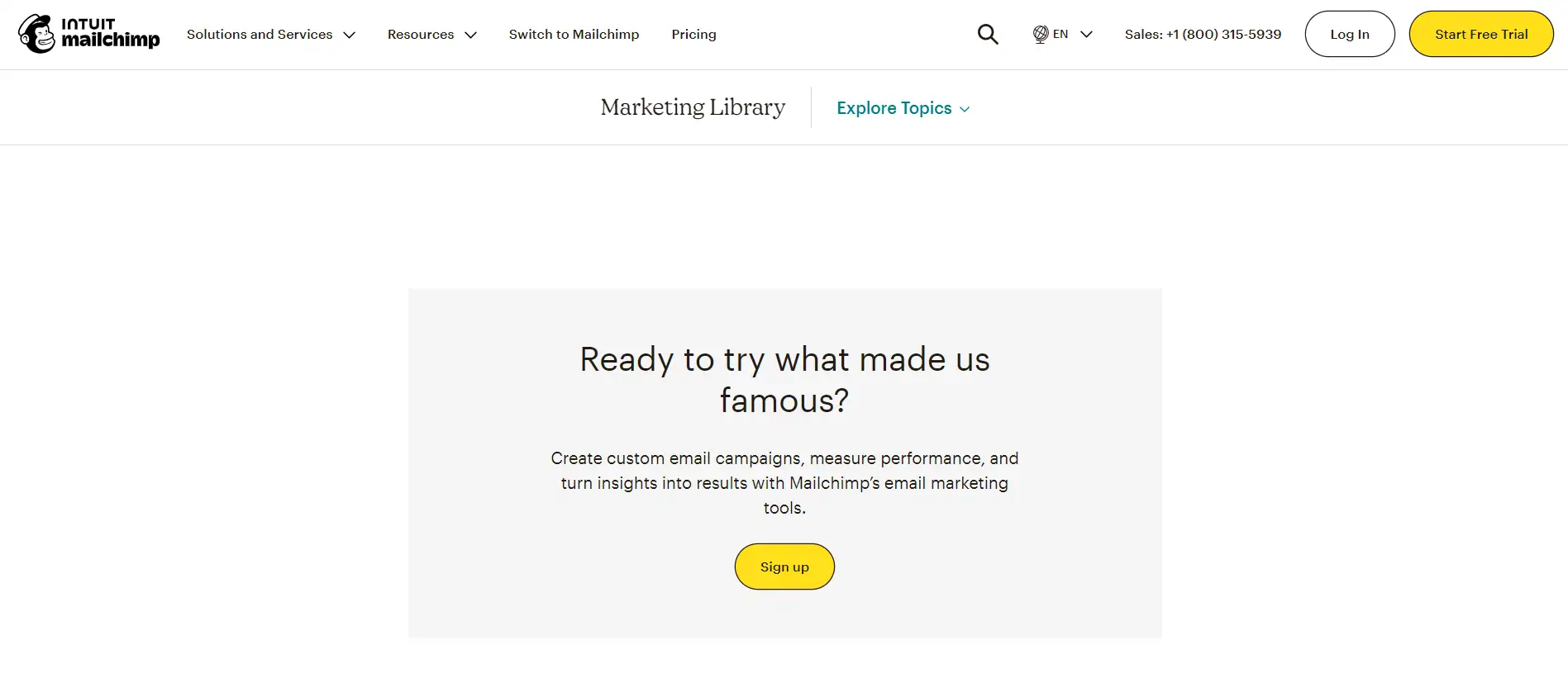
Mailchimp offers a lead capture page for its comprehensive email marketing guide, targeted at businesses looking to enhance their email campaigns.
Analysis
-
Compelling Headline: The headline, “Unlock the Secrets of Email Marketing,” piques curiosity and promises valuable insights.
-
Relevant Content Alignment: The page features excerpts and highlights from the guide, enticing users to want the full content.
-
Strong Visual Elements: Engaging visuals complement the text, making the page more appealing and easier to digest.
-
Social Proof: Mailchimp incorporates statistics about their user base, reinforcing trust and demonstrating the effectiveness of their strategies.
4. Canva’s Design Courses
Overview
-
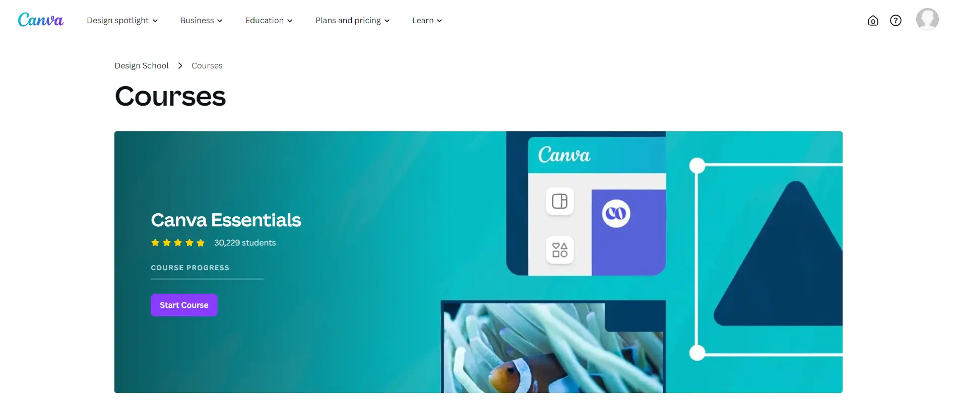
Canva promotes its design courses through a lead capture page that offers free access to valuable design resources.
Analysis
-
User-Friendly Layout: The layout is clean and intuitive, with a prominent sign-up form and relevant course information.
-
Strong CTA: The button reads “Join Now for Free,” which clearly communicates the value proposition and creates a sense of urgency.
-
Incentives for Users: The page lists the benefits of the courses, including skills users will gain and potential applications, making it clear what they stand to lose by not signing up.
-
Engagement Opportunities: Canva encourages further interaction by providing links to related resources and social media, nurturing ongoing engagement.
Conclusion
Lead capture pages are essential in today’s digital marketing landscape, serving as vital entry points that convert curious visitors into valuable leads. By effectively gathering user information, you can foster meaningful relationships and nurture potential customers through personalized interactions.
Implementing the best practices discussed can significantly enhance your lead capture efforts. Focus on creating compelling headlines, optimizing forms, and incorporating trust signals.
Remember to test and refine your strategies regularly to discover what resonates most with your audience. With these insights, you’re well on your way to crafting successful lead capture pages that drive results!
Written by
Kimmy
Published on
Mar 12, 2026
Share article
Read more
Our latest blog
Webpages in a minute, powered by Wegic!
With Wegic, transform your needs into stunning, functional websites with advanced AI
Free trial with Wegic, build your site in a click!
What kind of website do you want to build?