Best 15 Food Website Examples of 2025
Explore the best food website examples of 2025, get inspired, enhance your brand image, and enjoy exceptional user experience and visual design!

Food website design is akin to the art of plating in cooking. You may have a plate of top-notch cooking ingredients, but if the presentation is haphazard and lacks aesthetic appeal, the sense of anticipation and the experience for the diners' taste buds will be greatly diminished.
Design for a food website is not just a superficial modification, but the key to giving life and soul to the website, just like the seasoning in the food. Without it, even the best content will lose its proper charm. In this blog, we focus on what makes a perfect food website, and 15 best food website examples to share with you guys for inspiration in website design.
Why Should Any Food Website Focus on Design?
-
Visual Appeal: The colors and layout of a design are like the selection and combination of ingredients. Food is a combination of sight and taste, and since users can't taste food directly through the screen, the design must present the flavour visually. With high-quality food images, attractive color schemes, and appropriate layouts, design can make users "see" how good food tastes, which in turn stimulates their appetite and desire to buy.
-
Brand Personality: The design of a food website is an extension of the brand's personality. Whether it's a modern, minimalist design style or a cozy atmosphere with a rustic feel, the design must fit with the brand's core values and target audience. A good website design is one of the best ways to create memories for users.
-
User Experience: Users need to quickly find what they are looking for when navigating a website, such as menus, recipes, or ordering buttons. Simple and clear navigation, fast-loading pages, and responsive design are all key to improving the user experience. Not only does this reduce bounce rates, but it also boosts user loyalty and makes them want to come back.
-
Conversion & Sales: The ultimate goal of design is to drive conversions. Whether it's ordering food, purchasing a product or sharing content, design must guide users through these key actions. With clear calls to action (CTAs), enticing discount displays, and user-friendly purchase processes, design can dramatically increase website conversions and help brands achieve their business goals.
15 Best Food Website Examples of 2025
1. UND

-
The food site's key design components are scrolling animations and vivid graphics with kinetic effects, which demonstrate that the brand makes meals colorful and entertaining.
-
UND's logo animation is very original, the page scrolling logo animation also changes the layout, which also leaves the website user with UND's brand personality memory.
-
The web page has a hamburger-style menu bar but includes a "CART" button that is pasted at the top of the page. UND also focuses on engaging users on their social media platforms, adding an Instagram icon to capture the user's attention through a micro-interactive design.
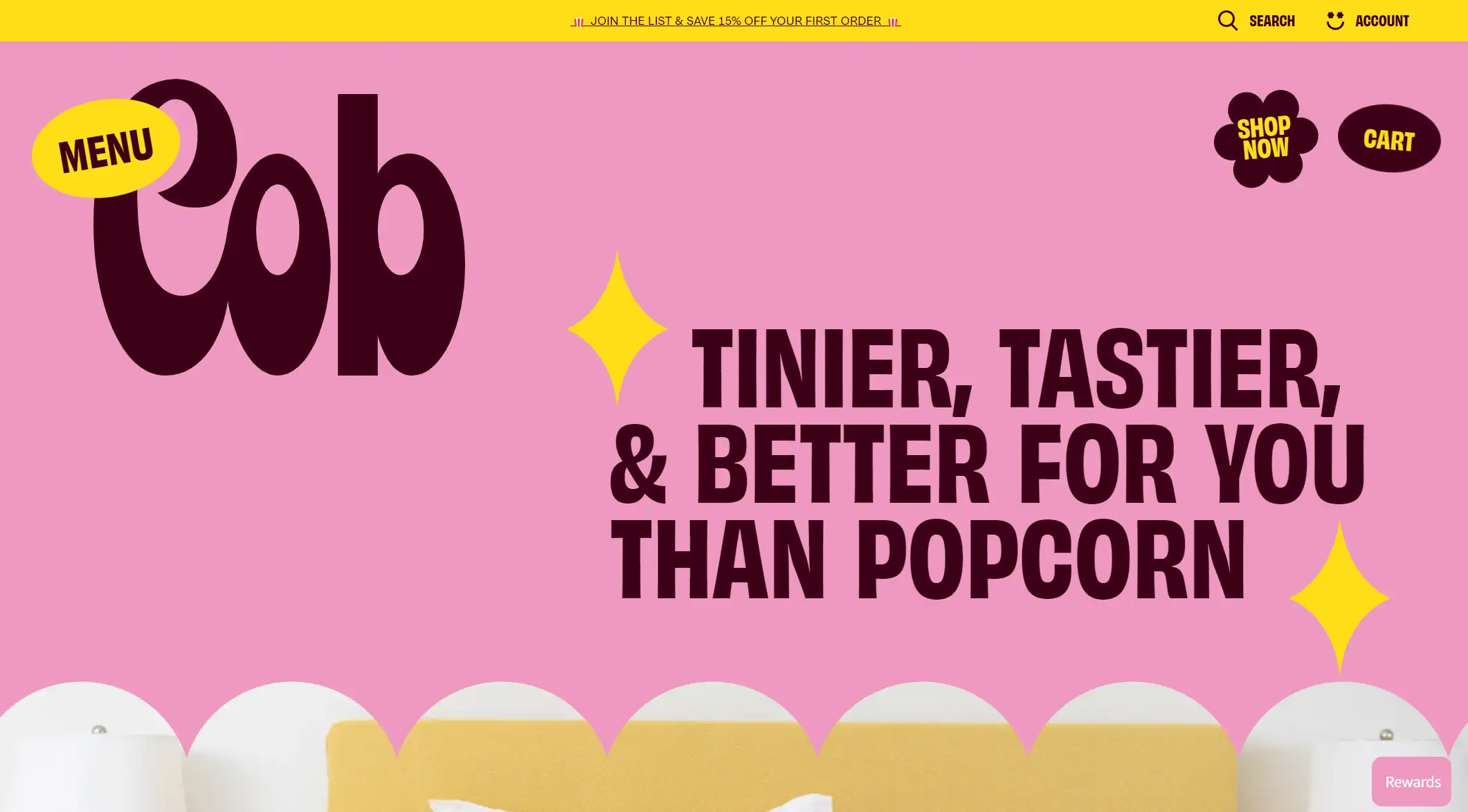
2. Cob
-
Cob's website uses eye-catching colors such as green, pink, yellow, and purple, which are not only impressive, but also convey the vibrancy and uniqueness of the snack brand.
-
Cob's use of bold fonts makes the brand name and key messages stand out, easily grabbing the user's attention. By using bold text and design elements like "WOW YUM CRAVEABLE", the site creates a fun and compelling user experience.
-
This gourmet website provides detailed nutritional information sheets that clearly show the nutritional content of each product. Real user feedback and this transparent way of delivering information can win consumers' trust, especially in the health food market. It helps to build brand credibility.
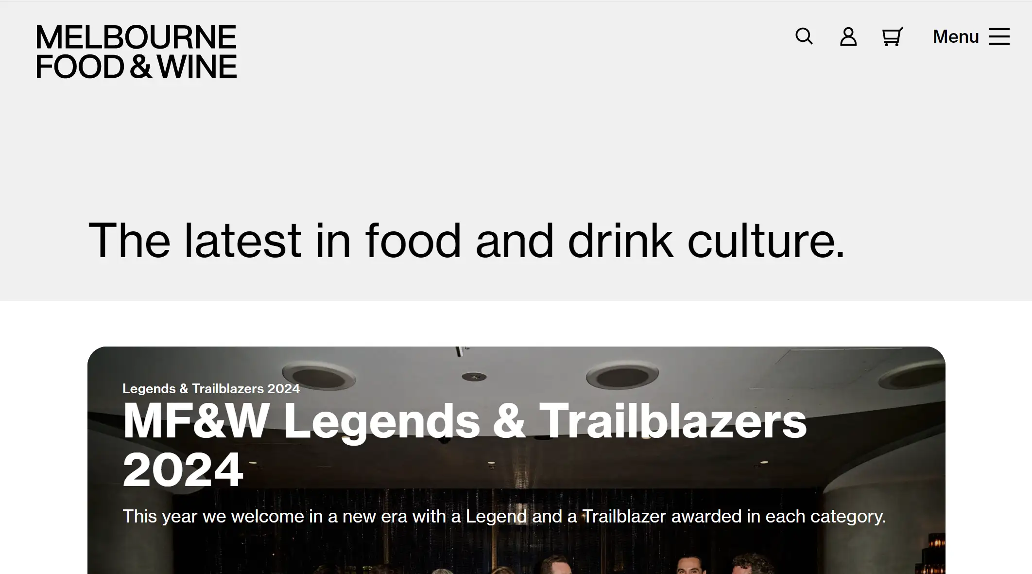
3. Melbourne Food&Wine
-
A lot of information related to food culture can be conveyed on a website. This website adopts a partitioned layout, displaying important content such as news, stories, and recommended dishes separately, so that users can easily find the parts they are interested in while browsing.
-
The website makes extensive use of high-quality images of food and people to authentically convey the visual appeal of the cuisine. This not only whets the user's appetite but also enhances the brand's professional image. As food web designers, this is a reminder that high-quality images are an important tool for communicating a brand's image.
-
A fixed menu bar at the top of the page keeps users from getting lost. The site's navigation is designed to be clean and easy to follow, allowing users to quickly find the information they need. This ease of use enhances the user experience while also strengthening the user's favorable impression of the brand.
-
The Melbourne Food & Wine website showcases a clear and user-friendly design style, with large headlines in larger fonts, paired with high-quality images that highlight the main message. The paragraphs in the body of the articles are designed to be concise and each paragraph is not too long, making it easy for users to quickly skim and understand the content.
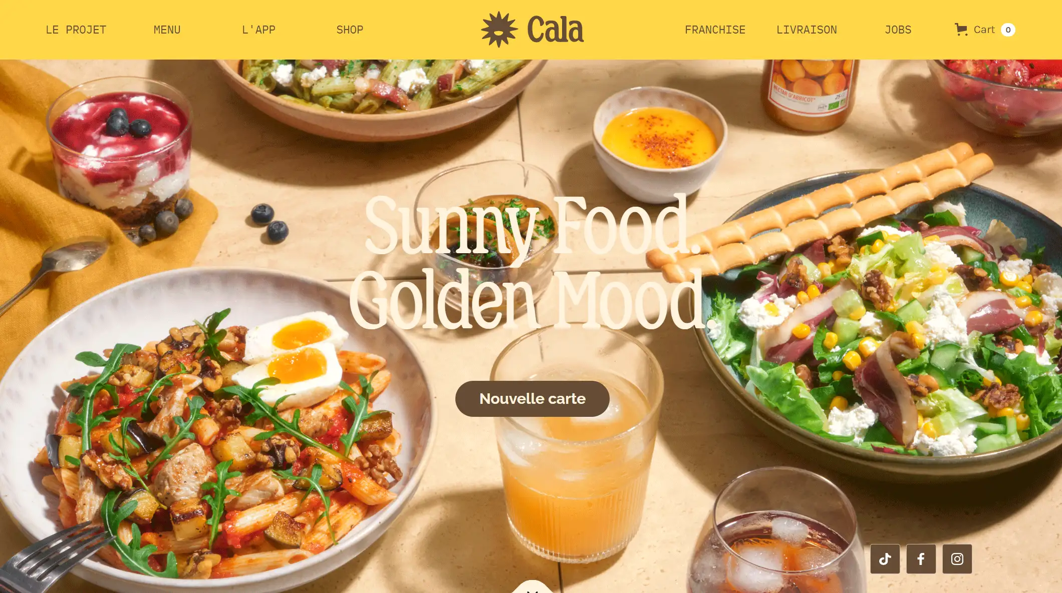
4. CALA
-
Cala's website has a section dedicated to Instagram posts for users to read and browse, which also encourages users to share and follow their social media accounts, enhancing the brand's online presence.
-
Cala employs a large number of CTA buttons and uses explicit call-to-action text, (e.g. Pour vous donner l'eau à la bouche), to motivate the user to take further action, such as ordering or downloading the app.
-
Cala uses a responsive design page to ensure that users can open Cala on mobile devices, and there are also apps designed specifically in a miserably lousy way for site visitors to learn about their subscription services.
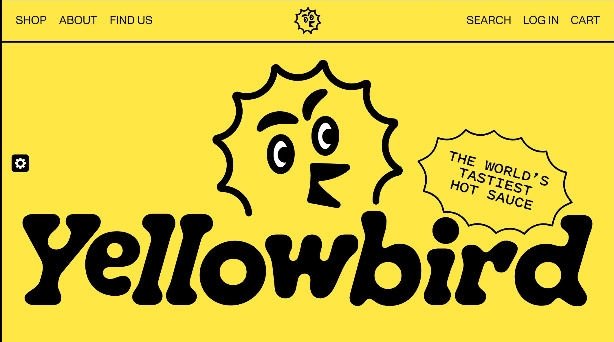
5. Yellow Bird
-
First of all, the color palette of this site is bold and jumpy, with yellow as the main color and black fonts to match, which creates a strong visual impact and attracts the user's attention.
-
The site's product display also uses large images, with concise descriptions, highlighting the characteristics of the product.
-
In addition, the video display of the raw materials of the products on the website not only reflects the high quality of Yellow Bird's products but also enhances the trust of the brand.
-
The example of a food website also shows us that website design can be creative. The website uses cartoon images and vivid patterns, coupled with the dynamic effects of image micro-interactions, which can create a relaxing and enjoyable brand atmosphere.
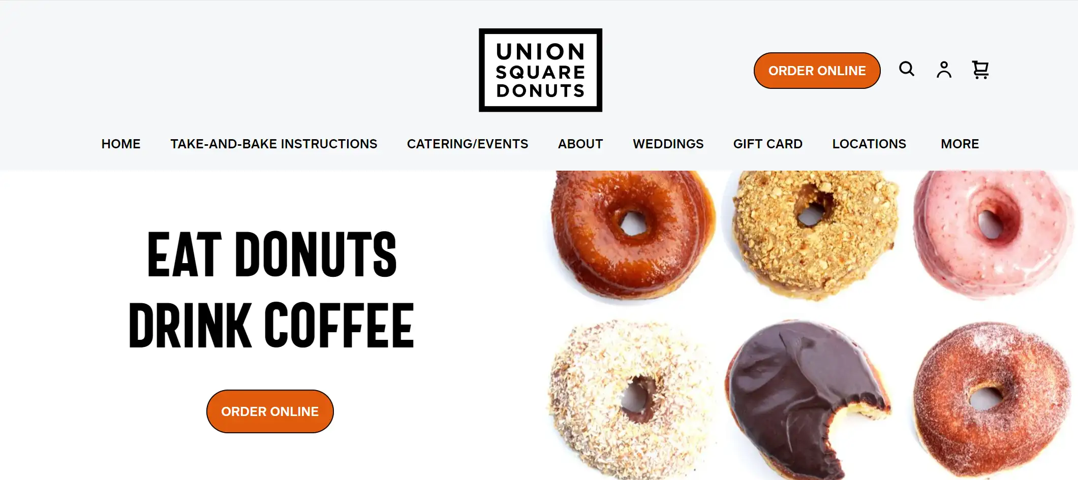
6. Union Square Donuts
-
The site serves products that reflect the food company's sales strategy, including seasonal specialties also offers home baking options to satisfy customers' need to make donuts at home.
-
This site shows the location of the stores through a map, making it easy for users to find them. Displaying the address and opening hours of each store enhances the user experience of this food website.
-
Since the site only offers offline stores, there are plenty of CTA buttons on the site that call on users to order online and follow events, which helps to motivate users to buy and take action to increase conversion rates.
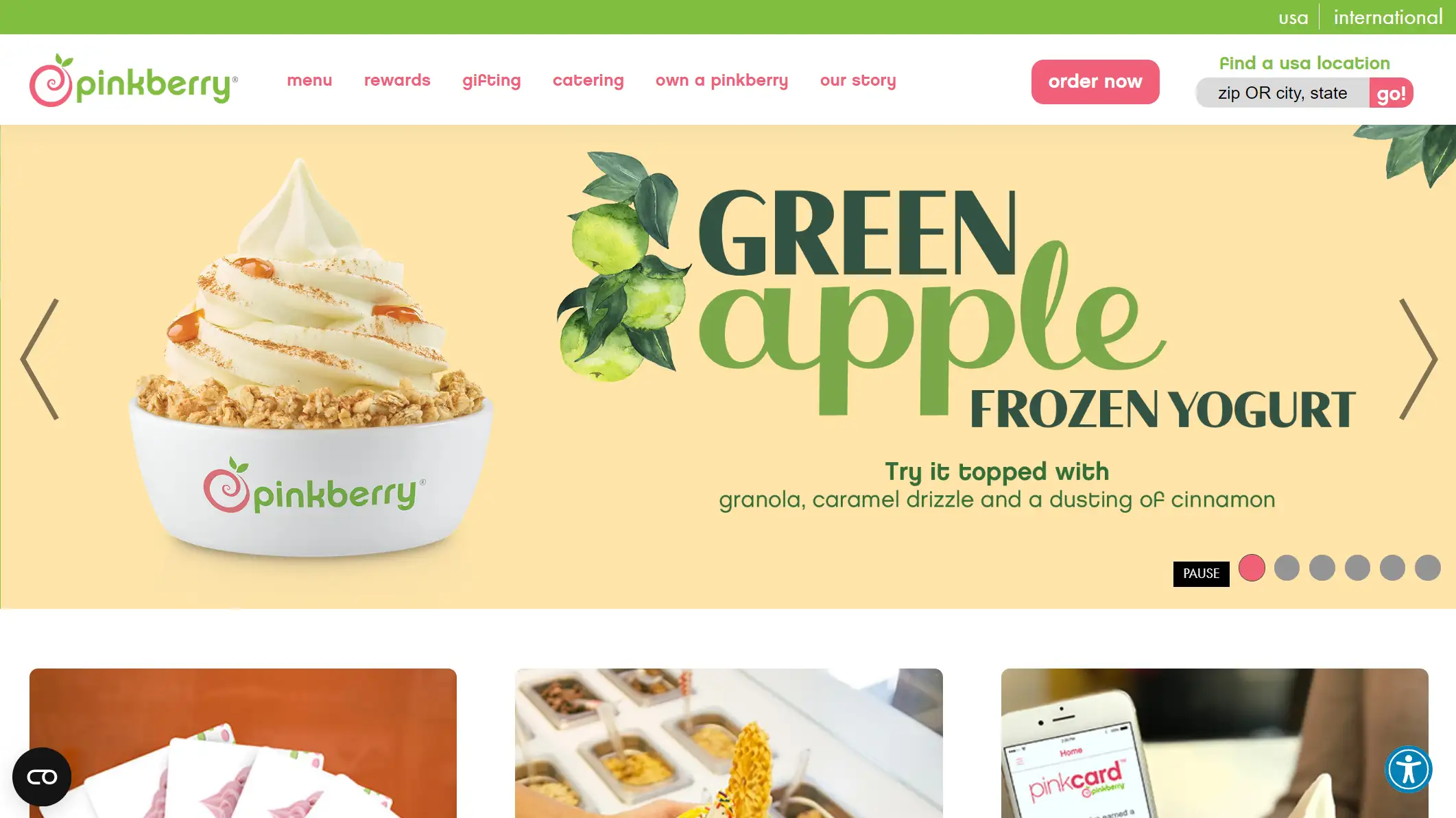
7. PinkBerry
-
Pinkberry's website content is featured prominently, with text on the site enticing consumers to try new products through CTA appeals. The brand also offers online ordering and takeaway services, which helps boost sales rates.
-
The main page of the website adopts user-friendly drop-down menus to categorize and expand different information contents, including menu, takeaway, rewards, etc. The website navigation is clear and enhances user experience.
-
The site performs well across devices, ensuring that the user experience is consistent across phones, tablets, and computers. Pinkberry's app also offers payment, compensation, and gifting features.
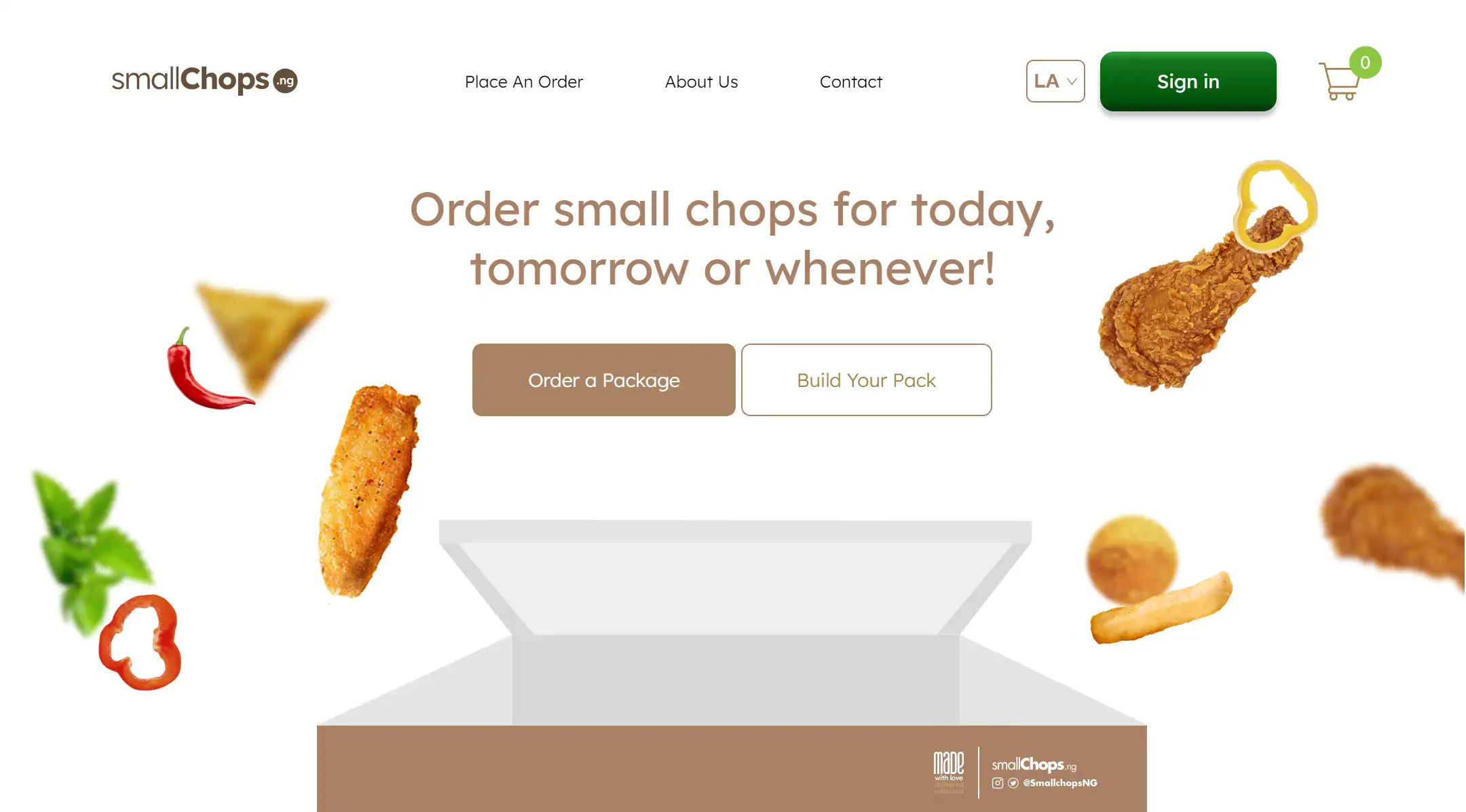
8. Small Chops
-
The home page of the site features a brief motion picture that shows many of the casual food items, such as fried chicken and nuggets, popping out of the package. The copy reads, "Order small chops for today, tomorrow or whenever!" and the CTA button "Order Now" urges the user to click to order.
-
Small Chops also employs a minimalist design style, cleaning up the obvious menus and layouts so that first-time users can find the information they're looking for and a simple process for purchasing products.
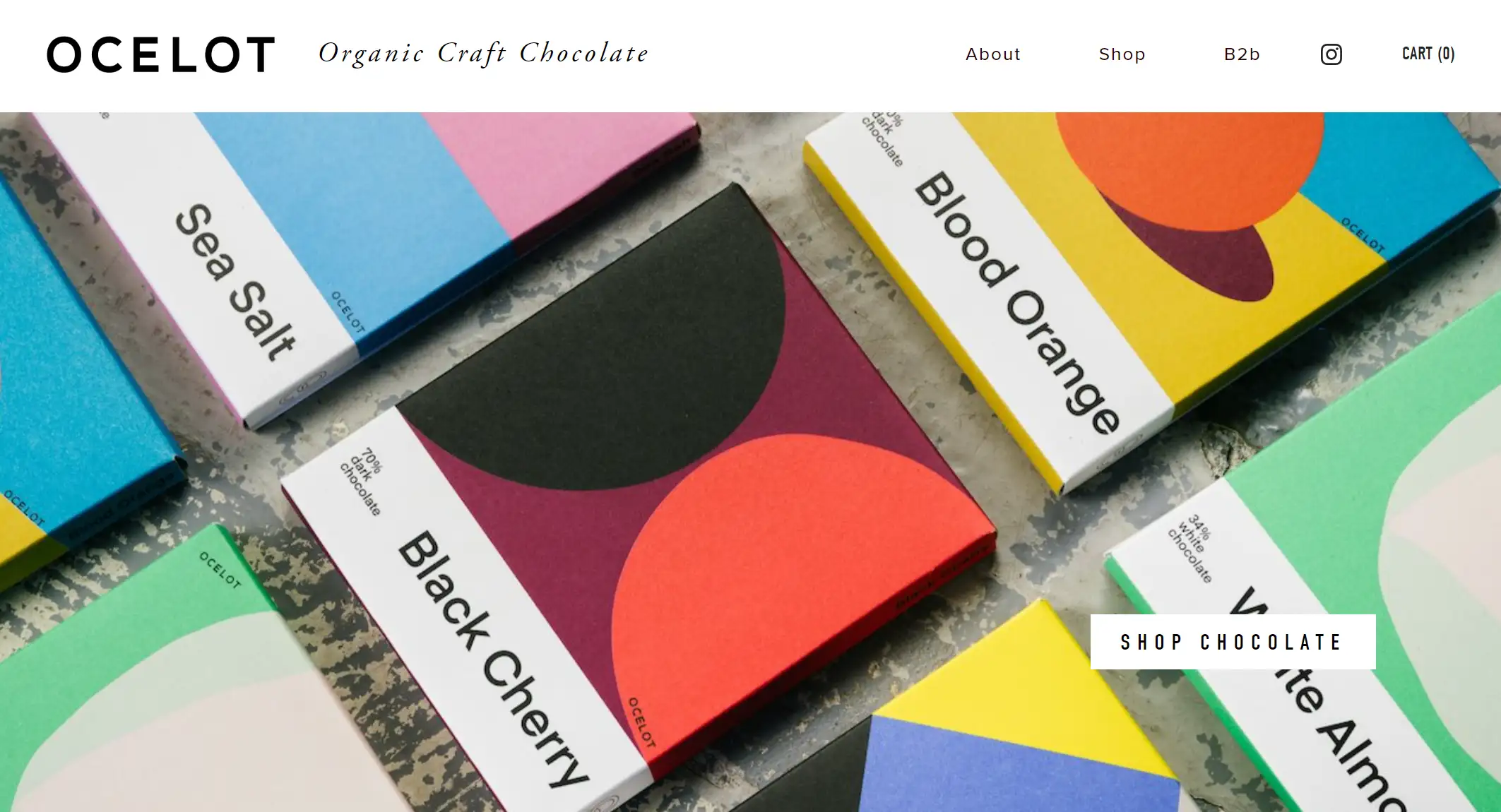
9. Ocelot Chocolate
-
The background page of the site is white, with a vibrant color scheme that echoes the chocolate packaging.
-
Another outstanding design advantage is the use of high-resolution images and minimal text layout, making the site simple and visually appealing.
-
The site's content also focuses on women's empowerment and collaboration, communicating the brand's values and social responsibility, enhancing the user's emotional connection, and attracting consumers who care about sustainability and social good.
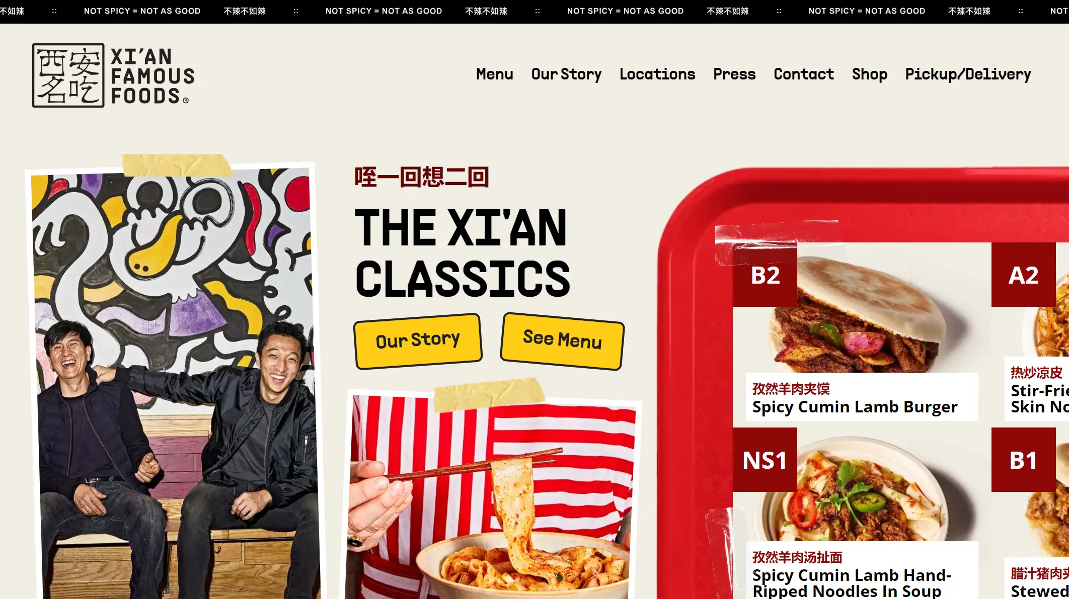
10. XI'AN Famous Foods
-
The Xi'an Foods homepage features a wide range of cuisines, with high-resolution photos of noodles and burgers to visually appeal to customers' appetites.
-
Xi'an Foods displays the image of the brand's founder on its homepage, quoting comments from well-known figures (e.g. Anthony Bourdain) to enhance the credibility of the brand and increase users' trust. In the "Get to Know Us" section, the brand's origin story is shared to help users build an emotional connection with the brand and increase loyalty.
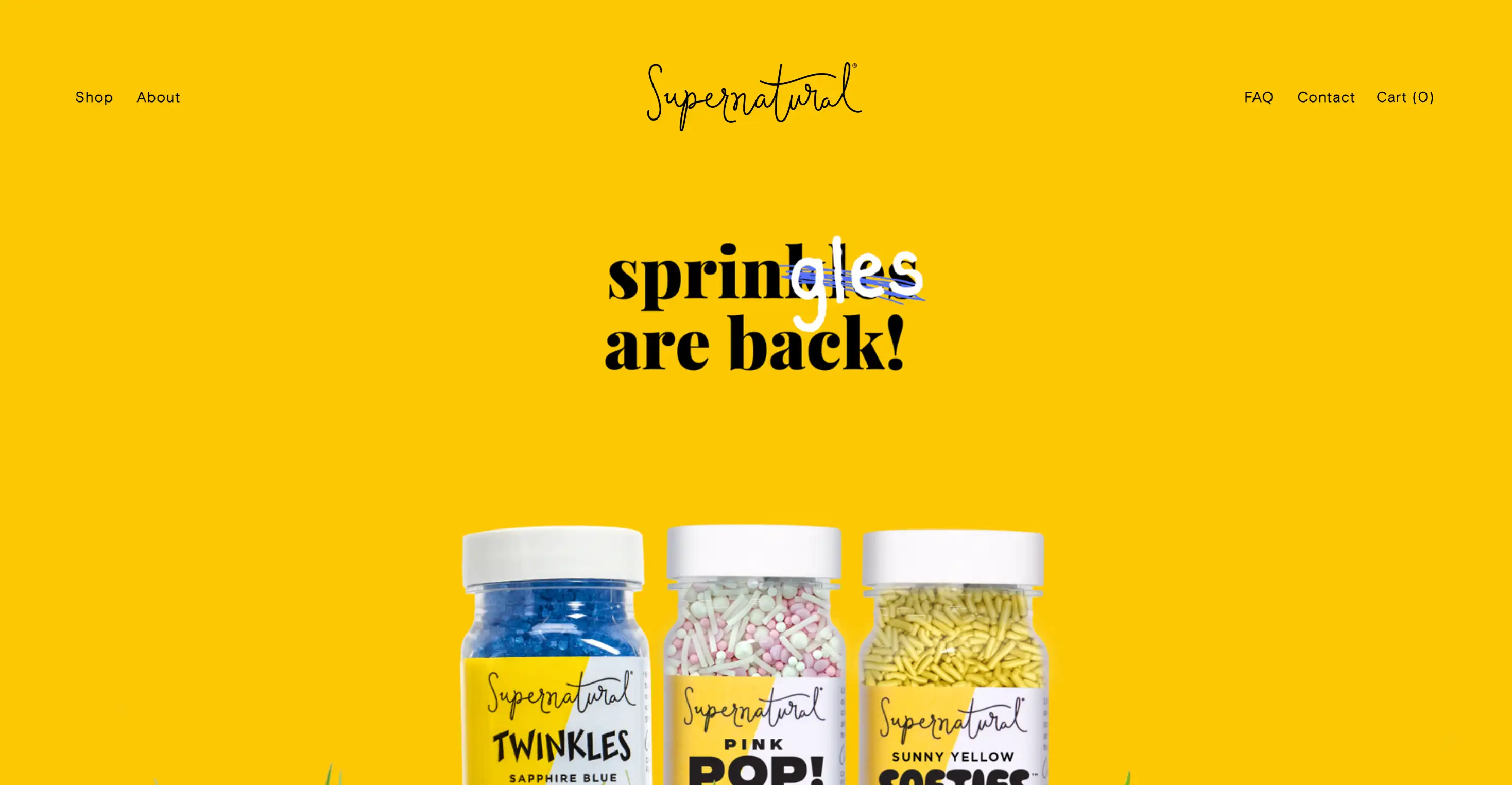
11. Supernatural Kitchen
-
Colorful, natural branding: The website’s bold, rainbow-hued visuals emphasize its commitment to dye-free, plant-based products, instantly conveying fun and health-conscious values38.
-
Transparent ingredient focus: Detailed FAQs and allergen charts build trust with health-aware consumers, addressing sensitivities to artificial dyes and common allergens like corn11.
-
Social proof: Highlighting over 5,000 five-star reviews and media features (e.g., The Today Show) reinforces credibility and community engagement3.
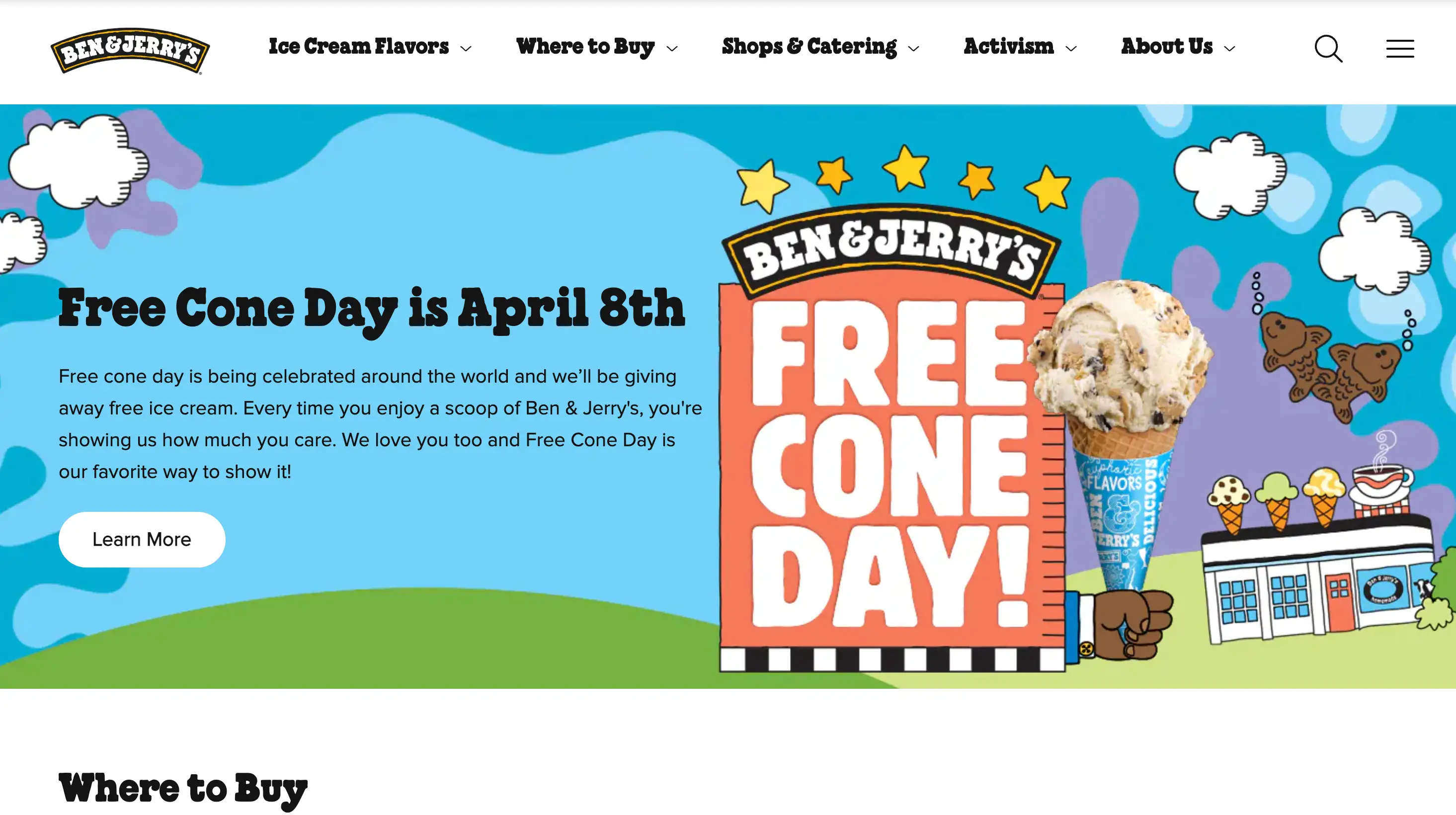
12. Ben & Jerry’s
-
Storytelling through design: The site’s whimsical graphics (e.g., cartoon cows, flavor-themed banners) reflect its brand personality, while sections like "Activism" align with its social justice values17.
-
User-friendly navigation: Clear categories (e.g., "Where to Buy," "Flavor Suggestions") and a responsive layout enhance the shopping experience.
-
Community engagement: Features like "Resurrect My Favorite Flavor" and franchise opportunities foster loyalty and audience participation.
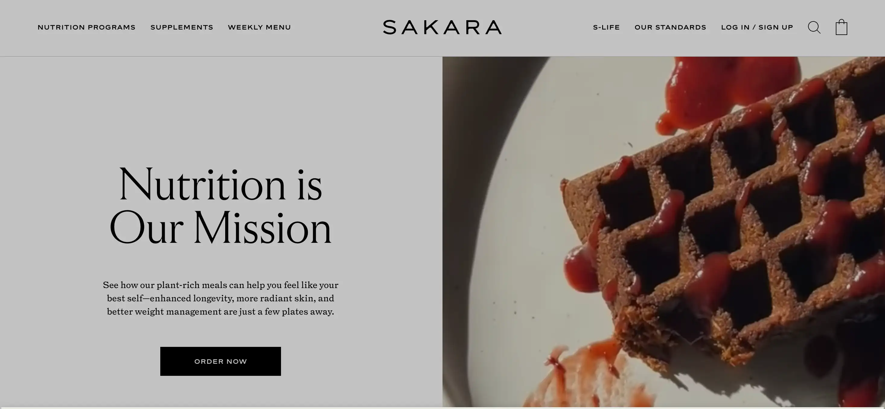
13. Sakara
-
Clean, high-end design: Ample white space and bold typography direct focus to its premium products, while lush food photography underscores its "nutrition as luxury" angle12.
-
Program-centric layout: Sections like "Detox" and "Shop All" simplify exploration of its subscription models, catering to goal-oriented consumers2.
-
Testimonials as social proof: Client quotes and results-driven messaging (e.g., "radiant skin, better weight management") build trust in its transformative claims2.
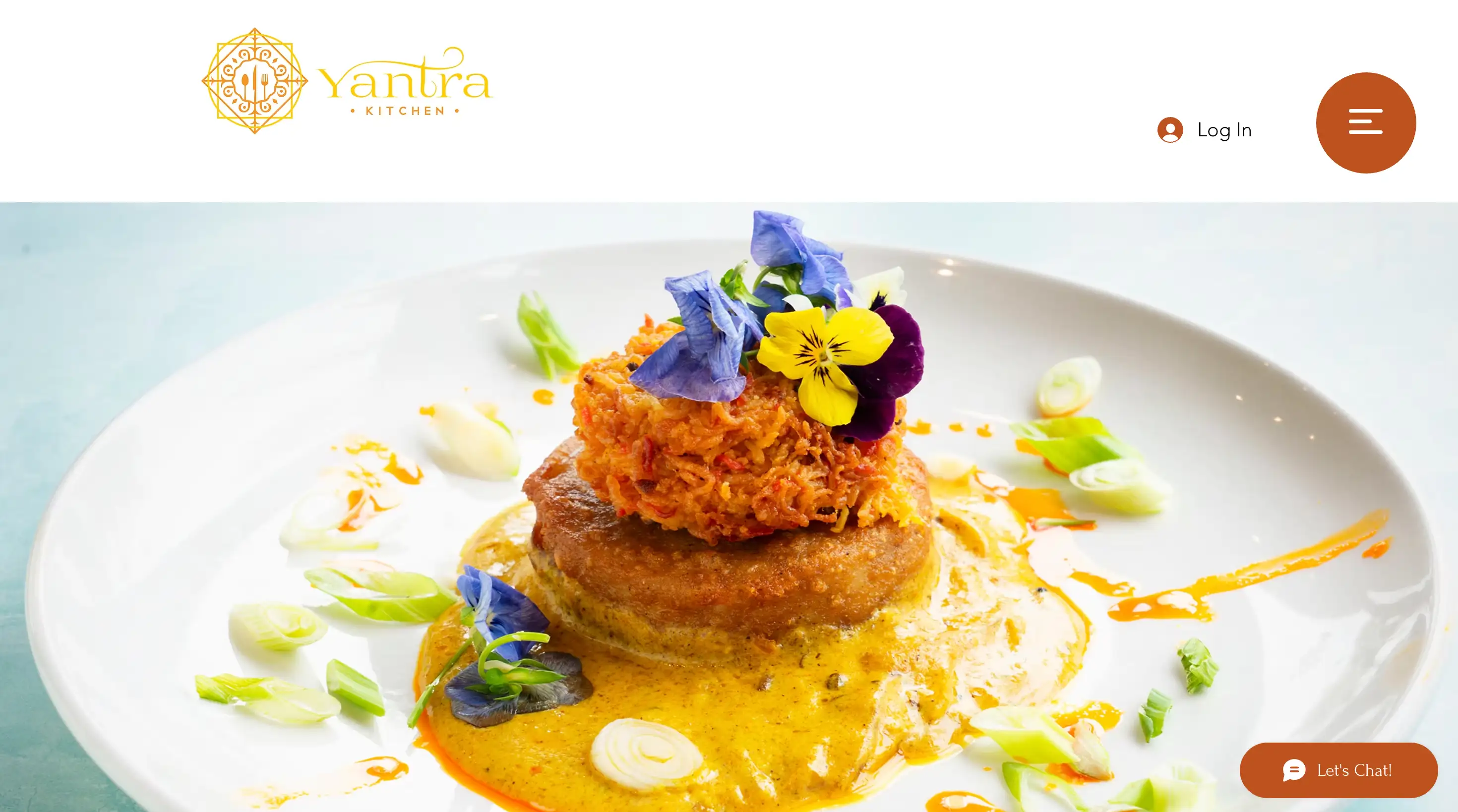
14. Yantra Kitchen
-
Cultural storytelling through visuals: Full-width images of silk-draped interiors, fort-inspired architecture, and artful plating instantly transport users, reinforcing Yantra’s promise of an experiential dining journey.
-
Intuitive navigation: A clean menu bar with quick links (e.g., "Menu," "Gallery," "Reservations") ensures seamless exploration, critical for hospitality websites.
-
Elevated color palette: Rich golds, deep reds, and muted neutrals reflect luxury while staying true to Indian heritage—ideal for brands targeting high-end audiences.
-
Ingredient transparency: Highlighting niche, regionally sourced spices and produce (e.g., "Subcontinent-sourced saffron") builds credibility for authenticity-seeking diners.
15. Field & Flower

-
Hero imagery that sells: The homepage’s artfully arranged meat display immediately communicates quality and variety, appealing to gourmet cooks and meat enthusiasts.
-
Smart categorization: The "Meat and More" grid layout simplifies browsing, allowing users to quickly filter by cut, animal, or meal type—ideal for reducing decision fatigue.
-
Trust-building content:
-
Recipe hub: Culinary resources (e.g., "How to Cook Ribeye Steak") add value, positioning the brand as a partner in the kitchen.
-
Reviews section: Highlighting customer testimonials reinforces credibility for an audience wary of online meat purchases.
-
-
Clean navigation: A well-organized menu bar with clear sections (e.g., "Shop," "Recipes," "Our Farmers") ensures a frictionless user journey.
By exploring food websites, you must have learned a lot of important information about building a well-designed website, such as the use of high-quality photos, keeping navigation simple, and responsive design No matter what device they use, this intuitive experience is a necessary element of a food website.
Create Your Own Food Website: Wegic Made It

Conclusion
Written by
Kimmy
Published on
Mar 17, 2026
Share article
Read more
Our latest blog
Webpages in a minute, powered by Wegic!
With Wegic, transform your needs into stunning, functional websites with advanced AI