Log in
Build Your Site
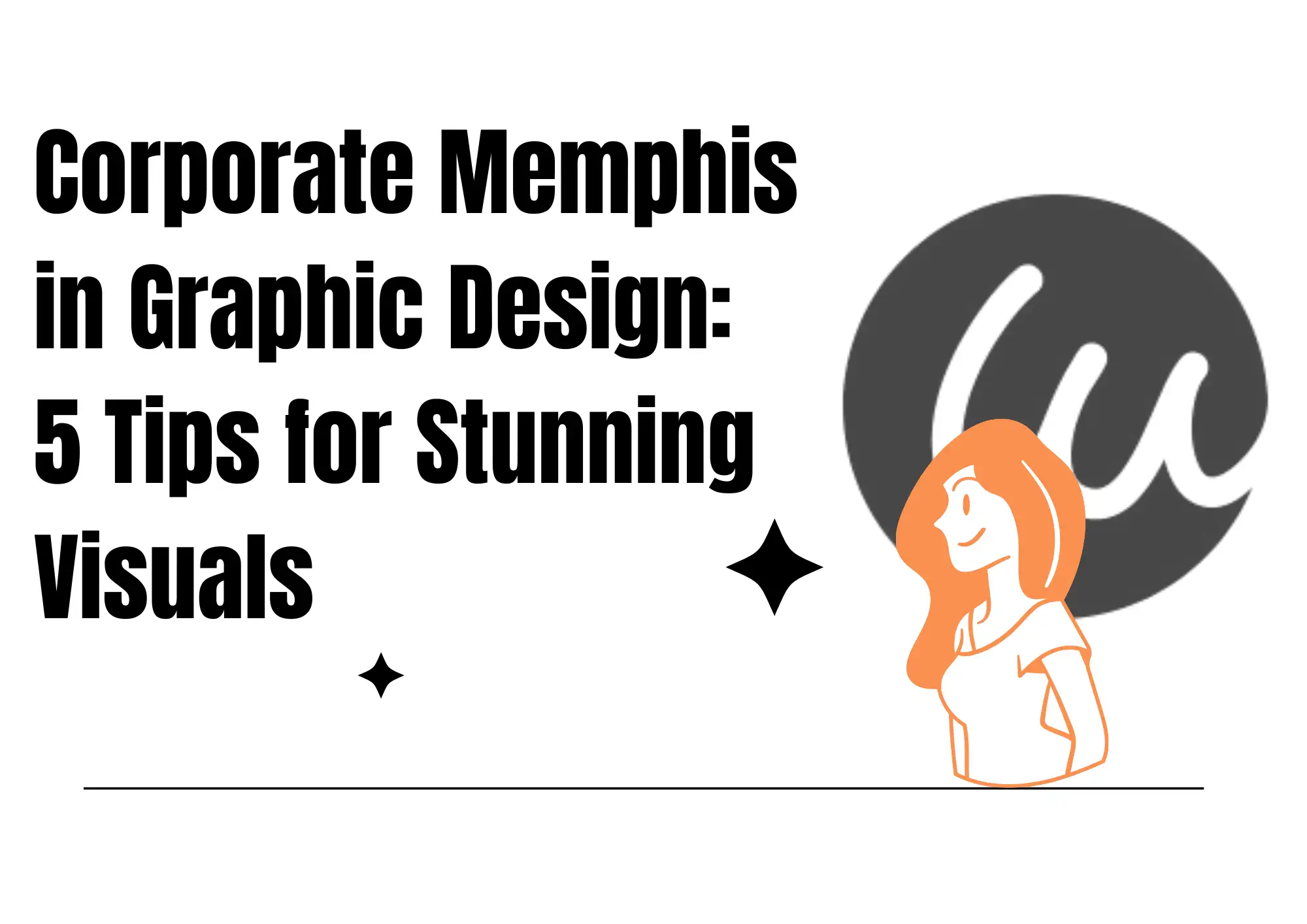
Corporate Memphis in Graphic Design: 5 Tips for Stunning Visuals
What is Corporate Memphis? Why is it popular? You can check this article to find 5 tips to give you more inspiration! Let's learn more about graphic design!

Corporate Memphis has been the quintessential hip visual symbol of corporate identity today. We've all witnessed those stylized, colorful illustrations with exaggerated limbs and proportionally small heads like they've been plucked from a graphics class. They're omnipresent on social media commercials, tech firm websites, and even on subway signs. Its illustration styles are full of newness. They're particularly effective at projecting a hip and relatable brand persona. But the omnipresence of Corporate Memphis illustrations has been paired with equally fast criticism, too. It's regarded by many to be too formulaic and unimaginative, and even goes far enough to mock it that it's a symbol of "global homogeneity."
Key to the Corporate Memphis style, in summary, is to portray information through the application of flat and rectangular character illustrations. The character has rubbery, flexing limbs and exaggerated shoulders and is filled with "cartoon feel" that's not grounded. The style of design was first used heavily across social sites and massive advertising. Because it can immediately catch a person's eye and communicate likability. But through time, the style's use has heavily expanded and even a bit "overused," which makes one feel like it isn't original.
Despite that, Corporate Memphis remains trendy with most brands across the globe. It gives a distinctive visual feel to the brand. And becomes a serious utility tool for Internet and technology companies to establish the identity of the brand. Wondering more about the art style? Follow the 5 Tips from Corporate Memphis art, and get more inspiration.
The origin of Corporate Memphis
"Corporate Memphis" was inspired by two very different design heritages. Firstly, "Memphis" brings to mind that famous Italian design studio known as Memphis Milano. The studio defined 1980s design style by the dramatic, emotive application of colours and simple geometry. The style was highly biased towards visual beauty over form. The "Corporate" part of the name has its origins with a direct reference to Facebook's "Alegria" illustration set.
Facebook launched the "Alegria" set of illustrations by BUCK and Xoana Herrera in 2017. It was integrated into the social media platform's and big businesses' brand image. The tech giant businesses across the globe. Most importantly, Silicon Valley giants, have since emulated and borrowed the look, taking popular corporate style Corporate Memphis to new heights on a grand scale, and turning it into a corporate iconic visual symbol that will dominate the early 2020s. The influence of Corporate Memphis illustrations has been vast so far. And brands and designers keep emulating how to create a unique and contemporary brand image in their style.
What is Corporate Memphis style?
Corporate Memphis style is a distinctive, minimalistic look that makes use of solid, bold colours, large silhouettes. And character-less figures create a friendly, contemporary, and unpretentious corporate image.
It began life within Facebook's "Alegria" set of illustrations created by design agency Buck. And soon became the default visual vocabulary of the majority of tech companies. These kinds of characters tend to lack distinctive characteristics of race, gender, or body type. So that they appear "universal" but not particular.
For companies, the appeal of the style is that it's extremely adaptable, easy to clone and customize, and can be easily translated into different media and marketing materials. It's exactly that "cookie-cutter" nature that annoys most designers. People feel it's not soulful and rich and that the patterns are too formulaic, dull, and unimaginative. Nonetheless, it is a hallmark of corporate design today. Especially in technology, where it's found everywhere because of how easy it is to apply, how easy it is to use, and how inexpensive it is.

Image by Blush Design
Why is Corporate Memphis popular online?
The ubiquity of the Corporate Memphis style within tech and corporate design is also attributed to the context within which it was created.
-
Flat design style
Along with the overall web and mobile design evolution, the formerly popular skeuomorphic design trend has fallen out of popularity and has been replaced by a newer, flatter, and more minimalist style. Skeuomorphic design once made things more intuitive by mimicking objects in the real world, but when technology continued to advance, the style gradually ceased to please designers and users alike. Apple's introduction of iOS 7 in 2013 was a signal of that design trend shift to go from the skeuomorphic 3D look to the cleaner, sleeker look.
-
More inclusive
Flat style has also popularized illustrations and vector graphics. Flat design, in turn, allows room for various screen resolutions and a superior user experience to be achieved. It also has the added advantage of being easy to copy, scale, and animate. Flat style and minimal illustration style, in turn, give small businesses with limited means a low-cost solution. Memphis corporate art's geometric figure illustrations are just serving precisely that purpose, with unrealistic proportions and colours, and free from explicit racial, gender, or identity depiction. These illustrations are meant to serve a cause of wide inclusion. The design avoids the potential problem of cultural bias, and also allows businesses greater freedom to represent diversity.
-
Appropriate to the modern network
In addition, Corporate Memphis art lends itself best to online environments. And can guarantee legibility and consistency across platforms. The environments are created through the application of vector graphics, making it a favorite of contemporary corporate design, while the style has caused fatigue among professionals. Because of its stereotypical and formulaic nature, no one can dispute that it is a phenomenal tool for contemporary tech brands to create a friendly, inviting, and contemporary image of themselves.
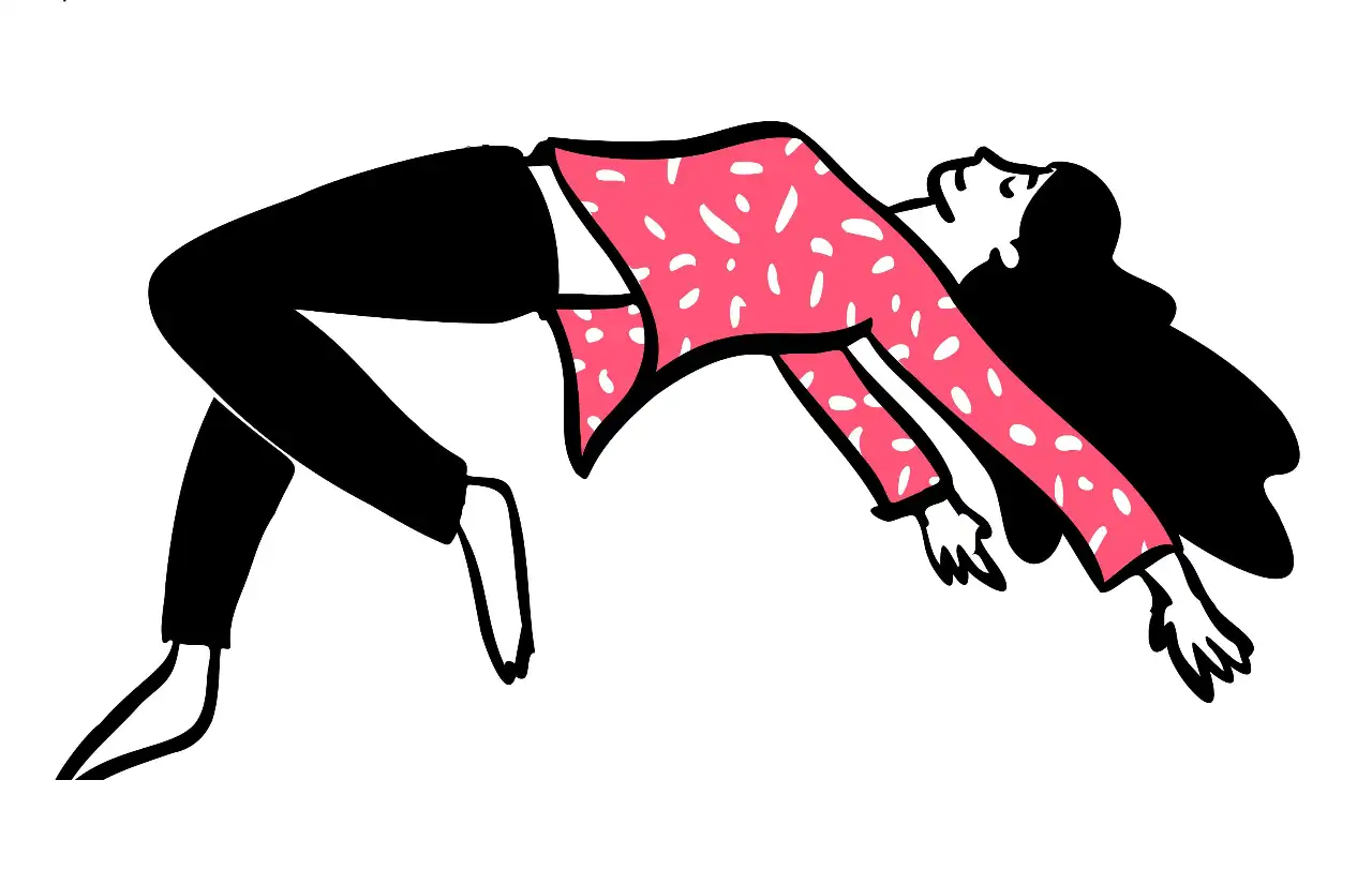
Image by Blush Design
5 tips to take from Corporate Memphis when it comes to lovely visuals
1. Minimalism
Do you remember those 3D graphics that you used to view on older iPhones? These are part of a design style known as "skeuomorphism". It's what makes digital objects look like real objects. The default camera application used to look like a real lens. For example, and the memo application used to contain yellow paper and lines around the edges. It was a very intuitive and easy-to-use design that assisted us in getting used to digital devices when we first adopted them, because it enabled us to map digital objects onto real objects instantly.
Yet, after Apple launched iOS 7 back in 2013 and left skeuomorphism entirely, the industry trends also changed. The iOS 7 update eliminated its rich 3D effects and switched to a flat style of design. That's because we are getting used to tapping screens and digital apps increasingly and no longer need to replicate the look of real things. On top of that, human beings today are acquiring information more and more rapidly. And minimalism makes it easier to process and view content.
Thus, skeuomorphism is over. Flatness and minimalism are the order of the day in corporate design today, where everything is focused on keeping things simple and unadorned. So, marketing graphics have begun to follow suit: flat, geometric, and bright colors. None speaks better than bright, cartoonish graphics.
The style exactly addresses this void like a piece of a jigsaw puzzle falling into place. By embracing simple shape, bright color and friendly design vocabulary. It matches the requirements of modern-day businesses in presentation, and serves the affection of humans towards simple and intuitive design today. Proceed and craft your work in this feature.
2. Exchangeable color
Another of the standout attributes of the Corporate Memphis art is that the style has a rich color palette. Not only does the style allow companies to sensibly include colors of a brand into each design part, but the style also has sufficient creative room to offer companies. With interchangeable colors, companies are able to openly alter the figures or horizon within illustrations to suit the visual requirements of a brand. Most attractively, the flexibility presents a simple solution to companies in depicting their "racial diversity."
Stock classics are plagued by a failure to represent the racial diversity of a globalized world. The race and ethnicity of the subjects portrayed in them are fixed and stereotypical, and they represent no kind of people. The corporate look of Memphis transcends the limitation by putting human beings in unnatural skin tones (blue, yellow, green, etc.). And brands are, in turn, able to represent racial diversity visually. The unconventional use of such skin tones removes from them any telltale signs of race or ethnicity, and the "characters" of the illustrations are able to represent any race or any ethnicity and no longer have a traditional identity.
Not only does that design strategy meet the demand of inclusiveness and diversity of a brand, but it also allows organizations to demonstrate social diversity visually in a respectful way, free from the controversy of deliberately choosing one race or one group of a similar type. By doing so, organizations are able to confidently build a global and inclusive image of themselves through a brand without the risk of losing consumer familiarity through overly uniform and stereotypical visual materials.
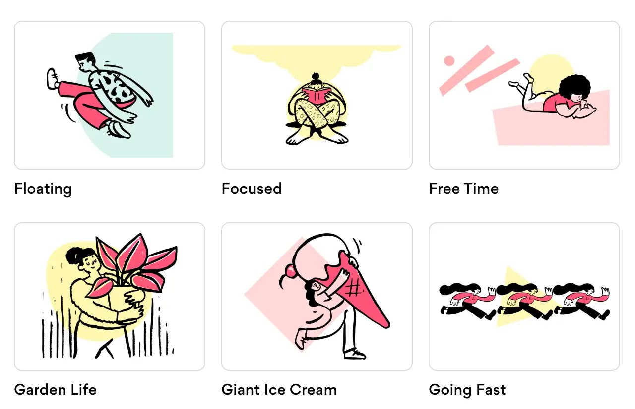
Image by Blush Design
3. Good atmosphere
One of the best advantages of the Memphis style is the "sunshine" mood that it brings. The style reminds us of our childhood. The bright colours, simplified shapes, and cute illustrations give a sense of safety and comfort, and we feel that everything is fine and everything has a solution. With the assistance of that style language, businesses simplify complicated things and make information look intuitive and easy to understand. Whenever I see the Corporate Memphis style illustrations, I feel hopeful and warm-hearted. If you want your company style to resemble that style, you can try!
4. Inclusive
One of the things that has made style so popular is that it has been inclusive. The style's design employs unrealistic figures and abstract graphics to symbolize characteristics such as race, gender, and age without any obvious signs or edges. The style's design is able to create the borderless, genderless, and ageless appearance of the figures in the illustrations and can represent nearly any group of human beings.
Its characters adopt unnatural skin tones, e.g., blue, pink, green, etc., instead of adopting conventional skin color representation. In that way, companies can represent racial and cultural diversity without the necessity to employ actual, potentially controversial group representation. With that, Corporate Memphis art allows companies to achieve a "no one can be excluded" look, eliminating the implicit hazards of stereotypes or exclusions.
5. Simple and scalable design
One of the other key advantages of the style is how easily it scales and how simple it is. One of the biggest elements of the style is the use of vector graphics, which are simple and easy to scale and look perfect within a range of varying screen sizes and have a lot of visual fidelity. You can scale them to whatever extent you want with no loss of definition or pixilation. That's crucial to business today or especially to tech companies, because their content must look perfect on a range of devices (mobile devices, tablets, desktops, etc.).
Older raster graphics (such as those in stock images), by contrast, degrade when scaled, so they won't work for these purposes. Both experienced and new designers can create illustrations in the style of Memphis easily by using vector graphics software. For small businesses and startups, the versatility and ease of use give them a larger competitive advantage. Using pre-design templates and assets, they are able to create websites, social media graphics, ads, etc., at a quick pace, not just saving time and money but also projecting a businesslike and uniform look.

Image by Blush Design
Conclusion
In today's digital era, Corporate Memphis is not just a hip style. It has evolved into a required method of visual communication by companies and brands. From its bright colours and simple geometry to its adaptable vector graphics that suit responsive design and multi-screen viewability, the style provides us with a quick, adaptable and dynamic way of designing. From the inspiration that you take from Corporate Memphis, you can let that lead you to create products or websites.
If you want to create a website, then you can create a new one with Wegic. With Wegic, you can create a contemporary and brand-friendly web look in just a jiffy. Whether you are a small startup business or a large enterprise looking to enhance a previously created webpage, Wegic can provide you with the best solution to your design needs. Let's end the monotony with Wegic and adopt the Corporate Memphis style in a new adaptive method to create your own fantastic digital visual world!
Check out the relevant graphic design article:
Written by
Kimmy
Published on
Mar 17, 2026
Share article
Read more
Our latest blog
Webpages in a minute, powered by Wegic!
With Wegic, transform your needs into stunning, functional websites with advanced AI
Free trial with Wegic, build your site in a click!
What kind of website do you want to build?