Log in
Build Your Site
12 Best Font for Your Next Resume Website
Discover these top fonts for resume websites that can not only look amazing but also clearly convey your personality and qualifications.


The typeface you use on your resume website has a big influence on how prospective employers see you. A well-chosen typeface helps create a good first impression by improving readability and projecting professionalism. Knowing the value of typography in resume design is essential in this digital age when it may help you stand out from the competition.
We'll look at the top 12 fonts for resume websites in this article to give you the knowledge you need to choose fonts that will not only look amazing but also clearly convey your personality and qualifications, assisting you in creating a polished and eye-catching resume website, regardless of your level of experience.
Click here to Build your site
Why Fonts Matter in Resume Websites
Readability
First Impressions
Professionalism
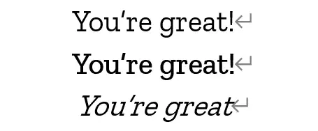
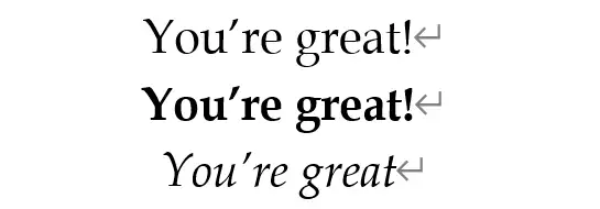
The font you choose for your resume website directly impacts readability. A clear and legible font ensures that your information is easily accessible, providing convenience for potential employers to quickly grasp your qualifications and experience. Fonts that are too ornate or difficult to read, like artistic fonts and handwriting-style fonts, can detract from the content and make it harder for your resume to be taken seriously.
First impressions are crucial in the job market, and your resume website is often the first point of contact with potential employers. Therefore, the right font can set a professional tone and convey your attention to detail and design sense that help create a positive and lasting impression, making your resume stand out from the competition.
The selection of fonts also has a significant impact on professionalism, as a well-selected typography shows that you have a solid grasp of design concepts and can arrange and convey information visually appealingly. Employing fonts that complement the overall design of your website will improve how people perceive your personal brand and present you as a professional and considerate applicant.
Criteria for Choosing the Best Fonts
Legibility
-
It is paramount when selecting a font for your resume website. A font that is clear and readable ensures that your information can be quickly and easily understood by potential employers. Make sure to avoid overly decorative fonts that may compromise readability, especially at smaller sizes.
Compatibility
-
Making sure your fonts are compatiable across different devices and browsers is crucial. The best fonts should look good on both desktop and mobile screens and be supported by major web browsers. Web-safe fonts or Google Fonts are typically reliable choices that ensure consistency in how your resume appears to all viewers.
Versatility
-
It is another important factor, meaning that a good font should be adaptable and work well for various sections of your resume, including headings, subheadings, and body text. Fonts that come in multiple weights and styles can provide the flexibility needed to create a cohesive and visually attractive design.
Visual Appeal
-
Your visual design should balance professionalism with visual attractiveness. The typeface you select for your resume should look professional while also representing your own style and blending in with the website's general design. Choose typefaces for your resume that will improve the visual hierarchy and give it a professional, interesting appearance.
The 12 Best Fonts for Resume Websites
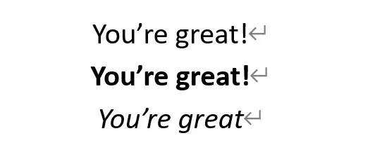
Arial
Arial is like the trusty sidekick of fonts—always there when you need it and ready to save the day with its straightforward charm. Known for its no-fuss simplicity and clean lines, Arial has become a go-to choice for everything from sleek digital designs to classic print media, with the font equivalent of a dependable friend who’s always up for a clear, easy-to-read chat, no matter the screen size.
With its easy-on-the-eyes layout, Arial keeps your resume website looking sharp and polished, whether you're using it for headings or body text. It’s a web-safe superstar, ensuring your resume looks stellar across all devices and browsers. Perfect for job seekers who want their resume to stand out while keeping things professional, Arial’s versatility makes it a top pick for making your online CV look both refined and unique.
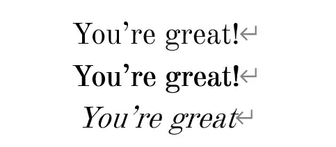
Times New Roman
Times New Roman is best described in three words: elegant, identifiable, and conventional. It is, after all, among the most widely used typefaces ever! If you're looking for a serif font that can be used for any occasion, Times New Roman is a wise option.
Times New Roman ensures consistent display across various browsers and devices, making it an excellent choice for body text and headings in resume websites, especially in fields like law, academia, and finance.
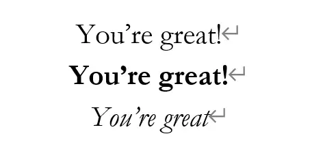
Cambria
Cambria is a modern serif typeface designed with one of the best readabilities in mind, particularly on computer screens. Developed by Microsoft and included in the ClearType font collection, Cambria's balanced proportions and clean lines make it a versatile choice for both digital and print media.
Cambria excels in providing a professional and polished look, making it ideal for resume websites. Its clear and legible design works well for body text and headings, ensuring that your content is easy to read.
Gothic A1 Regular
Gothic A1 Regular isn't what you would think a "Gothic" style font. Instead, it's a highly modern and contemporary font that uses a clear and linear design. Part of the Google Fonts collection, it offers excellent readability and a sleek, professional appearance that suits various digital applications, including resume websites.
The font's clarity ensures that your text is easily readable on different screens and devices, with its modern aesthetic particularly appealing for creative and tech industries, providing a fresh and dynamic look that can help your resume stand out.
Calibri
Meet Calibri, your go-to modern sans-serif typeface that's all about clarity and charm. Designed by Microsoft, Calibri has been the default font for Microsoft Office since 2007, making it familiar to many with its rounded edges and clean lines. Calibri brings a touch of friendliness to your resume, striking a perfect balance between professionalism and approachability.
Calibri's excellent readability on screens of all sizes ensures your resume looks sharp and is easy to read. Whether you're crafting headings or body text, Calibri's versatile design adapts seamlessly, making great first impressions for potential employers.
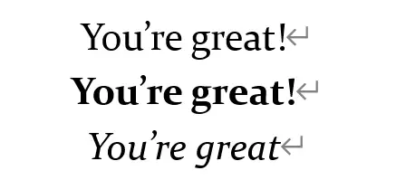
Georgia

Georgia is the typeface that’s like your sophisticated friend who also knows how to have fun. Created by the legendary Matthew Carter for Microsoft, Georgia blends classic serif elegance with modern readability, just like the perfect mix of a vintage novel and a sleek, modern magazine.
Why stick with the usual when Georgia can give your resume website a touch of sophistication with a friendly vibe? Perfect for both headings and body text, it’s versatile enough to fit into any industry, from artsy gigs to academic roles. With Georgia, your resume won't just be read—it'll be admired.
Old Standard
With Old Standard, your resume will radiate a sense of tradition and expertise, showing potential employers that you appreciate the finer details and know how to present them beautifully.
The typographic style seen in vintage scientific publications served as the inspiration for Old Standard's design. It's a traditional resume typeface all the way through and its standard style makes any paper easier to read and sophisticated.
This might be an especially smart decision if you believe the recruiting manager would value a retro style.
Garamond
Garamond is like that refined, cultured friend who always knows the best way to present themselves. With roots tracing back to the 16th century, this classic serif typeface exudes timeless elegance and sophistication and has been a favorite in print and digital media for its graceful curves and readability.
Using Garamond on your resume website adds a touch of literary charm and professionalism. Its distinctive style makes it ideal for creating a polished look that stands out in both body text and headings. Perfect for fields like publishing, writing, and design, Garamond helps your resume convey a sense of tradition and class, ensuring you make a memorable impression.
Constantia
Constantia is the font that brings a bit of refined flair to your resume website while keeping things straightforward. Designed by Microsoft as part of the ClearType font collection, it’s a serif typeface that combines modern readability with a touch of classic sophistication.
Think of it as the elegant friend who’s always ready for a formal event but knows how to make you feel at ease.
Constantia’s well-balanced design ensures your resume looks polished and professional, with its clean lines and subtle curves making it especially suitable for industries like academia, publishing, and business, where clarity and professionalism are key.
Zillab Slab
Zilla Slab is the typeface ideal for leaving a lasting impression since it blends assertiveness and approachability. It's a modern take on a traditional serif typeface, possessing all the power and character of a current slab serif, making it impactful and readable while adding a little humor without sacrificing professionalism.
This typeface looks well in headers and body copy, giving your CV a little flair and confidence. Zilla Slab's distinctive, eye-catching style makes it perfect for creative industries like media, marketing, and design, making your resume stand out.
Helvetica

The font that embodies sleek modernity with a touch of sophistication will be Helvetica.
As one of the most iconic sans-serif typefaces, it’s known for its clean lines and neutral appearance, making it a favorite for everything from corporate branding to minimalist designs, as its timeless look brings a touch of class and clarity to your resume website.
Helvetica lends professionalism and modernism to resumes, making it ideal for fields like business, design, and technology. Selecting Helvetica is more than simply picking a typeface; it's an investment in timeless design.
Book Antiqua
Book Antiqua is like the classy bookworm who’s always dressed to impress.
With its roots in classic serif designs, it brings a dash of vintage flair to your resume while keeping things modern and readable. Imagine a book that’s both timeless and trendy—Book Antiqua is that book, but for your resume! This font shines in both body text and headings, making your resume look polished and sophisticated without trying too hard, and perfect for industries where a touch of elegance goes a long way, like academia or publishing.
Book Antiqua adds a charming, scholarly vibe, as if our resume will say, “I’m knowledgeable, stylish, and I know how to make a great impression!”
Additional Design Tips
When crafting your resume website, the choice of font is just the beginning.
To ensure your resume truly shines, consider these additional design tips that can elevate your presentation from good to great.
Color and Contrast:
Your resume's readability and attractiveness can be greatly enhanced by using the appropriate color scheme and contrast.
To make reading easier, use a strong contrast between the text and backdrop, such as black text on light background. To draw attention to important parts or titles without overpowering your material, use color judiciously. A well-chosen color scheme may improve the eye-catching aspect of your resume without sacrificing professionalism.
Spacing and Alignment:
Making good use of alignment and space will help your resume appear clean and well-organized.
To prevent a crowded look and improve readability, provide enough white space surrounding text blocks. A neat, well-organized design is enhanced by text and header alignment that is consistent; a balanced and expert layout may be achieved by paying attention to paragraph spacing, margins, and line spacing.
Multimedia Integration:
Adding multimedia elements like images, icons, or infographics can bring your resume to life and showcase your creativity.
Ensure these elements complement your font choices and overall design without overpowering the text. High-quality multimedia should be well-aligned and enhance your content, not distract from it. Use these features thoughtfully to create a visually engaging and effective resume.
Best One-stop Solution for Your Resume Website
Tired of having to find the right font and design the resume website all by yourself or through an expensive design agency? Why not try the AI-assisted website builder--Wegic. It's surely going to build the just-to-the-point resume website for you with the font that's best appealing for potential employers.
Follow the three-step method to see how Wegic works.
Step 1: Briefly describe your needs (what kind of websites you are building)
Step 2: Follow Kimmy's instructions for details of the website.
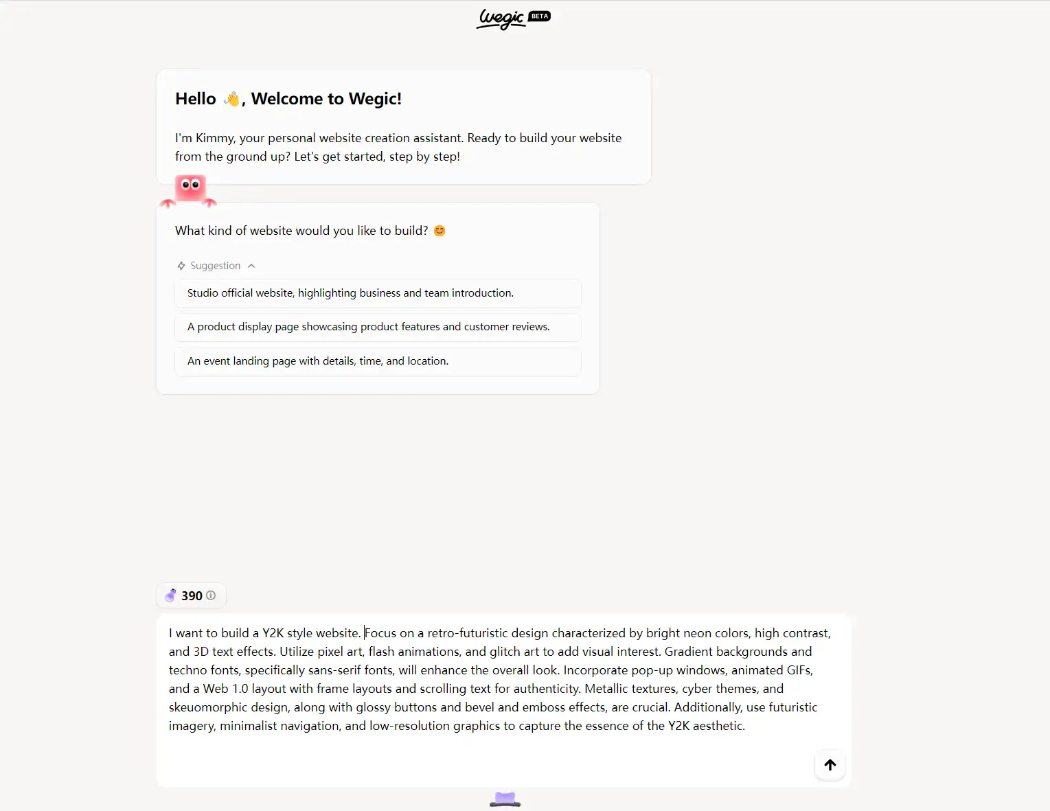
Step 3: See what's come out! (Wegic can always help you customize words, color schemes, fonts, pictures, etc through further chatting, or you can do the work by yourself!)
Try Wegicnow with your 70 free credits, which can be used for 1 website creation or 7 content modifications!
Click here to Build your site
Final Thought
Choosing the right font for your resume website is crucial for making a strong first impression and ensuring readability. The 12 fonts discussed each offer unique qualities that can enhance your website's professional appearance.
When choosing a typeface, take into account elements like readability, style, and harmony with your entire design. A well selected font not only conveys your attention to detail but also your professionalism and individuality, making your resume website more impactful and memorable.
Written by
Kimmy
Published on
Mar 12, 2026
Share article
Read more
Our latest blog
Webpages in a minute, powered by Wegic!
With Wegic, transform your needs into stunning, functional websites with advanced AI
Free trial with Wegic, build your site in a click!
What kind of website do you want to build?