Log in
Build Your Site
16 Best Website Header Design Examples for 2025
Explore 16 website header design examples! Learn key design principles and discover how top sites create engaging, effective headers for your next project.

A website header acts as your site’s handshake—it’s the first impression you make, and we all know how important first impressions are.
A well-designed header can instantly grab attention, making visitors feel welcome and guiding them effortlessly through your site. It’s not just about looks, though; a strong header reflects your brand’s personality, helping people connect with your business right from the start.
The real magic? A thoughtfully crafted header can speed up your conversion rates, gently nudging visitors toward taking action, whether that’s signing up, exploring more, or making a purchase. In this article, let Wegic walk you through the 16 best website header design examples to inspire you for your next project.
Essential Elements for Your Website Header Design
Your website’s header is a vital space where visitors expect quick access to important features like your logo, navigation links, and search tools. You can also include extras such as social media buttons, a shopping cart, or a login option to enhance usability. Each component should be thoughtfully crafted to ensure users find what they need swiftly and effortlessly.
1. Showcase Your Logo
Your logo acts as a spokesperson for your brand’s essence and values. A distinctive logo captures attention and sticks in visitors' minds.
-
Ensure it’s bold and easy to recognize at a glance.
-
Opt for colors that stand out against your site’s backdrop for maximum visibility.
2. Streamlined Navigation
Guide visitors effortlessly through your site with a well-structured navigation bar. Whether it’s your homepage, contact details, or product listings, each link should serve a purpose.
-
Keep labels short, clear, and intuitive.
-
Organize links logically to enhance user experience.
3. Accessible Search Functionality
A search bar is invaluable for helping users quickly find what they need.
-
Place it prominently so visitors can locate it without effort.
-
Ensure it works smoothly across all devices.
4. Stay Socially Connected
Social media buttons offer visitors a simple way to interact with your brand and share content.
-
Select platforms that resonate with your audience.
-
Keep designs current to reflect the latest trends and features.
5. Engaging CTAs & Secure Login
Encourage users to take action with clear calls-to-action and, when necessary, secure login options.
-
Tailor your CTA to drive conversions, aligning it with your website’s purpose.
-
If login is required, make it seamless and ensure the button is both easy to find and secure.
Website Headers: Design Trends in 2025
In 2025, it’s exciting to witness how website header design is transforming to create richer and more engaging user experiences. This year, several trends are emerging, each with its unique flavor, helping to connect brands with their audiences on a more personal level. Let’s explore these trends that can elevate your website’s header and make a lasting impression.
Minimalism
Description:
-
Encountering minimalism is like getting into a beautifully designed room where every item has its purpose, and there’s space to breathe. That’s the essence of minimalism in website headers—simplicity at its best. By stripping away the unnecessary, minimalism allows essential elements to shine.
Impact:
-
This clean approach helps users navigate effortlessly, making it easy for them to find what they need without distractions. Take a look at Apple—their website features a minimalist header that directs users to key products with stunning clarity.
Personal Insight:
-
Users love the feeling of clarity and focus that minimalism provides. In fact, studies show that 76% of users prefer websites with straightforward navigation, a testament to the power of less being more.
Bold Typography
Description:
-
Bold typography is like a loud conversation starter at a party—impossible to ignore and packed with personality. This trend uses large, striking fonts to capture attention and convey important messages or brand identity.
Impact:
-
Brands like Dropbox effectively use bold typography in their headers, making sure their messages resonate clearly with visitors. It’s not just about looks; strong typography enhances visibility and creates a memorable first impression.
Personal Insight:
-
Think about it: 95% of first impressions are design-related, and bold typography can play a pivotal role in ensuring that those impressions are positive and lasting.
Interactive Elements
Description:
-
Ever visited a website that felt like it was responding to your every move? That’s the magic of interactive elements in headers, from hover effects to animated icons, inviting users to engage and explore.
Impact:
-
Brands like Spotify are masters at this, using interactive header elements to create a lively experience that encourages visitors to dive deeper into their content. It’s like inviting someone to play a game instead of just reading instructions.
Personal Insight:
-
It’s fascinating to note that websites featuring interactive elements can see user retention rates soar by up to 50%, making engagement feel less like a chore and more like an adventure.
Animation
Description:
-
Animation brings headers to life, creating a dynamic feel that guides users through the site, much like a friendly guide leading you through a gallery.
Impact:
-
Websites like Airbnb showcase this beautifully with headers that smoothly transition between sections, offering visual cues that enhance usability. It’s all about making the user journey more intuitive and enjoyable.
Personal Insight:
-
According to research from the Nielsen Norman Group, users are 20% more likely to understand complex functionality when animations are thoughtfully integrated. It’s about turning what could be a confusing experience into a seamless one.
Website header design trends for 2024—minimalism, bold typography, interactive elements, and animation—are transforming online engagement. Embrace these trends to create visually striking and engaging headers that foster deeper connections. Your website is a platform for creativity and connection. For more insights, check out platforms like Smashing Magazine and Web Designer Depot.
Top 16 Website Header Design Examples
1. Asana

Visual Elements:
-
Full-width header with bold colors, a clean logo, and easy-to-use navigation.
Key Features:
-
Simple navigation, strong branding, and a bold CTA button ("Get started").
What Makes It Stand Out:
-
The bright color scheme and clear call to action make it easy for users to engage with the product immediately.
2. Zendesk
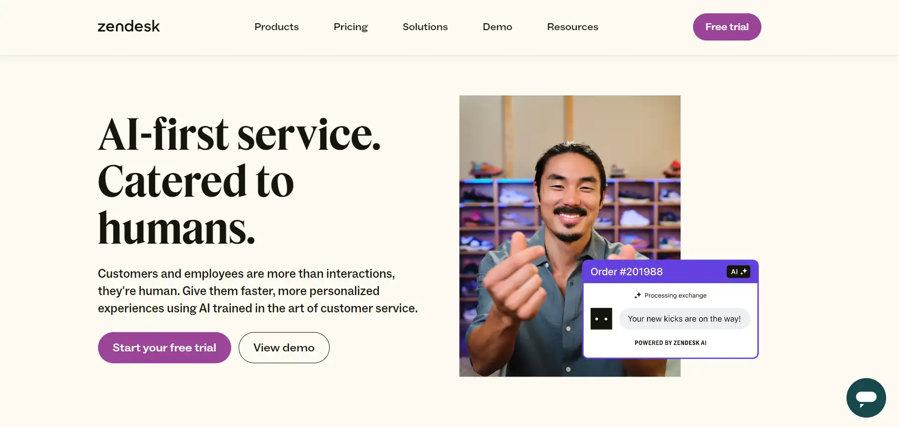
Visual Elements:
-
Minimalist design with soft colors, simple navigation, and clear CTA buttons.
Key Features:
-
Clean layout, easy navigation, brand consistency, and visible CTAs.
What Makes It Stand Out:
-
The soft color palette and simple structure make it feel professional and inviting, enhancing user engagement.
3. Trello

Visual Elements:
-
Full-width header with a vibrant background, large logo, and a clear call to action button.
Key Features:
-
Easy navigation, strong branding, and a colorful, engaging design.
What Makes It Stand Out:
-
The vibrant design and large CTA button create an engaging first impression, drawing users in to learn more about the product.
4. Canva
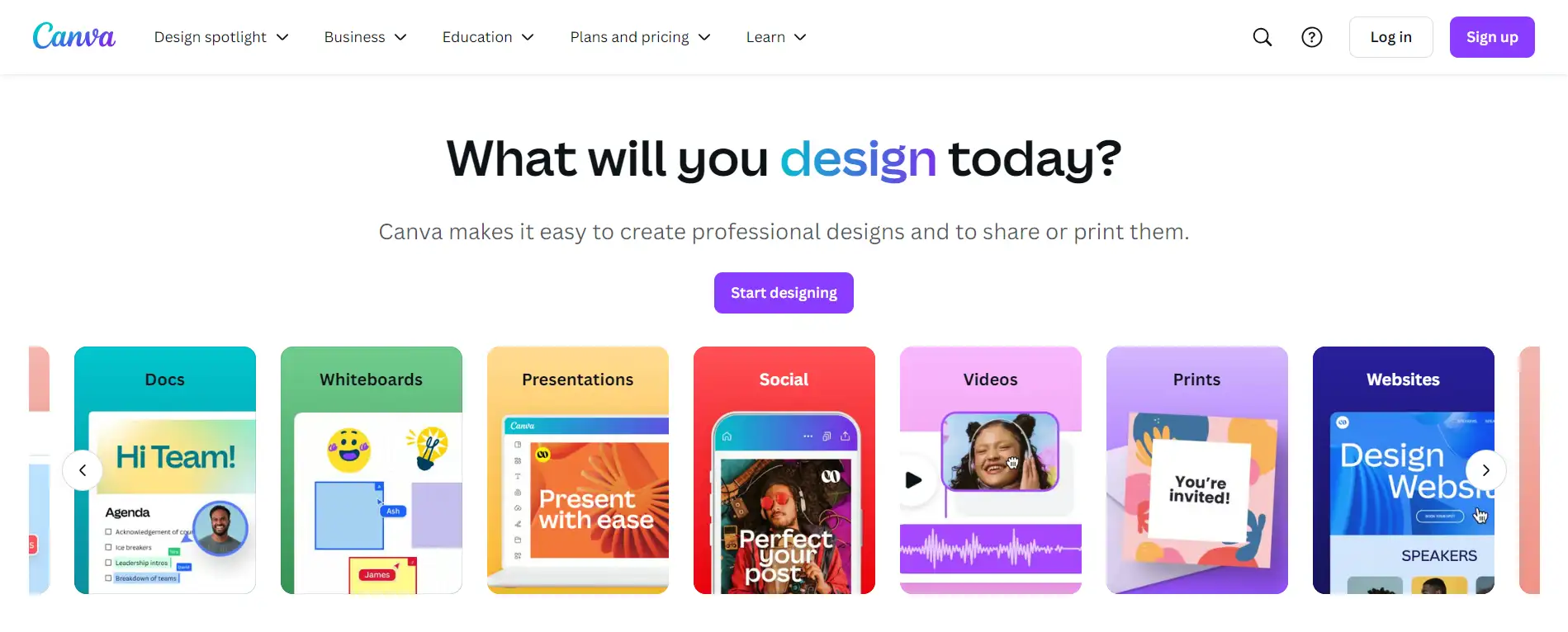
Visual Elements
-
Clean header with a prominent logo, simple navigation, and a clear "Sign Up" button.
Key Features:
-
Easy-to-use navigation, brand consistency, and a well-placed call to action.
What Makes It Stand Out:
-
Canva’s simple layout makes navigation straightforward, and the CTA is positioned perfectly for users looking to sign up and start designing.
5. Slack

Visual Elements:
-
Full-width header with vibrant colors and a simple logo.
Key Features:
-
Easy navigation with strong branding and a prominent "GET STARTED" button.
What Makes It Stand Out:
-
The lively color scheme and eye-catching buttons enhance user engagement immediately.
6. Wendy Ju
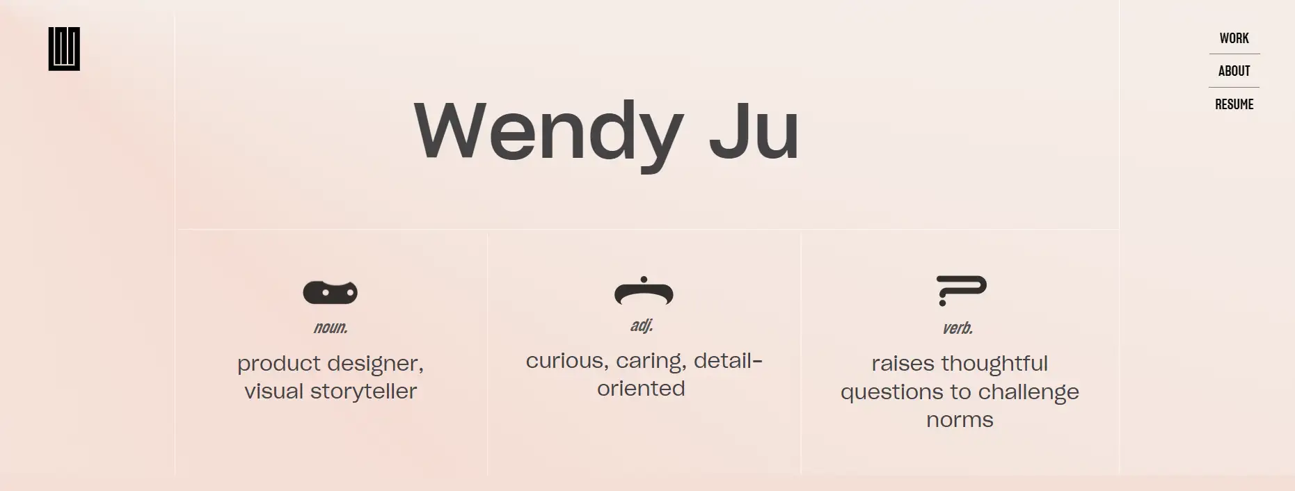
Visual Elements:
-
Clean layout with a short vertical menu on the right and a logo on the left.
Key Features:
-
Balanced navigation that enhances user experience and accessibility.
What Makes It Stand Out:
-
The menu and logo disappear when scrolling down but reappear with an upward scroll, ensuring users can easily navigate without distractions.
7. Aurelio de Anda
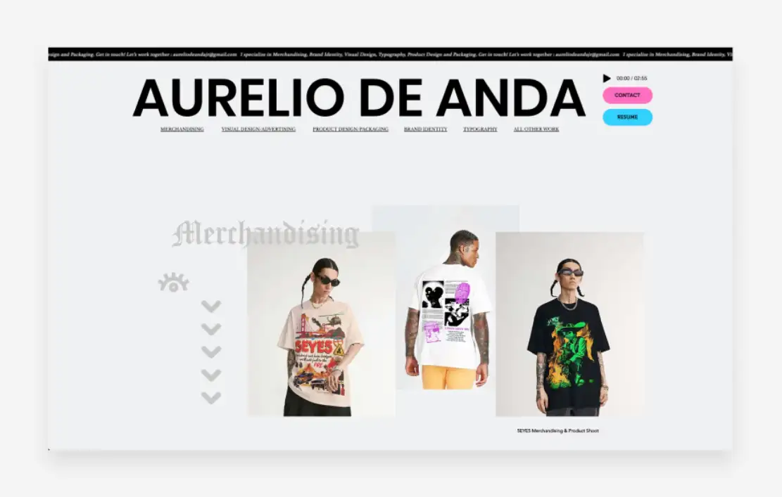
Source: Webflow
Visual Elements:
-
A ticker banner at the top displays a welcoming message, with the designer's name in a large, monolinear font spanning the page width.
Key Features:
-
A music player enhances the browsing experience, accompanied by brightly colored buttons for essential links.
What Makes It Stand Out:
-
Underlined anchors in a fine serif font provide easy navigation to different parts of the homepage, balancing aesthetics with functionality.
8. Di Rosa Center for Contemporary Art
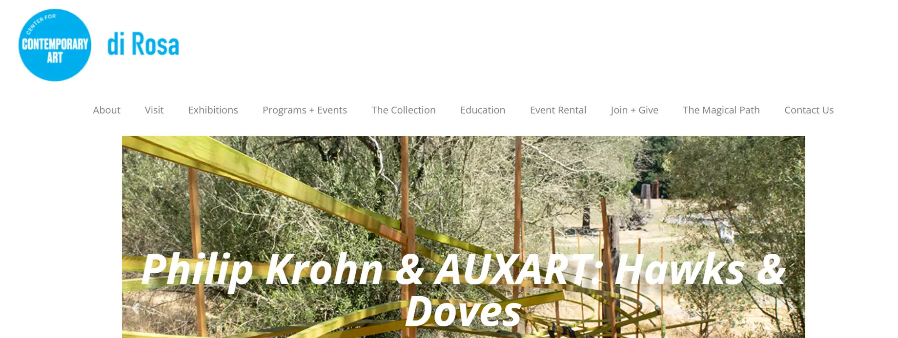
Visual Elements:
-
A simple header design surrounded by ample white space, enhancing readability.
Key Features:
-
The minimal text navigation ensures clarity and ease of access without overshadowing the artwork displayed on the site.
What Makes It Stand Out:
-
The header's understated style complements the site’s artistic content, especially highlighted during the promotion of the museum’s maximalism exhibit, creating a seamless user experience.
9. Florida Aquarium
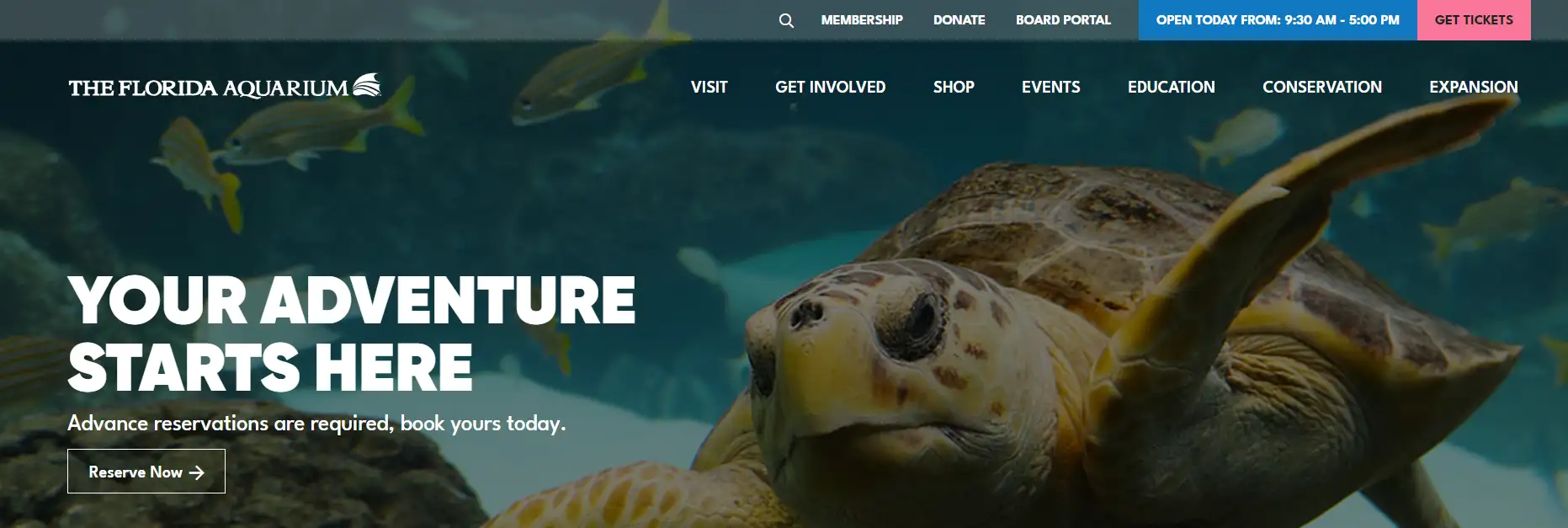
Visual Elements:
-
Hover animations on the main navigation, with faded-out effects to focus on the selected content.
Key Features:
-
Secondary and tertiary navigation links change color when hovered, improving visual engagement and user experience as a website header.
What Makes It Stand Out:
-
The interactive animations guide user attention effectively, while tools like Magic UI's animated library can help replicate such effects effortlessly.
10. Festela
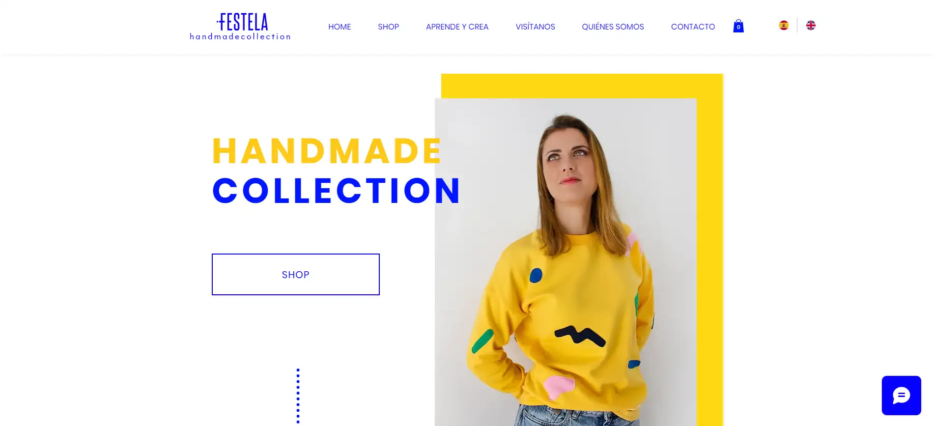
Visual Elements:
-
Static navigation bar with an electric blue hue for buttons and logo, ensuring a clean and legible appearance.
Key Features:
-
Effortless navigation with a static header, regardless of scrolling.
-
Language options in the top-right corner of the header for English and Catalan reflect global reach and local pride.
What Makes It Stand Out:
-
The use of distinct colors and language options demonstrates Festela’s commitment to both international and local customers, highlighting its Barcelona roots.
11. Generation She
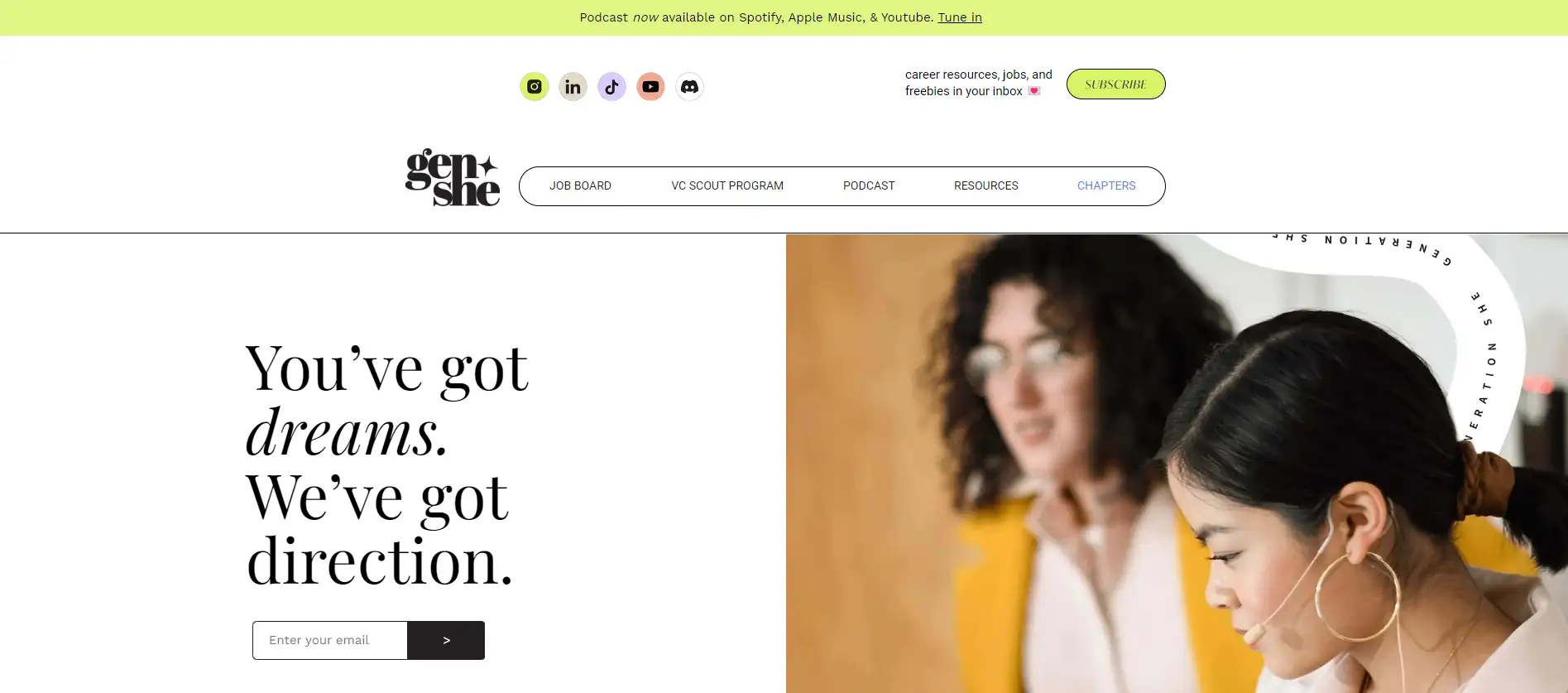
Visual Elements:
-
Modern nonprofit logo, well-organized navigation menu, and a clear call-to-action button.
Key Features:
-
Thoughtfully arranged elements that fit a variety of functions without clutter, making navigation and user engagement smooth on the header.
What Makes It Stand Out:
-
The combination of a compelling CTA and a structured layout encourages visitors to take action while accessing critical information easily.
12. Netflix
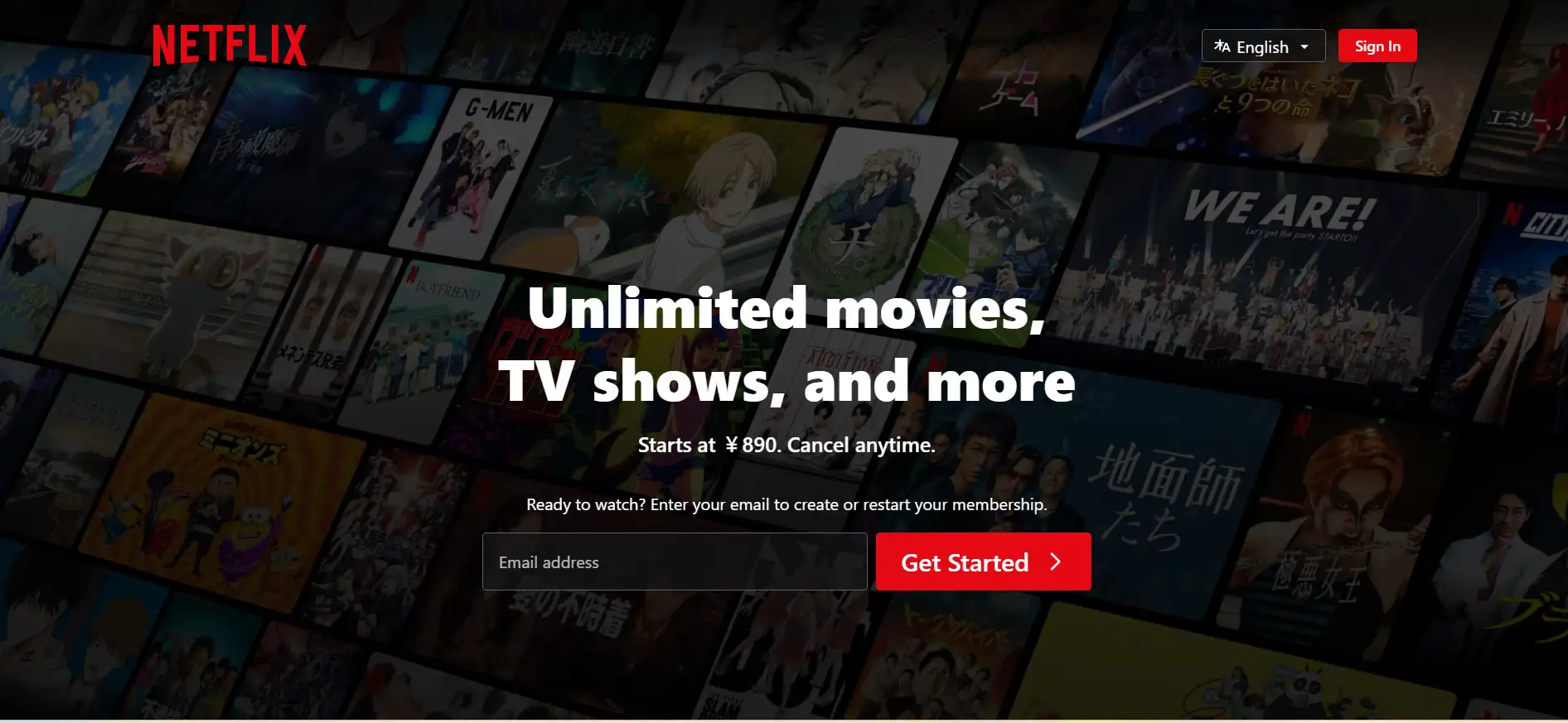
Visual Elements:
-
Dynamic header that adapts based on user activity, featuring the movie title and remaining time during playback.
Key Features:
-
Context-aware navigation that changes between showing content recommendations while browsing and displaying playback details during streaming.
What Makes It Stand Out:
-
The personalized nature of the header enhances user experience by providing relevant information based on current activity, keeping the interface intuitive and engaging.
13. Dopple Press
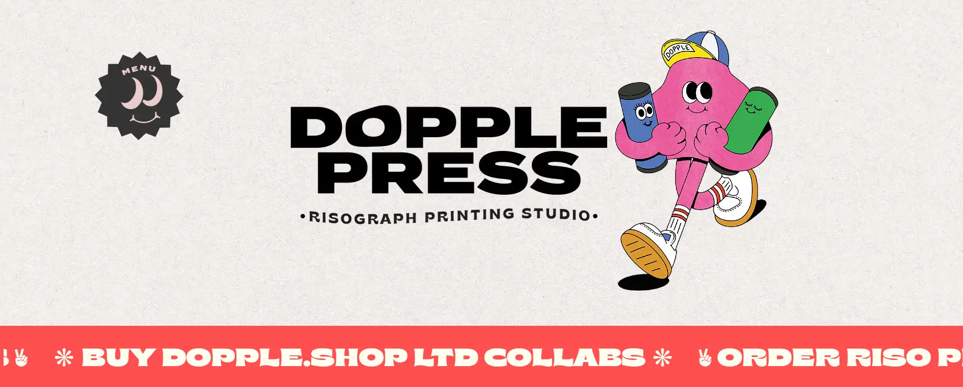
Visual Elements:
-
Hero header featuring the printer's natural paper stock as a background, with a playful cartoon mascot and spinning menu icon.
Key Features:
-
The brand's logo takes center stage, reinforcing identity, while the spinning hover effect on the menu icon adds interactivity.
What Makes It Stand Out:
-
The interactive menu reveals a full-screen layout with soy ink colors, tying in with Dopple Press’s eco-friendly printing process and enhancing engagement.
14. ESPN

Visual Elements:
-
Dynamic header that changes based on the current sporting event, showing scores, time, and other relevant information during live games.
Key Features:
-
When browsing highlights, the header displays the latest sports stories and updates for easy navigation.
What Makes It Stand Out:
-
The adaptive design keeps users informed and engaged by providing real-time updates during live events and relevant content when browsing.
15. The Believer
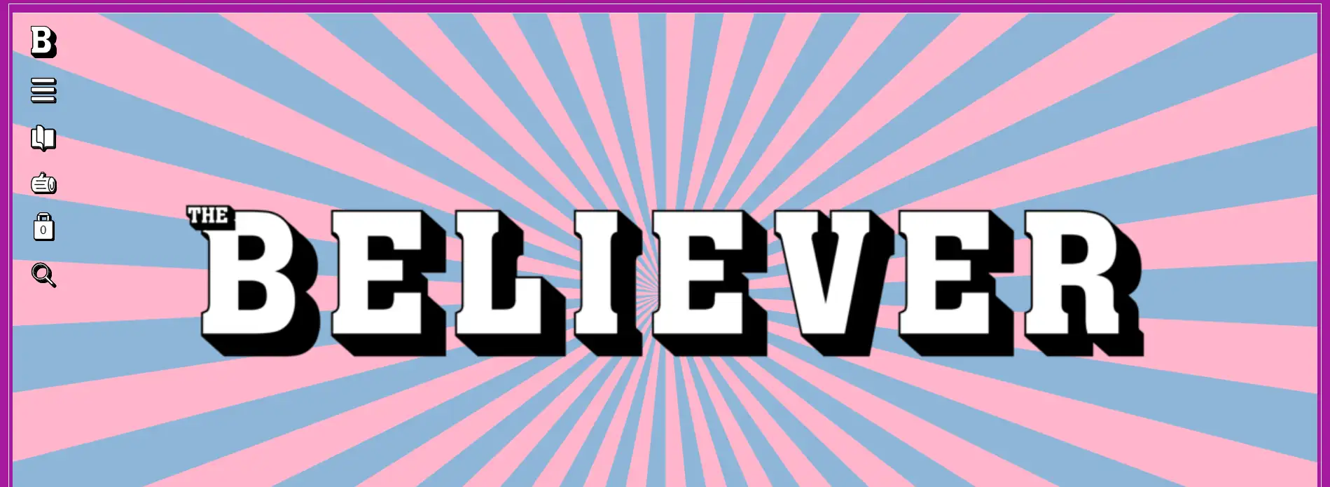
Visual Elements:
-
The magazine name is displayed in its signature font on the header, surrounded by soft pastel colors.
Key Features:
-
Instead of a conventional navigation bar, icons are placed on the left, with a larger menu sliding out when clicked.
What Makes It Stand Out:
-
The pastel color palette and unique navigation approach add a fresh and creative touch, enhancing user interaction with an unconventional but effective layout.
16. Katie Mai
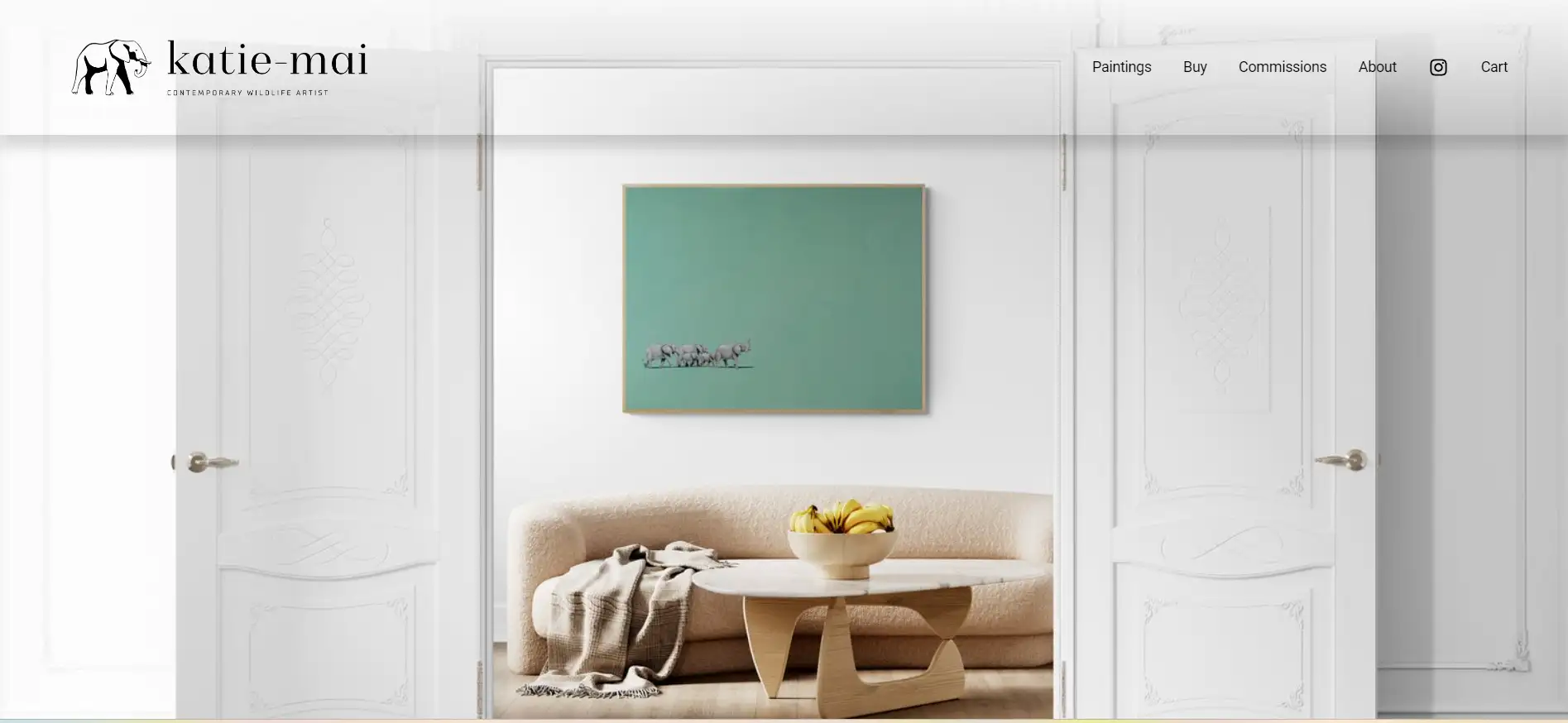
Visual Elements:
-
A circular logo featuring her name in vibrant colors, with a clean layout below.
Key Features:
-
Six navigation links in the same font and color scheme, with hover effects that change the link color.
What Makes It Stand Out:
-
The concise header design ensures ease of navigation while maintaining visual consistency with her brand identity
Website Header Design: Create Wisely with Wegic
Creating a website header that truly reflects your vision can be a challenge, especially when you’re aiming for something trendy. But don't worry—Wegic, your AI-powered website builder, makes this process not just manageable, but enjoyable! You don’t need to navigate complex coding or intricate design principles—just chat your way to a header that captures your style!
Click the image to try out Wegic now!
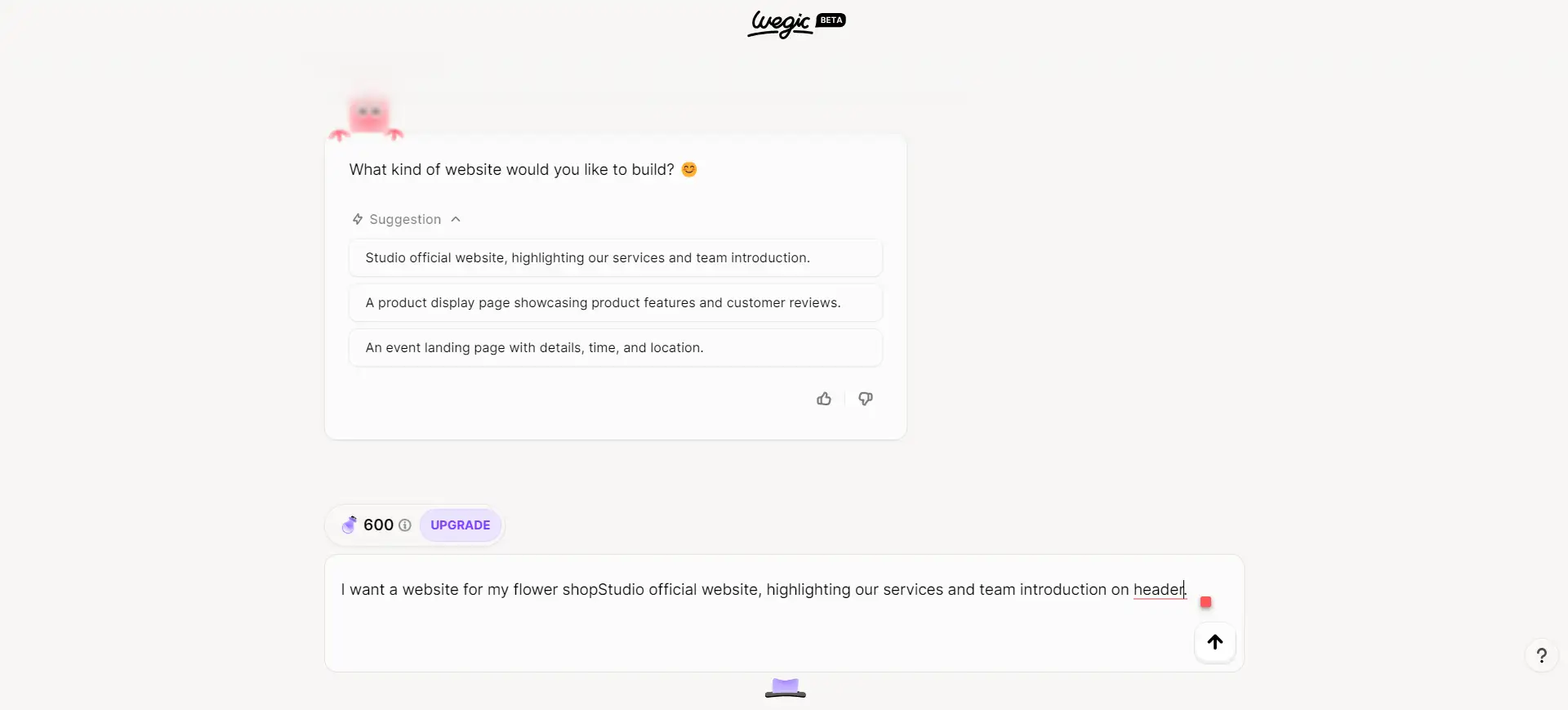
Step 1: Describe your website needs in the chat bar, focusing on the header's layout, style, and functionality.
Step 2: Team up with Wegic’s AI assistants to shape the details. If a minimalist vibe is what you’re after, don’t forget to mention keywords like vibrant colors, bold fonts, or graphics that evoke that feel.
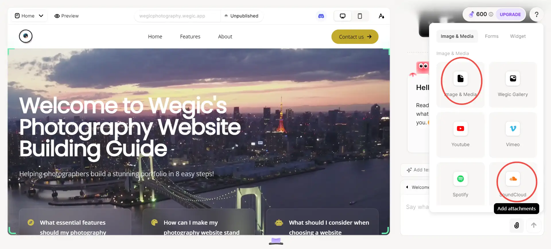
Step 3: Review and adjust your header! Wegic lets you easily refine fonts, images, and interactive elements through further chatting or DIY (you can always customize your website header by uploading images or videos or sending their links to Wegic) ensuring that your website’s header is both engaging and visually cohesive.
Get Inspired for Your Next Website Header Design!
Diving into these 16 standout website header designs reveals a treasure trove of inspiration for crafting your own unique space online. Each example not only highlights stunning visuals but also emphasizes the importance of user-friendly navigation and brand storytelling.
As you explore these creative headers, don't forget to try Wegic who can help you create a welcoming experience that resonates with visitors and reflects your brand's personality. Your header is more than just a design; it's the first impression that sets the tone for the entire journey.
Written by
Kimmy
Published on
Mar 17, 2026
Share article
Read more
Our latest blog
Webpages in a minute, powered by Wegic!
With Wegic, transform your needs into stunning, functional websites with advanced AI
Free trial with Wegic, build your site in a click!
What kind of website do you want to build?
