Log in
Build Your Site
10+ Best Saas Landing Page Practices and Why They Convert
Illustrate these outstanding saas landing page examples that help you to attract potential customers.

When you decide to use Software as a Service (SaaS), everything you do is aligned with the end goal: conversion rates. The saas landing page that converts potential users successfully!
What is SaaS?SaaS landing page A web page used to highlight features, list prices, and ultimately attract users by signing up for a free trial or subscription. Unlike home pages, landing pages focus on a single goal, use case, or target role. SaaS login pages can help your product announce new features, customize information, and more.
The saas landing page converts effectively. A good saas landing page can help you convert countless potential users. You may be wondering what a good SaaS landing page is. What are the elements that make a difference?
Next, I’ll introduce you to the 10+ best practices for SaaS landing pages and use examples to illustrate what makes a great SaaS landing page and the essential features it should include and how a saas landing page converts lots of customers.

10 + examples of saas landing page that converts
1.Userpilot
Every website's landing page is different because every SaaS business is different. But they usually have a lot of common elements. Userpilot is a good example.
If you look at Userpilot's saas landing page, you'll see that it has a nice Hero section. The Hero section is usually at the top of the page and contains the title and hero image. A good title captures the attention of potential users and indicates the purpose of the page. This is the first impression of your product, and you need to focus on it. the title of Userpilot is "See How Userpilot Can Take Your Product Strategy to the Next Level." This statement indicates both what their product is and what their product can help users. The hero section of the saas landing page converts customers successfully. Userpilot's saas landing page also has a basic element, which is the contact form. The contact forms of different companies are different and are usually designed according to the target customers of the product. Userpilot's form contains the name, Company name, Work email, and company size). This information allows users to actively contact them. In general, users who actively fill out forms have a strong interest in talking to the company. That's why the saas landing page converts a lot of users.

2.Bitly
I believe Biltly is one of the best saas landing page best practices. In the Hero section, the company makes it clear that it is "World-class link management" and adds a more convincing introduction at the bottom. At the bottom, it also adds another common element: Social proof-noting. The well-known brands that it has worked with for a long time. It includes BuzzFeed, the New York Times, and more. These well-known brands certainly add to Biltly's strong reputation.
CTA has also been added to the page to increase click-through rates. The whole page is also very designed, which undoubtedly adds to the user's liking. Saas landing page that converts often depends on a variety of factors. Examples include target audience, SaaS landing page design, and traffic quality. According to Wordstream, Software as a Service (SaaS) has an average conversion rate of around 2.35%. However, the top 25% of SaaS companies in the industry have a conversion rate of about 5.31%. So you can say that the average conversion rate is between 2% and 5%. I think Biltly's design will definitely increase conversion rates. Because its page design is very simple and beautiful.

3.Zoom
I'm sure you're all familiar with Zoom. Zoom became a popular office tool during the pandemic. Let's break down the key points of this successful company's saas landing page that converts users. First of all, like all good saas landing page examples, zoom has a good Hero section. As a video conferencing software that prides itself on intuitive features, Zoom uses the same simple principle when creating the landing page.
The headlines are also written directly enough, and Zoom has different targeting on its website for each industry and personalized videos, statistics, and benefits for each user's pain point. Also at the bottom of the page is a list of all the accolades and potential benefits of using this software. The design is not as aesthetically pleasing as other saas landing pages, but it is powerful enough and at the top of the industry that the company can ignore it. As a result, their saas landing page is as simple and straightforward as their company brand, and Zoom's saas landing page that converts lots of target users.
4.Gusto
Comfortable and beautiful. That's the first thing Gusto shows on their saas landing page. It is an all-in-one platform that provides many of the tools you need to recruit, pay, and manage your team. The saas landing page is beautifully designed. Sporty fun, ICONS, and backgrounds with hand-drawn style elements all give a very comfortable and friendly feel. Considering Gusto is an industry in HR, it's not surprising to give people this style. In the pages, the company combines visuals and simple text to make people feel professional and comfortable. The Hero section states that they are "#1 rated HR platform for payroll, benefits, and more," and the subheading states that they are the tool of choice for more than 300,000 businesses. All of this adds up to more credibility for the company and more conversions. Gusto has successfully used a saas landing page that converts lots of users.

5.User Testing
The saas landing page of User Testing is also very good. This is because it provides a good interaction mode with the user. The hero section uses a video to introduce the company. There are also interactive chatbots. Improves user experience by ensuring that basic questions are answered instantly. The design of the entire page is also in line with the company's brand style. Adding interactive chatbots not only allows potential users of User Testing to learn more about the company but also increases the number of saas landing page that converts users.
6.Monday.com
Monday.com is a project management software. Its functions include task management, human resources, marketing, and so on. And their landing page also highlights these features, so that people can see the company. It has a catchy title, "Your go-to work platform," a CTA button at the bottom, and an interesting sliding design that describes the company's main features. The company also highlights its well-known partners (canva, Cocacola, oxy). There is also a simple interactive comparison table that clearly Outlines the differences between Monday.com and other similar products. I believe that Monday.com's beautiful page design can bring it a lot of saas landing page that converts customers.
7.Survey Monkey
Survey Monkey is a tool designed to conduct and collect survey results from the target audience. Survey Monkey's design is more straightforward than other saas landing pages, but it doesn't lack a sense of design. It also lists its well-known partners. Among them are Uber, Adidas, Samsung, Harvard University, and others. However, Survey Monkey's page covers its business in more detail than other saas landing pages. Such as what you can do with SurveyMonkey tools, and the various scenarios and situations in which you can use them.
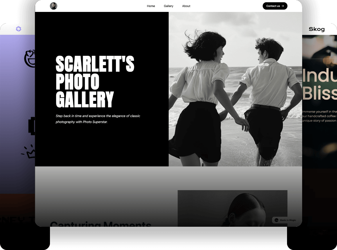
This saas landing page is more targeted. It's also a method of saas landing page that converts customers. This is because, for brands, the most important thing is to understand what the target customer likes. So a brand's saas landing page is a way of reflecting the concerns and style of its target customers. If you also want to create a saas landing page for your own company, you can try Wegic. It's a tool that generates web pages based on your conversation with an AI. Click here to try it for free.
8.Hurree
Hurree can help you display and analyze various metrics of your business. In the Heroes section, the title is: "Discover Data, Drive Decisions, Deliver Results with Hurree AI." The title directly points out the company's product uses and highlights. A panel is placed underneath to let users see how Hurree works. Then it rolls out its partner. Interactive bots have also been added to answer users' basic questions. The page design is simple, nice, and professional looking. The saas landing page that converts customers successfully for Hurree.
9.Asana
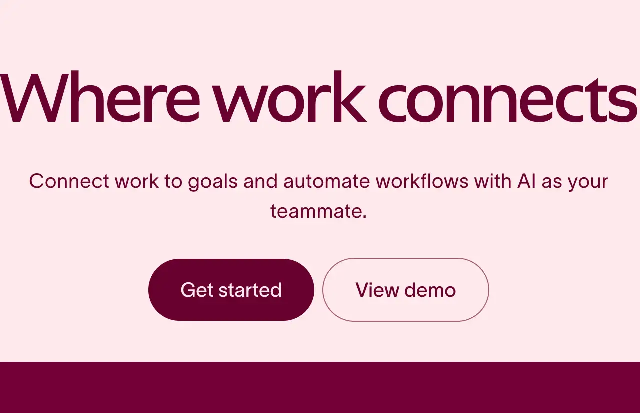
Asana has an excellent SaaS login page. Its web design is clean and modern, with bold typography and color images making the pages visually appealing and appealing. And the Heroes section is a straightforward introduction to show the benefits of using their company's software. It has immediately tells potential users what Asana does and why they should care. Various sections of the web page highlight various aspects of Asana's products. Each section has a clear title, a short description, and a relevant picture to go with it. This allows customers to understand what Asana offers and how it can help them. Asana's landing page also uses social credentials. But unlike other companies, they also include customer reviews that illustrate the value and impact of using asanas. You can take some inspiration from Asana's pages to create your landing page that converts lots of customers.

10.Hub Spot
Hub Spot's landing page is considered one of the best examples of saas landing page that converts customers. The page features a concise and attention-grabbing title that immediately conveys the value proposition of their software. HubSpot combines striking visuals and video. It shows the interface of the product and highlights its key features. This visual representation helps capture the user's attention and generate interest. This page includes customer referrals and success stories. It builds credibility and trustworthiness. This social acceptance helps potential customers feel more confident when choosing a Hub Spot. Saas landing pages strategically place visible CTAs. It leads visitors to take specific actions, increasing the likelihood of stickiness. Interactive chatbots are also being used to keep users informed.
11.Air table
Air Table is also a good saas landing page. Because this page conveys the value proposition of Air Table, it emphasizes the benefits of flexible organization, customizable workflows, and strong integration. The design of the web page is clean and modern, visually appealing, and reflects the user-friendliness of the platform. The title of the Air table also makes no small contribution to the saas landing page that converts customers. It's simple and attractive. And the web page also has a lot of high-quality visual effects. The landing page of Air Table is well structured. If you want to design a page like this, you can use Wegic to design it. Click here for a beginner's guide on how to make a web page with AI.
Click picture to find out how Wegic created website!⬇️
Conclusion
This article introduces several successful saas landing page examples. Their page design usually consists of a few basic elements: a hero section, Features/benefits, and Social proof-.call-to-action (CTA), or the addition of chatbots and user reviews. These basic elements make up one saas landing page after another. They use a saas landing page that converts countless customers by designing in line with the brand's style. SaaS landing page optimization is no joke, especially when you want to increase product conversion rates. Many of the best SaaS landing pages have some important qualities in common - more specifically, in terms of design, they are equally important in terms of functionality and aesthetics. It also helps saas landing page that converts countless potential customers. When crafting, you'll also want to make sure your company's SaaS landing page explains the importance of the product or service to customers provides a clear value proposition, and shows them how your organization is different from the competition. In general, you need to show customers your product's unique advantages and the achievements your product has achieved.
Written by
Kimmy
Published on
Mar 12, 2026
Share article
Read more
Our latest blog
Webpages in a minute, powered by Wegic!
With Wegic, transform your needs into stunning, functional websites with advanced AI
Free trial with Wegic, build your site in a click!
