Log in
Build Your Site
17 Resume Website Examples 2024 to Inspire Your Own
Discover the top 17 resume website examples of 2024. Learn how to design a clean and mobile-friendly website that leaves a lasting impression on employers.
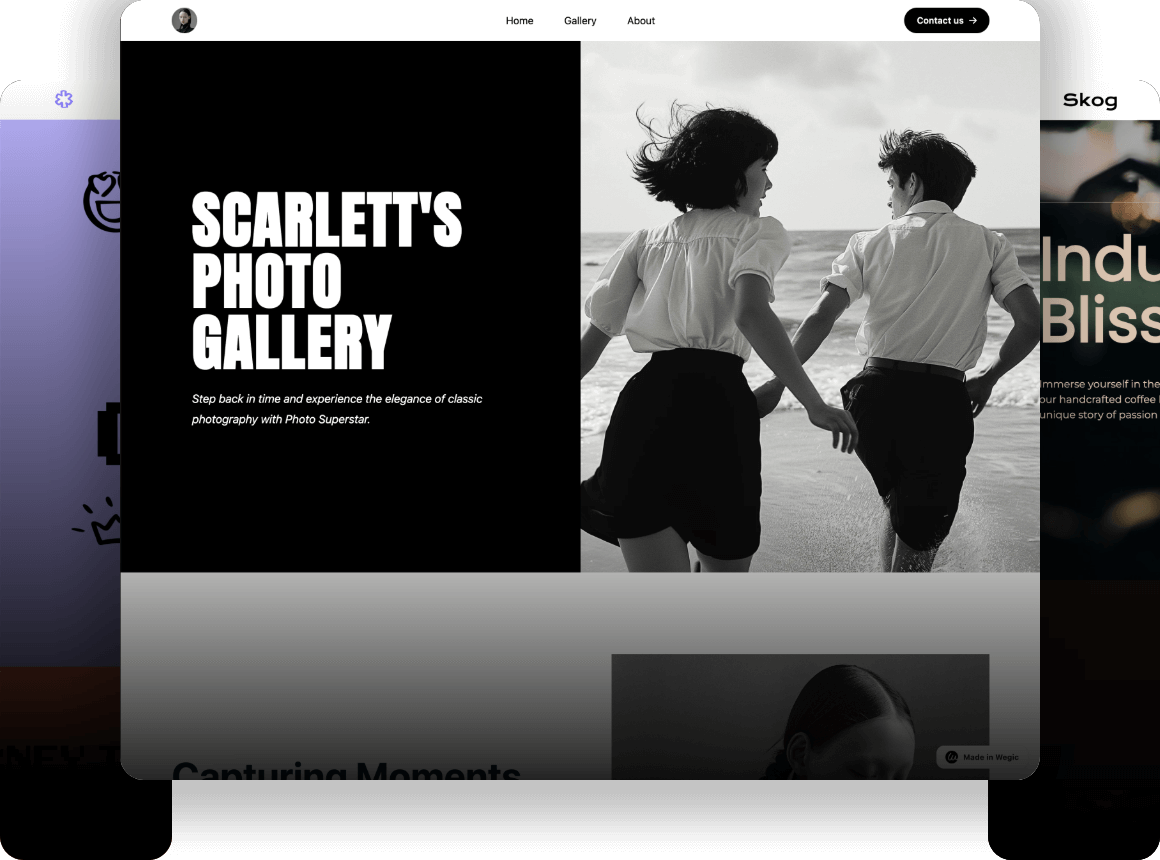
Isn’t it frustrating when you are tense about how to design an exclusive resume? You’re not alone. There are so many choices around today, that it can be quite paralyzing, especially if you realize that your resume is the only shot a prospective employer will ever get at you. However, what could be more effective than just displaying this list of accomplishments and expertise in front of the target audience in a plain and boring manner or even in the form of a one-page resume? The thing is to build resume websites.

The creation of your resume website allows you to influence the narration of your story by making it easier for employers to see what you have been trying to hide. Second, an applicant doesn’t have to limit themselves to what he/she wants to share about themselves with a resume website encompassing everything that cannot fit into a regular resume such as portfolios, testimonials, and even blog articles that may be related to the candidate’s field of specialization.
Here in this article, let me show you the highest-level tips on how to create your very own resume website and several of the best resume website examples of 2024 for your reference. No matter if you are still in college or are an experienced professional, here are the resume website examples that would suit everyone. Alright then, let’s get started and find out more about how to make a winning resume website for yourself!
High-Level Tips for Resume Websites
Keep It Clean and Simple
But where resumes are concerned and resume websites in particular, more is not necessarily better. Simplicity and cleanliness help to overcome the problem by meaning that the content is as important and easy to find as the layout. There should not be a lot of distractions such as other objects that might Flickr.com distract the attention of the audience from you. Thus, IT should avoid complex layouts with little white spots, thick headings, and a complicated menu bar. It also adds professionalism to it and helps the users have easy access to the information they are searching for.
Make It Mobile-Friendly
With more and more people accessing the web from their mobile devices, your resume website must be fully responsive. This means it should look and function well on all screen sizes, from desktops to smartphones. A mobile-friendly site ensures that potential employers can view your resume on the go, without any frustrating navigation issues. Remember, first impressions matter, and a poorly designed mobile site can be a deal-breaker.
Showcase Your Personality
Recruiters now come to your resume website to get to know you, so don’t be afraid to embrace your personality. Just remember to keep it somewhat professional and proper but don’t be afraid to put yourself into the design and the content. Choose a profile colour that may correlate with the personality you want to convey, upload a work-related but friendly photo, and write text in a way that is natural for you. This is important so that your site is easy to remember and it also makes you different from the rest of the people that are already associated with the site.
Highlight Key Achievements
Your resume website is also the perfect place for emphasizing your achievements and revealing what you can offer to the company. You should incorporate the use of visual aids such as graphs or charts, and other relevant infographics to make your achievements more engaging. You can also include comments and recommendations from previous employers or clients to bring credibility and emphasis to those specific areas. Remember always to ensure that you keep it as brief but packed with only the most relevant accomplishments so far as your career path is concerned.
Include a Call to Action
All the resume websites must give the visitors a clear direction on the next course of action in terms of a call to action (CTA). Whether it is requesting them to message you, download your resume or connect with you on Linked In, a CTA assists in guiding the process and makes it easier for the employer to get in touch. The best place to place your CTA is at the end of the home page or in the header of your site so that it will be easily seen.
Optimize for SEO
In case you would like other potential employers to find your resume website quickly, then you must make sure that they are search engine friendly. This entails writing your content with the right keywords, using proper meta tags and descriptions and also ensuring your site is fast. Search engine optimization can assist you to achieve a better rank on search engines, to get more visitors.
17 Resume Website Examples 2024 to Inspire Your Own
Pascal van Gemert
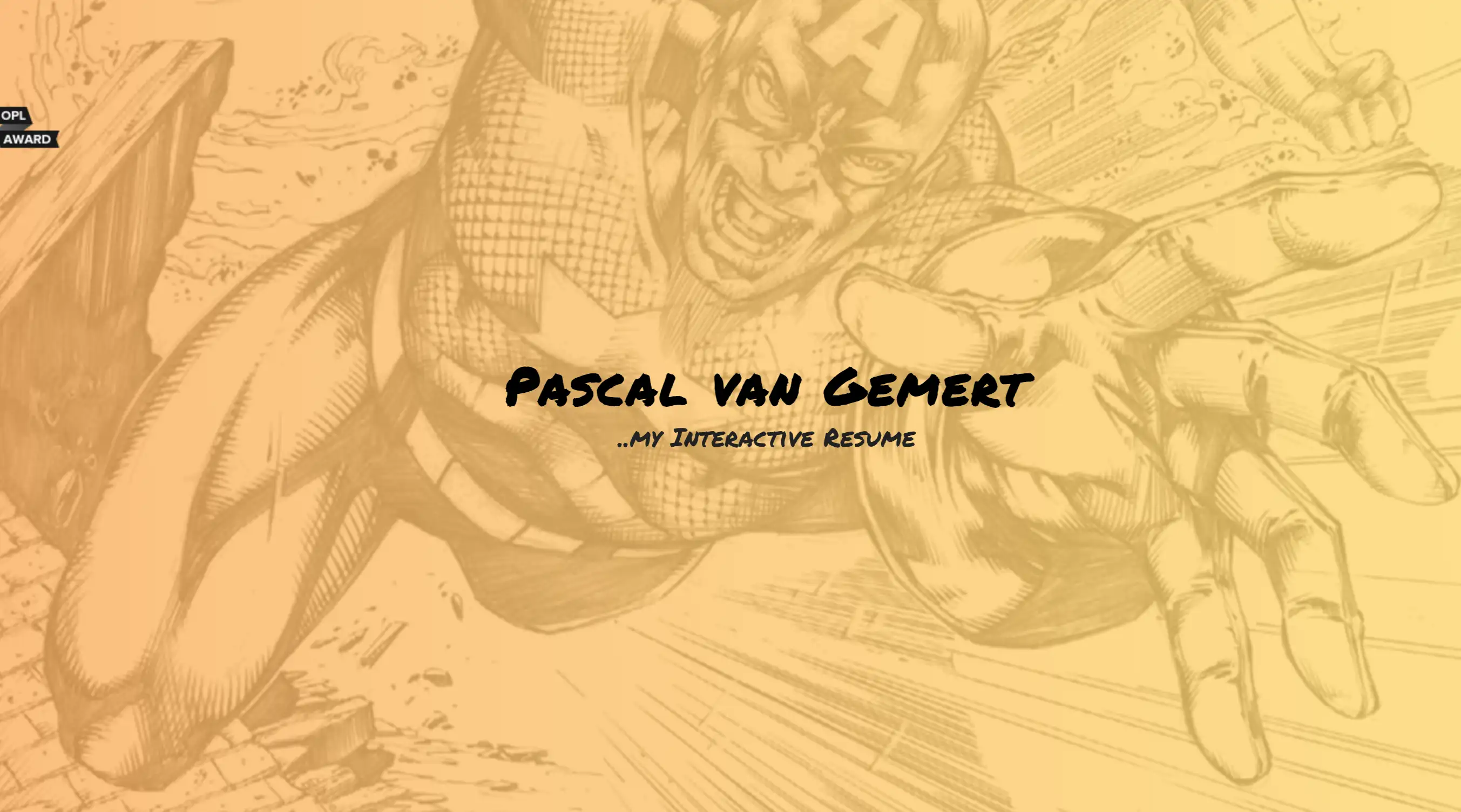
Pascal van Gemert’s resume website is an outstanding example of how to organize extensive information on a single page. For professionals with a wealth of experience, this resume website example demonstrates the power of a well-structured layout. Pascal employs a scrolling design that allows visitors to absorb his professional journey without needing to click through multiple pages. His use of sections like “Profile,” “Experience,” “Skills,” and “Projects” ensures his diverse talents are showcased clearly, all tied together with a consistent teal color that brands his resume website example with a cohesive visual identity.
Kristi Hines
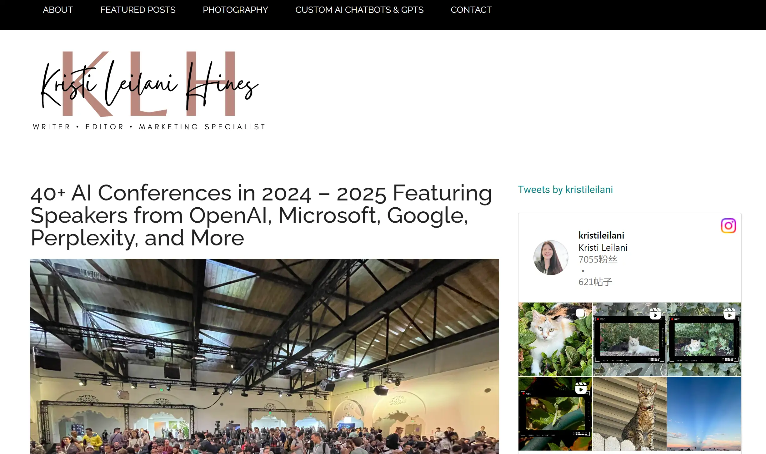
Kristi Hines' resume website exemplifies how to effectively showcase testimonials. This resume website example features glowing endorsements from clients and colleagues, alongside logos of prominent companies she has collaborated with. By incorporating these elements, Kristi’s website builds trust and credibility, a crucial aspect of any resume website. This approach highlights the importance of recommendations in making a resume website example stand out, making it more than just a static list of accomplishments but a dynamic showcase of professional reliability.
Tim Harford
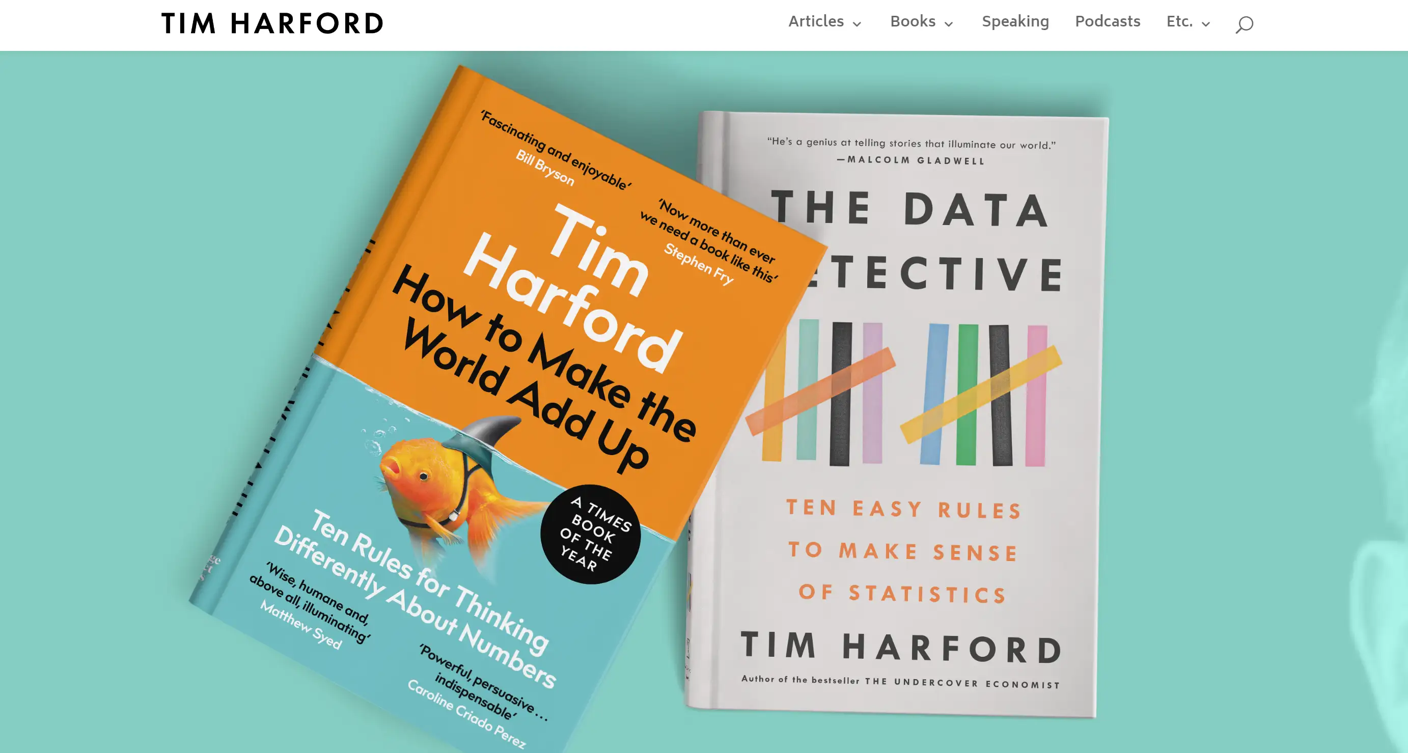
Tim’s resume website is a fantastic example of using whitespace to enhance the viewing experience. This resume website example smartly draws attention to the content without overwhelming the viewer with distractions. Instead of cluttering the site with excessive banners, Tim focuses on guiding visitors towards his featured book with a subtle call to action. This strategy maintains the website’s clean, content-driven aesthetic, making this resume website example a great lesson in balancing promotion with the primary goal of presenting one’s professional credentials.
Red Russak
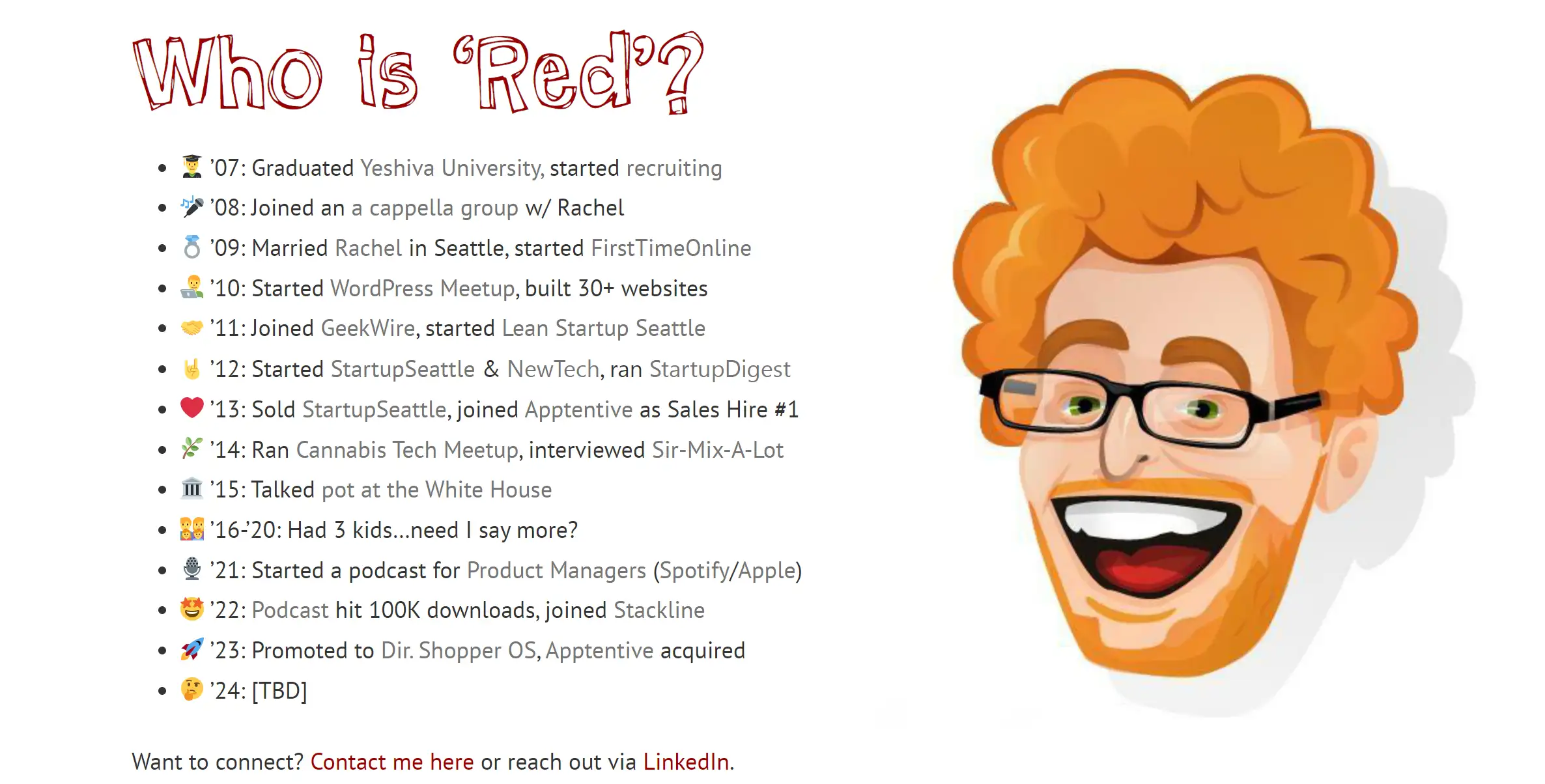
Red Russak’s resume website is a compelling example of storytelling through a resume website. This one-page design is both simple and effective, highlighting Red’s community-building and business acumen. This resume website example tells Red’s professional story in an engaging and orderly fashion, enhanced by excellent graphics that capture the essence of his experiences. From tech ventures to podcasting, this resume website example covers every aspect of Red’s professional life, proving that even a straightforward design can be highly impactful.
Diogo Correia

Diogo’s resume website is a prime example for students looking to showcase their experiences and aspirations. This resume website example goes beyond just listing qualifications; it offers a glimpse into Diogo’s personality and journey. The site features unique animations, a personal message, and a timeline that visually narrates his path. With its creative use of particle effects and an animated timeline, this resume website example stands out, proving that students can make a big impression with a well-designed online resume.
Sean Halpin

Sean Halpin’s resume website is a concise, visually appealing example of how to create a targeted and impactful online resume. This resume website example uses ample whitespace to enhance readability, especially on mobile devices, making it a user-friendly choice. The clean and modern design emphasizes user experience, with each section clearly labeled and easy to navigate. Sean’s approach is a great example of how to design a resume website that is both stylish and functional, ensuring visitors find the information they need effortlessly.
Melanie Daveid

Daveid’s resume website is an excellent example of the “less is more” philosophy. This resume website example features a minimalist portfolio that highlights her most significant work. Rather than overwhelming visitors with numerous projects, Daveid carefully curates her portfolio, showcasing only her best campaigns. This strategy demonstrates that sometimes, a few examples of excellence are far more effective than a plethora of mediocre ones. For those looking to create a focused and impactful resume website example, Daveid’s approach is worth emulating.
Robby Leonardi
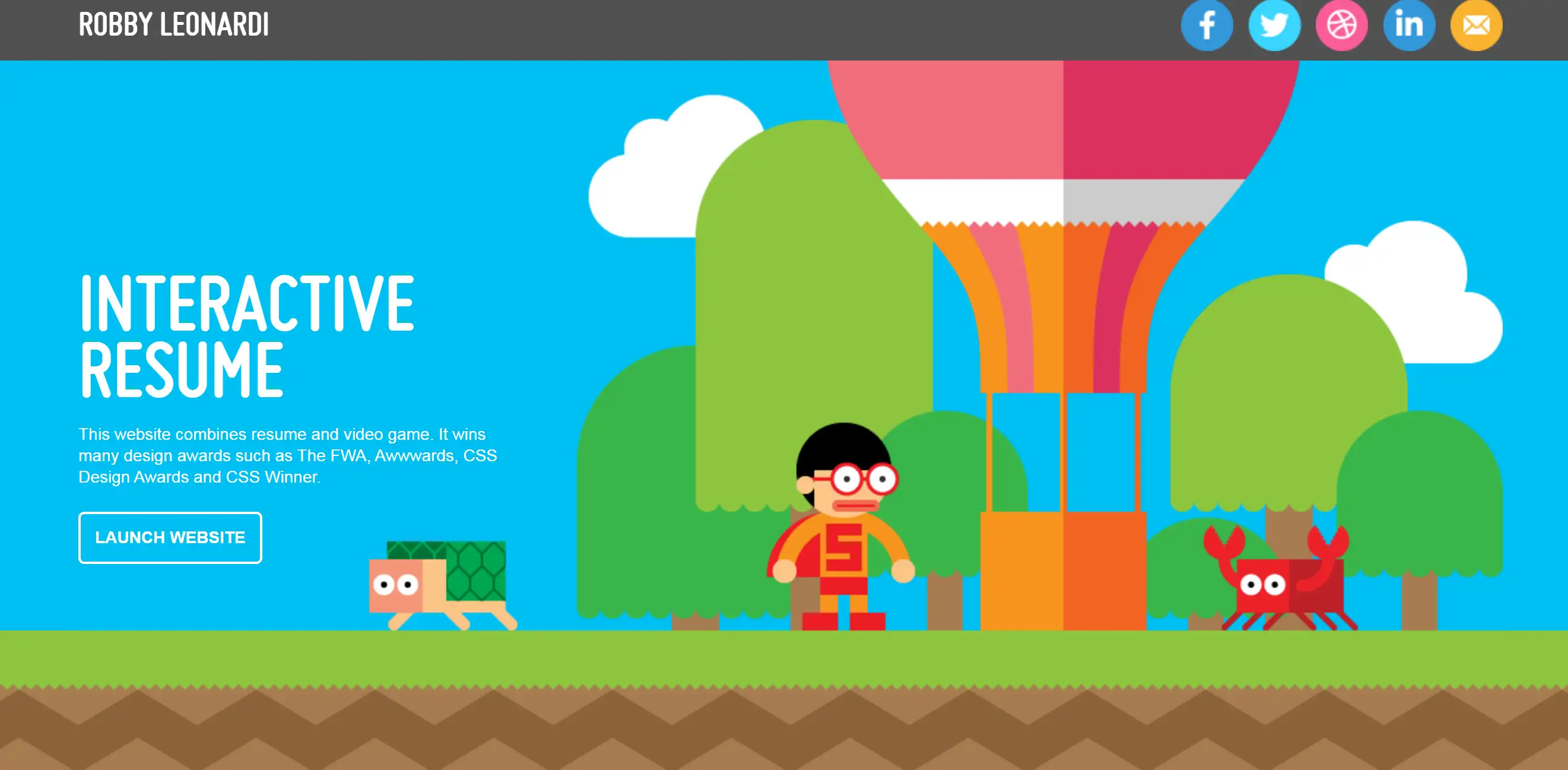
Robby’s resume website stands out with its bold use of typography and interactive design. This resume website example is a brilliant demonstration of how to make a lasting impression. By transforming his portfolio and resume into a video game-like experience, Robby ensures that his website is memorable and engaging. This innovative approach is a perfect example of how creative thinking can turn a standard resume website into an interactive storytelling platform that captures the viewer’s attention.
Nathaniel Koloc
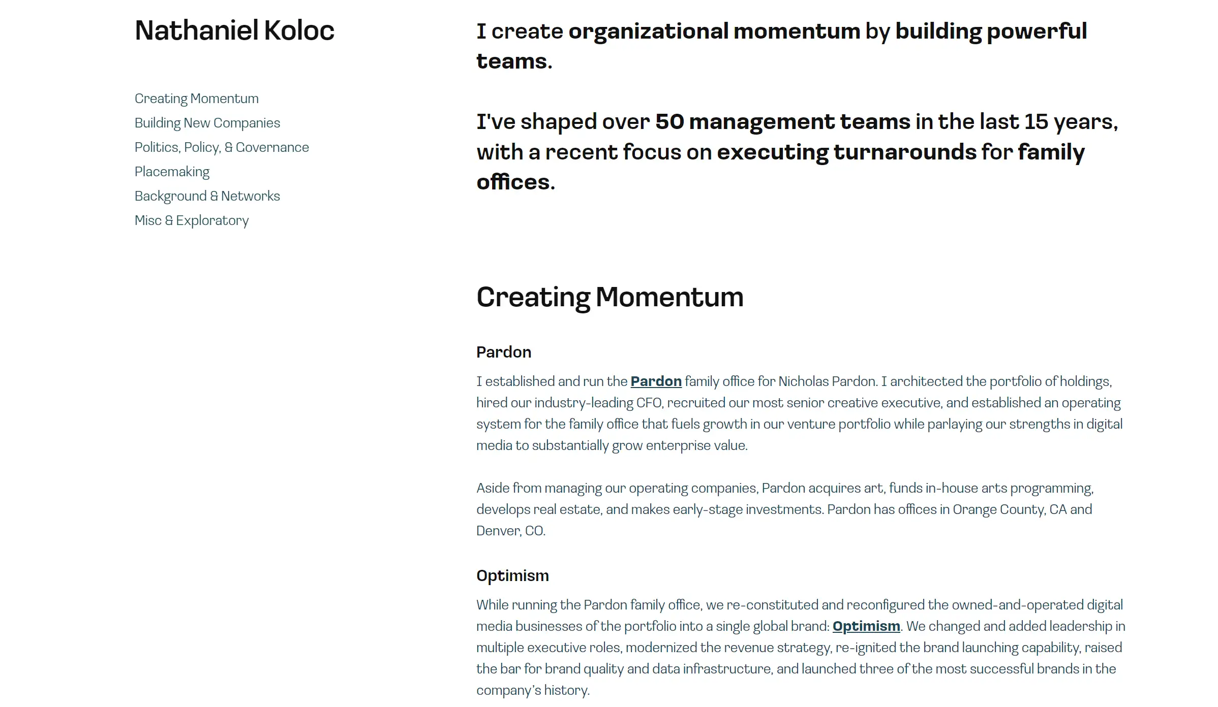
Nathaniel Koloc’s resume website is a simple yet effective example of a one-page design. This resume website example utilizes a floating navbar and multi-colored background sections, making navigation intuitive and visually pleasing. The straightforward layout and easy access to information make it a practical choice for those looking to create a basic yet professional online resume. This resume website example shows that sometimes, simplicity is the key to a successful presentation.
Lisa Elias
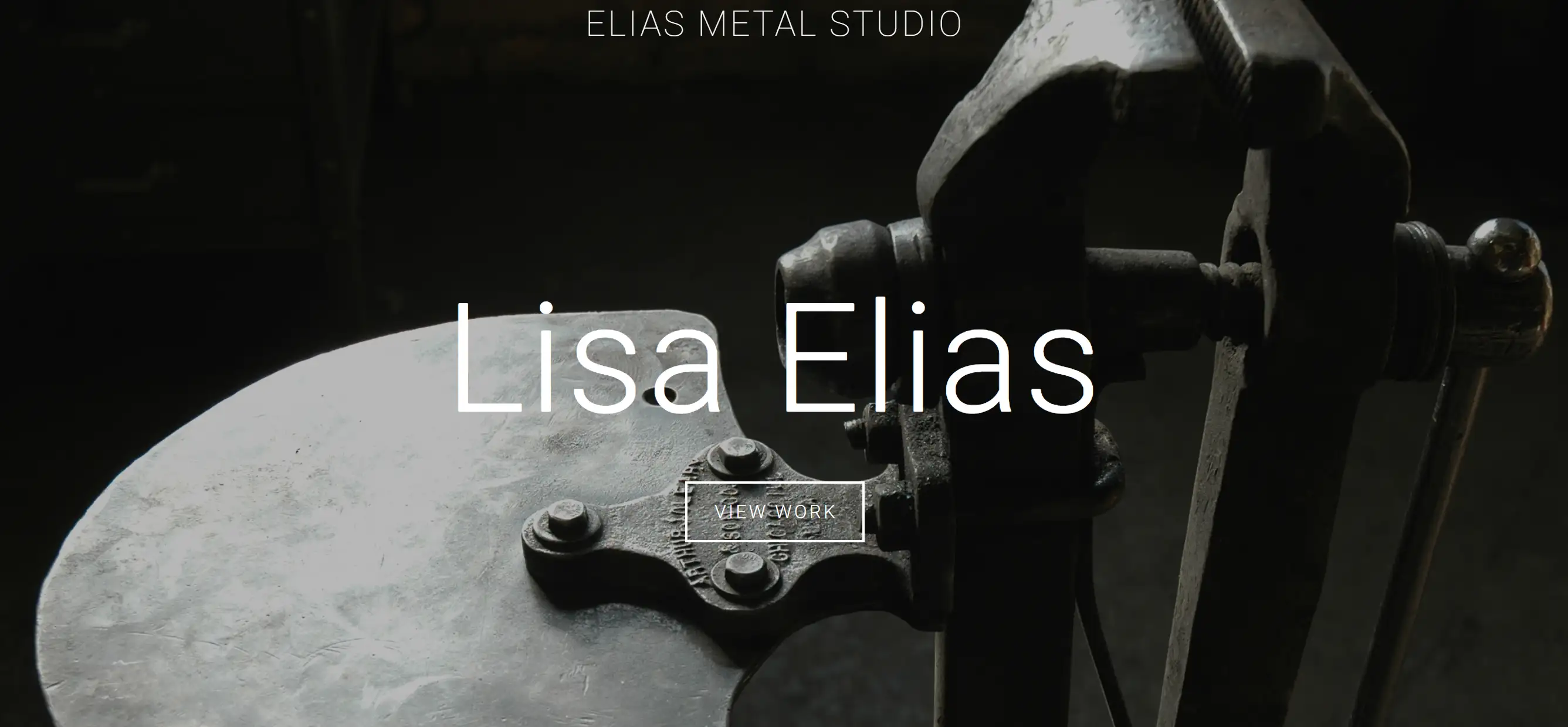
Lisa Elias’s resume website is a masterpiece in itself, much like her metalwork. This resume website example effectively showcases her work with striking images and a captivating video that takes visitors on a journey through her creations. What sets this site apart is how Lisa integrates her personality into the design, using her sculptures to highlight various issues she cares about. This resume website example is not just about displaying her portfolio; it’s an engaging narrative that offers a glimpse into who she is, making it a brilliant model for anyone looking to inject a bit of their personality into their resume website.
Alisha Selena
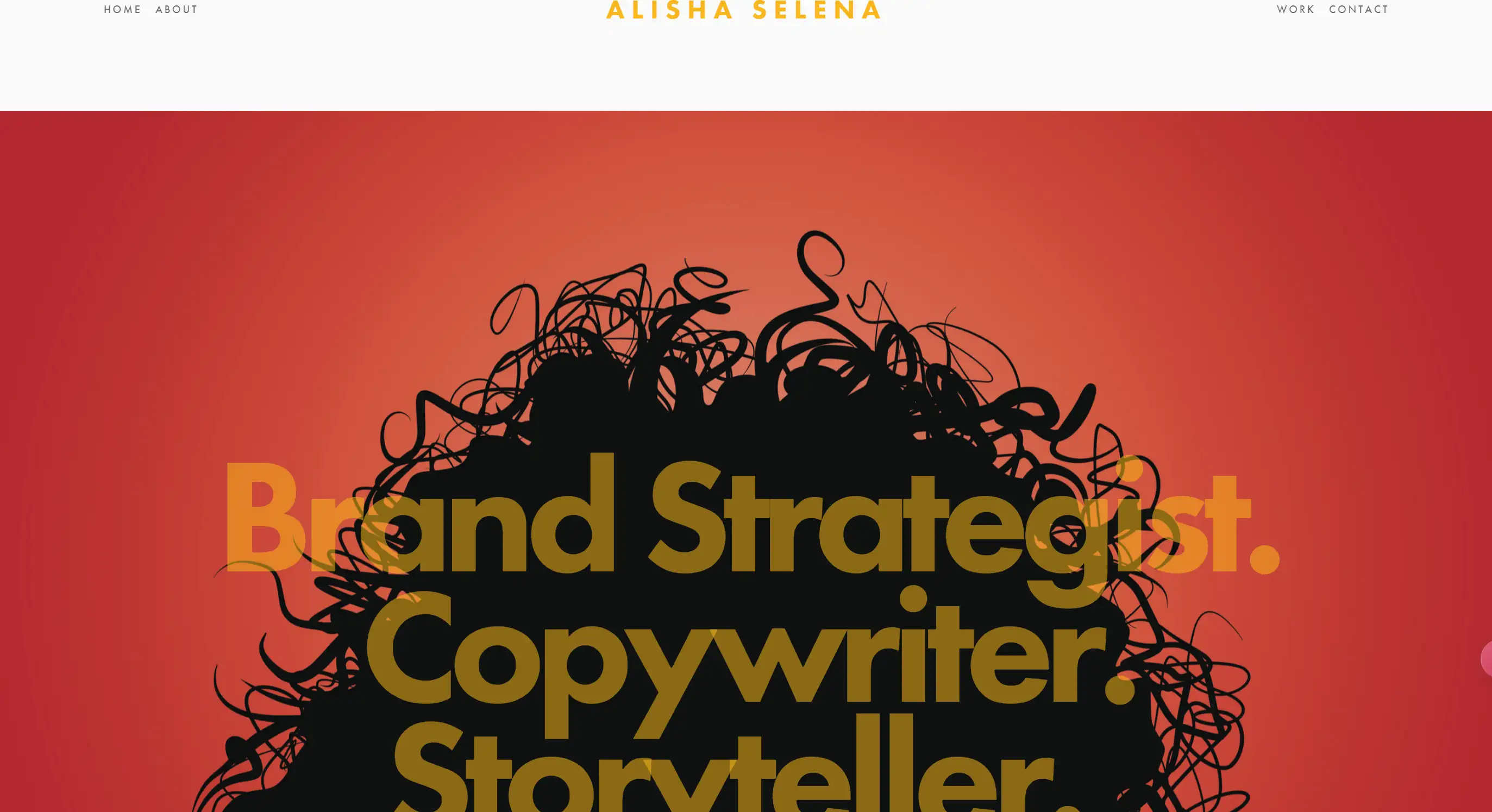
Alisha Selena’s resume website is the epitome of minimalism with a twist. This resume website example is straightforward and to the point, with a parallax image that adds just the right amount of flair. The header is simple, the footer only includes social links, and in between, a “view my resume” button opens up a PDF in a new tab. It’s an excellent example of how parallax functionality can breathe life into a page without overwhelming the user. Each section is clearly labeled and easy to navigate, making this resume website an example of a breeze for visitors to find exactly what they need.
Julian Breheny
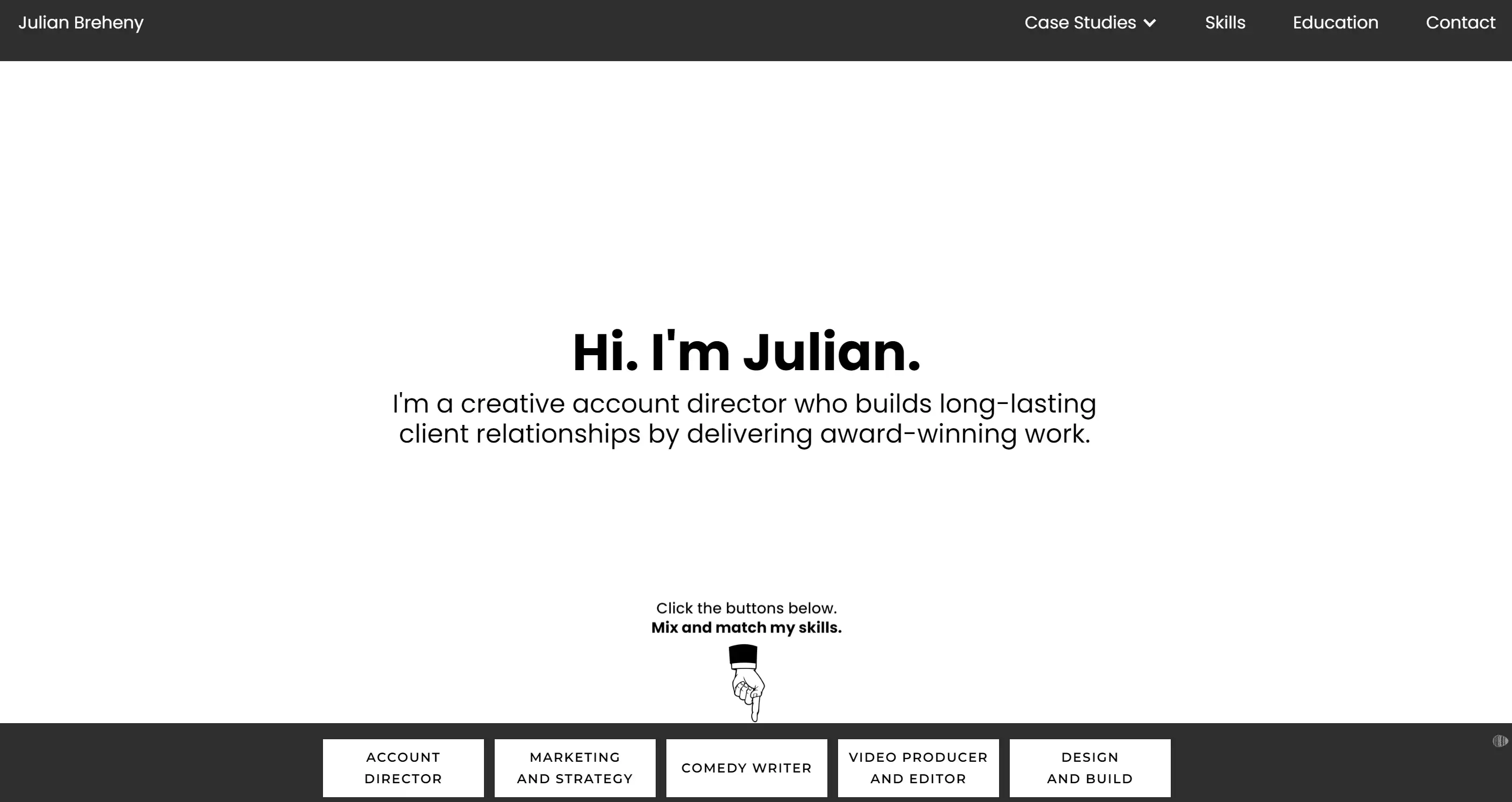
Julian’s resume website is a playground for the creatively inclined. This resume website example brilliantly showcases his diverse skills and talents in a fun, interactive way. As you navigate through his site, you’re met with playful elements that keep you engaged while effectively presenting his abilities. The top menu is loaded with information about his skills, education, and work history, making it a perfect resume website example for multi-talented professionals who want to highlight their versatility while keeping things lively and enjoyable.
Erik Kindel
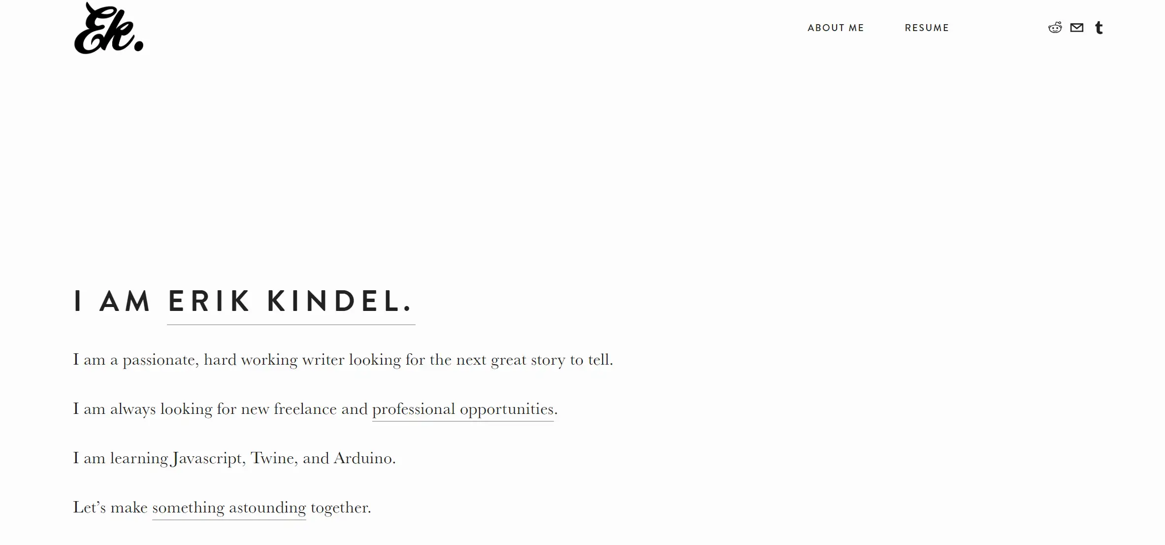
Erik Kindel’s resume website is a fantastic example of how simplicity can still pack a punch. With a text-heavy hero section, parallax scrolling, and a straightforward layout, this resume website example is all about delivering content in the most efficient way possible. The site works seamlessly on both desktop and mobile, ensuring a smooth experience for all users. Erik’s website proves that you don’t need flashy elements to make an impact; sometimes, a clean design with a focus on the essentials is all you need to create an effective resume website.
Jim Ramsden
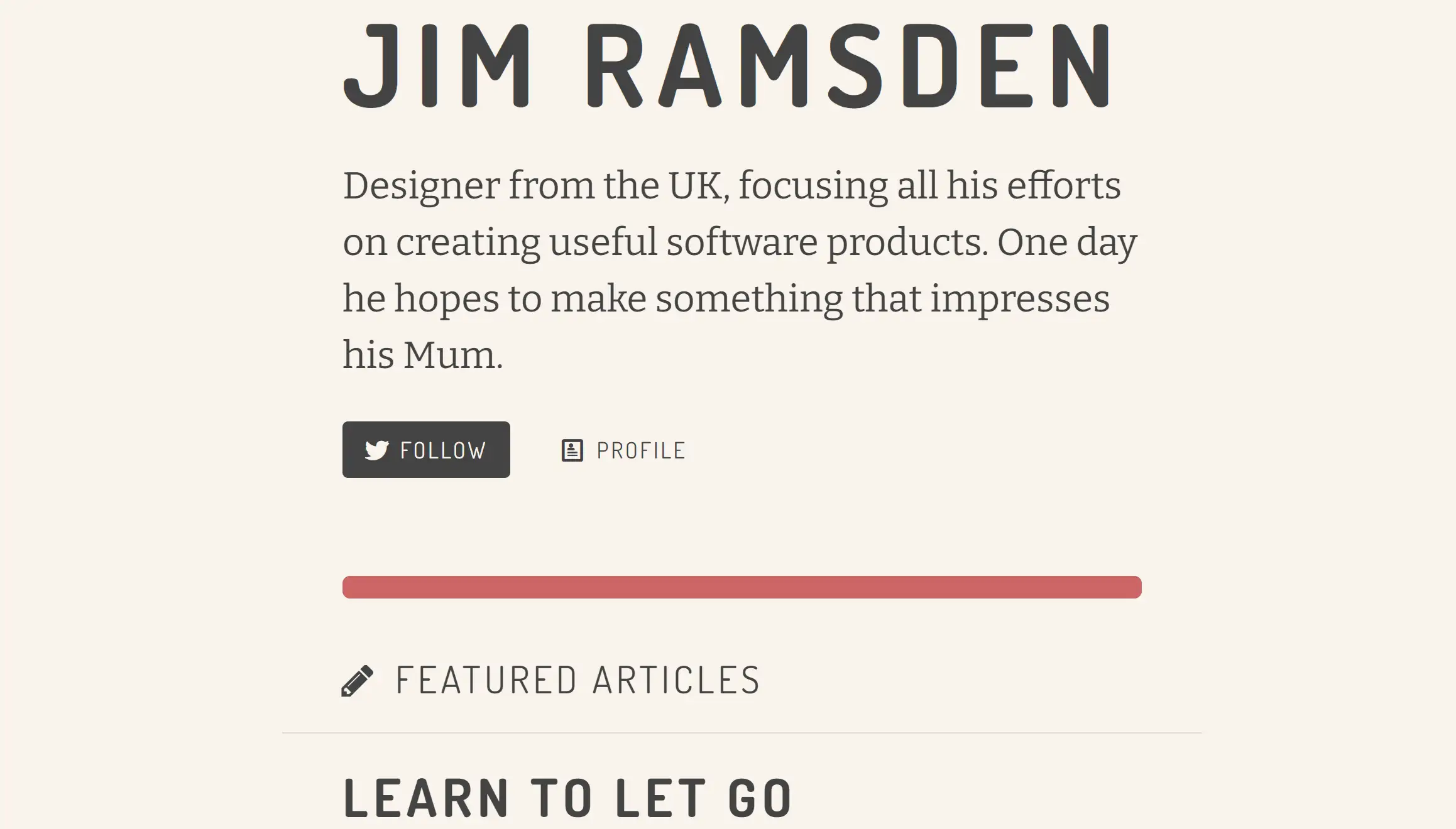
Jim Ramsdem’s resume website stands out from the crowd with a captivating photo and a tagline that immediately grabs your attention. This resume website example goes beyond the standard template by offering a compelling About page that delves into Jim’s personal and professional life. It’s a fantastic resource for anyone looking to create a resume website that not only showcases their qualifications but also reflects their unique personality. Jim’s website is a prime example of how a well-crafted About page can make all the difference in leaving a lasting impression.
Kevin Koeshartono
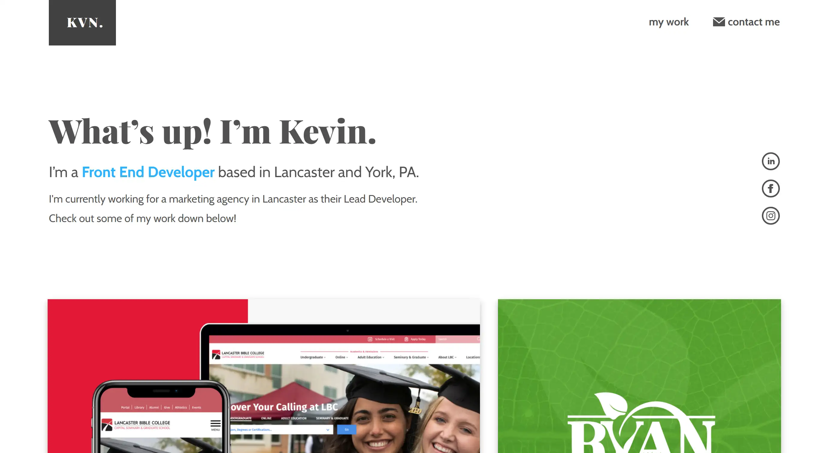
Kevin’s resume website is a shining example of how to mix youthful design with user-friendly functionality. This resume website example features a clean, modern design with a fun and engaging tone. The site is easy to navigate, with a homepage that provides quick access to Kevin's social profiles, experience, skills, and portfolio. The use of video and slideshows adds an extra layer of interactivity, making this resume website example a perfect fit for anyone looking to showcase their web development skills in an attractive and accessible way.
Gary Sheng
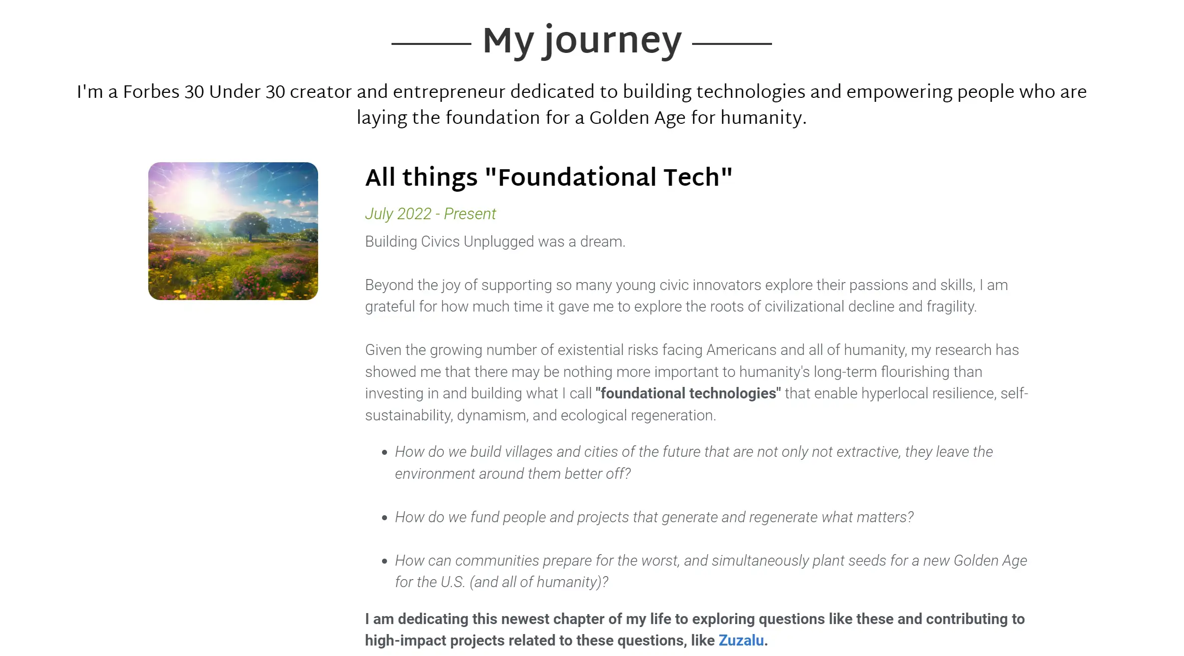
Gary Sheng’s resume website is one of the most inspiring resume website examples out there, blending his journey as a Forbes 30 Under 30 creator with his passion for using technology to drive social change. The site is straightforward, with easy navigation to key sections that highlight his mission, projects, and communities. What makes this resume website example stand out is its ability to connect visitors with Gary’s broader vision, making it not just a resume but a call to action for collaboration and innovation. It’s a minimalist yet powerful example of how to build a resume website that speaks volumes about your purpose.
Amy Colleen
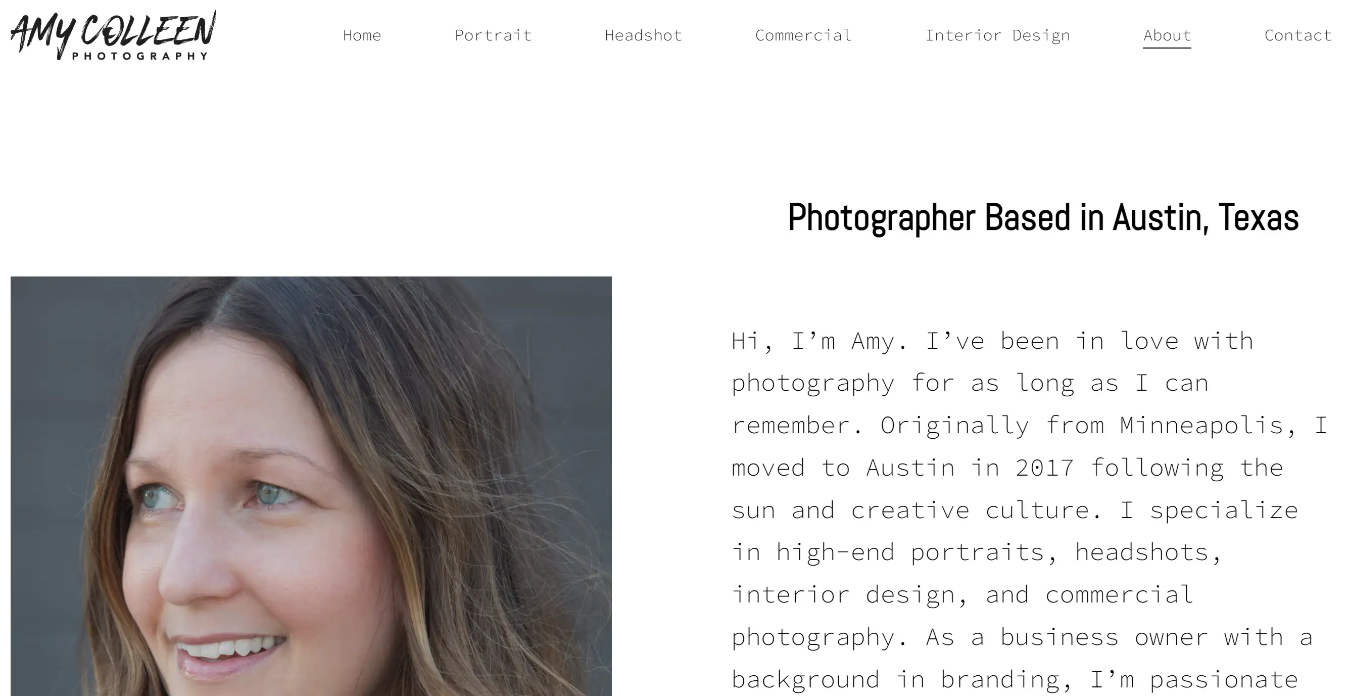
Amy Colleen’s resume website is a beautiful example of how less can be more, especially for photographers. This resume website example is all about letting the images do the talking, with a design that’s simple yet stunning. The homepage features a full-screen slideshow that immediately draws the viewer in, with minimal text to distract from the visuals. For anyone in the creative field, Amy’s website serves as a fantastic model for how to create a portfolio-focused resume website that’s both visually appealing and highly effective.
Ready to Create Your Resume Website?
So, you’ve explored these inspiring resume website examples, and now it’s time to ask yourself: What’s holding you back from creating your own? I know it can feel daunting—where do you even start? Maybe you’re not a designer or unsure how to translate your experiences into a compelling online presence. Trust me, you’re not alone in feeling this way. But here’s the good news: You don’t need to be a tech guru to create a standout resume website. Go to Wegic now and chat with us. Now it is effortless to build your dream site.
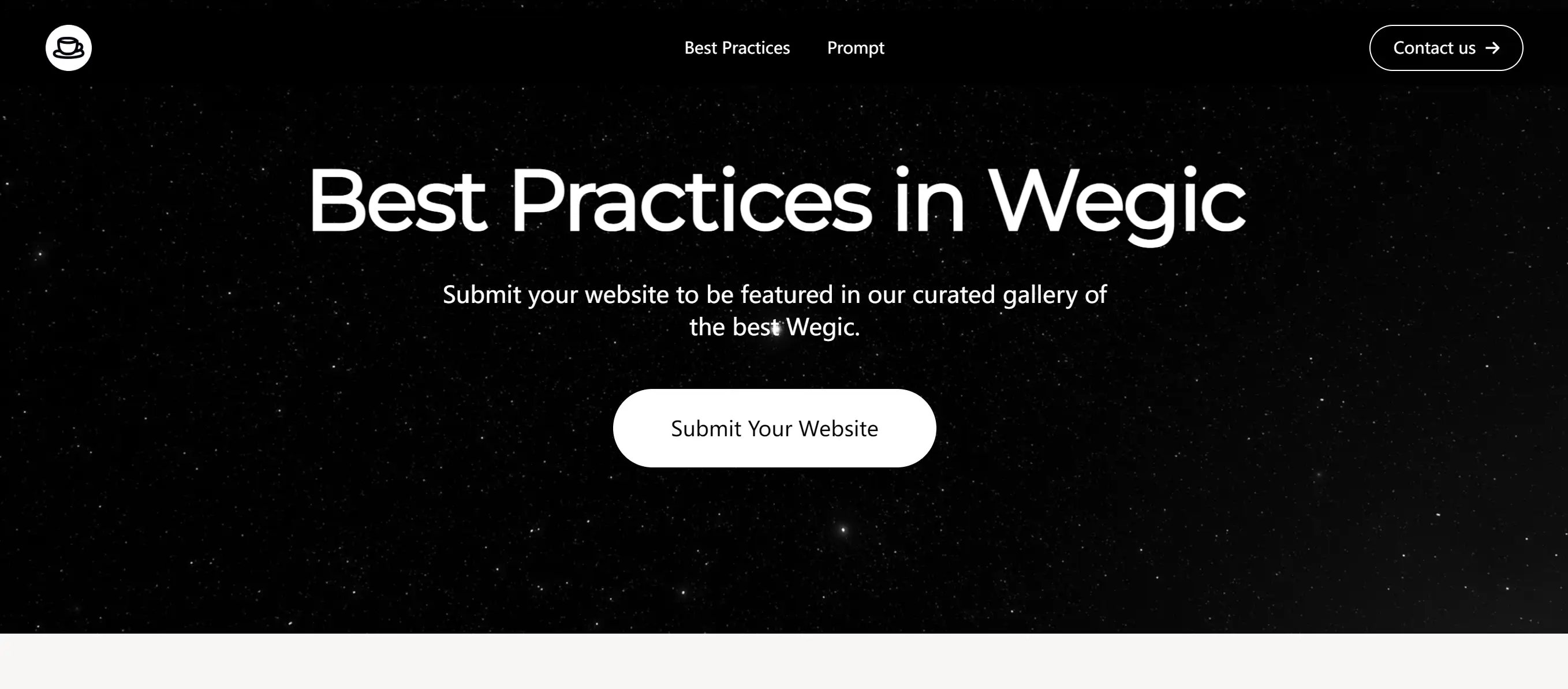
No need to worry if you're not a tech pro—Wegic is here to understand your needs and bring your ideas to life. Wegic is like having a friendly AI web designer and developer by your side, making the process of creating a website as simple as having a chat. Unlike other AI web designers, Wegic offers a smooth, conversational experience powered by the latest GPT-4 model. Creating your site through easy chat interactions is not just super innovative, but also incredibly user-friendly, catering to individuals with specific ideas and those seeking inspiration and guidance.
Wegic stands out due to several key features:
-
AI-Powered Design and Development: Wegic uses advanced AI algorithms to understand your requirements and transform them into a functional, visually appealing website. Notably, Wegic is the first AI web designer and developer powered by the latest GPT-4o model.
-
Conversational Interface: Wegic uses a chat-based interface to simplify website creation to the level of a conversation. Effortlessly create your ideal website through simple conversational interactions.
-
Adapt to all screens and sizes: Wegic is designed to work seamlessly across all major web browsers, ensuring compatibility with a wide range of devices. Websites created by Wegic are carefully optimized to ensure they display well and provide a great user experience on various devices such as desktops, laptops, and mobile phones.
-
Multilingual Support: Wegic seamlessly supports many languages, including English, Chinese, Japanese, and others, ensuring that your website can easily reach a worldwide audience.
These resume website examples show that with the right inspiration and a little guidance, anyone can build a professional, eye-catching resume website that sets them apart. Whether you’re looking to switch careers, land your dream job, or simply showcase your skills in a modern way, a resume website is your chance to shine.
Remember, your resume website isn’t just a static document—it’s a dynamic platform that lets you tell your story your way. With these resume website examples as your guide, you have everything you need to get started. So, why wait? Dive in, get creative, and let your resume website be the tool that opens doors to new opportunities.
Written by
Kimmy
Published on
Mar 17, 2026
Share article
Read more
Our latest blog
Webpages in a minute, powered by Wegic!
With Wegic, transform your needs into stunning, functional websites with advanced AI
Free trial with Wegic, build your site in a click!
What kind of website do you want to build?