Log in
Build Your Site
Responsive vs. Adaptive Web Design: What's the Difference?
Click and discover the definitions, advantages, and scenarios for responsive vs. adaptive web design. After reading this blog, you can make informed choices.

As a newcomer to the design industry, are you still feeling perplexed about the difference between responsive and adaptive design? You’re not alone.
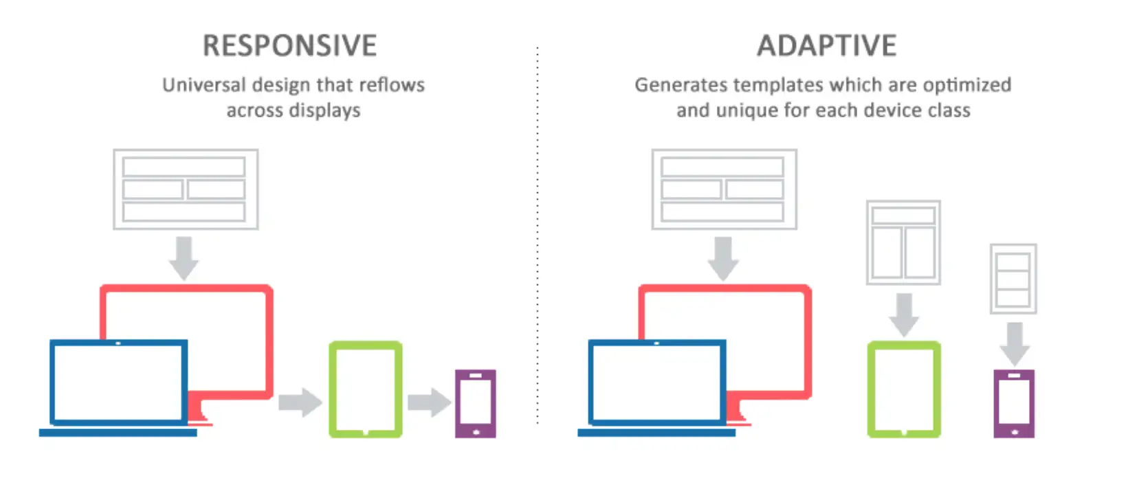
Both designs are essential approaches for creating websites that look great on any device, but they function quite differently. Responsive design fluidly adjusts layouts based on screen size, while adaptive design uses predefined layouts tailored to specific screen dimensions.
This article will dive deep into the definitions of responsive and adaptive design, explore their key differences, and weigh the pros and cons of each approach. By the end, you’ll have a clearer understanding of which design method is best suited for your specific needs.
Responsive vs. Adaptive Web Design: What are the Key Differences?
01. Differences: The Evolution of Responsive & Adaptive Web Design
Traditional Web Design
In the early days of the Internet (1990s-2000s), websites were designed in a "fixed" way, which meant they had one layout. This was the "one-size-fits-all" approach, mainly because the internet was accessed almost exclusively through desktop computers with a limited range of screen sizes. The simplicity of this design was appealing; developers and designers could focus on creating content for a single, standardized environment. However, as the digital landscape evolved, so did the need for more dynamic and flexible web design solutions.
Adaptive Web Design
As smartphones, tablets, and other devices became more common, web designers began to realize that a single fixed layout didn’t work well on smaller screens. This led to the development of adaptive web design (AWD). Instead of having just one layout, the adaptive design allowed websites to have several fixed layouts, each designed for a specific screen size. That's to say, a website might have one design for desktops, another for tablets, and another for mobile phones. When you visit an adaptive website, it detects your device and serves the best layout for it. For example, if you open a site on your smartphone, it will display a version designed just for small screens, making it easier to read and navigate. If you open a site on your desktop, what you see might be different from the mobile ones. This made websites more user-friendly on different devices but required designers to create multiple versions of the same site.
Responsive Web Design
The next step in the evolution of web design was responsive web design (RWD), which took the concept of AWD a step further. Instead of having multiple fixed layouts, RWD uses fluid grids, flexible images, and CSS media queries to create a single layout that adapts to any screen size. This approach ensures that the website looks good and functions well on all devices, from the smallest smartphone to the largest desktop monitor. The design is not just about resizing elements but also about reorganizing the content in a way that makes sense for the device being used. This means that the layout can change dramatically from one device to another, but the core content and user experience remain consistent.
Differences Between Adaptive and Responsive Web Design
While both adaptive and responsive design aims to enhance the user experience across devices, they differ in their strategies and implementation. Adaptive design offers tailored experiences for different devices, whereas responsive design ensures consistency by providing a single, adaptable interface.
02. Why Is Responsive Web Design Dominating the Industry?
We have analyzed the pros and cons of responsive vs. adaptive web design, but have you ever wondered which one is more popular and the reasons behind it?
In 2015, Google released a major update called "Mobile-First Indexing", which made it clear that the search engine would prioritize crawling and ranking websites that are mobile-friendly. Google clearly stated that responsive design is its recommended mobile optimization method because it can adapt to all devices with one URL and the same HTML without creating multiple page versions.
The 2022 Design Trends Report released by Webflow pointed out that responsive design has almost become a standard for website design. According to W3Techs' 2023 statistics, more than 90% of the top 1 million websites use responsive design to optimize users' mobile experience. The data mentioned above show that responsive design has become the mainstream of modern web design.
Such a great change primarily stems from the widespread use of mobile phones. According to a report by Statista, more than 58% of global web traffic will come from mobile devices in 2023, and the use of mobile devices has exceeded that of computers.
More importantly, the development of advanced technology like CSS3 and media queries makes responsive design easier. Also, many companies prefer responsive design because of its low maintenance cost, because they only use one flexible design, and there is only one codebase to maintain.
Therefore, if a company, especially those with a limited budget, wants to build their own website, responsive web design is always an ideal choice. Because no matter if you are developing or designing a new website, or making any update or maintenance of the existing version, the cost (money, time, and effort) required for responsive web design is much lower than the adaptive one.
Moreover, as far as I am concerned, many websites have adopted responsive design from the perspective of SEO considerations. Search engines prefer responsive design because it provides a consistent URL structure, which can enhance SEO. On the contrary, adaptive sites often have different URLs for different layouts, which can dilute SEO efforts.
Overall, the responsive design's flexibility, ease of maintenance, SEO benefits, and alignment with modern web standards make it a more future-proof and scalable solution

After knowing what they are, next, we will talk about the key difference between responsive vs. adaptive web design. In this way, you can have a further understanding of these two designs and make informed decisions. I will delve into key differences between responsive vs. adaptive web design in terms of layout flexibility, device compatibility, development complexity, design control, website performance, and maintenance.
Responsive vs. Adaptive Web Design: The 6 Key Differences
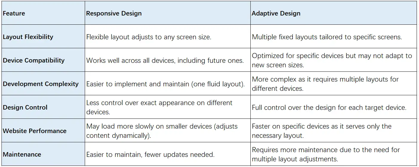
01. Layout Flexibility: Responsive vs. Adaptive Web Design
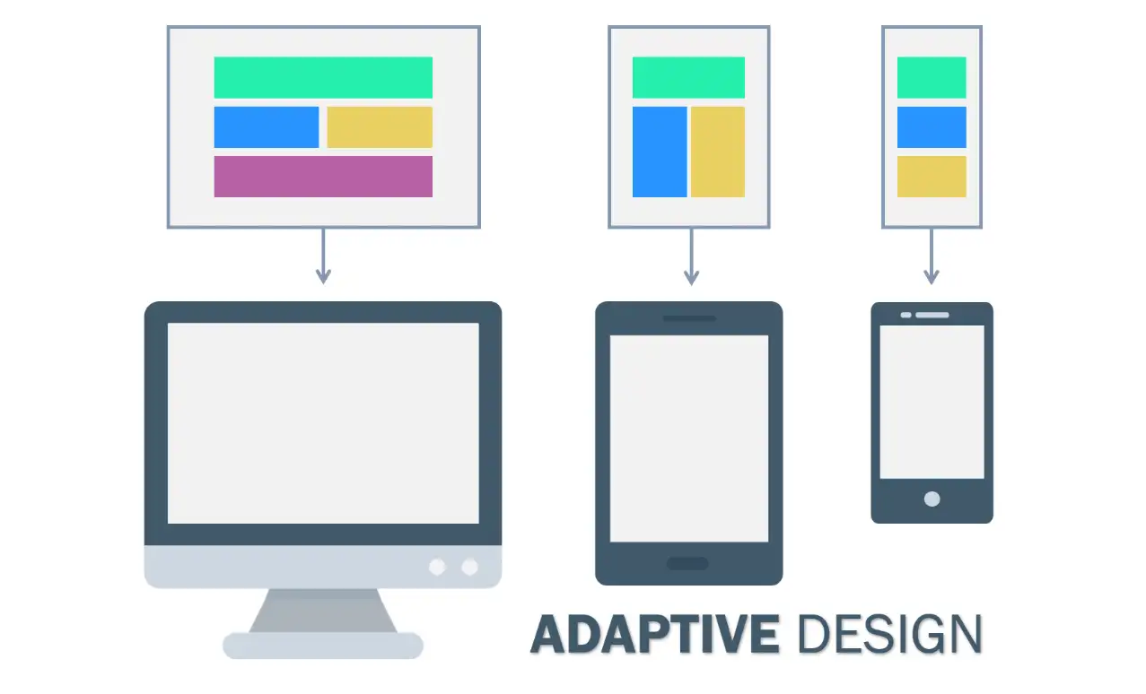
The adaptive design includes several predefined fixed layouts. They are tailored to specific screen sizes, like one for mobile, one for tablets, and another for desktops. Each layout is different. The website will choose which one to display based on the devices detected.
The responsive design uses a single, flexible layout that fits any screen size. It uses fluid grids and flexible images. Fluid grids mean that the layout of the web page will automatically adjust according to the size of the browser window. For example, if you pour a glass of water into cups of different sizes, the water will adjust itself according to the shape of the cup. This is like a fluid layout because the content on the page will automatically adjust according to the screen size. Flexible images mean that the size of the image can automatically scale according to the screen size. It will not change the aspect ratio of the image and will not cause the image to be distorted.
02. Device Compatibility: Responsive vs. Adaptive Web Design
Responsive design is highly compatible with all devices, including those that may be developed in the future. Since it adjusts fluidly, it can accommodate new screen sizes without the need for major changes.
In contrast, adaptive design is optimized for specific devices, which means that it might not perform well on new or less common screen sizes. As new devices are released, adaptive designs require updates to ensure compatibility, potentially increasing the workload for developers.
Therefore, that's also one important reason why responsive design is considered more future-proof. Responsive web design can easily adapt to new devices, including those with unique screen configurations, like foldable phones. On the contrary, adaptive design needs updates and revisions if there are new screen sizes. This might become a drawback for some companies.
03. Development Complexity: Responsive vs. Adaptive Web Design
With just one fluid layout, responsive web design is much easier to implement and maintain. Developers only need to create one set of code that works across all devices, simplifying both the design and the coding process. It does not cost much time, money, and effort.
In contrast, for adaptive web design with several different layouts, its development is more complex. It requires multiple layouts for different devices, you need to design and test separate layouts for mobile, tablet, and desktop. This will take longer.
04. Design Control: Responsive vs. Adaptive Web Design
In responsive design, developers have less control over the exact appearance of the site across different devices. The layout adapts dynamically, which can lead to variations in how content is displayed.
Adaptive design offers full control over the design for each target device, allowing designers to fine-tune elements specifically for different screen sizes.
For example, let's say you are designing an adaptive site for your retail store and you need to create two different layouts, one for desktop and the other for mobile phone. For the desktop, you can create a layout that features large images, multiple columns for product categories, and detailed descriptions. For mobile phones, you might opt for bigger buttons and simplified navigation, making it easier for users to shop on smaller screens.
05. Website Performance: Responsive vs. Adaptive Web Design
In terms of performance, responsive design might load more slowly on smaller devices because it dynamically adjusts the content. This ensures a good experience across various screen sizes, but it can lead to longer load times if the content is heavy.
Adaptive design tends to load faster on specific devices, as it delivers only the necessary layout and content tailored to that device. This optimizes the experience for speed.
06. Maintenance: Responsive vs. Adaptive Web Design
Maintaining a responsive website is generally easier because there is only one layout to manage.
On the contrary, adaptive design requires more maintenance because developers must adjust and update multiple layouts if changes are made or new devices are introduced. This also increases the cost of maintenance.
Which is better: Responsive vs. Adaptive Web Design?
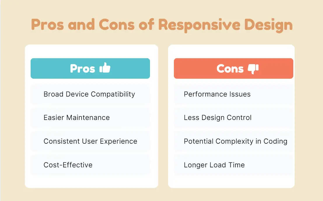
Responsive Web Design
Pros
-
Broad Device Compatibility: Adapts to various screen sizes, from small mobile devices to large desktop monitors.
-
Easier Maintenance: One layout to manage all devices, meaning fewer updates and less maintenance work.
-
Consistent User Experience: Provides a seamless experience across devices, which can improve user engagement and satisfaction.
-
Cost-Effective: Faster to develop than multiple separate layouts for different devices.
Cons
-
Performance Issues: This may result in slower loading times on smaller devices, as the same content and images are loaded regardless of screen size.
-
Less Control: Designers have less control over how the website looks on different devices, especially in terms of exact design and layout.
-
Potential Complexity in Coding: Ensuring the design works well across all devices can involve complex CSS and media queries.
-
Longer Load Time: Since all elements are loaded and resized dynamically, it can impact page speed, especially on mobile.
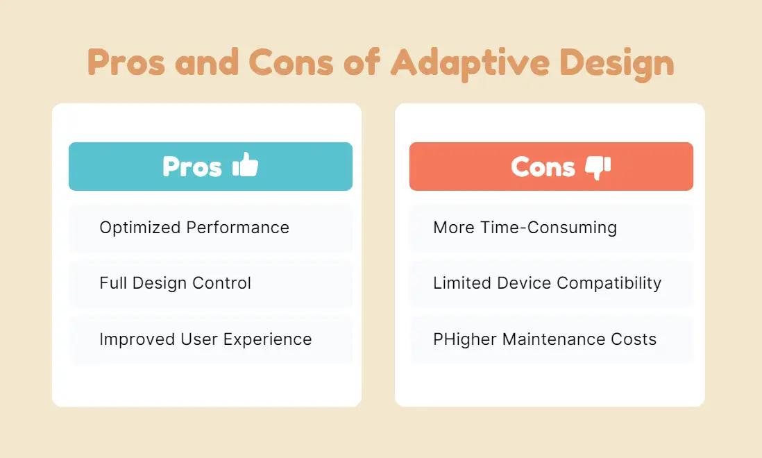
Adaptive Web Design
Pros
-
Optimized Performance: Loads faster as each device gets its pre-designed layout with content specifically adjusted to fit.
-
Full Design Control: Designers can fully customize how the website looks on different devices, ensuring optimal design for each screen size.
-
Improved User Experience on Specific Devices: Can deliver tailored experiences for high-priority devices, enhancing engagement on those platforms.
Cons
-
More Time-Consuming: Requires creating and maintaining multiple layouts for different devices, which increases development time.
-
Limited Device Compatibility: Unlike responsive design, it doesn't adapt fluidly to new or unexpected devices. It may require redesigns as new screen sizes become popular.
-
Higher Maintenance Costs: Updating multiple layouts for each new device type or screen size can be expensive and time-consuming.
It is hard to tell which one is better because each has its pros and cons. Let's take Amazon as an example.
Amazon’s mobile site historically used adaptive web design. It can provide a tailored shopping experience for its audiences, no matter if they are browsing the website across mobile phones or desktops. E-commerce platforms often use adaptive design to control how content is displayed on mobile vs. desktop.
Now, Amazon primarily uses responsive web design. This approach allows Amazon to provide a seamless shopping experience, automatically adjusting content and layout based on the user's device. However, specific elements may be optimized for different screen sizes, but the overall strategy leans heavily toward responsive design principles.
On the other hand, a specialized e-commerce site, like Etsy, may use adaptive design to create specific layouts for mobile users. It might highlight product images and easy navigation on mobile phones. Such a design is good for increasing conversion rates and user experience.
Conclusion
In this blog, we have discussed responsive and adaptive web design, examining their unique features and ideal applications. Neither approach is superior. The right choice depends on various factors such as your project goals, budget constraints, target audience, and so on.
Responsive design tends to be favored for its flexibility and ease of maintenance, while adaptive design can offer a more tailored user experience for specific devices. By considering these elements, you can create a website that not only meets your needs but also provides an engaging experience for your users. If you find yourself leaning toward responsive design, there are numerous tools available, like Wegic or Webflow. Wegic supports responsive design and mobile-first features.
What are the advantages of using adaptive design?
Adaptive design offers tailored layouts for specific devices, allowing for optimized performance and user experience. This can be beneficial for applications where precise control over design elements is essential, such as in e-commerce sites or complex web applications.
Can I switch between responsive and adaptive design later?
While it’s technically possible to switch between responsive and adaptive design, it can be challenging and may require a significant redesign. It’s important to carefully consider your initial choice based on your project's goals and user needs to minimize future complications.
Written by
Kimmy
Published on
Mar 12, 2026
Share article
Read more
Our latest blog
Webpages in a minute, powered by Wegic!
With Wegic, transform your needs into stunning, functional websites with advanced AI
Free trial with Wegic, build your site in a click!
What kind of website do you want to build?