Log in
Build Your Site
Agency Website: 12 Examples for Inspiration
Discover these great agency website examples to enhance your website design. Learn about key features of a well-designed agency website.
A well-designed agency website can bring plenty of benefits to your business. Much of a company's online marketing, advertising, and branding relies on agency websites. If your agency website is not updated and regularly optimized, or even if you do not have an agency website currently, you will lose a lot of potential clients and cooperation opportunities.
Therefore, it is essential to have an intriguing, brand-related agency website. That's why, in today's blog post, we will recommend these 12 examples of top agency websites. Hopefully, they will inspire you to create an agency website for your brand.
Click here to Build your site
What Features an Agency Website Should Have?
Clearly present your services to customers: Whether you offer branding services, web design services, or search engine optimization services, you should clearly state your main business on the front page. Use a centered title to help visitors quickly locate the nature of your organization.
Showcase your creative work or product: This is the key to getting more customers for you. Your work or products represent you, and they will represent your organizational image and achievements to your clients.
Keep it clean, keep it low on interaction: We acknowledge that too many features can be tempting, but it can also distract visitors from the key information you want them to see. We recommend making your website marketing as concise as possible, not vague.
Consider local customers: If you have a physical agency offline, don't forget to focus on those local prospects, who may be more likely to trust the company closer to them.
Best 12 Agency Website Examples
Overview
-
Inspira Marketing Group
-
Bilberry
-
Isadora Digital Agency
-
Belle Epoque
-
Elk Creative
-
The Eastside Co.
-
Cemtrex Labs
-
Made by Many
-
Impression
-
RNO1
-
Creative Theory
-
Norry Agency
Inspira Marketing Group
Key Takeaways
-
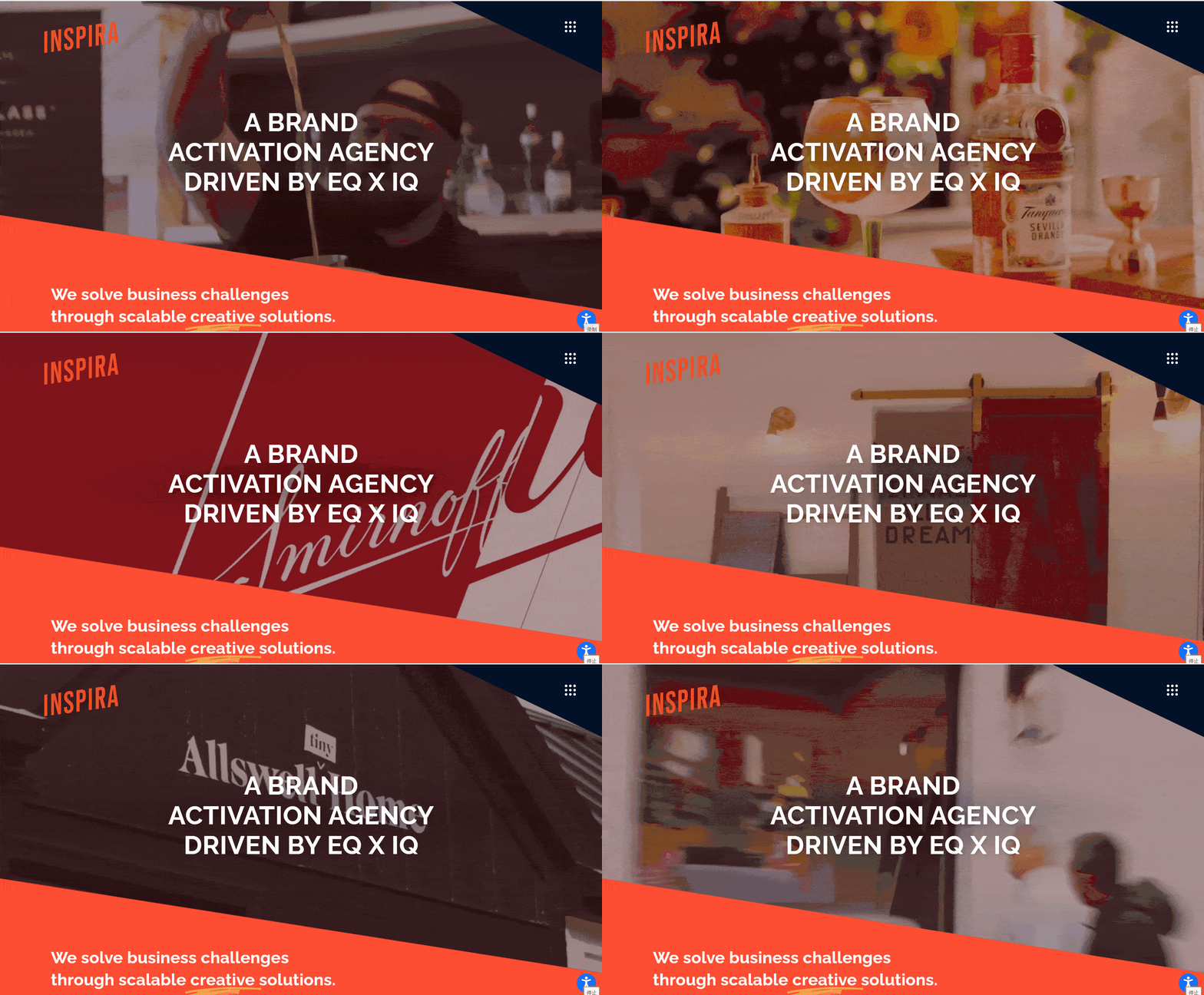
Engaging home page carousel: The home page of the website uses a carousel design to show important cases, service highlights or brand stories of the company. Each image is accompanied by a concise caption, which effectively grabs the user's attention and sparks their interest. The design of the carousel map not only improves the visual impact of the page but also allows users to understand the company's business scope and service quality more intuitively by means of dynamic display. This design approach has a positive effect on improving the conversion rate and user engagement of the website.
-
Functional icon design: In the bottom right corner of the picture, a small magnifying glass or search box icon is unremarkable, but cleverly suggests that the site has a search function, providing users with a convenient way to retrieve information. This kind of functional icon design can enhance the user experience and reflect the website designer's careful consideration of the user's needs.
Bilberry
Key Takeaways
-
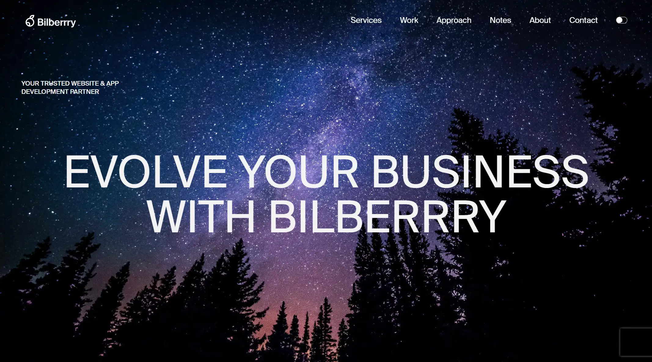
Clear brand communication and positioning: Bilberry's website directly conveys its brand positioning as a website and app development partner through the concise and powerful slogan Evolve Your Business With Bilberrry on the front page. This direct communication helps visitors quickly understand the company's core values and scope of services. At the same time, the overall design style of the website is consistent with the brand identity, through a uniform color scheme and visual elements to strengthen the brand identity.
-
User-oriented design thinking: When the website introduces the service, it is not simply a list of technologies or features, but from the user's perspective, emphasizing that "we listen, learn and understand before building." This user-oriented design thinking is reflected in every detail of the website, such as using case presentations to specify how to help customers achieve digital transformation, so that visitors can intuitively feel the actual results of the service.
Isadora Digital Agency
Key Takeaways
-
Structured content layout: The content layout of Bilberry website is clear and orderly. Through clear navigation bar and page partition, the company's services, cases, team introduction and other information are presented orderly. This structured layout is beneficial to improve the readability and ease of use of the website. What's more, it can help visitors find the information they need quickly and improve the user experience.
-
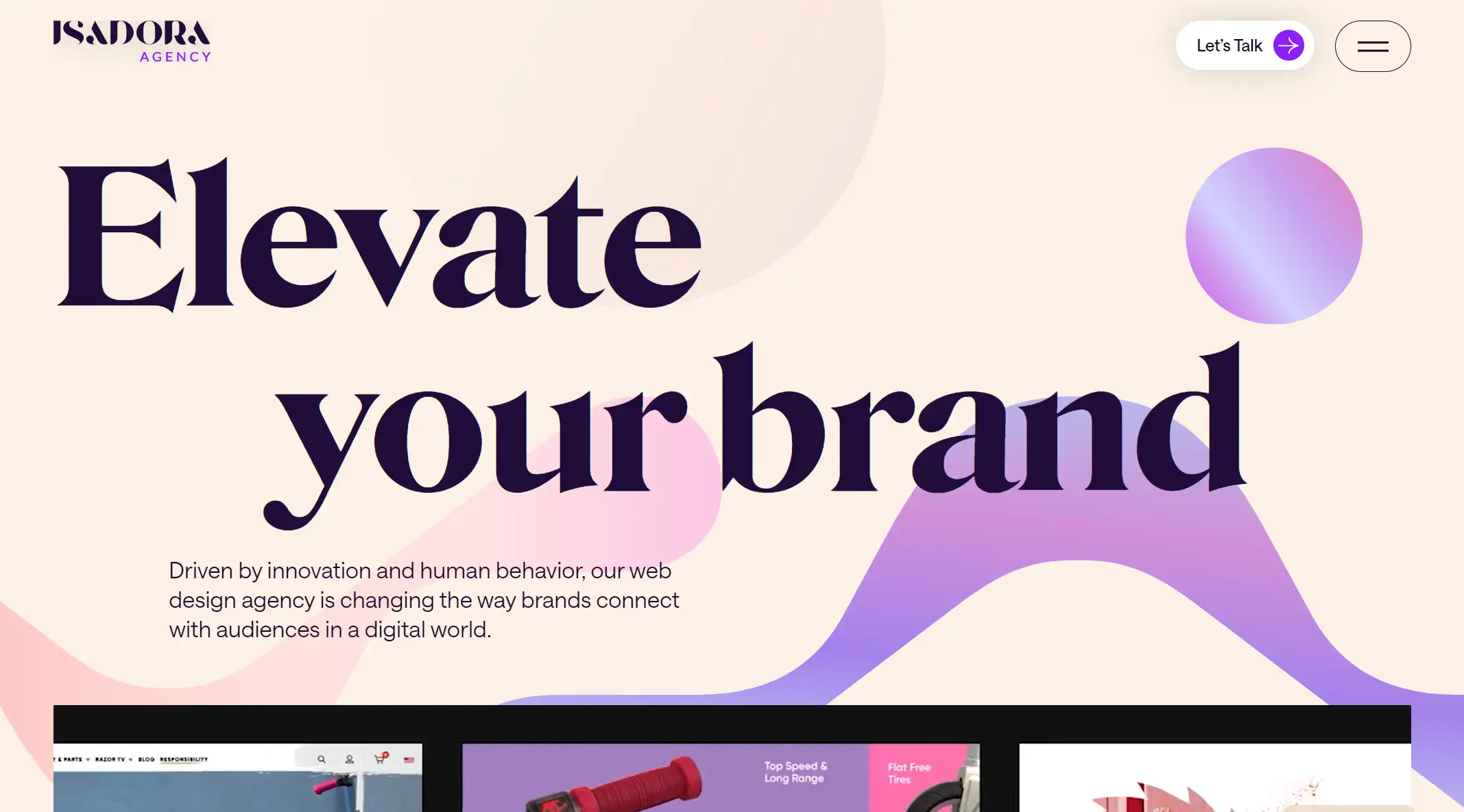
Creative design elements: The clever use of circles, lines, and geometric shapes in the design elements, these elements not only add a sense of visual hierarchy to the page but also make the whole page look more lively and interesting. The use of these design elements not only shows the creative ability of the company, but also brings a new visual experience to the users. This structured layout not only improves the readability and ease of use of the website, but also helps visitors find the information they need quickly and improves the user experience.
Belle Epoque
Key Takeaways
-
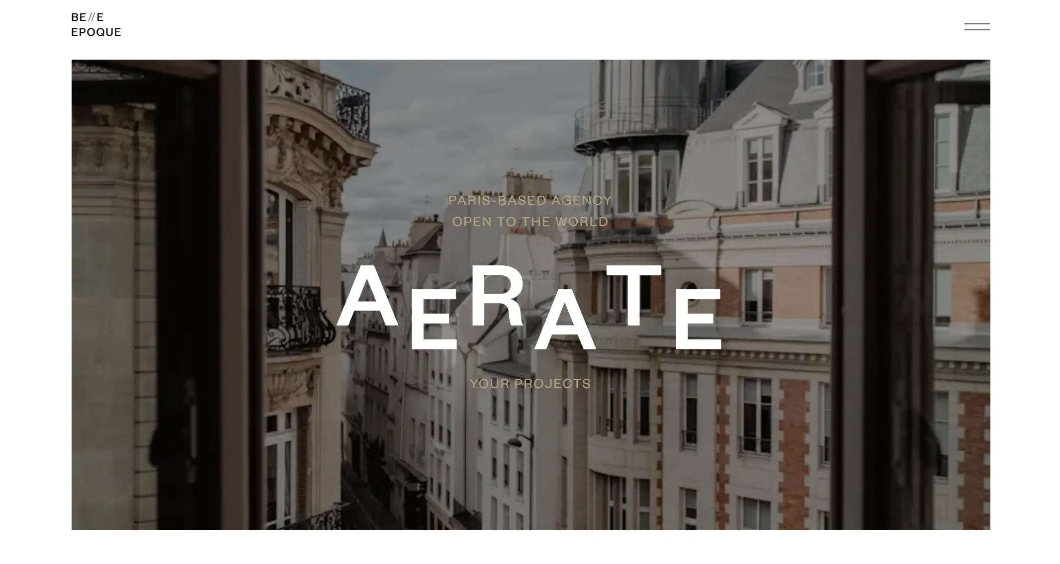
Unity and high-end sense of visual style: The first thing that catches the eye about Belle Epoque's website design is its high level of visual unity. The website uses a simple yet elegant color scheme, white as the base, with soft grey and gold elements, to create a high-end, professional brand image. The images and graphic elements on the page have been carefully selected and laid out to demonstrate the artistry of the design while keeping the message clear. This unity of visual style not only enhances the user's aesthetic experience, but also strengthens the brand image recognition.
-
The combination of regional characteristics and international vision: The phrase "PARIS-BASED AGENCY OPEN TO THE WORLD" not only emphasizes AERATE's regional identity as a Paris-based agency, but also expresses its global vision. This combination of regional identity and international vision allows AERATE to attract potential customers from all over the world while maintaining its local cultural identity. In website design, skillfully integrate regional elements and show international vision, help to enhance the brand image and market competitiveness of the organization.
Elk Creative
Key Takeaways
-
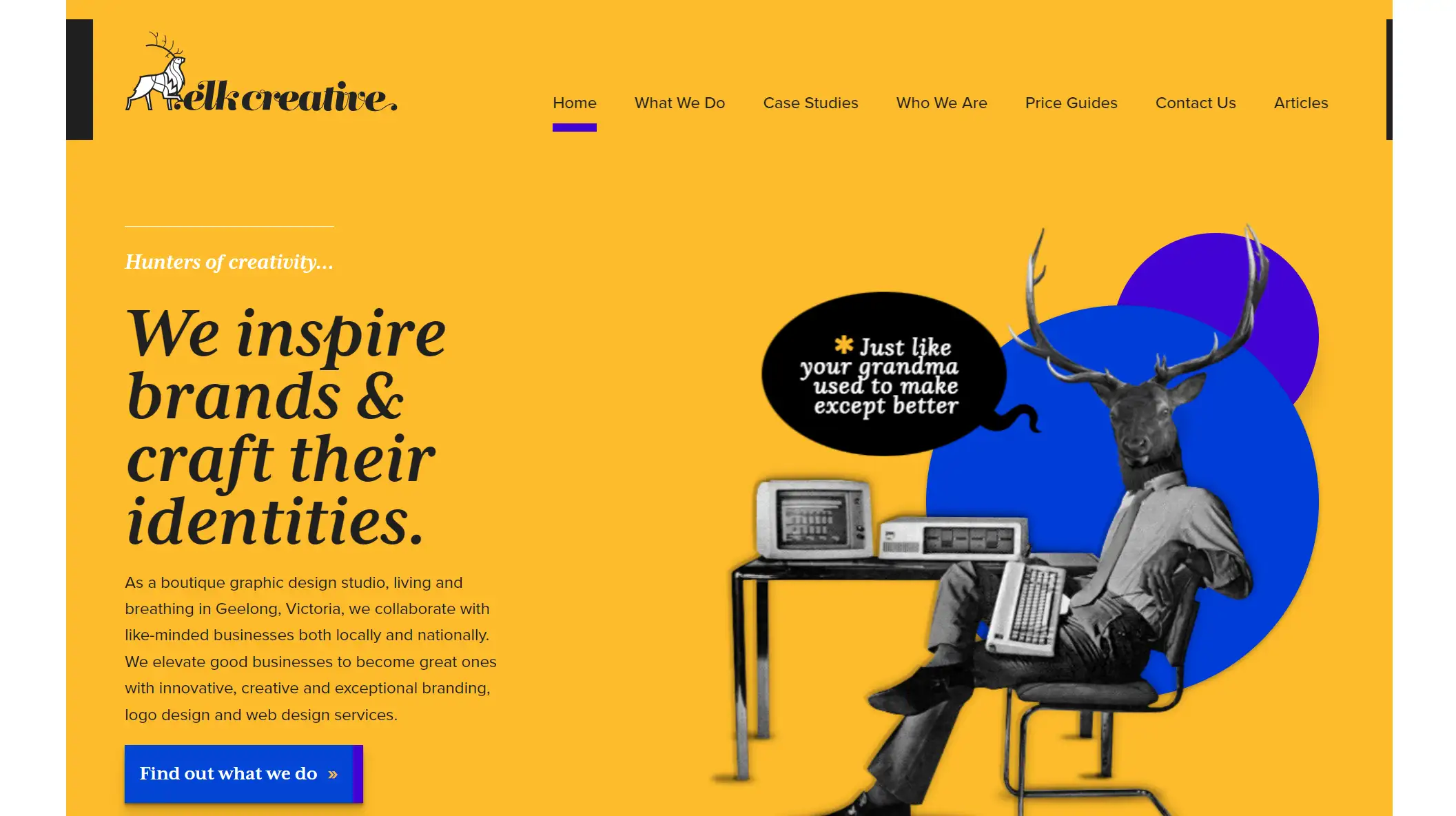
Brand recognition and color Application: Elk Creative's website does a great job in brand recognition. The prominent orange and black brand logo at the top not only contrasts with the tone of the entire website, but also subtly conveys the vitality and professionalism of the brand through color psychology. As one of the main colors, orange represents vitality and innovation, which is highly compatible with the company's positioning as a creative design studio. Black is used as an auxiliary color to add a sense of sedation and advanced to the site. This combination of colors is both striking and harmonious, making the brand stand out from many websites.
-
High-quality case studies: Elk Creative has displayed multiple high-quality case studies on its website, which not only show the company's design capabilities and creativity level but also provide users with intuitive reference and inspiration. Each case is accompanied by beautiful pictures and detailed descriptions. Users can click to further understand the background of the case, the design process and the results. This kind of case display method not only enhances the attraction of the website but also improves the user's trust and satisfaction.
The Eastside Co.
Key Takeaways
-
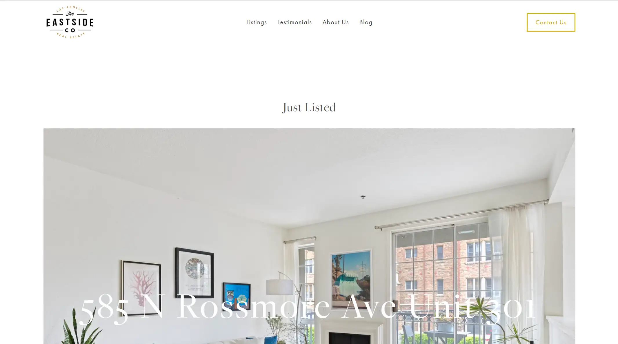
Balance and hierarchy of content layout: The balance and hierarchy of the content are fully considered in the design of the website. The image occupies the primary position as the visual center, but it does not ignore the importance of other elements. For example, the display of furniture such as TV and books has already added a breath of life and enriched the space level; A combination of text messages (like "Just Listed") and call-to-action buttons (like "Contact Us") directs the visitor's attention; The navigation links at the bottom of the page serve as auxiliary information, providing visitors with more opportunities to explore the site. This balanced and layered layout makes the whole site look harmonious and unified without losing focus.
-
Community culture and brand building: The Eastside Co.'s website is not only a listing platform, but also a window to showcase the community's culture and brand image. Through customer reviews, blog posts and other forms, the website shows the company's professional ability and service attitude in the real estate field, and also conveys the company's concern for community culture and sustainable development. This kind of brand building method helps to enhance the user's sense of trust and identity in the company and improve the company's market competitiveness.
Cemtrex Labs
Key Takeaways
-
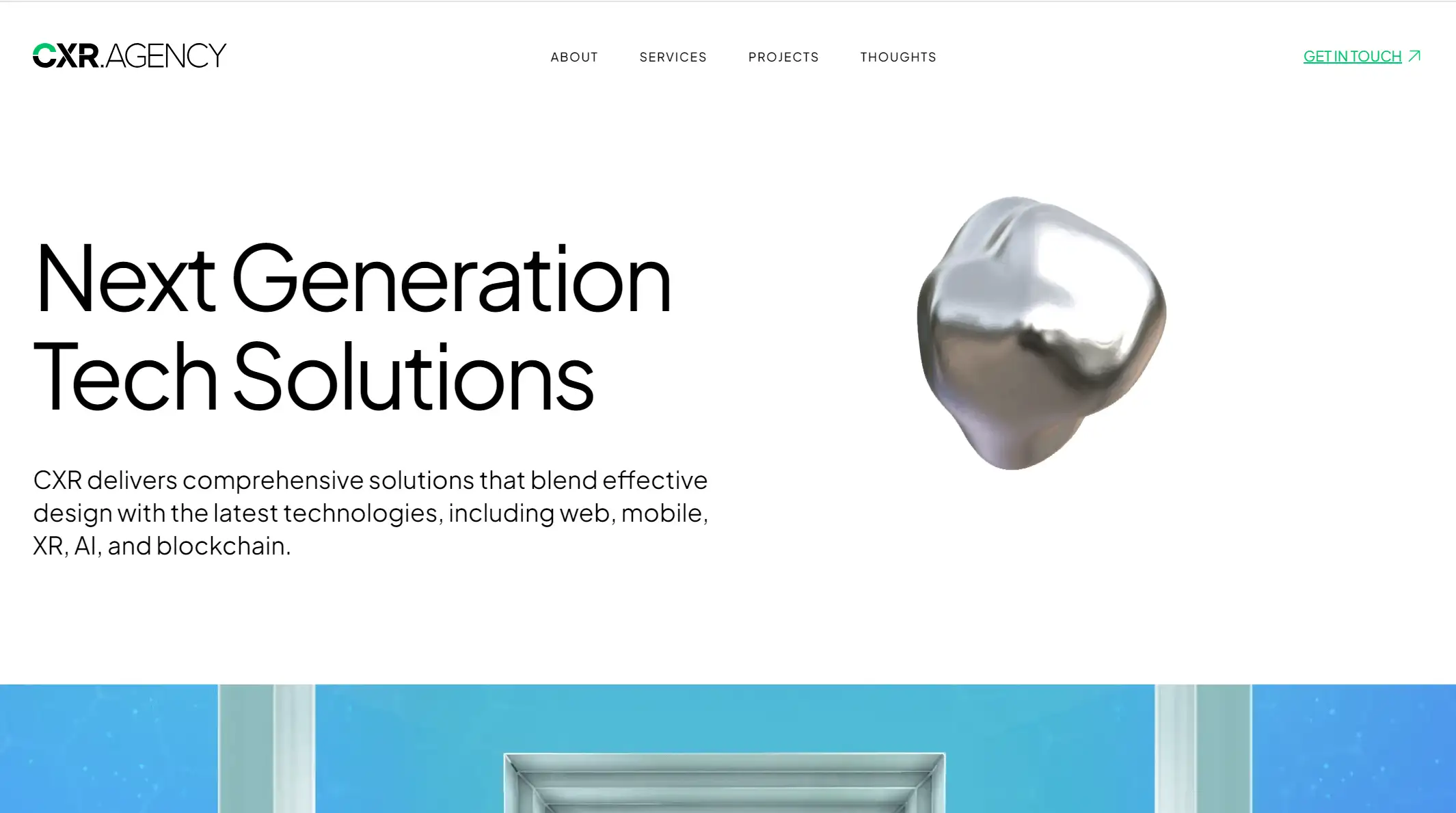
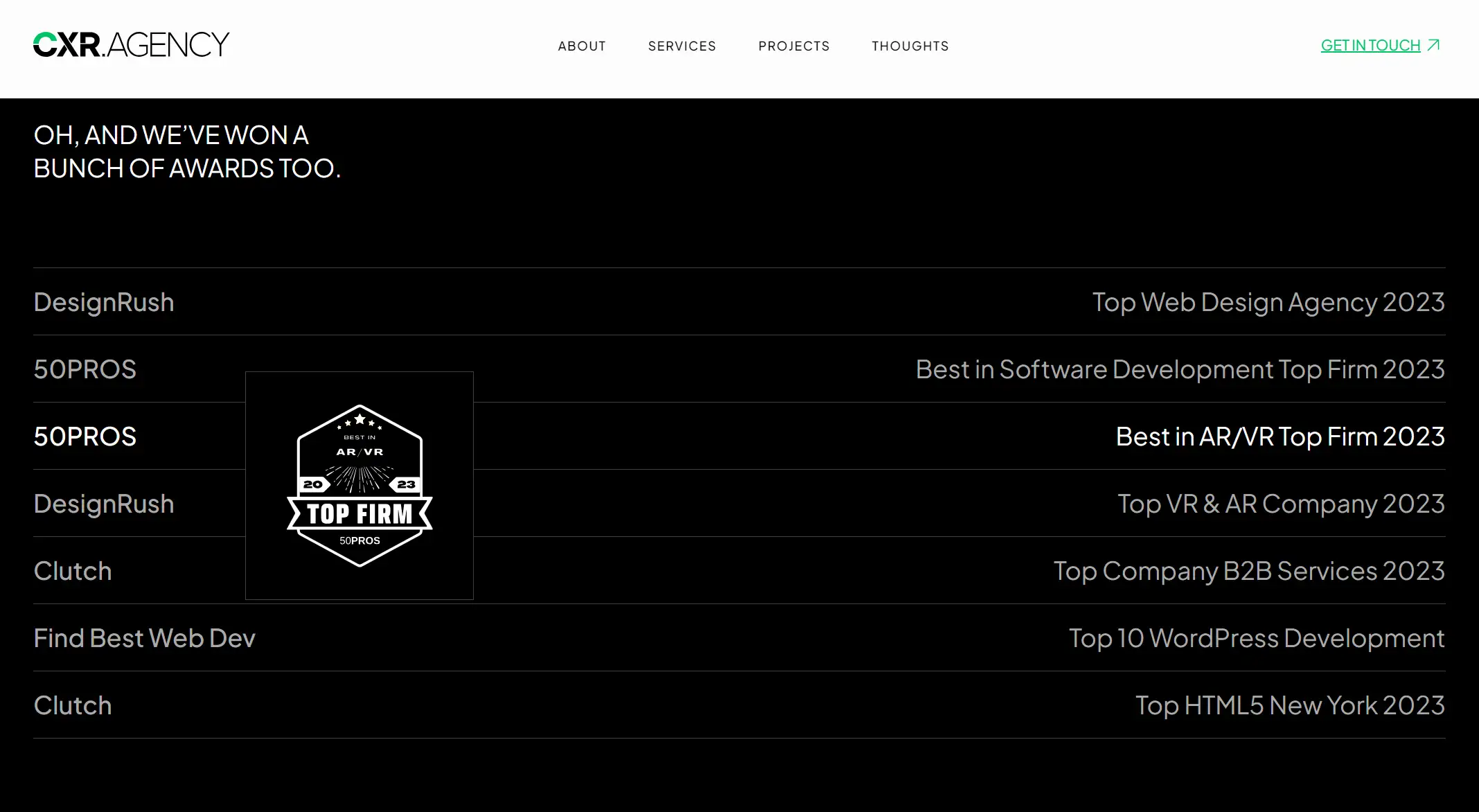
The integration of brand and technology: The most noticeable feature of the homepage is its effective integration of brand image and advanced technology. With the slogan "Next Generation Tech Solutions", the site clearly communicates its positioning as a technology solutions provider. At the same time, the various technology tags displayed on the page (such as web, mobile, XR, AI, blockchain) not only demonstrate the company's technical strength, but also cleverly integrate the brand color and design elements to form a unified visual style and enhance the brand identity. This design idea of seamless combination of brand and technology is worthy of reference in the design of other institutional websites.
-
Customer trust endorsement and award display: Featuring prominent global clients (e.g., Modelo, Pacifico, Dropbox, etc.) and awards (e.g., DesignRush's Top Web Design Agency 2023, etc.), these elements form a strong endorsement of trust. By displaying cooperation and recognition with top enterprises and authoritative institutions, the website effectively enhances its professionalism and credibility. This use of customer cases and awards to enhance the sense of trust is important to enhance the authority and attractiveness of the organization's website.
Made by Many
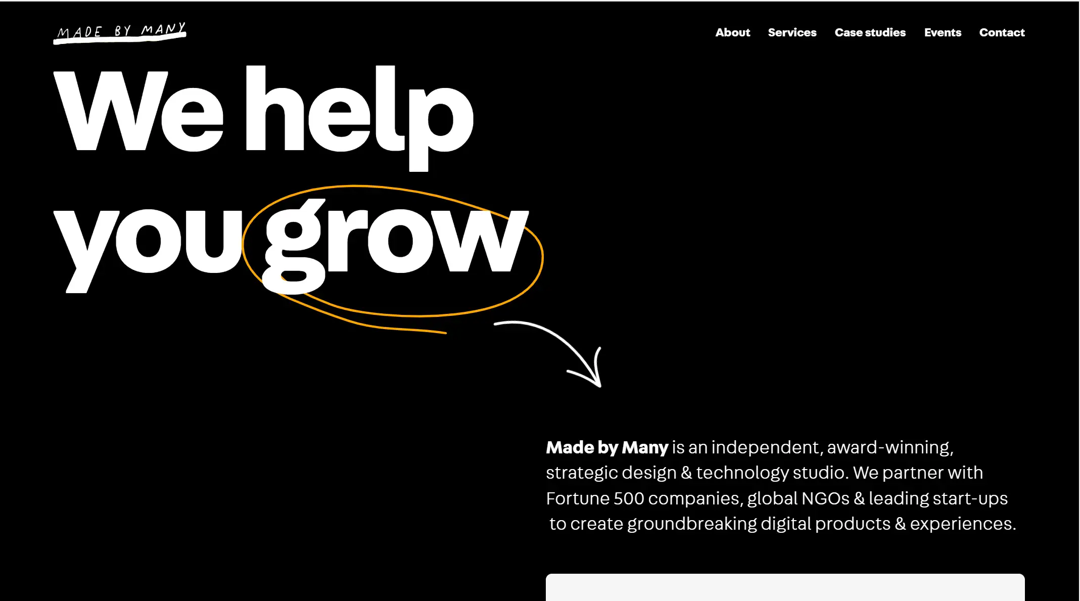
Key Takeaways
-
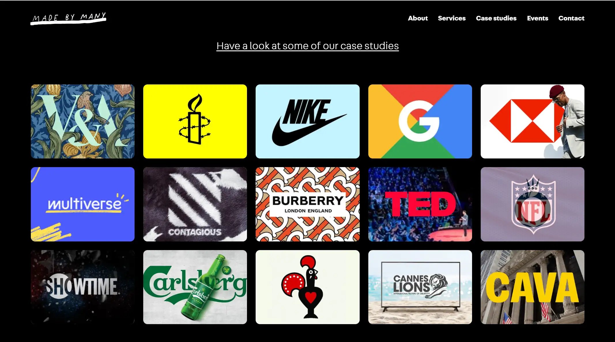
Rich display of successful cases: The "Case studies" section is a highlight of the website, which fully demonstrates the excellence of MADE BY MANY in the field of strategic design and technology by showcasing successful cases of cooperation with Global 500 companies, global ngos and leading start-ups. Each case is accompanied by a detailed introduction and beautiful pictures or videos, so that users can have an in-depth understanding of the background and results of the project, so as to trust and recognize the professional competence of the institution more.
-
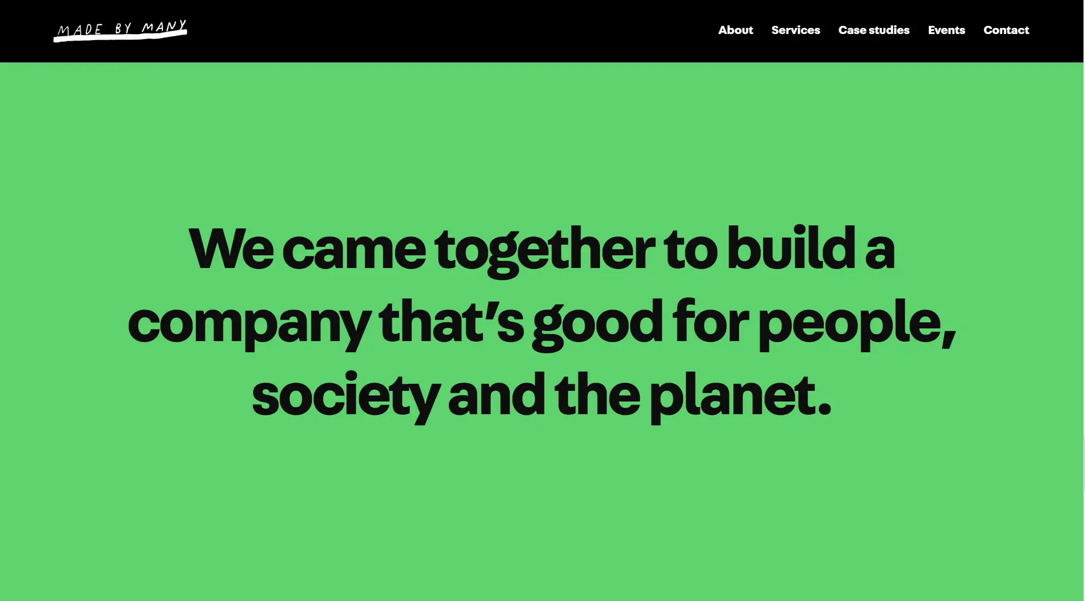
Communication of social responsibility and environmental protection concept: At the bottom of the website or a prominent position, Made by Many clearly expresses the company's social responsibility and environmental protection concept. for example, with the phrase "We came together to build a company that's good for people, society and the planet." The company communicates a positive corporate image and values to visitors. This kind of communication of social responsibility and environmental protection concept not only helps to improve the brand's awareness and reputation, but also attracts more customers and partners with the same values. This combination of brand values and website design is a valuable experience for many enterprises in brand building.
Impression
Key Takeaways
-
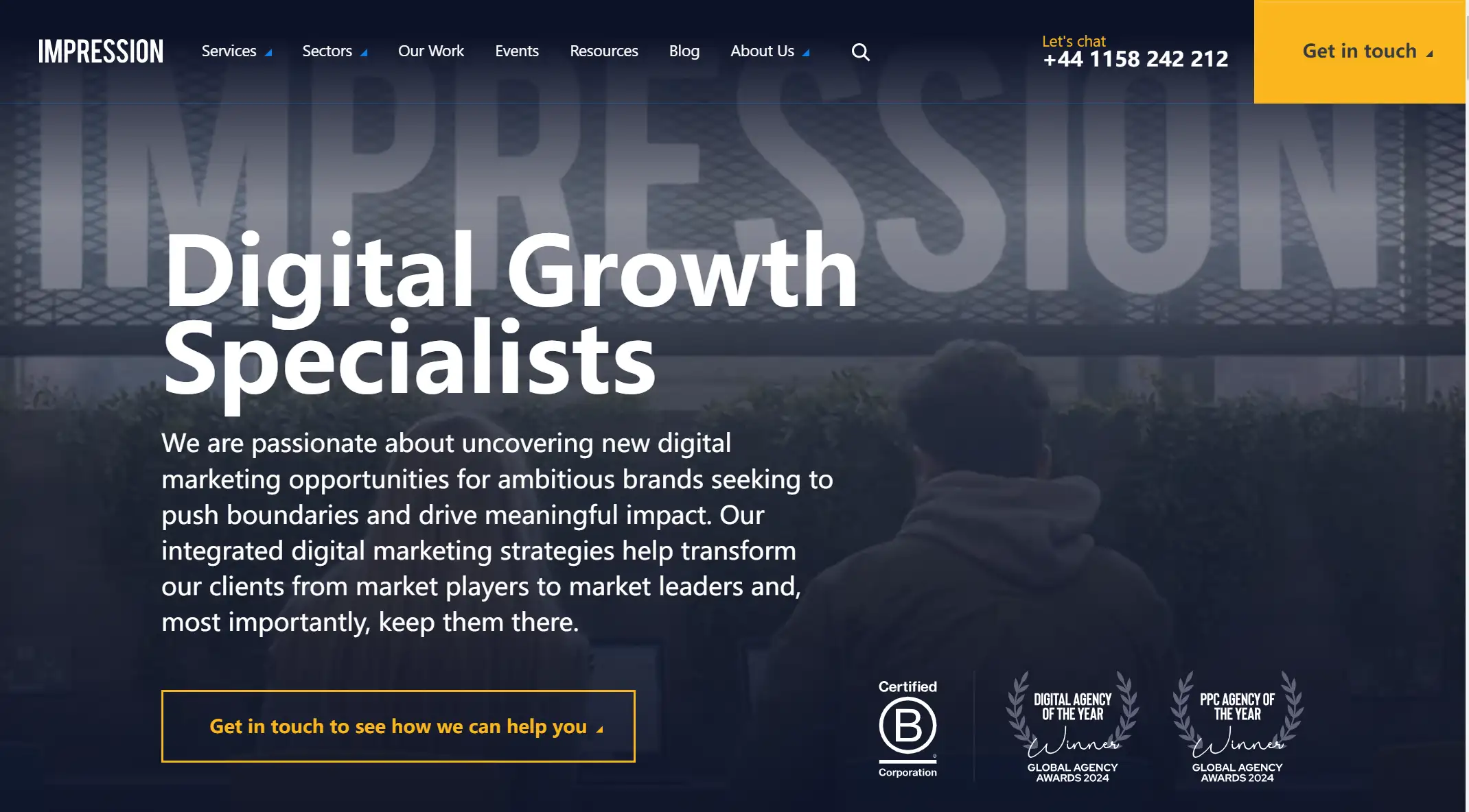
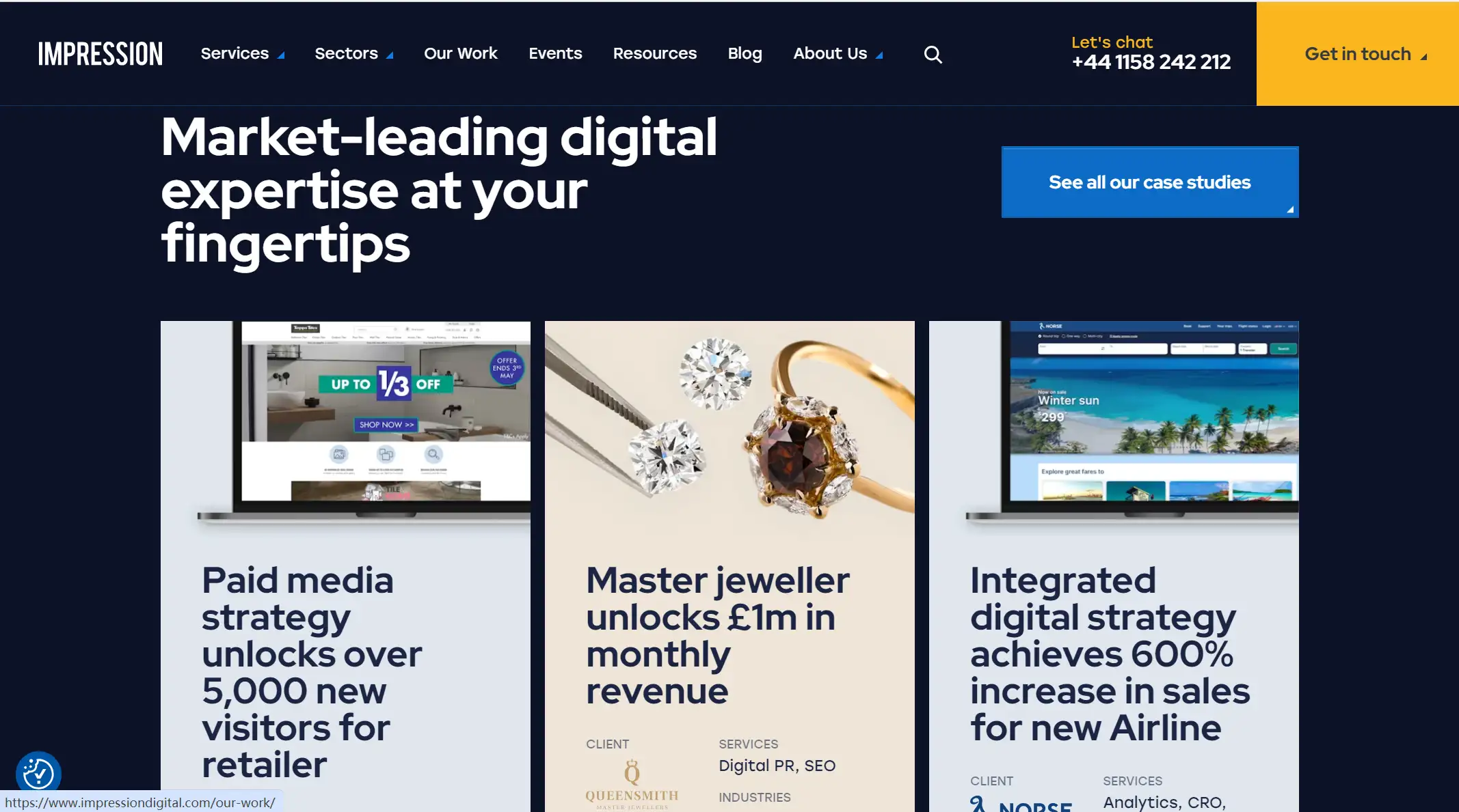
Structured and intuitive navigation design: The navigation bar of the website is designed to be simple and clear, and the key contents such as "Services", "Sectors", "Our Work", "Events", "Resources", "Blog" and "About Us" are presented in a side-by-side way, so that users can easily find the information they need. This kind of structured navigation design not only improves the user experience, but also helps increase the depth and conversion rate of the website. In addition, the website also encourages users to take the initiative to contact the agency through the "Get in touch" button, which enhances interactivity and user engagement.
-
Multi-channel contact and convenience: In order to facilitate visitors to get in touch with the organization, IMPRESSION provides a variety of contact methods (such as email, contact number, etc.) on the website, and details the address and map information of many office locations around the world. This multi-channel and all-round contact design ensures that visitors can choose the appropriate communication method according to their needs and preferences, thus improving communication efficiency and convenience. At the same time, it also reflects the importance and attention of the organization to customer service, which helps to enhance the trust and loyalty of customers to the organization.
RNO1
Key Takeaways
-
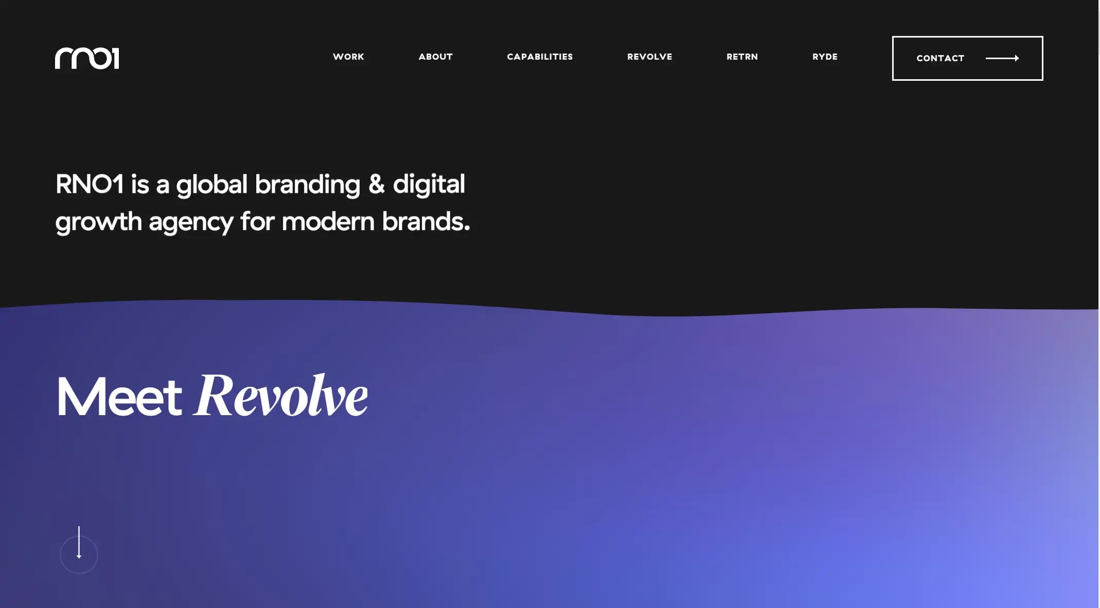
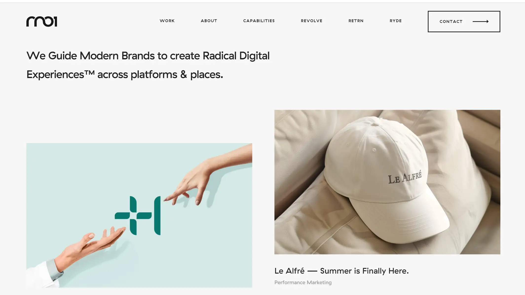
Professional copywriting and brand story communication: In the middle of the purple gradient, RNO1 directly conveys the agency's core business and area of expertise through the concise and powerful copy "RNO1 is a global branding & digital growth agency for modern brands." This sentence not only shows the professional ability of RNO1, but also clarifies its service object - modern brands. At the same time, the website may further tell the brand story and service CAPABILITIES through pages such as "ABOUT" and "Capabilities", so as to deepen visitors' understanding and trust in the organization. This kind of professional copywriting and brand story communication method helps to enhance the professional image and brand value of the agency.
-
Simple and modern design style: RNO1's website design as a whole is simple and modern, without excessive decoration and redundant elements. The color combination of black, white, blue and purple is both classic and stylish, which is in line with the aesthetic needs of modern brands. At the same time, the graphics and ICONS are designed to be simple and clear, such as the right-pointing arrow icon and the "Meet Revolve" button at the bottom, which reflect the minimalist style of modern design. This simple and modern design style not only improves the aesthetics of the website, but also allows visitors to focus more on the content while browsing the website.
Creative Theory
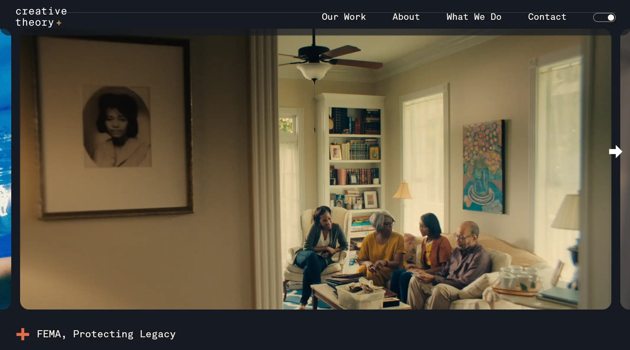
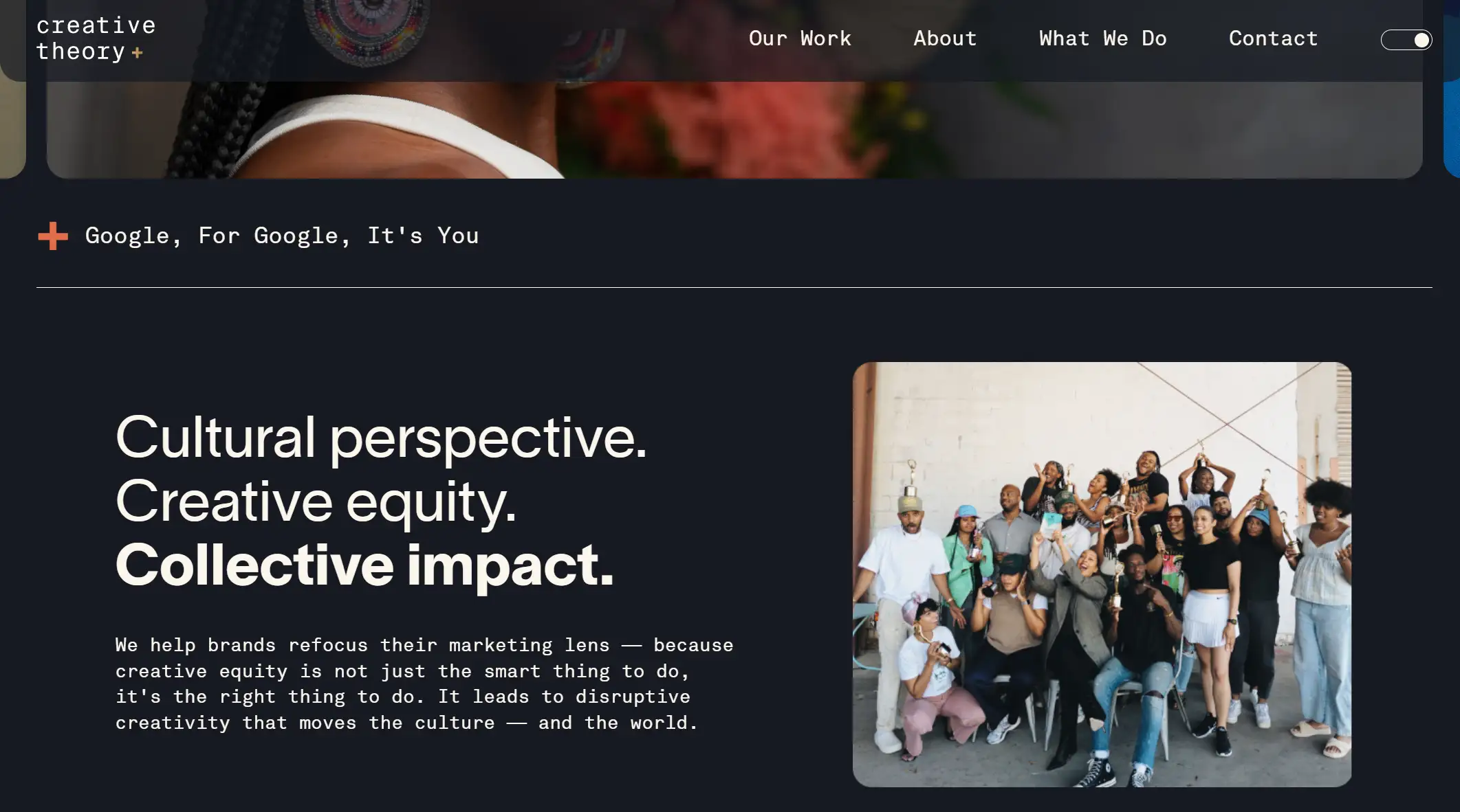
Key Takeaways
-
Emotional resonance and brand story: The warm and friendly family gathering scene in the picture constructs a starting point for emotional resonance of the agency website. Agencies can use this approach to tell brand stories by showing how their services impact people's everyday lives, such as family gatherings, planning and execution of important moments, and so on. Such a design can not only let potential customers feel the temperature of the brand, but also enhance the affinity and credibility of the brand.
-
Scene display service: Although the picture itself does not directly show the service content of the organization, the scene of the family gathering provides a platform for the organization to show its service capabilities. Institutional websites can learn from this way of scene display, and show the effect and value of services by simulating the actual use scenarios of customers. For example, through case presentation, customer evaluation, and service process introduction, customers can intuitively feel the professional ability and service level of the institution.
Norry Agency
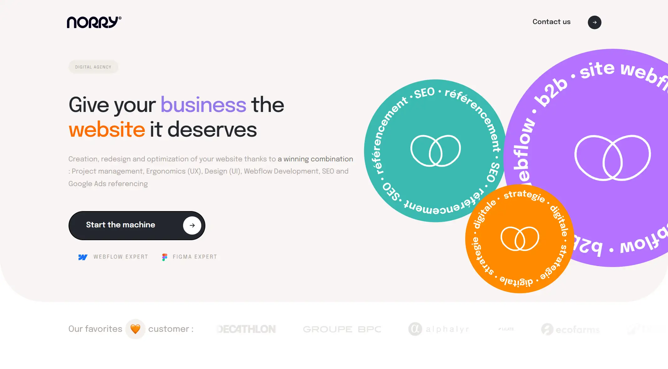
Key Takeaways
-
Professional service description and detailed presentation: Below the green icon, the organization provides a detailed list of services, including project management, user Experience (UX), interface design (UI), workflow development, SEO, and Google Ads marketing. This detailed service description not only shows the professionalism and comprehensiveness of the organization, but also reflects its in-depth understanding and meticulous care for customer needs. At the same time, by enumerating specific technologies and tools (such as Webflow, Figma, etc.), the user's sense of trust in the professional competence of the institution is further enhanced.
-
Call to Action and guidance: In the middle of the page, the call to action, "Start the machine," is concise, encouraging users to take action and start working with the agency. This direct and powerful guidance method helps to stimulate users 'purchase desire or cooperation intention. At the same time, the statement also implies the efficiency and execution of the agency, making the user feel that working with the agency will bring positive results.
Click here to Build your site
Create Your Agency Website Now
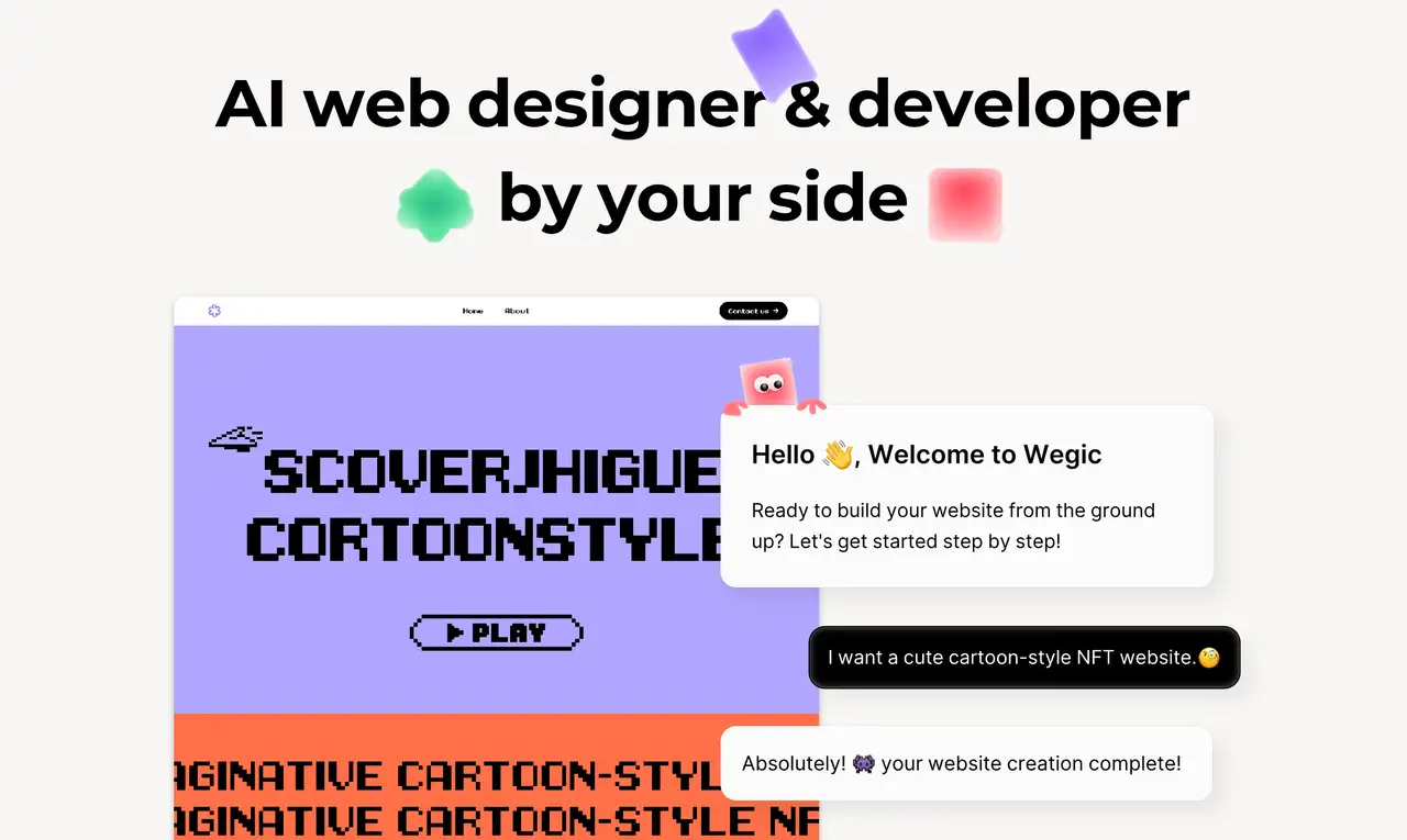
With these excellent agency website examples in hand, we believe you are ready to create your own agency website. You don't have to worry about spending a lot of money or time to build a website. With the help of AI website builders, you can create a high quality and brand identity website in just a few minutes. For example, Wegic, the world's first AI web designer and developer, can help you design a sophisticated agency website in only a few clicks. Here, you just tell your requirements to your AI assistant and it will automatically analyze and match your website type and content. What are you waiting for? Build your unique organization website with Wegic!
Written by
Kimmy
Published on
Dec 5, 2024
Share article
Read more
Our latest blog
Webpages in a minute, powered by Wegic!
With Wegic, transform your needs into stunning, functional websites with advanced AI
Free trial with Wegic, build your site in a click!