登录
创建你的网站
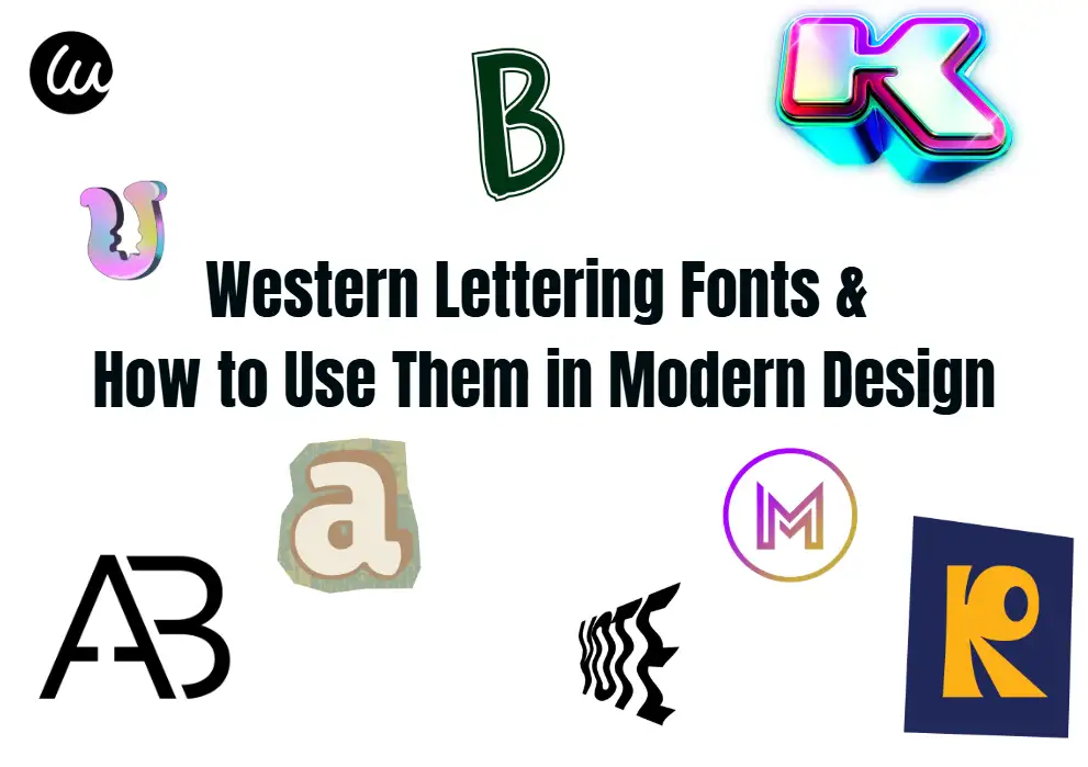
Western Lettering Fonts & How to Use Them in Modern Design
Discover western lettering fonts and their role in modern design. Explore styles, pairing tips, tools, and applications in packaging, digital design, and more for impactful, authentic visuals.
In today's fast-paced modern design world, standing out while connecting with the audience is a significant and ongoing challenge. Because many designers struggle to strike a balance between traditional and contemporary aesthetics and layout, you may sometimes feel outdated or disconnected from tradition when viewing their work. So, Western fonts are now particularly useful. Western fonts are rooted in the rugged charm of border culture, providing us with a unique blend of nostalgia and boldness. If used properly, they can elevate the aesthetic standards of modern design. In this guide, we will explore the essence of Western fonts with you, break down their main styles, and share feasible techniques for integrating these fonts into everything from brand logos to digital advertising, keeping your work fresh and unique.
Western Lettering Fonts & How to Use Them in Modern DesignWhat Is Western Lettering?
Western fonts are a typesetting style closely associated with the American West, originating from the frontier era of the 19th century. Its inspiration comes from cattle brands, salon logos, cowboy sports posters, and cowboy culture. The characteristics of this font are bold lines, sharp serifs, and decorative splendor, evoking people's imagination of open plains, leather saddles, and dusty paths. Unlike typical sans serifs or minimalist fonts, Western fonts have a narrative quality, where every curve and stroke on the font tells a story of adventure, resilience, and tradition. For example, you can think of the iconic "wanted" posters in old Western movies, which usually have exaggerated serif and spaced fonts, as well as weathered signs like those above country bars, decorated with swirls, stars, or rope patterns. These styles are specifically designed to capture an emotion, a rough yet warm, bold yet enticing one.
Click on the image to learn about Western Writing Fonts👇

Key Styles of Western Lettering Fonts
Western lettering fonts do not have only one style, nor do they literally come from the West, so they are called Western fonts. It includes several different styles, each with its own personality. The most easily recognizable among them is the retro denim font, which is marked by thick block letters with sharp, angular serifs that look like they were chiseled into wood or painted on a barn.
These fonts typically feature decorative elements such as Spurs or lasso interwoven within the letters, accompanied by a borderland style. Then there is the ranch style font, which overall has a softer slope, rounded edges, and more natural curves, reflecting the leisurely atmosphere of rural life. This style is common in the design of farm-to-table brands or rural resorts. Another subset is cowboy sports lettering, which gives the impression of being bold and dynamic, with some strokes featuring exaggerated rises and falls, mimicking the energy of riding a bull or a bronc. These fonts are very suitable for event posters or clothing that needs to convey excitement.
The Role of Western Lettering in Modern Design
In an era dominated by fashion minimalism, Western fonts exhibit unique authenticity. Modern audiences crave to establish connections with stories, heritage, and 'real' things, and Western fonts provide this connection. A survey conducted by Design Insights Group in 2023 found that 68% of consumers associate brands using traditional style fonts with "credibility" and "authenticity," which are key driving factors in building user loyalty.

That's why outdoor equipment companies, craft breweries, and handmade food brands are increasingly using Western letters. For example, a handmade whiskey brand may use bold Western fonts on its label to evoke the spirit of the old West and connect its products with traditional craftsmanship. Similarly, a modern clothing collection aimed at adventurers can incorporate ranch-style letters into its logo to indicate a connection with nature and rugged individualism.
How to Choose the Right Western Lettering Font
Choosing the perfect Western font is actually not difficult, but overall it depends on two key factors: your design purpose and your target audience.
For brand identity, clarity is crucial if you want a unique yet clear font. The retro denim font with simple lines (avoiding overly complex decorations) has a good effect because it balances personality and readability. For example, the logo of a coffee shop with a Western theme may use a bold, slightly rounded Western font that is easy to read from a distance while still conveying warmth.

Pairing Western Lettering with Other Fonts
We have introduced a lot about Western fonts above, but in reality, they are rarely used separately. If you pair it with complementary fonts, it can present your design better. So the key is to coordinate the styles of the two, such as balancing the boldness of Western fonts with simpler and more modern fonts. A common method is to use Western fonts as titles or focal points, and clean sans serif fonts such as Helvetica or Open Sans as the main text. This creates a visual hierarchy that guides the audience's eyes while ensuring readability.

For example, a music festival poster with a Western theme may use dramatic cowboy sports fonts as the event name, paired with minimalist sans serif fonts for details such as dates and ticket information. Another effective combination is combining Western fonts with classic serif fonts such as Times New Roman or Georgia, creating a harmonious fusion of old and new. It is best to avoid using Western fonts in combination with other fancy styles such as Gothic or handwritten fonts, as this can make the design appear cluttered and uncomfortable.
Tips for Using Western Lettering in Digital Design
The digital platform has brought unique challenges to Western fonts, but with some adjustments, these fonts can actually be presented very well online. What can you do specifically? Firstly, pay attention to the size of the font: Western fonts with thick strokes may appear too heavy in small sizes, so zoom in slightly to maintain an appropriate proportion.
For website titles, the font size should be at least 24px to ensure readability on mobile devices. Secondly, you also need to consider the colors of both. Western fonts usually look best on simple backgrounds, for example, you can think of earthy tones such as brown, tan, or deep red. These tones complement their cutting-edge aesthetics. For example, white Western fonts on a dark brown background create strong contrast and enhance readability. Finally, caution should be exercised when using Western fonts in digital design. Overuse of it (such as in the main text or navigation menu) can make the interface feel cluttered. You can use them in key elements such as designing hero banners, chapter titles, or call-to-action buttons to maximize their impact.
Western Lettering in Niche Applications
In addition to branding and digital design, Western fonts also have significant potential applications in related fields such as tattoos and customized signage. Western letter tattoos are a popular choice, typically featuring names, quotes, or symbols (such as horseshoes or cacti) with cowboy or ranch style fonts. Tattoo artists suggest choosing simpler Western fonts for this medium, as the intricate details on tattoos can become blurred over time. But bold, chunky retro denim fonts, they don't have much decoration in the first place, so tattoos can still maintain the same clarity as before in the long run. For customized signage, such as ranch gates, bars, etc., Western fonts can add personality and charm to them. Carpenters and metalworkers often use laser cutting or hand drawing to reproduce Western fonts on wood or metal, emphasizing the craftsmanship of engraving and materials. The wooden logo of the mountain hut may use weathered ranch-style fonts, dyed to match the wood, creating a seamless fusion of layout and nature.

Common Mistakes to Avoid
Even if you have a formal purpose, misusing Western letters can damage your design. A common mistake is using overly complex fonts that are too ornate. Although decorative elements add personality, too much exaggeration or complex details can make the text look difficult to read, especially for small-sized texts. You can stick to fonts with 1-2 decorative elements above each letter (such as a vortex on the rising part of the "T") to maintain clarity.
Another mistake is ignoring the national context: Western letters may feel out of place in designs unrelated to tradition, such as tech startups or minimalist fashion brands. So you need to ensure that the font is consistent with the brand's values and story. For example, using denim fonts in luxury skincare collections may not look very harmonious. Finally, ignoring the readability of style is a fatal mistake. No matter how visually striking Western fonts are, if the audience cannot understand the text, the design will fail. So you need to always test fonts of different sizes and across devices to ensure clarity.
LSI Keywords in Western Lettering Design
To fully grasp the Western alphabet, identifying relevant terms helps enrich the context. For example, terms such as "cowboy font," "frontier font," and "ranch style font" are often used interchangeably with Western fonts, which also reflects their origins. The 'retro Western font' highlights the nostalgic charm of many styles, while 'Western font' refers to a smoother, cursive style variant (although not as common as the block style). These LSI keywords not only help to understand the breadth of Western fonts, whether they are looking for rugged cowboy fonts or softer ranch style options, but also guide designers to refine their search for perfect fonts.

Western Lettering in Packaging Design
Packaging utilizes the main space of Western letters as it can immediately convey the identity and story of the product to shoppers. For handmade foods such as jerky, honey, or craft beer, carefully selected Western fonts can reflect a sense of authenticity and tradition, making them stand out on crowded shelves. Imagine a jar of homemade candied fruits with ranch style fonts on the label. The edges have soft curves and subtle rope patterns, accompanied by hand drawn fruit illustrations. The combination of layout and images here creates a coherent narrative of small batches and fresh farm quality. Even for products with non-Western themes, a little bit of Western letters can increase their appeal. For example, a luxury chocolate brand may use exquisite vintage denim fonts in its limited edition "Wild West" collection, blending indulgence with adventure. Whether it's sturdy, warm, or nostalgic, the key is to align the personality of the font with the product's value proposition.

Tools and Resources for Finding Western Lettering Fonts
Nowadays, with such abundant digital resources online, finding the perfect Western font may not necessarily be difficult. Platforms such as Adobe Fonts and Google Fonts provide us with a range of free and high-quality Western style options, whether it's bold retro style or more understated ranch fonts. For unique handmade designs, markets like Etsy have independent designers selling customized Western fonts, usually with commercial use licenses. Tools such as Canva and Figma also include Western font libraries, making it easy to directly experiment with different styles in the design workflow.
When searching for fonts, you can use specific keywords such as "Western Font Generator" to find tools that can customize fonts. For example, adding fonts, adjusting stroke thickness, or adding patterns such as stars or horse hooves. Many of these generators also allow you to preview fonts on models such as signs or clothing, helping you design visual appearances. So, you can spend more time exploring these resources to ensure that you find a font that not only suits your project, but also adds extra authenticity.
Conclusion
Western fonts serve as a bridge between the past and present, providing modern designers with rich choices of personality and tradition. For example, in various design projects, they come with rugged charm and authenticity, and can also effectively convey the style and tone of different projects. By understanding their styles, properly matching these fonts, and using the right tools, you can turn these fonts into a unique design that resonates deeply with the audience, ensuring that your work can vividly reflect the style of the times. So if you're interested, you can try these fonts more and see what kind of sparks can be created by combining different fonts!
FAQs
What are Western fonts commonly used for?
It's ideal for headlines, posters, logos, branding, signs, events, or any design you want to bring a Western flavour to.
What is the overused cowboy font?
Bleeding Cowboys
Widely appreciated for its rugged aesthetic and edgy curves, it quickly became the hallmark typeface of bad tattoos and cheap t-shirts. Naturally, the hype didn't last long. The font's overuse has since become a design cliche.
Can western fonts be used for modern designs?
Smora is a modern take on the classic Western serif font. Its clean lines and subtle decorative elements make it suitable for contemporary logo designs and branding projects. This font strikes a balance between traditional Western style and modern aesthetics.
What is the most universally used font?
Helvetica
Helvetica, it's safe to presume, is the most popular and widely used font in the world. It possesses clean shapes, crisp look and legibility, and it is a big font family containing 22 different fonts, expanding to more than just different weights, bold and italics.
What is one of the fonts to avoid?
Comic Sans
Comic Sans MS, a.k.a., Comic Sans, is, arguably, the least liked font of them all.
撰写者
Kimmy
发布日期
Jul 31, 2025
分享文章
阅读更多
我们的最新博客
Wegic 助力,一分钟创建网页!
借助Wegic,利用先进的AI将你的需求转化为惊艳且功能齐全的网站
使用Wegic免费试用,一键构建你的网站!