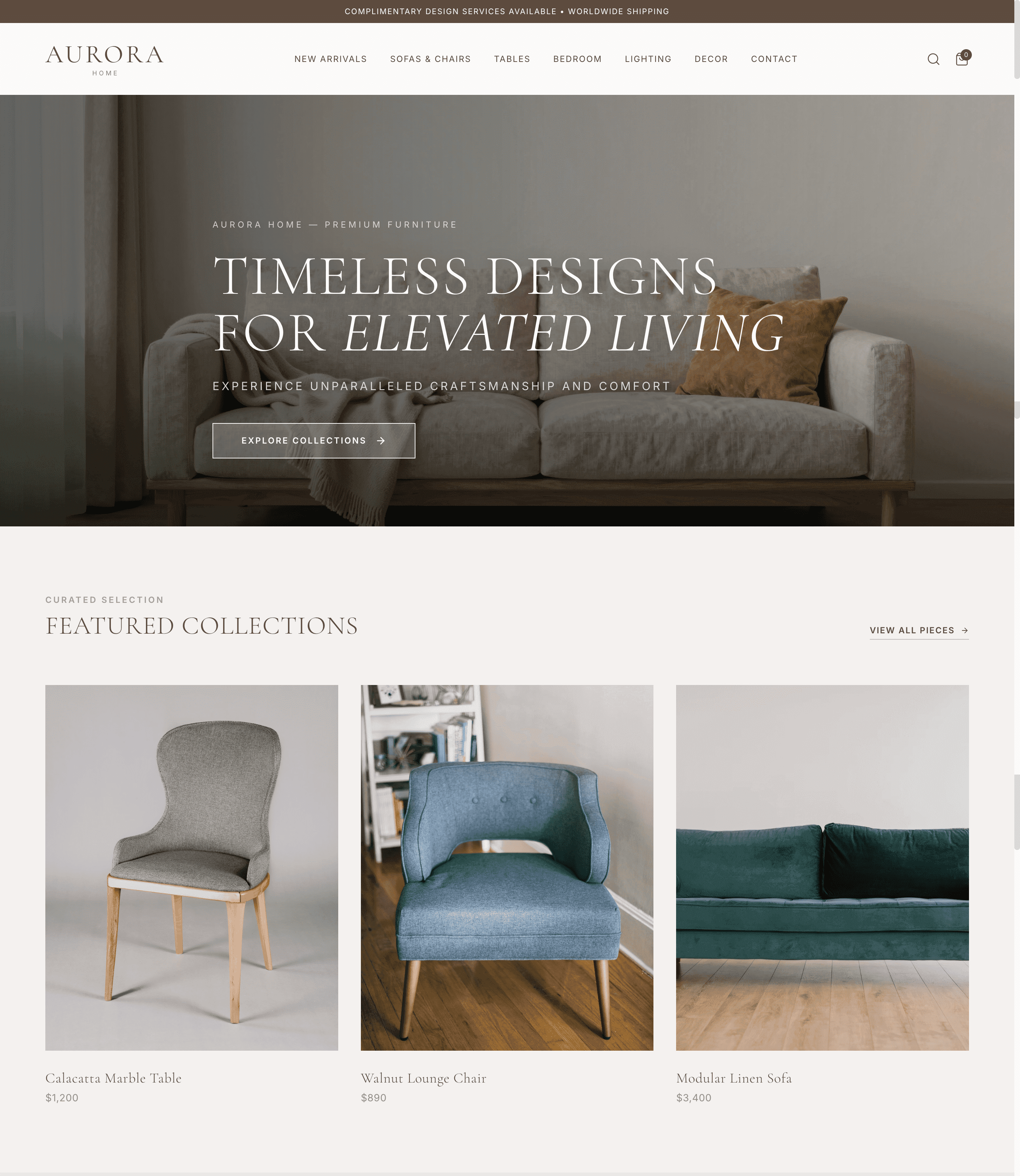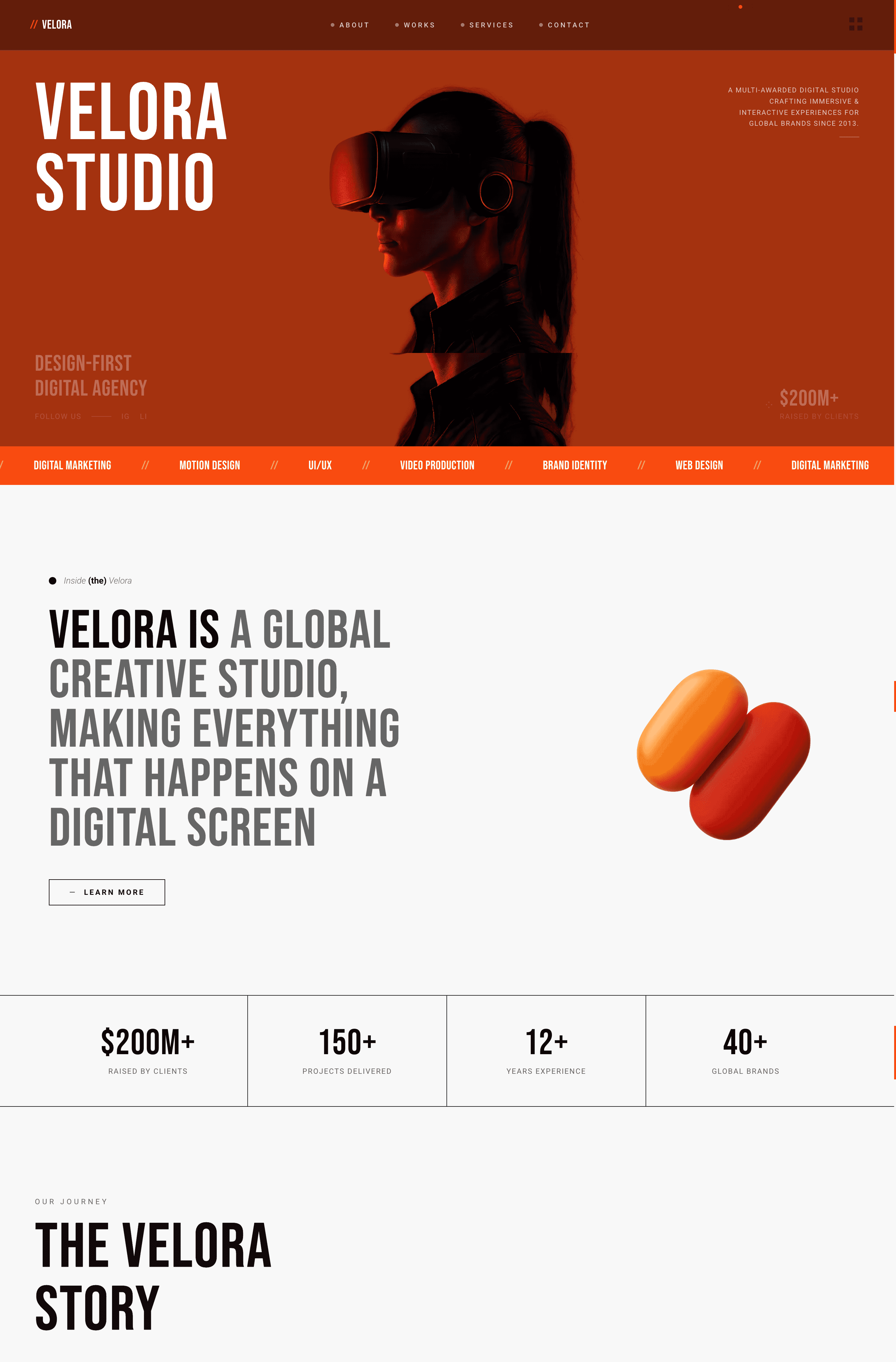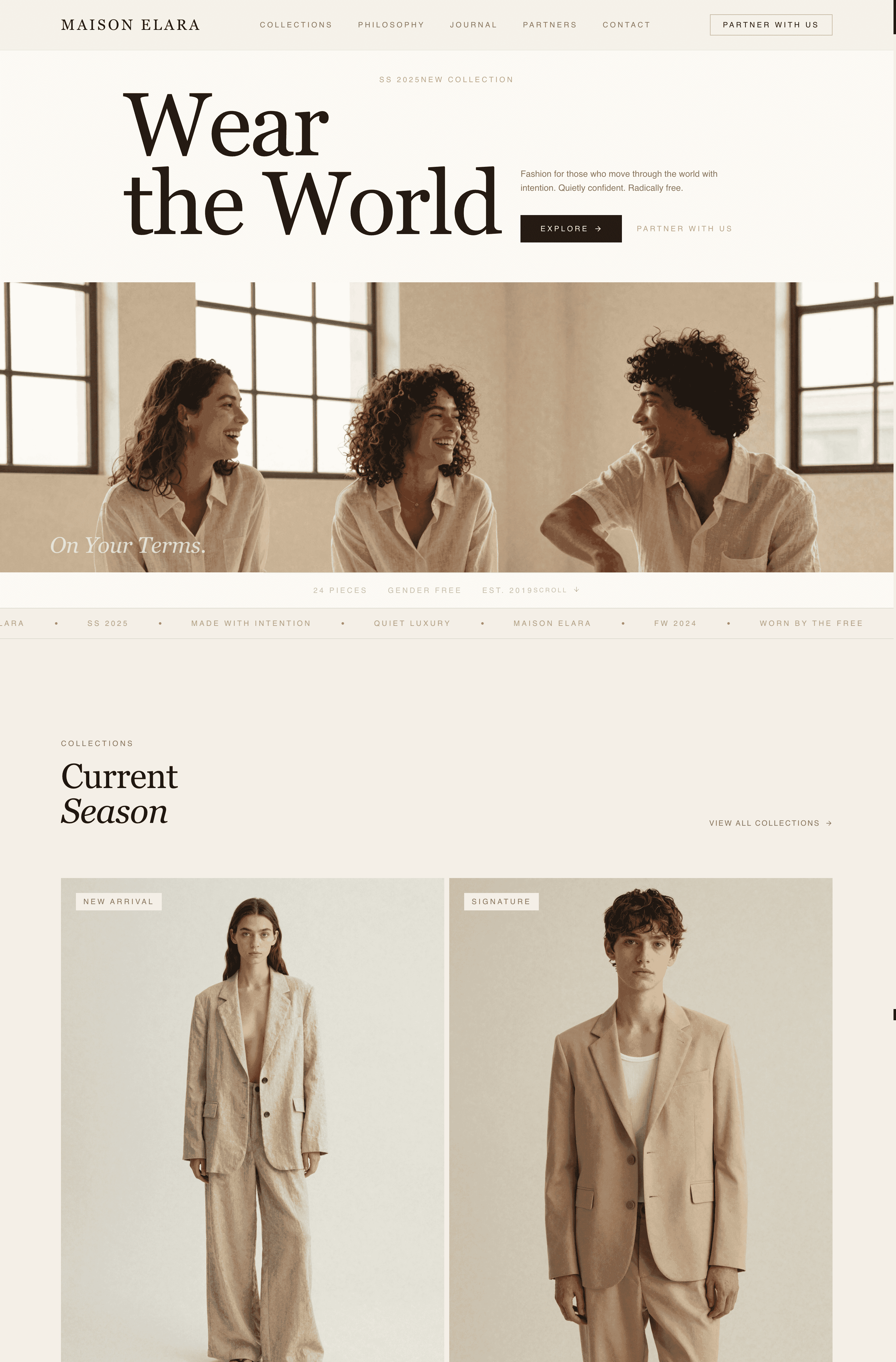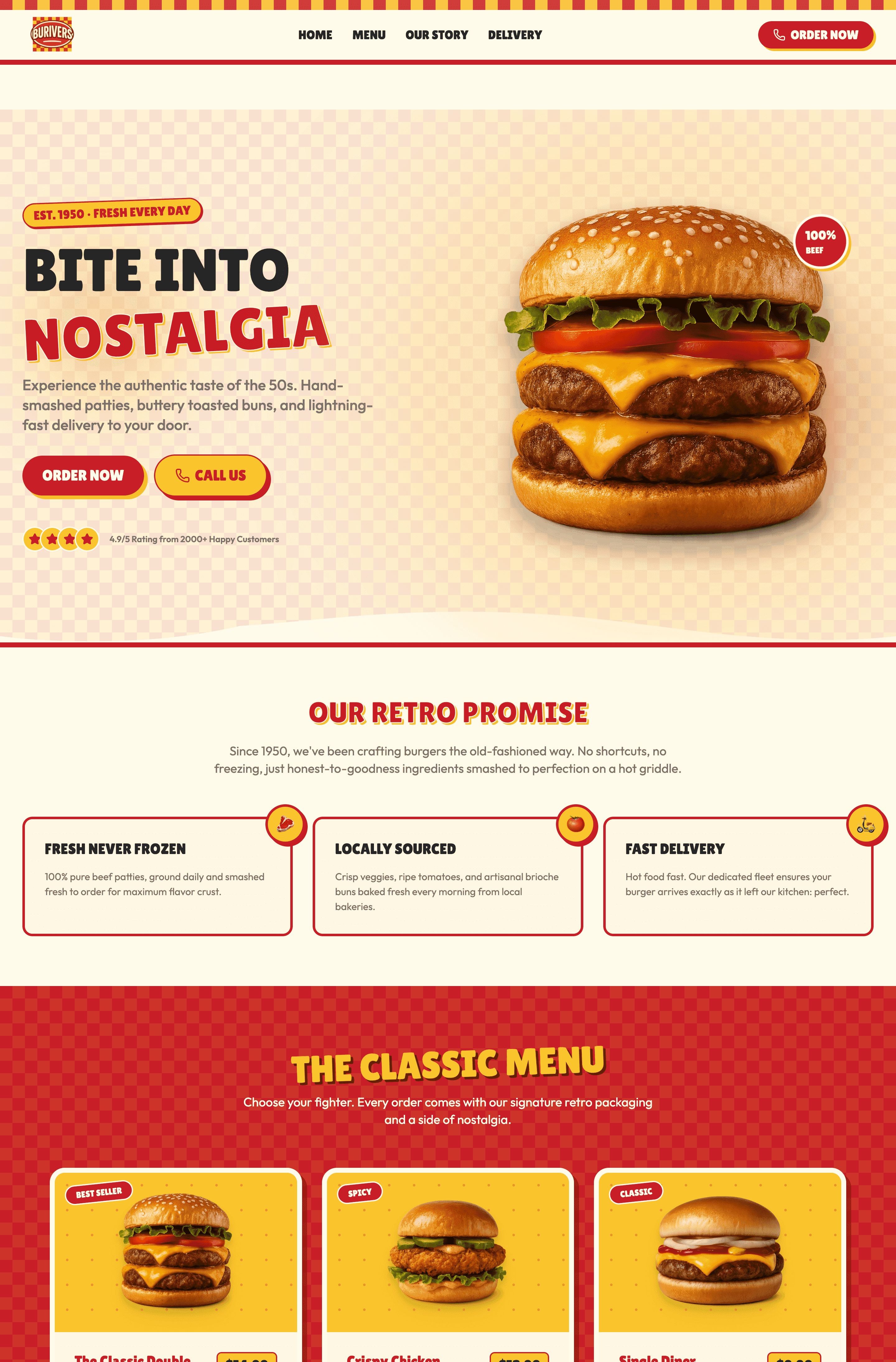
Digital and email marketing are important. However, if one belief unites marketers, the painpoints are limited customisation, dated designs, and monthly costs that add up faster than you expect. There's now a better way: Wegic lets you build a complete website by just chatting with AI. There are no stiff templates to copy, no drag-and-drop menus to learn. I collected 10 Constant Contact website examples spanning facilities, salons, consultants, e-commerce, music bands, and non-profits, covering nearly every small business type you can imagine.
Constant Contact started as an email marketing tool. Users can make their emails look like websites, create a sign-up landing page to collect new emails and SMS contacts. The website builder came later, almost like an afterthought.
If you're searching for constant contact website examples, chances are you're either:
- 1.Trying to see what others have built with the platform
- 2.Wondering if it's worth your time and money
Here's what I found after analysing dozens of these Constant Contact website examples: the results are... mixed. Some Constant Contact use cases look decent. Others look like they were built in 2010 and never updated.
But first, let's look at what you're currently working with.
10 Constant Contact Website Examples
1.Hubbell
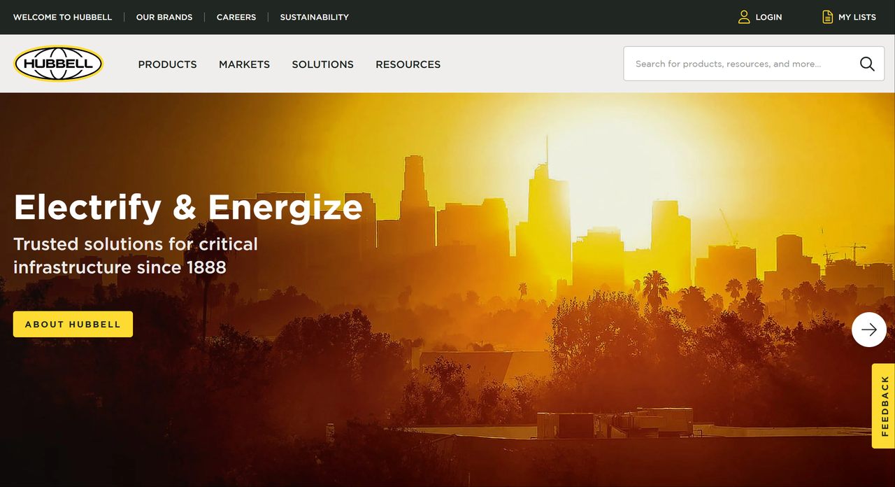
It effectively uses a clean, grid-based layout to showcase Hubbell's diverse market segments and product categories. Each section features prominent, visually appealing images alongside concise descriptions, allowing for quick comprehension. The consistent branding and clear navigation emphasise their role in electrifying and energising communities.
2.USTA
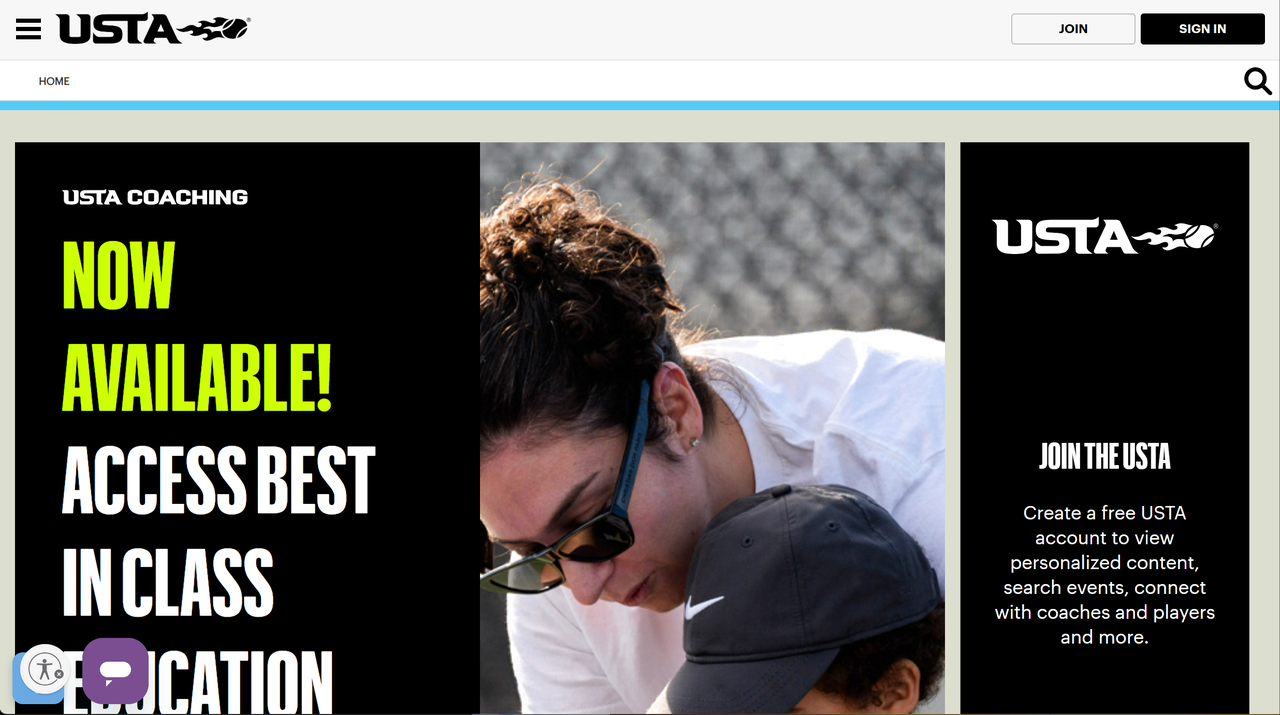
The USTA website employs a user-centric design, prominently featuring calls to action for coaches, event discovery, and membership benefits. Its localised experience option and clear navigation for "What are you looking for?" streamline the user journey. The site also dedicates significant space to Safe Play initiatives and educational resources, highlighting a commitment to athlete well-being.
3.WM
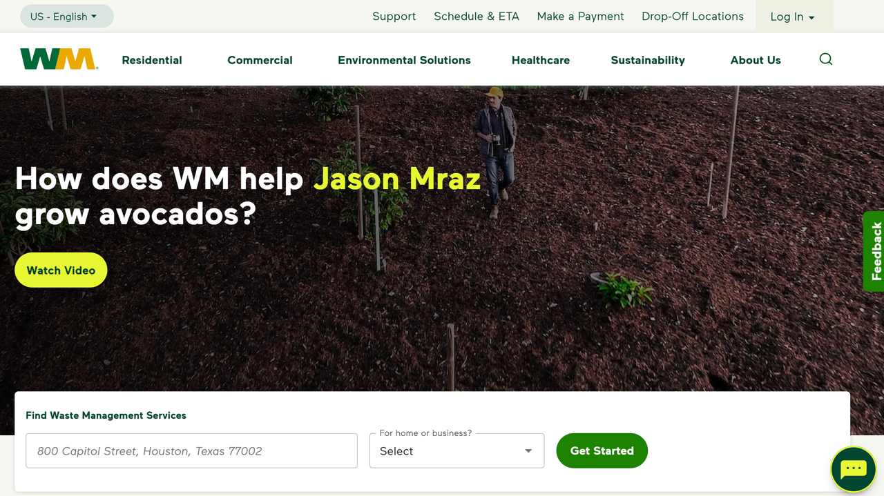
It effectively uses clear headings and prominent images to showcase its waste management services, making it easy for users to quickly understand their offerings. It highlights "My WM" for quick access.
4.Qorvo
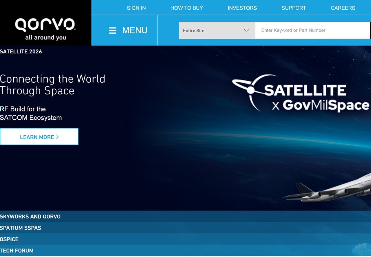
This webpage effectively showcases Qorvo's products and news, using clear headings and distinct sections for easy navigation.
5.RedHotChiliPeppers
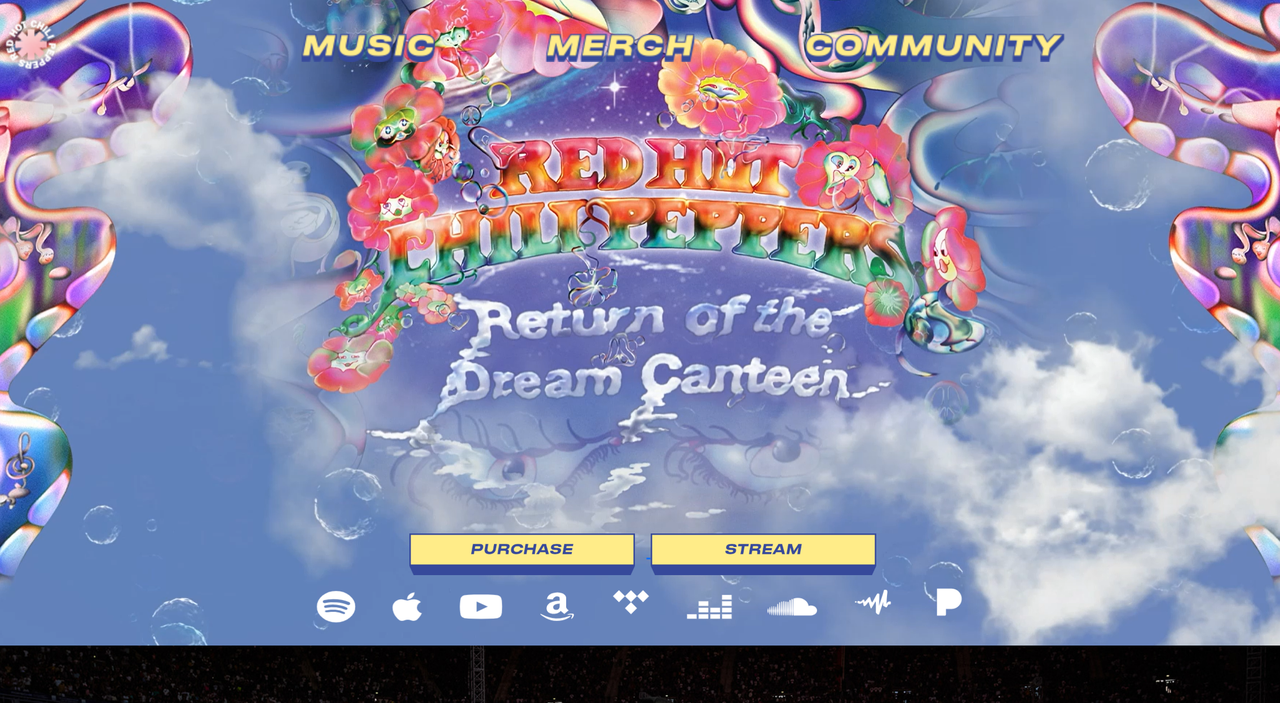
The Red Hot Chili Peppers' website features a visually attractive design, primarily using imagery of the rock band, with limited text. Its most prominent design choice for capturing user information is a direct, uncluttered subscription form, asking only for an email or phone number to receive news, events, and exclusives. This straightforward approach focuses solely on collecting contact details without distractions, leveraging the band's established brand to encourage sign-ups.
6.Orvis
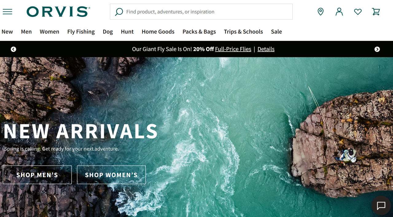
It uses a bold, immersive hero image and lifestyle photography to sell an aspirational outdoor identity, with clear top-level navigation and strong category tiles that make browsing intuitive and visually engaging. The layout prioritises shopping pathways (“Shop Men’s,” “Shop Women’s,” etc.) and product discovery over intrusive pop-ups, maintaining a premium, brand-first feel.
7.TheLifeGuardStore
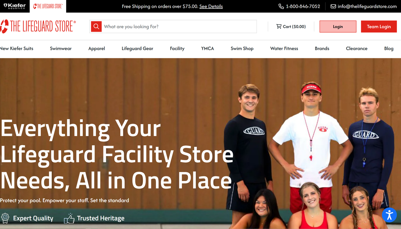
This homepage emphasises clarity and conversion, with a strong value proposition in the hero banner and highly visible contact information (phone number and email) placed prominently in the top bar to build trust and encourage direct inquiries. The dual “Login” and “Team Login” buttons signal a B2B focus, aimed at facilities and organisations. Unlike lifestyle-driven retail sites, this design prioritises utility and accessibility, making it easy for customers to get in touch quickly.
8.Pearlizumi
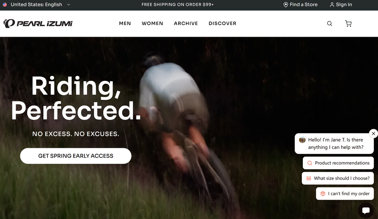
This webpage effectively uses large, high-quality images to showcase its cycling gear, immediately drawing the user's attention to product categories and informational guides like the "WINTER GLOVE GUIDE."
9.MLB
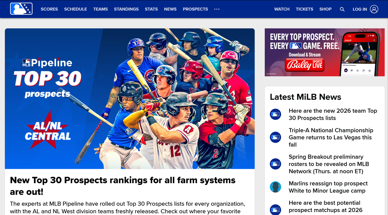
It features a clean, article-focused design. The site shows recent news and stories from Minor League Baseball. Its primary characteristic is content dissemination, with prominent headlines and summaries for various articles.
10.iu13
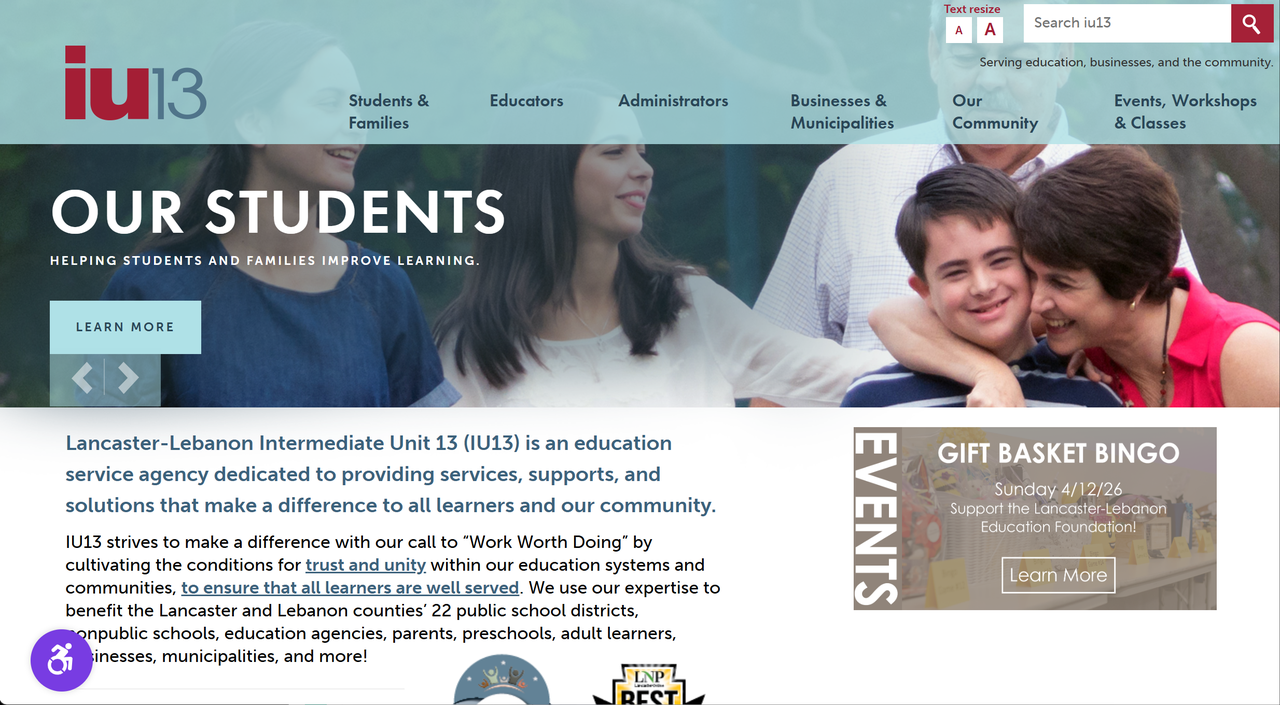
It features a clean, professional design with a clear mission statement and prominent calls to action. Notably, it uses embedded images with direct links to encourage engagement, such as joining their team or learning about events like "Gift Basket Bingo."
The Real Problems With Constant Contact Website Builder
After reviewing these Constant Contact website examples, here's what keeps small business owners up at night:
Limited Design Flexibility
The section-based editor works, but you can't fine-tune every pixel. You're stuck with what they give you.
Monthly Costs Add Up Fast
$10/month sounds cheap. But when you add email marketing ($20+), e-commerce features, and premium templates? You're looking at $50-100/month easily.
Dated Templates
Constant Contact's designs feel safe but stale. They work, but they don't impress.
Learning Curve
Even with their "easy" builder, there's still a learning curve. Drag, drop, align, configure, hope it looks right.
No True AI Assistance
Here's the big one: Constant Contact is still building websites the old way. No AI. No conversation. Just manual editing.
The Better Alternative: Building Websites with Wegic AI
Wegic is an AI website builder that creates complete websites through conversation. No dragging elements around. No selecting from hundreds of templates. You just tell it what you want, and it builds it. You comment to polish the draft, and it refines it.
I built a website for a fictional yoga studio called "Zen Flow." Here's how it went:
Step 1: Describe Your Vision
I opened Wegic and typed:
I need a website for a yoga studio. Calm, peaceful, focused on stress relief and mindfulness.
That's it.
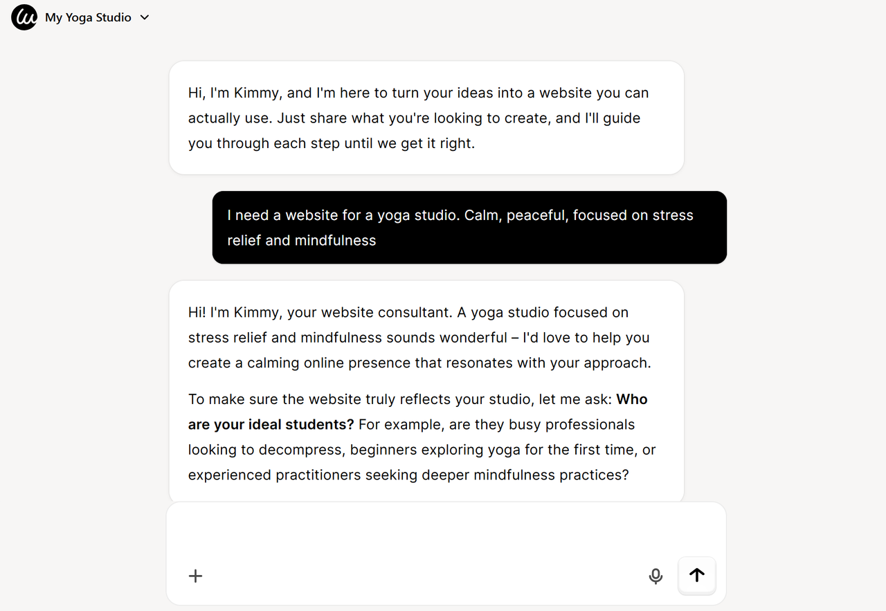
The AI (named Kimmy) acknowledged my request and asked a few simple questions to understand my vision better.
Step 2: Answer Simple Questions
The AI asked about my target audience, location, and style preferences. Each question was clear and purposeful.
I told it:
- Business: Zen Flow Yoga Studio
- Vibe: Calm, peaceful, focused on stress relief and mindfulness
- Ideal Students: Busy professionals
- Types of Services: Drop-in classes, monthly memberships and private sessions
- Booking and Payments: Calendly
- Contact: WhatsApp + phone number
- Visual assets: Generate all of them by AI
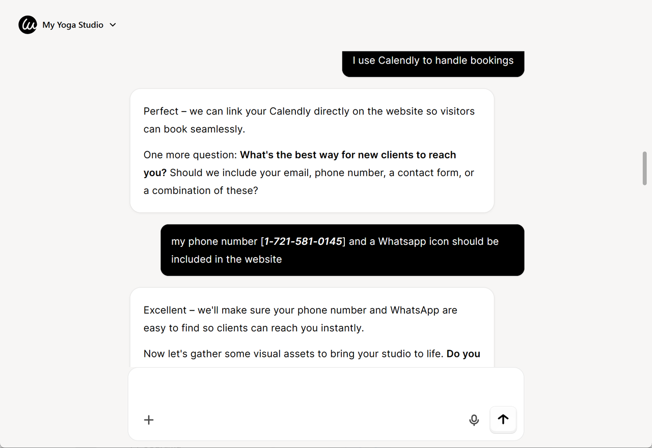
Step 3: Choose from AI-Generated Designs
Within minutes, Wegic generated 5 unique design options tailored to my description. Each had a different personality: modern, traditional, minimalist, nature-focused.
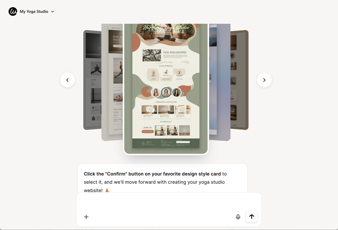
I picked the "Natural Zen" design.
Step 4: Watch Your Website Get Built
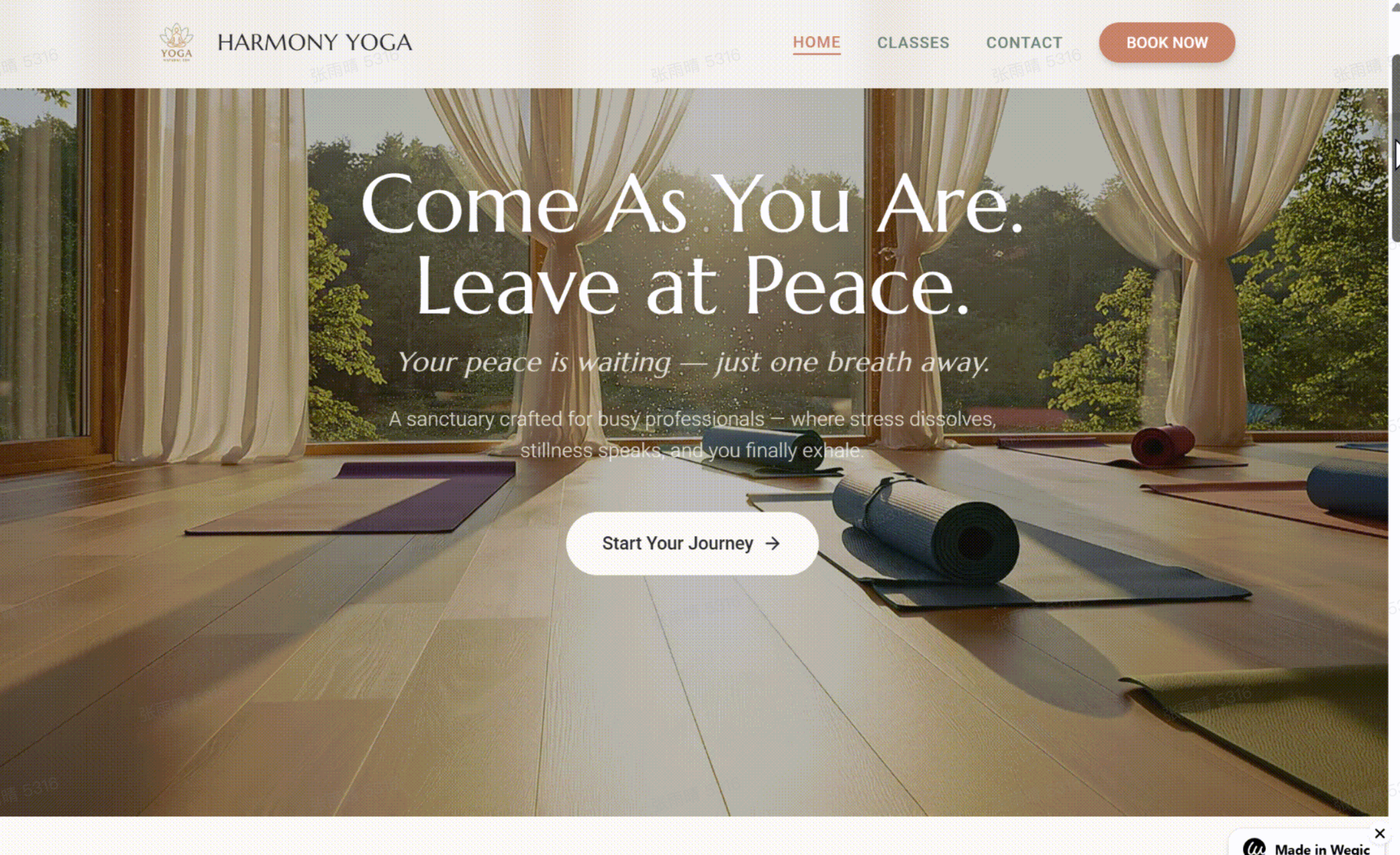
Wegic created a complete website with:
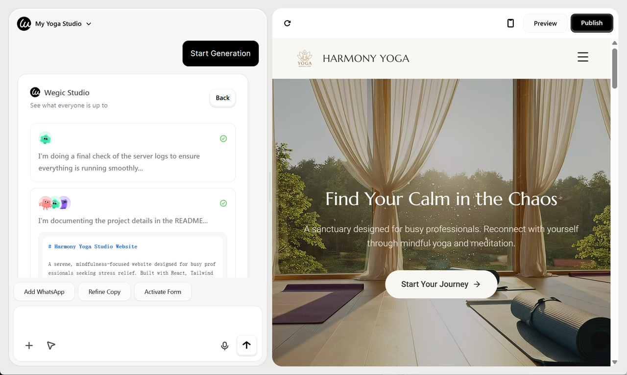
- Homepage with hero section and class highlights
- About page telling the studio's story
- Services page with pricing and packages
- Class schedule section
- Contact page with map and form
- Blog section for mindfulness content
Step 5: Edit Anything
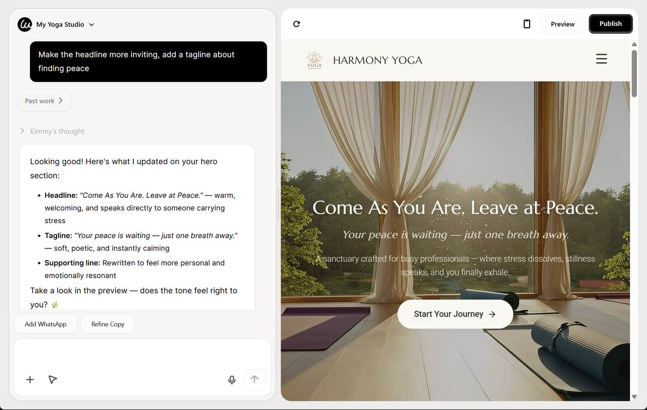
Here's the magic part. I wanted to change the hero headline. I just typed:
Make the headline more inviting, add a tagline about finding peace
Wegic updated it instantly.
What Blew My Mind
- 0 experience needed: I have never built a website before. I just had an idea and described it.
- Actually intelligent AI: It understands context, style preferences, and business goals—not just keywords
- Incredibly fast: Complete website in under 10 minutes. I timed it. Twice.
- Always fresh: Just tell Wegic to "update the summer promotions" or "change the holiday hours" and it happens instantly
- Actually affordable: No surprise monthly fees for "premium" features. Everything is included
- Global reach: Built in 230+ countries. 95% of users chat in their native language—because great tools should work for everyone
The Final Website
After my edits, here's what the final Natural Zen Yoga website looked like:
The Choice Is Yours
You now have 10 Constant Contact website examples, and a clear picture of what works and what doesn't.
Small business owners chose a platform, learned its quirks, settled for its limitations, and paid monthly fees to keep their site alive.
But you don't have to make the same choice.
Wegic Templates for Small Business
Here are Wegic templates that solve those exact problems:
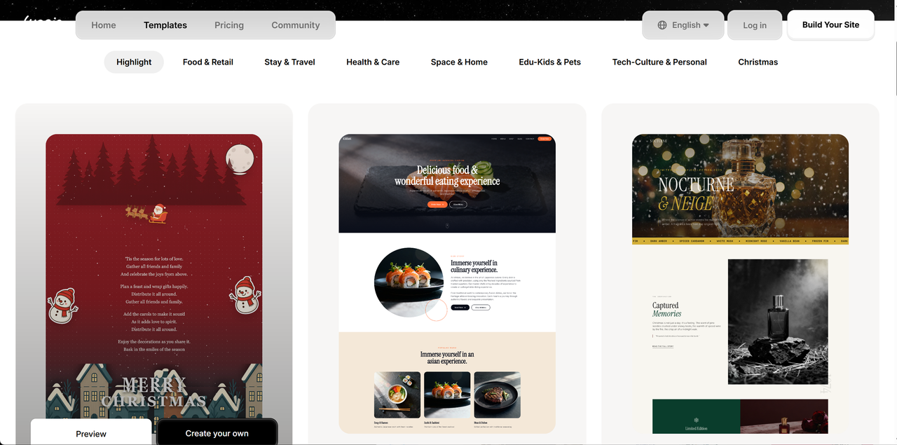
- Wellness & Health Template: Perfect for yoga studios, fitness centres, and wellness practitioners.
- Restaurant & Cafe Template: Ideal for food businesses needing menus and online ordering.
- Professional Services Template: Great for consultants, lawyers, and service providers.
- Creative Portfolio Template: Best for photographers, artists, and designers.
- E-commerce Template: Ready for online stores with full shopping functionality.
When I built the Natural Zen Yoga Studio website earlier, I spent maybe 10 minutes total. One minute, describing what I wanted. Two minutes answering questions. Five minutes waiting for Kimmy generate a draft. Two minutes making edits through conversation. That's it. A professional, mobile-responsive, complete website that would have cost $2,000-5,000 from an agency.
Ready to build something better? Head to Wegic and start chatting. Your dream website is closer than you think.
Frequently Asked Questions
Is Constant Contact good for building websites?
Constant Contact offers a website builder, but it's not its core strength. Their templates are dated, and the design flexibility is limited. For the same price (or less), AI builders like Wegic offer significantly more value and modern designs.
Can I switch from Constant Contact to Wegic?
Absolutely! You can build your new Wegic website in minutes, then simply point your domain to the new site. Wegic provides easy instructions for connecting your existing domain.
Do I need coding skills to use Wegic?
Zero. That's the point. 80% of Wegic users have never built a website before. You describe what you want, and AI builds it. That's it.
What makes Wegic better than Constant Contact for websites?
Wegic uses AI to generate entire websites from conversations, verbally or in text. It's faster, more flexible, and produces more modern results. Plus, you can edit anything using natural language commands.
Can Wegic help with e-commerce websites?
Yes! Wegic includes e-commerce functionality with product galleries, shopping carts, and checkout. No extra monthly fees for premium features.