Log in
Build Your Site
Top 10 UX Designer Portfolio to Learn From in 2024
Explore these great UX portfolio examples with latest trends in 2024. Get inspiration to build your own portfolio website better.
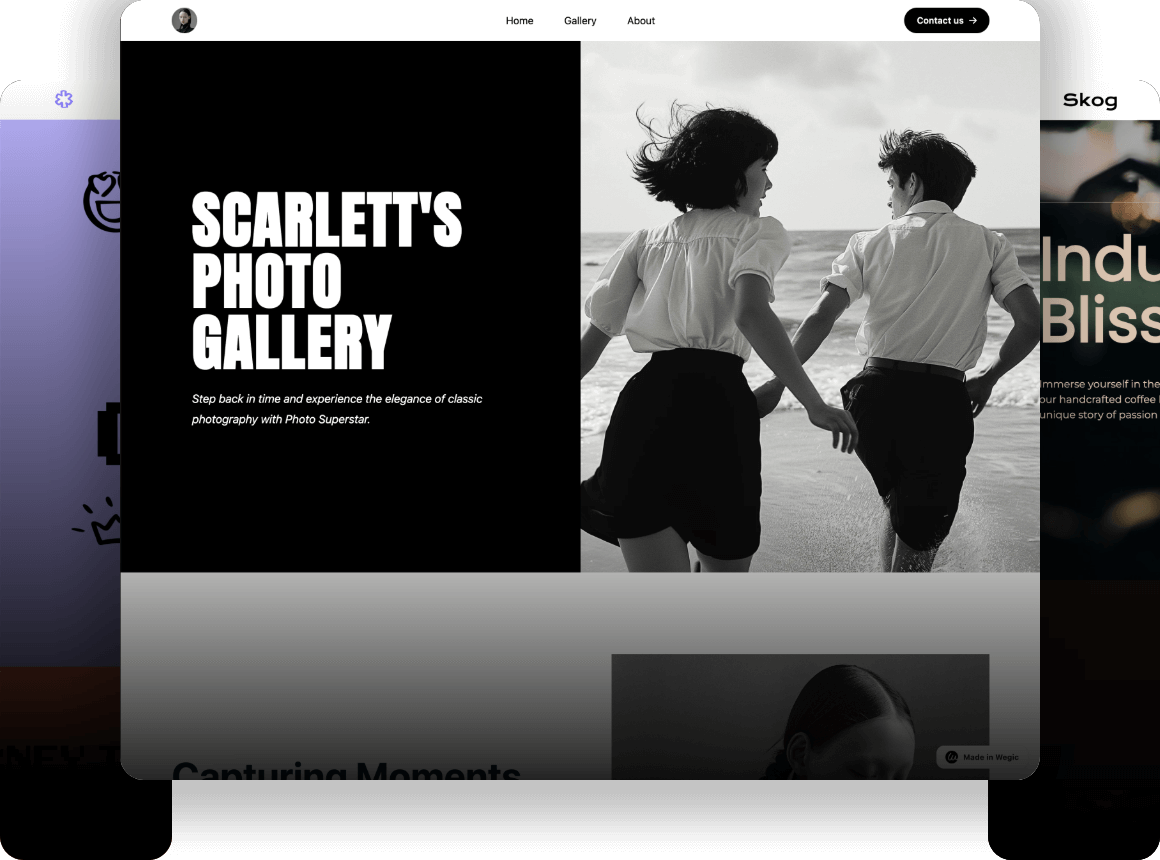
If you want more people to know about your work, it is really important to adopt some marketing strategies appropriately. Building a portfolio on your own is a good choice.
For UX designers, you can put your works on the portfolio website for more people to see. These works can show your professionalism in the field of design and reflect your taste and aesthetics. If your work is liked by many people, then you can also gradually improve your reputation in the industry. As more and more people see you, you can also get more job opportunities and resources.
In short, personal portfolios have many advantages. I don’t know if you already have your portfolio, or if you are planning to build your portfolio website recently. In this article, we will share with you the Top 10 UX Designer Portfolio in 2024. These personal portfolio websites have their highlights, especially for novices. If you haven’t built your portfolio yet, these websites might give you some inspiration
Click here to Build your site
Top 10 UX Designer Portfolio to Learn From in 2024
01.Simon Pan
First, I want to introduce Simon Pan's portfolio. Simon Pan is an experienced UX designer renowned for his work at companies like Uber and Google.
The overall style of his portfolio website is minimalist and clean, with black and white as the main colors. The page navigation is intuitive and clear, helping the audience to quickly locate information.
The page consists of a total of four cases, covering a wide range of topics, including Uber Magic, Amazon Prime Music, London By Bike, and Independent Living NSW. Each project is accompanied by a very conspicuous logo, a bold title, and a subtitle that further explains the project so that the audience can know the general introduction of the project and its effects and benefits, which helps to enhance the audience's interest and to know the designer better.
The key takeaway for inspiration
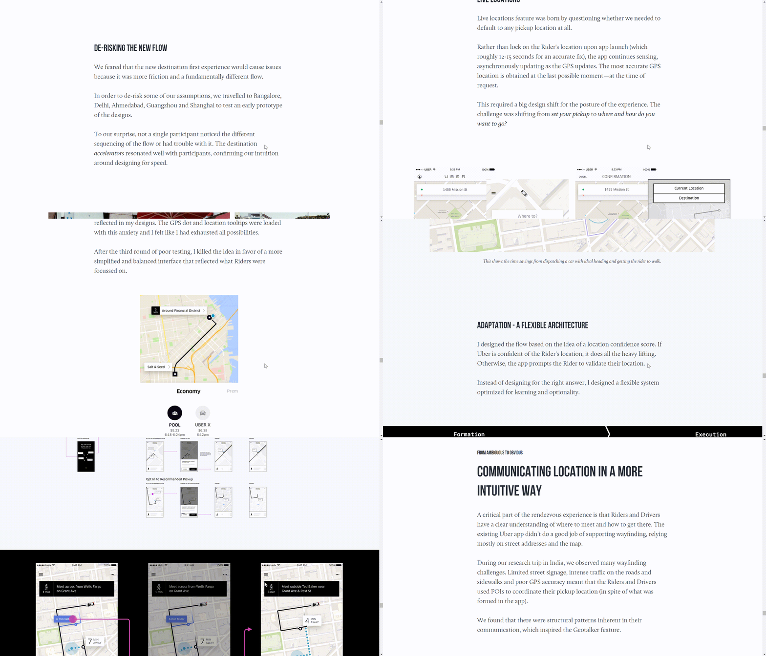
Take Uber Magic as an example. Clicking on this case, we can see that Simon also chose black and white in the process of presenting this case, which is consistent with the overall tone of his website and maintains a consistent minimalist style.
His case analysis covers several parts, including the background of the project, the challenges faced by the application, his role and job responsibilities in the project, how the team discovered and solved the problem, and his feelings and thoughts after the project was completed.
Especially in the part of solving the problem, he explains it in great detail. Doing so not only demonstrates his professional level in the field of design and his ability to solve problems, but also increases the readability of the case, and gains the trust of potential customers in designers. After all, only those who actually solve problems know how each step is carried out. Most of his other cases also follow the same structure, with a simple and intuitive layout, full of logic and hierarchy.
It is worth mentioning that in each case he uses a lot of pictures and texts, focusing on what kind of investigation and research he took in the project to find the problem, and how he solved the existing problems by modifying the design and optimizing the user experience.
He highlights the effects and important metrics of his design in his case analysis, which is very important, especially if you want to make a living by design. This data can very intuitively reflect your business value and bring you more employment opportunities.
02.Sophie Westfall
Sophie Westfall is a talented graphic designer known for her vibrant, innovative designs that blend modern aesthetics with timeless appeal.
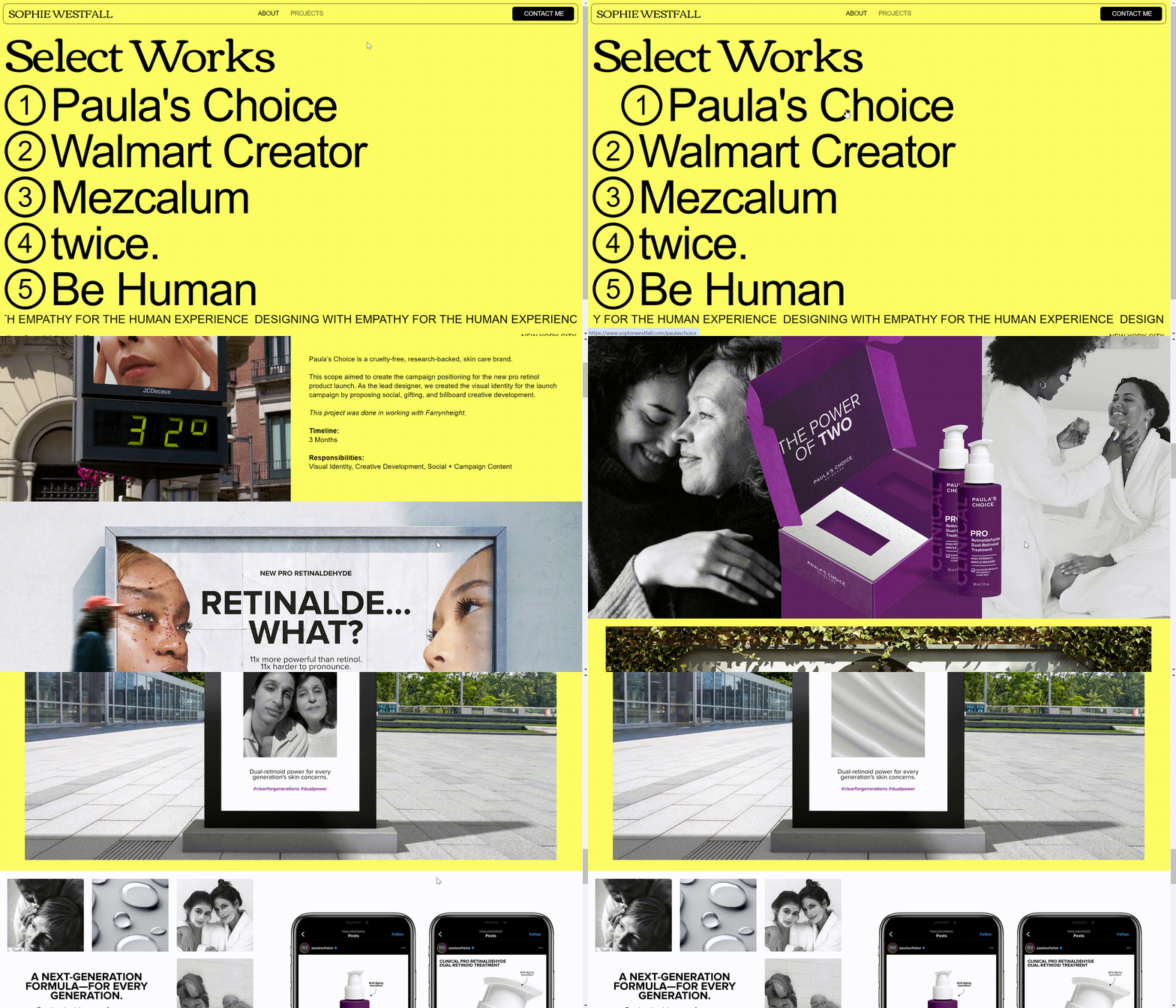
Sophie adopts the minimalist principle. We can see that the navigation bar is also simple and intuitive. The yellow background and the black bold font form a sharp contrast. The highly saturated yellow itself looks eye-catching and can directly attract the audience’s attention. The bold black font allows the audience to focus on the content itself.
At the same time, it also has some animation, such as a hover effect, which enhances the user experience.
The key takeaway for inspiration
Take Paula’s Choice as an example. We can see that the designer still adopts a minimalist design, with only some simple text, mainly introducing the goals, timeline, and responsibilities of the project.
The most noteworthy thing should be a large number of high-quality exquisite pictures and subtle animation effects. These creative pictures fit the brand and are more convincing than any text. Through these pictures, we can also feel the designer’s aesthetics, taste, and design style.
Contact information and social media integration help the audience to directly contact and communicate with the designer and expand their popularity.
03.Kyson Dana
Kyson Dana is an illustrator and designer known for his unique, storytelling-driven approach to branding and visual communication.
The style of Kyson's portfolio is simple, with black as the background color and white fonts, which presents a sharp contrast and increases readability.
His portfolio includes a simple self-introduction and a selfie, and the overall style is very clean and straightforward with intuitive and user-friendly navigation and a well-classified layout.
He showed the audience ten cases. Each case uses hero animation. The images or videos occupy the entire screen, making the portfolio more visually appealing.
The key takeaway for inspiration
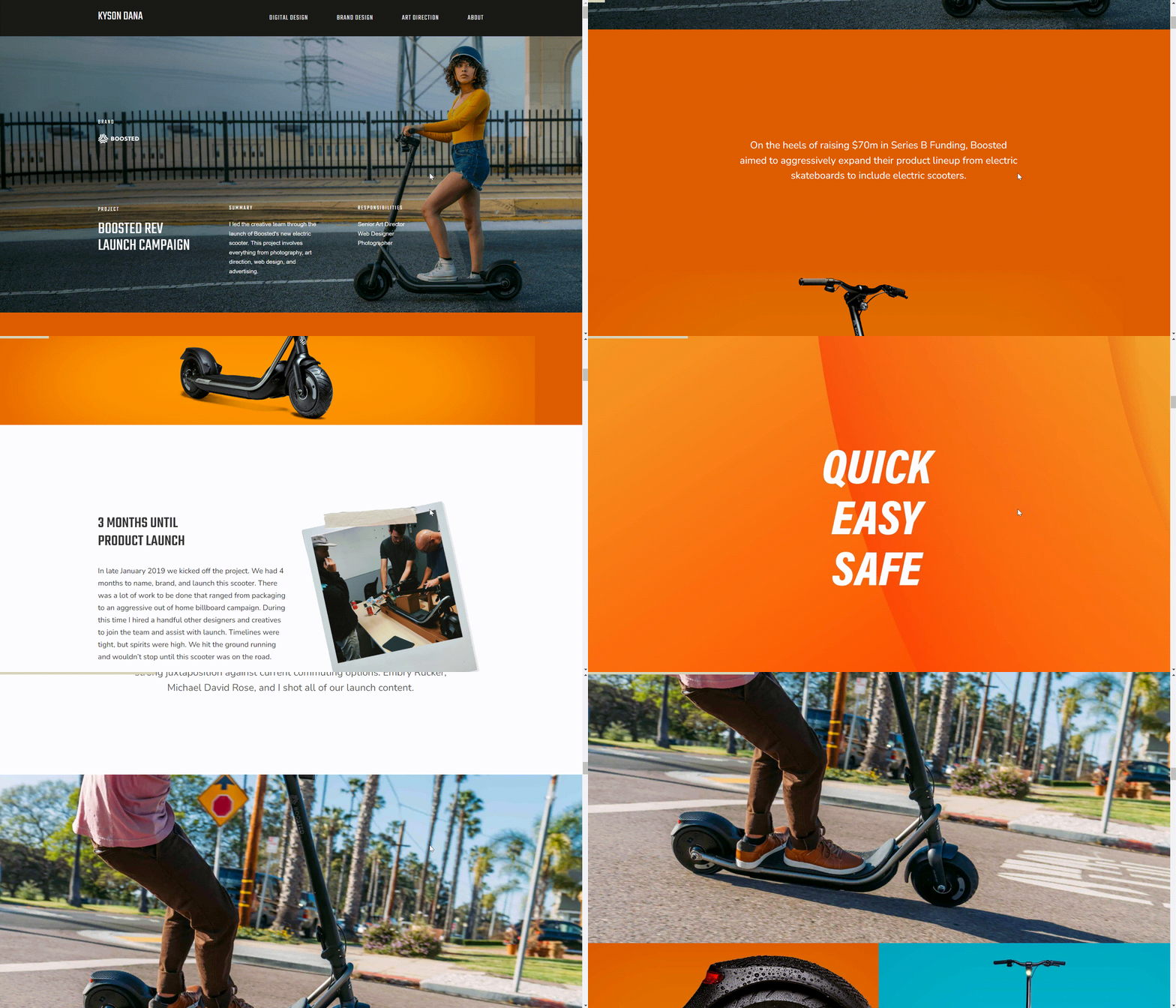
Take Boosted as an example. We can see that he used background animation to show a group of people riding scooters, so the audience can immediately get to know what products they serve. The use of video can better show the features of this brand and product, which also reflects the designer's creativity and thoughts.
In the case analysis, he introduces the background of taking over the project, the time he has spent on preparation, how the team conducted user research, and the efforts and results they made at each stage. These all show his thinking and ability to deal with challenges and problems during the design process.
One of the biggest features of his analysis is that he likes to show a large number of design pictures and videos, such as finished products or framework products. These exquisite and high-quality visual elements can help the audience understand his design characteristics and style more intuitively.
In addition, the case analysis also mentions the effects of the project, which are of great help to both the company and individuals as well as to society in the field of transportation. This can establish the trust and recognition of the designer by the client.
04.Bethany Heck
Bethany Heck is a design leader and typographer whose work, such as the Eephus League, showcases her passion for typography and classic design elements.
Bethany's portfolio is presented in a word-cloud format with a lot of brand names. These brand names are arranged in an orderly manner in a seemingly random way. It integrates a variety of fonts to make the whole design more playful, which also illustrates his features as a typographer.
He chooses white as the background color, and the font color uses a gradient color scheme from blue to green, creating a very harmonious and clean feeling.
Minimalist navigation has only one about/CV option, and after clicking in, the page is a simple text introduction about the designer, which allows the audience to focus on his work.
At the same time, the use of white space also gives the whole design a breathing room. Even a large number of texts will not feel overcrowded. Hovering the mouse over one of the brands, the font color turns black, which can enhance the user experience.
The key takeaway for inspiration
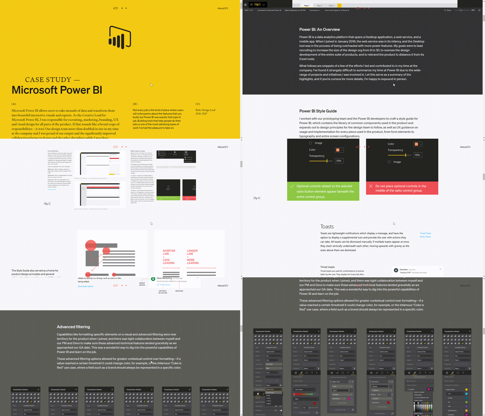
Let's consider Microsoft Power BI as an example.
The homepage of this case study features a striking yellow background paired with a black font, creating a sharp contrast that enhances readability.
The designer starts with an overview of the project and his role, giving the audience a clear understanding of the case. He then dedicates substantial space to detailing his design process, utilizing numerous images and annotations to thoroughly explain his approach—this is a hallmark of his case analysis.
He presents a visual framework to the audience, highlighting key features within the image and providing extensive textual explanations and descriptions. The images are meticulously organized, clear, and logically arranged, ensuring the audience isn't overwhelmed.
More importantly, the accompanying text is straightforward yet professional, showcasing his exceptional skills as a designer. Through this, we also gain insight into his design philosophy, such as the interplay between macro- and micro-elements.
A portfolio like this is more compelling than any other material, as it convincingly demonstrates your professionalism and trustworthiness to the audience.
05.Karina Sirqueira
Karina Sirqueira is a multidisciplinary designer recognized for her bold, colorful designs that push the boundaries of conventional aesthetics.
Her personal portfolio website is a vibrant showcase of her creativity. The page is composed of multiple color blocks. The colors are very bold. With a variety of animation effects, the color blocks are arranged in different patterns. Hovering over the cursor on a color block will trigger a subtle animation, and the color will change accordingly, creating a lively and engaging user experience
In addition to a few color blocks, there are no other extra decorations on the entire page, following the design principles of minimalism.
The key takeaway for inspiration
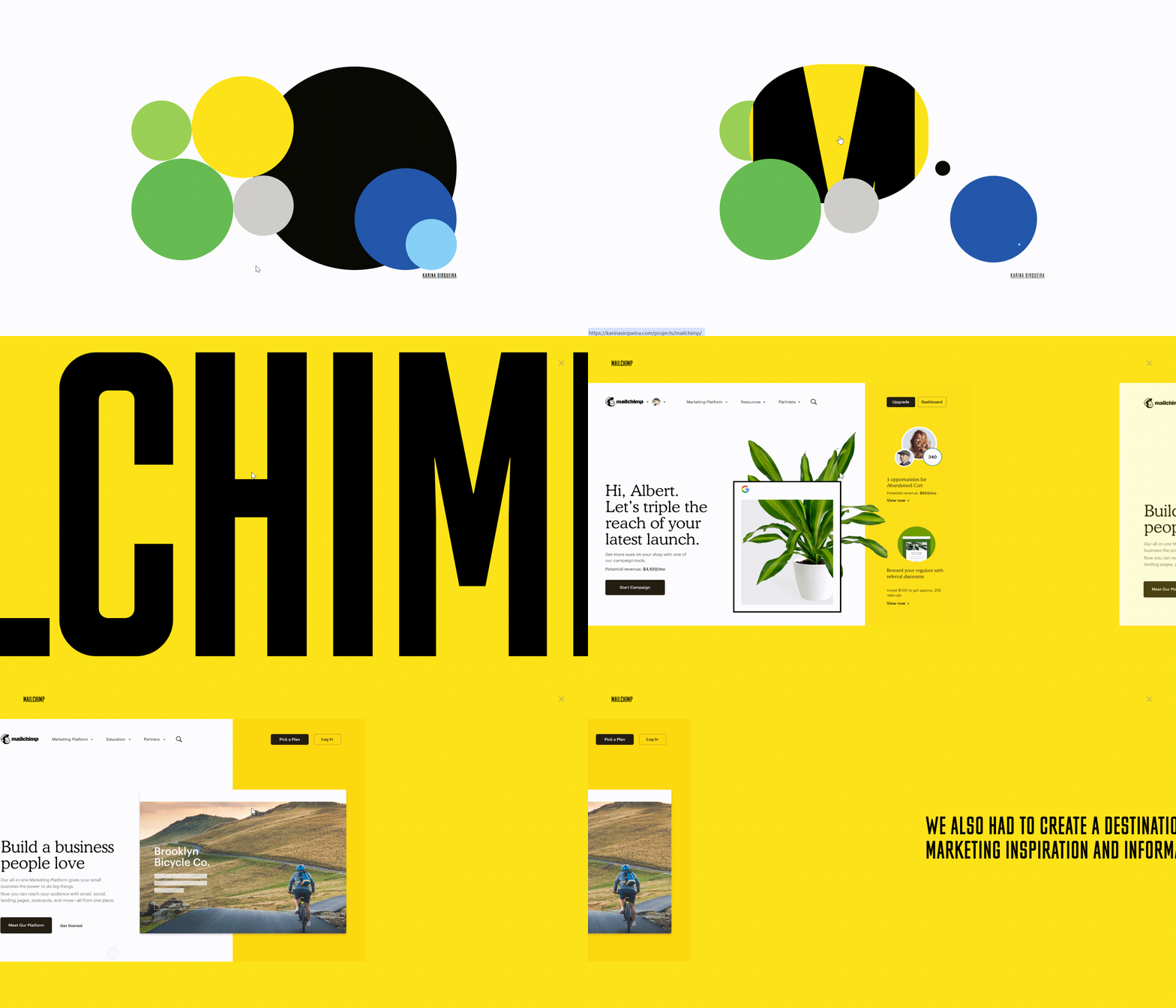
Click on a case at random—let’s take Mailchimp, for example. We can see that the brand name occupies the entire homepage. The bold black font and the yellow background form a sharp contrast. The advantage of this design is that it can quickly attract users and focus their attention on the content displayed on the web page.
Slide your mouse, and you will find that her portfolio is different from other traditional portfolios. Karina employs a horizontal scrolling format. In case analysis, where text and images are deliberately separated—one page displays text, while another showcases images, staying true to minimalist principles.
Compared with other designers, her case analysis is simpler and clearer. This is also the biggest feature of his portfolio, but even a simple work display is enough to convey a strong sense of professionalism and style.
06.Elizabeth Lin
Elizabeth Lin is a UX/UI designer with a flair for creating intuitive digital experiences that prioritize user needs and accessibility.
Elizabeth's portfolio is a perfect example of storytelling. The navigation bar is simple and intuitive. The combination of a pink background and black font creates a sharp contrast, which looks lovely while enhancing readability.
She shows us six cases, and each case card has hover effects. When you hover the cursor on the card of the case, there will be an emoji animation effect, which will increase user interaction and bring users closer.
The key takeaway for inspiration
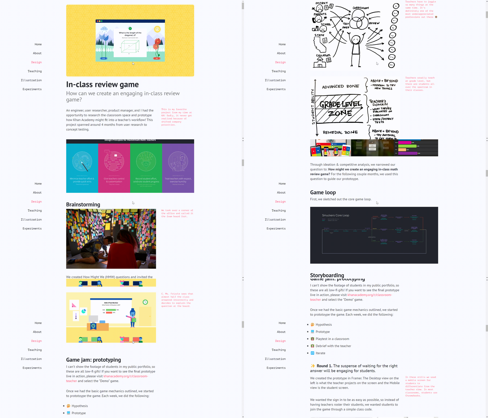
Take the In-class review game as an example.
As mentioned at the beginning, the biggest highlight of her case analysis is storytelling. She divides the background of the entire design, the original intention of the design, and the specific operation process into many parts, and introduces them in detail one by one.
Her text language is very approachable and easy to understand. She also likes to use some emojis very much and will add some notes on both sides of the page to express her feelings. These designs have made a closer connection with the audience as if you are chatting with your friends.
She has also incorporated many pictures and videos in each part of the description to help the audience better understand what she is saying.
07.Robin Nogiuer
Robin Nogiuer is a French designer and illustrator and she is good at crafting playful and minimalist visuals.
Robin's portfolio website is a vibrant and engaging showcase, featuring a mix of highly saturated colors and cool animation effects. Vertical scrolling animation and text fade-ins have been used in her portfolio website. This design looks lively, interactive, and eye-catching.
At the same time, simple and user-friendly navigation makes it easy for the audience to find what they are looking for.
The key takeaway for inspiration
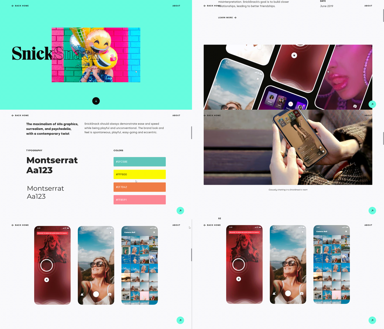
Let's take SnickSnack as an example.
The overall layout of the pictures and text of the case analysis is well structured, with a sense of hierarchy and clear logic, making it easier for the audience to follow.
At the same time, animation effects help to improve the user experience and enhance the readability of the content.
An outstanding feature of Robin's portfolio is her approachable writing style. She uses a storytelling narrative to tell her entire project as if she is talking to a close friend, which brings her closer to the audience. She introduces the background of the project to the audience, shares her design ideas and methods, and emphasizes how her design highlights can improve the user experience and what she has gained from the entire project.
What’s interesting is that her works are as friendly as her personality. During the design process, she always emphasizes how to make the design communicate and connect with users more closely, and how to have intimate and interesting conversations with users. This fully reflects her design concept, which in turn allows potential customers to have a deeper understanding of her personal style and strengths and encourages collaboration.
08.Saloni Joshi
Saloni Joshi is a UI/UX designer with a strong focus on creating inclusive and user-friendly digital products that cater to diverse audiences.
Soloni’s portfolio follows the principle of minimalism. The homepage has a simple self-introduction and social media integration. Her self-introduction with a personal tone makes people feel close. The portfolio contains several major parts, including title explanations and card displays. White background and black bold titles enhance readability and accessibility.
The key takeaway for inspiration
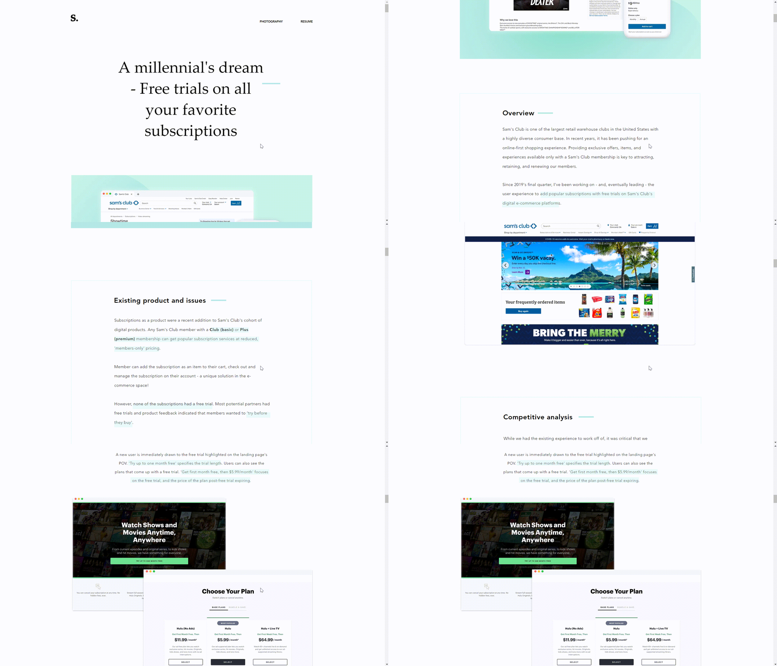
We can take the case of Sam’s Club as an example.
It is not difficult to see that the design still follows the principle of minimalism. She chooses white, black, and green as the color combination for the website.
In this case analysis, she introduces the current situation of Sam’s Club and the problems it faces. When facing existing problems, the designer analyzed the characteristics of other key players and learned from them. She uses text and pictures to show each design process in detail, as well as the results and important metrics achieved.
She also highlights important text information, which allows the audience to have a deeper understanding of the designer and her work. These designs also enhance the readability of the content and user experience.
09.Archit Saxena
Archit Saxena is a graphic designer specializing in clean, modern designs that emphasize clarity and effective communication
Archit's page starts with subtly animated design samples. The navigation is simple and user-friendly, including her great works, skills, etc.
On the homepage, we can see that she has listed three projects in her portfolio, with a wide range of themes, not only related to medical care but also related to AI design tools. She summarizes each project with a bold black title to let the audience know the content of her work in advance.
The key takeaway for inspiration
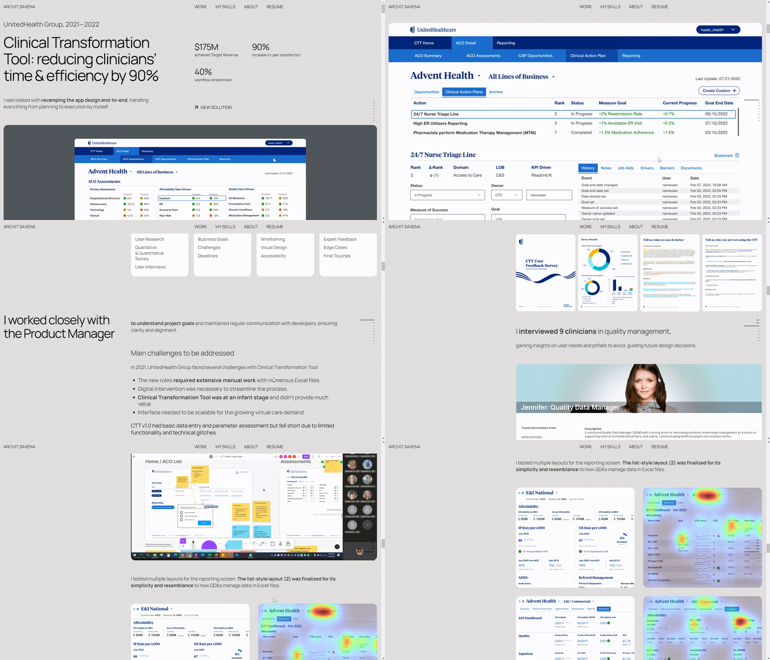
Take clinical transformation tools as an example.
In the beginning, she directly explains the good results obtained by her design, which has attracted the attention of the audience.
Then she employs text and pictures to give a detailed introduction to the entire design process, including her role and job responsibilities, the challenges she encountered, what methods she adopted to conduct research, how she used design software to make prototypes, how to work with the team, etc., as well as some important metrics.
Additionally, Saloni presents several before-and-after comparison images, emphasizing key textual information to enhance understanding. These case analyses can not only reflect the professionalism of the designer but also increase readability and user experience.
Moreover, the designer also lists many of her skills, which can reflect the professionalism of the designer and increase the audience's trust in the designer.
10.Siriveena Nandam
Siriveena Nandam is a digital designer known for her innovative use of color and typography, creating visually striking and memorable user interfaces.
Siriveena’s style also adheres to the minimalism principle. The navigation is simple and direct. The gray background contrasts with the bold black title.
The choice of different fonts also creates a distinct sense of hierarchy. She briefly introduces herself on the home page and lists five projects. The overall style of the portfolio is simple but very professional.
The key takeaway for inspiration
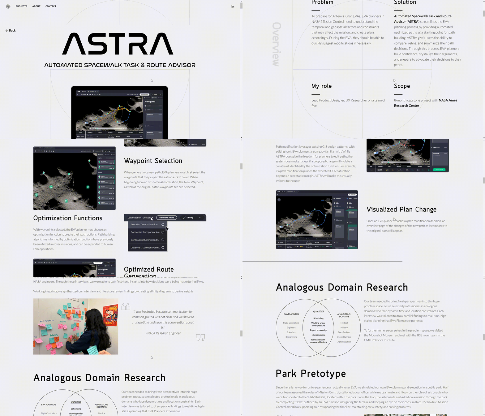
Take NASA as an example. The page adheres to the minimalist principle. The problem, solution, and role of the project are well organized in the form of a table.
This case study is rich in content, including a large number of pictures and text explanations. She explains each design step in detail to the audience, from the initial research to the design of the prototype, and then to the testing and verification. The whole process is detailed and rich in content.
Not only that, she also introduces the methods used in the research and their findings. These contents are accompanied by many high-quality images to help users understand. This can help the audience better appreciate her design style, professionalism, and her ability to solve problems.
Click here to Build your site
Conclusion
The above are the top 10 UX designer portfolios I want to introduce. I wonder if they have inspired you. Your portfolio is not just a folder that holds all your works, nor is it just a tool for display. More importantly, your portfolio speaks for you. It represents your style, aesthetics, design attitude, and philosophy. You can communicate with your audience through your portfolio so that they can see you, know you, and trust you.
It is not difficult to create your portfolio. You can use a variety of AI tools, such as Wegic. But more importantly, you have to think clearly: Why are you creating the portfolio? What do you want to convey to your audience? How do you want them to perceive you through your portfolio? With these questions in mind, you're ready to start crafting a portfolio that truly represents you.
Written by
Kimmy
Published on
Mar 12, 2026
Share article
Read more
Our latest blog
Webpages in a minute, powered by Wegic!
With Wegic, transform your needs into stunning, functional websites with advanced AI
Free trial with Wegic, build your site in a click!
What kind of website do you want to build?