Log in
Build Your Site
12 Graphic Design Styles to Use in Your Site
How many graphic design styles do you know? We picked 12 graphic art styles for boosting your design on your site.
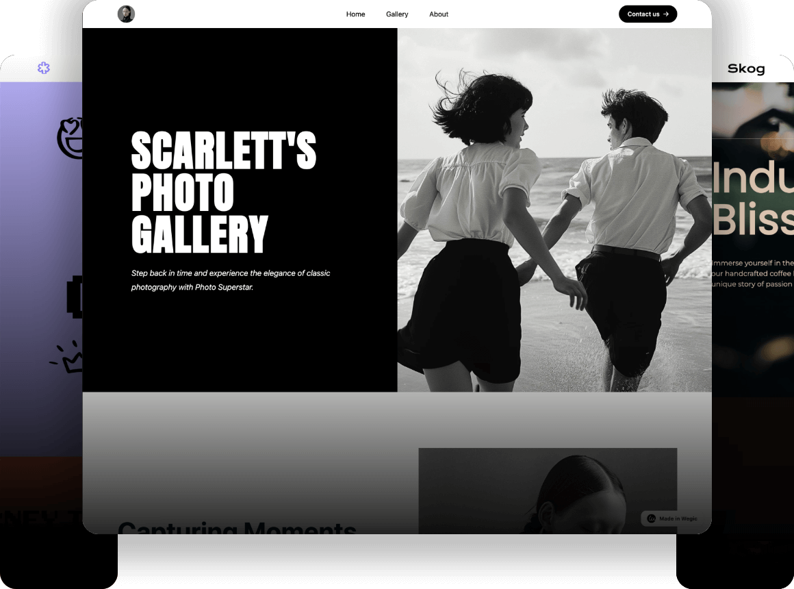
Graphic design is a form of visual communication that combines images, text, and concepts to convey specific messages to an audience.
According to the latest data from Business Research Insights, the global graphic design service market is valued at approximately US$52 billion in 2024 and is projected to reach US$68 billion by 2032, with a compound annual growth rate of around 3.5% over the forecast period.
The market is typically divided into online and offline services. Among these, online services represent the largest market segment. When analyzing by application, the market can be split between large enterprises and small to medium-sized enterprises (SMEs), with large enterprises holding the largest share.
At the core of graphic design are its various art styles, which drive the creativity and impact of this visual communication art.
文案内容
Why You Need to Know Graphic Design Styles
An excellent graphic design style plays an important role in establishing a brand image. With the changes in society, the development of industrialization, urbanization, and globalization, coupled with the continuous emergence of art movements and various trends of thought, a variety of styles have emerged. Each style has its own characteristics.
Therefore, you need to understand the positioning of your brand, the needs, preferences, and behaviors of your target group, in order to resonate with the target audience. There is no doubt that a graphic art style that fits your brand and the tastes of the target group can establish brand awareness, form a language for communicating with customers, convey clear messages, and enhance brand loyalty.
12 Graphic Design Styles to Use in Your Site
I've picked 12 trending graphic design styles for you. Let's go!
Warm UP
-
Abstract
-
Art Deco
-
Corporate
-
Flat
-
Geometric
-
Maximalism
-
Minimalism
-
Modernism
-
Postmodernism
-
Retro
-
Three-Dimensional
-
Typographic
1#Abstract
-
Symbolic Patterns
-
Unique Color Palettes
-
Openness to Interpretation
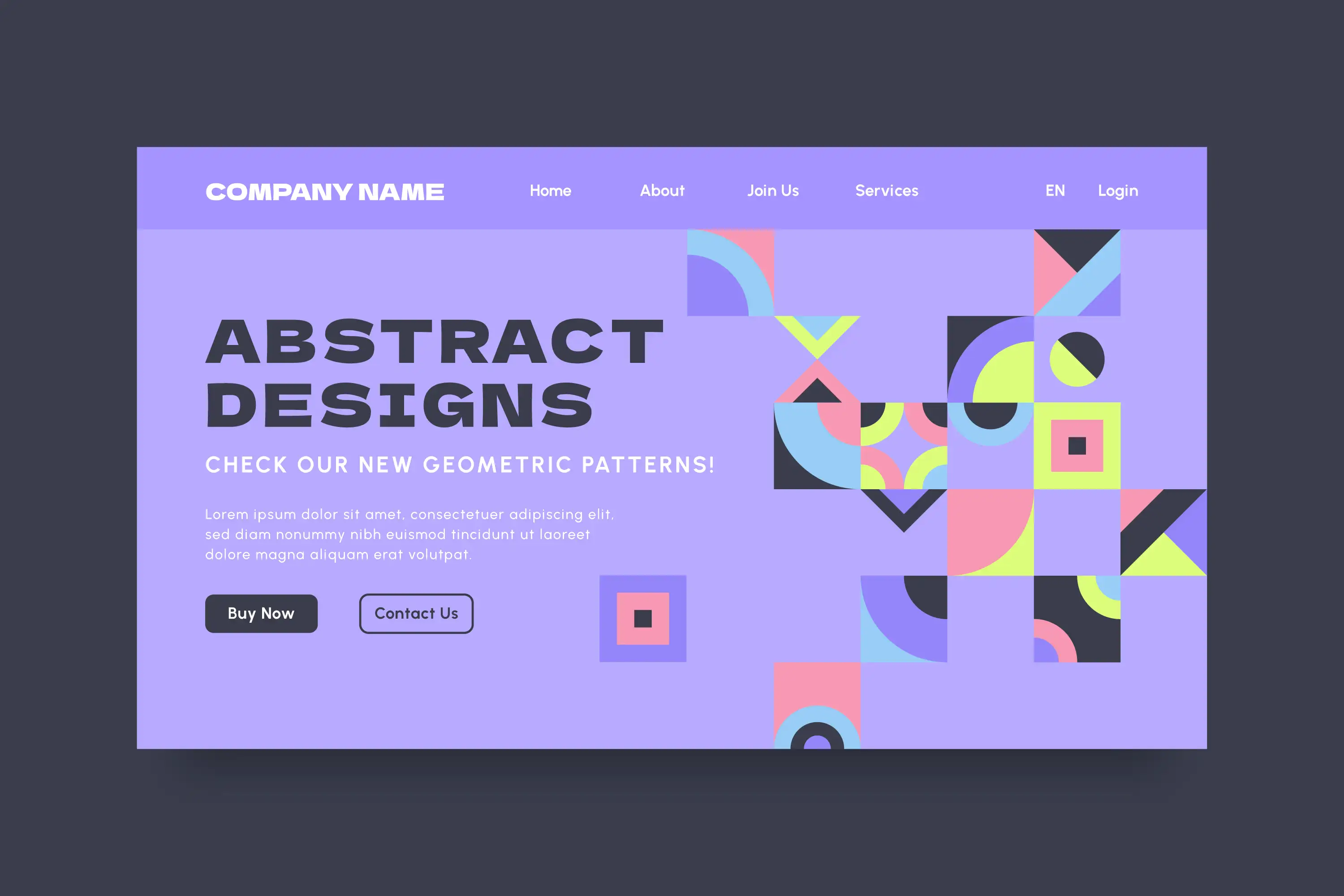
Tired of conventional graphic design styles? Abstract design might be just what you're looking for.
Abstract design blends visual elements that don't necessarily reflect reality. You've likely encountered this style in magazines, museums, or websites. It uses symbolic patterns and unique color palettes to convey emotion, making it an expressive and creative choice.
If you're looking to build a website for your brand, incorporating abstract design elements can help set you apart from competitors. This style gives your brand a distinct personality and attracts your target audience with its openness to interpretation.
Abstract design encompasses a variety of styles, including geometric patterns, watercolors, and more. Its versatility allows you to create something perfectly tailored to your brand, regardless of your industry.
2#Art Deco
-
Geometric Shapes
-
Sense of Luxury
-
Lighting and Shadows
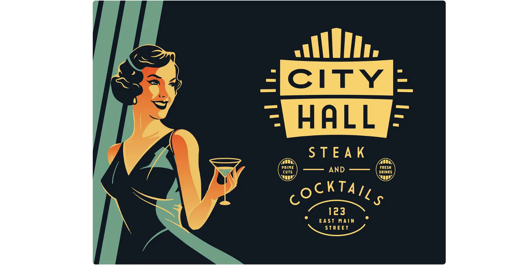 Source: Emir Ayouni for The Forefathers Group
Art Deco, originating from the French term Arts Décoratifs, is one of the most renowned graphic art styles. Emerging from Paris in the 1920s, this design style is characterized by its use of rich colors, bold lines, and geometric shapes. A great example can be seen in the work of designer Emir Ayouni for The Forefathers Group.
Art Deco is synonymous with glamour and luxury. In the example mentioned, you can see a stunning woman holding a cocktail in a tall goblet. The lighting on her face and dress accentuates her graceful figure, while the overall scene radiates opulence, with glossy finishes enhancing the sense of luxury.
This style is often used to depict settings like theaters and stages, with particular emphasis on light sources, such as spotlights illuminating figures or buildings. In the example, the sharp, geometric lines of the goblet contrast beautifully with the flowing curves of the woman’s evening gown, creating a bold and dynamic visual language that is both captivating and elegant.
3#Corporate
-
Formal, Clean Fonts
-
Consistent Visual Elements
-
Clear Call-to-actions
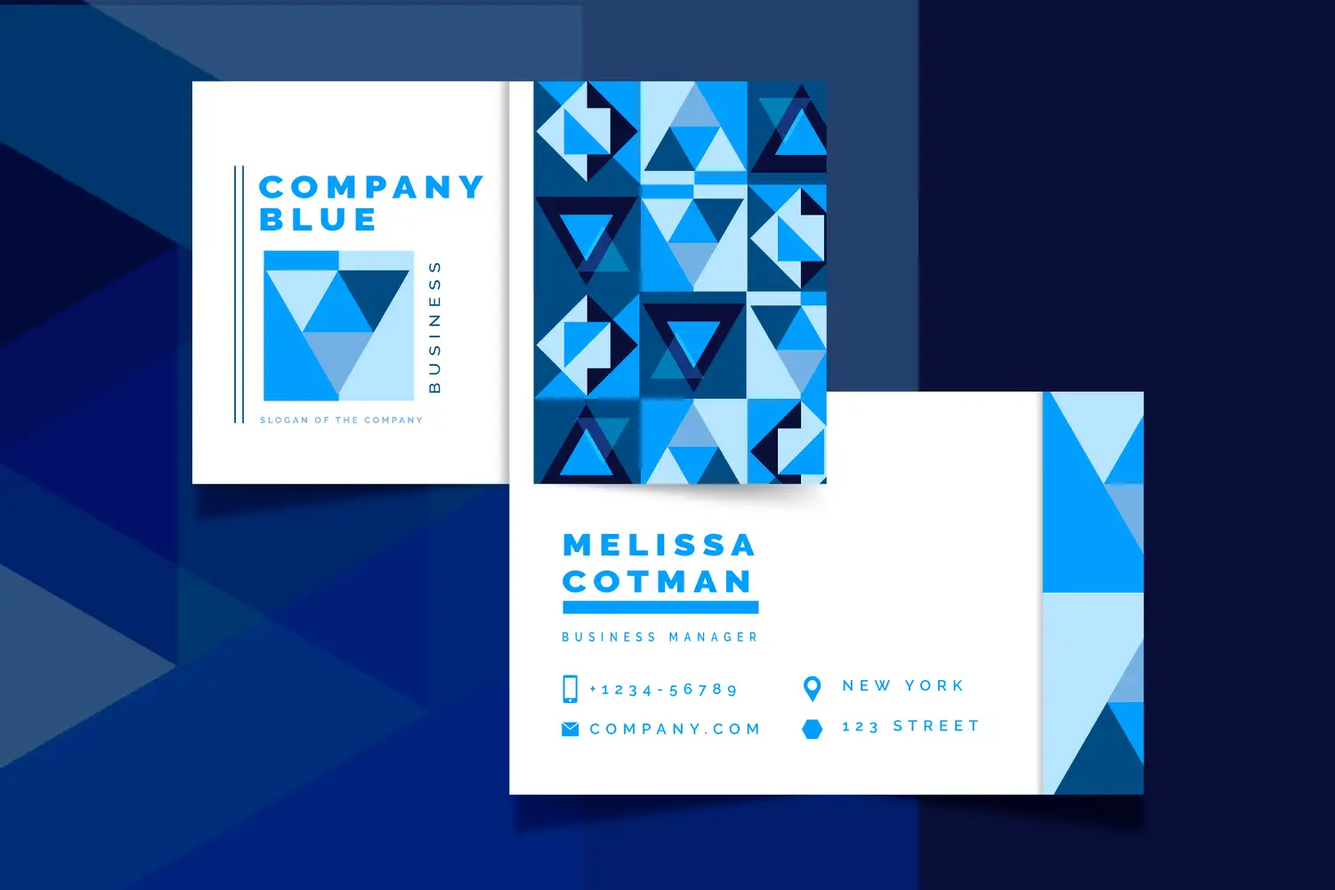
Corporate graphic design style plays a key role in shaping and packaging all aspects of a company’s image and brand, from web design to social media, enhancing both professionalism and impact. Different design styles may suit various corporate roles, but in terms of overall corporate design, certain elements are universally effective.
Corporate design features formal, clean fonts, simple typography and shapes, clear call-to-actions, and consistent visual elements. It also avoids overly elaborate color schemes. Together, these components help create a professional and trustworthy image that strengthens a company’s brand identity.
4#Flat
-
Popular for UI
-
Streamlined Design
-
Functionality
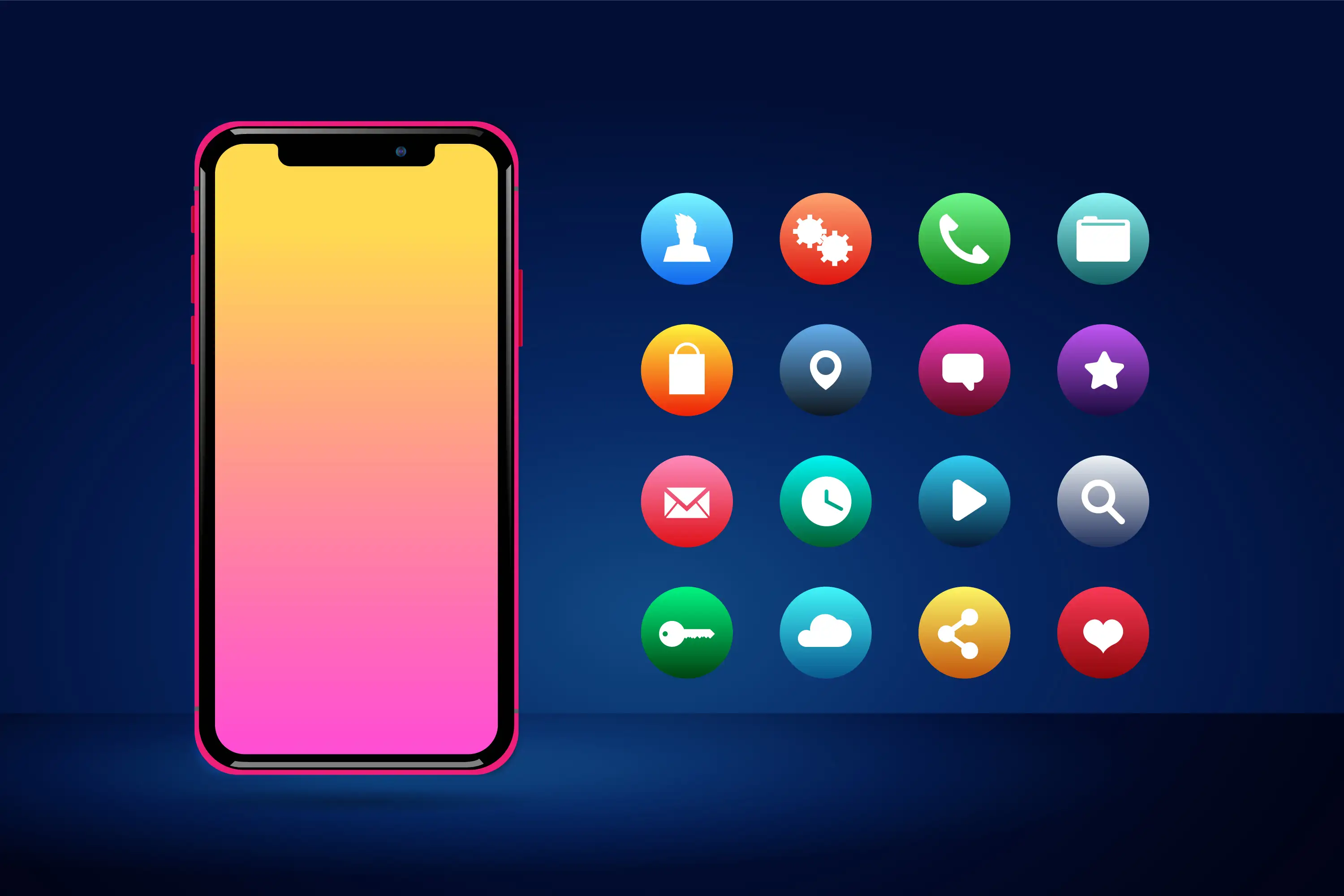
Flat design is a popular choice in user interface design, commonly seen in icons and other visual elements. This graphic design style is monochromatic and two-dimensional. This art style focuses on simplicity and functionality. Its streamlined design enhances usability and makes it easy for websites to load quickly.
Flat design is widely used in posters, documents, websites, and mobile applications. If your priority is usability and clarity, a flat graphic design may be the perfect fit, offering a clean, straightforward aesthetic that keeps the focus on functionality.
5#Geometric
-
Mathematical Elements
-
Harmony of Shapes and Lines
-
Bright, Contrasting Colors
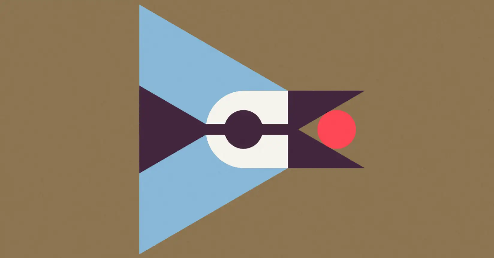
Source: snapshot of geometric style picture by Ben Stafford
Geometric design is one of the most captivating graphic art styles, attracting attention through the use of mathematical elements like angles, lines, and points. This design approach incorporates shapes such as squares, circles, and triangles to create a sense of balance and symmetry, celebrating simplicity while emphasizing the harmony of forms, lines, and edges.
For example, the blue jay in the image above was crafted from symmetrical shapes like triangles and circles, enhanced by bright, contrasting colors. This simple yet striking design shows how geometric shapes can be transformed into visually stunning works of art, making the geometric elements even more engaging and appealing.
6#Maximalism
-
Joyful Layouts
-
High Density
-
Unexpected Combination
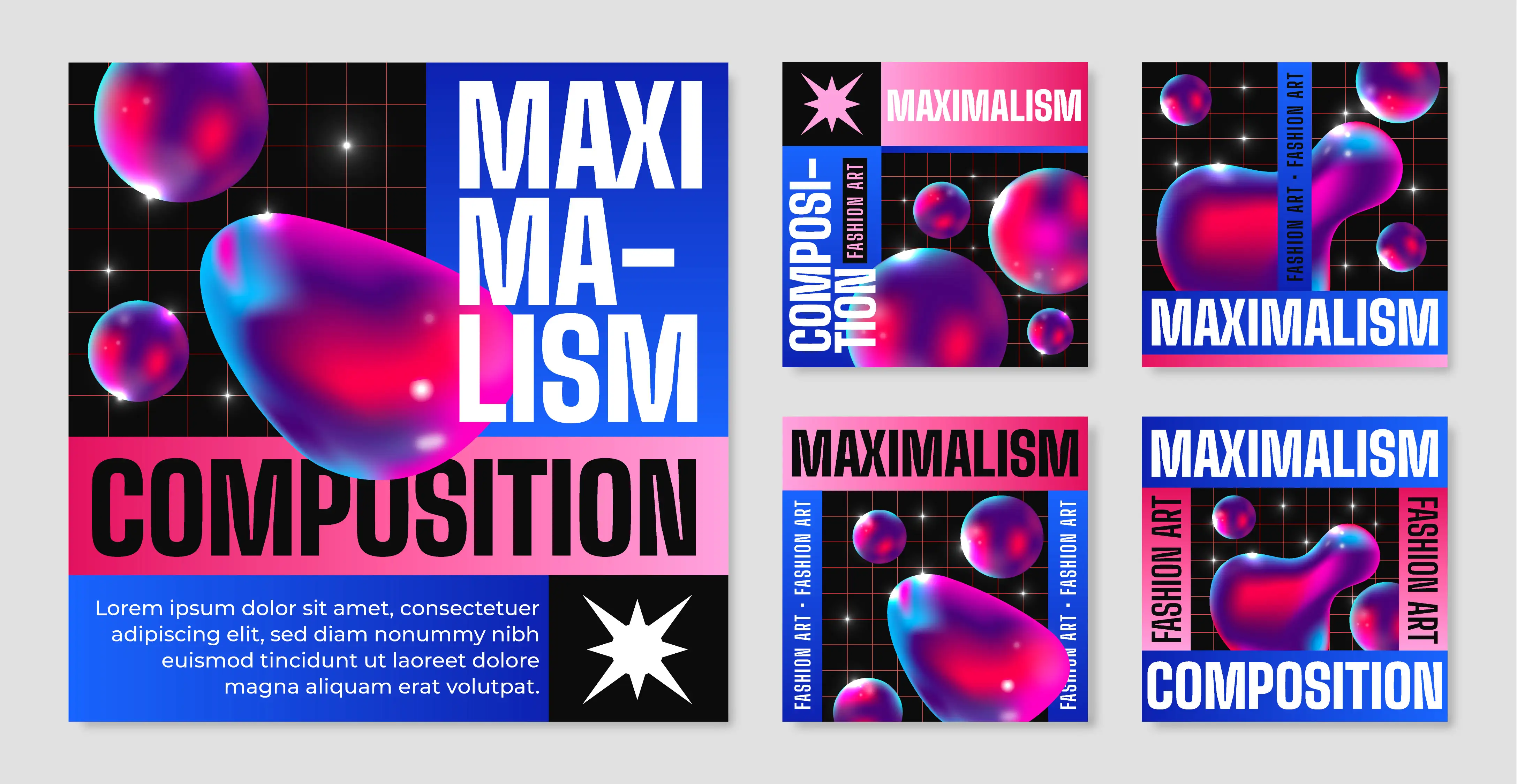
"More is more" defines maximalism, a bold graphic design style known for its high density, contrasting patterns, and unexpected fonts and imagery. Maximalist designs often feature joyful, dynamic layouts, with various layers of text and information, offering designers great creative freedom.
This style embraces unconventional, yet captivating layouts, incorporating unique text sizes and fonts. Multiple layers of graphics, textures, and patterns are skillfully combined, enhancing the design’s vibrancy and creating an expressive, visually engaging composition. Maximalism thrives on its ability to push boundaries, making each design rich and full of life.
7#Minimalism
-
Contrast Colors
-
Apparent CTAs
-
Negative Space
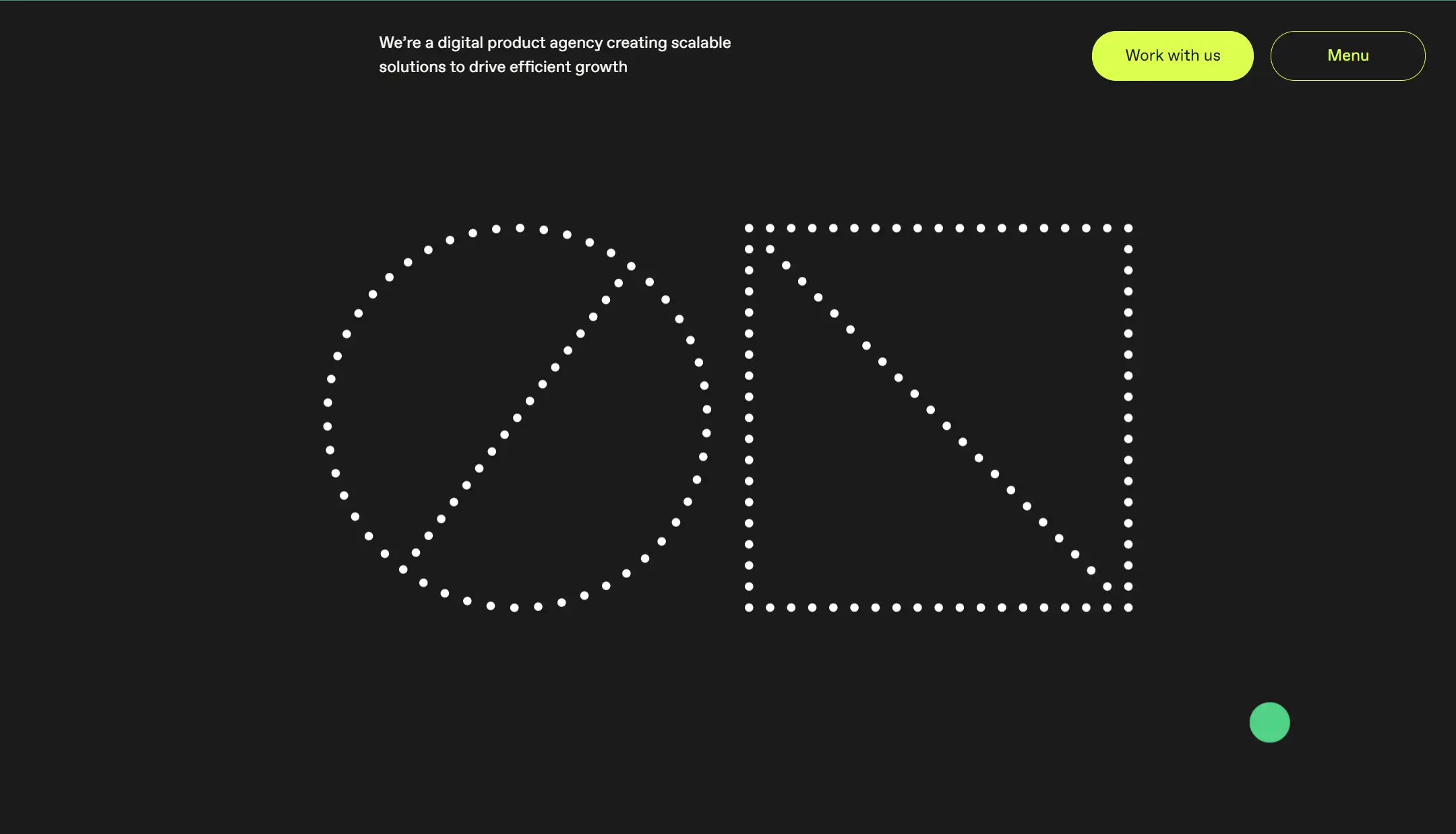
Minimalism follows the philosophy of "less is more" and stands in contrast to maximalism. For inspiration, you can visit ON's website, where the minimal design is evident on the front page. The black background highlights the white geometric patterns, making them stand out, while bold colors create optimal contrast. Additionally, the buttons are strategically placed in the upper right corner, allowing visitors to focus on the call-to-action elements. As users move their cursor, they can observe the convergence and divergence of small dots, which adds to the interactive experience. It enhances user experience while communicating the brand's expertise in design and technology, as stated in the "About Us" section.
This graphic design style also makes effective use of negative space, guiding visitors' attention to the most important information. The clean, well-organized interface ensures a seamless user experience, making the message clearer and more direct.
8#Modernism
-
Clean Typefaces
-
Vivid Colors
-
Minimal Images & Copywriting
Some people believe that Modernism is a contemporary graphic design style, but most experts agree that modern art predates contemporary art. Modern art is said to have developed in the West from the 1860s to the 1960s, while contemporary art refers to more recent creations.
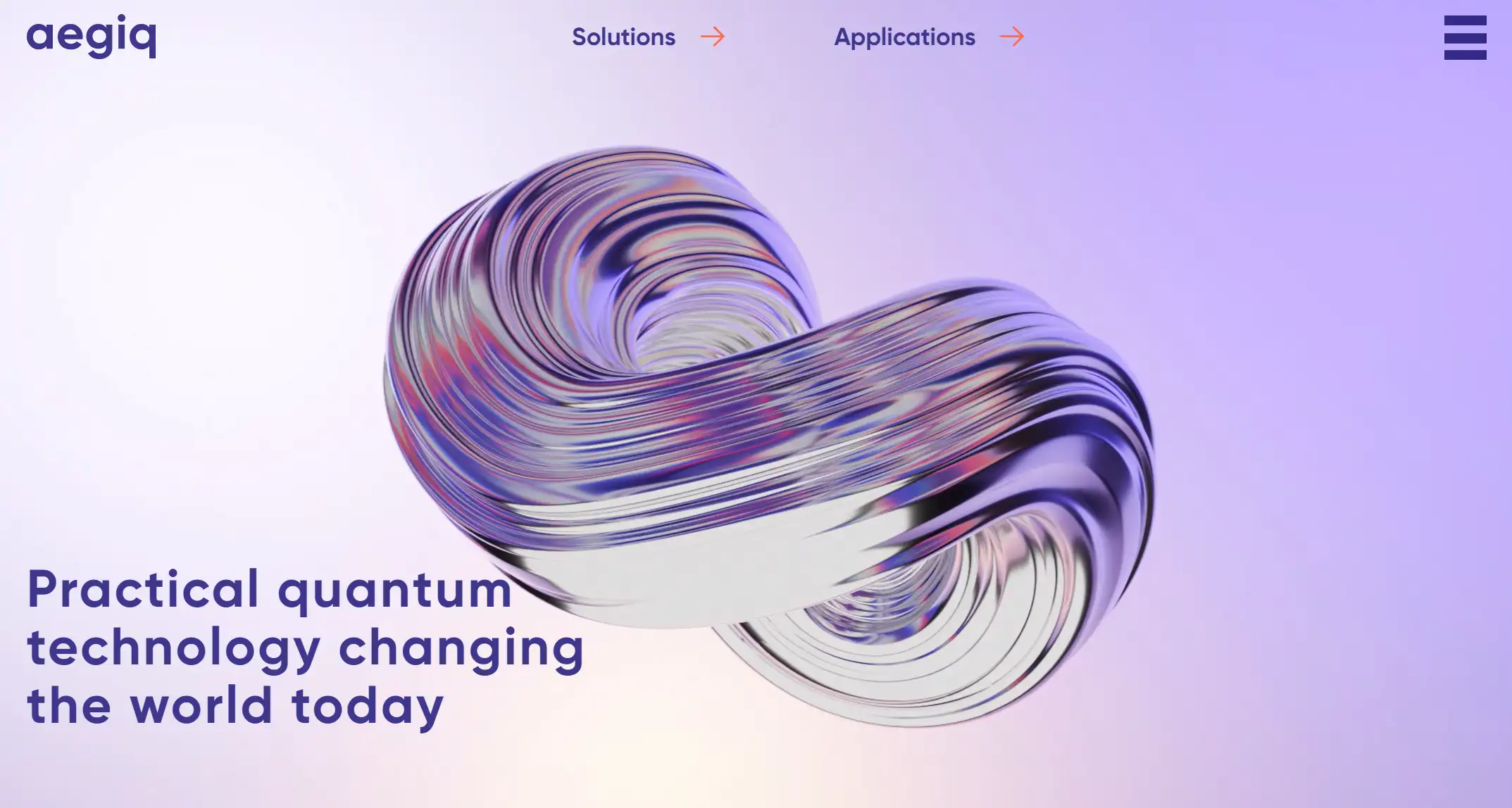
Modernism in graphic design emerged during a time of rapid technological and industrial growth. It emphasizes bold contrasts in color, simple layouts, and clean typefaces. Aegiq’s website is a great example of this modern graphic art style, with an abstract image at its center. The site as a whole highlights usability and clarity, featuring a clean and orderly layout with minimal images or copywriting. Key elements of this style include clean lines, irregular shapes, vivid colors, and symbolic designs, all of which enhance its visual impact. The fonts typically used in this design are simple sans-serif fonts, adding to overall clarity.
9#Postmodernism
-
Diversity
-
Complexity
-
Anti-formalism
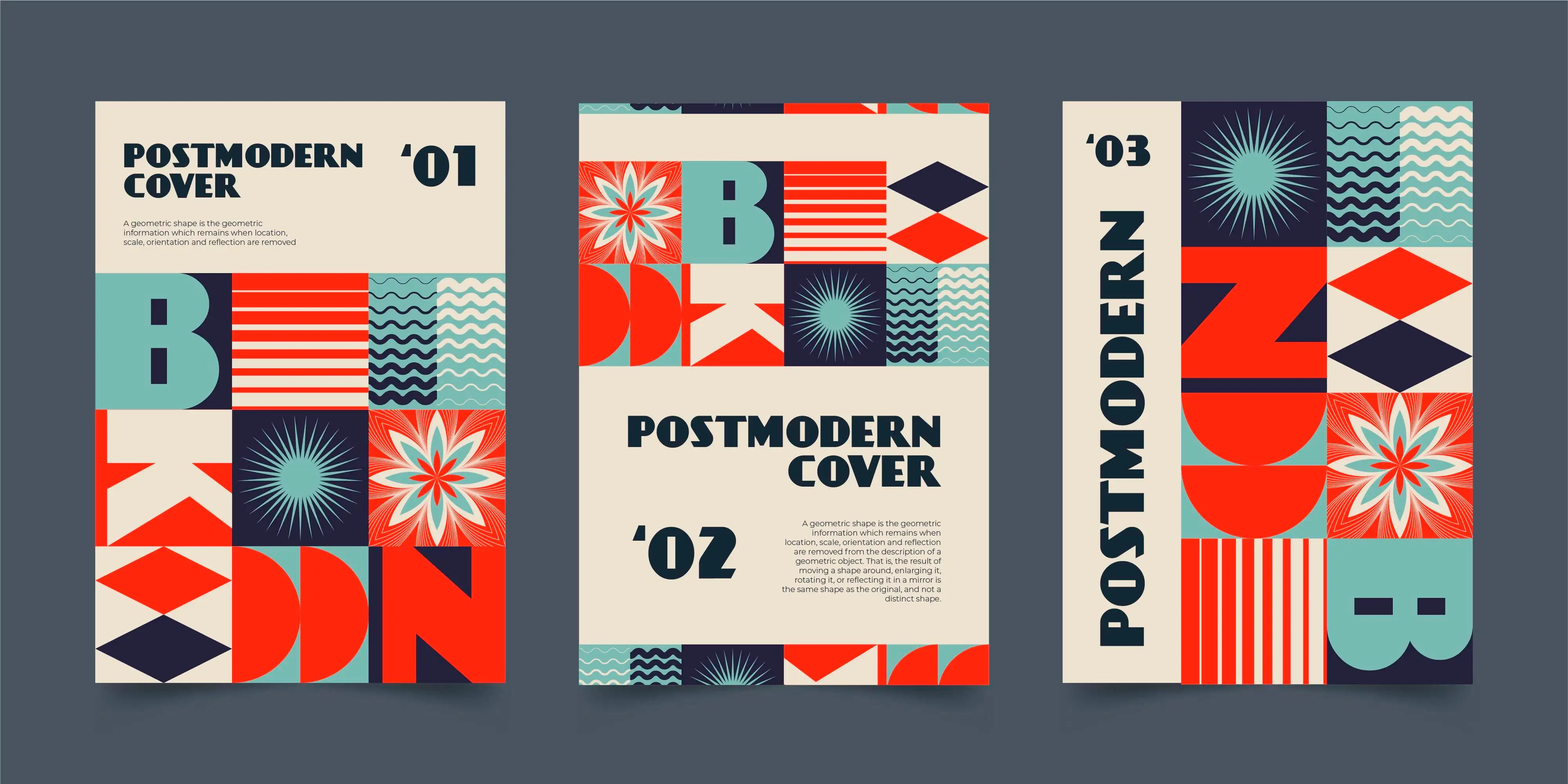
Like Maximalism and Modernism, Postmodernism and Modernism are distinct graphic design styles. In fact, postmodernism emerged as a reaction against the constraints of modernism. It challenges conventional notions of what is considered "reasonable" or "high art" versus "low design." Postmodernism rejects these rigid categories, instead encouraging designers to break traditional rules and use a mix of styles in their work.
Anti-formalism is a defining characteristic of Postmodernism. The style celebrates variety, complexity, and diversity, often introducing elements of humor or irony. It blends different artistic styles and historical forms, and frequently features unique typefaces that break away from the strict grid layouts of modernism.
10#Retro
-
Vintage Elements
-
Historical Narrative
-
Relevant to Modern Audience
Retro art style evokes nostalgia by drawing inspiration from earlier eras, such as the psychedelic aesthetics of the 1960s and 1970s, the 1980s grunge, or the early-internet vibes of the 1990s. It incorporates vintage or nostalgic elements from a specific period, often featuring vintage fonts.
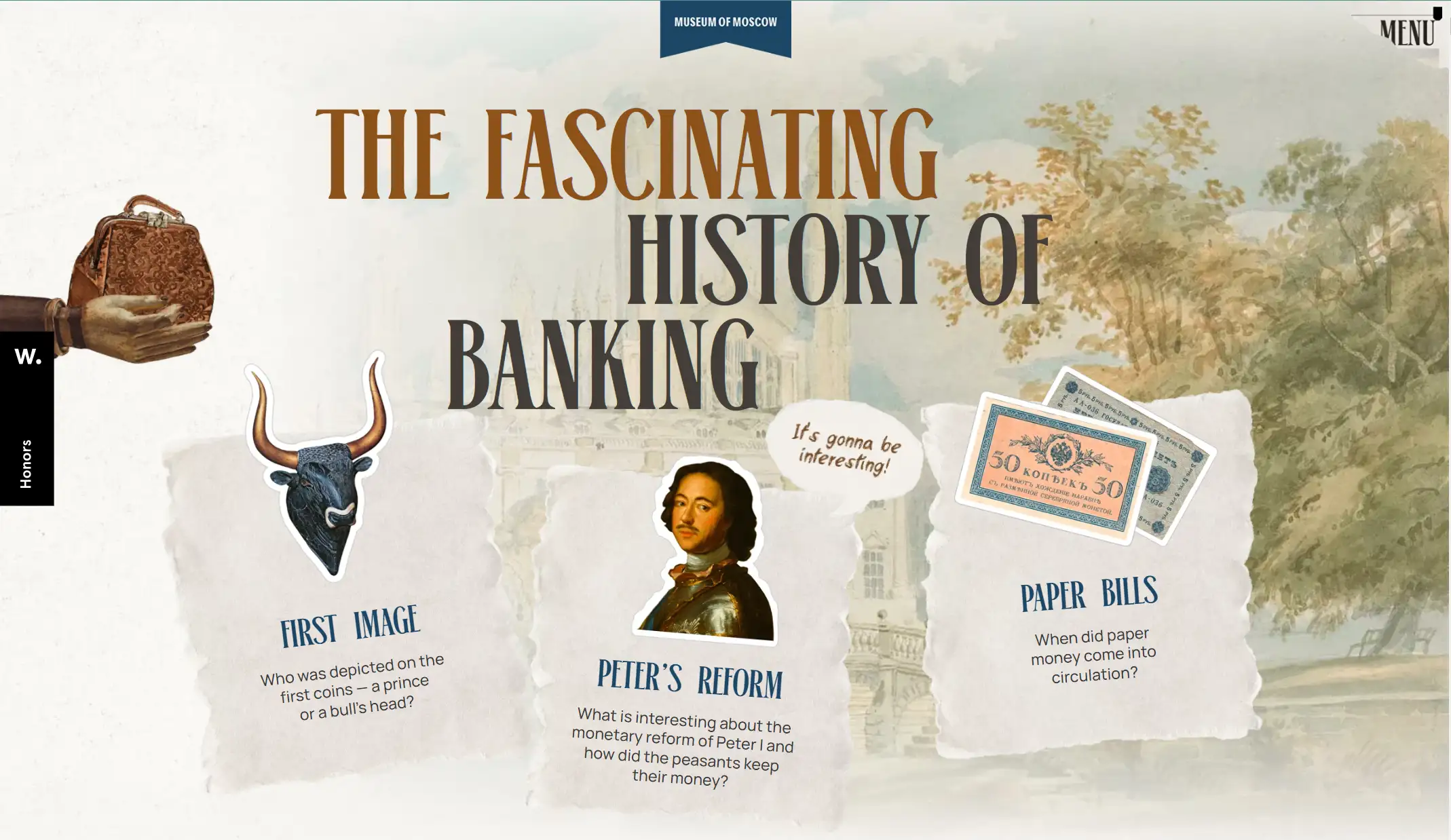
A great example of retro design is the website showcasing the history of Russian banking, created by the Museum of Moscow. The site perfectly embodies retro style, using decorative vintage portraits, artifacts, and even historical coins to tell the story. The coins, in particular, have a distinctly retro feel. As you scroll down, you encounter the reforms of Peter I from 1698 to 1704, with an interactive experience that stands out. For instance, images of famous historical figures in classic attire are accompanied by chat boxes, adding a modern twist. Black-and-white photos narrate the evolution of the bank and the currency system, enhancing the historical narrative.
This retro design is both creative and meaningful for its modern audience, drawing inspiration from the past while offering a fresh, engaging experience.
11#Three-Dimensional
-
Dynamic Touch
-
Immersive UE
-
Animation
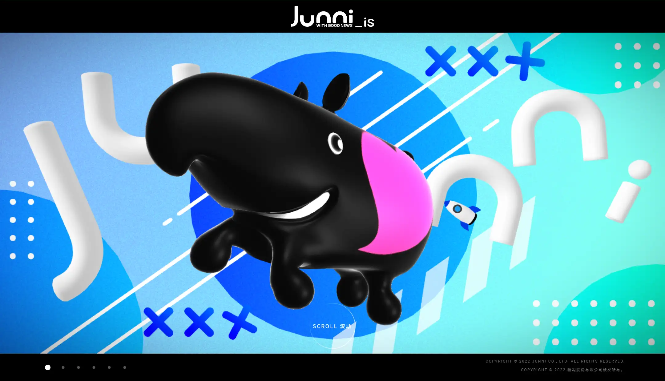
Junnis excels at three-dimensional art style, bringing flat design to life in a creative way. Like other designs of this style, it uses lighting and shadows to create a 3D mascot. With each click and scroll, the mascot transforms—first appearing black with a pink heart sticker (or maybe painting), then becoming transparent and floating in the air. As you move your mouse, interactive elements rotate in sync, adding a dynamic touch. This highlights how three-dimensional design incorporates depth and volume to achieve a more realistic effect.
Three-dimensional design style is often used in social media content, web design, and animation to engage viewers with lifelike, immersive experiences.
12#Typographic
-
Typography
-
Bold, Distinct Font
-
Solid Color Background
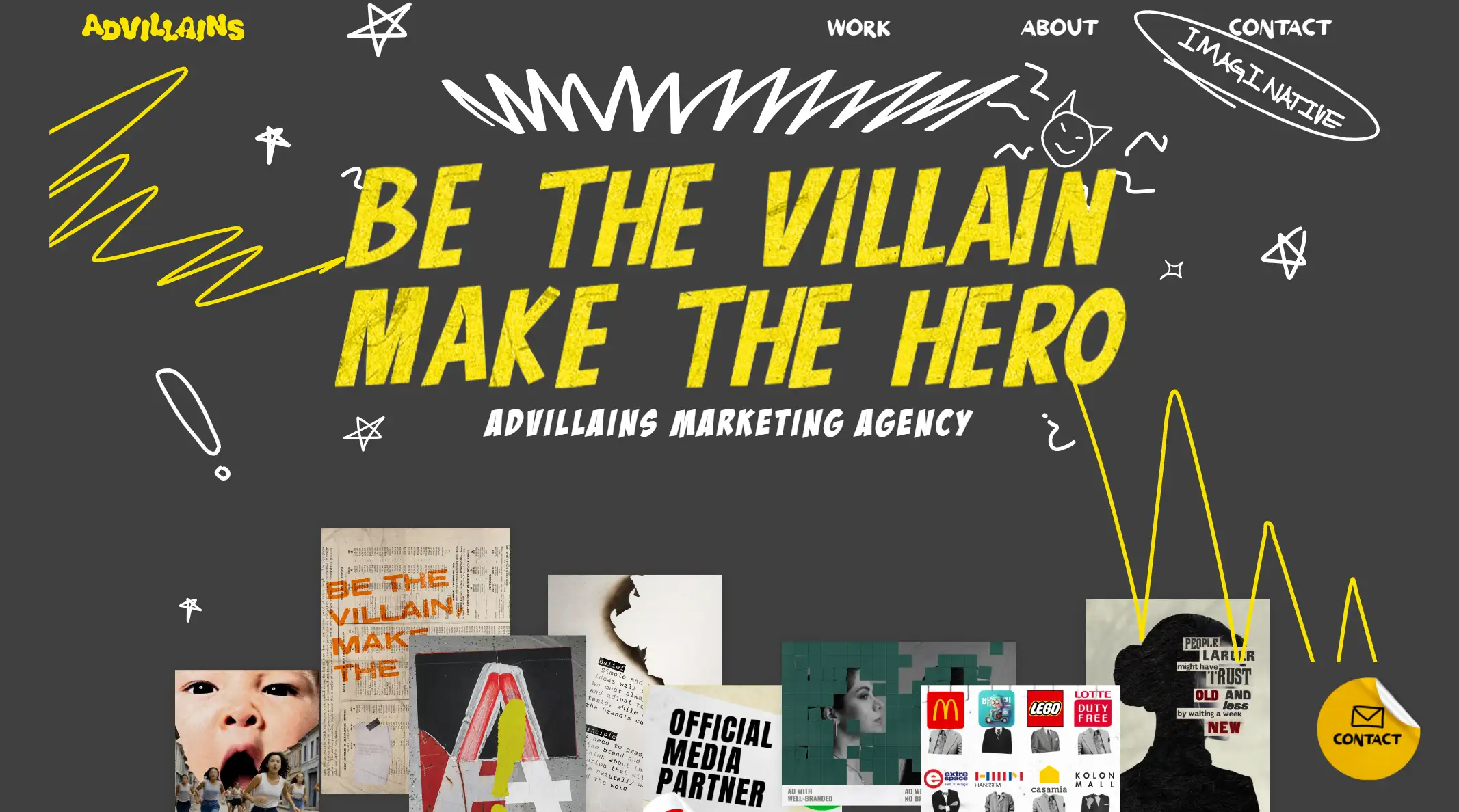
This graphic art style emphasizes the significance of typography as both a design element and a communication tool, blending expressive typography with bold graphic elements for maximum effect.
Typography is the art of arranging and combining letters and words to create text that is both legible and visually appealing. It involves the style, appearance, and structure of a typeface, carefully crafted to evoke a particular emotion and convey a specific message.
A great example of this style is the Advillains company website. The bold, distinct font—yellow capital letters against a dark background—immediately stands out. The phrase "BE THE VILLAIN, MAKE THE HERO" takes center stage, combining powerful messaging with dynamic visual impact, making the typeface the focal point of the design. Surrounding elements like hand-drawn stars, graffiti, and exclamation marks add a playful and edgy touch. The seemingly scattered and random placement of images and text creates a sense of controlled chaos that complements the overall aesthetic.
How to Select Style for Your Site
Although these 12 styles cannot cover all graphic art styles, you may be inspired by them. When choosing a design style, you should consider your brand style, target audience, and niche market preferences, your personal style, and the style of your competitors, etc. You can also find inspiration from historical art and daily life.
Final Thought
As graphic design styles continue to evolve in 2025, businesses and individuals must be adaptable. Keeping your graphic art style fresh and relevant can help you connect better with your customers, stay true to your brand, and remain responsive to promotions or current events. Constantly refining your style can make a lasting impact in today’s visually-driven world.
Written by
Kimmy
Published on
Mar 17, 2026
Share article
Read more
Our latest blog
Webpages in a minute, powered by Wegic!
With Wegic, transform your needs into stunning, functional websites with advanced AI
Free trial with Wegic, build your site in a click!
What kind of website do you want to build?