Log in
Build Your Site
The Ultimate Guide to Dashboard Design: Best Practices in 2025
Are you still worried about designing a new dashboard? In this article, we will help you find the best design guidelines for 2025 through multi-dimensional analysis.

In today's digital world, data is everywhere. But without the right tools, it's hard to understand or use that data. That's where dashboard design comes in. A dashboard is a visual screen that shows key information in one place. It helps users see what's happening quickly, make wise decisions, and stay in control. A good dashboard design is not just about making things look nice. It's more important to show data clearly and in a way that makes sense. Whether it's on a phone app or a computer, an innovative dashboard helps people save time and get more work done. In 2025, designing a dashboard matters more than ever. With AI, big data, and remote work growing fast, companies need dashboards that are clear, fast, and easy to use. From UI design for apps to BI design for analytics, dashboards are now a must-have for both users and businesses.
This guide will show you the best practices for building dashboards in 2025. You'll learn about tools like Figma, design tips, templates, and real examples. Whether you're new to dashboards or want to improve your work, this guide is for you.

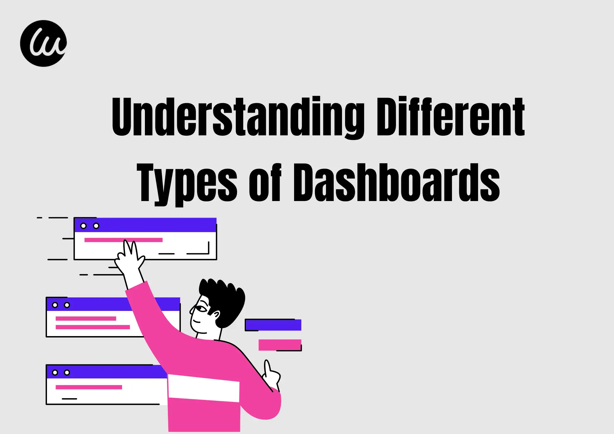
#01 Different Types of Dashboards
Dashboards are tools that help people see and understand data. But not all dashboards are the same. There are two main types: UI dashboards and BI dashboards.
A UI dashboard is part of a website or app that users interact with. It shows helpful data clearly and simply. For example, if you use a fitness app, the screen that shows your steps and heart rate is a UI dashboard. These dashboards are made to look good and are easy to use. This is called UIdashboard design. The goal is to help users find what they need fast.
A BI dashboard is short for Business Intelligence dashboard. Companies use these to understand large data sets. For example, a sales manager might use a BI dashboard to see how many products were sold this month. These dashboards are used in tools like Power BI, Tableau, or Looker. The focus in BI dashboard design is on presenting numerous numbers and charts in a way that makes it easy to identify trends and make informed decisions.
Both types of dashboards are helpful, but they have different users and goals. A good dashboard shows the correct data to the right person in the right way. Whether you're building a UI or BI dashboard, good design is key to success.
#02 Core Principles of Great Dashboard Design
To perform better when designing a dashboard, you should follow these five simple rules:
1. Information Clarity
Show data in a clean and easy-to-read way. Users should understand the meaning without guessing.
Make the most essential data bigger or bolder. Help users know what to look at first.
3. Interactivity
Let users click, filter, or sort the data. A good UI dashboard design makes exploring data easy.
4. Data Prioritization
Only show the most helpful data. Don't overload the screen with too much information.
The dashboard should work well on all devices—phones, tablets, and computers.
By using these five steps, your design will be more useful, innovative, and friendly. A strong UI dashboard design helps people work faster and make better choices.
#03 Top Dashboard Design Trends in 2025
Designing the dashboard is constantly changing. In 2025, these new trends will help you build better and more innovative dashboards:
1. Auto Layout and Smart Suggestions
AI tools can now help you place charts and data in the best spots. These innovative tools save time and make your dashboard easier to read.
2. Dark Mode and Light Mode Switch
Many users like to choose between dark and light themes. A good design lets users pick the mode they like best.
3. Minimalism
Simple is better. In 2025, most dashboards will use fewer colors, clean shapes, and less text, making data easier to understand. A clean dashboard template is a great way to start.
People want dashboards that fit their own needs. Now, dashboards can change based on the user, showing only what matters most to them.
By following these trends, your dashboard can feel modern, innovative, and user-friendly. Whether you are building a business tool or a web app, using the right dashboard template will help you create something great in 2025.
#04 Best Tools for Dashboard Design
To make a great dashboard, you need the right tools. Here are the top tools you can use in 2025:
1. Figma
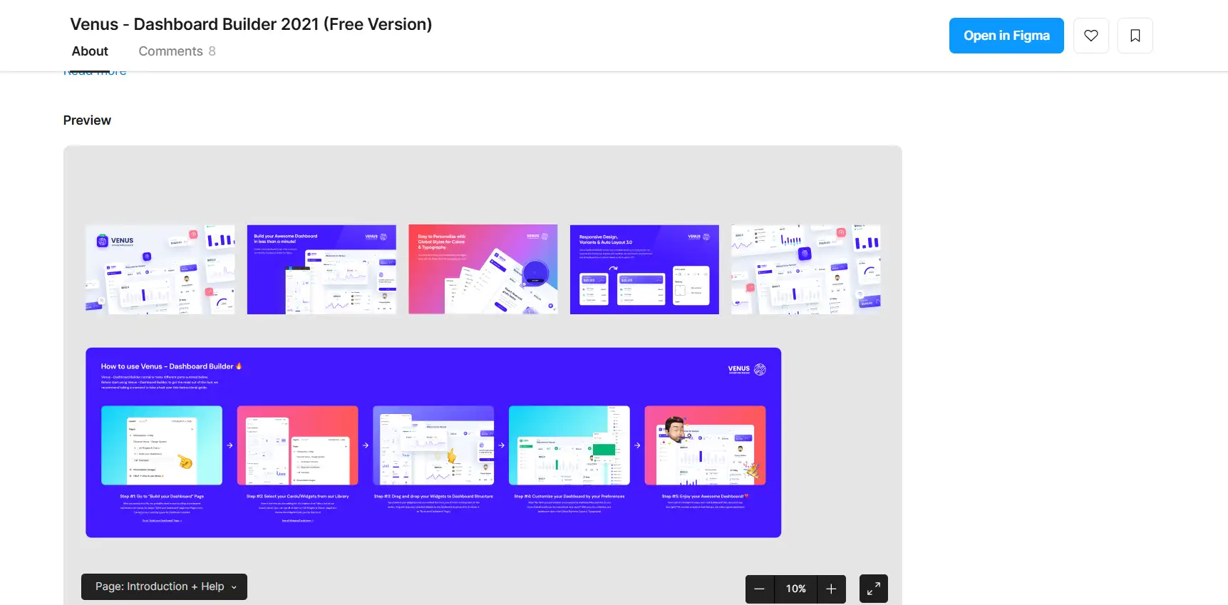
Figma is a very popular design tool. It helps you create clean and modern user interfaces. With Figma, you can drag and drop shapes, text, and charts to build your dashboard. Many people use dashboardFigma templates to save time. These templates make it easy to start your project fast.
Figma has many useful plugins. Some plugins help you line up your design. Others can make charts for you or let you reuse design parts (called components). These plugins make Figma design faster and smarter. If you want to create a smart and simple dashboard, plugins can help a lot.
With these tools, you can create dashboards that look visually appealing and function effectively. Use Figma design tools to design faster. Use Power BI or Tableau when working with lots of data.
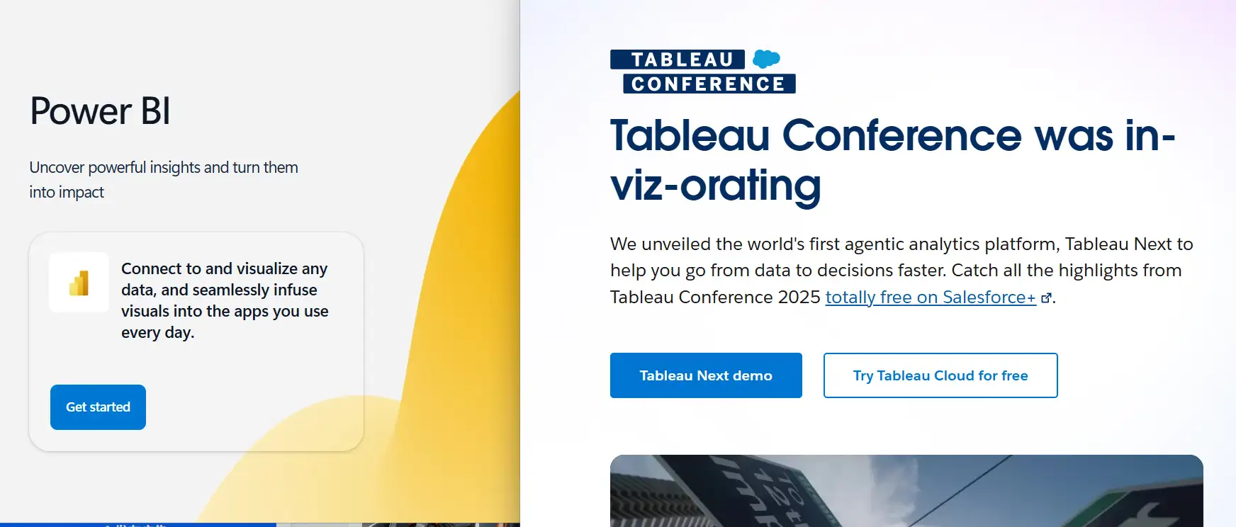
2. Power BI and Tableau
Power BI and Tableau are top tools for business dashboards. These tools help you show data in charts, tables, and maps. If you need to display sales, numbers, or reports, Power BI and Tableau are great picks. They are perfect for business dashboard design template ideas.
#05 How to Use Dashboard Design Templates Wisely
Using a dashboard template can help you save time and keep your design clean and clear. But you need to use it the smart way. Here are some easy steps:
Step 1: Know the Benefits
A dashboard template gives you a ready-made layout. This means you don't have to start from zero. You can quickly place charts, numbers, and text. It also helps you keep the same style across all your pages. This makes your template look professional.
Step 2: Find Good Templates
There are many places to find great dashboard templates:
-
Figma Community: Many designers share free and paid templates here.
-
UI Kits: These are design packs with buttons, charts, and layout blocks.
-
BI Tools: Power BI and Tableau also have built-in templates.
Step 3: Customize for Your Business
Don't rely entirely on templates; be yourself. Add your data, logo, and colors. Remove things you don't need. A good dashboard design template should match your business goals.
Final Tip:
Use a dashboard template to help you get started fast. However, always ensure it works for your users. Keep it simple, clean, and clear.
#06 Figma Tips for UI Dashboard Design

Figma is a powerful tool for making clean and smart dashboards. If you want to build a great dashboard design, here are some easy tips to help you use Figma better:
1. Use Components
In Figma design, components are reusable parts like buttons, cards, or charts. When you make a component once, you can use it many times. If you change the main one, all the others will change, too. This saves a lot of time!
2. Try Auto Layout
Auto layout helps your dashboard items move and resize by themselves. This keeps everything neat. It is very useful when you are making a dashboard with Figma for both desktop and mobile.
Build Your Dashboard Step-by-Step
To make a full dashboard design in Figma:
-
Start with a simple frame (like a web page).
-
Add a top bar, side menu, and content area.
-
Use charts and numbers to show your data clearly.
-
Keep space between items, so everything is easy to read.
Use Helpful Plugins
Here are some great Figma plugins:
-
Chart plugin: Create pie charts and bar charts faster.
-
Content Reel: Add sample names, numbers, or text quickly.
With these Figmadesign tips, making a strong and clear dashboard becomes easy and fun!
#07 Common Dashboard Design Mistakes to Avoid

Even if you have a nice-looking dashboard, it might not work well if it's not planned right. Here are common mistakes people make in dashboard design and how to fix them:
1. Showing Too Much or Too Little Data
If your dashboard has too much information, it looks messy and hard to read. If it has too little, it doesn't help the user.
Tip: Pick only the most important numbers or charts. In your Figma dashboard, use simple blocks to keep it clear.
2.No Interactivity
A good dashboard design should not be just for looking. It should also let users click, filter, or explore data.
Tip: Add buttons, drop-downs, or sliders so users can see what they want.
3. Forgetting the User's Goals
Some dashboards look cool but don't help people do their job. That's a big problem!
Tip: Always think, "What does the user need to do?" Build your Figma dashboard to support that task, like checking sales, watching trends, or tracking progress.
By avoiding these simple mistakes, your dashboard can be smarter, easier to use, and more helpful to real people. Keep the user in mind, and your dashboard will work great!
#08 Real-world examples and Templates
1. Sales Dashboard Template (Figma)
Powered by: Figma
Why It Works:
-
Data Distribution: The template places total sales, revenue, and customer counts in big header cards at the top. This makes key numbers easy to spot first.
-
Color Usage: A simple blue-and-white color scheme highlights important metrics. The blue stands out on a white background, making the data very clear.
-
Icon Choices: Small icons like a dollar sign for revenue and a shopping cart for orders help users understand each section quickly.
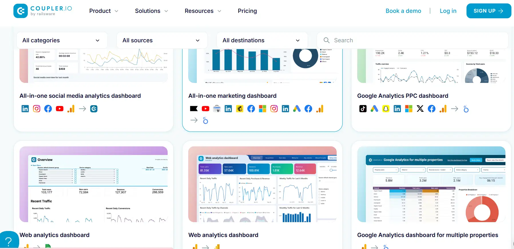
2. Website Analytics Dashboard Template (Power BI)
Powered by: Power BI
Why It Works:
-
Data Distribution: Traffic sources, user sessions, and bounce rates are arranged in separate charts side by side. This layout makes comparisons easy.
-
Color Usage: Uses green for positive growth, red for drops, and gray for neutral numbers. These colors help users see good or bad trends at a glance.
-
Icon Choices: Small web and mobile icons show which data belongs to desktop or mobile traffic. This helps users know which device trends they are viewing.
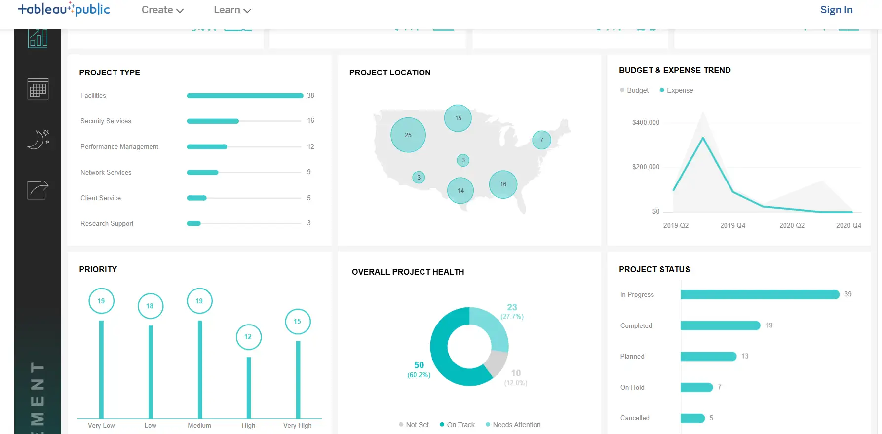
3. Project Management Dashboard Template (Tableau Public)
Powered by: Project Management Dashboard | Material Design
Why It Works:
-
Data Distribution: Budget, expense trends, and project status are all visible in separate sections. This side-by-side layout helps managers track overall health at once.
-
Color Usage: Pastel blues and greens group-related tasks, making it easy for the eyes and helping separate info.
-
Icon Choices: Uses checkmarks for completed tasks and clock icons for pending tasks, so users quickly see each project's status.
By studying these three dashboard design templates, you can see how good dashboard examples balance data placement, color, and icon use. Use these links as a guide to create your own clear and helpful dashboards.
Conclusion
Dashboard design in 2025 is smarter and more helpful than ever. To make the best dashboards, you need to focus on three big ideas: keep the information clear, make it easy to use, and help people make smart decisions fast. A good dashboard is not just about looking nice—it should help users understand the data and take action.
If you want to build better dashboards, try using both Figma design and BI dashboard design tools. Figma is great for dashboard layouts, colors, and buttons. Business Intelligence (BI) tools like Power BI or Tableau are perfect for showing data clearly and interactively. When you combine both, you can make dashboards that look good and work well.
In 2025, make sure your dashboards are more than just pretty pictures. Use wise tools, follow clear design rules, and always focus on the user’s needs. That’s how you build dashboards that truly matter.
Written by
Kimmy
Published on
Mar 17, 2026
Share article
Read more
Our latest blog
Webpages in a minute, powered by Wegic!
With Wegic, transform your needs into stunning, functional websites with advanced AI
Free trial with Wegic, build your site in a click!
What kind of website do you want to build?