Log in
Build Your Site
Logo Evolution: How Branding Has Changed Since the 90s
Dive into the fascinating history of logo evolution since the 90s. Learn how top brands redefined their identity and the impact of logo design on branding."
Preface
Brand visual identity is not just a part of the design, but a complete expression of company culture, values and cognition by the consumers. Logo because logo is mostly a first visual reference to the brand that forms a consistent preference of consumers to use this brand. It has been found out that the human brain receives images 60,000 times quicker than text. This comprehends that logo designing is crucial in the creation of brand image as well as in communicating brand information.
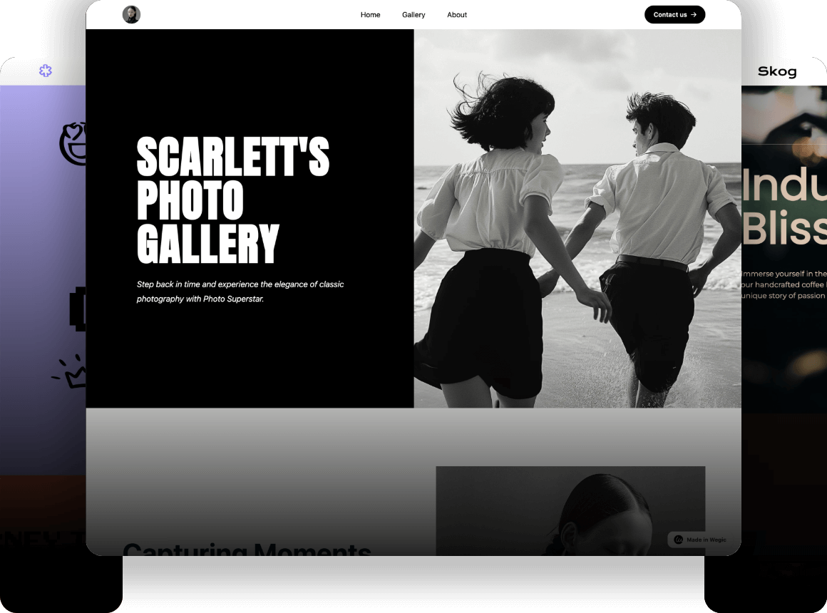
Click on the image to build a branded website without code! ⬇️
Consequently, this has made most firms invest considerable amounts of energy in the design of logos to make the brand more recognizable and competitive in the market. Logo design has transformed a lot since the 1990s. The changes in the cultures, the technology, and the desires of the customers can be tracked by the design style and trends of that era. These developments influence the functioning of the brands. This paper will talk about the evolution of logos from the 1990s. It will elaborate on the design characteristics of each time. It will also demonstrate the work of logos in making brands more recognizable.
Why does Logo Matter for the Brand?
The logo of a brand is not necessarily an image. It is the main symbol according to which people could know and trust the brand. It makes individuals identify themselves with the brand as well. Both small new brands and big companies require a logo. An effective, easy-to-identify logo draws the attention of people in a short time. It assists in making the brand prominent in the market.
Improve recognition
A good logo is a reassurance of a brand. As an example, the bite mark logo is the logo of Apple, which people around the globe can identify readily without even a text logo. The logo is original in form, and it is very handy-looking. Apple has been able to get consumers to recall its logo through a simple yet effective image.
Enhance trust
A brand committed to being trustworthy usually captures consumers. Let us take an example of McDonald's, happening to McDonald's golden arches. The Golden Arches Logo has been able to project a feeling of uniformity and dependability. Once McDonald's logo is viewed in any country, people feel that it is a familiar and friendly logo. This emotion assists McDonald's in establishing good credibility among global customers.
Image by Istock
Emotional connection
The logo is not an ordinary symbol of the brand because there is an emotional contact between the brand and the consumers, as though it is a bridge. The example of the Swoosh on Nike can be taken. This is a straightforward, almost curved hook logo, which symbolizes sportsmanship and the daring spirit of challenge. It says a great deal to consumers: no matter how hard it might be, going through sports and challenging oneself would result in breakthroughs and success. This has led to Nike becoming a pioneer in sport-related brands and having plenty of adherents.
Commercial value
The redesign of the logo also influences the commercial performance of the brand directly. As an illustration of that, once Burberry redesigned its logo, its annual revenues went up by 20%. This indicates that a new logo has the potential not only to refresh the image but also to capture the interest of a new generation of customers by redefining the image of a brand, which helps to advance the sales and market share as well.
To improve your commercial performance, click the article: ⬇️
Evolution Logo Since the 90s
The process of logo design evolution does not only show the tendency of changes in the design world, but is also influenced by the development of technology, consumer demand and constant growth of brand culture. Logo design has undergone several evolution periods since the 90s till the present day and each has a specific design style and an extremely valuable contemporary, modern history.
Evolution Logo: 90s (1990-1999)
It can possibly be labeled that the Logo design during the 1990s is a turning point and transition period brought about by innovation. This is when the logo design switched to a more vivid and decorated style. Designers began to employ smooth coloring transitions and 3D appearance. Such manipulations made logos appear wonderful and more present themselves. Bold colors such as red, blue, and yellow were very common. They put a new life into brands.
Click on the image to design a branded website with AI! ⬇️
Image by Istock
Logo evolution examples:
- Nike: The symbol of movement and speed, Nike's Swoosh logo had hit its ultimate point during the 1990s. In this decade, Nike has been fortifying the perception of the phenomenon called the Swoosh and ensuring that it becomes the brand of world's sports brand.
- Microsoft: In the 1990s, the the evolution of logo of Windows mutated much. Originally it consisted of a plain square. It employed smoothly blended colors later. These changes were a show by Microsoft to indicate that they were high tech and modern. They were interested in remaining up to date with the rapid dynamics in technology then.
- Yahoo!: During the 1990s, the logo of Yahoo! used bright colors and was bold. It applied purple and yellow colors, which blended with each other. The font is large and playful, and the design resembles the early internet. This logo was a huge sensation at the time. It attracted the attention of a lot of young users and turned into a famous sign of the early web.
- Pepsi: Logo evolution of famous brand Pepsi has been evolving its logo further into the 1990s, and eventually it has refined it down into a simpler graphic whereby complex design elements have been eliminated and a light use of color has been used to present a rather youthful and fresh brand image. Check AI graphic design tools to design some graphics.
Evolution Logo: 2000s (2000-2009)
Once the 21st century arrived, the popularity of the Internet and the ethos of minimalism started influencing logo design in a significant manner. The complex designs were discarded by most brands in the 2000s, as they started resorting to flat designs. The logos of this period emphasize on simplicity and clarity. They refrain from using such effects as shadows and gradients. Colors tend to be light-colored. This style looks modern and tech-friendly.
Logo evolution examples:
- Apple: During the 2000s, there was a significant change in the evolution of logo of Apple. The initial gradient color thus disappeared and was replaced with a shorter version and thus putting an emphasis on the very picture of Apple. This adjustment rendered the logo more contemporary to look at and made the brand more coherent.
- Google: Logo evolution of famous brand Google has set in the upgradation of its logo, where the original gradient effect in the logo is eliminated, and this replacement of the letter design is in a clearer, brighter color. This change was aligned to the need of becoming more digitalized and terse under the Internet ag,e and the Google new logo made better sense to its time.
- Pepsi: The logo of Pepsi was also made simpler in 2008, where complicated graphics were discarded and expressed in a shorter and more contemporary model. This change made the logo of Pepsi more modern and closer to modern design trends, and more recognizable as the image of the brand.
- Target: Target had simplified its logo by eliminating the former complicated pattern, keeping only the red circle of the bull's eye, and that is why the logo became less wordy and more straightforward in graphic appearance.

Image by Istock
Evolution Logo: 2010s (2010-2019)
Simplification of logo design was achieved never before in the 2010s. The symbols of numerous brands started to take away all the superfluous details and resorted to simple graphic design. In this era, designers started to have a closer interest in motion and personalization. Dynamic icons became part of the brand under the influence of social media and mobile platforms. It is not just enough that the logo of the brand is good-looking; it has to fit the requirements of various platforms and devices. So, the logo design in the 2010s was more concerned about how to be coherent and flexible in different conditions.
Logo evolution examples:
- Instagram: Logo evolution of famous brandInstagram has changed its logo dramatically in 2016. It made the original camera logo even simpler, changed to gradient colors and was formed in a round or disc, which modernized the logo and kept up with the styling of the social platform, as it is youth oriented.
- Uber: Uber even more reduced the sophistication of its logo in 2016 and eliminated complicated graphic symbols, and switched to the design of simple letters. The new logo signifies the image of the brand of being technical and international.
- Airbnb: Airbnb has changed its logo in 2014 as the new logo is the so-called B-L-O logo, which is an abstract expression indicating belonging. It is a contemporary and emotionally reaching design, which delivers the message of the brand.
- MasterCard: The changes that MasterCard made to its logo back in 2016 made it more minimal and up-to-date, as it removed complicated text and graphics and kept the two-dimensional overlap of two different circles.
Evolution Logo: 2020s (2020 to present)
Further, the trend of logo designing has in the 2020s progressed towards being natural and soft in the 2020s. Brand logos started to preoccupy themselves with natural environment aspects and social responsibility. Sustainability and environmental protection have gained popularity being one of the main values of many brands. Design-wise, the brand logos are smooth and curvy as compared to the sharp cuts, which makes people associate them. Besides, to be able to fit on various devices and platforms, brands have introduced using dynamic logos slowly as well. This design can be changed according to different display scenarios, enhancing the flexibility and interactivity of the logo.
Logo evolution examples:
- Spotify: In 2020, Spotify updated its logo by getting rid of a 3-D illusion, switching to simpler, flattened shapes and fonts, and becoming expressive in the digital environment.
- Facebook (Meta): In 2021, Facebook renamed itself to Meta and introduced a new logo. This evolution logo is built on modern fonts and streamlines the graphical elements, but it is also a way the brand is moving into the metaverse.
- Microsoft: In 2020, Logo evolution of famous brandMicrosoft presented another version of the evolution of logo that is much simpler in graphics as well as more modern, with the emphasis on the atmosphere of technology as well as the global outlook.
- Coca-Cola: Coca-Cola did not seek to change its classical font but advocated the use of more muffled shades in the 2020s and introduced an active logo to meet the multifaceted requirements of social media.
Creative Logo Ideas for Brands in 2025
In addition to understanding the evolution of logos, we also need to pay attention to changes in future trends. Future logo design will be based on personalization and interactivity. The brand logo has become no longer a single fixed symbol. It will vary dynamically with regard to the interactive behaviour of consumers. With the aid of data and AI, future logos will be transformed according to the actions of users, geographical position, and likes. As an example, user interaction on social media can alter the way the logo appears. The color and the shape of the logo might also change according to the market orientation of the brand. This makes the brands more flexible and creative, which they can use in order to be different in a severe rivalry.
Image by Istock
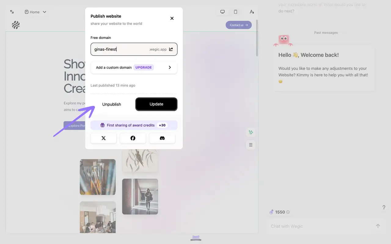
In this brand visual innovation, how to display and maintain a consistent brand image on different platforms becomes particularly important. A unique design on a website is necessary for many companies to demonstrate the style of their brand. Wegic is a no-code website-building tool that allows companies to develop their websites without hassles. Companies can speak to Wegic AI to have a site that suits their brand instead of employing designers or coders, since they do not require a high-level design.
Wegic: No-code Brand Website Builder
Wegic is a powerful no-code brand website building platform designed for users who want to easily build and optimize brand websites. With its simple and intuitive interface and powerful functions, users can quickly create and manage professional websites without any technical background. Here are the core features and advantages of Wegic:
1.Intelligent optimization to improve the sales conversion rate
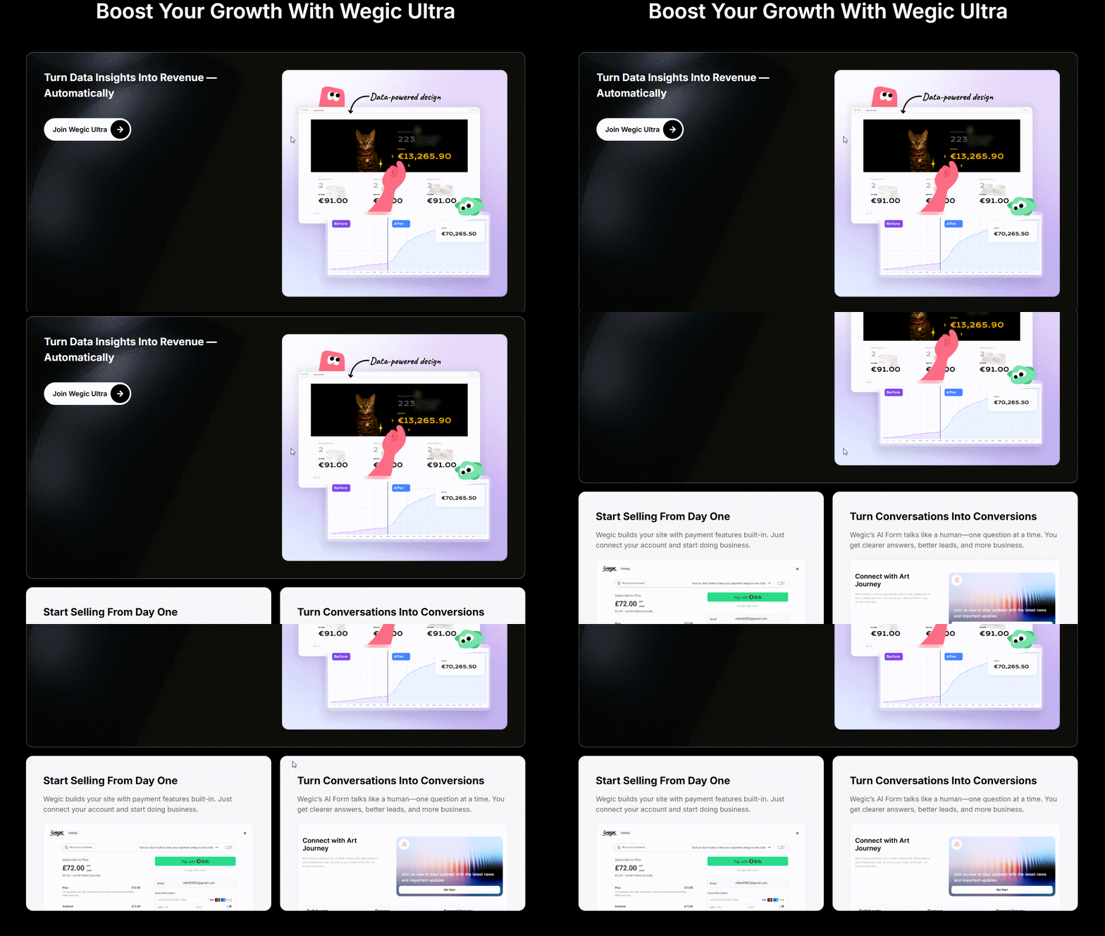
Using the smartness of Wegic Ultra, the platform will be capable of automatically analysing and modifying the contents of the site according to the actions of the visitors and thus increasing the conversion rate of the particular site. It is a one-stop solution, and it helps to optimize layout, content, and CTA (call to action) on the fly to make sure that the most attractive content appears on the site to any visitors, regardless of their type. The platform allows simple configuration of product lists, payment methods, inventory, and other functionality to allow users to establish a comprehensive online store.
2.Fully custom design
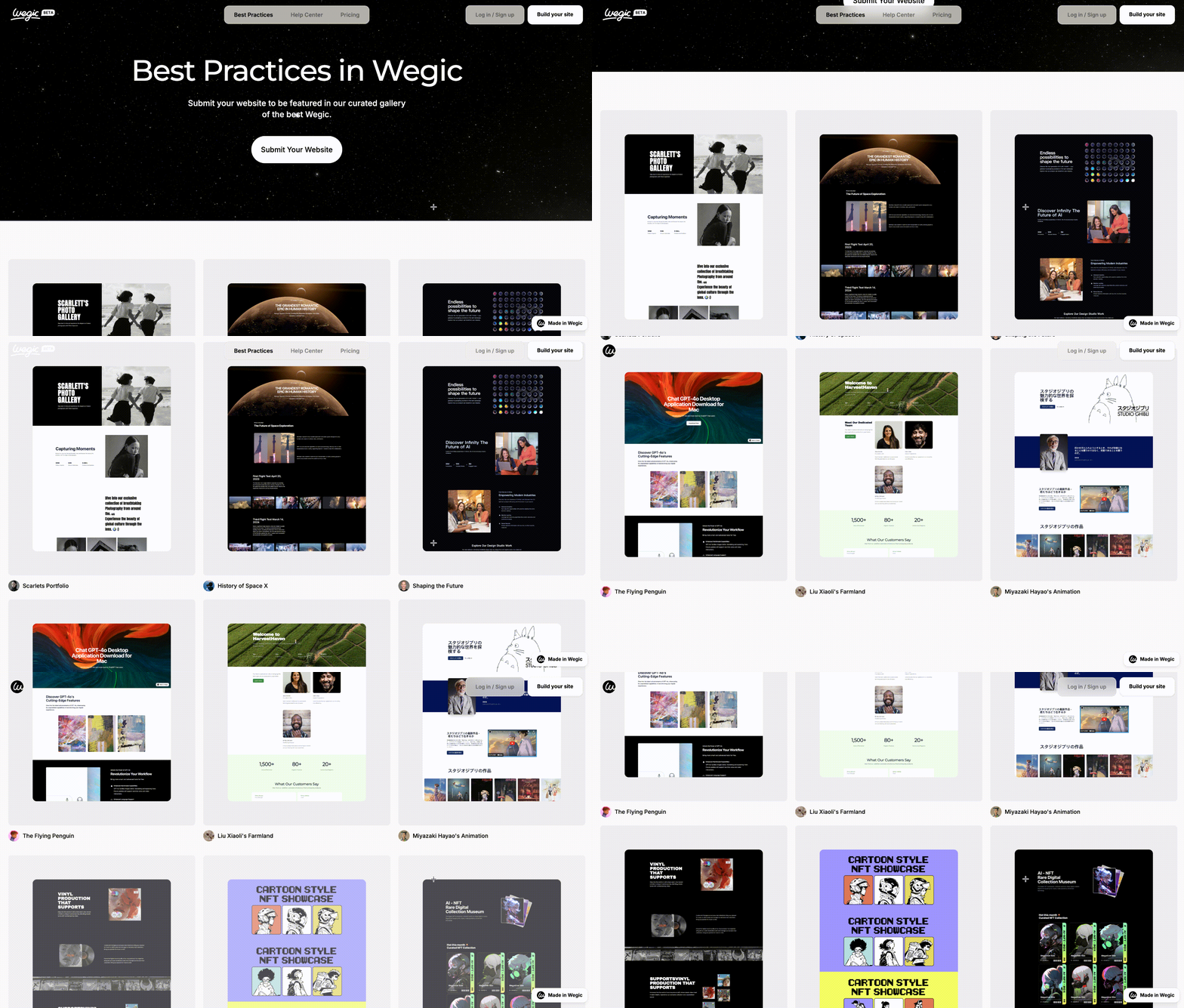
Wegic offers its customers a wide variety of designs, which can be customized according to industry. No matter in the field of fashion, catering, technology, or service industries, it is possible to find a proper design framework, and also to further adjust and idealize it according to the needs of brands to realize a customized display of brands in the true sense.
3.Responsive design
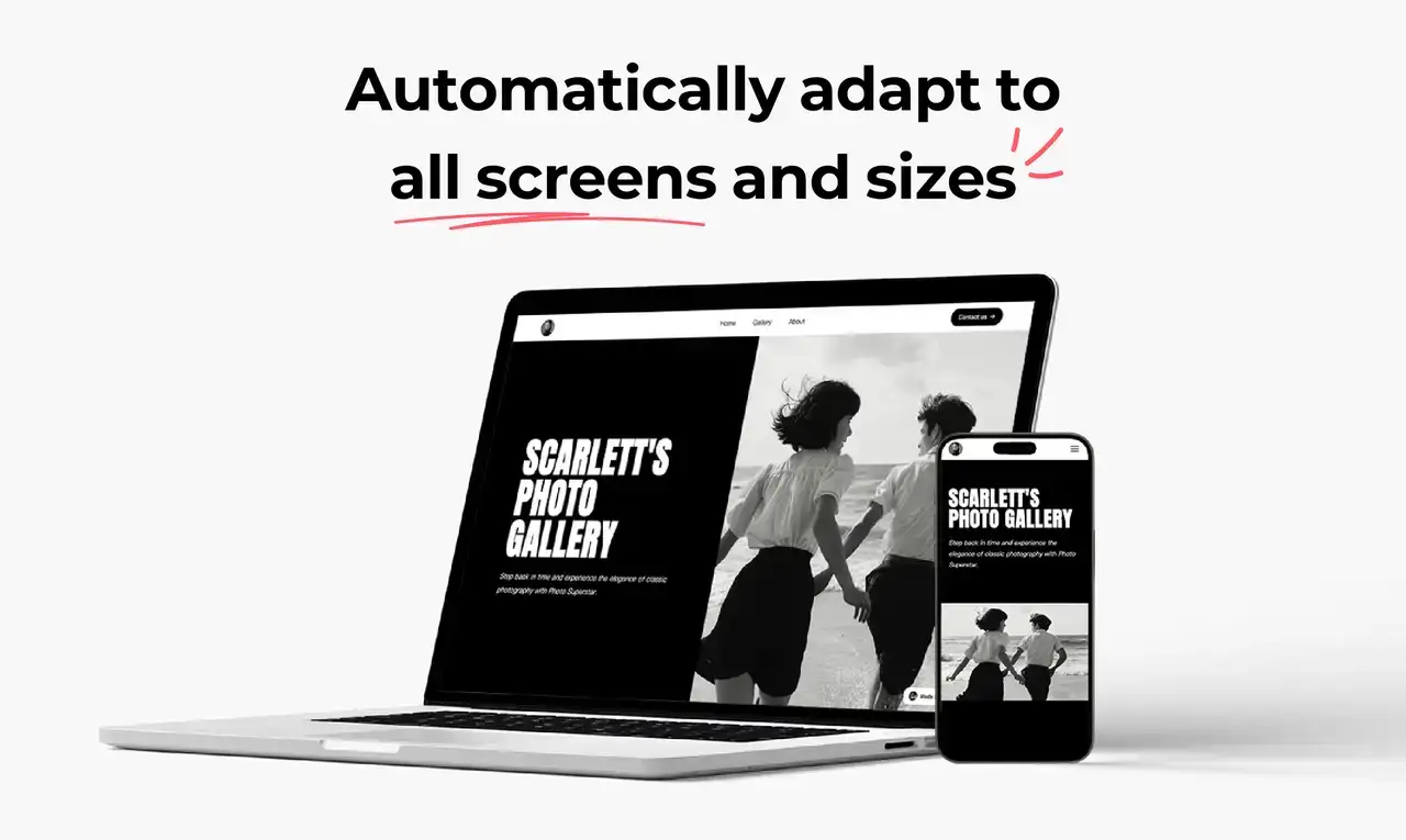
Be it a desktop computer, tablet, or mobile phone, the site created by Wegic will resize automatically to match the screen size. Browsers will have an optimal browsing experience regardless of the device that they use to access your site. It is useful in terms of bettering the user experience and SEO of websites.
4.Social media integration
Social media accounts can also be integrated into the platform, such that the contents of the website can easily be disseminated to various social media platforms, thus increasing the reach of the brand.

5.Powerful data analysis and reporting tools
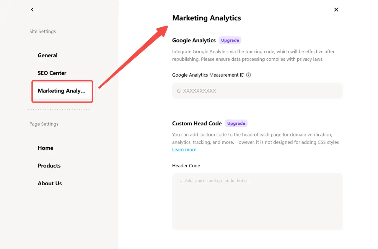
Wegic can adds a feature of connecting to Google Analytics, a data analysis tool. Users can precisely follow important parameters like visits to their websites, visitor activities, conversion ratios, etc., develop a clear picture of how their websites are performing, and effect the necessary changes in application of optimization methods in time.
6.Quick release and update
Using Wegic, a customer will be able to take the web page through the design stage and to the web in a brief period of time, and the content may also be updated quickly using the platform. It can be easily done whether it is the launch of a product, promotional activities, or any update of the brand story.
Conclusion
As we consider the progress of the evolution logo, we realize that a logo is not just the symbol of the brand, but symbolizes everything about the brand, which includes the philosophy, emotional attachment, and commercial worth of the brand. Logo design in the future will still be on the track of personalisation, dynamism, and interactivity, and Wegic, as a non-coding exhibitor of website building, could be effective in making brands distinguishable in the digital age. Creating a separate site with the help of Wegic will make it more convenient to demonstrate the identity of brands, but with smart optimization, they will increase their control over the market.
Written by
Kimmy
Published on
Mar 17, 2026
Share article
Read more
Our latest blog
Webpages in a minute, powered by Wegic!
With Wegic, transform your needs into stunning, functional websites with advanced AI
Free trial with Wegic, build your site in a click!
