Log in
Build Your Site
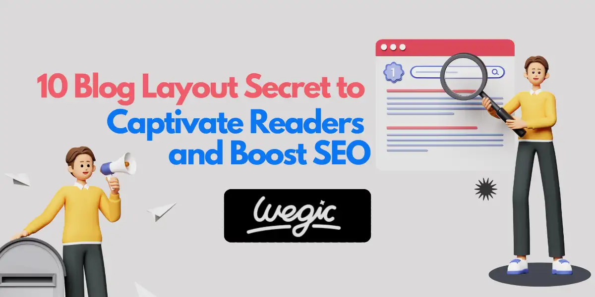
10 Blog Layout Secrets to Captivate Readers and Boost SEO
Learn 10 proven blog layout secrets to captivate readers, boost engagement, and skyrocket your blog’s SEO performance with expert-backed design strategies.

Creating a blog that not only shares valuable information but also captivates its audience is a crucial endeavor for any website owner. The visual presentation of your blog posts, often referred to as the blog page layout, plays a pivotal role in determining whether visitors stay engaged or quickly navigate away. A well-thought-out blog post layout can significantly enhance the user experience, improve blog readability, and ultimately contribute to better search engine rankings. Many bloggers face the challenge of striking the right balance between aesthetic appeal and functional design. This article unveils 10 essential secrets to crafting blog page layouts that not only make your posts visually stand out but also optimize them for engagement and search engine visibility. By implementing these strategies, you can transform your blog into a powerful tool for connecting with your audience and achieving your online goals.
Master the Art of Readable Fonts and Optimal Font Sizes
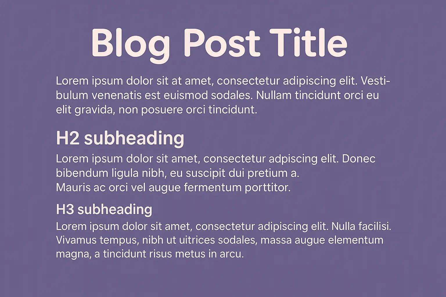
The foundation of any effective blog page layout lies in its typography. Choosing fonts that are easy on the eyes and setting them at appropriate sizes is paramount for blog readability. When selecting fonts for your website layout for blogs, consider the distinction between serif and sans-serif typefaces. Sans-serif fonts like Open Sans, Lato, and Montserrat are often preferred for body text due to their clean and modern appearance, which facilitates comfortable reading for extended periods. Serif fonts, such as Merriweather and Georgia, can lend a more traditional and authoritative feel and are sometimes used for headings. The key is to ensure clear letterforms and adequate spacing, preventing eye strain.
Setting the right font size is equally critical. For body text, a minimum size of 16px is generally recommended to ensure readability across various devices, especially for users with visual impairments. Headings (H1, H2, H3) should be distinctly larger to establish a clear visual hierarchy and enable readers to quickly scan the content. Furthermore, adjusting the line height, also known as leading, and the letter spacing, or tracking, can significantly impact blog readability. Sufficient line height prevents text from appearing cramped, while appropriate letter spacing ensures individual letters are easily distinguishable. Tools like Google Fonts offer a vast library of web-safe fonts that you can explore and implement to enhance the blog design tips of your site. Prioritizing legible typography is a fundamental aspect of creating a user-friendly blog layout and contributes positively to user engagement metrics, a factor that search engines consider when ranking content.
Conquer Content Organization with Crystal-Clear Headers and Subheaders
Effective organization is paramount in creating an engaging and SEO-friendly blog layout. Utilizing clear headers and subheaders is essential for structuring your content logically, both for your readers and for search engine crawlers. Employing semantic HTML heading tags (H1 to H6) correctly is crucial. The H1 tag should be reserved for the main title of your blog post layout and should ideally include your primary keyword. Subsequent sections and subsections should be organized using H2, H3, and so on, to establish a clear visual hierarchy and indicate the relationships between different parts of your content.
Descriptive and keyword-rich headers and subheaders significantly enhance content scannability. Readers often skim through blog posts before delving into the details, and well-crafted headings allow them to quickly grasp the main points and locate the information they need. Furthermore, breaking down long paragraphs into shorter, more manageable sections with relevant subheadings makes the content less intimidating and encourages readers to stay engaged. The strategic use of bullet points, as mandated by these guidelines, is another effective way to present information concisely and improve blog readability. Proper heading structure also plays a vital role in SEO. Search engines use these tags to understand the topic and subtopics of your content, which can improve indexability and potentially boost your rankings for relevant keywords.
Integrate High-Impact Images and Engaging Visuals Strategically
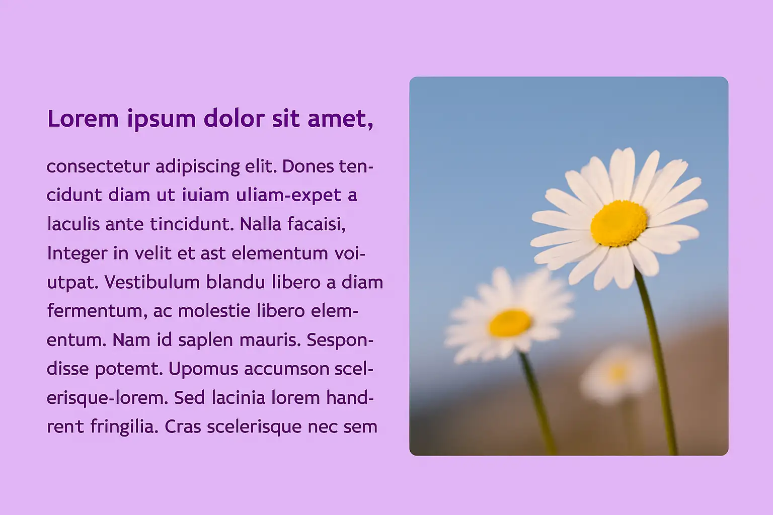
Integrating high-quality and relevant visuals is a powerful way to enhance your blog page layout and maintain reader interest. Images, illustrations, charts, graphs, infographics, and embedded videos can break up large blocks of text, making your content more visually appealing and easier to digest. The key is to ensure that the visuals you use are directly relevant to the surrounding content and add value to the reader's understanding. Generic or purely decorative images can be distracting and may not contribute to engagement.
When incorporating visuals, image optimization for blog layout is crucial. Large, unoptimized images can significantly slow down your page load time, which negatively impacts user experience and SEO. Therefore, it's essential to compress your images without sacrificing too much quality using appropriate tools or plugins. Choosing the right file format (JPEG for photographs, PNG for graphics with transparency, and WebP for superior compression and quality) is also important. Furthermore, using descriptive and keyword-rich file names and alt text for your images is vital for both accessibility and SEO. Alt text provides a textual alternative to the image for screen readers and helps search engines understand the content of the image. Strategic placement of visuals within your blog post layout can guide readers through the text, highlight key points, and enhance the overall narrative.
Prioritize the Power of White Space and a Pristine Layout
In the realm of blog design tips, the strategic use of white space in blog design is often underestimated but plays a crucial role in creating a visually appealing and readable blog page layout. White space, also known as negative space, refers to the empty areas around text and other elements on a page. It can be categorized into macro white space (the space around larger elements) and micro white space (the space between lines of text and individual letters). Both types of white space contribute significantly to blog readability and the overall user experience.
Ample white space improves focus by reducing visual clutter and making the content feel less overwhelming. It allows readers' eyes to rest and easily distinguish between different sections and elements. Proper line height and paragraph spacing, as mentioned earlier, are key aspects of micro white space that enhance readability. Avoiding overly busy backgrounds, excessive use of dividers, and cramming too many elements together can lead to a cluttered and uninviting website layout for blogs. A clean and well-spaced layout not only enhances the aesthetic appeal of your blog but also contributes to better user engagement metrics, which are positive signals for search engines.
Establish a Dominant Visual Hierarchy to Guide the Reader's Eye
A strong visual hierarchy in blogs is essential for guiding readers through your content in a logical and intuitive manner. It helps them quickly identify the most important information and understand the structure of your blog post layout. Several elements contribute to establishing an effective visual hierarchy:
-
Font Size and Weight: Larger and bolder fonts naturally draw the reader's attention to headings and subheadings, indicating their importance.
-
Color and Contrast: Using contrasting colors can highlight key elements such as calls to action or important pieces of information.
-
Placement and Alignment: The position of elements on the page influences their perceived importance. Centrally aligned text, for instance, often draws more attention than left-aligned body text.
-
Spacing and Proximity: Grouping related elements together with sufficient white space creates visual connections and indicates their relationship.
-
Imagery: The size, prominence, and placement of images can create focal points and guide the reader's eye.
By strategically manipulating these elements, you can create a blog page layout that naturally directs the reader's attention to the most critical aspects of your content, improving content scannability and overall user experience. This, in turn, can positively impact engagement metrics.

Design for Seamless Mobile Responsiveness in a Mobile-First World
In today's digital landscape, where a significant portion of online browsing occurs on mobile devices, designing for seamless mobile-responsive blog design is not just a recommendation but a necessity. A blog page layout that adapts flawlessly to various screen sizes, including smartphones and tablets, ensures a consistent and positive user experience regardless of the device being used. This is often referred to as "mobile-first" design, where the mobile experience is prioritized.
Implementing mobile-responsive blog design typically involves techniques such as fluid grids, flexible images, and media queries. Fluid grids ensure that layout elements adjust proportionally to the screen width, while flexible images scale appropriately without breaking the layout. Media queries allow you to apply different CSS styles based on the characteristics of the device, such as screen width. A common approach for mobile blog post layouts is a single-column design that prioritizes content flow. Simplifying navigation and ensuring that key content is easily accessible on smaller screens are crucial considerations. Regularly testing your website layout for blogs on different devices or using browser developer tools is essential to ensure optimal responsiveness. Furthermore, mobile-friendliness is a significant ranking factor for search engines, making mobile-responsive blog design a critical aspect of SEO.
[Image Placeholder: A blog post displayed on both a desktop computer and a mobile phone, showcasing its responsive design.]
-
Alt text: "A mobile-responsive blog design adapting seamlessly to different screen sizes on desktop and mobile devices."
Craft Effortless Navigation for Optimal User Flow
Effortless navigation is a cornerstone of a user-friendly blog layout. Visitors should be able to easily find their way around your blog and access the content they are looking for without confusion or frustration. Key elements of effective website navigation for bloggers include:
-
Clear Header Navigation: This typically includes your blog's logo, primary menu links to important sections (e.g., categories, about page, contact page), and often a search bar. The header navigation should be consistent across all pages of your blog.
-
Internal Linking: Strategically incorporating internal links within your blog post layout to related content keeps users engaged and encourages them to explore other articles on your site. Contextual internal linking also helps search engines understand the relationships between different pieces of content.
-
Category Pages and Archives: Well-organized category and archive pages allow users to browse content by topic or publication date, providing alternative ways to discover relevant information.
-
Footer Navigation: The footer can include secondary links, copyright information, social media icons, and sometimes a повторение of key navigation links.
-
Sidebar Navigation (Consideration): On desktop layouts, a sidebar can be used for additional navigation elements such as recent posts, popular categories, or newsletter signup forms. However, on mobile, sidebars are often moved below the main content to avoid cluttering the smaller screen.
A well-implemented navigation system improves user experience, leading to longer session durations and lower bounce rates, both of which are positive SEO signals. It also helps search engine crawlers index your site more effectively.
Embrace Scannable Layout Patterns for Busy Readers
In today's fast-paced digital world, readers often have limited time and tend to scan online content rather than reading every word. Therefore, designing your blog page layout to accommodate common reading patterns is crucial for capturing and retaining their attention. Two well-known reading patterns are the F-pattern and the Z-pattern:
-
F-Pattern: This pattern is common for text-heavy content. Readers typically scan across the top of the page, then move down and scan across the left side, creating an "F" shape. Important information should be placed along these horizontal and vertical lines. Utilizing headings, subheadings, and bullet points (as mandated) along the left margin can align with this pattern.
-
Z-Pattern: This pattern is more common for pages with less text and more visual elements. The reader's eye moves in a "Z" shape: across the top, diagonally down to the opposite corner, and then across the bottom. Key elements can be strategically placed along this path.
By understanding these patterns, you can structure your blog post layout to guide readers' eyes to the most important information. Using visual cues such as headings, subheadings, bold text (secondary keywords), and strategically placed images can further enhance content scannability and improve user engagement.
[Image Placeholder: A graphic illustrating the F-pattern and Z-pattern of eye movement on a typical blog post layout.]
-
Alt text: "Visual representation of the F-pattern and Z-pattern illustrating how users typically scan blog post layouts."
Strategically Integrate Calls to Action and Engagement Features
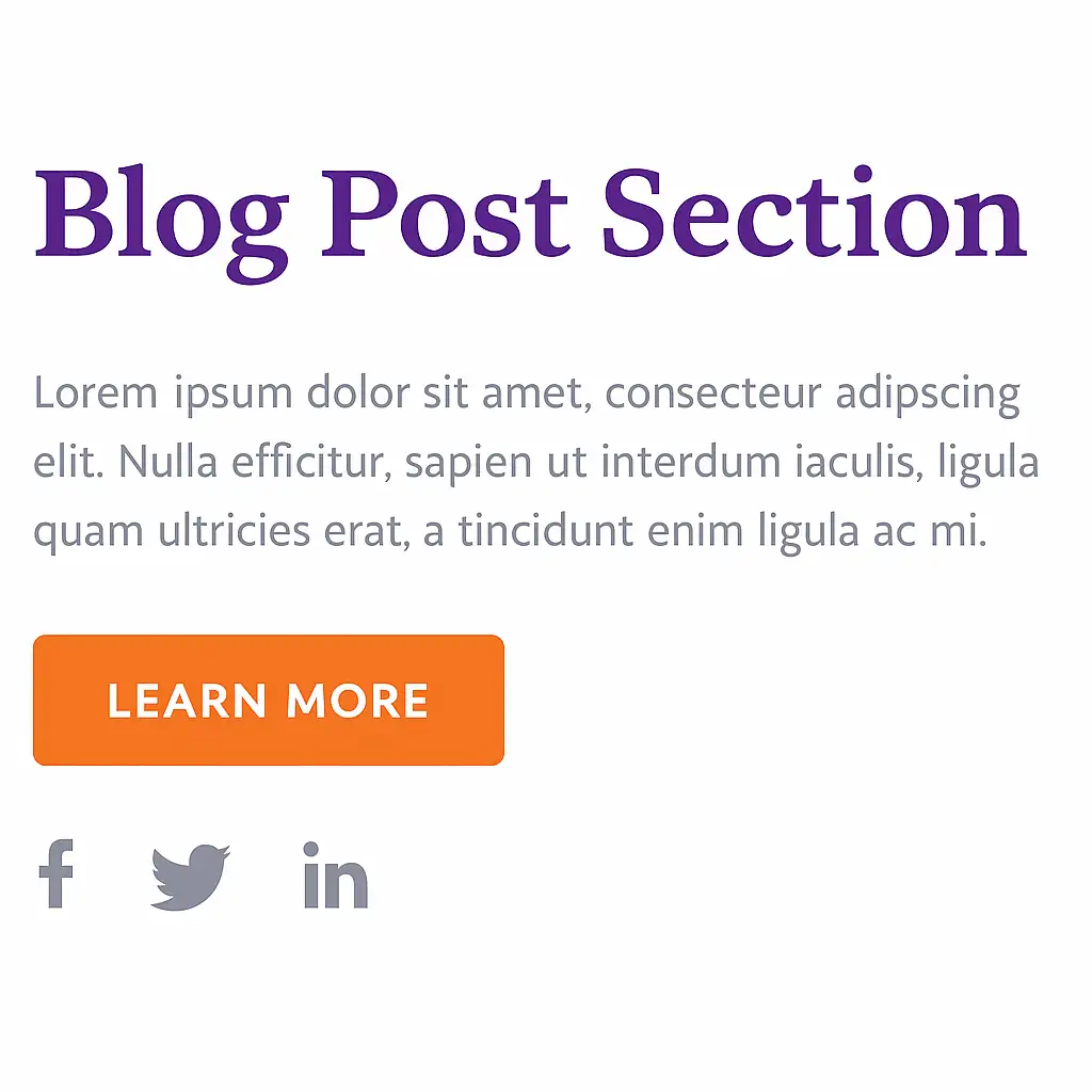
A well-designed blog page layout should not only provide valuable information but also encourage interaction and guide readers towards desired actions. Strategically integrating call to action, blog designelements and engagement features is essential for achieving these goals. Common types of calls to action (CTAs) on blogs include:
-
Email Subscription Forms: Encouraging readers to subscribe to your newsletter.
-
Social Sharing Buttons: Making it easy for readers to share your content on social media platforms.
-
Comment Sections: Fostering community and discussion around your blog posts.
-
Related Posts Suggestions: Keeping readers engaged by suggesting further reading.
-
Downloadable Resources: Offering valuable content in exchange for an email address or other action.
Effective CTA design involves using compelling copy, visually prominent buttons with contrasting colors, and strategic placement within your blog post layout (e.g., within the introduction, at the end of sections, or as a sticky sidebar element). Similarly, making it easy for readers to leave comments and share your content can significantly increase engagement and expand your blog's reach. Thoughtful placement and design of these engagement features are crucial for a user-friendly blog layout. Increased engagement can indirectly signal the value of your content to search engines.
Relentlessly Optimize Page Load Time for a Seamless Experience
In the fast-paced online environment, blog page speed optimization is a critical factor that directly impacts user experience and SEO. Slow loading times can lead to frustration, higher bounce rates, and lower search engine rankings. Therefore, ensuring that your blog page layout is lightweight and optimized for speed is paramount. Several techniques can be employed to improve page load time:
-
Image Optimization (Revisited): Properly compressing images and using efficient file formats are crucial.
-
Minifying CSS and JavaScript: Removing unnecessary characters from your code can reduce file sizes.
-
Browser Caching: Enabling browser caching allows returning visitors' browsers to load your site faster.
-
Content Delivery Network (CDN): Using a CDN distributes your website's content across multiple servers, improving loading times for users in different geographical locations.
-
Lazy Loading: Implementing lazy loading for images and other non-critical elements ensures that they are loaded only when they are about to enter the viewport.
-
Choosing a Fast Hosting Provider: Selecting a reliable and fast web hosting service is fundamental for good performance.
-
Avoiding Excessive Plugins: Too many plugins can often slow down your website.
Regularly testing your blog's page speed using tools like Google PageSpeed Insights is essential for identifying areas for improvement. Optimizing for speed not only enhances user experience but is also a direct ranking factor for search engines.
To Sum Up
Creating a blog page layout that truly stands out involves a multifaceted approach that considers both visual appeal and functional design. By mastering the art of readable fonts and optimal font sizes, conquering content organization with clear headers and subheaders, strategically integrating high-impact visuals, prioritizing the power of white space, establishing a dominant visual hierarchy in blogs, designing for seamless mobile-responsive blog design, crafting effortless navigation, embracing scannable layout patterns, strategically integrating call to action blog design elements and engagement features, and relentlessly optimizing blog page speed optimization, you can create a blog that not only captivates your readers but also performs well in search engine rankings. Implementing these 10 secrets will transform your website layout for blogs into a powerful asset for connecting with your audience and achieving your online objectives.
You’ve got the content — now give it the layout it deserves.
Whether you’re building with Wegic or optimizing your blog from scratch, these 10 proven design secrets will boost engagement, sharpen SEO, and turn readers into loyal fans.
Written by
Kimmy
Published on
Mar 12, 2026
Share article
Read more
Our latest blog
Webpages in a minute, powered by Wegic!
With Wegic, transform your needs into stunning, functional websites with advanced AI
Free trial with Wegic, build your site in a click!
What kind of website do you want to build?