How to Create an Effective App Landing Page: 19 Examples
The creation of a well-designed app landing page plays a vital role in the competition of thousands of mobile apps.In this blog, we will showcase 19 diverse examples that illustrates multi-functions of this critical powerful tool.

The creation of a well-designed app landing page plays a vital role in the competition of thousands of mobile apps. Both innovative strategy and user-friendly design are effective to make your app landing page sophisticated and unique. It is beneficial in many aspects: attract audiences for you app by creating a sense of interest, upgrade adoption and promote engagement.
How to create an effective app landing page?
For a good start, please take a look at a few suggestions we want to share with you for creating an effective app landing pages:
- Fansinating Headline: Step one, set a compelling headline-as the most visible part of the app landing page, it is essential as it establish visitor's first sight. It needs to be straightforward enough to show them how your app could solve their problem or provide services they seek for.
- Intriguing Visuals: Step two, design engaging visuals-they are indispensable if you aim at creating an effective app landing page. Use a series of high-quality visuals (including audios, videos, images) which could embody your app's function. Make it as easy as possible for your audiences to clearly figure out what your app is.
- CTA(Clear call-to-action): Step three, build a direct CTA(Clear call-to-action)-that could be considered as the central pivot of your page. It should be well-built and subtlely placed to arrest attention. Make sure that you set more than one path for visitors.
- Social Confirmation: Step four, try to put some social proof elements in your app landing page. It will enhance your credibility as well as establish trust. Introducing third-party endorsements will considerably effect your potetial users.
- Succinct Copy: Step five, ensure that your copy is concise. It needs to highlight how your app upgrades user experiences. Simple and succinct text can promote and reinforce your message.
- In this blog, we will showcase 19 diverse examples that illustrates multi-functions of this critical powerful tool.
19 Examples
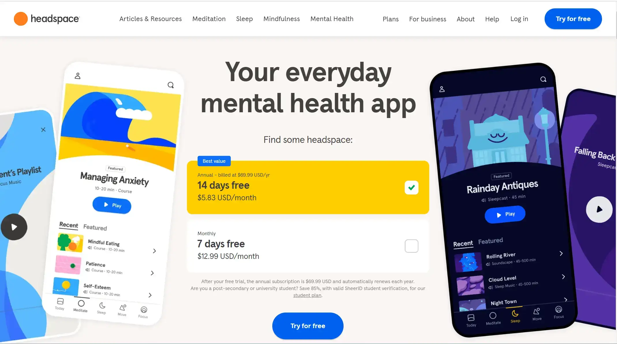
1. Headspace
What it is: Headspace provides every person access to lifelong mental health support. Think of it as your lifelong guide to better mental health. They dedicate themselves to helping people get through tough times and find joy in daily lives.
Lessons to learn: Headspace utilizes a very jumpy colour layout to add interest and spectacle to the entire app landing page. As soon as the user opens the site, they instantly get an idea of exactly what the app does and how it can be used. At the same time, they also put a free trial of the software right in the middle of the app landing page, which is a marketing strategy to attract users to download and use it initially, increasing the scale of users and click-through rates.
2. Skyscanner
What it is: Skyscanner offers online travel search services (including flight, hotel and car hire price comparison) and other travel related services to travellers throughout the world via their websites, apps and other platforms. It is the bridge between customers and third-party platforms for booking, renting and ticketing, mainly providing retrieval services.
Lessons to learn: Skyscanner's app landing page adopts a split-column design, dividing its main businesses (including flight ticket purchase, hotel booking and car hire) into different search columns, which enables users to go to the corresponding interface according to their needs in the first place. The dark blue and light white background colours make the whole page look more professional and authoritative, which inadvertently increases users' trust and willingness to use this app.

3. Calm
What it is: Calm is a mental health app designed to help clients manage stress, sleep better, and live a happier, healthier life. Their research-based tools can help people build life-changing habits to support their mental health.
Lessons to learn: To fit the functionality of the app, Calm designed its app landing page using a combination of natural landscapes and a tagline for the purpose of their app. This creates a sense of calm and harmony for the user. This allows them to relax while browsing the page and experience the change in mental state that Calm brings. The simplicity of the page does not distract or make the visitors uncomfortable. Meanwhile, the download button is highlighted at the bottom of the page.

4. Triage
What it is: Triage is an iPhone application designed to help people who get a lot of email get on top of their inbox. It shows the unread email as a stack of cards, allowing users to quickly archive email they don’t need to action, write a short reply, or keep some email to process later.
Lessons to learn: The strong clash of colours creates a strong visual impact on the viewer. High saturation and high contrast colours stimulate the user's eyes and arrest them to look at the content introduction in more detail. The straightforward demonstration of the software's usage clarifies the functionality to users, giving them a general feel for the software experience before downloading. The eye-catching iOS download button also seems hard to ignore.

5 Current Vehicles
What it is: The app makes renting both flexible and convenient, giving users the option to pick up a vehicle 'Now' or schedule one for 'Later'.
Lessons to learn: Sans-serif fonts are used throughout the page, contributing to a clean and modern aesthetic. The typography is chosen for legibility and readability, which aligns with the overall user-friendly design approach. For the moment, CTAs are also strategically placed, using contrasting colors and clear wording to encourage user interaction. This enhances guiding visitors towards desired actions without being intrusive.

6. Clipdrop
What it is: The Company offers its users a solution enabling them, in particular to capture images or texts from a computer or/and photographs of real objects taken with a phone and add them directly to a computer program to make montages or to edit photos.
Lessons to learn: Clipdrop gives an introduction to their app content in the form of a video on the app landing page, so viewers don't have to do anything to easily learn about it. As they slide down the page, they are again presented with a detailed product showcase and a download button. The entire page is designed to be well structured and clearly divided.

7. Gevena
What it is: Geneva is the group chat app connecting clients to the people they want to meet and the things they want to do in their city.
Lessons to learn: Compared to other pages, Gevana uses a lot of white space to guarantee that viewers can expand their visual ideas. But then it highlights the app's landing buttons and links with distinct fluorescent colours. For the headline, they use a variety of different fonts that catch the viewer's attention. The video on the right vertical screen continuously scrolls through the creative work and experience of the app's existing users, adding to the richness of the entire page.

8. Kiff
What it is: Kiff was built with one goal: help people eat their food in its best state possible. Because food loses its nutritional capabilities after keeping it for too long, and if spoiled, it can be a risk for people's health. By eating fresh food, they waste less, save money, and help the planet.
Lessons to learn: Kiff's wise combination of its own tagline and the actual use of the app is a very creative design approach. The use of different theme colours for each type of food both enriches the app landing page and makes it clearer to the user what the specific categories are. The green colour of the logo and tagline reflects the environmentally friendly spirit.

9. Slowly
What it is: Slowly was founded to bring the traditional pen pal experience to the digital era. Unlike other social media apps that prioritise speed and brevity, Slowly offers a more personal and intimate mode of communication – one letter at a time.
Lessons to learn: The website for Slowly's landing page embodies a distinctive design style characterized by a blend of scrawled, sophistication, and a touch of playfulness. Additionally, there are occasional illustrations that are interesting and whimsical, contributing to the overall friendly and approachable feel of the whole page. It effectively communicates the company’s values and invites potential cunstomers to engage with the content in a visually appealing manner.

10. Ulysses
What it is: Ulysses for Mac, iPad, and iPhone is a text editor for writers and winner of the prestigious Apple Design Award. Its pleasant, focused writing experience, combined with effective document management, seamless sync, and flexible export, make Ulysses a premium choice for writers of all kinds.
Lessons to learn: The app landing page for Ulysses showcases a design style that is sleek, professional, and focused on clarity and functionality. The color scheme featuring various shades of only black, gray and white. This choice creates a clean and minimalistic appearance, which is typical of many professional and tech-oriented websites. The use of subtle gradients adds depth and sophistication to the design without distracting from the content.

11. Strong
What it is: Strong is the most intuitive and convenient way to track gym and weightlifting workouts and measure users' progress. It's a place for everyone to record their entire workout history, safely in the cloud.
Lessons to learn: Strong's app landing page showcases a user-focused design style. The design reflects Strong's brand identity through its clean and user-friendly interface. The focus on clarity and functionality aligns with Strong's commitment to providing a robust and intuitive fitness tracking experience. The use of imagery is minimal but purposeful. Icons and illustrations are used sparingly to complement text and aid in visual navigation.

12. Duolingo
What it is: Duolingo is the most popular language-learning platform and the most downloaded education app in the world, with more than 500 million users. The company’s mission is to make education free, fun, and available to all. Duolingo is designed to feel like a game and scientifically proven to be effective. In addition to its core platform, the company created the Duolingo English Test, an affordable and convenient language certification option that is accepted by thousands of institutions.
Lessons to learn: It uses bright and vibrant colours such as vibrant greens and blues, and warm oranges. These colours not only enhance the visual appeal of the site, but also convey a sense of learning and energy. The page makes extensive use of humorous and personal illustrations and graphics that are not just decorative, but are used to explain and enhance the understanding of the content. They provide a more relaxed and enjoyable user experience. What's more, this app landing page introduces rich interactive elements, such as animation effects and gamification design, which not only increase user engagement and attraction, but also make the learning process more vivid and interesting.

13. Bear
What it is: Bear is a beautiful, powerfully simple Markdown note taking app to capture, write, and organize your life. It is packed with advanced features that reveal themselves naturally once users dive in.
Lessons to learn: The Bear application's website design style combines modern visual elements, clear and concise messaging and personalised illustrative animations, in a way that effectively engages the target user and enhances the user experience, while subtly showcasing the product's features and functionality. Besides, a preview of how the app will look when used on different devices is also given.

14. Photon
What it is: Photon Studio is a companion to Photon Camera that can be run on any compatible iOS, or MacOS device. It allows users to connect that device to their phone running Photon Camera and will display, in real time, the latest photo taken.
Lessons to learn: This page demonstrates a design style that is both straightforward and technological, with some creativity and uniqueness. The color choice of it is simple, in keeping with the professional and modern feel of the tech product, while the red and purple accents add to the vibrancy and visual appeal of the page. Notably, the animated background on the home page is clean but highly compatible with the theme of the product, adding to the modernity and attractiveness.

15. Givingli
What it is: It's not only an app but also a way for users to connect in life’s most meaningful moments. Showcasing works from dozens of independent artists, Givingli offers both convenience and a personal touch in every gift and greeting.
Lessons to learn: Givingli's app landing page is very stunning and impressive. The website uses high-quality illustrations, which are not only used to showcase products and services, but also add to the page's visual appeal and sense of professionalism. Animations are clean and simple, such as the transition effect when scrolling and the gradient of elements appearing, making the page more dynamic and modern.

16. Flashform
What it is: This is a simple-use service, which allows users to configure the sending of contact forms from their website to select messengers in a few clicks.
Lessons to learn: The page's design uses large font sizes and contrasting fonts to enhance visual impact. The different font styles in the copy (e.g. bold, italic) create a hierarchy that catches the eye. The background colour is dark, which contrasts strongly with the bright green text, making the text more prominent and easy to read. Also, the gradient colour pattern in the centre of the page adds visual appeal and serves as an accent. It is worth noting that the copy clearly communicates the core function of the brand in a concise manner: "We just send forms and that's all". This direct expression conveys the brand's message quickly in the marketplace.

17. Great Jones
What it is: It is a women-run, New York-based small business that wants to equip and empower clients cook at home-and make their kitchen a happy place.
Lessons to learn: By displaying scenes from everyday life, Great Jones conveys an intimate and warm brand image, allowing consumers to feel the connection between the brand and their own daily lives. This style of design creates emotional resonance with consumers and enhances the brand's accessibility and memorability. The "Shop the Sale" button guides users to make a purchase, enhancing the interactivity and conversion rate of the page. In addition, the free shipping, 30-day trial, and free return information at the top of the page increases the user's confidence in making a purchase.

18. Munchery
What it is: Munchery was an online food ordering and meal delivery startup that served San Francisco, Los Angeles, Seattle, and New York City. It was founded in 2011 by two founders who wanted to offer food delivery that was healthier than pizza and Chinese food. The company's mission was to "make great food accessible to everyone."
Lessons to learn: The large search box and clear headings give users a clear idea of the site's main functions as soon as they enter the page, and the design is simple and intuitive. The download prompt and subscribe button at the top provides additional user engagement options, helping to improve user experience and conversion rates. They use orange as an accent colour is both lively and discreet, highlighting important information (such as the "FIND A RECIPE" headline and the "ACCEPT" button) and guiding the user's visual focus.

19. Zoom
What it is: Zoom, a widely used video conferencing application that facilitates online meetings, webinars, and virtual gatherings. It allows users to connect via video, audio, and chat across various devices such as desktop computers, laptops, tablets, and smartphones.
Lessons to learn: Zoom's website features a clean and simple navigation bar. The top navigation bar usually includes main sections such as "Search," "Support," "Join," etc., allowing users to quickly find the information they need. " and other major sections, enabling users to quickly find the information they need. The page layout is simple, with a clear hierarchy of information so that users can easily navigate and understand the content of each section. Its app landing page has clear CTA buttons such as "Sign Up Free", "Contact Scales", "Sign in" and so on, which are designed in eye-catching colours and positions to encourage users to take the next step.

Create an app landing page by yourself
We hope that these wonderful examples above will help you make your own app landing page. Before you start designing, define the customer base you want to attract and the need for user conversion rates. Whether it's a simple design or a subtle one, the ultimate goal is to increase the scale of users and click-through rates for your app. Please keep in mind that your app landing page is more than just a tool – it’s the gateway to your app’s promoting success.
Written by
Kimmy
Published on
Mar 12, 2026
Share article
Read more
Our latest blog
Webpages in a minute, powered by Wegic!
With Wegic, transform your needs into stunning, functional websites with advanced AI