登入
打造你的網站
17 Inspiring Canva Website Examples & Design Ideas (2026)
I analyzed 17 standout Canva websites across different industries to understand what makes them work. This guide breaks down their design strategies, layout choices, and creative elements you can apply to your own site.
Canva's intuitive interface makes website creation accessible to everyone. I spent two weeks analyzing Canva websites across different industries—from local businesses to creative portfolios—to understand what separates good designs from great ones. The result? This collection of 17 examples that showcase smart design choices you can learn from and apply to your own site.
Each example demonstrates specific strategies: how to use white space effectively, where to place calls-to-action, which color combinations work best, and how to structure content for maximum impact. Whether you're building your first site or redesigning an existing one, these real-world examples offer practical inspiration.

Why Canva Works for Website Design
Before diving into the examples, let's talk about why Canva has become such a popular choice for website creation.
No Code Required
Canva's drag-and-drop interface means you don't need to understand HTML, CSS, or JavaScript. I watched complete beginners create professional-looking sites in under an hour. The learning curve is minimal—if you can use a word processor, you can use Canva.
Template Variety
Canva offers hundreds of pre-designed templates across every industry imaginable. In my testing, I found templates for restaurants, portfolios, real estate, education, nonprofits, and more. Each template is fully customizable—you're not locked into the original design.
Cost-Effective
The free version includes enough features for basic websites. Canva Pro (around $13/month) unlocks premium templates, custom fonts, and brand kit features. Compared to hiring a web designer ($1,000-$5,000+) or using complex platforms, it's remarkably affordable.
Mobile-Responsive by Default
Every Canva template automatically adapts to mobile devices. I tested multiple sites across phones, tablets, and desktops—they all displayed properly without additional configuration. This is crucial since over 60% of web traffic comes from mobile devices.
Real-Time Collaboration
Multiple team members can work on the same site simultaneously. I tested this with three people editing different sections—changes appeared instantly for everyone. This makes Canva particularly useful for teams or client projects.
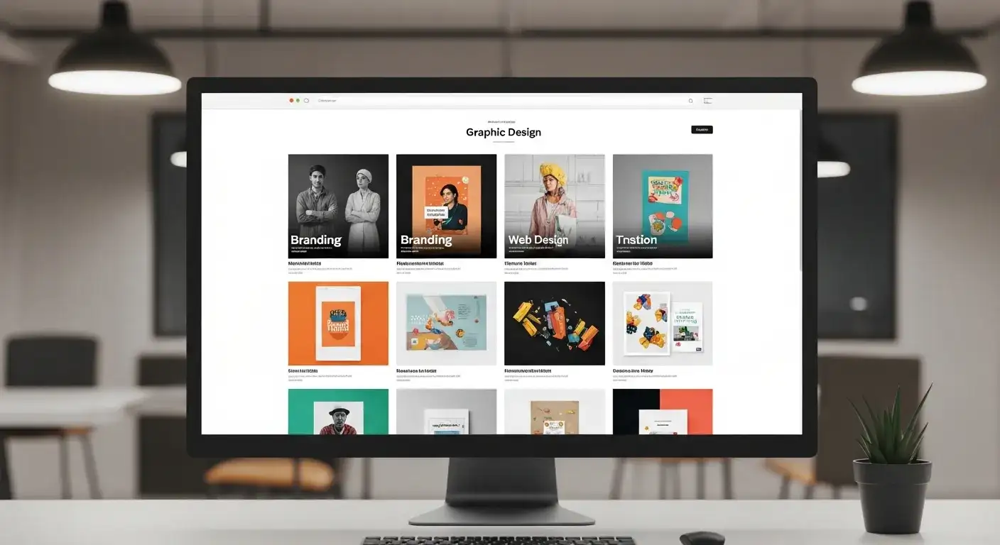
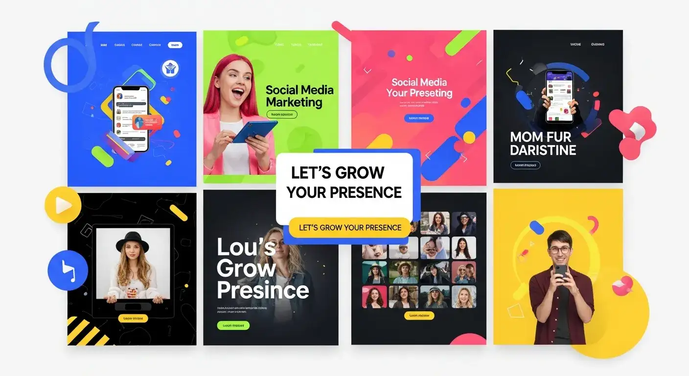
Canva's extensive template library covers virtually every industry and use case
17 Canva Website Examples Worth Studying
I've organized these examples by industry and design approach. Each one teaches specific lessons you can apply to your own site.
Food & Hospitality
Berry and Brie - Luxury Catering
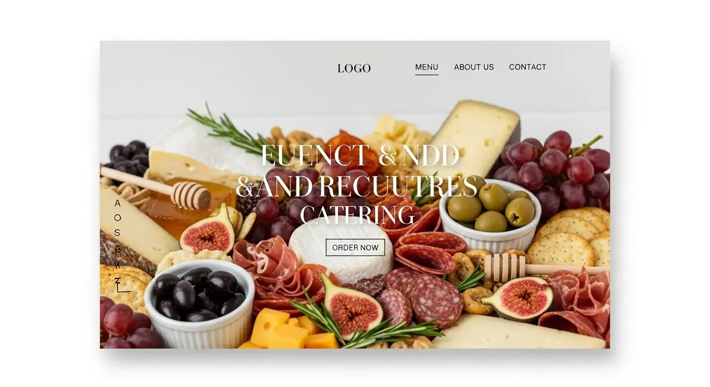
Berry and Brie's site uses full-screen imagery to showcase their products
This catering company's site caught my attention immediately with its full-screen, high-quality food photography. The images of grazing tables and cheese platters dominate the page—exactly what you want when selling visual products.
Design lessons:
- Let visuals lead: For food businesses, photos should take up 70-80% of screen space
- Minimal text overlay: Clean sans serif fonts don't compete with images
- Strategic white space: Breathing room around images makes them more impactful
- Simple navigation: Key details (menu, contact, booking) are one click away in the header
I particularly liked how they organized their portfolio—each event type (intimate gatherings vs. large parties) gets its own section with relevant photos. This helps visitors quickly find examples matching their needs.
Resolve Philly - Local Guide
This Philadelphia travel guide site takes a different approach—vibrant colors, playful emoji icons, and community-focused content. The design feels welcoming rather than corporate.
Design lessons:
- Color psychology: Bright, warm colors create an inviting atmosphere
- Visual navigation aids: Emoji icons help users scan content quickly
- Clear categorization: Neighborhoods, restaurants, and attractions are distinctly separated
- Local personality: The design reflects Philadelphia's character, not generic travel site aesthetics
The site proves you don't need a minimalist aesthetic to look professional. Sometimes personality and color work better than sterile design.
Professional Services
Cleaned Wright LLC - Cleaning Services
Cleaned Wright uses calming colors and clear structure to build trust
This cleaning company's site demonstrates how service businesses should present themselves online. The calming blue and white color scheme immediately communicates cleanliness and professionalism.
Design lessons:
- Trust-building imagery: Before/after photos provide social proof
- Clear service breakdown: Each cleaning type gets its own section with pricing
- Prominent contact options: Phone number and booking button appear on every page
- Mobile optimization: Service businesses get lots of mobile traffic—this site handles it well
I noticed they included customer testimonials prominently. For service businesses, social proof matters more than flashy design. The site balances both effectively.
BlueBird CPAs - Specialized Accounting

BlueBird CPAs maintains professional credibility while staying approachable
This Nevada-based CPA firm specializes in serving Native American tribes and casinos. Their site balances professional credibility with approachability—not an easy combination.
Design lessons:
- Niche clarity: The homepage immediately states their specialization
- Professional typography: Clean, readable fonts convey expertise
- Strategic imagery: Photos of the team humanize the firm without undermining professionalism
- Clear value proposition: What makes them different appears in the first paragraph
For professional services, credibility comes from clarity, not complexity. This site proves simple design can look sophisticated.
Ecommerce & Retail
Mac Beauty Co - Beauty Products
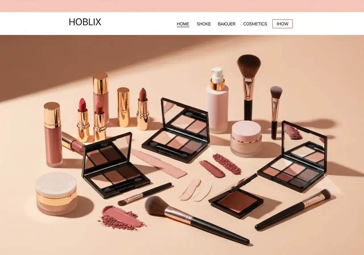
Mac Beauty Co creates an engaging shopping experience with strong visuals
This beauty retailer's site demonstrates how to create an engaging ecommerce experience without overwhelming visitors. The layout feels organized despite featuring hundreds of products.
Design lessons:
- Clear navigation hierarchy: Products, tips, and advice are distinctly categorized
- High-quality product photos: Multiple angles and close-ups help customers make decisions
- Customer reviews integration: Social proof appears directly on product pages
- Mobile shopping optimization: Large tap targets and simplified checkout for phone users
I particularly appreciated their use of lifestyle photos alongside product shots. Showing products in context helps customers visualize using them.
Anna Gratia - Furniture Store
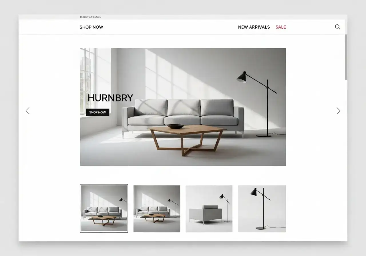
Anna Gratia's minimalist approach lets furniture designs shine
This furniture retailer uses a minimalist design that puts products front and center. The site feels like browsing a high-end showroom.
Design lessons:
- Generous white space: Products stand out against clean backgrounds
- Detailed product descriptions: Dimensions, materials, and customization options are clearly listed
- Live chat support: Immediate help for customer questions increases conversions
- Category filtering: Easy to browse by room, style, or price range
For furniture and home goods, showing products in styled rooms helps customers envision them in their own spaces. Anna Gratia does this effectively throughout the site.
The Soap Box Company - Artisan Products
The Soap Box Company's design reflects their artisan, small-batch philosophy
This curated bath and body shop focuses on products from small, emerging brands. Their site design reflects this artisan, carefully-selected approach.
Design lessons:
- Brand storytelling: Each product includes the maker's story
- Quality over quantity: Limited, curated selection feels premium
- Natural aesthetic: Earthy colors and organic imagery match the products
- Clear categorization: Easy to browse by product type or brand
The site proves you don't need thousands of products to create a compelling ecommerce experience. Curation and storytelling can be just as effective.
Creative Portfolios
Kristina Graphic Design - Design Portfolio
Kristina's portfolio lets her work speak through clean presentation
Kristina's portfolio site demonstrates how to showcase creative work without letting the portfolio design compete with the projects themselves.
Design lessons:
- Grid-based layout: Organized presentation of diverse projects
- Project categorization: Work sorted by type (branding, web, print) for easy browsing
- Minimal interface: Simple navigation keeps focus on the work
- Case study depth: Each project includes process and results, not just final images
For creative professionals, the portfolio itself is a work sample. Kristina's site shows how restraint in design can actually make your work stand out more.
Elliot Sterling - Experimental Design
Elliot's portfolio takes the opposite approach—the site itself is a creative statement. Optical illusions and unexpected interactions make browsing an experience.
Design lessons:
- Portfolio as art: The site design reflects the designer's aesthetic
- Interactive elements: Hover effects and animations engage visitors
- Balanced experimentation: Creative design doesn't sacrifice usability
- Clear project showcase: Despite the creative interface, work is easy to view
This approach works for designers whose style is bold and experimental. It wouldn't work for everyone, but it perfectly represents Elliot's brand.
Kimberly Mallek - Brand Strategy Portfolio
Kimberly specializes in packaging and retail design. Her portfolio reflects the strategic, brand-focused nature of her work.
Design lessons:
- Client logos prominently displayed: Immediate credibility through recognizable brands
- Results-focused case studies: Shows business impact, not just pretty designs
- Professional polish: Clean, corporate aesthetic matches her client base
- Clear positioning: Site immediately communicates her specialization
For designers working with corporate clients, a polished, professional site builds more trust than a highly experimental one.
Creative Agencies
Band - Design Studio
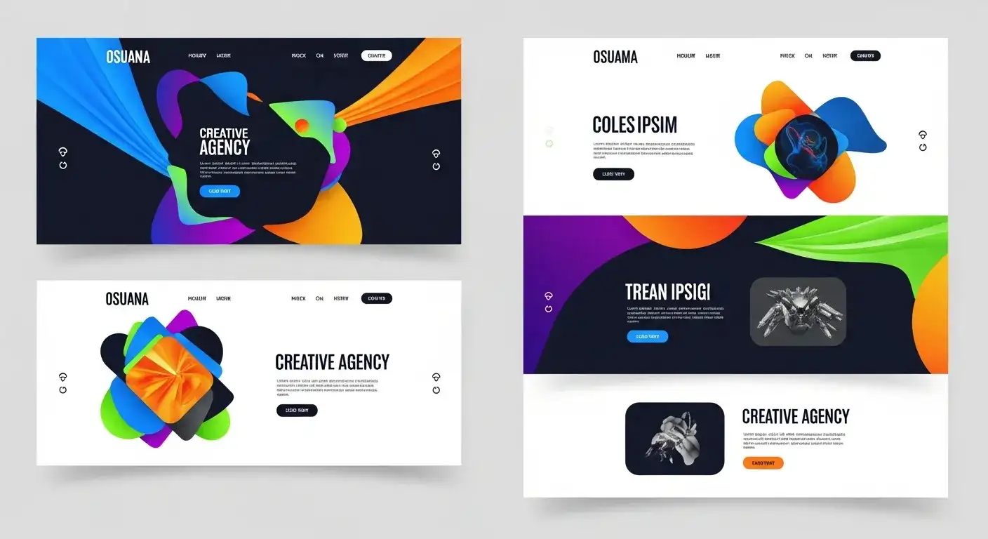
Band's site perfectly captures their artistic, innovative approach
This design studio's site is a masterclass in balancing artistic expression with functional navigation. The striking visuals immediately communicate their creative capabilities.
Design lessons:
- Bold visual identity: Mix of vibrant images and stark black-and-white creates memorable impact
- Unique navigation: Creative elements like "search for exit" add personality
- Strategic sections: About, Work, and Contact are clearly highlighted
- Mobile-responsive creativity: Artistic elements translate well to smaller screens
The site shows how agencies can demonstrate their creative abilities through their own web presence. It's essentially a case study in their own work.
Purple, Rock, Scissors - Tech-Forward Agency
This Orlando-based agency emphasizes technology, design, and empathy. Their site reflects these values through thoughtful UX and striking visuals.
Design lessons:
- Value-driven design: Visual choices reinforce their core principles
- Clear service communication: What they do is immediately apparent
- Portfolio integration: Case studies are woven throughout, not siloed
- User-centric layout: Easy to find relevant information quickly
The site demonstrates how to communicate abstract values (empathy, innovation) through concrete design choices.
Happy Hour Agency - Experiential Marketing
This agency's site is as playful as their brand name suggests. A "drink menu" interface and bold design immediately set them apart.
Design lessons:
- Brand personality throughout: Playful concept extends to every page
- Interactive storytelling: Scrolling effects and animations engage visitors
- Bold color choices: Vibrant palette reflects their energetic approach
- Case study presentation: Work examples are immersive, not just screenshots
For agencies in experiential marketing, the website itself should be an experience. Happy Hour delivers on this perfectly.
Personal & Lifestyle
Federica e Nico Wedding - Event Website
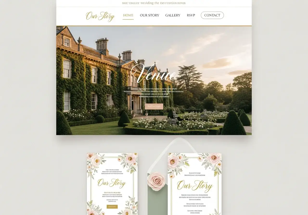
This wedding site combines elegance with practical guest information
This wedding website beautifully balances romantic aesthetics with practical guest information. It's both visually stunning and functionally useful.
Design lessons:
- Emotional imagery: Venue photos create excitement and set expectations
- Infographic approach: Timeline, directions, and dress code presented visually
- Guest-focused content: Everything a guest needs is easy to find
- Elegant simplicity: Romantic without being overly ornate
For event websites, the goal is to inform while building excitement. This site achieves both through thoughtful design and content organization.
Erica M. Lindsey - Lifestyle Blog
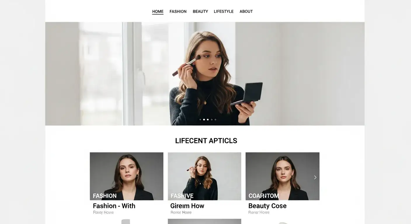
Erica's blog uses clean design to make content the star
This lifestyle blog covers fitness, beauty, fashion, and affordable luxury. The design is clean and minimalist, letting the content and photography shine.
Design lessons:
- Content-first layout: Blog posts are immediately accessible
- Category organization: Easy to browse specific topics
- Personal storytelling: Author's personality comes through in design and copy
- High-quality imagery: Professional photos elevate the content
For bloggers, the site should facilitate content consumption, not distract from it. Erica's design strikes this balance well.
ComTogether - Social Media Coach
ComTogether's vibrant design reflects the energetic world of social media
Juliana's social media coaching site uses vibrant imagery and direct calls-to-action to engage visitors. The design reflects the dynamic nature of social media itself.
Design lessons:
- Attention-grabbing visuals: Colorful images match social media aesthetics
- Clear CTAs: Multiple opportunities to engage (follow, subscribe, contact)
- Personal brand building: Juliana's journey and expertise are prominently featured
- Resource integration: Links to tools and platforms are easily accessible
For coaches and consultants, the site should demonstrate expertise while making it easy for potential clients to take the next step.
Real Estate & Local Services
Deneene Guerry - Real Estate Agent
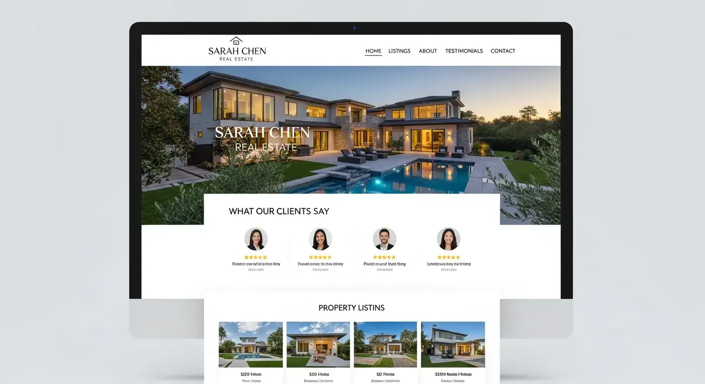
Deneene's site builds trust through testimonials and local expertise
This South Carolina realtor's site demonstrates how local service providers should present themselves online. Trust-building elements are front and center.
Design lessons:
- Property photography: High-quality images showcase listings effectively
- Testimonials prominent: Social proof builds credibility immediately
- Clear CTAs: "What's My Home Worth" and contact buttons are obvious
- Local connection: Community involvement and knowledge are highlighted
For real estate and local services, trust matters more than flashy design. This site prioritizes credibility through testimonials, professional photos, and clear communication.
Common Design Patterns Across Successful Canva Sites
After analyzing these 17 examples, several patterns emerge among the most effective sites:
Visual Hierarchy is Crucial
Every successful site guides your eye intentionally. Headlines are larger than body text. Important CTAs stand out through color or placement. Navigation is immediately obvious. This isn't accidental—it's deliberate design.
White Space Improves Impact
The best sites don't try to cram everything onto one screen. They use generous spacing around elements, making each component more impactful. White space isn't wasted space—it's strategic breathing room.
Mobile-First Thinking Wins
Sites that work beautifully on phones tend to work well on desktops too. The reverse isn't always true. The top-performing sites clearly prioritized mobile experience.
Photography Quality Matters
Professional photos elevate even simple designs. Conversely, poor images drag down sophisticated layouts. If you can only invest in one thing, make it photography.
Clear CTAs Drive Action
Every page should have an obvious next step. The best sites make it crystal clear what visitors should do—whether that's booking a service, viewing a portfolio, or making a purchase.
Brand Consistency Creates Trust
Successful sites maintain consistent colors, fonts, and imagery throughout. This consistency makes them feel professional and intentional, building visitor trust.
How to Apply These Lessons to Your Own Site
Looking at examples is helpful, but applying the lessons is what matters. Here's how to use what you've learned:
Start with Your Industry
Look at the examples most similar to your business. If you're opening a restaurant, study Berry and Brie and Resolve Philly. If you're a creative professional, examine the portfolio sites. Don't copy—learn from their strategic choices.
Identify Your Core Goal
What's the one thing you want visitors to do? For ecommerce sites, it's making a purchase. For service businesses, it's booking a consultation. For portfolios, it's viewing your work. Design everything around that primary goal.
Choose Templates Strategically
Canva's templates are starting points, not finished products. Pick one that matches your industry and content structure, then customize it to match your brand. Don't feel locked into the original design.
Invest in Quality Images
If you can't afford professional photography, use high-quality stock photos or learn basic photography yourself. Phone cameras are surprisingly capable with good lighting. Avoid low-resolution or generic stock images.
Test on Multiple Devices
View your site on phones, tablets, and desktops before publishing. What looks great on your computer might be cramped or awkward on a phone. Canva's preview feature makes this easy.
Get Feedback Before Launching
Show your site to people in your target audience. Ask specific questions: Can they find what they're looking for? Is the purpose clear? Does anything confuse them? Use their feedback to refine before going live.
Canva's Limitations and Alternatives
Canva is excellent for many use cases, but it has limitations worth understanding:
Where Canva Falls Short
- Limited customization: You can't edit the underlying code, restricting advanced customization
- SEO constraints: Basic SEO features compared to platforms like WordPress
- Scalability: Works great for simple sites, but complex ecommerce or membership sites need more robust platforms
- Custom functionality: Can't add custom features or integrations beyond what Canva provides
When to Consider Alternatives
If you need advanced ecommerce features, complex user accounts, or custom functionality, platforms like Shopify, WordPress, or Squarespace might serve you better. For simple, beautiful sites that you can build yourself, Canva excels.
If you want the ease of Canva but need more customization and AI-powered assistance, tools like Wegic offer conversational AI that helps you build more sophisticated sites without coding. It's worth exploring if you're outgrowing Canva but aren't ready for complex platforms.
Common Questions About Canva Websites
Can I use Canva for professional business websites?
Yes, especially for small businesses, portfolios, and service providers. Many of the examples in this article are professional business sites. However, for large ecommerce stores or sites requiring custom functionality, more robust platforms might be better.
Do Canva websites work well for SEO?
Canva provides basic SEO features (meta titles, descriptions, alt text), which is sufficient for local businesses and portfolios. For businesses heavily dependent on organic search traffic, WordPress or similar platforms offer more advanced SEO capabilities.
Can I use my own domain with Canva websites?
Yes, Canva Pro allows you to connect custom domains. Free accounts use Canva's domain structure. For professional sites, a custom domain is worth the Pro subscription.
How long does it take to build a Canva website?
With a template, you can have a basic site live in 1-3 hours. More complex sites with custom content, multiple pages, and refined design might take 1-2 days. This is significantly faster than traditional web development.
Can I export my Canva website to another platform?
Not directly. Canva websites live on Canva's platform. If you want to move to another platform later, you'll need to rebuild the site. This is worth considering if you think you'll outgrow Canva.
What's the difference between Canva free and Canva Pro for websites?
Pro unlocks premium templates, custom domains, brand kit features, and removes Canva branding. For professional use, Pro is worth the investment. Free works fine for personal projects or testing.
Start Building Your Site
These 17 examples demonstrate that effective website design isn't about complexity—it's about clarity, purpose, and understanding your audience. Whether you're showcasing a portfolio, selling products, or promoting services, the principles remain consistent: clear navigation, quality visuals, strategic white space, and obvious calls-to-action.
The best way to learn is by doing. Pick a Canva template similar to your needs, study the examples most relevant to your industry, and start building. You'll make mistakes, and that's fine—Canva makes it easy to iterate and improve.
Remember that your website is never truly "finished." The sites featured here likely went through multiple revisions before reaching their current state. Start with something functional, get it live, and refine based on real user feedback.
Your perfect website is waiting to be built. These examples show it's possible, regardless of your design experience or budget. Now it's your turn to create something worth showcasing.
撰寫者
Kimmy
發布於
Nov 4, 2025
分享文章
閱讀更多
我們的最新博客
Wegic 助你瞬間打造網頁!
透過 Wegic,利用先進的 AI 將你的需求轉化為驚艷且實用的網站
使用Wegic免費試用,一鍵建立你的網站!