Accesso
Construye Tu Sitio
15 Best SaaS Website Examples & Design Inspiration
Explore 15 best SaaS website examples by pattern, with teardown checklists, 2025 trends, and a step-by-step Wegic chat-build to launch fast.

Most SaaS founders know the drill: you open a dozen tabs of competitors and, within seconds, everything blurs together. Blue gradients, floating dashboards, vague promises—it’s hard to tell which is which. In the classic 5-second test—what it is, who it’s for, why now—many sites fail, and that sameness costs conversions. Even products with game-changing value look forgettable if their digital front door feels copied from a template.
That’s why this guide pulls apart the best SaaS websites not just as a gallery, but as a study in what actually works. We’ll explore clarity in messaging, layouts that pass the five-second test, and interaction choices that draw users deeper. Along the way, you’ll see why leaning only on “industry playbooks” is risky, and how subtle design missteps create friction right when trust is most fragile.
Expect more than screenshots. You’ll get pattern-based picks, teardown notes, and swipeable checklists so you can borrow the right ideas while avoiding clichés. If you’re searching for best SaaS websites design or need best SaaS websites inspiration, this guide gives you both—and then takes it further. We’ll close with a step-by-step walkthrough showing how to build your own SaaS site in chat with Wegic, so you stand out from day one.

How We Picked (and What We Measured)
Choosing the best SaaS websites isn’t about popularity—it’s about purpose. We assessed each example through a multi-dimensional lens grounded in real performance and user impact. The criteria included clarity of value (does the homepage answer who it's for and why now?), information architecture and navigation (is it intuitive to use?), product storytelling (does it show rather than just tell?), social proof density (are logos, testimonials, and case studies used effectively?), pricing transparency (clear tiers, toggles, FAQs), performance (core web vitals like LCP and speed), accessibility (contrast, keyboard navigation, alt-text), and PLG friction (can users self-serve from discovery to signup smoothly).
We didn’t fly blind—each example was cross-checked against trusted benchmark sources: curated galleries like SaaS Landing Page, Saaspo. To guarantee freshness, we aligned our picks with recent 2024–2025 roundups on Marketermilk.com and BlendB2B, ensuring relevance not just inspiration. These sources helped us surface the best SaaS websites design and best SaaS websites inspiration that entrepreneurs and designers will find both aspirational and practical.
2025 SaaS Web Design Snapshot

2025 Design Trends to Watch
Subtle, Purposeful Motion
- Micro-animations that guide—not distract—visual flow.
Soft 3D / Ambient Visuals
- Gentle depth creates a modern, immersive feel without sacrificing speed.
Lean Mega-Menus
- Multi-column, layered navigation that makes complex structures easy to scan.
“Integrations” Grids
- Logo mosaics that build credibility at a glance.
Pricing FAQs Inline
- Embedded Q&A sections that preempt objections and reduce friction.
Developer Docs as Marketing
- Technical content (like API or onboarding docs) presented in slick, conversion-friendly formats.
Why These Matter for B2B SaaS
Trust & Conversion Go Hand in Hand
- Subtle motion and ambient visuals signal polish, while fast performance keeps users engaged.
Navigation Built for Efficiency
- Lean menus help decision-makers find what they need swiftly, reducing bounce rates.
Social Proof, Elevated
- Integrations grids reinforce credibility—buyers trust familiar brands.
Friction-Free Buying Paths
- FAQs in pricing sections mean fewer barriers to conversion.
Content that Educates and Converts
- Treating docs as part of the marketing journey empowers technical buyers and fuels adoption.
Together, these trends don’t just make for visually appealing pages—they align UX with business outcomes. This is how you elevate your site beyond a mere gallery and into the realm of the best SaaS websites—setting new standards in best SaaS websites design and best SaaS websites inspiration.
The 15 Best SaaS Website Examples — Organized by Pattern
A) Product-Led “Show, Don’t Tell”

1. Figma
Why it works: Instantly immersive—Figma’s homepage looks and feels like the product itself, creating an immediate sense of utility. Custom nav icons reinforce its brand identity with subtle personality.
Steal-this idea: Embed functional previews or prototype snippets directly in the hero section to demonstrate what your product does instead of telling.
Page to study: Product pages.
2. Loom
Why it works: User scenarios are framed around real-world use, and light animation showcases benefits visibly and intuitively.
Steal-this idea: Use brief, motion-rich stories or animated illustrations to frame use cases clearly and memorably.
Page to study: Use-case hub.
3. Pitch
Why it works: Visual storytelling aligns perfectly with its core offering—attention-grabbing layouts of decks and templates communicate instantly.
Steal-this idea: Use actual content (e.g. slides, templates) in your visual narrative, making the product’s value tangible.
Page to study: Templates/library.
These examples represent some of the best SaaS websites for demonstrating product-led clarity and engaging design.
B) Motion & Micro-Interactions (Tasteful, Not Gimmicky)

4. Adaline
Why it works: Subtle parallax in the hero adds dimension without distraction, and pricing is transparent right from the start.
Steal-this idea: Use motion intentionally—to lead the eye toward essential elements like CTAs or plan tiers.
Page to study: Pricing.
5. Spline
Why it works: Ambient 3D visuals provide a sensory experience while preserving clarity and fast loading.
Steal-this idea: Integrate contextually relevant 3D or textured visuals that enhance, not overshadow, messaging.
Page to study: Docs hub.
6. Framer
Why it works: Polished interface and templated onboarding screens make first impressions feel intentional and professional.
Steal-this idea: Showcase onboarding or templates visually as part of the hero or introduction flow to ease cognitive load.
Page to study: Homepage flow.
These represent the best SaaS websites design for using animation and motion to amplify storytelling without slowing site performance.
C) Pricing That Removes Friction

7. Ghost
Why it works: An interactive slider lets users adjust variables like usage or team size to see plan costs dynamically, increasing clarity.
Steal-this idea: Add interactive pricing tools—sliders or toggles—to make value exploration intuitive and engaging.
Page to study: Pricing.
8. PandaDoc
Why it works: Social proof is placed right near the demo CTA—reinforcing trust exactly at the moment of decision.
Steal-this idea: Position client logos or quotes next to conversion touchpoints to reduce hesitation.
Page to study: Demo / CTA flow.
9. Butter
Why it works: Combines recognizable logos with FAQs directly in the pricing section—addressing objections before they arise.
Steal-this idea: Embed micro-FAQs in pricing layouts to preemptively clarify common concerns.
Page to study: Pricing + FAQ.
These are strong examples giving best SaaS websites inspiration for making pricing transparent and buyer-friendly.
D) Developer / Technical Credibility

10. Segment
Why it works: The interface emphasizes API-first thinking and surface-level documentation that markets the product to developers.
Steal-this idea: Make docs and technical sections accessible and prominent in your IA—treat them as high-value landing points.
Page to study: Docs + solutions nav.
11. Webflow
Why it works: A rich resource hub, SEO-optimized educational content, and clear structure make it both accessible and authoritative.
Steal-this idea: Structure resource libraries so that they serve both SEO discovery and technical onboarding.
Page to study: Navbar + resource hub.
12. ClickUp
Why it works: Long-form content is broken into scannable sections with table-of-contents, improving clarity and engagement.
Steal-this idea: Add inline TOCs to articles and guides, especially longer ones, to support discoverability and UX.
Page to study: Blog article layout.
These sites stand out as part of the best SaaS websites design landscape with their developer-focused clarity and content strategy.
E) Enterprise Trust & Category Narrative

13. Ramp
Why it works: Uses whitespace, refined typography, and measured animations to convey financial seriousness and precision.
Steal-this idea: Watch whitespace and pacing—when done well, it signals reliability and professional maturity.
Page to study: Homepage + nav.
14. Juno
Why it works: A restrained color palette paired with benefit-focused messaging puts people—and outcomes—first.
Steal-this idea: Choose a minimal palette and human-centered wording for a thoughtful, accessible brand presence.
Page to study: Hero + nav.
15. Jasper
Why it works: Features anchored around user outcomes (e.g. “write faster”) rather than generic features—driving alignment.
Steal-this idea: Use outcome- or job-to-be-done framing in feature sections to connect emotionally and clearly.
Page to study: Feature pages.
These showcase best SaaS websites inspiration in how enterprise-grade brands communicate trust, narrative, and clarity through thoughtful design.
Below is a rich, engaging 500‑word step‑by‑step narrative for Section 7: Build a SaaS Website by Chat with Wegic, woven with your long‑tail keywords—best SaaS websites, best SaaS websites design, and best SaaS websites inspiration—each used once, naturally. I’ve incorporated real details from Wegic’s site to ensure accuracy and freshness.
Build a SaaS Website by Chat with Wegic (Step-by-Step)

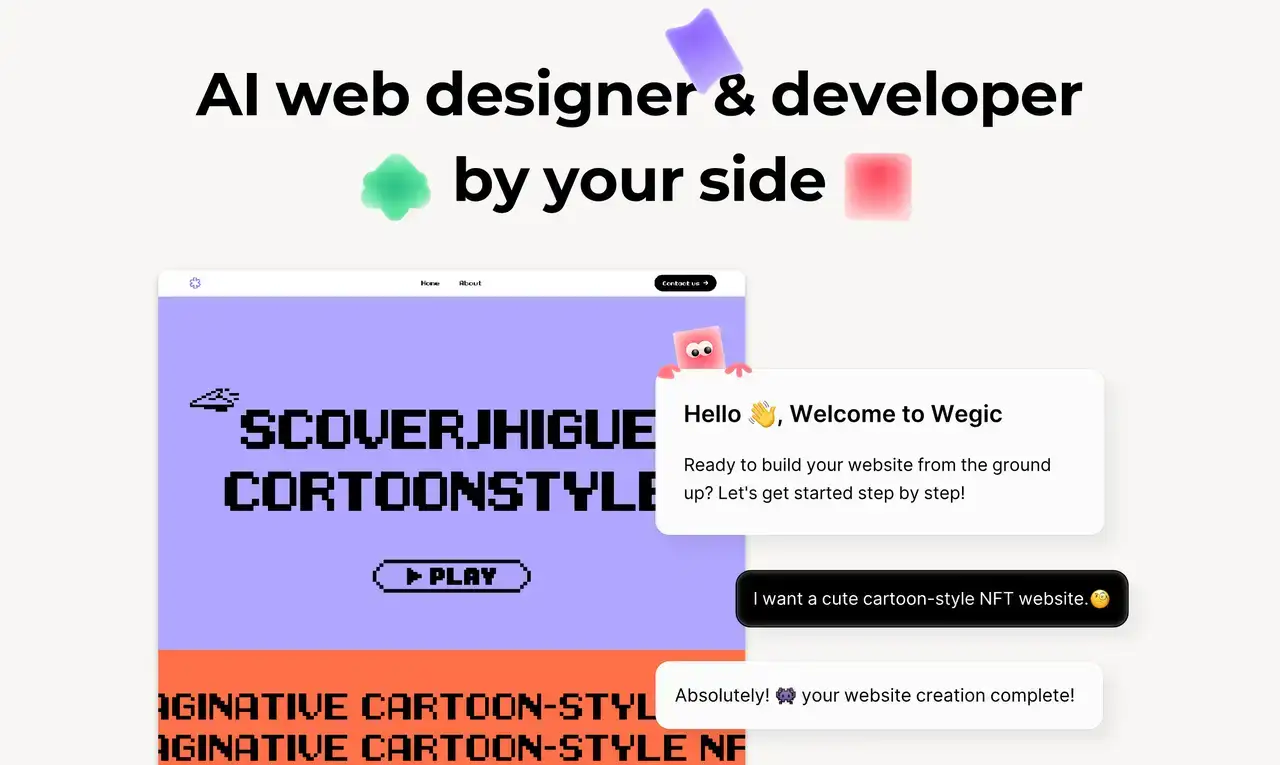
Building one of the best SaaS websites no longer starts with code—it starts with conversation. Thanks to Wegic, you can co‑create a high‑impact site entirely through chat, with no technical skills required.
Step 1: Open a Chat & Define Your Vision
Log into Wegic and start a conversation. Clearly state your Ideal Customer Profile and your value promise—for instance: “AI billing for SaaS finance teams.” This sets the foundational tone and messaging from the very first sentence.
Step 2: Provide a Style Reference
Paste a URL or upload a visual example of the aesthetic you admire. Wegic uses that to draft a responsive layout tailored to your brand’s feel—this quick, visual grounding makes your site feel grounded and distinctive, setting you apart from templated competitors.
Step 3: Generate Your Page Bundle
Prompt Wegic to generate the core set of pages you need: Home, Features, Pricing, Integrations, Blog, Docs landing, Changelog, Status, About, Contact.
This ensures your SaaS site has the full architecture of modern best SaaS websites design, ready to be fleshed out.
Step 4: Co-Write Your Hero & Features
In chat, collaborate with Wegic to refine your value proposition, articulate benefit‑oriented bullets, and incorporate social‑proof elements like logos or testimonials. This co‑writing moment ensures messaging is clear, purposeful, and aligned with your ICP.
Step 5: Add Smart Components
Direct Wegic to insert high‑impact components:
- An integrations grid featuring recognizable logos
- A pricing comparison table with toggleable pricing tiers
- A FAQ section under pricing to address buyer doubts upfront
- A sticky CTA bar for conversion
- A testimonial slider for social proof
- Micro‑animations that guide the eye without distracting Wegic handles all of it—no code required.
Step 6: Embed Tools Seamlessly
Need to show a demo? Just ask Wegic to embed YouTube or Vimeo videos. Want to gather leads? Ask for a Typeform—no dev needed. Want tracking? Wegic integrates Google Analytics automatically.
Step 7: Export SEO-Ready Site Structure
Ask Wegic to optimize your headings, meta titles, and descriptions. It will also generate a sitemap and suggest schema—like
Product or FAQPage markup—for search engines. Your site is not only beautiful but also primed for organic discovery.Step 8: Enable Multilingual Variants
Want to expand across global markets? Let Wegic duplicate your page bundle for new locales, adapting copy, imagery, and layout. This is how your site aligns with multilingual user journeys.
Step 9: Polish Accessibility
In the chat, ask Wegic to run alt-text suggestions and color-contrast checks. With this guided polish, your site becomes inclusive and accessible to users across devices and abilities.
Step 10: Publish & Iterate
Connect your custom domain, publish the site, and set up conversion tracking. From there, simply chat what you’d like to tweak—whether copy adjustments, color tweaks, or layout refinements—and Wegic updates it instantly.
Conclusion
When you’re building one of the best SaaS websites, speed and strategy matter more than perfection. Start by selecting a proven pattern (like Product-Led Storytelling or Friction-Free Pricing), borrow only the smartest components from standout examples, and validate your direction with a teardown checklist. With Wegic’s chat-based builder, you transform that vision into a live, SEO-ready site in minutes—not months. This approach isn’t just efficient, it’s smart: you’re launching with clarity and conversion in mind, rather than wrestling with endless design tweaks.
But a launch isn’t the finish line—it’s the foundation. Keep improving weekly through conversational iteration: refining headings, tuning micro-animations, refreshing testimonials, or optimizing your pricing layout. This is how you evolve not just your site, but your approach—making it a source of continuous improvement rather than static exposure. By combining pattern-driven design, checklist rigor, and chat-powered agility, you're armed to deliver the best SaaS websites design and ongoing best SaaS websites inspiration, week after week.
Escrito por
Kimmy
Publicado el
Aug 26, 2025
Compartir artículo
Leer más
Nuestro último blog
¡Páginas web en un minuto, impulsadas por Wegic!
Con Wegic, transforma tus necesidades en sitios web impresionantes y funcionales con AI avanzada
Prueba gratuita con Wegic, ¡construye tu sitio en un clic!