Accesso
Construye Tu Sitio
Best Font Styles for Modern Websites (Legibility + Aesthetics)
Discover the best font style for website design that blends legibility and aesthetics. Learn which modern fonts enhance readability, UX, and visual appeal in 2025 web design trends.
When people make a website, many will first think about color, pictures, and layout. But actually, font is also very important. A good font is not only good-looking, but also easy to read, good for reading a long time, and makes people feel comfortable.
Think about it: if a website uses a very fancy but hard-to-read font, people may want to close the page very fast. On the other hand, if the font is too simple, it may look like there is no design. Then, there is a question: how to choose a font that is both beautiful and easy to read?
This article is here to help you solve this problem. We will talk about font styles that many modern websites use, how to choose the right mix, and also look at which fonts are most popular in 2025. If you're curious how font choice fits into a full website design, you can also check out some of the best-designed websitesfor inspiration. No matter if you are a designer, a developer, or a beginner who just started making websites, you can find the idea of best font style for website here.
Are you ready? Let’s go into the world of fonts, so your website not only looks professional, but also makes people want to stay a few more minutes!
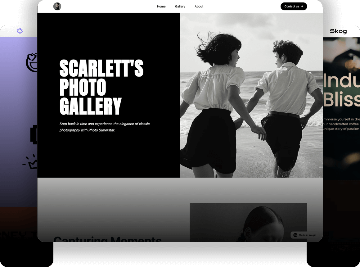
Click on the image to get more inspiration 👇
")
Why Font Style Matters in Modern Web Design
Why is font style so important in modern website design? The reason is simple: it directly affects the user experience.
Have you ever opened a website, but the words were too small or too fancy, and you couldn’t read them clearly? At that time, no matter how good the content is, you may not want to keep reading. The better the font readability is, the longer users stay. It also helps SEO. Search engines like websites that are easy to read.
Also, fonts can show the feeling of the brand. For example, a high-end brand uses an elegant serif font, and it feels more high-class than a random sans serif font. A creative website may like to use a different handwritten or geometric font. Different fonts bring different feelings.
One more thing — now many people use phones to go online. If the font looks messy or too small on a phone, it will make the experience worse. So when you choose a font, you also need to think about both desktop and mobile use.
Especially in the header part, font is very important. A strong and eye-catching header font can get people’s attention right away. So, finding the best font style for website header is really important.
Key Principles for Choosing the Best Font Style for Website
Choosing a website font is not just about picking one that looks good. There are some important rules to follow.
First is readability. There are two parts: one is if each letter is clear (Legibility), the other is if a full paragraph is easy to read (Readability). Some fonts look fine alone, but if you read a whole paragraph, your eyes get tired. Then it’s not a good choice.
Next is visual level. For example, the title should stand out, the body text should feel comfortable, and small tips should be low-key. If you choose fonts well, the whole page will look organized, not messy.
Another important point is consistency. Your website may open in Chrome, Safari, or Firefox, and people may see it on phones, tablets, or computers. A good font should look the same on all these. If not, it will look strange.
Last is loading speed. Font files also need to load. If they are too big, they make your website slow. You can use Web font compression tools, or only load the characters you need, to make it faster.
So, when you write website CSS and choose a font style, you should not only look at beauty. You need to think about whether the best font style for website CSS can be clear, well-organized, and fast. If you're building a portfolio site, for example, the right font can help highlight your work professionally—check out these portfolio website templates to see how font choice affects design.
Best Font Styles for Modern Websites in 2025
By 2025, choosing website fonts will be more careful than before. It’s not just for looking good, but also for being clear, fast, and matching the brand style. Now let’s look at some of the most popular font types.
- Sans-serif Fonts These fonts have simple lines, no extra decorations. They look clean and neat, and are very good for modern websites. They show clearly on screens, both on phones and computers. Good choices are: Inter, Open Sans, Lato, Helvetica Neue. If you want your website to look more modern and relaxed, this type is a good choice.
- Serif Fonts Serif fonts look more serious and are good for high-end or professional brands. They usually give people a feeling of tradition and trust. For example, law offices, schools, or luxury brands. Recommended fonts are: Merriweather, Georgia, Playfair Display. If you use them well, your website will feel more high-quality.
- Variable Fonts This is a popular font type in the past few years. One file has many weights and styles, so it keeps your design flexible and also saves loading time. It’s great for responsive websites. Recommended ones are: Roboto Flex, IBM Plex. If your website has a lot of content and you want it to load fast but still look good, this type is a great choice.
- Custom Web Fonts Want your brand to look more special? Then you can try custom fonts. They make your website look different from others. But be careful, the font file may be too big and slow down your site. Before using, remember to compress and improve performance.

In short, different font types have different uses. You need to choose the best one based on your website’s style, target users, and loading needs. In the end, the best font type for website is not just one answer. It is the one that fits your website the most.
Best Practices for Font Pairing
Font pairing is also a very important part of website design. Using only one font may be too boring, but using too many can look messy. So, the combination of main font + helper font is very important.
A good pairing can make the title more attractive, the body text more comfortable to read, and the whole style better. For example, you can use a stylish font for the title, like Playfair Display, and match it with a clean sans-serif font for the body, like Source Sans Pro. This kind of “has personality + easy to read” pairing is very common and popular.
Of course, there are also some mistakes to avoid. For example, if two fonts look too similar, there is no strong contrast, and the pairing has no meaning. Also, some fonts may look cool alone, but when you put them together, they don’t match well and make the website look less professional.
Also, you need to care about the font file format. Common web font formats are TTF, OTF, WOFF, and others. WOFF or WOFF2 is better for websites. They load fast and work well in different browsers. We can say this kind is the best font format for websites now, especially for websites that care about speed.
In short, font pairing is about contrast, unity, and matching your brand style. Don’t make it too complex. A simple pairing with good style is the key.
Try Wegic to Make Font Choices Easier
Choosing a font looks easy, but when you really do it, it can make you feel tired. You need to think about beauty, readability, loading speed, and brand style. Sometimes, the more you choose, the more confused you get. At this time, you can try some smart tools to help you feel less stressed.
Now, some AI tools can give you font and layout ideas for your website style by just a few simple sentences. Some can even help you make the first version of your website, and the font mix is already well done for you. For example, Wegic, which is popular now, is this kind of tool. It can make a design style for you based on your brand or website needs. Font choice is one part it thinks about.
Even though every website needs people to change the details later, using this kind of tool to start is a good way to save time. If you don’t know much about layout or design, this kind of platform can help you build a good base. Then, you can make it better step by step.

Choosing a font is important, but you don’t have to do it all by yourself. There are many useful tools now. If you use some smart help, your design work will be easier and have a better direction. Here is a comprehensive beginner's guide and Wegic web examples for your reference.
Common Mistakes to Avoid
When choosing fonts, many people make small mistakes. These mistakes can make your website look unprofessional, and even hurt the user experience.
First, too many fonts. Some people think using many fonts will make the design better. But it’s the opposite. Too many fonts make the page look messy. Usually, two fonts are enough — one for titles and one for body text.
Second, not thinking about responsive design. You may choose a good-looking font on a computer, but on a phone, the text becomes too small or too close. It is hard to read. So, when choosing a font, make sure it looks clear and easy to read on all devices.
Third, not thinking about loading. Many people use external font links, but forget that fonts also need to load. If the font does not load in time, the browser will show a default font first (this is called the FOUT problem). The page will flash, and it doesn’t look professional. You can fix this by using font preload or backup system fonts.
If you want to build a website that feels professional, the most important things are simple design, clear text, and font consistency. Find the best font style for professional website that fits your brand, and avoid these common mistakes. Then your website will feel more trustworthy and easier to use.
Conclusion
Now you should already know how important fonts are in website design. Fonts are not just for looking good — they also affect user experience, brand image, and even SEO performance. Whether someone stays on your page or leaves in a few seconds can sometimes come down to how easy your text is to read.
A good font style can make your website look more professional and easier to remember. It gives a clear first impression. But this doesn’t mean you must use a popular font or follow trends blindly. The most important thing is to find the style that fits your brand and that your target users will like. For example, if your brand is young and full of energy, you can choose a modern sans-serif font that feels fresh and friendly. If your website is about consulting, finance, or education, maybe a more serious serif font works better to build trust and authority.
So, there is no best font style for website. But you can choose the best one for your own needs. It all depends on what kind of feeling you want to give and who your users are.
Of course, the world of fonts is much bigger than this. There are thousands of options out there. You can keep exploring more font resources, like Google Fonts, Adobe Fonts, or try font pairing tools to find great combinations. Also, many graphic design websites offer visual inspiration on how fonts work in real branding cases. You can even use AI-powered website tools like Wegic to help you generate layouts and font styles that match your content and brand, especially if you’re short on time or design experience.
Remember this: if you choose the right font, your website is already half successful. It’s a small detail, but it makes a big difference.
Escrito por
Kimmy
Publicado el
Aug 11, 2025
Compartir artículo
Leer más
Nuestro último blog
¡Páginas web en un minuto, impulsadas por Wegic!
Con Wegic, transforma tus necesidades en sitios web impresionantes y funcionales con AI avanzada
Prueba gratuita con Wegic, ¡construye tu sitio en un clic!