Best 15+ Inspiring Yoga Website Examples
In this blog, you will find the best 15+ inspiring yoga website examples of 2024 and receive the help and valuable information granted by these websites to design your own fabulous internet home.
Hey, yoga enthusiast! If you are like me, then you are aware of what yoga is and how it has the potential to change our lives. By today’s standards, simply having a studio or class exclusive to teaching is rather insufficient. You require a good point-of-entry to the web that draws new students and lets people know what you are all about. Just picture using an eye-catching and appealing website to make people want to attend your classes; let alone have an intellectually appealing website.

If you are in a dilemma about how to design your uniquely differentiated yoga website, remember you are not the only one in this world. Most yoga instructors as well as owners of yoga studios share similar sentiments. This is why it is our pleasure to present you with this guide, where you will find the best 15+ yoga website examples of 2024. You will receive the help and valuable information granted by these websites to design your own fabulous internet home. By the end of this article, you will be armed with the right knowledge to start your yoga journey by developing the right website that appeals to the right audience. It is time to wade in and get ideas!
The Role of Design in Yoga Websites
A yoga website is an online location that helps you maintain your yoga practice and engage with your learners and fans while expanding your enterprise. It is not merely your ‘Hey You – Here is my telephone number/would you like my e-mail address?’ credit; your yoga website is an interactive and informative experience. There’s a vast and sole selection of yoga teachers, studio owners, and even online course creators, and having a sleek, visually appealing site is critical in today’s community.
Get the design of your yoga website right. It should portray yoga as a calming activity as well as affirm your brand’s personality. Simplicity and white/black are the primary colours of the room, which are perfect for maintaining a clean and serene environment. Your website should convey a sense of peace and relaxation, making visitors feel welcome and at ease from the moment they land on your page.
Photography is one of the key components that make it possible to receive this outcome. The targeted content is to show a group of people performing different yoga poses to prove the benefits of the practice, mainly to evoke an emotional response in the audience. These photos should be selected in the best way possible so that they represent the brand as it is. Do you practice sport yoga, or yoga for creating a strict and powerful body? Or is it a slower, more focused healing and relaxation service that you provide? Your photos should depict this story.
Key Elements of a Yoga Website

To make your yoga website effective, it needs to include several key elements:
- About Section: This is where it is your turn to tell your story. Tell your story of how you became a yogi, what your teaching style is, and what sets you apart from the rest. This section can assist in establishing rapport and gaining the visitors’ trust.
- Course Descriptions: Make sure to write specific details about the different yoga classes or the course offerings you have for the customers. The information that needs to be provided includes the kind of yoga and its degree of difficulty as well as what students stand to learn in the class. Be specific, and thus accurate about what is to be expected from a particular institution, so that when a student is choosing, at least they have a clear idea of what they are getting into.
- Class Schedule: Ensure that your class schedule is easy for visitors to locate. Regardless of the format of the class, whether it is face-to-face, fully online or hybrid, you need to make your schedule as clear as possible to read. Implementing the use of a booking system for easier organization of the rooms might be necessary.
- Teacher Profiles: If you have more than one instructor for an academic subject, then assign a particular section for the introduction of each of them. Emphasize their education, their work background, and how they approach their lessons. It creates credibility and then lets students look for a teacher they are comfortable with.
- Testimonials: Incorporation of success stories from your students can be very effective. Testimonials are real-life endorsements of your work, and using them can boost the chances of persuading more students to enroll in your classes. Ensure that these are real and that they come from different people.
- Educational Content: Animate your website with shareable blog articles, training videos, and other material that provide useful information about yoga. This makes you authoritative in that area and people will always check on your site for more information.
- Contact Information: Make sure that your contact information is not hard to locate. Include your address, phone number, email, and links to your social media profiles. This makes it simple for potential students to get in touch with you.
- Online Payment Options: Make registration easier by including the payments that are facilitated online. If you provide classes online or if you have downloadable content, then this is especially important. It just makes overall use more fluent and more professional.
- Shop Page: You should centre this on your site if you deal with products such as mats, clothing or accessories with labelling to do with yoga. This has the added benefit of creating more income but also improves the visitors’ experience of your establishment.
Best 15+ Inspiring Yoga Website Examples
Alo Moves
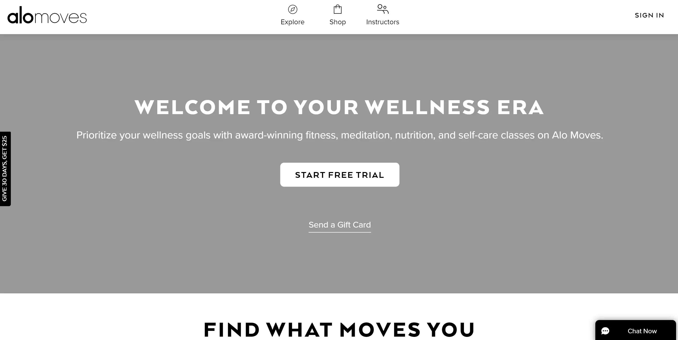
Alo Moves stands out among yoga websites with its eye-catching video background on the homepage, making the subscription yoga service appear modern and unique. The entire website boasts a high-tech and advanced aesthetic, setting it apart from other yoga websites. This modern design, especially with the incorporation of video backgrounds, can significantly differentiate your yoga website, making it both attractive and engaging for visitors.
Dylan Werner
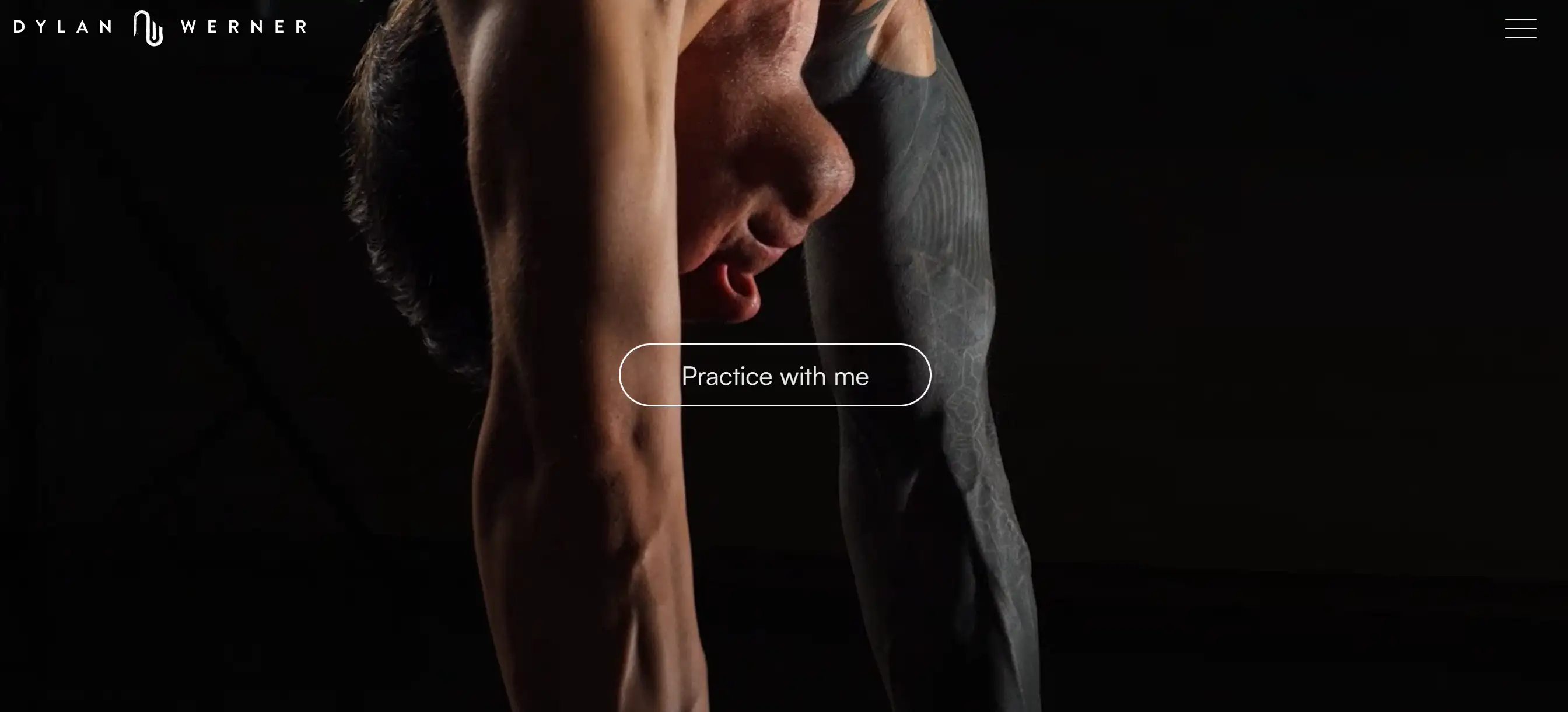
Dylan Werner's yoga website is a fantastic example of a yoga website that caters specifically to males. While the yoga industry has traditionally targeted women, Dylan’s site features a darker theme and focuses on offering retreats as he travels the world. This unique approach makes his yoga website appealing to a broader audience, particularly men looking for tailored yoga experiences.
Natural Living

The Natural Living Yoga studio’s website offers a comprehensive range of services, including Pilates, a health clinic, and support for smokers trying to quit. Their courses are diverse, covering yoga for pregnancy, special evening wind-down sessions, and general yoga for all. This variety makes their yoga website a valuable resource for individuals seeking holistic wellness solutions.
CorePower Yoga
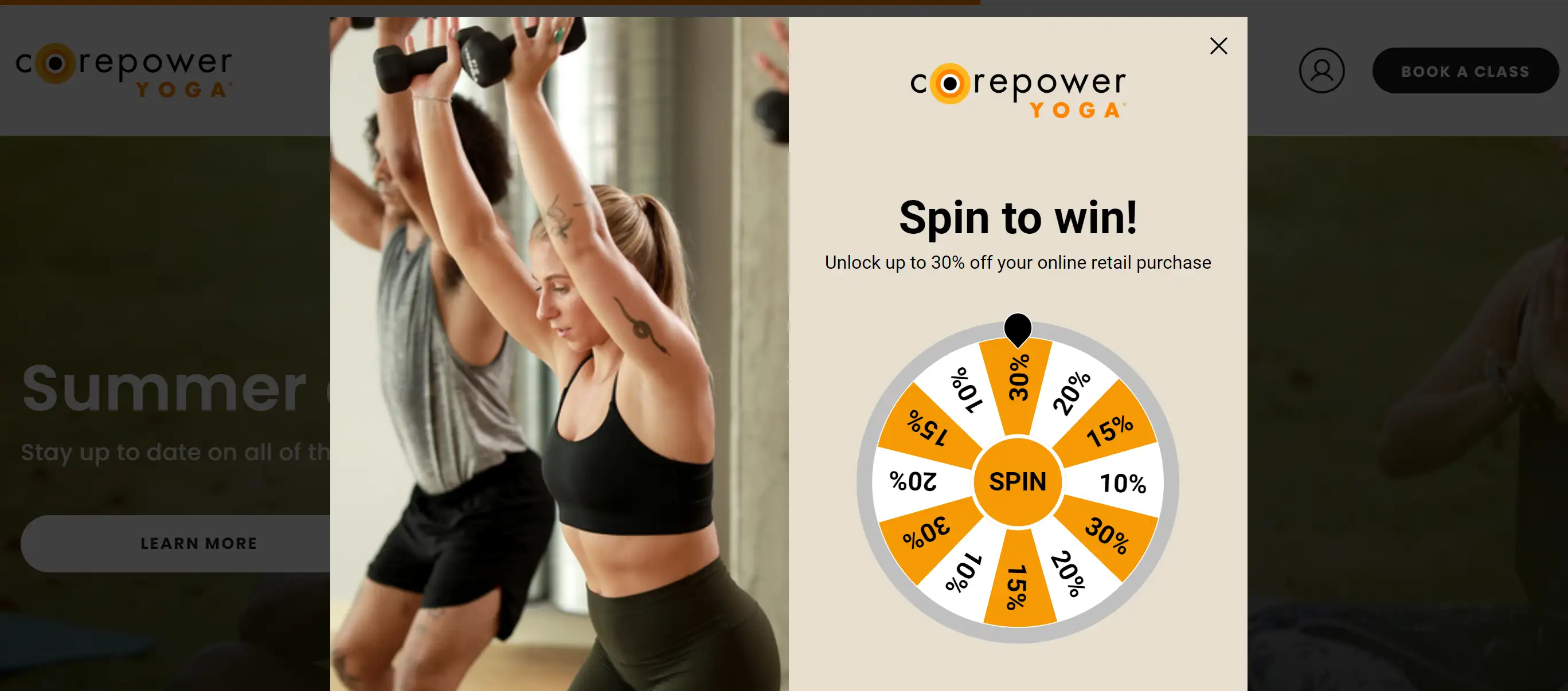
CorePower Yoga, with over 200 studios across the United States, showcases a bright orange and black design on their yoga website, giving it an electric energy. Unique to their site is the utilization of a chat app, setting them apart from most competitors. This feature allows them to answer new clients’ questions promptly, gather more customer information, and capitalize on impulse buying decisions, making their yoga website highly interactive and user-friendly.
Elena Brower
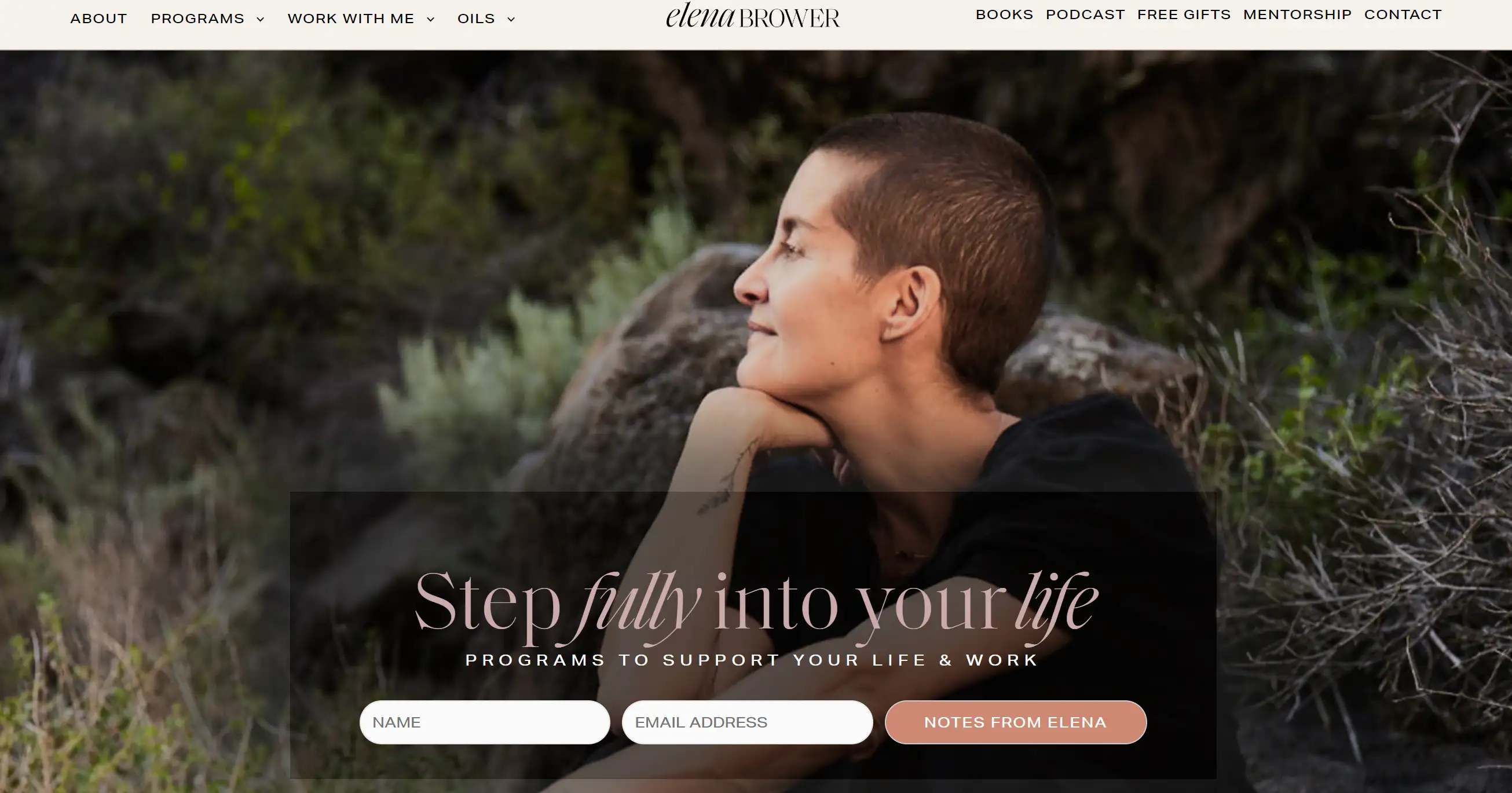
Elena Brower's yoga website serves as a hub for her multiple businesses. Visitors can access links to her books, meditation and yoga classes, and podcasts, as well as subscribe to her membership program. This multifaceted approach makes her yoga website a versatile platform for those interested in a holistic yoga experience and personal growth.
Seven Senses
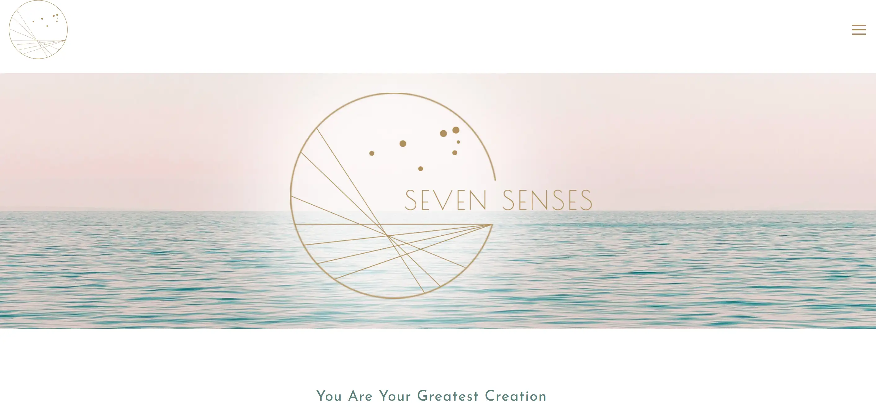
Dr. Erica Matluck’s yoga website highlights her global recognition as a Doctor of Naturopathic Medicine. Her practice focuses on healing through yoga, meditation, and energies, offering classes, retreats, and programs that aim for a personalized experience. This approach ensures that her yoga website caters to individuals seeking a holistic and tailored wellness journey.
Boho Beautiful

Boho Beautiful’s mantra, "Your decisions today will define your tomorrow," drives its unique yoga website, which extends beyond yoga to encompass a developing travel brand. This site inspires a positive long-term outlook on the mind, body, and planet, making it more than just a yoga website—it’s a platform for holistic wellness and positive living.
Yoga with Adriene

Adriene Mishler’s yoga website, designed for yoga enthusiasts, features free yoga videos, a calendar, courses, a blog page, and social media links. The homepage includes a strategic video directing visitors to her YouTube channel, showcasing a clever way to monetize her content. This integration makes her yoga website both functional and profitable, providing a comprehensive yoga experience for her followers.
Dr. Anna Roth

Dr. Anna Roth’s yoga website combines her expertise as a licensed psychologist and yoga instructor. Her practice emphasizes the importance of yoga in mental health, offering one-on-one services, workshops, and more. This dual focus on mental health and yoga makes her yoga website a unique resource for individuals seeking a holistic approach to wellness.
Love Light Yoga

Love Light Yoga specializes in “yin” yoga, a slower-paced form that incorporates elements of traditional Chinese medicine. Their yoga website features virtual classes, a “yin school” membership program, customized programs, and other projects. This variety of offerings makes their yoga website a valuable model for studios looking to provide diverse and specialized yoga experiences.
Kino Macgegor

Kino MacGregor’s yoga website offers a taste of the tropics, with a beachy theme that evokes the ocean and the tropics. This yoga website stands out with its playful use of pastel colors and stunning yoga poses. Users can easily navigate through her calendar of events, blog posts, and online shop. The straightforward design ensures that visitors can effortlessly find information on classes, schedules, and events, making it a prime example of user-friendly yoga websites.
Black Swan Yoga
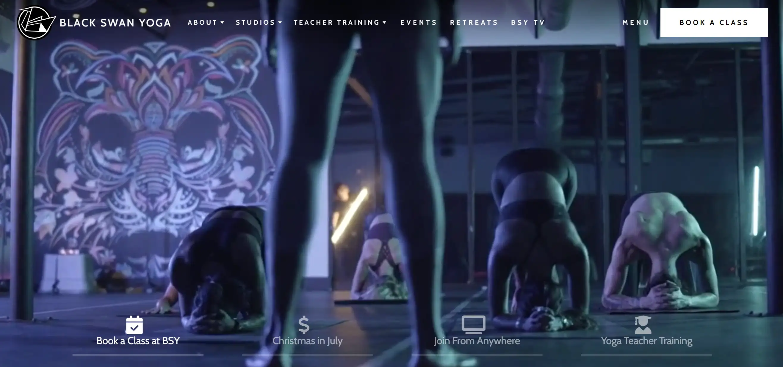
The Black Swan Yoga Studio’s website serves multiple locations across Texas, offering a unique yoga experience in facilities maintained at 90 degrees for detoxification. This yoga website caters to both beginners and advanced practitioners, with classes designed for building power and strength as well as relaxation. The clear structure and detailed class descriptions make it a standout among yoga websites, appealing to a wide range of yoga enthusiasts.
Hoboken Yogi

Jill Stout, also known as Hoboken Yogi, supports individuals in their yoga journeys across northern New Jersey. Her yoga website features a clean design with engaging elements such as a locomotive scroll, micro-interactions, hero-loading animation, and lazy loading. Offering group and private classes in HOT, restorative, and pre-and post-natal yoga, her site ensures a seamless and visually appealing user experience, making it one of the more dynamic yoga websites.
Marcel Hosl

Holistic Bodywork by Marcel offers a unique approach to movement by combining massage tactics with yoga practices. His yoga website highlights ancient methods, including Thai Yoga Massage, showcasing how these techniques benefit both the body and mind. This holistic approach makes his site stand out among yoga websites, providing users with a comprehensive view of his unique services.
Power Yoga
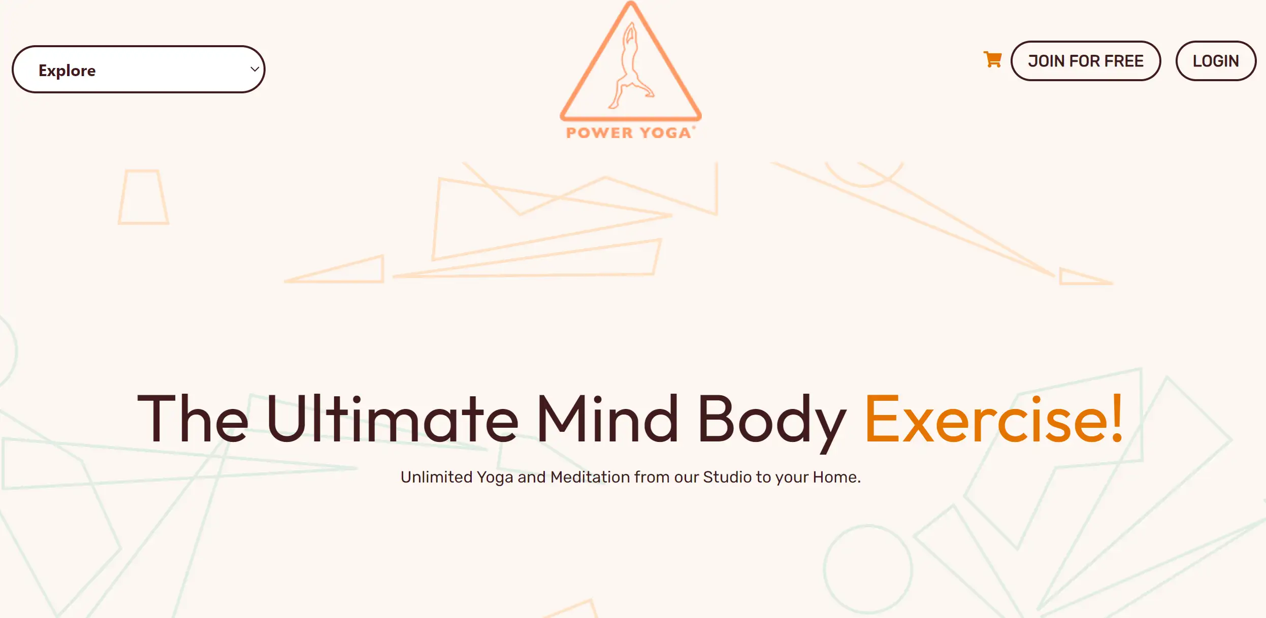
Power Yoga’s online service offers a variety of courses available as recurring classes or single sessions. These courses focus on different aspects of yoga, including lower and upper back, core yoga, and morning yoga practice. Each instructor has a dedicated biography page, adding a personal touch to the yoga website. This detailed and structured approach makes Power Yoga’s site a comprehensive resource for online yoga classes, distinguishing it from other yoga websites.
Patrick Beach
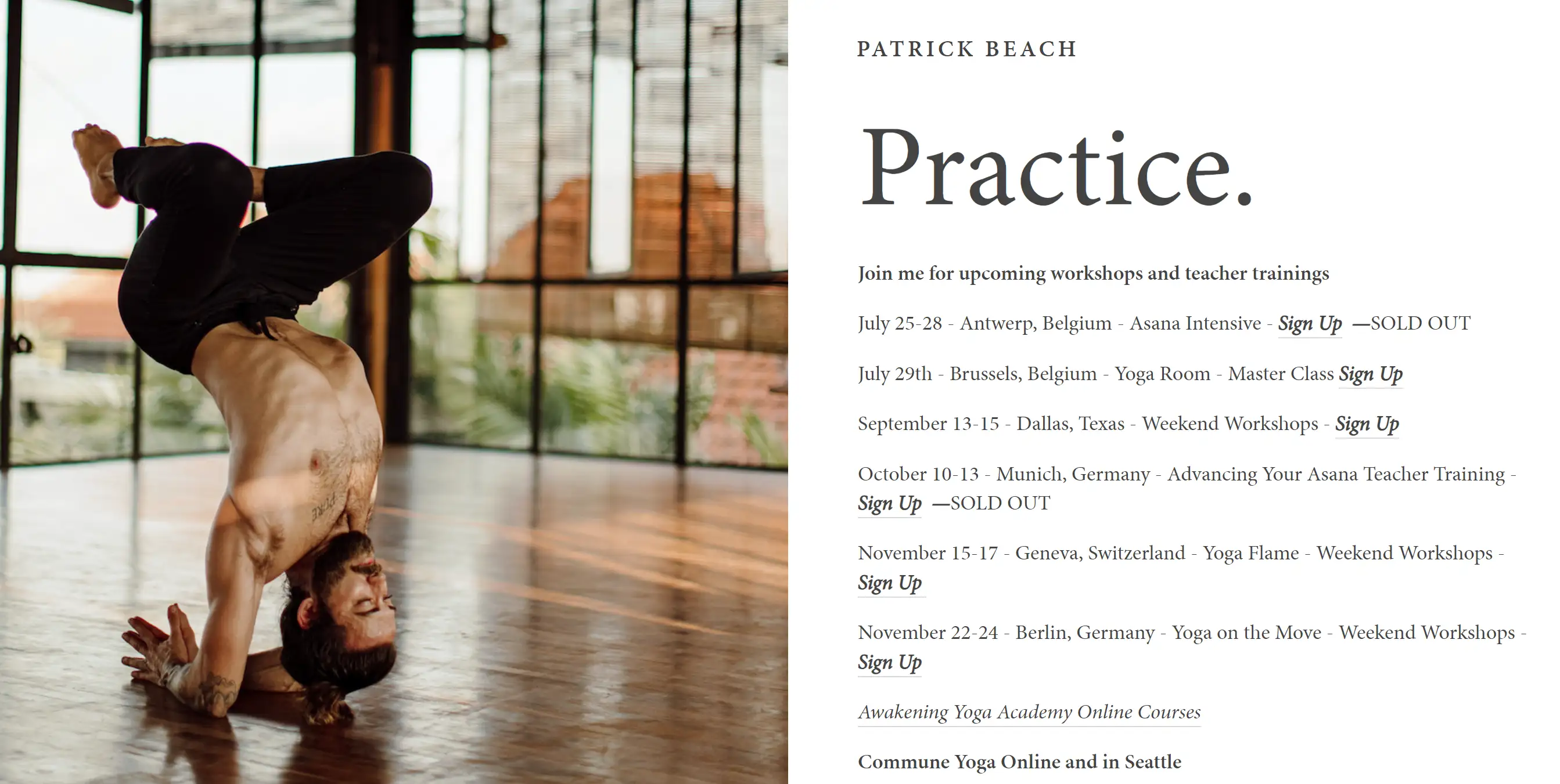
Patrick’s yoga website features a clean and modern design that effectively uses feature boxes to direct visitors to the most relevant content. The site guides users to his yoga workshops, meditation guides, and online yoga classes with concise and to-the-point copy. This user-friendly design ensures that visitors can easily find what they are looking for, making it one of the most efficient yoga websites in terms of navigation and usability.
Discover Powerful Tips to Enhance Your Yoga Website

Building an active yoga website is not an easy task, It just starts with developing a cool website. To attract even more people, you should employ activities that make your site even more noticeable and/or interesting. Below are some useful strategies that can assist you in promoting your yoga website to get more students for yoga.
Optimize for Search Engines
To increase your visibility it is essential to hire a professional Search Engine Optimization (SEO) service. Begin with the keyword that relates them to yoga and the services that you offer so that they can find their way through the website. This concerns the title of your page, meta tag description, headings and the actual textual content of your page. For example, keywords such as; online yoga classes, yoga teacher training, and yoga studio near me will get you a better ranking.
Also, make sure the website is also friendly to mobile devices if the business has one. Another important aspect to consider when designing a website is the rising number of visits made through technologies connected to the World Wide Web from portable devices, this is why a website layout should be responsive, meaning that it should correspond to a range of sizes and shapes of the screens of the devices which the visitor is using. Also, during mobile-first indexing, if a site is not mobile-optimized and friendly enough for it, then be prepared for your site to suffer from a ranking perspective as well.
Create Engaging Content
Indeed, content is the king in this sense with references to the need to attract and maintain visitors. Fresh and interesting blog entries and articles, as well as tutorial videos about yoga, bring new users and keep them interested. Broadcast relevant content like yoga tips, different tutorials and outcomes of various kinds of yoga. This not only makes you an expert in the field in the eyes of the viewers but also makes the viewers dwell longer on your site. Perhaps it will be useful to have something like a blog where you discuss different topics connected with yoga. You can also post video content, such as yoga routines, class previews, or interviews with other instructors. Rich, engaging content can increase the likelihood of your site being shared on social media, further boosting your exposure.
Leverage Social Media
Social networks are effective means to bring traffic to your website. It becomes advisable to create accounts on some of the primary social media platforms which include Instagram, Facebook, and Twitter, and post content that directs users to the website. Convey a short part of your classes, a powerful message, or a sneak peek into your practice extra. Interacting with the fans on social media platforms assists in the building of a community around the brand hence, increasing traffic to the site.
Advertise on social media since they provide a wider coverage to the client. Choose Individuals by their interests in services and geography to guarantee your appear to the persons of interest. Advertisement campaigns can also be employed to help save costs of marketing and yet help in making a school popular with the target group of students.
Avail Yourself of Email Marketing
Direct or e-mail marketing still provides one of the best ways to keep the audience up-to-date. Gather an email list through your Yoga enthusiasts by providing them with useful tips about Yoga, free downloadable material or a one-time offer on your classes. The newsletters can also remind your subscribers of new class events or new posts on the blog. Newsletters can also make your students feel special and this will make them come back to your site again and again. Make your emails clean in design with prominent links and make sure to come up with clear CTA’s that guide subrecipients to your websites. 1 The best subject lines and content formats should be established using A/B testing to chop higher open and click-through rates.
Collaborate with Influencers
This comes as a way of ensuring that your website gains a lot of traffic, especially from the yoga community influencers. Finally, for the actual collaboration, you can identify yoga bloggers social media influencers and yoga instructors who are sympathetic to your brand’s cause. They can share your website through guest posts social media sharing or any other project that relates to your website. If an influencer has a vast following, then it means your brand will be seen by more people and the approval from the influencer and his audience makes your brand more believable. Search for bloggers that have an active audience and who have similar values as you do.
Encourage User Reviews and Testimonials
It should also be noted that the addition of positive comments and impressions from other people significantly improves the trust in your internet resource. Remind your students to write about your school on the webpage or write comments where potential clients may read them, for instance, Google My Business or Yelp. It is recommended to place these testimonials in a highly visible and accessible area to increase new student confidence. Try to encourage your current students to write the reviews by giving them some sort of a reward something like a discount on the next class they are going to take or some free product or eBook. Real comments from other satisfied clients are also effective at convincing first-time visitors to join as well.
Use Analytics to Monitor Performance
Always review your site statistics to assess areas that you need to focus on and perfect parts. From the sources, which include Google Analytics, one can determine visitors’ behaviour, traffic source, and conversion rates. Utilise this data to fine-tune these approaches and improvements to add value to the efficiency of your website. Track specific indicators consisting of the number of views, visitors’ engagement levels (bouncing rates), and time spent on the page. Familiarization with these metrics is useful in other content-related activities such as design or indeed marketing.
Keep it Fresh
Same as when you are preparing your studio for students, your website should attract people’s attention and make them interested and eager to know more. Make your site aesthetically pleasing with soft colours, good graphic designs and other related images and other quality content that people would like to stay on the site and read through. Just do not forget that your website should be developed as a living dynamic thing. Fresh content must be posted now and then, with class schedules, and new photos. This is not only crucial for keeping the existing students knowledgeable but also presents the prospects with evidence of your work’s present relevance. A website is the face of a yoga business and having a current and active one portrays a healthy and busy yoga practice.
With the help of the above-mentioned strategies, you will be able to ensure increased visits of targeted audiences on your yoga website, and therefore the growth of your business. Concentrate on the quality and relevance of the content, on SEO, and on the audience to gain popularity and a customer base online.
Enhance Your Yoga Website with Wegic
So, as we have come to the end of our tour of the 15+ best yoga website examples for 2024, I trust you are charged with the energy to design your spectacular yoga website. Yoga needs no introduction and creating a website, for it is not just about having a virtual shop; it is a marketing portfolio that defines you and your practice. Incorporating the elements that have been covered, along with a little look at the leaders in design, you can come up with a beautiful and efficient website for your business.
So what are you waiting for, to take your next step? If you are interested in creating your perfect yoga site that will reflect the spirit of your practice, here’s the place. At Wegic, we understand that involving you in the creation and launching of a great website is as inspiring as your journey to the practice of yoga. This AI colleague will help you through the entire ordering process, guaranteeing the site meets your objectives.

Do not put it off any longer – be a part of Wegic now and let your idea turn into reality. Take a tour of our tools so you can get an idea of how easy it is to establish a yoga website that stands out from all the rest. To expand your knowledge and start cooperating with Wegic, click here now!
Written by
Kimmy
Published on
Aug 2, 2024
Share article
Read more
Our latest blog
Webpages in a minute, powered by Wegic!
With Wegic, transform your needs into stunning, functional websites with advanced AI
Free trial with Wegic, build your site in a click!