11 Inspiring Contact Us Page Designs We Love for 2025
Take a look at 11 inspiring 'Contact Us' page designs for 2025 that enhance user engagement and drive conversions. Explore trends, tips, and best practices to elevate your website's communication.
You’re on a website, eager to get in touch with a business that piqued your interest. You click on the “Contact Us” page, only to be met with a cluttered layout, confusing forms, and no clear instructions. Frustration sets in as you wonder if your inquiry will ever reach someone who can help.
It’s a scenario many of us have faced, and it highlights just how crucial a well-designed "Contact Us" page is.
A thoughtfully crafted contact page not only makes it easy for users to reach out, but it also builds trust and enhances the overall user experience. In this world where first impressions matter—especially when it comes to communication, a seamless contact experience can significantly boost conversions, turning curious visitors into loyal customers.
Sit down and explore 11 inspiring "Contact Us" page designs that stand out for 2025 with Wegic. Each example showcases innovative layouts, creative elements, and best practices that enhance user engagement. Whether you're a web designer, a business owner, or simply curious about effective design, you’ll find plenty of inspiration and actionable tips to elevate your own contact page. Let’s dive in and transform that often-overlooked section of your website into a powerful communication tool!
Inspiring Contact Us Page Design in 2025: Importance
The "Contact Us" page, more often than not, is an underappreciated part of a website, yet it plays a pivotal role in establishing trust and fostering communication between businesses and their customers. When users navigate to this page, they are typically seeking assistance, information, or a connection. A well-designed contact page not only meets these needs but also reassures visitors that they are valued and their inquiries will be taken seriously.
Research shows that 44% of website visitors abandon a page if there’s no clear way to contact the business, underscoring the importance of having a user-friendly contact page. When users encounter barriers—such as complex forms, unclear instructions, or a lack of options for communication—they are more likely to leave without taking action. Conversely, a straightforward, inviting contact page can encourage visitors to reach out, increasing the chances of conversion.
Moreover, studies reveal that timely responses to inquiries can significantly impact customer satisfaction. According to a report by HubSpot, 82% of customers expect an immediate response when they have a question about sales. Failing to provide prompt communication can lead to missed opportunities and, ultimately, lost revenue.
Businesses investing in a thoughtfully designed "Contact Us" page can not only facilitate communication but also cultivate a sense of trust and reliability. When visitors see a clear path to get in touch—whether through a simple form, an email address, or even a live chat option—they feel more confident in engaging with the brand.
In essence, the "Contact Us" page is not just a formality; it’s a crucial touchpoint in the customer journey. By prioritizing its design and functionality, businesses can foster meaningful connections, enhance user experience, and drive conversions—all essential components of success in the digital landscape.
Key Takeaway:
- A well-designed contact page builds trust by valuing visitor inquiries.
- Clear options can prevent 44% of users from abandoning the page.
- Timely responses boost customer satisfaction and engagement.
- A functional contact page enhances connections and drives conversions.
Inspiring Contact Us Page Design in 2025: Best Practices
Define User Expectations
It’s essential to let visitors know exactly what your contact form is for and how they can expect to be contacted. For example, include a message like, “We’ll respond within 24 hours, and one of our friendly team members will be in touch!” This transparency not only reassures users but also builds trust. According to studies, 70% of consumers prefer knowing when they will receive a response, so this simple practice can significantly enhance user satisfaction.
Eliminate Unnecessary Things
Your contact page should be straightforward and focused. Avoid overwhelming visitors with excessive information or unrelated details. Instead, keep the messaging concise and to the point. For instance, rather than a lengthy introduction, you might say, “We’re here to help! Fill out the form below, and we’ll get back to you shortly.”, which respects users’ time and keeps their attention where it matters most.
Ask for Only Essential Information
Streamlining your form is key to a positive user experience. Focus on collecting only the information necessary to address the inquiry. For example, if someone is reaching out for customer support, consider asking just for their name, email, and a brief description of their issue, which speeds up the form-filling process and also makes users feel more at ease, reducing any anxiety about sharing personal details.
Provide Diverse Ways to Connect
Recognize that your audience has different preferences when it comes to communication. Some may prefer a quick phone call or a live chat option rather than filling out a form. Offering a variety of contact methods, such as an email address, phone number, and live chat link, allows users to choose what suits them best. This flexibility not only enhances user experience but can also lead to higher conversion rates, as users are more likely to reach out if they feel comfortable with their chosen method.
Inspiring Contact Us Page Design in 2025: Design Gallery
1. Wegic
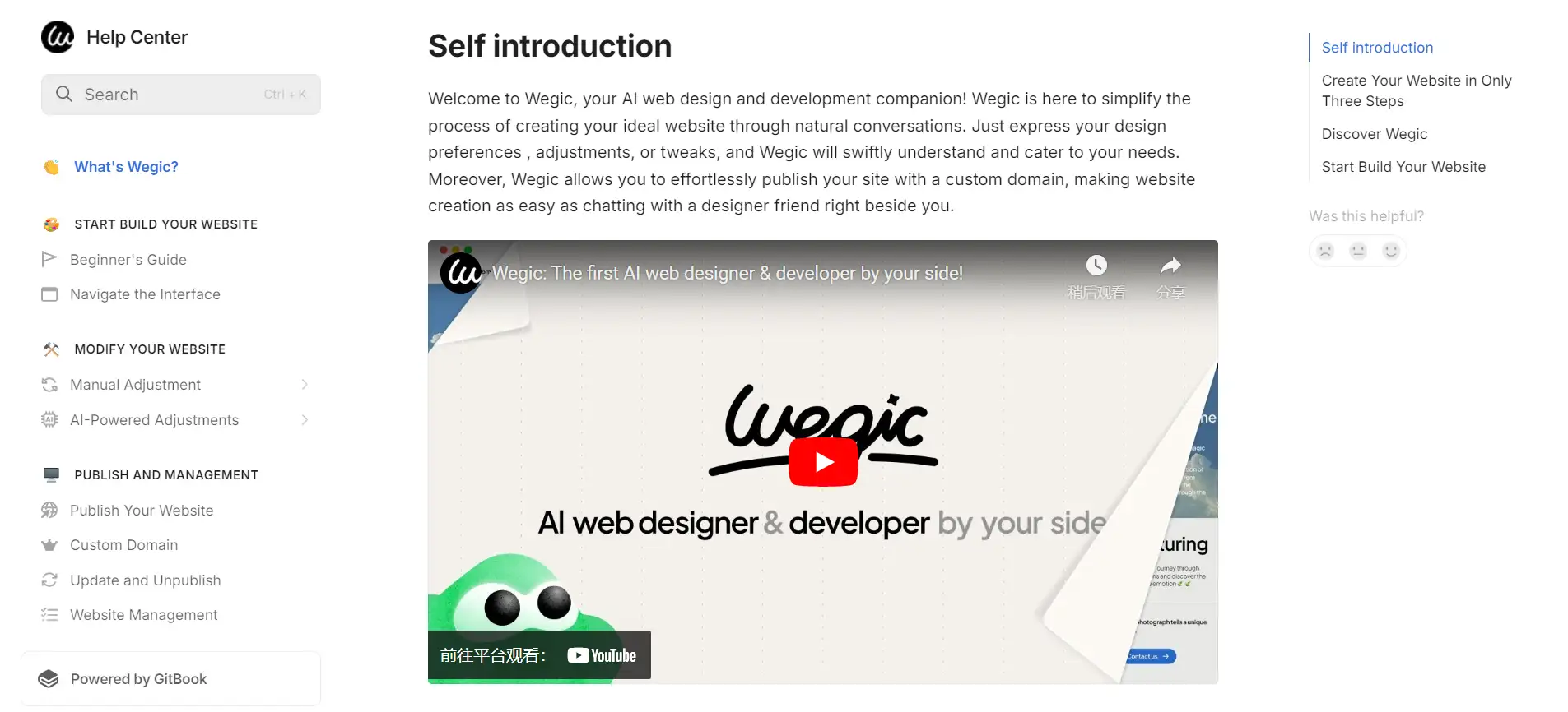
Wegic's Help Centerstands out as an invaluable resource for users looking for guidance on their conversational-AI-assisted website-building tool. The intuitive layout ensures easy navigation, featuring a rich collection of articles, FAQs, and step-by-step guides tailored for both beginners and seasoned users. Visual aids are incorporated throughout, helping to clarify complex concepts and making them more digestible.
Moreover, the Help Center doubles as a contact page, providing users with options for personalized support, including social media channels. Overall, it functions as a comprehensive support hub that aligns perfectly with Wegic's mission to streamline web design processes.
- Key Takeaway: A well-structured support center can significantly enhance user experience by offering clear resources and personalized assistance, making it easier for users to engage with your tools effectively.
2: Berry Insurance
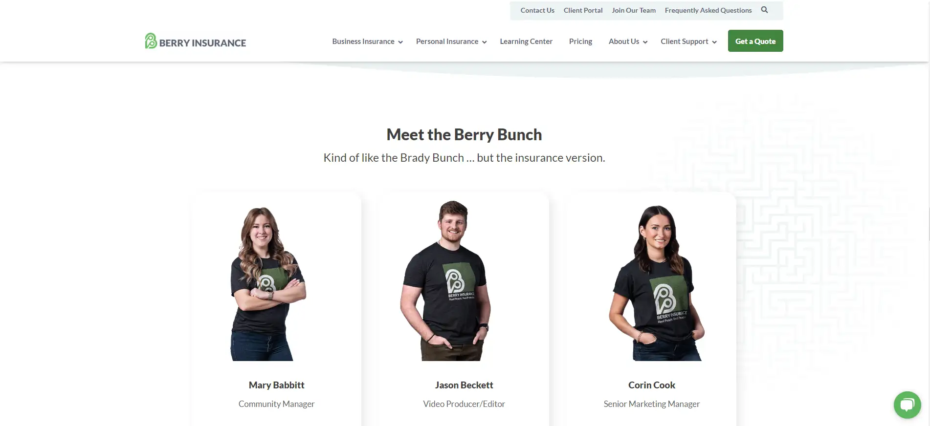
Berry Insurance's contact page excels by showcasing authentic images of their team in their actual office, creating a warm and inviting atmosphere. It offers multiple communication options—form, live chat, phone, or email—catering to various user preferences. Clear expectations for response times are provided, along with detailed driving directions to their office, including landmarks to assist visitors.
Additionally, the page lists team members with photos, allowing users to connect directly with specific individuals, fostering trust and personalization.
- Key Takeaway: Don’t hesitate to display your team information; enabling direct connections enhances user experience and builds rapport.
3: Stripe
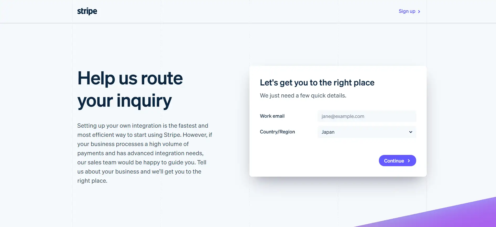
Stripe’s contact page effectively ticks many boxes for success, featuring a clean design that clearly communicates how to get in touch with their team. The warm and friendly tone of the content creates a welcoming environment for visitors.
What stands out most is the strategic placement of logos from companies that utilize Stripe’s services, positioned right next to the contact form. This social proof instills confidence, prompting visitors to think, “If these reputable companies trust Stripe, why shouldn’t I?” However, the page could improve by providing more contact options, as it currently lacks visible location details and phone numbers.
- Key Takeaway: Social proof is incredibly powerful—if you have it, showcase it! Including elements that build trust near conversion points can significantly enhance user confidence.
4: Hootsuite
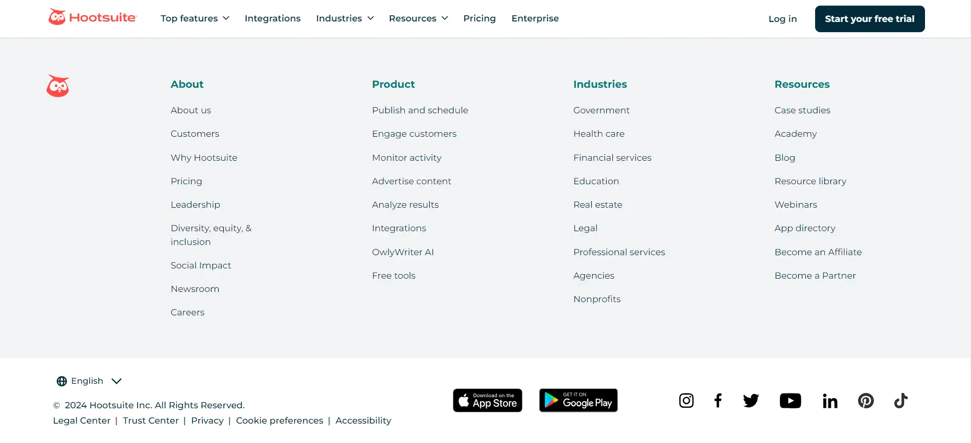
Hootsuite has streamlined the process of reaching out on their contact page, making it exceptionally user-friendly. The page opens with a straightforward sales form, catering to those looking to make inquiries about their services. To accommodate various user needs, alternative options for connection, such as links to social media and their help center, are conveniently located beside the form.
Additionally, Hootsuite lists all of their international offices, allowing users to connect with representatives closer to their location. While the emphasis on sales is evident, it would be beneficial for support options to hold equal importance, providing users with a clear either/or choice for their inquiries.
- Key Takeaway: If your contact page serves multiple purposes, ensure users have ample options and avoid limiting them to a single standard form. This flexibility can greatly enhance user experience.
5: HubSpot
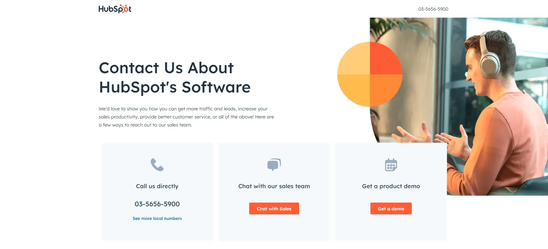
hubspot contact page with options to call chat demoHubSpot’s contact page stands out by empowering users to opt for their preferred way, facilitating quick access to the answers they seek. As they navigate down the page, visitors can easily find local phone numbers for HubSpot's domestic and international offices, along with detailed driving directions to the nearest headquarters—an excellent feature for those preferring face-to-face assistance.
A live chat option is also available, allowing users to engage in real-time conversations if they require immediate help. However, to further enhance usability, it would be beneficial to incorporate jump links organized by global regions. This addition would streamline navigation, guiding users to the most relevant information based on their location.
- Key Takeaway: When designing your contact page, consider geographical relevance. Making it simple for users to connect with resources in their area is essential for delivering effective support.
6: InVision
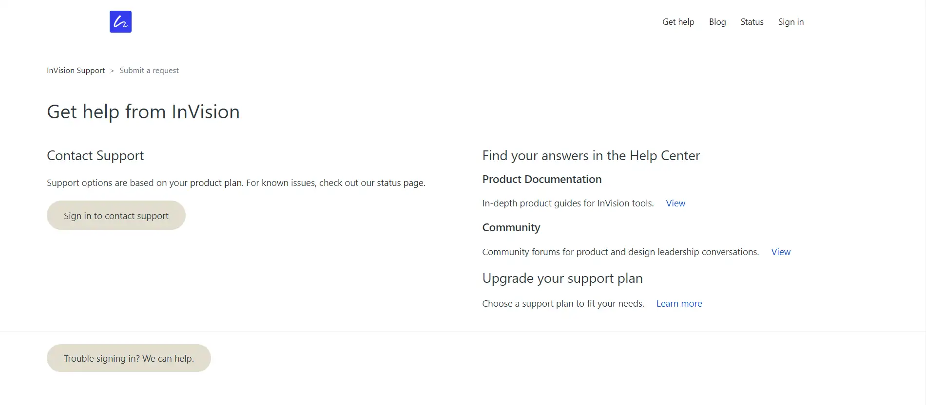
Previously, InVision’s contact page was integrated into a larger company site, offering a wide array of information that users might seek. However, they have recently shifted to a more streamlined, standalone contact page. This new design features a form where users can select specific topics related to their inquiries. While this approach aims to guide users to the appropriate resources, the redirect to the new page can be sluggish, causing potential confusion as users might start filling out the form only to be redirected without any visual warning.
- Key Takeaway: Simplifying your contact page can enhance usability, but don’t sacrifice essential information. Aim for a balance by using effective contact page design ideas that ensure clarity while minimizing unnecessary redirects for a better user experience.
7: Zeroqode Development Contact Page
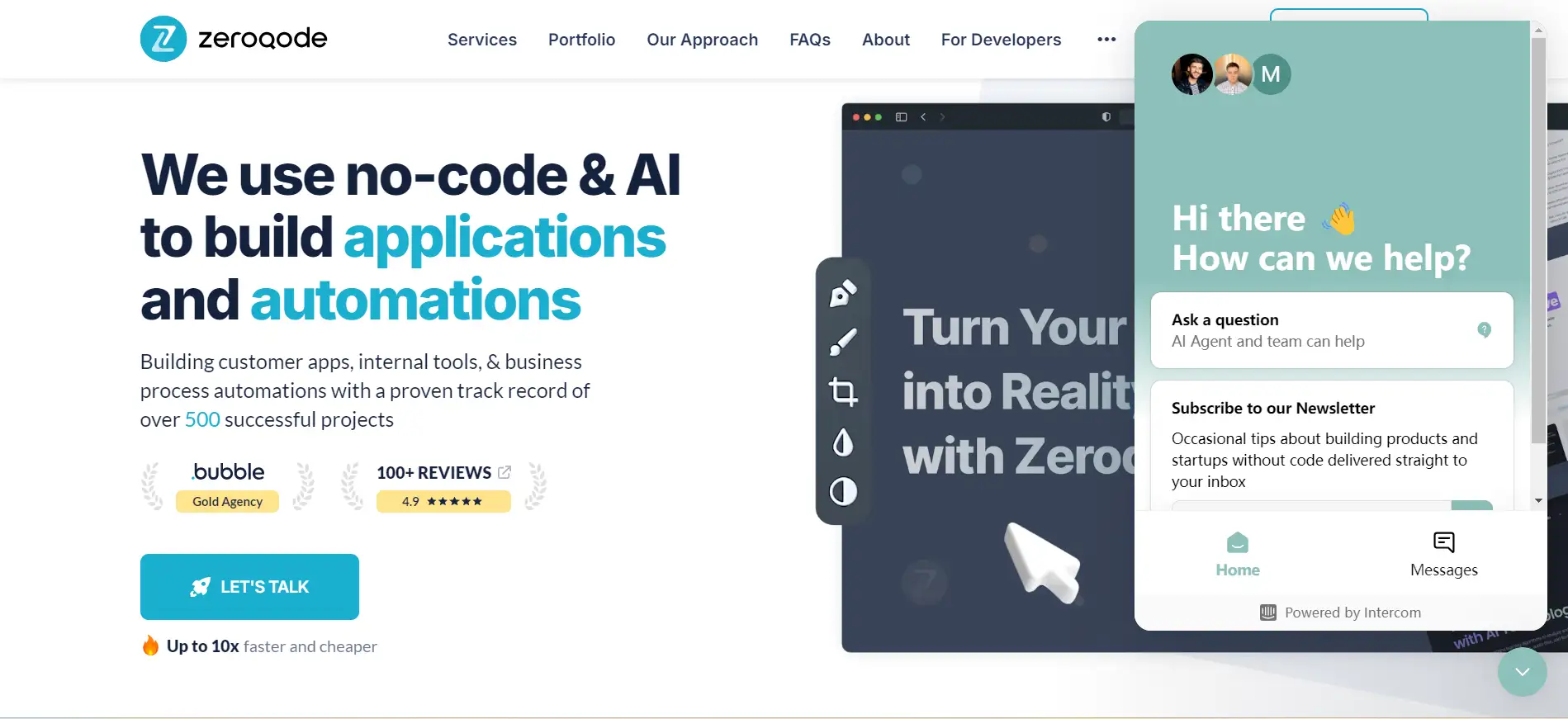
Zeroqode Development, known for their mobile app creation services, elevates the concept of a contact page by transforming it into a lead generation powerhouse. Upon entering the page, users are greeted with a concise contact form, but what truly sets it apart is the pricing table positioned just below, complete with links encouraging users to “Get Started.” This innovative feature essentially turns the contact page into a hybrid pricing page.
Despite this creative approach, the page could benefit from clearer visual cues to guide users down the page to discover this valuable information.
- Key Takeaway: Your contact page doesn’t have to be limited to a simple form. Explore innovative contact page design ideas that engage users and help qualify leads more effectively, utilizing a contact page design template that maximizes conversion potential.
8: Squarespace Contact Page
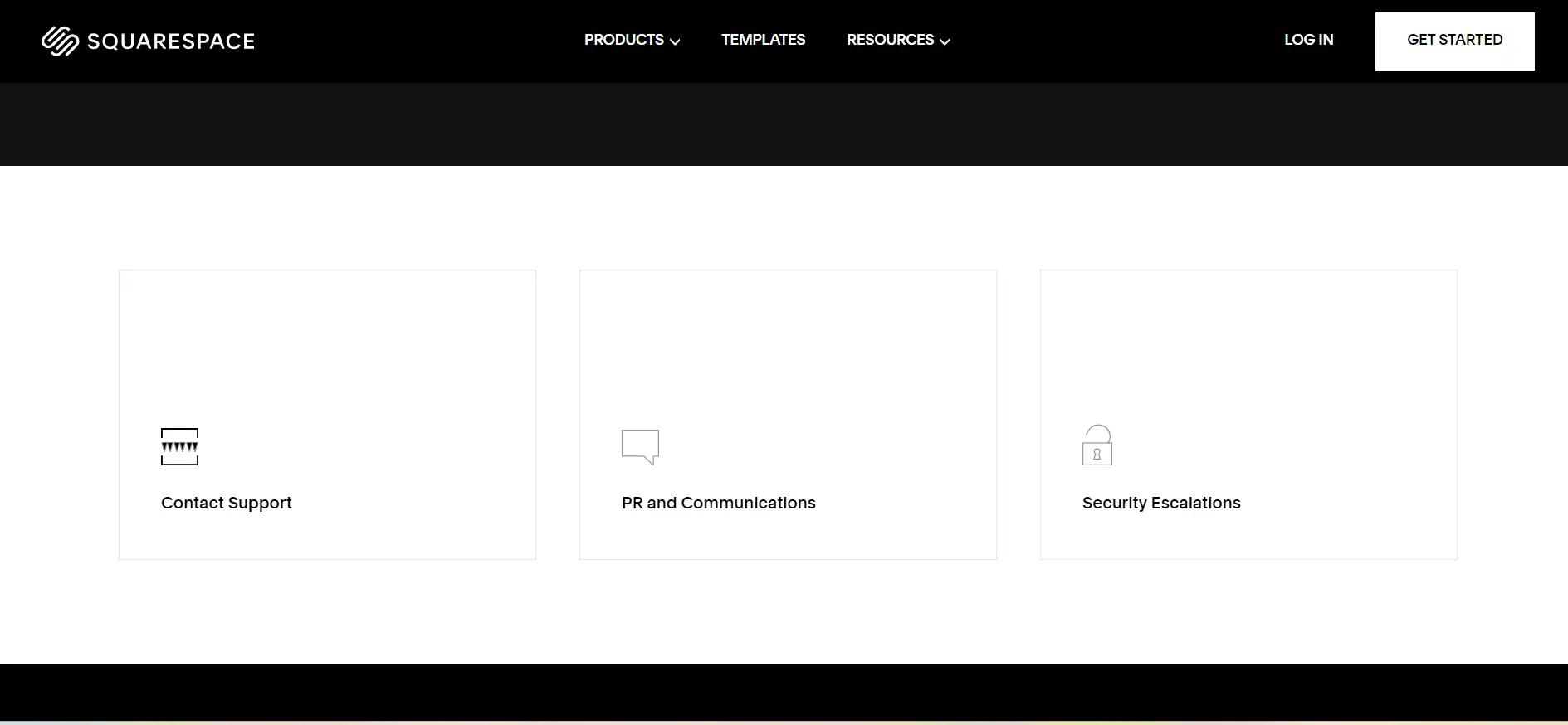
Squarespace’s contact page impresses with its minimalist design, distinguishing it from other examples. Instead of a simple either/or choice, users can select from six categories to find relevant information. This selection directs them to a concise form or a user-friendly help center for browsing at their own pace.
The layout is clear and efficient, ensuring users quickly access what they need.
- Key Takeaway: Don’t hesitate to showcase your brand's essence. Squarespace excels by organizing information neatly in “square spaces,” making for an effective user experience. Use these contact page design ideas to enhance your own contact page design template.
9: Adobe Contact Page
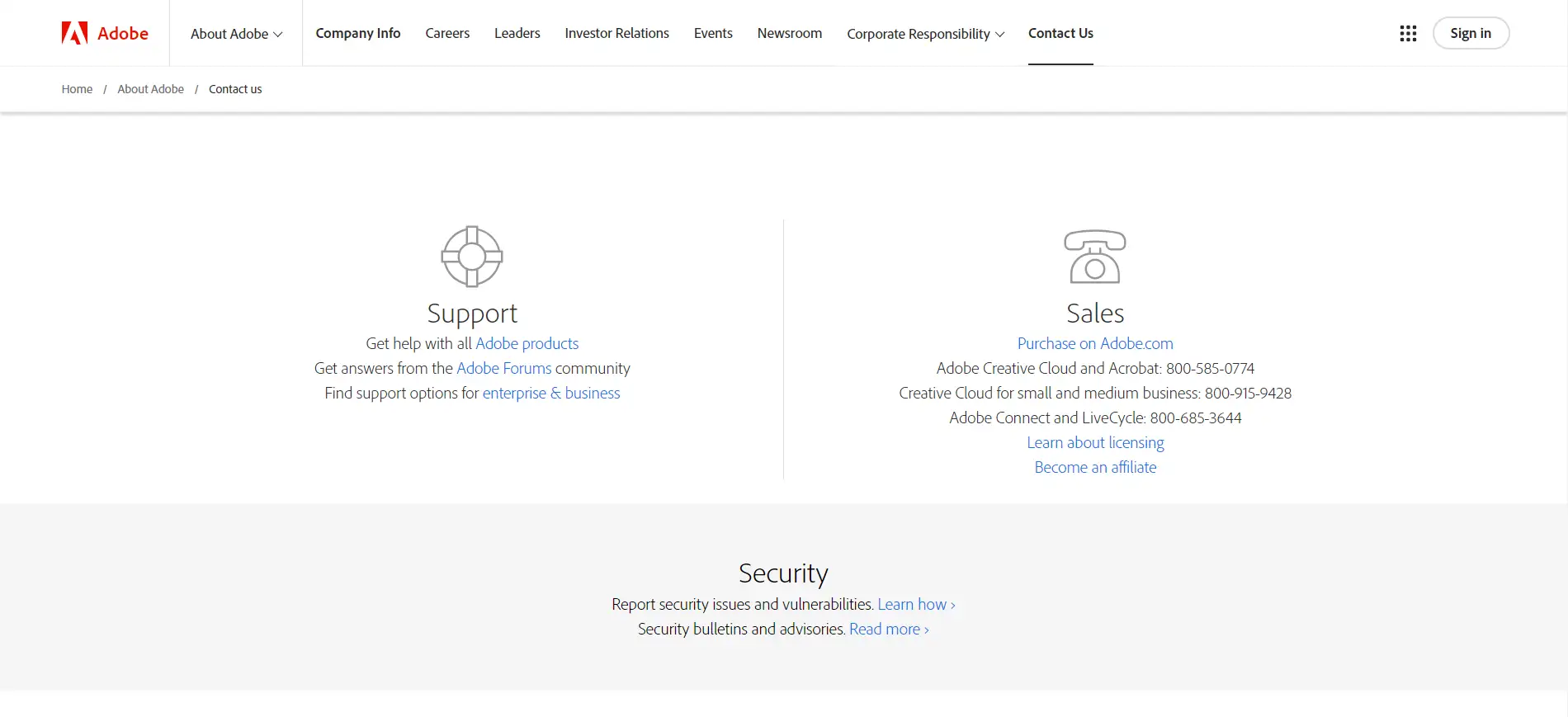
Adobe stands out with a well-segmented contact page that allows visitors to choose between sales or support. After making their selection, users can access various channels, including community forums, a help desk, or multiple phone numbers. The page also highlights global locations and offers specific links for media inquiries and sponsorships, providing a comprehensive user experience.
However, the design feels somewhat bland and lacks Adobe's signature style. While it effectively prioritizes functionality, enhancing its visual appeal could better reflect the brand's creativity.
- Key Takeaway: This layout organizes numerous useful links without overwhelming users. Consider how to present your information—can you rearrange elements to boost usability? Thoughtful contact page design ideas can transform your contact page design template into something both informative and engaging.
10. Basecamp
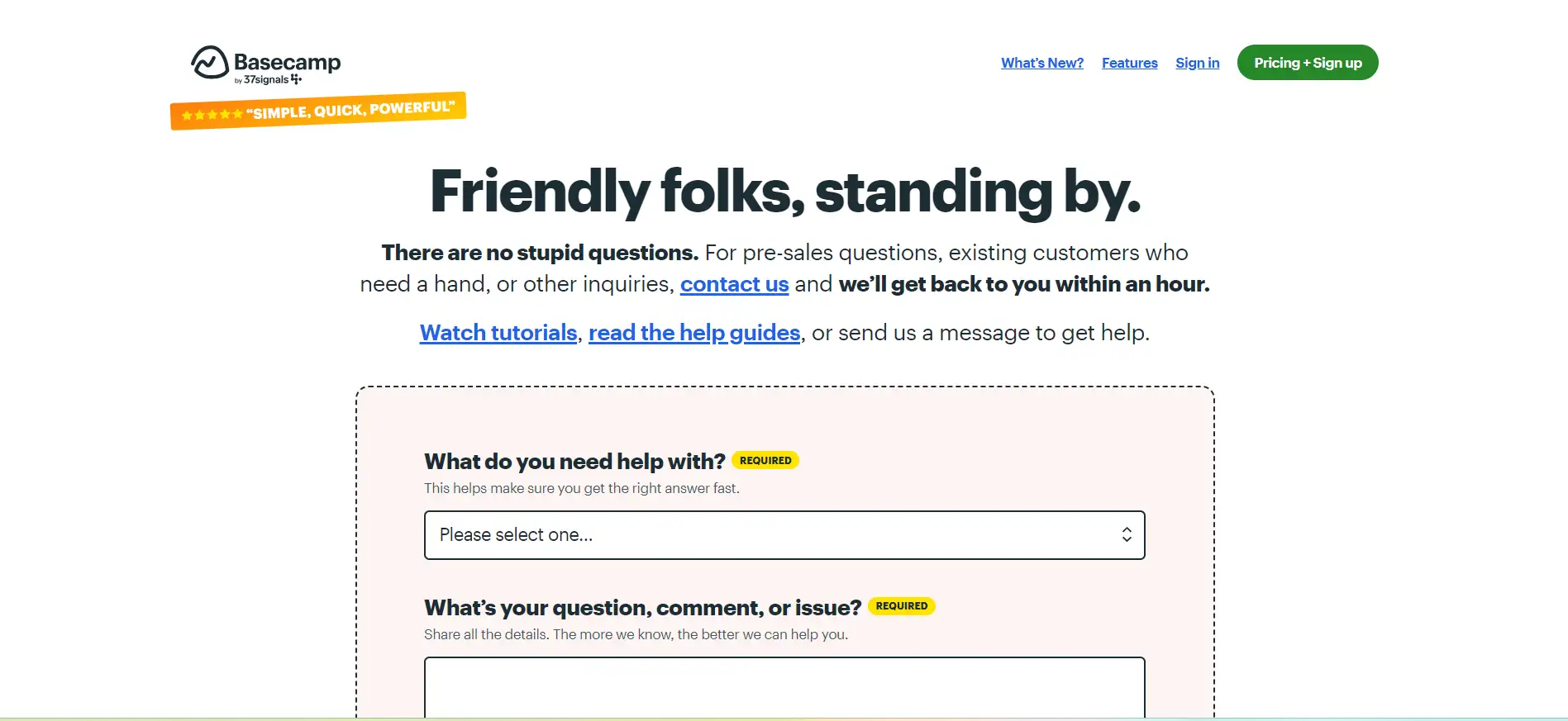
Right from the moment users land on this page, they immediately recognize who they’ll be engaging with and the expected response time. The design is perfectly aligned with the brand’s identity, utilizing engaging illustrations that maintain a consistent user experience throughout the site.
Highlighting response times further enhances transparency, fostering a sense of reliability.
Key Takeaway: Personalize your brand’s presence! Informing users about who will assist them builds trust, making them feel reassured that they’re communicating with a real person, not an automated response.
11. Lucky Orange
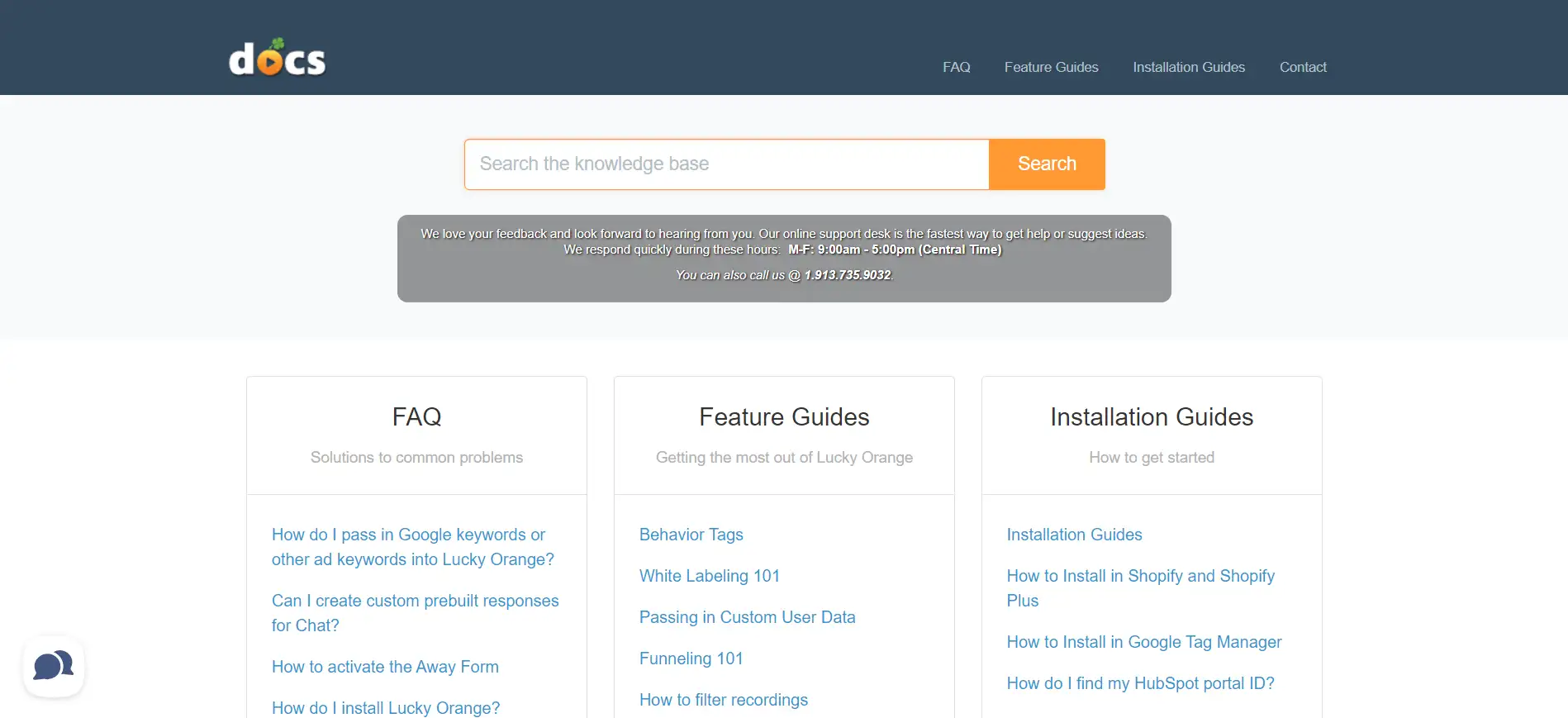
This contact page is direct and efficient. Upon arrival, users immediately see a simple pop-up modal for the contact form. If they prefer not to engage directly, they can easily dismiss the modal and explore other helpful options that lead them to the knowledge center.
However, the modal's limitation is that once dismissed, it can't be easily reopened, which may frustrate some users.
Key Takeaway: Focus on showcasing features that matter to your users on your contact page. Clear and accessible information can greatly improve user experience. Utilizing smart contact page design ideas can transform your contact page design template into a user-friendly resource.
Conclusion
An expertly designed "Contact Us" page is more than just a form; it's a crucial link that facilitates interaction between businesses and their customers. A well-thought-out contact section invites questions, reassures visitors, and offers clear routes for communication, making it indispensable for any website.
As you reflect on the diverse design inspirations presented, think about how these elements can be customized to align with your brand's essence and audience's expectations.
Feel free to innovate and personalize—your contact page should echo your unique identity while fulfilling its essential role. Embrace these concepts, and you'll transform your "Contact Us" page into an inviting hub that encourages dialogue and nurtures meaningful connections.
Written by
Kimmy
Published on
Oct 31, 2024
Share article
Read more
Our latest blog
Webpages in a minute, powered by Wegic!
With Wegic, transform your needs into stunning, functional websites with advanced AI
Free trial with Wegic, build your site in a click!