2024 website trends
Follow the latest trends to make your website stand out in the digital world. Start with these 20 great website design trend ideas.
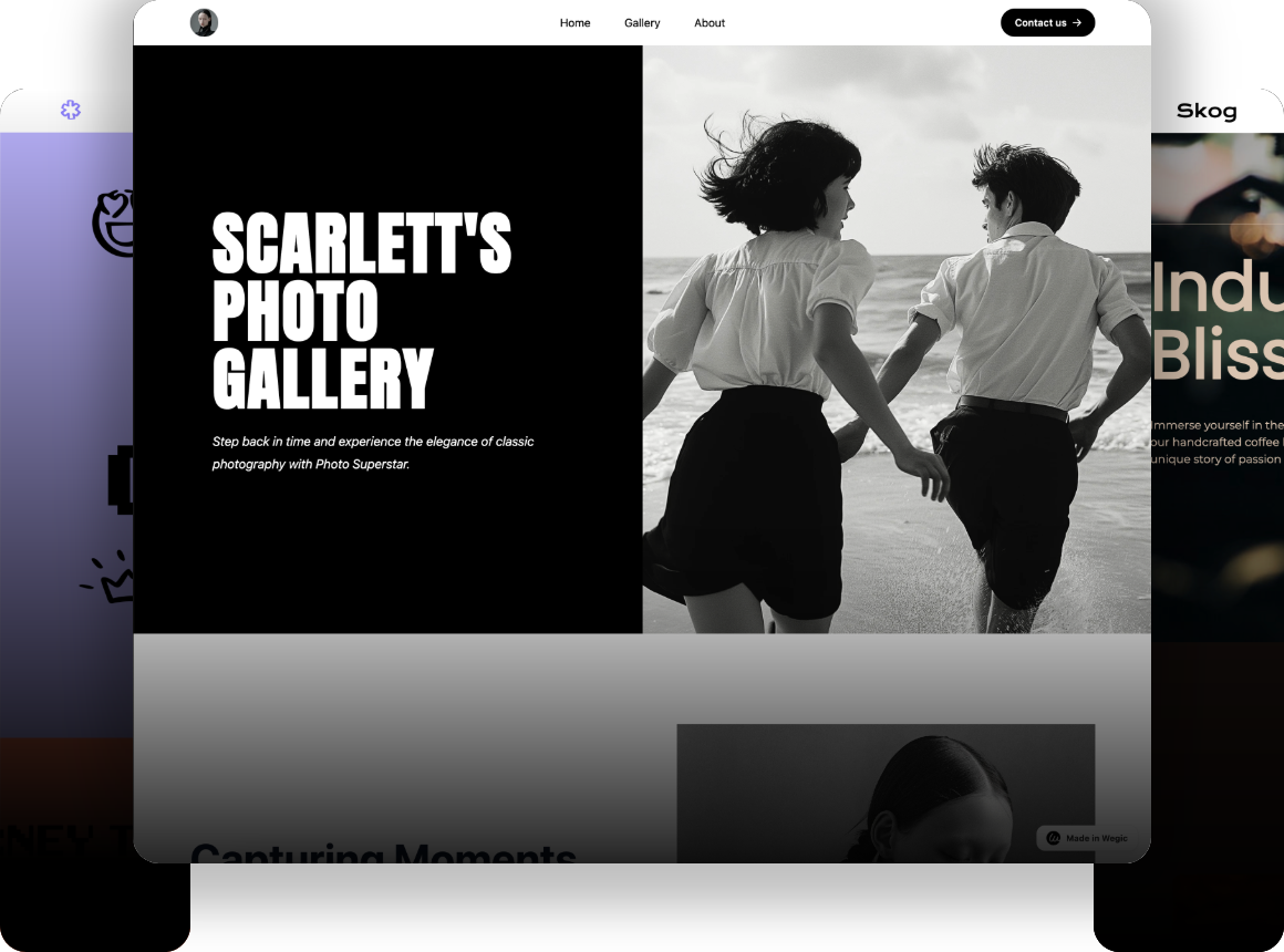
As we all know, curiosity and embracing change is what pushes boundaries. While today's trends will be broken by tomorrow's trends, professionalism and creativity when you are following the latest trends are what make you stand out in the web design industry.
Here, we wipe the dust off your computer keyboard, the light of inspiration is about to shine on us. In this blog, you will start with these 20 website design trend ideas and create your project today!
Table of Contents
Why Do We Need to Understand Website Design Trends?
10 Fresh Ideas to Inspire Your Website
-
AI-Generated Design
-
Y2K Inspired Design
-
Parallax Scrolling
-
Kinetic Typography
-
Maximalism
-
Brutalism
-
Kawaii-Inspired Design
-
Techno and Sci-Fi Design
-
Bentobox Layout
-
Fluid and Organic Textures
How to Keep up with Website Design Trends?
Wrapping up
Why Do We Need to Understand Website Design Trends?
According to Forbes, consumers establish opinions about a website in an average of 0.05 seconds, with design accounting for 94% of that impression.
Whatever the design, it seeks to resonate with the market and users. Like fashion, website design also needs to be presented to designers like models in a big show, so that every designer and learner is aware of the trends in every design element, which will help them and their brands to build websites that are beautiful, functional and user-friendly.
Below we will outline 10 popular website design trends for 2024. They are already on the center stage or on their way to the website catwalk.
10 Fresh Ideas to Inspire Your Website
AI-Generated Design
The first changes in website design must have been influenced by the ever-changing technology. As Chat GDP continues to advance, it is clear that it is changing the way web designers work and design. It has been integrated into many of our design workflows, such as ideation, content delivery, prototyping and wireframing, as well as image and video generation.
Some sites like Wegic utilize the chat GPT model, which allows designers to design pages without having to code at all, relying only on natural language to communicate their design needs.
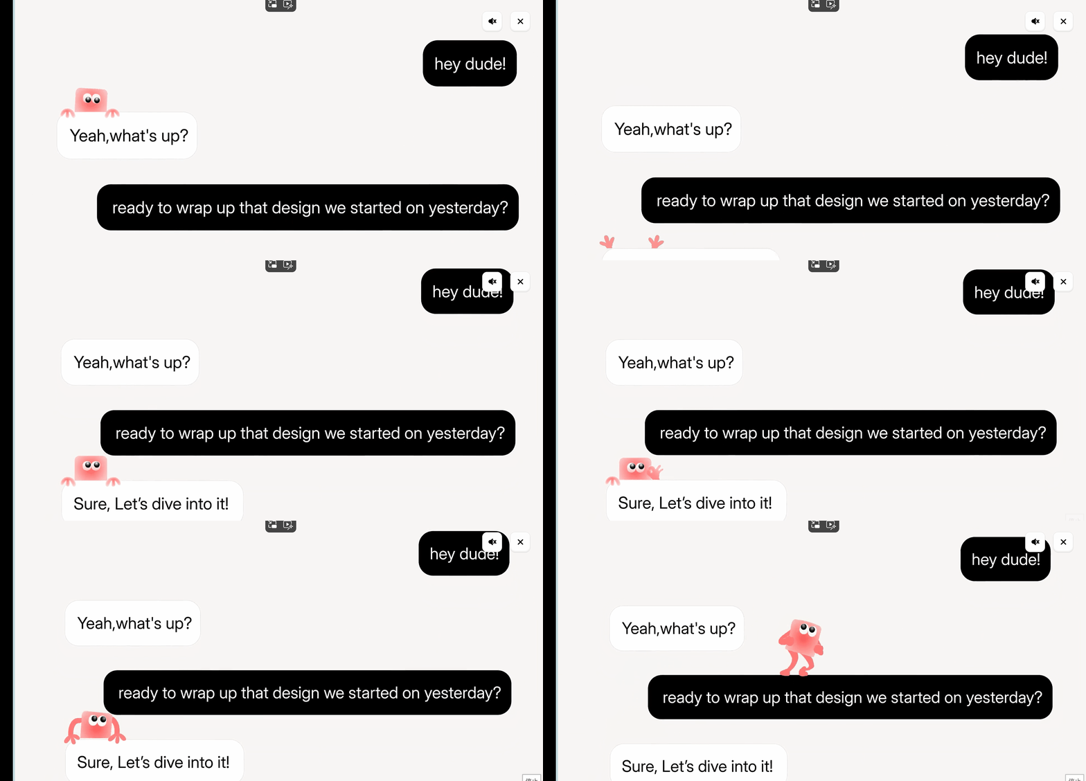
In 2024, more and more websites will be equipped with AI tools to assign chat boxes to website pages, so designers will need to integrate them into the web environment while maintaining consistency with their brand identity.
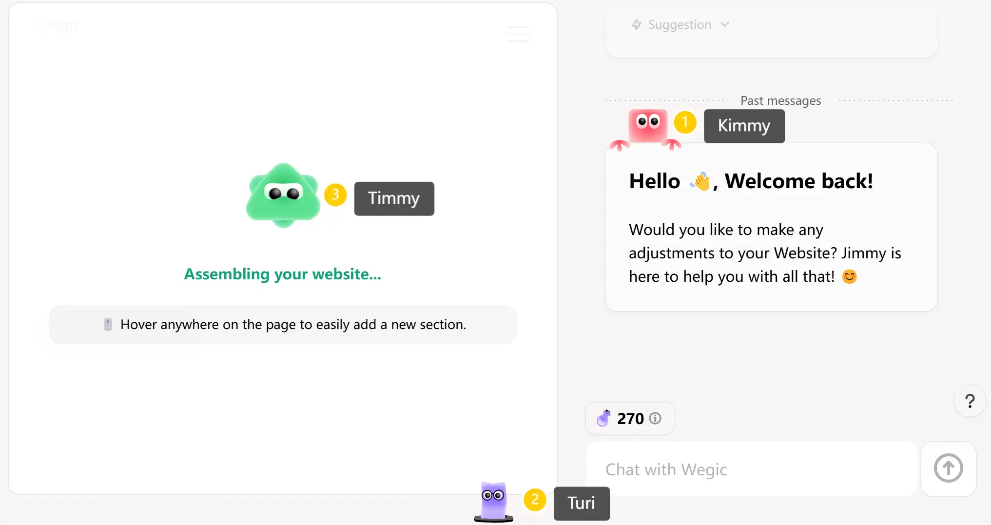
Wegic has a highlight, and three little sprites that talk to the user to improve the efficiency of website building interactions, bridging the gap between professional designers and general users, and the design processing is a pleasant surprise.
Y2K Inspired Design
Y2K's resurgence shows that people are more nostalgic than ever. 2023 was affected by the turbulence of the post-New Crown Epidemic era, war conflicts, and people began to look back to the past for comfort. The field of web design has also been influenced by elements of the 80s and 90s as of 2024.
The following three elements are the main trend of Y2K, representing Millennials and Gen Z's obsession with all things vintage.
-
Pixelated aesthetics:
Pixel art icons, avatars, and background patterns evoke the inventiveness and simplicity of the early Internet era, while more complex and colorful pixel creations can be created using modern design tools.
We take the Nerds website as an example. This page utilizes cool pixelated elements to form the main page, making the page more cool and interesting.
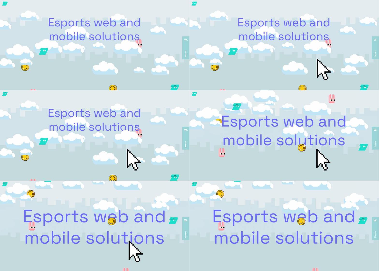
Pixel art also creates a nostalgic and humorous atmosphere through low-resolution images and fonts reminiscent of early online visuals and classic video games.
-
Y2K grunge:
Y2K grunge is a sub-style of the Y2K aesthetic that combines futuristic and digital elements of the early 2000s with a raw, edgy and decadent look inspired by grunge culture.
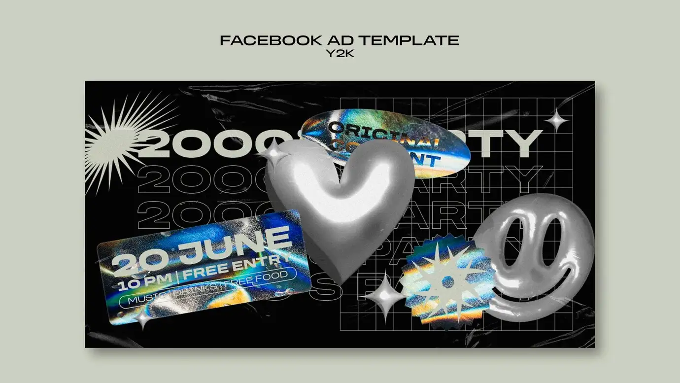
Photo by Freepik
-
Low-fidelity purism:
By mimicking the low-fidelity aesthetics brought about by the limitations of the 2000s, purist designers of the 2020s are starting a trend of low-fidelity purism. They use clipart-style icons and stickers, simple backgrounds, default fonts, and low-resolution photos, sometimes in clashing colors.
Looking at Olivia Rodrigo's site, you find the Y2K style in web design to evoke a sense of nostalgia.
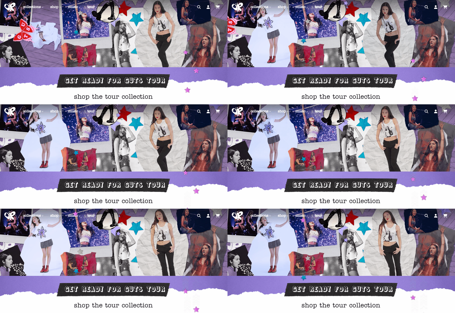
These design elements give their websites a playful and unserious look.
Parallax Scrolling
The parallax effect is the illusion of depth and perspective given to the human eye by moving visual elements at different speeds.
Parallax scrolling allows the user's scrolling behavior to interact with the visuals of the page. This interactivity enhances the user's engagement and makes them feel like they are controlling and exploring the content rather than passively browsing.
Parallax scrolling actually appeared a decade ago, but in 2024, it emerged as an original technology that excited designers to adopt the design to tell a story and revitalize a boring structure.
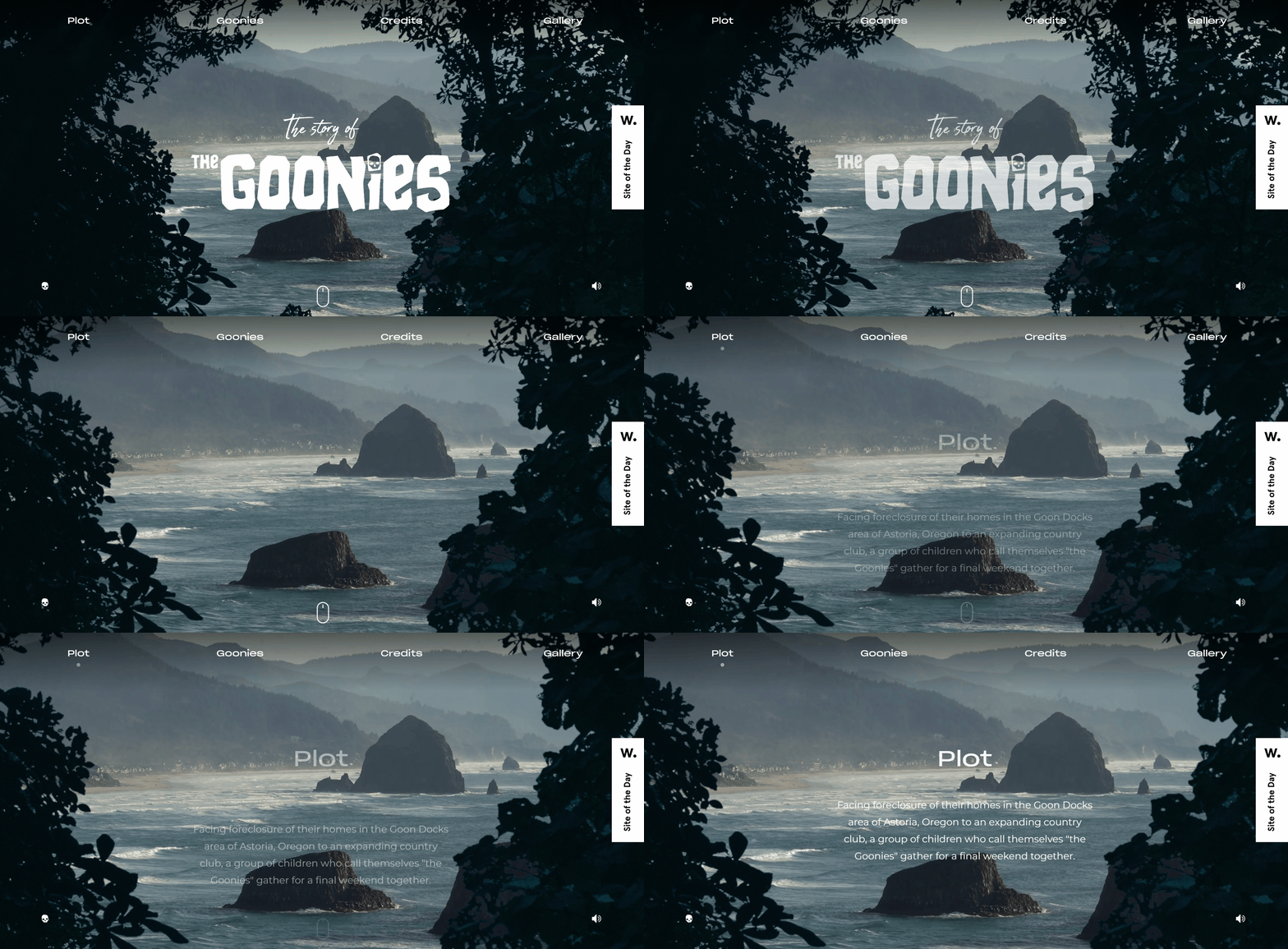
An excellent website based on parallax technology is The Story of the Goonies. The site's pages scroll down and the content cascades in and out of the site, which is technologically exciting and gives a new sense of engagement.
By scrolling the page, users can discover and experience the content incrementally, like flipping through a book, enhancing the storytelling.
Kinetic Typography
Kinetic typography, like parallax scrolling, is a popular web design trend among designers due to the growing popularity of motion effects and dynamic solutions.
Simply put, he is moving text, turning the simplest of scheduling into a compelling visual element. Web designers can utilize this trend in conjunction with other design elements to give website users an immersive experience.
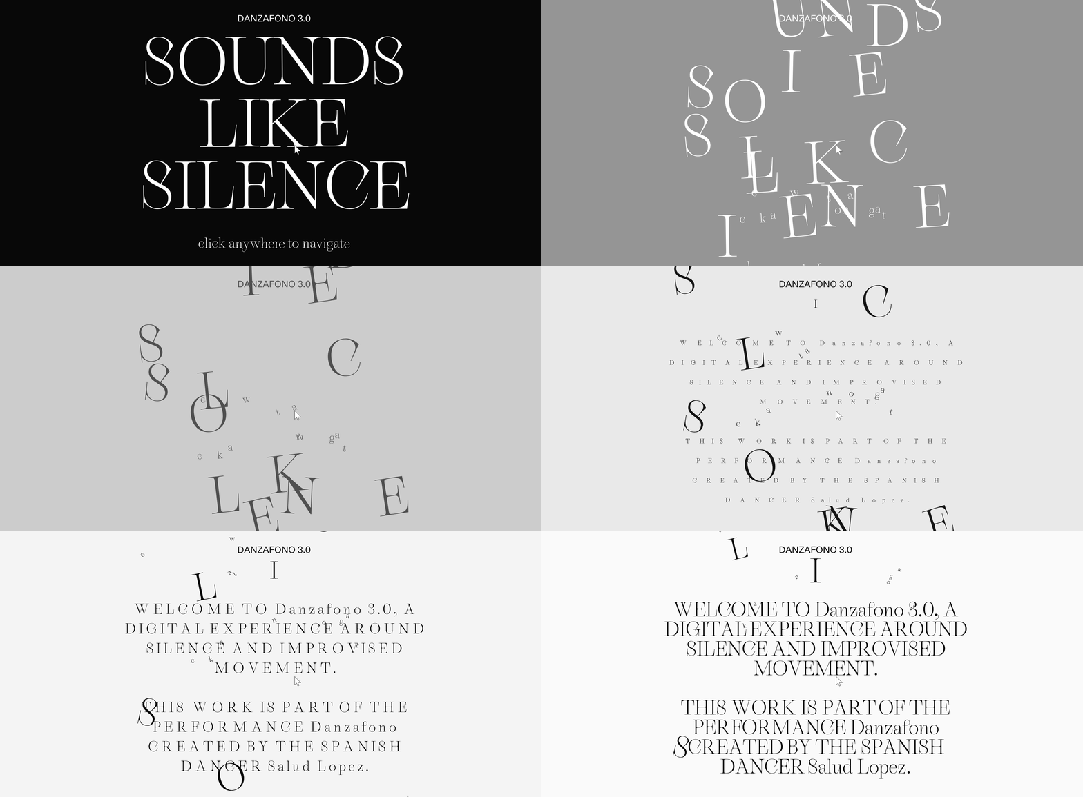
There are so many different kinds of distortions in dynamic typography that designers dare to imagine and apply them to all kinds of text, including event content, important announcements, and CTAs, which can capture the audience's attention.
Maximalism
There are two sides to the coin, maximalism and minimalism. Maximalism in web design challenges the idea that less is more - more is better. It's characterized by being loud, unique and bold. This all came about due to the millennial generation and everything goes mentally.
A well-designed maximalism page features contrasting patterns and colors, merges repeating elements, and uses dense text and bold colors.
Glitché's website fits perfectly into the minimalist aesthetic. The neon green loading screen immediately grabs attention before being replaced by a bunch of overlapping videos and images.
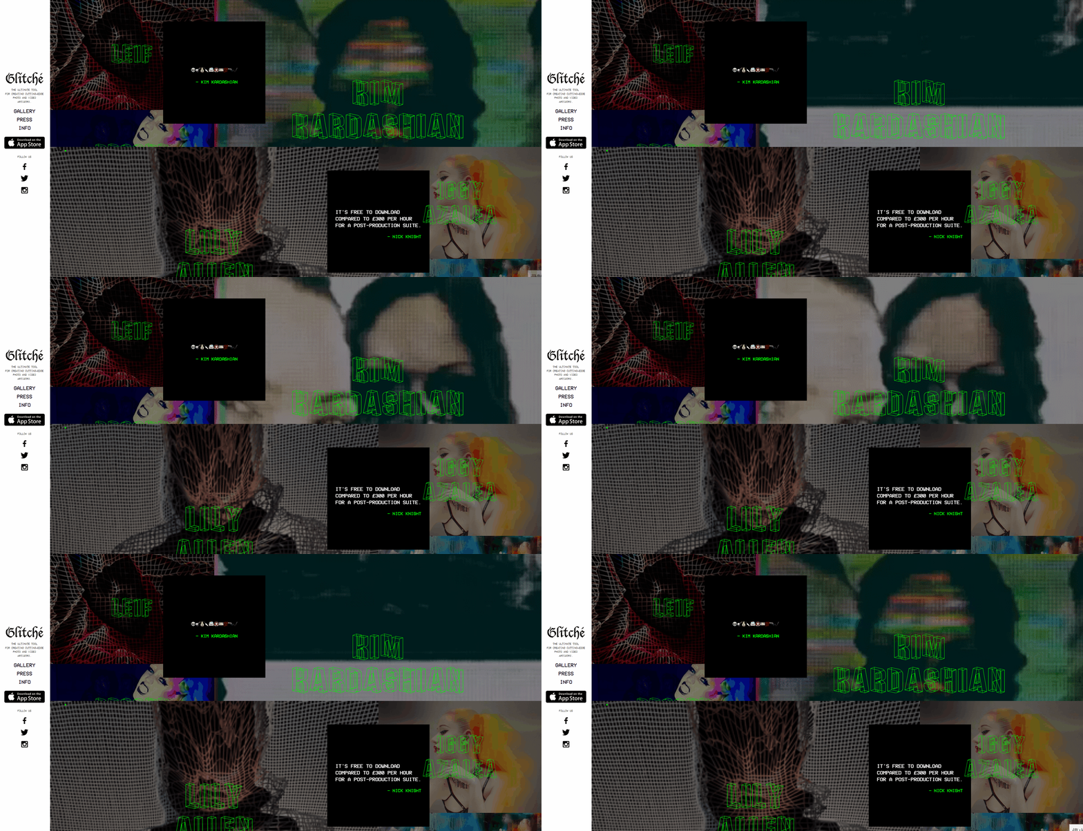
In a world where many websites follow similar design patterns, minimalist web design can help brands stand out. The bold use of colors, graphics and animations draws the eye and builds a strong and memorable visual identity.
Instead of the simplistic features of minimalism, maximalism embraces excess in a thoughtful and organized way, turning each page into a dynamic and immersive canvas.
Brutalism
Another trend in web design is brutalism, which is a brutal and unpretentious style. Brutalism originated as a design style in architecture in the 1950s. Its design is characterized by a raw look and an extremely simple and minimalist approach. Some recognizable features of this web design technique:
-
Solid color backgrounds with little to no decoration.
-
Geometric components and sharp edges.
-
No borders, shadows, or peripheral images.
-
Dividing lines between sections.
The brutalism has its own set of rules. It requires designers to do the bare minimum of what you need to do, allowing no waste and creating only the content needed for an effective website. It also promotes strength and stability through structure.
A2-TYPE is an independent font foundry. Much of this site is what you'd call a brutal design - the open navigation at the top of the site shows all the pages without having to engage.
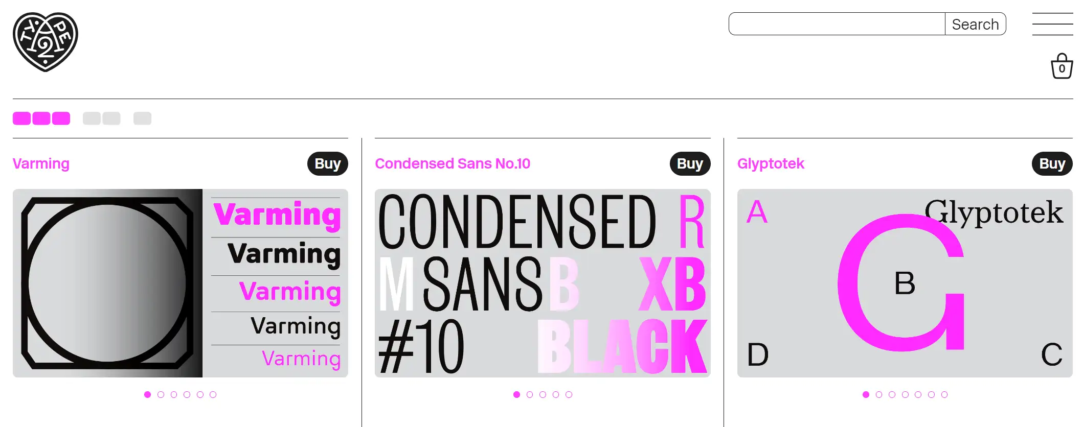
Using basic colors such as black and white and natural colors such as grey, tan, and copper will also make the site feel more sturdy and portray a site that has an industrial feel to it.
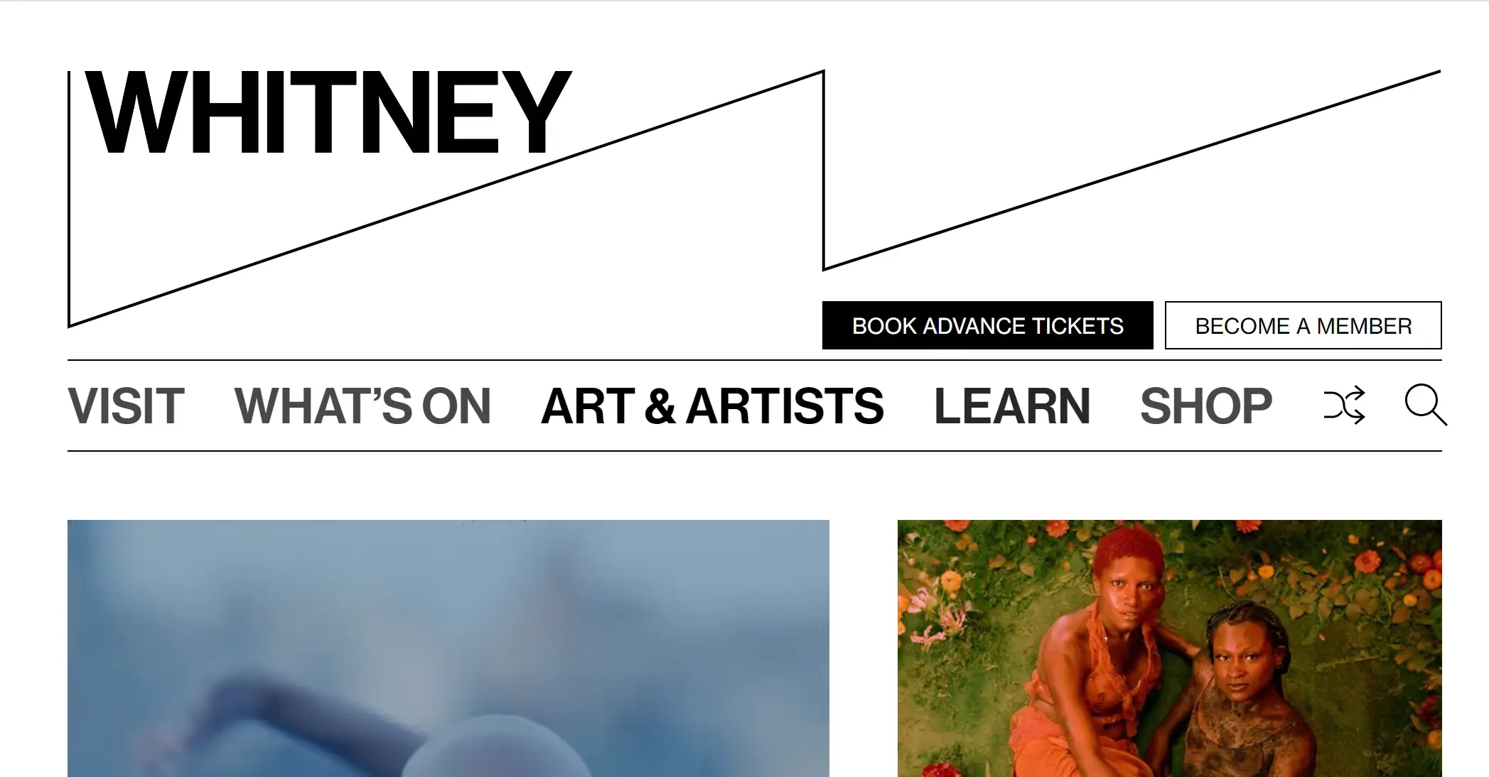
Modern design methods are infused with brutalism by web designers. For example, the Whitney Museum website uses a lot of images and, in accordance with modern web design principles, has a predictable structure.
Kawaii-Inspired Design
The kawaii style design is derived from Japanese pop culture. This web design trend is ultra-feminine and web pages will appear with some glittery hearts, bows elements.
The website design incorporates feminine elements, soft colors, lots of cute characters and playful graphics. They all highlight the young female demographic that this type of design is geared towards. These design choices foster an enthusiastic and positive perception of female users and contribute to a more inclusive digital space.
Girlish playfulness is at the center of kawaii web design. This trend emphasizes the importance of emotional connection in web design and encourages designers to evoke uplifting emotions through their creations.
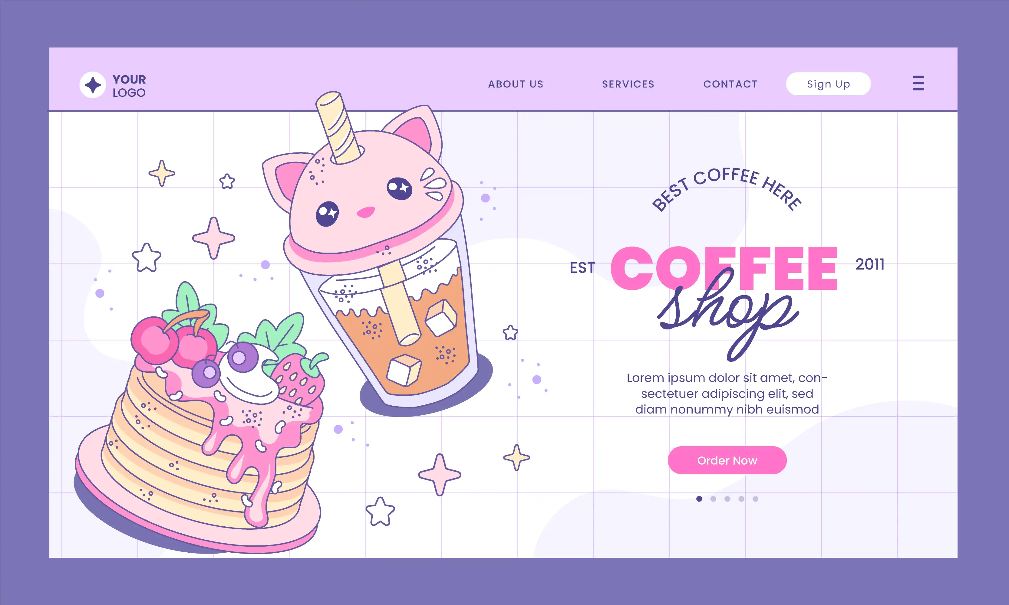
Photo by Freepik
Techno and Sci-Fi Design
As the trend of artificial intelligence spreads, it changes the traditional view of companies.
Website designers based on the futuristic and high-tech in sci-fi movies, websites are gradually taking on a sci-fi style, gradually adding robots, sci-fi characters, futuristic shot fonts and illustrations to their website designs. In 2024, this design style is also increasingly meeting the needs of tech brands that position themselves as futuristic.
Typically designers are inspired by:
-
Cosmic environment
-
Neon colors
-
Futuristic typefaces
-
Bright or metallic colors
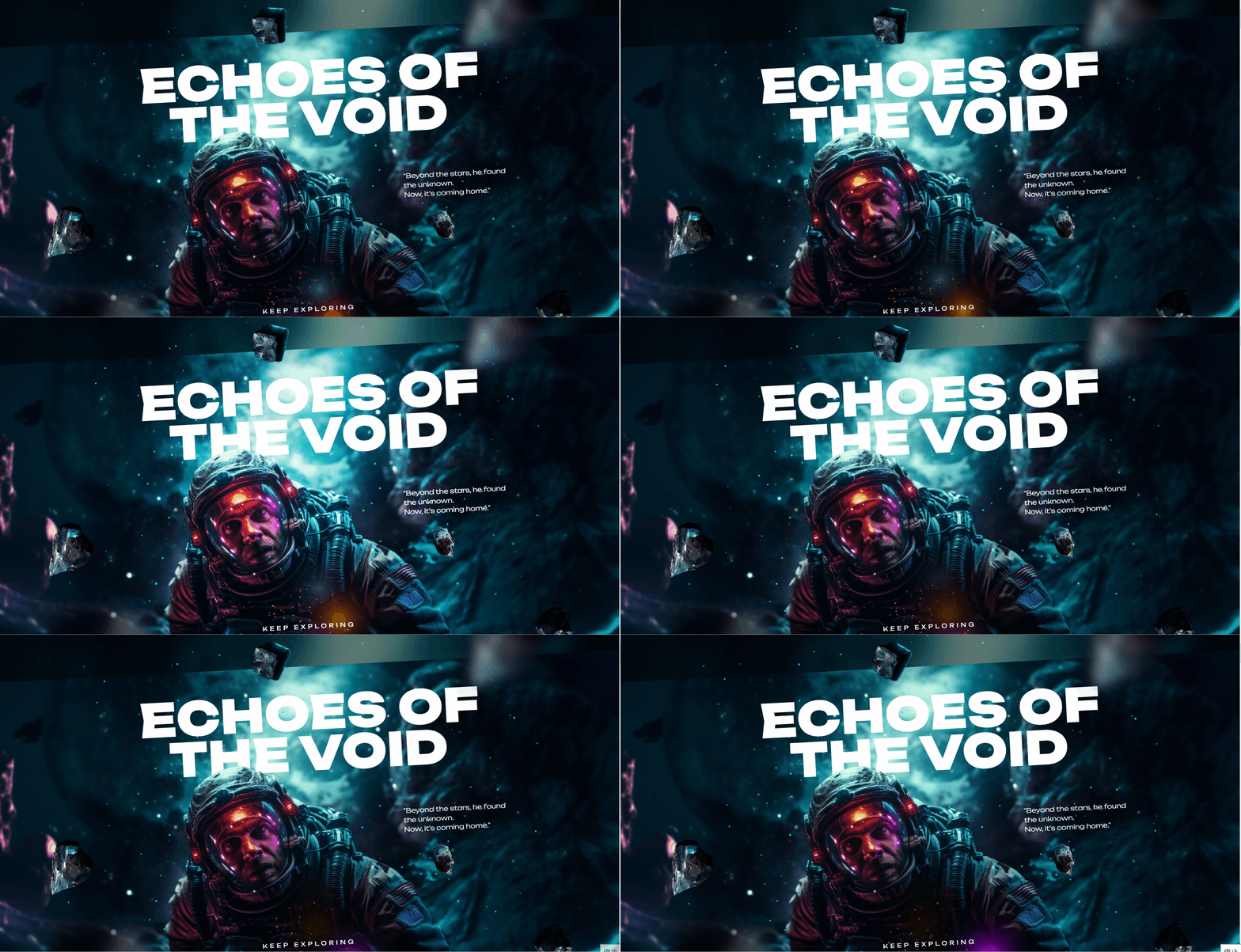
Gif by Slider Revolution
Bentobox Layout
Bentoboxes are containers designed to organize meals. Their principles have a clear hierarchy of information and easy navigation like a bentobox. Implementing a well-executed bento box layout can have a positive impact on UX. It helps users easily understand the structure of the site and find information efficiently, and clear navigation prevents confusion.
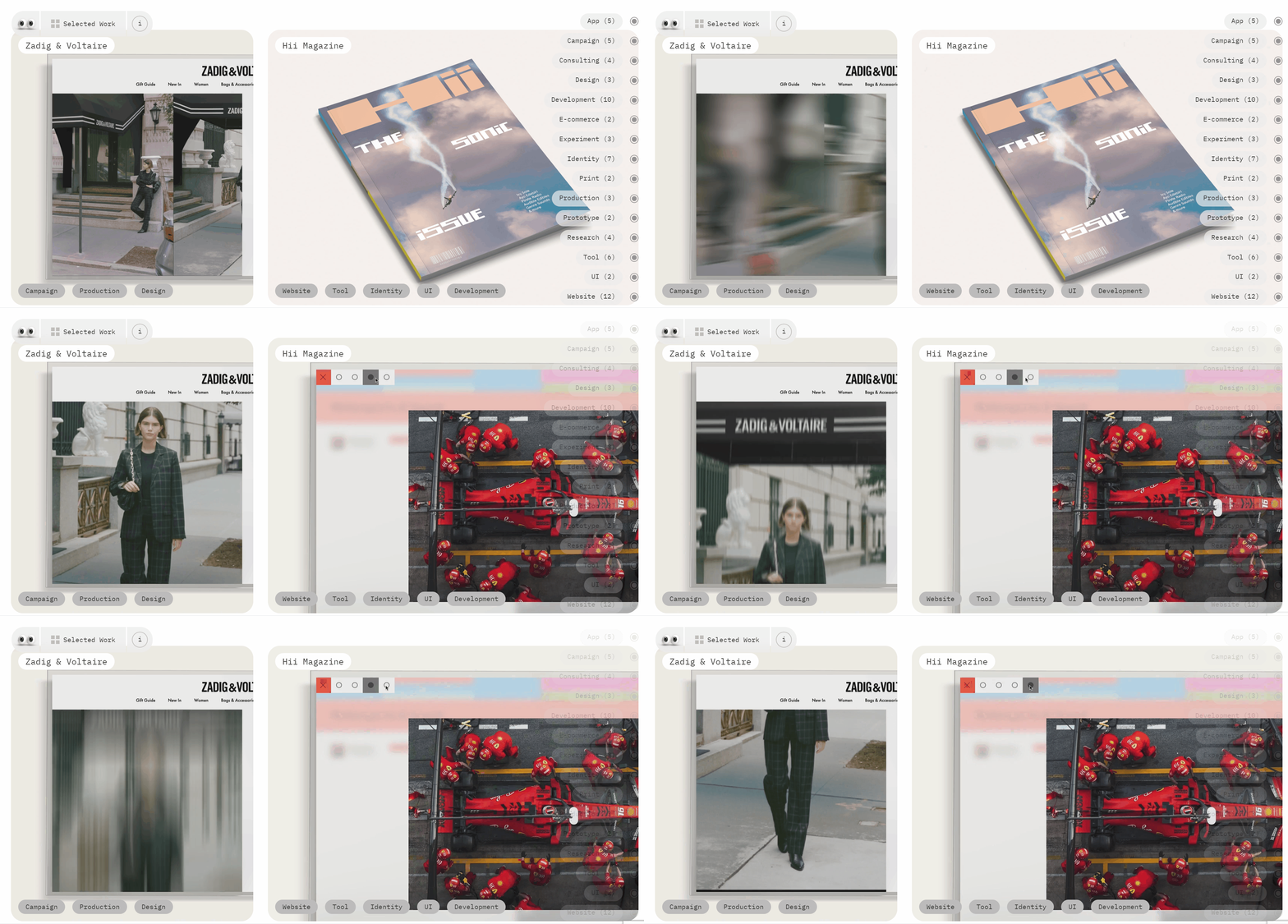
Schoooool Creative Studio is all about the bento-style grid design. Neatly divided sections of the grid present slightly rounded edges. This trend may peak soon, but it's expected to reach more in 2024.
The site shows us how fun and easy it is to use a website with a bento grid. Not only can users view images and text, but they can also move their mouse around to view cool animations and effects.
Fluid and Organic Textures
Fluid and organic design web design elements are the latest design trend in web development. In 2024, web designers escaped urban environments and focused more on taking inspiration from nature. This is also influenced by the current awareness of environmentalism and carbon neutrality. They have the ability to focus more on organic textures and explore a sense of natural calm in their screens.
By incorporating elements that mimic the fluidity and arbitrariness of nature, designers create web pages that are more visually appealing. Such dynamics can make a website feel more active, and organic textures evoke a sense of comfort and familiarity, fostering a deeper emotional connection with the viewer.
Clouds in the sky, waves in the sea and rolling hills. These liquid shapes can be background patterns, or they can be used to isolate different sections and provide a softer, more organic feel to a website.
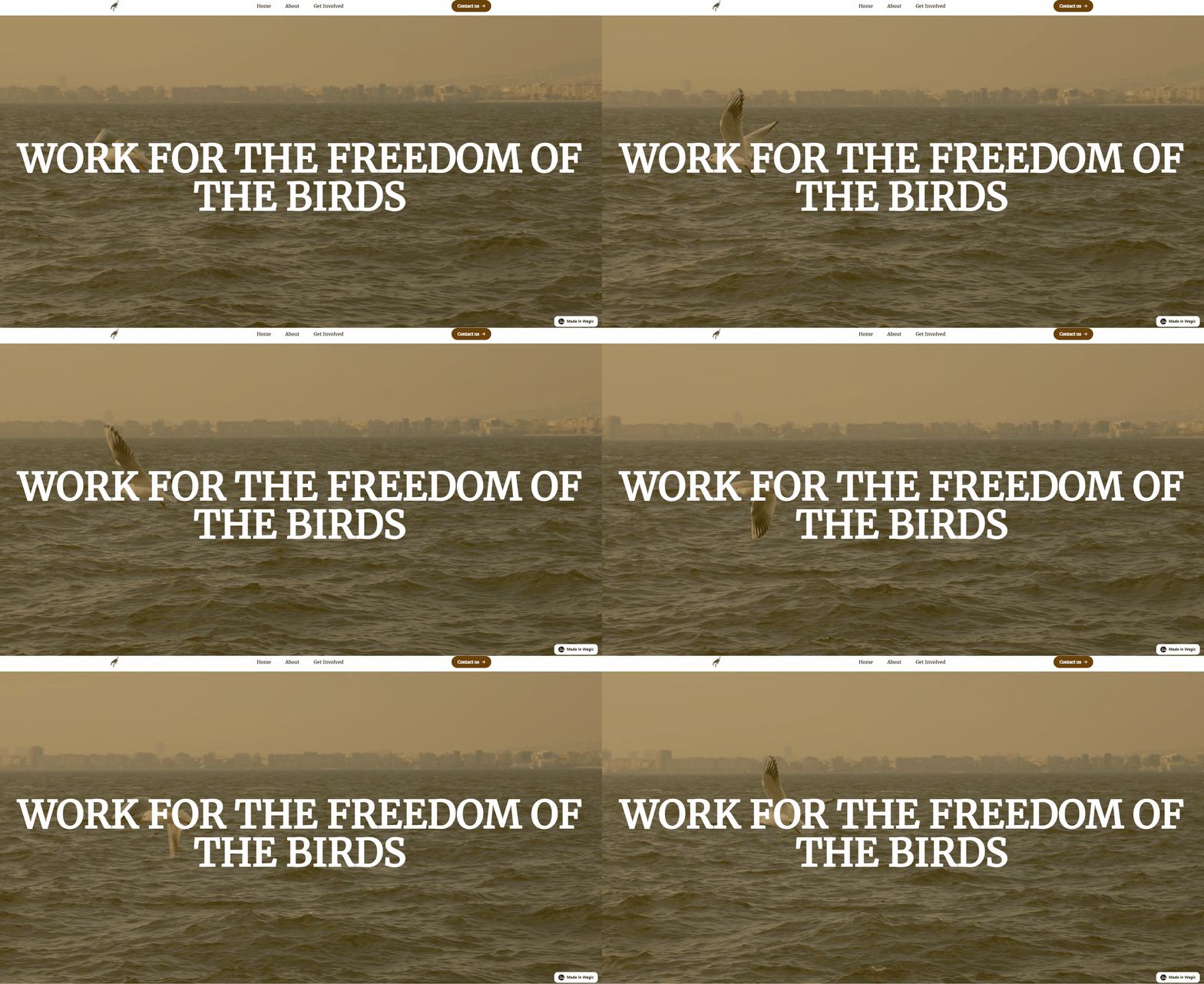
The background of the homepage generated by Wegic features a dynamic image of birds flying over a flowing sea, reflecting the site's theme of protecting birds. So a good page that uses natural textures also helps establish the values of the company's brand and breathes new life into it.
How to Keep up with Website Design Trends?
First and foremost, we need to understand what the nature of the latest trends. The main idea behind this concept is to explore creativity.
Below are some tips to share with you to keep up with these trends:
-
Utilizing new tools to experiment with your ideas.
New tools are usually meant to streamline workflow and increase productivity. They enable you to improve your adaptability in the face of a changing industry, industry competitiveness
-
In-depth understanding of the core principles of web design.
Principles are the backbone of the website design outline. We need to get to know these principles, and no matter how technology and tools evolve, some designs are timeless.
-
A designing community to break the information cocoon.
Focusing on the same community means sharing common interests or ambitions online. Here you are able to share the latest trends with like-minded people, get inspired, stimulate creativity and encourage you to explore new trends!
-
Following design blogs, information sites, social media.
Many influential blogs or social media outlets are connected to industry leaders who share their ideas, experiences, and work, and by following them you gain access to the insights and expertise of industry leaders. A constant flow of information and interaction helps you break out of the information cocoon.
Capitalizing on web design trends is both an opportunity and a challenge. Whether as a web designer or a maintainer of a website, the best advice is to be aware of these creative trends and use them with caution.
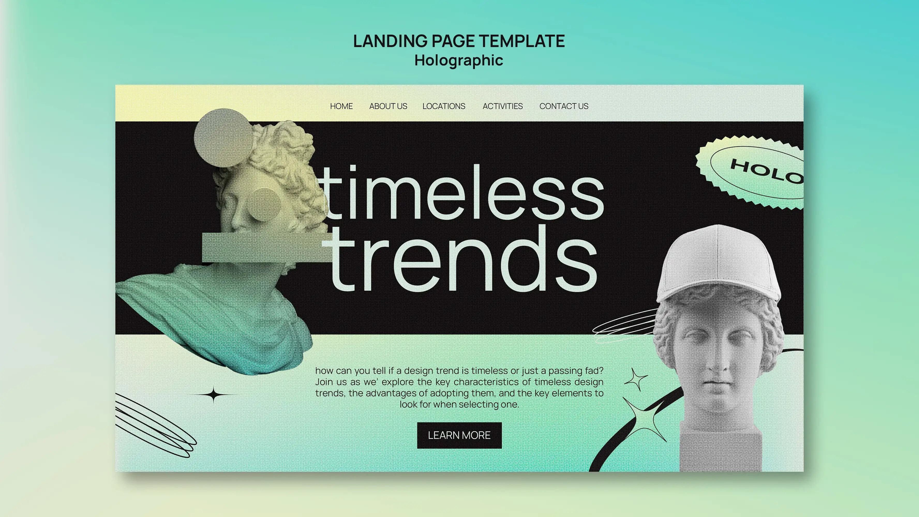
Photo by Freepik
Wrapping up
After browsing through the above ten 2024 web design trends outlined and successful website design examples shared, we know that web design has come and gone, driven by technological advancements and the social environment.
Remember that when a design technique or element becomes instantly popular, it's not just about looking good or increasing conversions, it's about having an eye to see beyond the surface and digging deep to find the most powerful part of it, and turning it into something truly lasting for yourself.
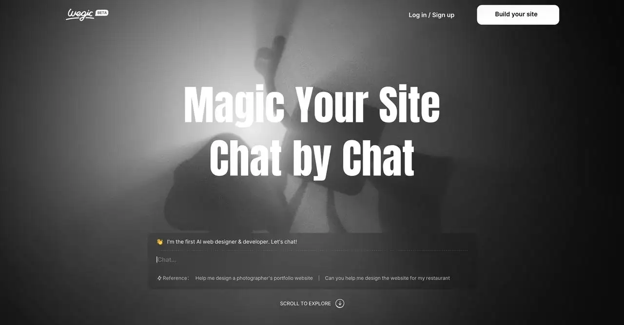
Wegic enjoys the elements of popularity, but what Wegic wants to achieve is to seize the trend and turn it into a truly powerful tool to help every designer or web design learner to create extraordinary websites. Let's have a try this new tool!
Written by
Kimmy
Published on
Aug 7, 2024
Share article
Read more
Our latest blog
Webpages in a minute, powered by Wegic!
With Wegic, transform your needs into stunning, functional websites with advanced AI
Free trial with Wegic, build your site in a click!