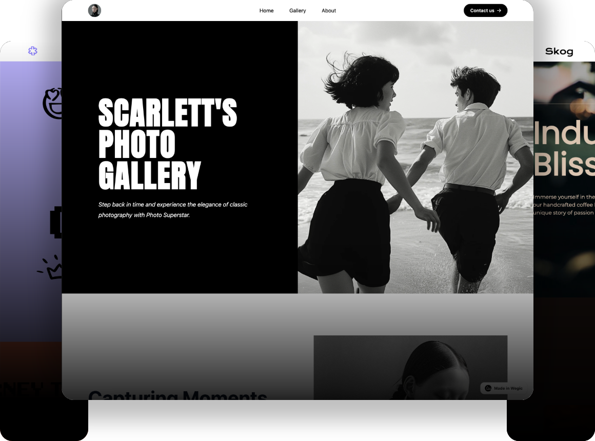
15 Best Artist Websites to Inspire Your Creativity
Discover 15 of the best artist websites that will inspire your creativity and help you craft a compelling online presence. Explore stunning, functional designs that showcase art beautifully while enhancing visibility and engagement. Get inspired and learn how to make your artist website stand out!

As an artist, your website is more than a digital portfolio—it's a crucial piece of virtual land that shows your creativity. It's your online gallery, where people come to see your work. But it's not just about a pretty website. It's about a site that looks great and promotes your talents, standing out in the online art world.
You might wonder, "Why look at other artist websites?" Well, seeing great examples can spark ideas and show how to present your work in an engaging way. A well-designed website mirrors your art, creating a pleasing space where your work shines.
In this article, I'll share 15 amazing artist websites to inspire you. These sites are not only beautiful; they're also quite catchy and upgrade the visibility of the artists' work. Let's explore these inspiring artist websites and improve your own.
Having Your Own Artist Website is Pivotal
An artist's site is important for showing your work to many people. It's not just about looking nice; it's about making it easy for people to appreciate your style, leaning the story behind your works of art. How your site looks, how people can use it, and what it says are all really important. A good site can show how creative you are and help you find new clients and fans.
15 Best Artist Websites to Inspire Your Creativity
Alex Fisher

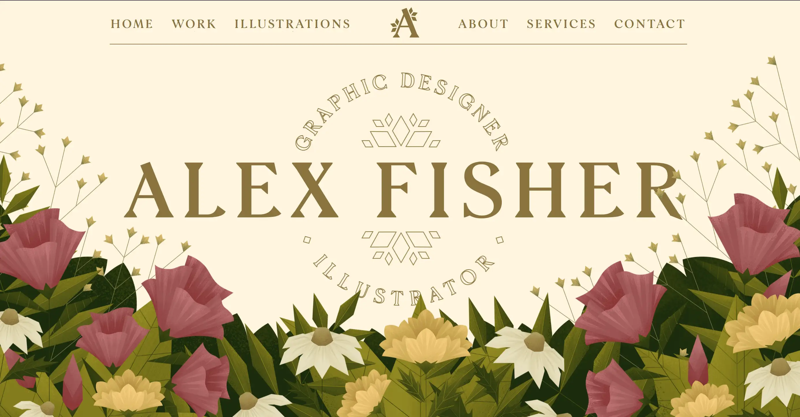
Indeed, the website owned by Alex Fisher is wonderful itself. It features rich and bright colors and an easy-to-scan structure, which makes a visitor’s attention naturally focus on the content. The gallery of her latest works is presented on the landing page and in the about tab, the viewer gets a glimpse of the artist’s workflow. One of the most interesting features you find with the website is the diamond-shaped mouse pointer that makes it fun to use. It is important to understand that an artist’s website can be and should be both beautiful and functional – as is this site.
Adam Martinakis

The works of art created by Adam Martinakis are presented on his website using 3D tour that guides the users through the artworks. The choice of high-resolution photographs and turning the images into 360-degree view helps to feel his art. First of all, the spacious and uncluttered layout is effective in not distracting from the sculptures they have created and the logical and smooth interface allows for comfortable navigation throughout the site. This website exemplifies how an artist can utilize high Internet creativity in presenting their work.
Hygge & Cwtch

At Hygge & Cwtch, the website itself serves as an example of the branding with style and clarity. The clean, white background is simple but elegant, which makes the subject focus on his artwork. In this way each work is brought in front of the audience in the most straightforward manner, there is no distraction from the artwork.
Wengting Li

The website of Li looks very dominating and colorful that are similar to the abstract painting works of Li. One can even appreciate the colours that he has used and the layouts that are very dynamic in his own way. The site also has a blog section where Li posts updates of the projects he is working on as well as information on his art-making process. For such reasons, Li’s website offers a nice example of how an artist can design their site in such a way that truly reflects who they are as an artist and speaks to audience through visuals.
Rebecca Miller

The homepage of this artistic web-site looks like a turn-acket of the book. The symbiosis of black and white color combinations and unexpectedly interesting letters reveal a different aspect of the minimalistic concept. Following the click on the “Portfolio,” one gets an opportunity to see the sort of clean, minimalist illustrations and humor-themed subject matters that picked Rebecca Miller as a outstandinggartist.
Braf Albright

Braf manages to maintain artistic images as a unifying theme. This homepage also displays a recent selection of the artist’s works. Textured background complement the mood which Brad Albright sets with illustrations, design and 3D art incorporated into this site which features both written and visual content making for an all-rounded view of Braf.
Steven Kozar

The background of Steven Kozar’s website is unique and provocative which is appealing to the audiences. Looking at this artist’s website for the first time, one can easily get mistaken by this masterpiece for a live one. It's an authentic painting. Olivia’s website combines her gallery with a web store. People can look at her new paintings and use the site to order the prints of the paintings. The shop section is visible and situated under the navigation bar of the site, thus exhibiting integration.
Hannah Jacobs

It is Hannah’s art website with a white background and serves as her personal gallery of the beautiful photos. Literally, this site is packed with brilliant snapshots of Hannah’s best and beautiful works of art, featuring her fascinating style. Hannah has all her prestigious awards on display for the clients to see in the shorts symbol just before the About icon page. You can learn more about her and get her contact information on the About tab. Its colorful colors and the friendly use of aesthetics appeal to people and keep them engaged.
Jessie Bearden

With the assistance of one picture, a visitors’ attention is attract to Jessie’s food art on her site. She use navigation menus in order to direct the visitors to exactly the page they would like to get to. Many photographs and videos of her greatest work can be freely accessed at her work website. There is a client page to which all her previous clients are posted; this will help her to appeal to her targeted audience.
Alex Tran

Having a nice self-introduction on the home page, the visitors approach Alex’s website in a positive manner. Through the site, Alex Tran posted a lot of professional quality pictures of portraits and headshots. It seems to mean that the photographs are arranged in triple rows wherein the sizes of the photographs are varied, making the site more lively. When the users place the cursor over the image, the artist site offers the title of the photo.
Ketakuma

I believe Ketakuma's website is the most fascinating in today's selection. A neutral backdrop serves as a canvas for colorful, interactive animations and paintings. This intriguing artist website example virtually encourages visitors to scroll down to see what happens next. It also features an integrated store where visitors may buy Ketakuma items. The bold color scheme quickly draws attention and creates a lively environment.
Benjamin Hardman

Benjamin Hardman's website allows visitors to view his photographs, purchase prints, and participate in a masterclass. It is Benjamin's website on which one can see how he preserves the stunning loveliness of nature in the picture. It has a user-friendly structure and convenient navigation allowing users to go through various areas of photography.
Michelle Carlos

Michelle Carlos has a good fine arts and fine cinematography background, as presented in her website. She currently has a hand-drawn appearance on her website to make her more appealing. In addition, she has astoundingly incorporated the same style in the children’s books that she both writes and illustrates. Michelle’s website also has a cheerful blog section where the viewer can find out more about what inspired Michelle.
Levon Biss

Levon Biss is a talented and creative photographer who always provides his work in rather creative and well thought manners. His large scale pictures are can be seen in some museum collections and individual’s homes across the world. The design of the site represents a balance of simple and complex, concerning itself with the delicate detailing of its motifs. Another is his website that has a full screen; the artwork neatly arranged to capture the readers’ attention demanding that they scroll down further.
Woohyon

Woohyon is a South Korean paper artist who created beautiful and complex creations of paper. The homepage of Woohyon’s website is represented by the photograph of the artist with a grin on his face;His biography is also published on the website. The biographical text about Woohyon written in the style of storytelling that is coherent for the entire website. Closely related to hitting the target of getting visitors to view his artwork and stories in video format, a dark background is also employed to enhance the website’s visuals.
Create Your Inspiring Artist Website
A good artist's site is key for showing your work and connecting with people. The 15 sites in this article are good for seeing how artists can make their own online space. Whether you like simple designs, new ways to show art, or a mix of things to see and buy, these show why it's good to plan and make a site that's easy for people to use.
You’ve seen what the best artist sites are like, now do it yourself. If you want to make your own artist site soon, check out Wegic, a comprehensive website builder, to get your AI assistant and help in making a site for your art. Wegic can help make a website that's true to your way of thinking and gets noticed in the big online art world.

Wegic, powered by the latest GPT-4o model, allows anyone to easily create and manage websites through natural conversational interactions, breaking down the professional complexity of traditional website building.
Written by
Kimmy
Published on
Jun 24, 2024
Share article
Read more
Our latest blog
Webpages in a minute, powered by Wegic!
With Wegic, transform your needs into stunning, functional websites with advanced AI