20 Art Portfolio Website Examples for Designers
We've selected this list of 20 best artist portfolio websites to fuel your inspiration. These examples include the lastest trends and standards of good web design, your portfolio will not only be your artistic side but also your technical side.
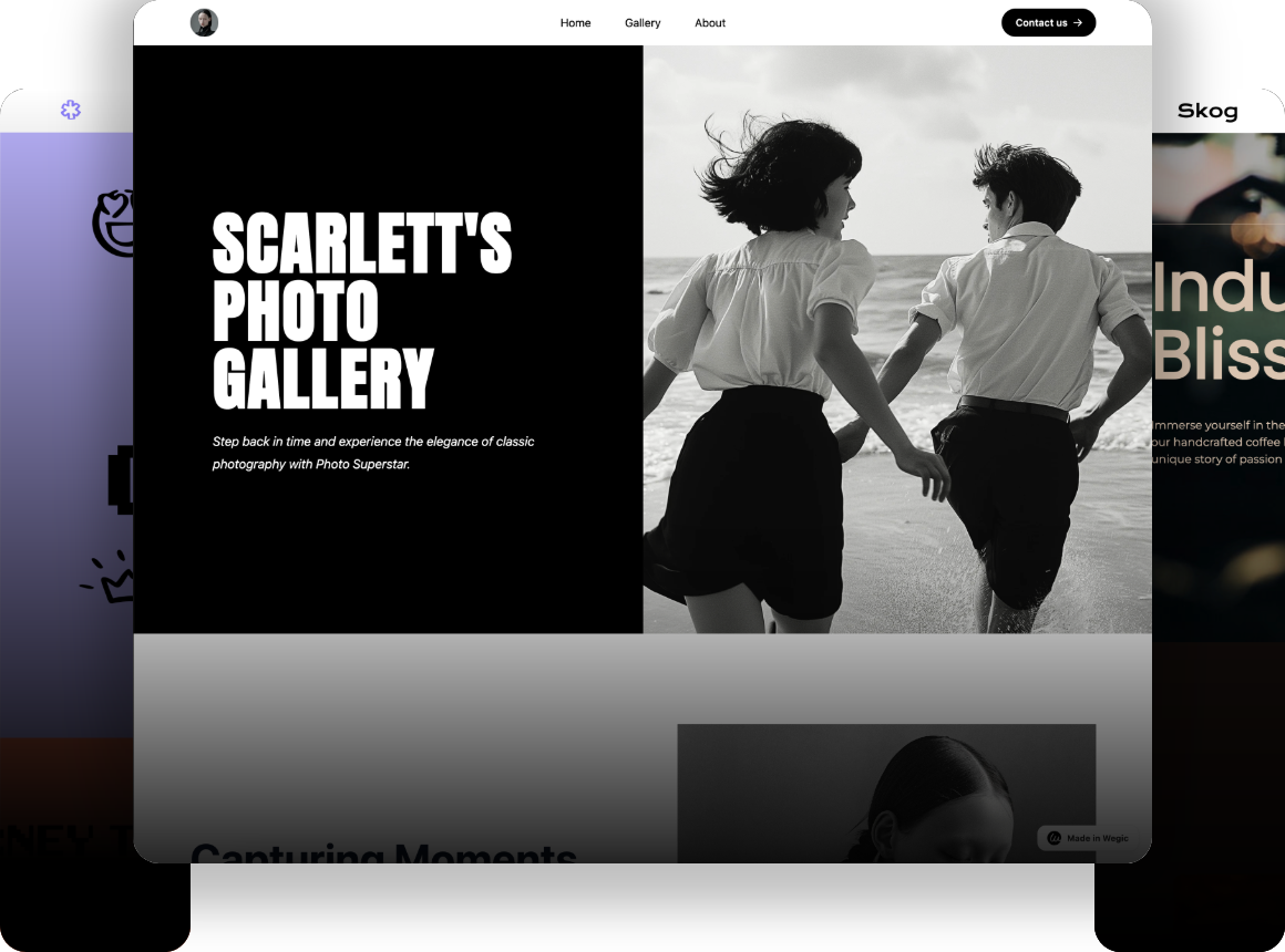
Are you struggling to create an art portfolio website that truly represents your talent? Do you wish to design your art portfolio website that presents all of you and your art skills at its best? You're not alone. As artists, every one of us must already have a sense of having a website or a page where all of our artworks could be displayed to the public. Now let’s be real, creating the perfect portfolio is a challenge. Having no prior experience or even if you are redesigning your existing site, you are bound to get confused by the numerous features as well as complexities.
I have been there also and can fully appreciate the feeling of wanting to present artwork in its best light but not knowing how. That’s why I decided to gather this list of 20 rather inspiring artist portfolio websites for you, oh, dear reader. These examples include the current trends and standards of good web design; your portfolio will not only be your artistic side but also your technical side.
All the websites chosen are beautiful, have a good easy-to-use layout and cover the character of the artist well. Here, by the end of this article, you will get a better understanding of how to build an artist portfolio website and ensure that it reflects your art style/genre and draws in the appropriate traffic. Ready, steady, go and change your web appearance today with the help of these bright portfolio examples.
The Importance of an Artist Portfolio Website

It is, however, crucial for any serious artist to have some form of online presence, especially in the current world where everything is turning digital. It assists in creating an online presence as well as marketing your company or product to the world. Having a website, you can present your work professionally. Thus, when people visit your website they are in a position to appreciate your work. On e-portfolios, several aspects are critical in designing an artist portfolio website.
To make your artist portfolio website stand out, it should include:
- High-quality visuals: Use clear, high-resolution images of your artwork.
- Intuitive navigation: Ensure your website is easy to navigate.
- Artist biography and contact information: Provide a brief bio and contact details.
- Regular updates and blog sections: Keep your content fresh and engaging with regular updates and blog posts.
Top 20 Artist Portfolio Website Examples in 2024
Caroline Denervaud
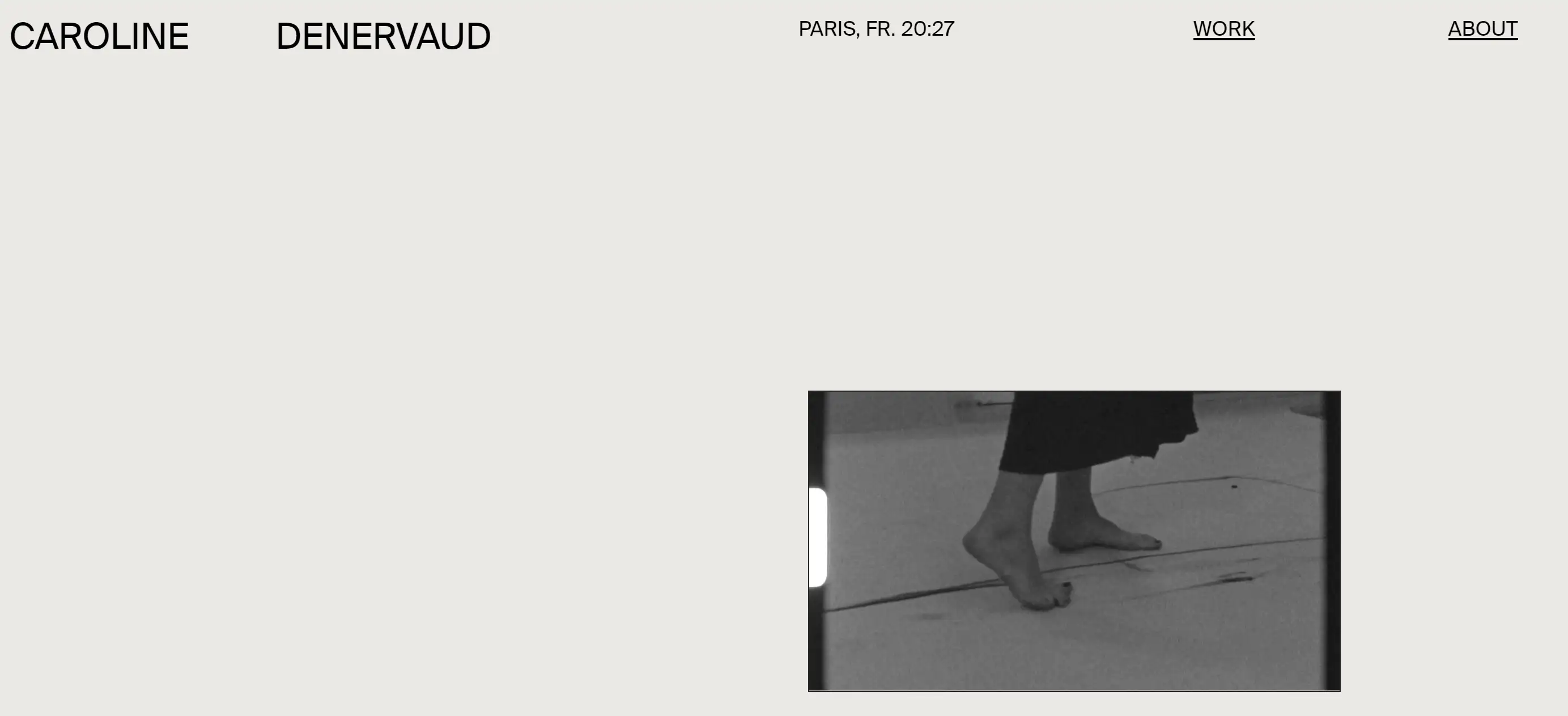
Caroline Denervaud's art portfolio is an exceptional example of minimalist design, ideal for any freelancing site. The soothing grey and beige colour scheme, combined with ample white space, keeps the focus on her visual art. The homepage features the site's title, location, time, and a clean menu with just two items. A dynamic scroll-triggered video adds a captivating element to the browsing experience. The About page is rich with information, detailing her educational background, press publications, and an extensive list of exhibitions, art fairs, and collaborations.
Sarah Letovsky
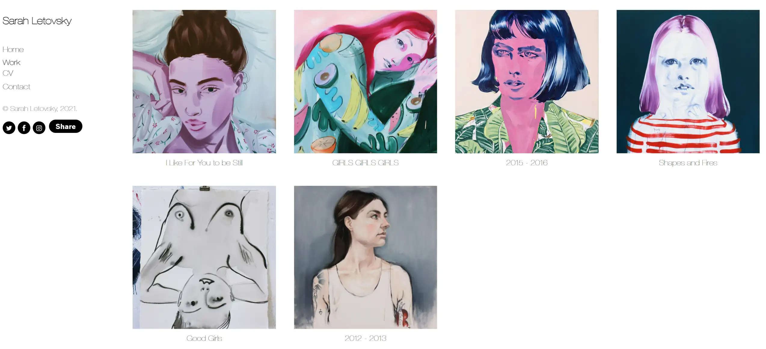
Sarah Letovsky’s art portfolio mirrors the introspective nature of her oil paintings. A sidebar menu with Home, Work, CV, and Contact sections makes navigation straightforward. The Work page introduces visitors to her oil paint projects, while the CV page provides a comprehensive overview of her educational journey and experiences in auctions, residencies, exhibitions, fairs, awards, and publications.
Grace Blair
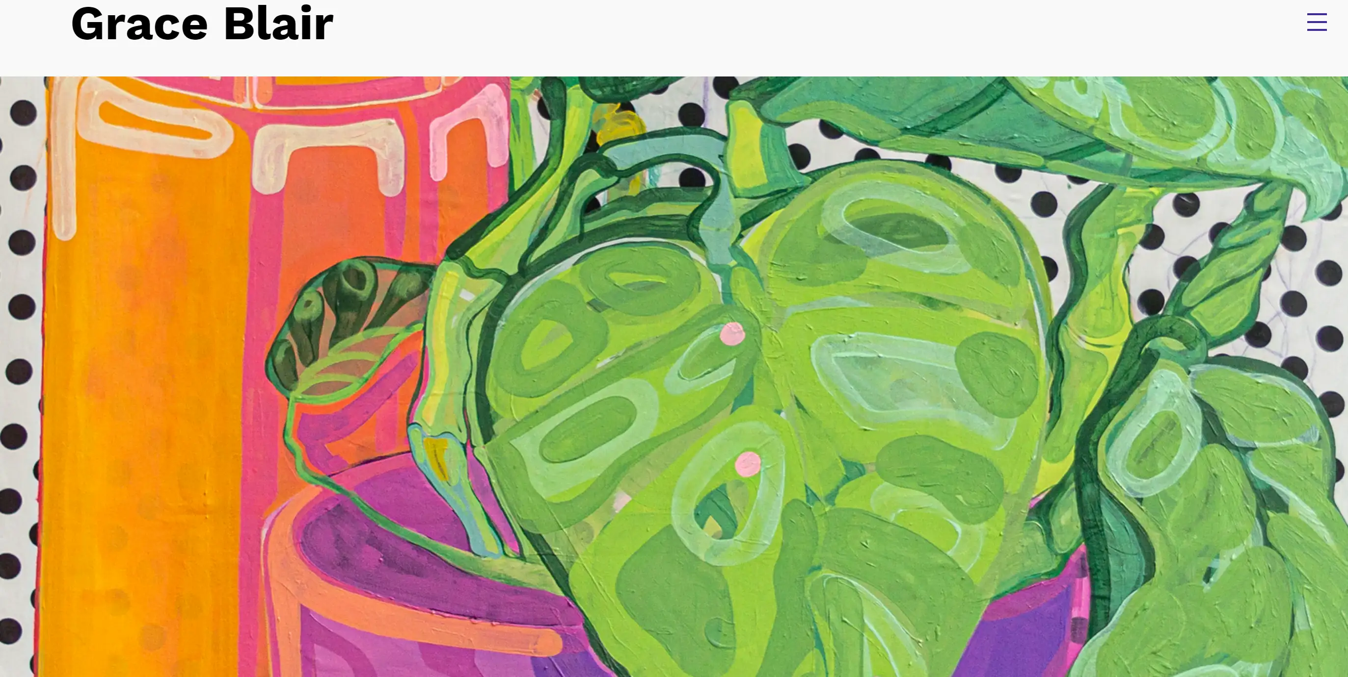
Grace Blair’s art portfolio is a great resource for art students aiming to promote their work online. Featuring colorful pieces from her thesis and undergraduate studies, the homepage offers simplicity with a full-width hero image, site title, and a hamburger menu. The Resume page includes an artist statement, professional experiences, skills, and contact details. A unique Camera Reel page gives a behind-the-scenes look at her artistic process.
Jennifer Xiao
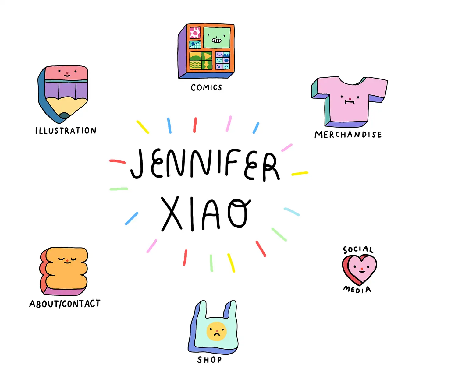
Jennifer Xiao’s website impresses with high interactivity and a cool aesthetic. The site lacks a traditional header and footer, emphasizing a minimalist design that enhances the browsing experience. It cleverly combines a portfolio with an online store, allowing artists to showcase and sell their work seamlessly.
Karina Sirqueira
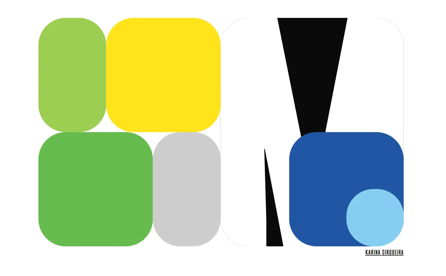
Karina Sirqueira, a Digital Product Designer at Airbnb in New York, presents a polished and professional portfolio. Her journey started at globo.com, followed by roles at Huge in Rio, Elephant in SF, and Work & Co. Her site’s modern design and streamlined layout make a strong impression, showcasing her work with prominent clients like Apple and MTA.
OhDada
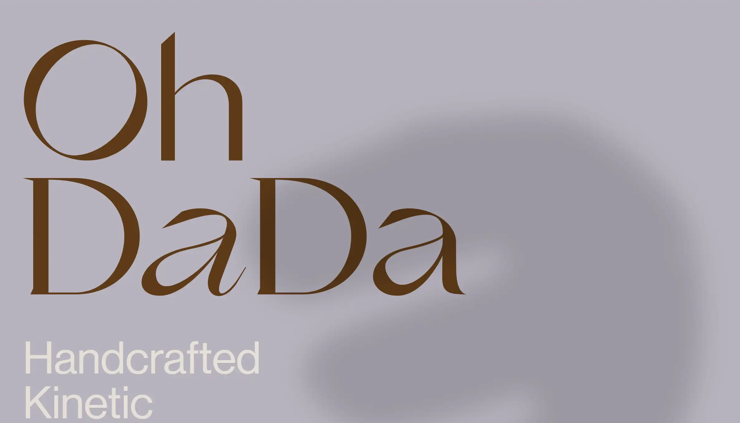
OhDada, a project by two graphic designers, focuses on handmade kinetic sculptures aimed at creating soothing home environments. The site features easy navigation and a minimalist design, highlighting their best work. Each product page details the item's name, materials, measurement, and price, exuding elegance with a sophisticated colour palette.
Gerhard Richter
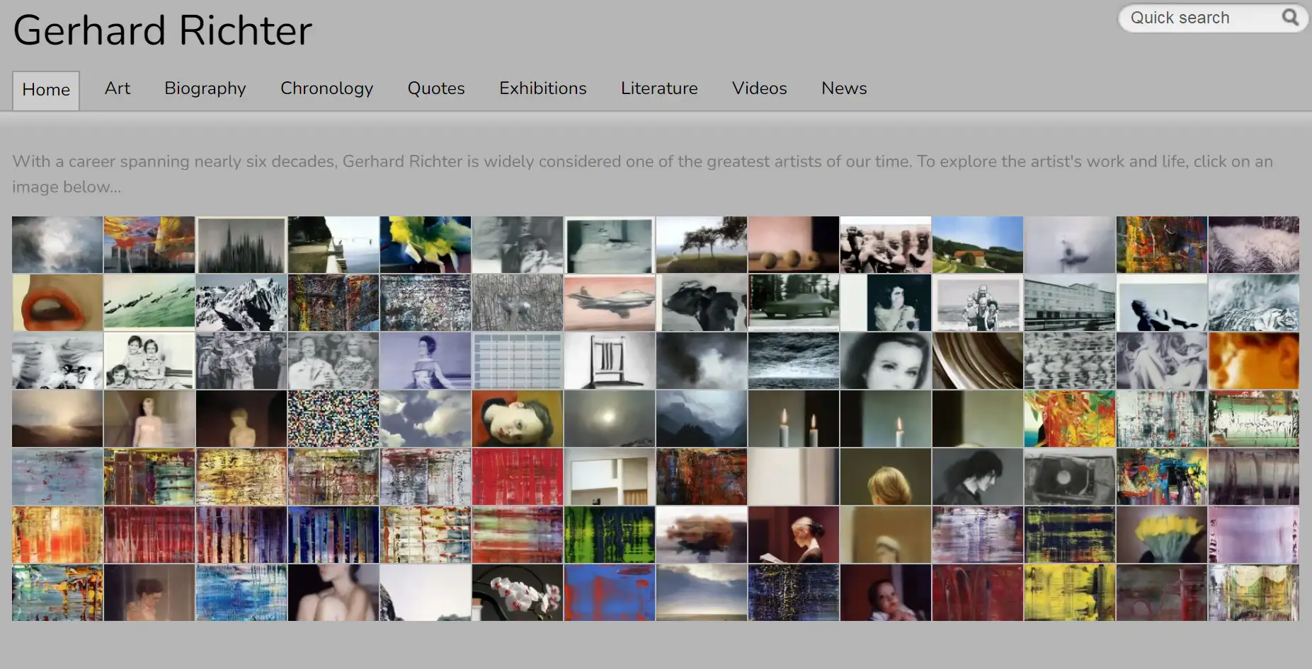
Gerhard Richter’s website stands out with its pristine, clean design that highlights his extensive body of work. The organized layout offers unique insights into his art portfolio. Notably, the site supports multiple languages, catering to an international audience. For those building a portfolio for global fans, Ucraft’s multilingual website builder is a great option.
Lirona
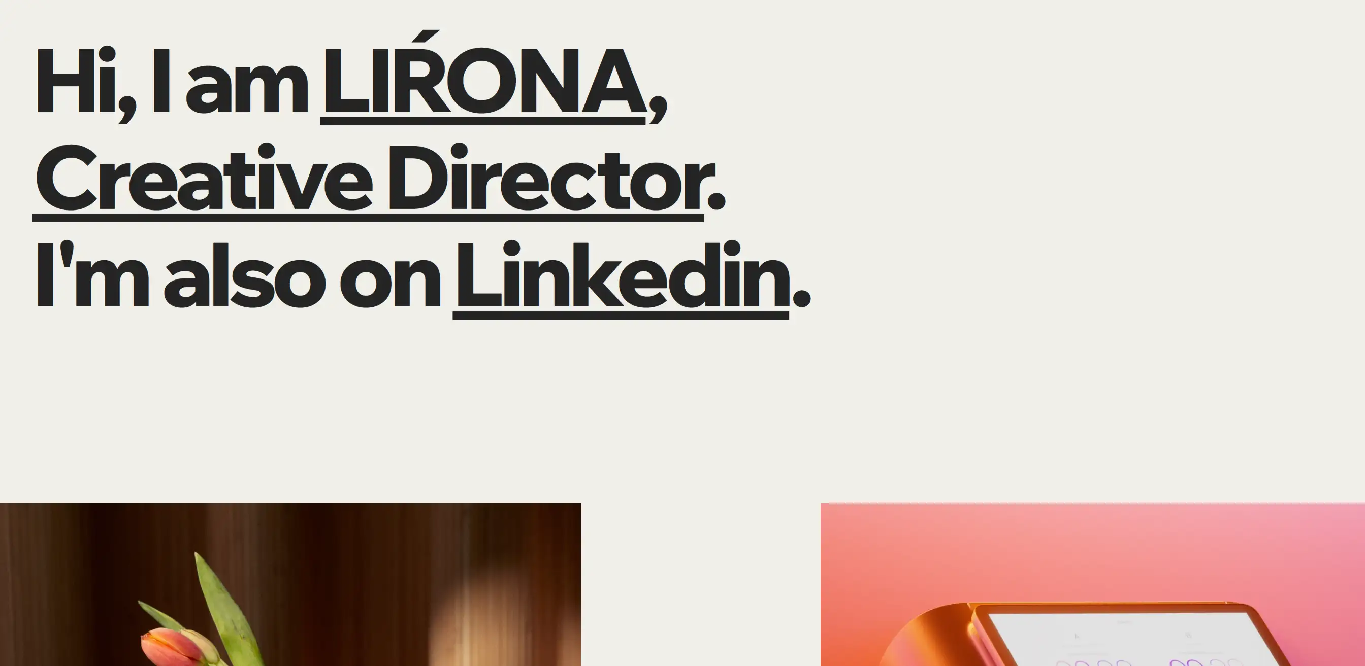
Lirona’s portfolio features bold typography and contrasting colours to highlight essential elements. The site is easy to navigate with only two menu options – Work and About Me. The Work section showcases her projects, while the About Me page provides background information, with clever colour changes emphasizing different site elements.
Lotte Niemenen
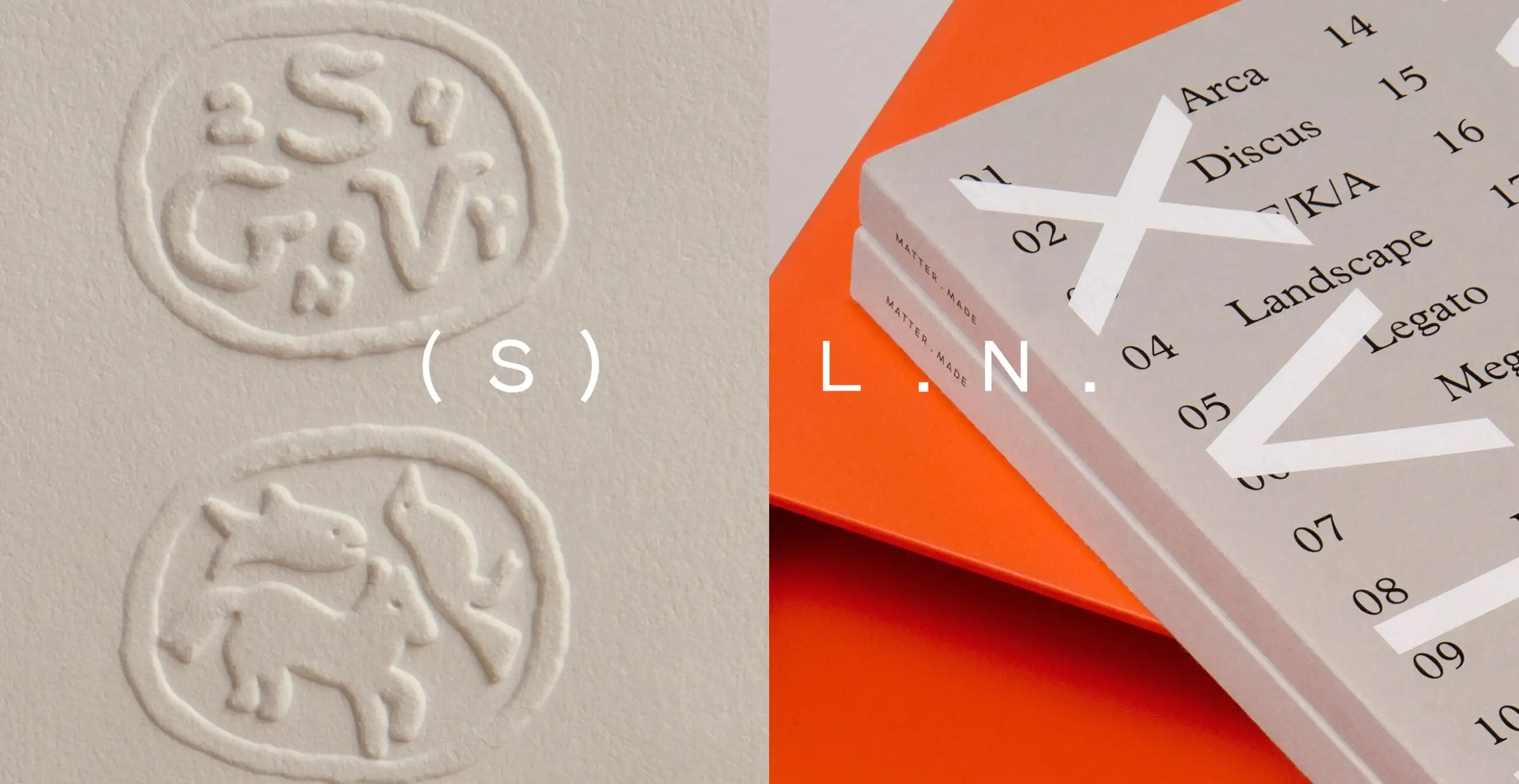
Effective graphic design portfolios often let the work speak for itself. Lotte Niemenen's website features a streamlined design that highlights client deliverables, with text that adds value by detailing the design process. The site showcases a wide range of skills with a consistent vision, and clean, exciting navigation enhances functionality.
Gina Kirlew
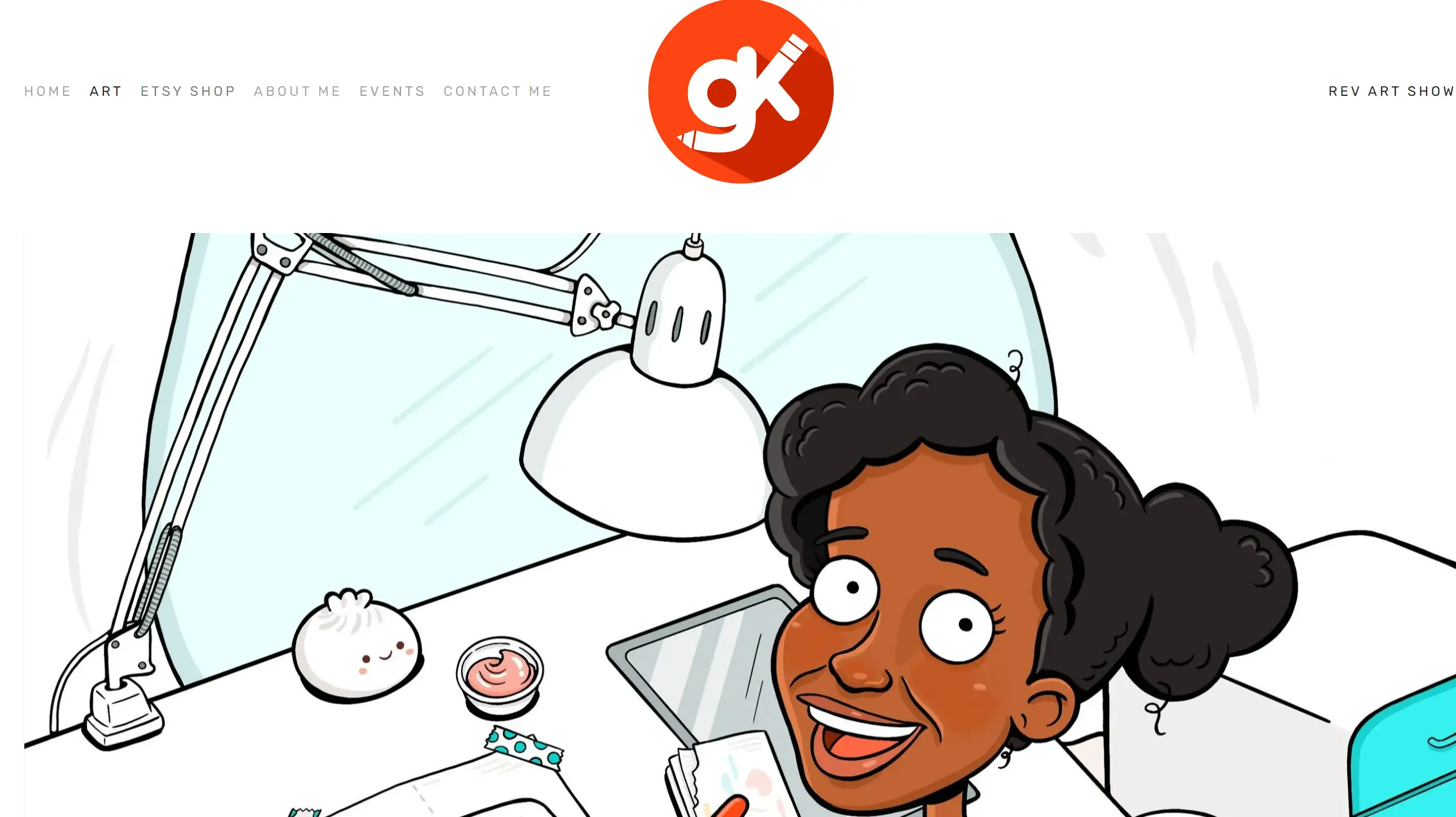
Gina Kirlew combines minimalist web design with her vibrant art to create a welcoming viewing experience. Her site uses warm colours and personal anecdotes, fostering an intimate atmosphere. The simple homepage features a header, a footer with three social icons, and a cartoonish self-portrait, perfect for artists who want to share their journey.
Julia Paul
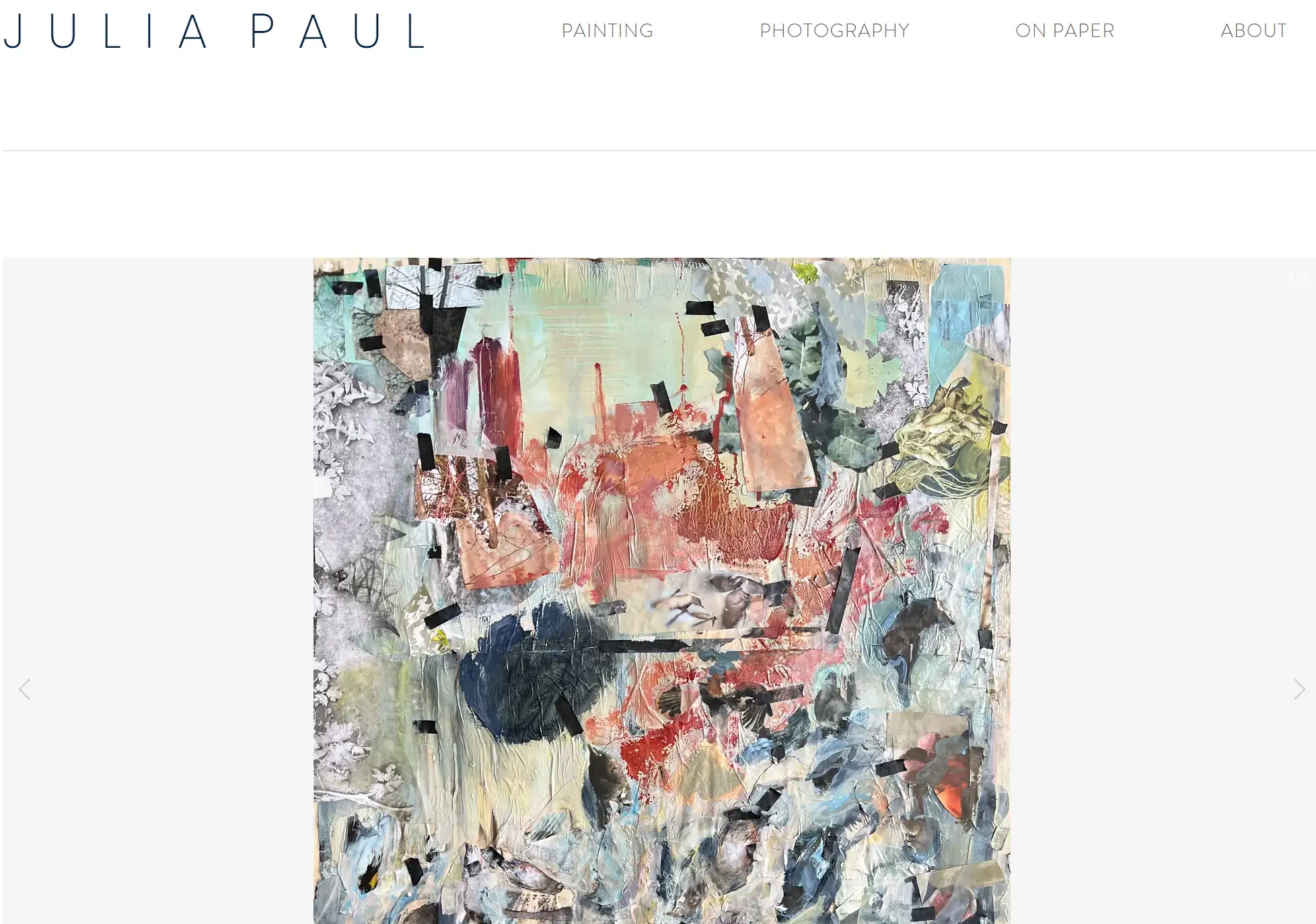
Jula Paul’s art portfolio captures the essence of a gallery setting with its stark white background, reminiscent of the "white cube" style. The white space framing each image emphasizes her paintings, drawings, pottery, and photographs. An organized menu provides easy access to her diverse works, while the descriptive About page offers a thoughtful artist statement, detailing her inspiration, experience, and focus, adding value for potential clients.
Ray Hart
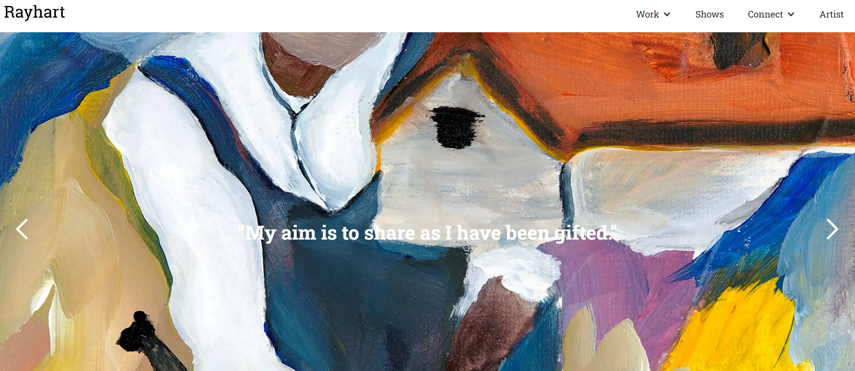
Ray Hart’s website features a full-screen image slider with text overlay and a sticky header with a drop-down menu. Uniquely, the search bar is located below the slideshow. The minimalist design of the other pages puts the spotlight on his vibrant and dynamic artwork. Bright colours and bold layouts make the site visually captivating, reflecting Hart's creative style.
Sophia Yeshi
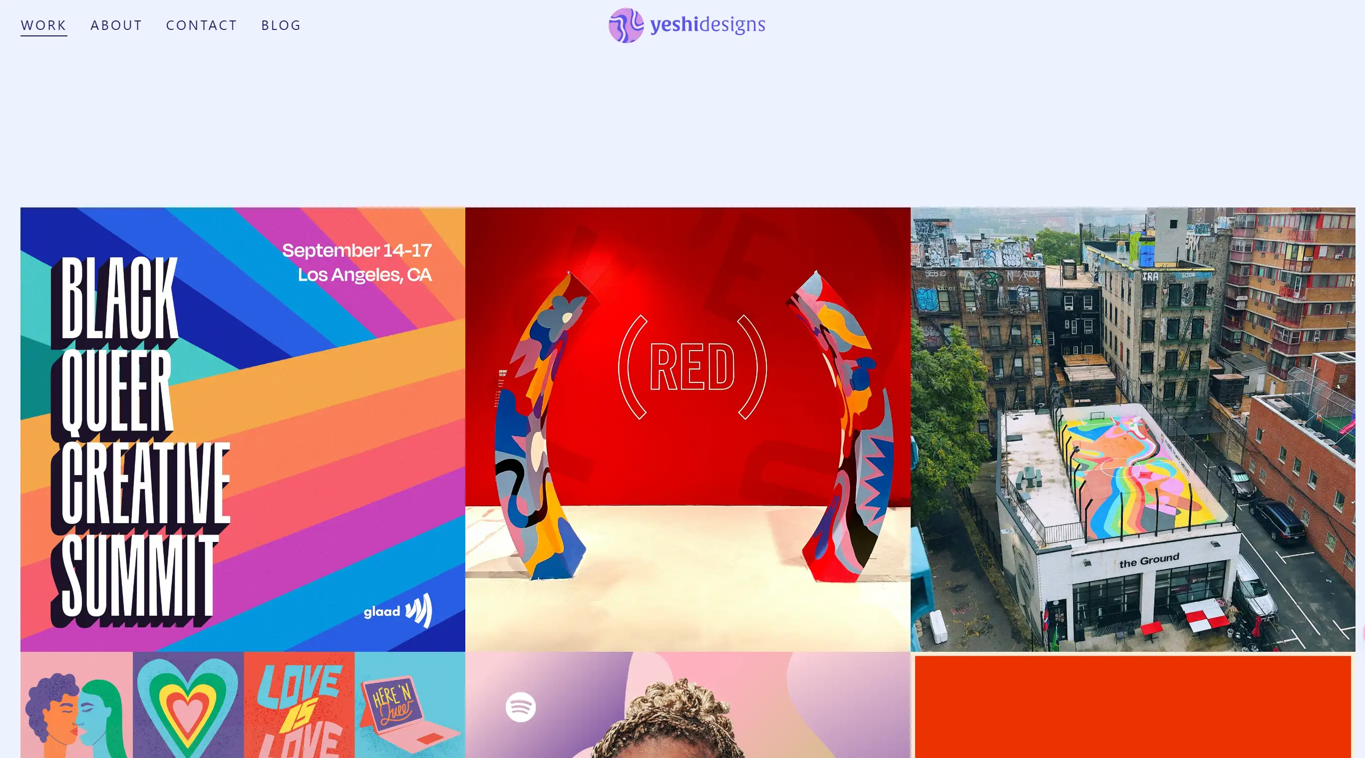
Showcasing a distinct style in graphic design while highlighting its application in a business context can be challenging. This portfolio achieves that balance. Tiles display the designer's unique style, and clicking each tile reveals detailed project information. This approach is ideal for designers who want to share the story behind their work while maintaining easy navigation.
Lisa Maltby
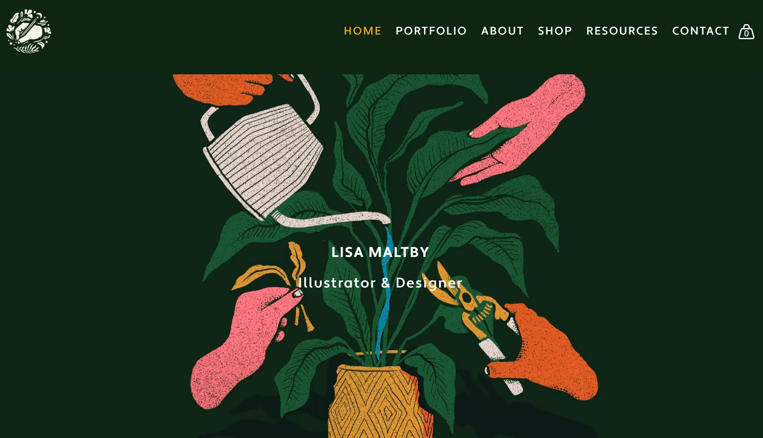
Lisa Maltby’s homepage features a bold portfolio grid with both static and animated elements, adding visual interest. The animated logo in the header, drop-down navigation, and cart icon contribute to a dynamic yet clean look. Personal touches make the website feel intimate and inviting, perfect for artists seeking a personal connection with their audience.
Lissa Brandon
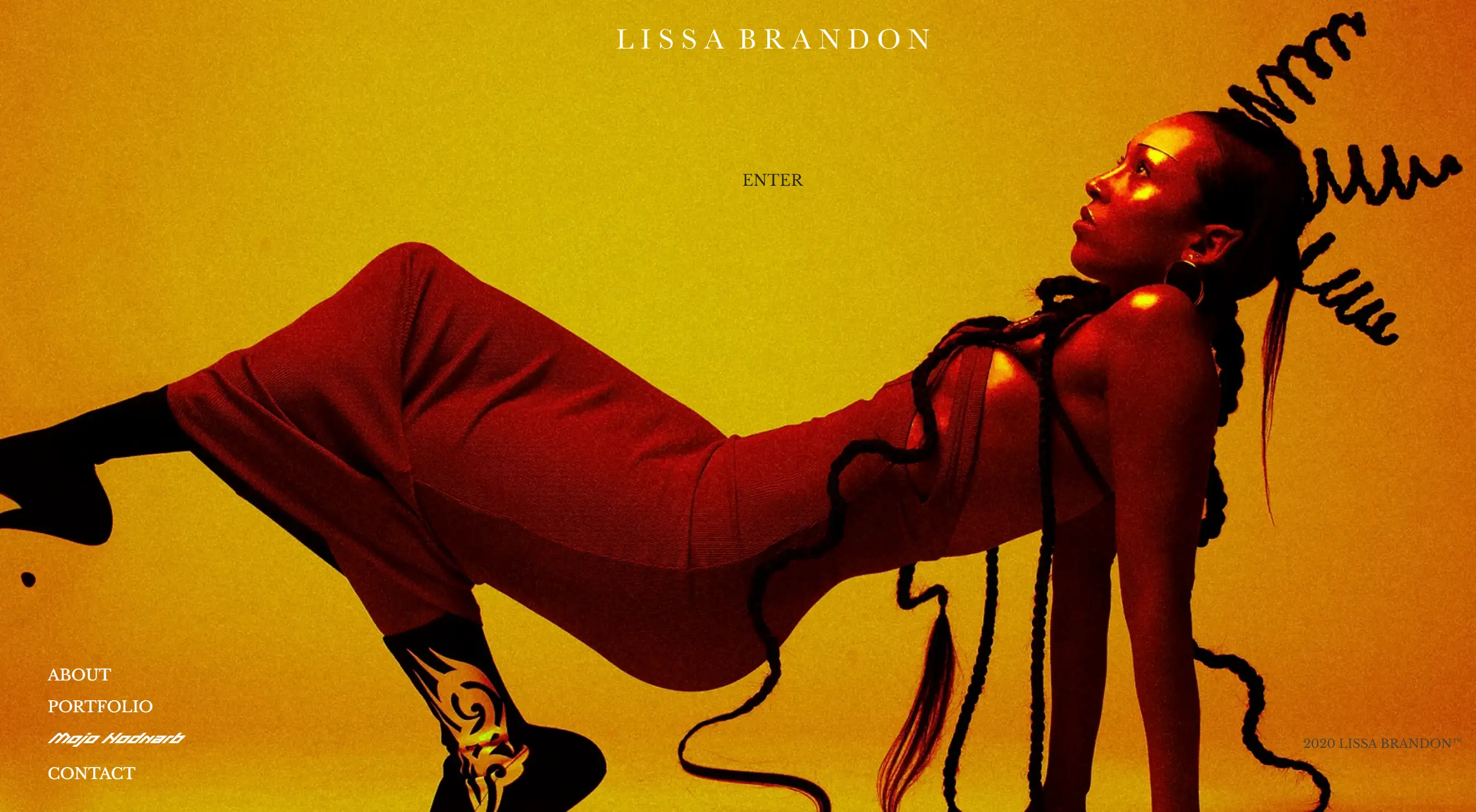
Lissa Brandon’s portfolio starts with a bold splash page that mirrors her tangible works. The organized gallery of projects, parallax background, and micro-animations engage visitors effectively. A dark colour scheme matches her sophisticated and bold art. The use of varied typefaces, white text, and neon highlights creates a lively and captivating design, emphasizing key elements.
Natalie Petrosky
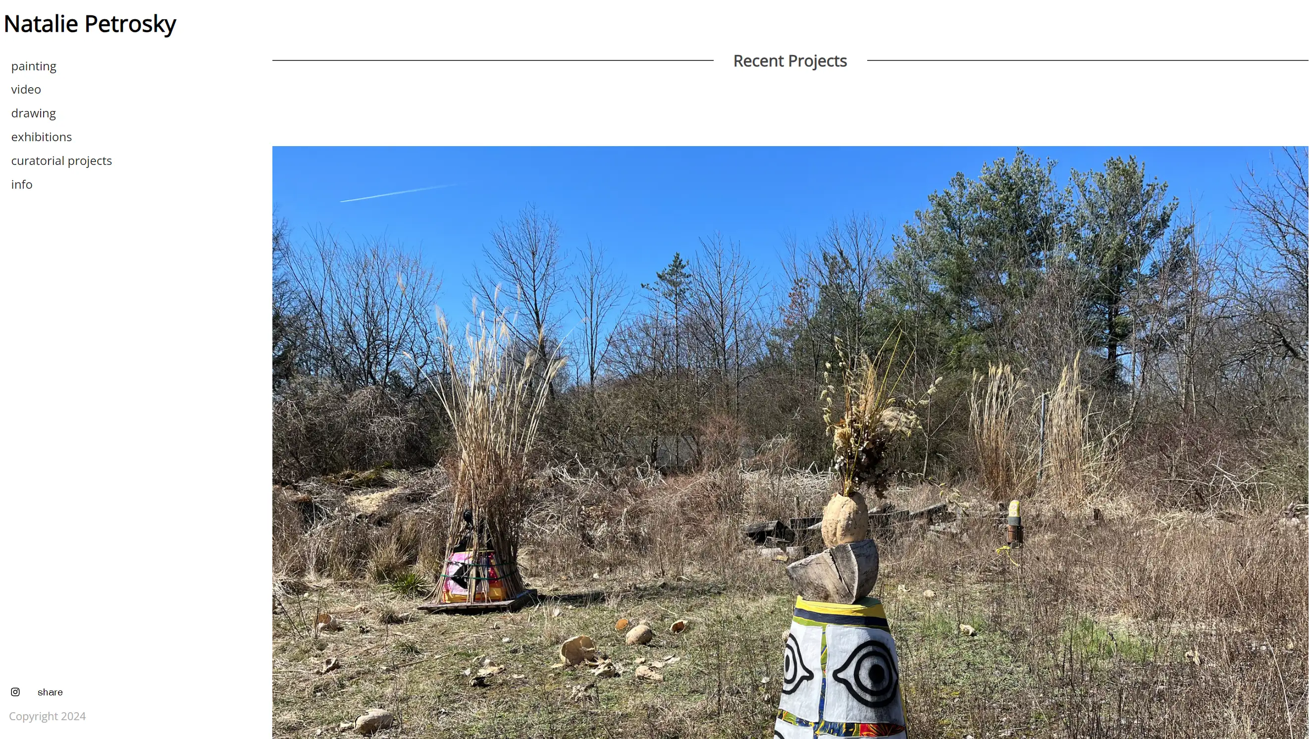
Natalie Petrosky’s adaptable website suits artists with a diverse range of works. The flexible layout can be customized to fit any style, making it ideal for showcasing various mediums. This versatile design accommodates different types of artwork, catering to artists who work across multiple disciplines.
Gail Anderson
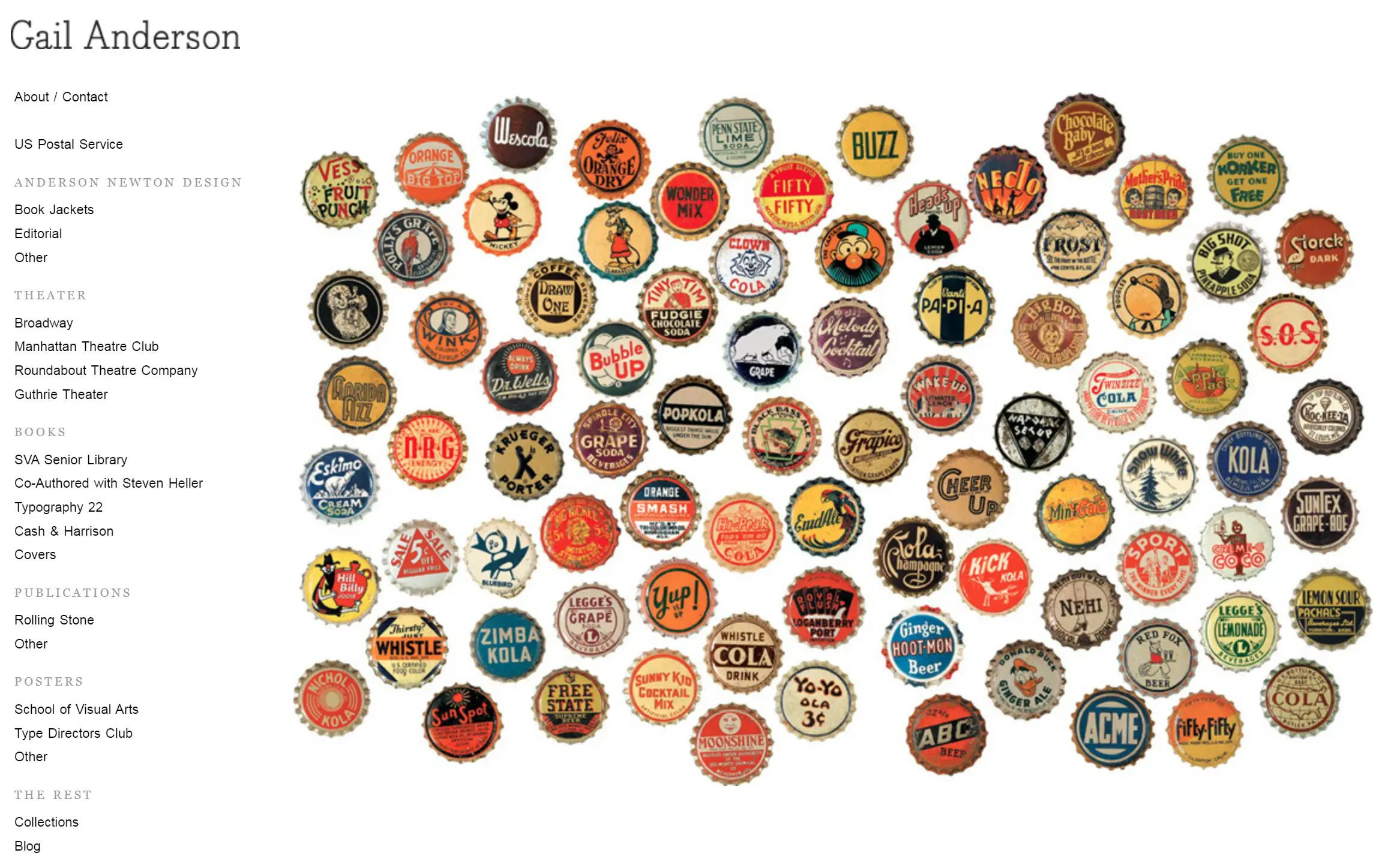
Anderson’s portfolio showcases her dedication to design thinking, technical skills, and passion for design. The simple left-hand side navigation leaves ample space for high-resolution images of her detailed works. This graphic design portfolio emphasizes clean navigation and the ability to appreciate the intricacies of each piece.
Kris Truini

Kris Truini’s website greets visitors with a striking minimalist opening screen. A black background highlights a white 'K' logo, capturing attention immediately. The black backdrop then seamlessly transitions into a dynamic video playing behind the logo. This subtle yet powerful introduction showcases Kris’s expertise in visual storytelling. Each page is meticulously organized, featuring rows of full-bleed videos that vividly bring Kris’s projects to life.
Shira Bar
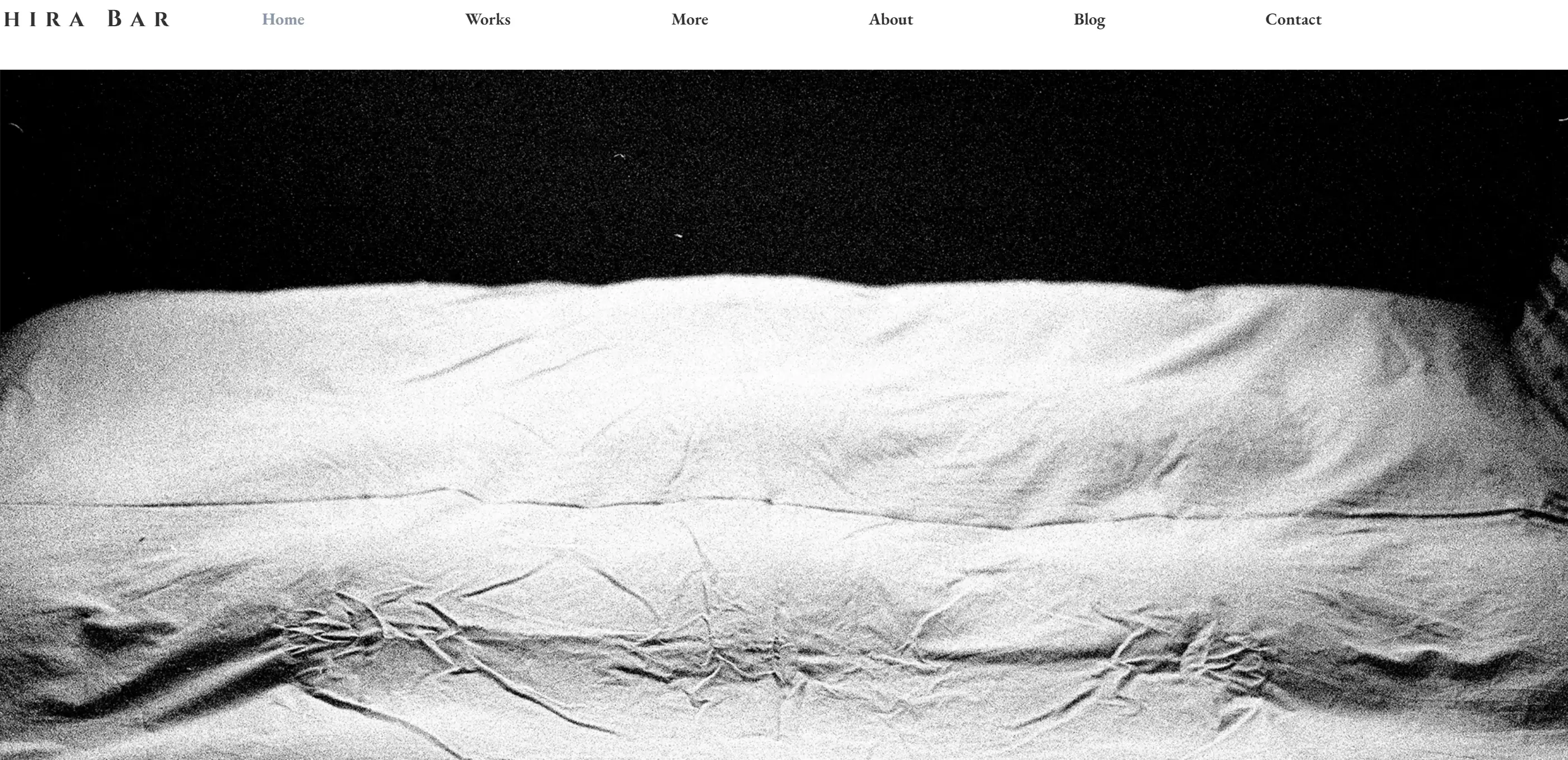
Shira Bar’s photography portfolio highlights her elegant style with an analogue photograph on the homepage. The addition of a blog, created by a blog maker, offers insights into her artistic process and motivation. This approach provides readers with a deeper understanding of her methods, making the portfolio more engaging.
Chip Kidd
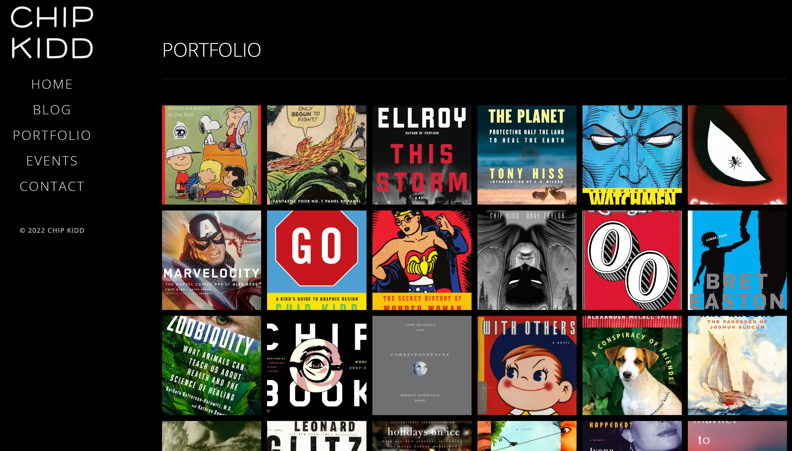
Chip Kidd’s graphic design portfolio uses lightbox-style pop-ups to highlight each book cover, allowing viewers to focus on the visuals. This method showcases his range of styles naturally and excitingly. The dark background makes his designs stand out, and the simple side navigation offers quick access to information about the designer and his work.
Tips for Creating Your Artist Portfolio Website

- Choosing the Right Platform: Select a platform where you will be hosting the artist portfolio website depending on your preference. Some common platforms are the WordPress, Squarespace and Wix. This means that the different platforms are suitable in different ways and depending on the qualities you deem most essential.
- Designing for Your Audience: The target audience should be identified and then the web design should be done in such a way that it appeals to the audience. Here you can think of what they want to see or have when they visit an artist portfolio website, and ensure that you offer that to them.
- Maintaining and Updating Your Portfolio: One important thing is frequent revisions of this portfolio to ensure that it attracts the attention it deserves. Create a new job, most frequently, update the blog, and check whether the contact information is actual. Fresh content also points back since the visitors have to come back for newer content on a frequently updated site.
Let's Wrap This Up
All in all, designing and developing an incredible artist portfolio website is crucial for promoting the pieces of art and for gaining global exposure. In this article, examples are mentioned that show what sites representatives of various directions and styles can create, which can inspire you to develop your site. If you are to adhere to the tips and examples provided, it will be easy to develop an enthralling portfolio that will spearhead your opportunities to have a clientele or a set of fans.
Are you ready to start or redesign your artist portfolio website? Start using Wegic now and bring your art portfolio website design to the next level!
Written by
Kimmy
Published on
Aug 2, 2024
Share article
Read more
Our latest blog
Webpages in a minute, powered by Wegic!
With Wegic, transform your needs into stunning, functional websites with advanced AI
Free trial with Wegic, build your site in a click!