404 Pages: The Complete Guide for Website Owners
404 pages plays a crucial role on websites, keeping users on your site and leaving a lasting impression of your brand. This guide will help you understand everything you need to know in 404 pages.
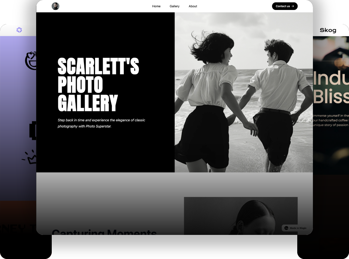
Millions of 404 pages are accessed each year, with a high likelihood that user traffic is lost as awake users simply return to Google in search of another target result.
While there are no specific statistics currently tracking the volume of sales and opportunity losses incurred because of 404 pages, we can confidently assure that the financial toll will be substantial.
Whether you're a business owner, an independent blogger, or someone offering website management services through an agency, if you are indeed the owner of any websites, let go of your former notion: building a great 404 page is not worth your time and effort.
404 pages can play a crucial role on a website, keeping users on your site and leaving a lasting impression of your brand.
This guide is designed to help you understand everything you need to know in 404 pages. Keep reading!
Table of Contents
- What Is 404?
- Common Reasons Why You See a Page Not Found Message
- Why Are 404 Pages Important for Websites?
- Key Components of a 404 Page
- Effective Ways to Guide Users Back to Useful Content
- How to Create a Custom 404 Page?
What Is 404?
A 404 page (also known as a 404 not found page), is a page that is displayed when a visitor is unable to retrieve the requested information from the server, either because the server is unable to respond or because it does not know the reason for the failure.
The 404 error code is one of the many standard error messages in the HTTP status, where the number indicates a specific problem that is occurring. In short, the page is called a 404 page because it displays the HTTP 404 status code. This error is a shorthand for 'not found,' indicating that the resource you are looking for cannot be found.
HTTP STATUS CODES
- 1XX Informational codes indicate that a request was received and is being processed
- 2XX Success codes show that the request was successfully received, understood and accepted
- 3XX Redirection codes inform that further action needs to be taken to complete the request
- 4XX Client error codes indicate errors caused by the client
- 5XX Server error codes show that the server failed to fulfill a valid request.
We can take a look at the process of a website server:
Whenever you enter a URL in your browser, the browser sends a request on your behalf.
(1)You click a link via your browser.
(2)Request a page.
(3)Look for the file on the disk.
(4)If found, show the page.
(5)If not found, shows error 404.
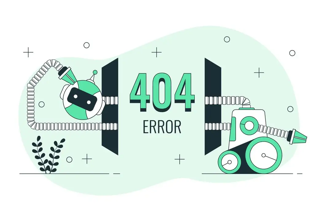
A 404 page may make the user feel frustrated. However, it's also a chance for the website to turn things around. A witty and entertaining 404 page can bring joy to users, helping them forget their frustration and discomfort.
The following are examples of turning frustration into delight with a 404 page:
On the Google Chrome 404 page, it shows a small game where you control a dinosaur to avoid obstacles.
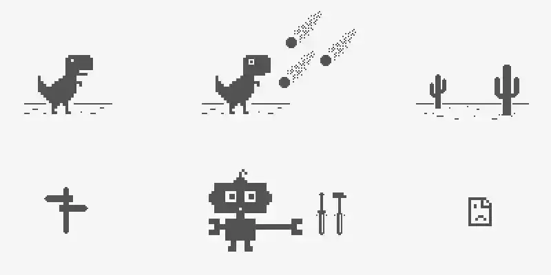
This way not only draws visitors in, but it also lengthens their stay on your website, which can enhance user engagement metrics.
Pixar's 404 page, a character from the much-loved movie crying from "Inside Out," accompanied by the text "Awww…Don't Cry."
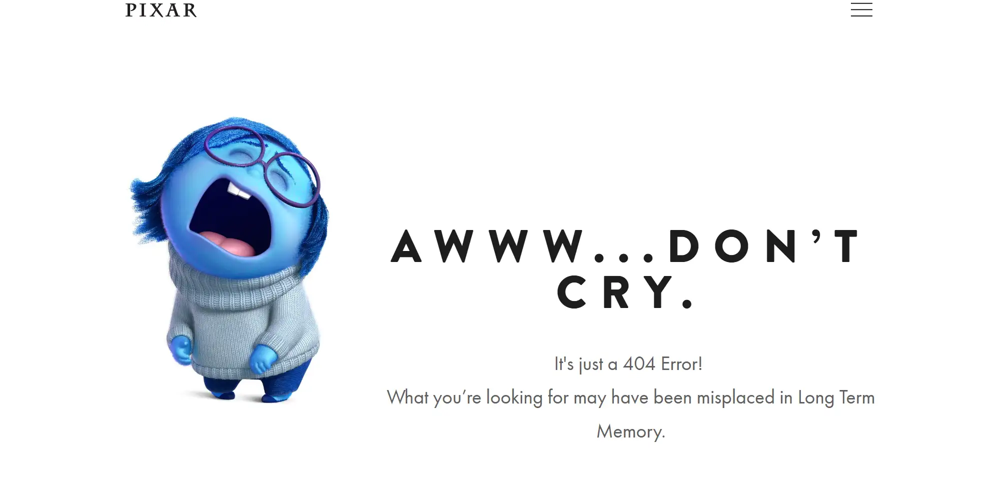
This touching 404 page will undoubtedly resonate with Pixar fans. A warm and interesting language can also
engage your audience like "awww" and "oops."
Interesting! We've gotten carried away. After we have enjoyed these delightful 404 pages, a question pops up: why do 404 pages appear?
Common Reasons Why You See a Page Not Found Message
There are many reasons why the server is sending you a 404 error message about the page you are trying to access. Let's delve into five main reasons:
01 Making a typo in a URL
If the user's address is not the correct URL for the website, even the tiniest spelling error in the URL might result in a 404 error. We should carefully check if the URL address is spelled correctly and pay attention to capitalization, slashes, underscores, special characters, etc.
02 Clicking on a broken link
A broken link is a hyperlink that does not work. When you click on a broken link, it fails to take you to the intended web page.
When moving or deleting image files without updating the links in the HTML code, the links pointing to the images may also break.
When the external platform that third-party plugin code depends on changes its code, the links in the third-party plugin code may break.
03 Trying to reach a blank page
In short, the page that was previously here has been deleted. This may be due to intentional cleaning of the website or accidental deletion of the page.
If the requested resource does not actually exist, we can try to find alternative resources. Sometimes, errors occur simply because the resource has been moved or renamed.
04 The domain name doesn't exist
Website owners may change their domain names due to various reasons such as brand upgrades.
However, failing to update both the old and new domains properly would result in numerous web pages being inaccessible with the error message 404.
The 301 HTTP status code informs users and search engines that your webpage has moved to a new location and redirects them there.
Why Are 404 Pages Important for Websites?
In website design and operation, 404 pages are often overlooked, but their importance cannot be ignored.
The 404 page is to help lost visitors retrace their steps, return to the website's homepage, or find an alternative page where they can find the information they are looking for.
Though its function and importance extend far beyond this, the 404 page also offers countless additional benefits for websites. Let us take a closer look:
Ensure user confidence
When users encounter a 404 page, their initial feeling is usually frustration or confusion, much like someone driving with GPS only to find themselves at a dead end. This experience can be uncomfortable, especially for website visitors who are looking for specific information or trying to complete a task.
An effective 404 web page gives users the confidence to stay on the website and continue browsing. A custom-designed 404 error page clearly shows that you care about your users, and it shows that you have made additional efforts or countermeasures to improve your website.
This behavior will help you increase the trust among users and can provide the final boost to encourage users to do business with you.
Increase customer retention
Users may quit a website or a brand if they are unable to locate what they are looking for on a consistent basis. Up to 88% of consumers believe they are reluctant to return to a website after a negative encounter.
An effective 404 page detects the problem and transfers the user to the correct page. This allows you to present crucial connections to your visitors, such as your homepage, FAQ, or any other relevant links, which will keep people on your website and lower your bounce rate.
Enhance UX and showcase brand personality
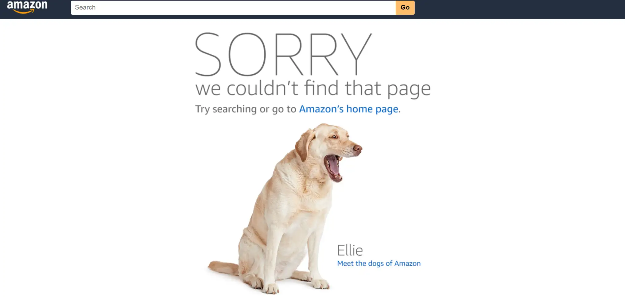
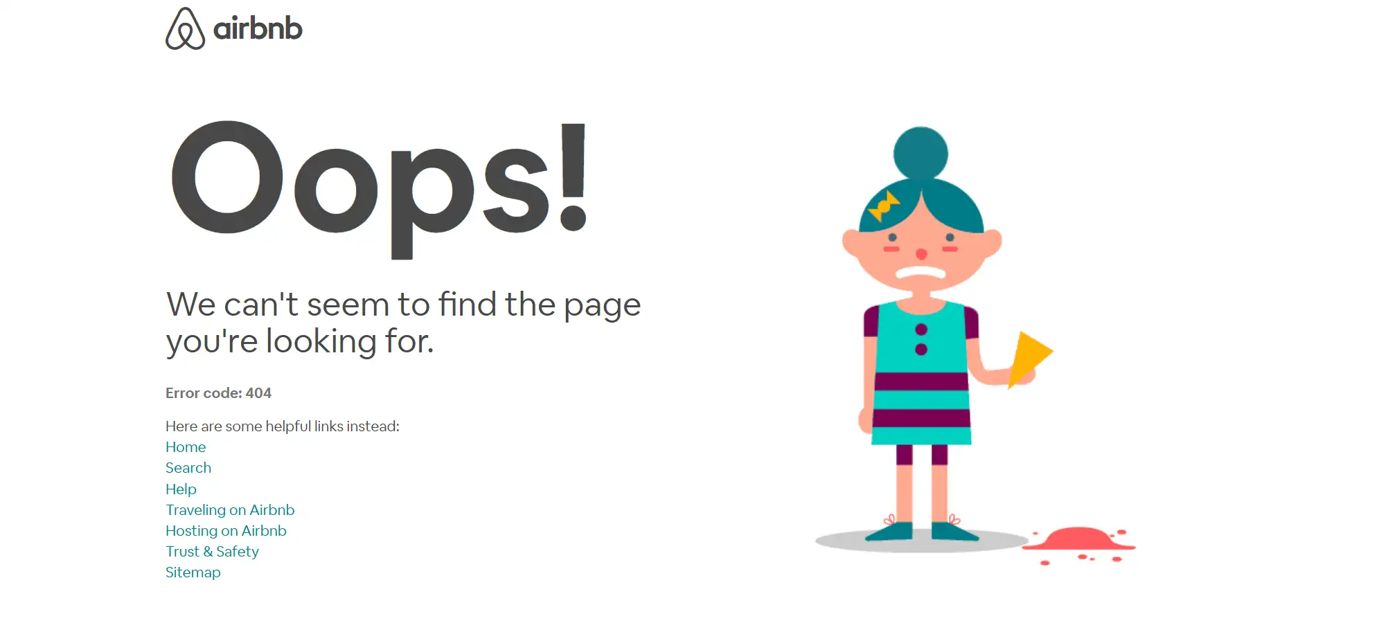
Typically, the occurrence of a 404 error page is not beneficial for user experience (UX), but its proper and creative design can actually enhance UX. For instance, many companies employ whimsical imagery and typography to entertain their audience. Asking "Where Did It Go?" in a humorous tone isn't that bad.
Some websites also try to give navigation choices that guide visitors to the proper place or other relevant material on the site, improving their overall UX. This not only gives users a nice interactive experience, but it also emphasizes the professionalism of the business, resulting in a win-win situation.
Key Components of a 404 Page
01 Clear information notification
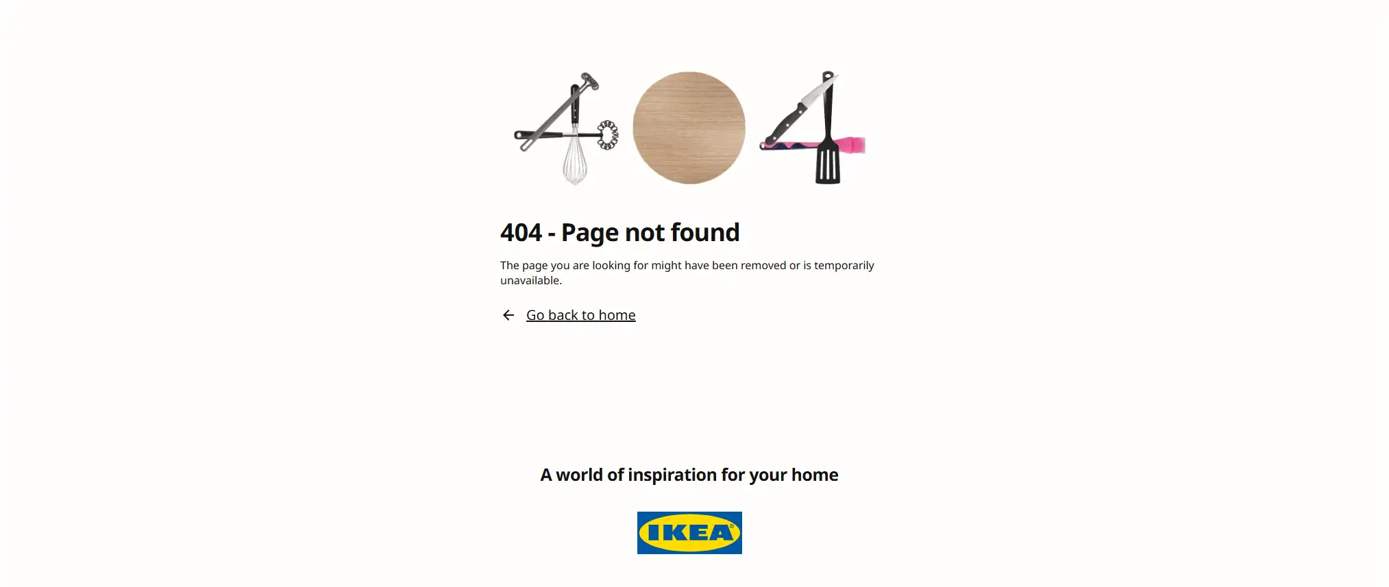
The 404 page should display a clear error message indicating the 404 error, and unequivocally states that the requested page cannot be found. It confirms the issue and its possible causes in friendly, concise language. It uses large, readable text and avoids technical jargon because most web users do not understand it, and it does not help your website.
For example, "404 - Page Not Found". This direct approach helps to immediately set the user's expectations and let them know exactly what the problem is.
02 User-friendly language
The tone and language employed on a 404 page can influence how website users perceive information.
Treating users with courtesy and selecting polite dialogue language ensures that users feel at ease and effortlessly employ your product.
Please contrast the two tones below, which one exhibits a more gentle disposition? This may elicit a longer dwell time in your user, thereby enhancing understanding.
- You see this page because......
- You might have ended up here due to......
03 Visual consistency
Visual consistency is an indispensable attribute of good design. A consistent visual language should apply to all product components, including the 404 page. By doing so, you will create a familiar experience for your audience and facilitate their ease of navigation through your website.
The 404 page should seamlessly blend in with the rest of the website's branding, both linguistically and aesthetically. You must employ the same visual attributes (colors, fonts, spacing) as all other pages on the website. This contributes to strengthening your brand image and ensuring a seamless user experience.

04 Adding Visuals
A single image speaks louder than a thousand words. Employing relevant imagery is a compelling means of visually communicating with your audience while demonstrating unwavering attention to detail. Correctly selected illustrations, photographs, or videos can help you captivate your audience's interest and establish an emotional connection with them, thereby encouraging them to remain on your website.
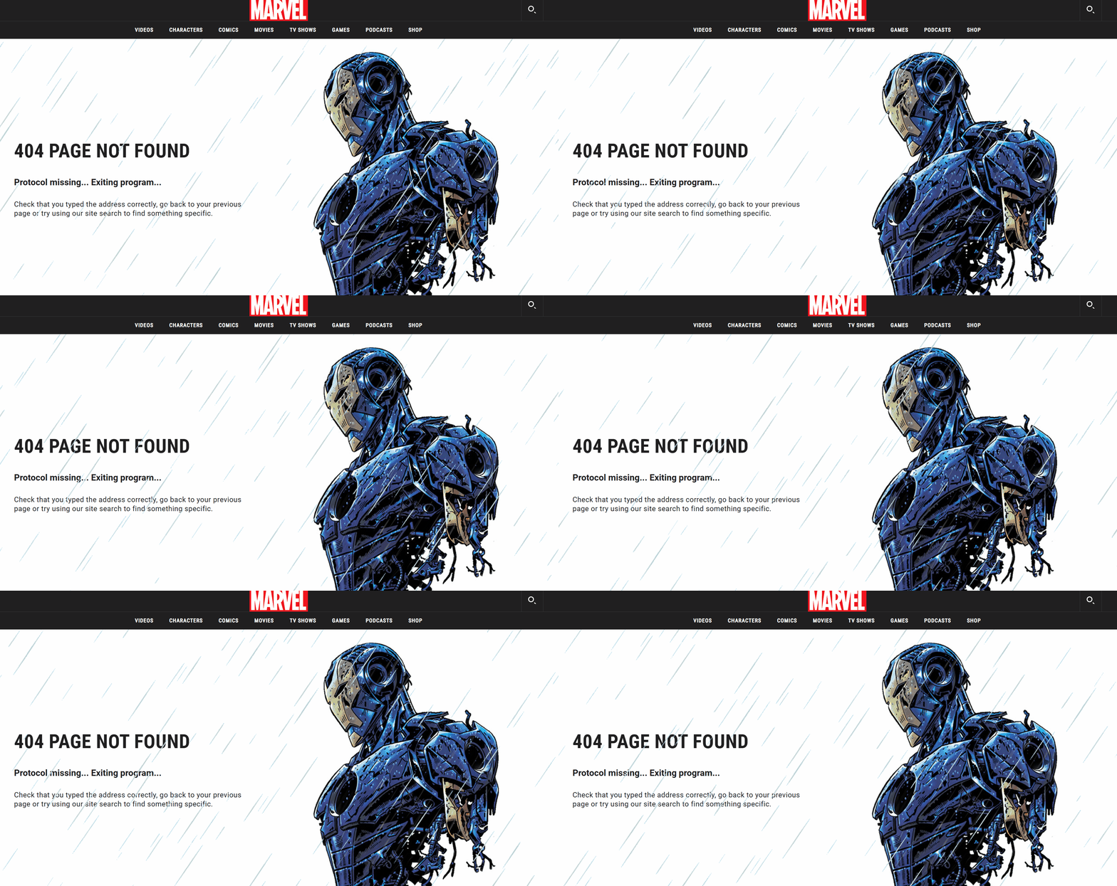
Tip: Incorporating elements such as logos or familiar imagery can reassure users that they have not entirely left the website.
05 Humor
Humor is the most effective way to develop an emotional connection with your audience. A funny 404 page might keep people on your website for longer.
For instance, amusing illustrations related to errors, or statements like "We must have placed that page in the wrong spot!"
Not only can this approach alleviate feelings of depression, but it also enhances your brand's relevance and friendliness, potentially transforming negative user experiences into positive ones.
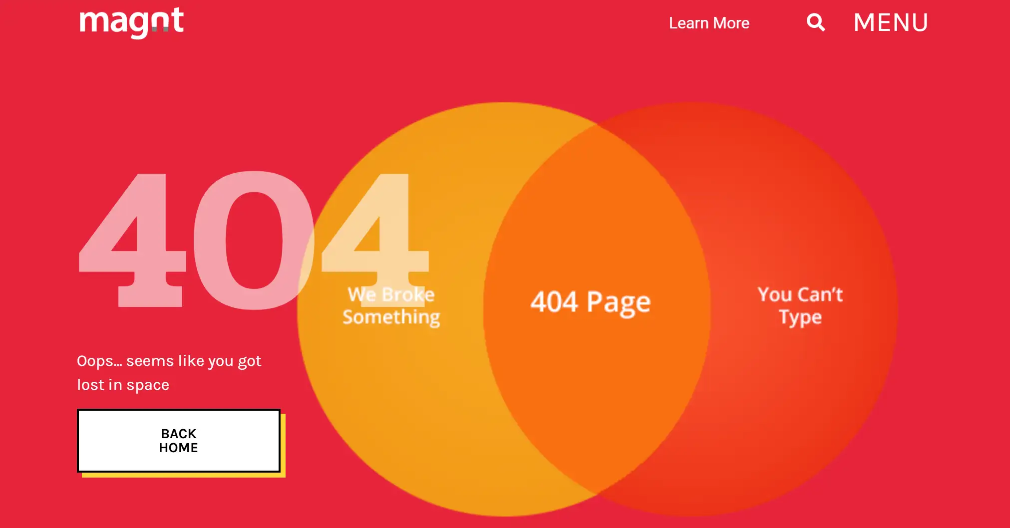
Tip: If you wish to infuse humor into your website, please ensure that your jokes resonate with your users. Visitors should not be offended by your jokes.
Effective Ways to Guide Users back to Useful Content
To enhance user experience and retain visitors, it is crucial to provide clear navigation options even when they encounter a 404 page.
Here are some effective ways to guide users back to useful content:
- Provide menu:
A clear and straightforward navigation menu on the 404 page can help consumers quickly reorient themselves. This menu should mirror the main site navigation, including links to important pages like Home, About Us, Services, and Contacts.
Furthermore, the larger 'Home' button may function as a reset button for visitors, returning them to a familiar starting point from which they can quickly navigate to various portions of the website.
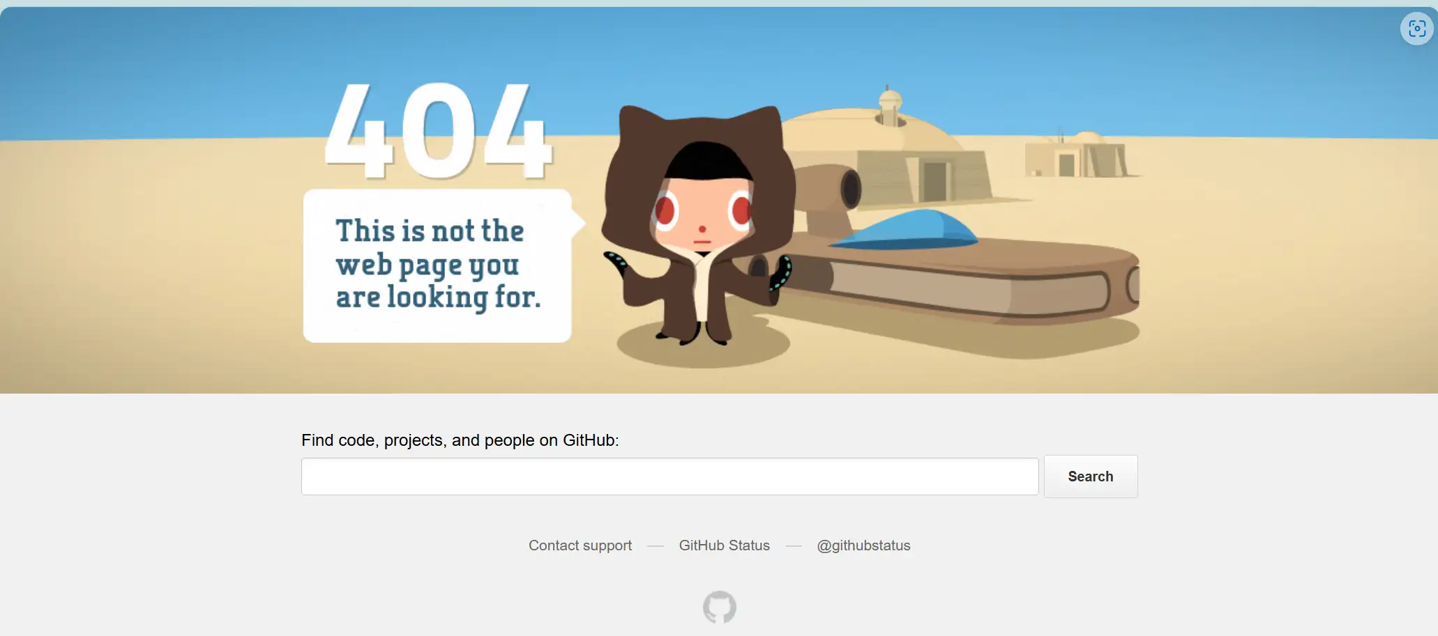
- Provide search bar:
Add a search box at the top of the page, allowing people to find the content they were looking for. Placing the search box prominently on the 404 page gives visitors a proactive option for finding what they need without having to go back.
This feature is simple, but it allows visitors to engage directly with your website's content database, perhaps leading to the discovery of more information than they originally expected.
You should ensure that the search bar is easily accessible and usable, either at the top or in the middle of the page.
- Provide a method:
Give users the option of reporting broken links or problematic pages to your team. You can also include contact information for users who require assistance with specific concerns, or direct them to the website's support/help center.
This transparency not only promotes confidence, but also helps to maintain the website's quality and accuracy by allowing users to detect and fix errors.
- Link to popular or related content:
By providing links to popular or relevant material, you may direct people to portions of your website that they frequent or are relevant to their interests. This might be in the form of images, hyperlinks, or even a dynamic area that refreshes popular articles or posts.
- Accessibility testing:
By considering these and other accessibility features, you help all visitors navigate your website smoothly, turning potential barriers into positive interactions and building trust and loyalty with users. For example, providing convenient keyboard controls for users who cannot navigate with a mouse ensures they can easily access all elements.
Tip: You need to refer to WCAG (Web Content Accessibility Guidelines) to ensure that your 404 page meets the necessary standards.
How to Create a Custom 404 Page?
Customizing a 404 page is a great way to add personality to your website and help visitors find a solution when they encounter a 404 error. After understanding what a 404 page is and its main components, the next step is to take action.
Developing a custom 404 page requires time and effort. If your website is custom-coded, you may even need to hire a developer. This comes at a cost.
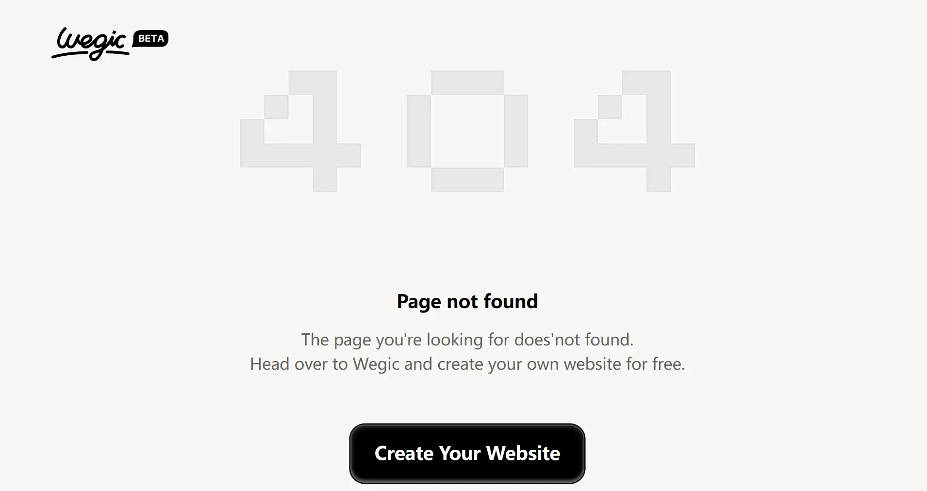
Don't worry, Wegic can help you get rid of these troubles in just two steps.
01 Tell your request to Kimmy
During the process of setting up the website, tell the assistant Kimmy in the dialog box to help you create a blank page to use as the 404 page.
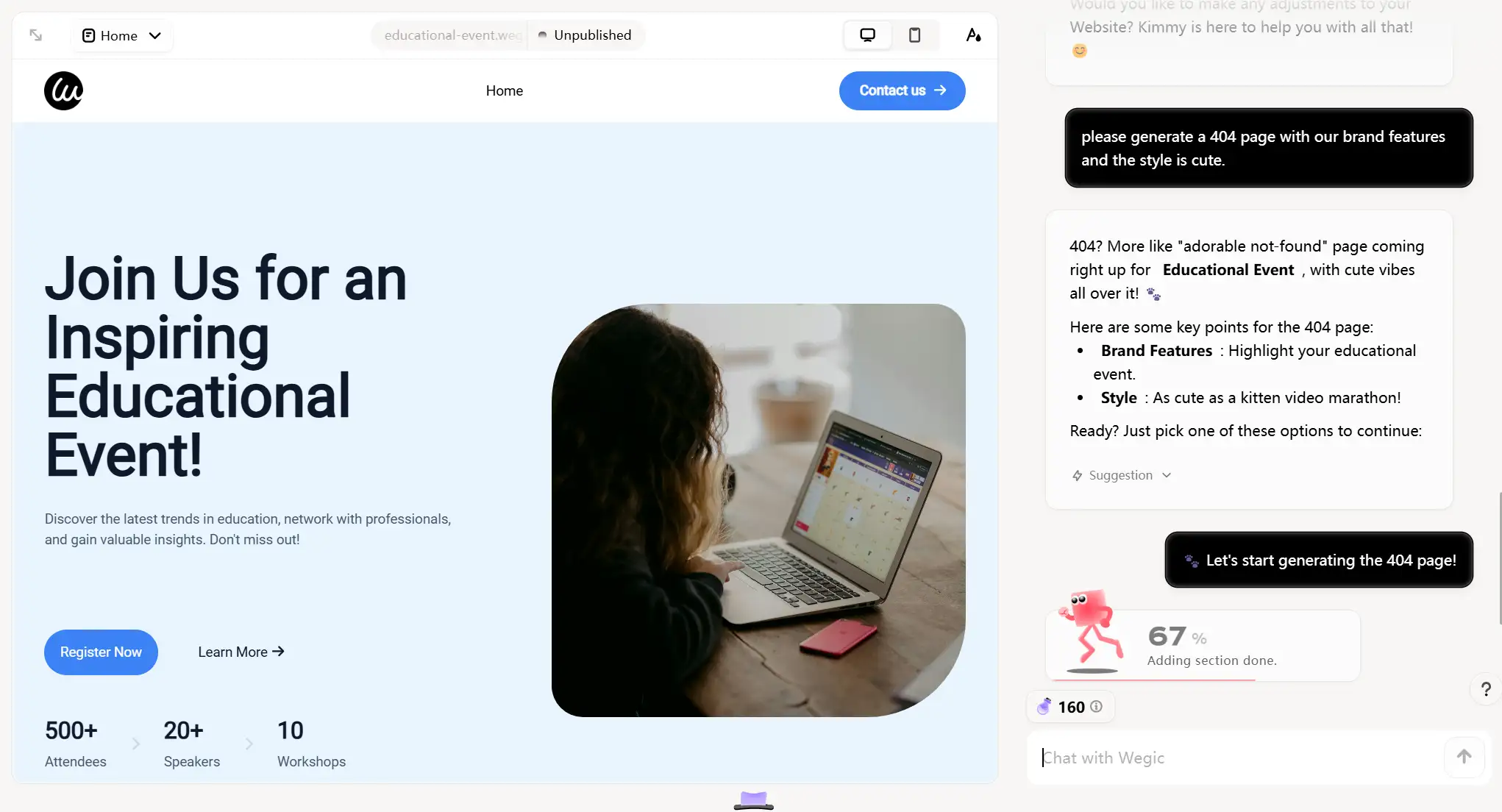
02 Custom your 404 page
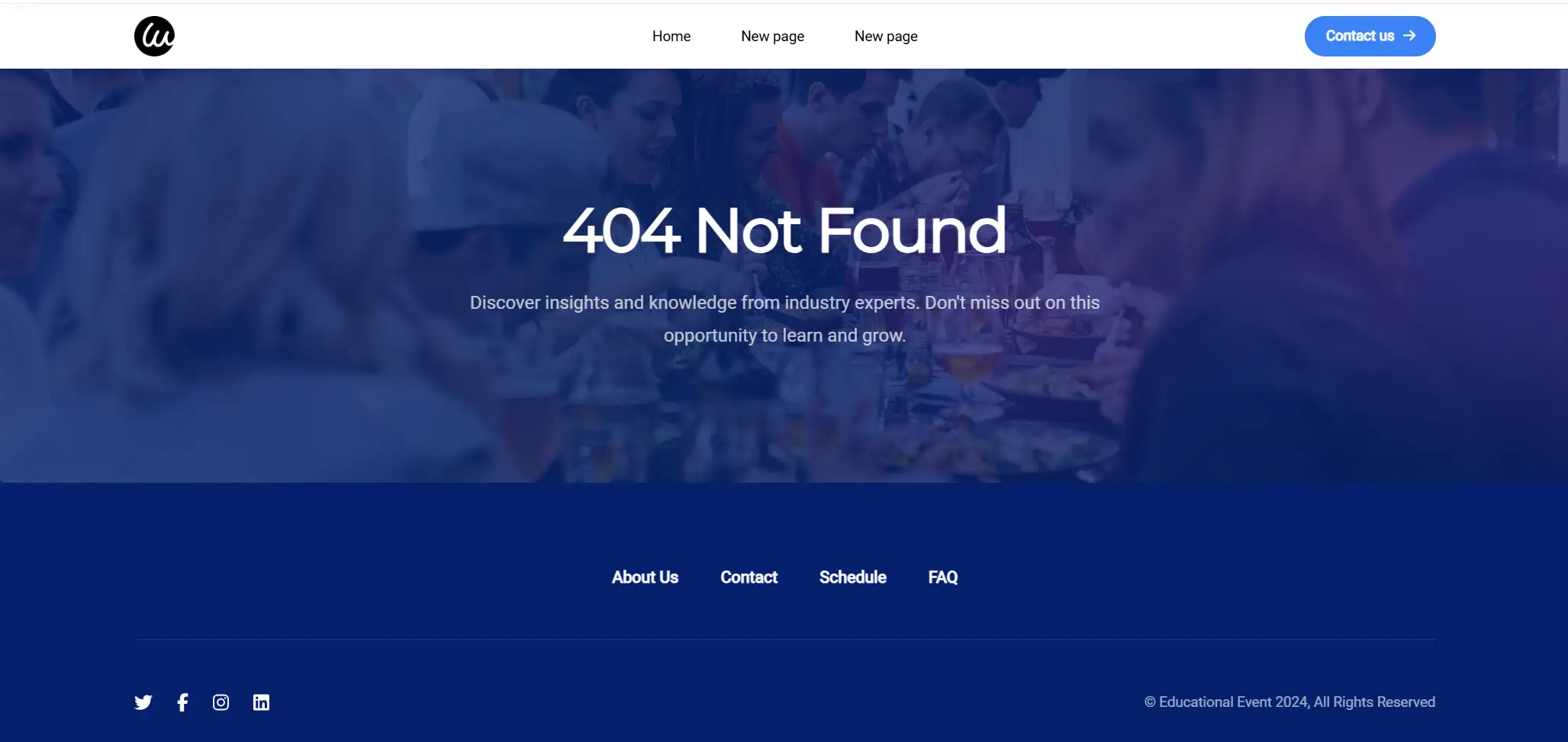
Upon generating the page to your specifications, you can edit both the text and animations and craft a one-of-a-kind 404 website page. In addition, if you wish to infuse some creative motion graphics into your website's branding to convey its personality or adding in interactive elements so users engage in novel ways, Wegic is perfectly suited for this task!
Conclusion
The 404 error page is very important since it serves as a critical touchpoint in the user experience. It is worth noting that the presence of 404 errors on a website should not be the reason for alarm. Damaged links or pages are frequently discovered over time when websites change or are updated. According to Google, having certain 404 pages does not harm a website's overall rating.
But you don't want your website visitors to get stuck on page 404. So, ensure that they can easily navigate away from the error page and find what they're looking for elsewhere.
Design is in the details. By refining your design judgments, you can enhance the user experience. The quality of error pages, such as 404 pages, can serve as a testament to your commitment to excellence. Trust in Wegic's capability to meet your meticulously crafted page requirements.
Let's start from here: Wegic
Written by
Kimmy
Published on
Aug 5, 2024
Share article
Read more
Our latest blog
Webpages in a minute, powered by Wegic!
With Wegic, transform your needs into stunning, functional websites with advanced AI
Free trial with Wegic, build your site in a click!