登入
打造你的網站
What Colors Go Well With Pink? A Designer’s Guide
Explore what colors go well with pink in design. From subtle pastels to bold contrasts, find perfect pink color combinations and ideas for every project!
Pink is a color that is both romantic and rebellious. Its versatility makes it an indispensable color in design and fashion. From gentle pink to powerful glitter, each pink has its own unique charm. So, how did pink evolve from a royal color to a popular trend symbol today? What colors can make pink more attractive when paired with it? This article will introduce you to history, the reasons for its popularity, and what colors go well with pink. Next, let's take a deeper look at this charming color.
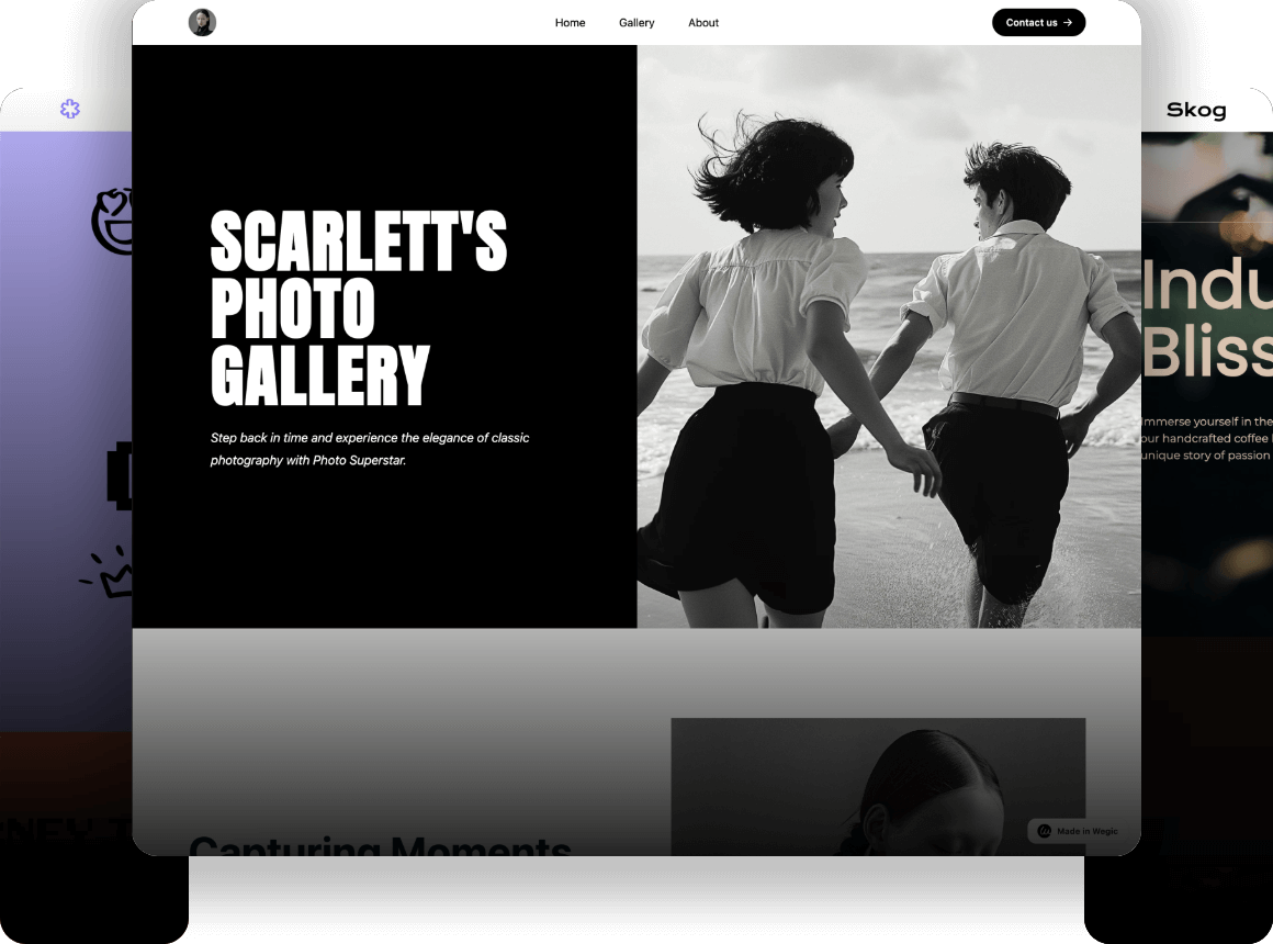
Click on the image to build a colorful website without code! ⬇️
Introduction to Pink Color
Pink, the first impression this color brings to people is mostly gentle, romantic, and sweet. It is often associated with flowers, spring, and love. However, pink does not always represent weakness or tenderness. It was once a symbol of war and a symbol of a rebellious spirit. With the changes of the times, pink has gradually broken through the traditional gender framework and become an indispensable color in modern design.
History
At different stages of history, pink has represented nobility, masculinity, and even political attitudes. Understanding these evolutionary processes can help us better grasp the ambiguity of pink in modern design. The following are several key nodes in the historical evolution of pink:
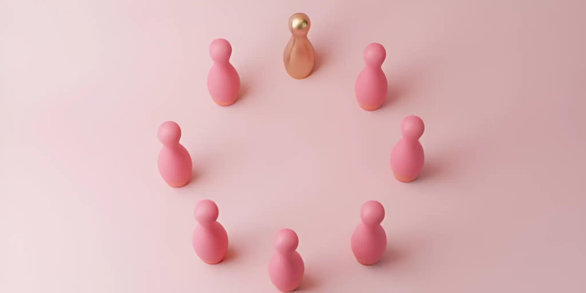
Image by Istock
- 18th century: In the 18th century, French royal culture was very popular. At that time, pink was not seen as a "color only for women." It was a stylish and fancy color. Rich men in the upper class often wore pink in their clothes and fabrics. The color showed wealth and high social standing. Madame Pompadour, the lover of French King Louis XV, even made her own special pink shade. It was called "Pompadour pink."
- Mid-to-late 19th century: As society solidified gender roles, pink began to slowly move towards "femininity". At this time, the pink and blue color combination in children's clothing began to take shape, but it was not yet fixed.
- 1920s: Coco Chanel broke the impression that pink only belonged to "gentle little women" in the early 20th century, adding pink to modern women's clothing with neat cuts and simple lines, and pink began to be given more power and independence.
- During World War II: The German Nazis used pink triangles to mark gay prisoners, making this color a symbol of oppression and exclusion in some historical contexts.
- Second half of the 20th century: From the 1950s to the 1980s, American toy brands such as Barbie dolls further associated pink with "girl products", forming a strong market recognition. Pink during this period was a symbol of sweetness and tenderness.
- 21st century: After 2000, Generation Z and Millennials grew up. They helped make gender fluidity more popular. Because of this, pink is no longer seen as just a color for girls. Now, many men also use pink in their style. The "Millennial Pink" that became popular in 2017 is a representative.
The history of pink tells us that the color itself is not limited, but society gives it meaning. And these meanings are constantly updated with the times.
To create a good pink color combination, click the article: ⬇️
Popular Reasons
Pink is popular because it has many meanings in different areas, like the mind, society, and business.
From a mind and feelings point of view, pink is seen as a calming color. It makes people feel relaxed and warm. It can also help lower worry and stress. Because of this, people often use pink in places like kids' rooms and hospitals. These places need to feel safe and cozy.
In society, people now think more about fairness between men and women. Pink is no longer just a color for girls. It has moved past old ideas about gender. Now, pink is used in many things like men's clothing, sports gear, and tech products. This shows that society now accepts more ways to express gender and personal style.
From a commercial perspective, pink has also become the iconic color of many brands. For example, "Tiffany Pink" launched by Tiffany not only successfully created a luxurious and unique brand image, but also attracted global attention. Brand searches surged by 200% in 2021.
From these perspectives, pink is undoubtedly a color that has both emotional charm and commercial value. It occupies an important position in design, fashion, and even brand marketing.
What Colors Go Well With Pink?
The color pink is an extremely expressive color that may be combined with other various shades to produce a certain unique visual effect. We are next to investigate what colors go well with pink and take some real-life examples of popular brands where these color arrangements would brilliantly succeed in different domains.
Click on the image to design a colorful website with AI! ⬇️
Image by Istock
Pink Color Combination: White
The mixture of white and pink usually creates a fresh and easy-to-look-at effect. It is possible to use white to enhance the pink lightness and make the atmosphere warm and opulent. The mix of white and pink can depict a light and modern look, whether at a wedding, in home design, or in fashion.
- Apple: Apple incorporates the pink and white combination in brand product design, particularly, in the so-called rose gold version of iPhone and MacBook, which establishes a rich and modern premium aesthetic.
- Chanel: Pink bags of Chanel are combined with white iconic accessories to transmit the message of elegance and classic temperament.
- Victoria Secrets: Victoria's Secret is a brand that deals with underwear; they apply pink and white color matching in its advertising and packaged products, which depict a romantic and feminine nature.
Colors that Compliment Hot Pink: Gray
The grey and pink combination can be called modern and warm in turn of what colors go well with pink. The neutral color of gray has the potential to stabilize the sweetness of pink, and the overall design will be more stylish. Fashion and home furnishing are the places where this type of combination is commonly used, presenting the effect of softness and calmness.
- Muji: In Muji, pink and grey are common in beddings and small accessories in the home furnishing, as stated by Muji, to get a simple and comfortable home.
- H&M: The pink and gray combination is also quite common in the fashion series of H&M, and gray provides some calmness to the tender pink.
- Ikea: Some of IKEA’s modern home designs use a combination of pink and gray, especially in the furniture arrangements of the living room and bedroom, which are both practical and artistic.
Pink Color Combination: Navy Blue
This fellowship of navy blue and pink is stable and vibrant at the same time. The effect of a sharp contrast of this combination of colors is capable of disrupting the sweetness of a pink shade and resulting in a visually charming yet strong design. It is commonly found in brand design, fashion, and contemporary furnishings.
- Lacoste: The navy blue and pink are also common in the sports series of Lacoste. This mixture is professional and feminine at the same time.
- J.Crew: In the spring and summer episodes of J.Crew, the pairing of navy blue and pink gives a feeling of layering, thus making the ensemble more stylish and luxurious.
- Anthropologie: Navy blue and pink are widely used in home decorations of Anthropologie, mostly in applying large furniture items like curtains and sofas to give the house a feeling of romanticism in a calm environment.
To check more about what colors go well with pink, click the article: ⬇️
Color Matches up with Pink: Black
The color mixture is frequently employed when one wants to indicate feelings of modernity, fashion, and power. The impact between black and pink is very tense, especially in the package form of clothing design, including the packaging design and the logos.
- Moschino: The mixture of pink and black is a common combination in the brand of Moschino in its design, through advertisement series in its design shows and contents, giving a strong visual effect and personalized touch.
- MAC Cosmetics: The use of black and pink is not foreign at all in the packaging of products by MAC. The mix of these colors is all fashion and modernity which besides bringing out the liveliness of the brand, also brings out the high-end.
- Chanel: During the classic line, the coupling of black and pink has given Chanel a high-end and feminine appearance in designing its bags and accessories.

Image by Istock
Color Matches up with Pink: Gold
The color scheme created through the fusion of gold and pink is so luxurious and cozy. Gold is able to introduce the softness of pink into a more noble environment, particularly, in organizing a festival, a wedding and luxury brands; more often the combination of gold and pink turn into a highlight.
- Gucci: The use of gold and pink in the design of Gucci is highly unique and the touches of gold decoration are mostly seen in designing bags and shoes, which demonstrate the innovation and mobility of Gucci.
- Lush: Another example of the use of the color pink in combination with gold is Lush treatment in its Christmas and New Year presents limited editions, which transfer a warm, festive, and luxury brand image.
- Chopard: The other fashion accessories by Chopard include jewelry designs that fit into watches and necklaces made of gold and pink metal.
Colors that Compliment Hot Pink: Mint Green
When it comes to what colors go well with pink, the blending of mint green and pink makes the feel new and calm. It is a color combination that is adorned with an occasional touch of playfulness, so it is very much appropriate to be used with the young, trendy, and individualistic groups. The juiciness of mint green and the softness of pink give the impression that is not only new but also lovable, too.
- Anthropologie: The color combination of mint green and pink is found in Most homes designed by Anthropologie have at least some aspect of the color matching of kitchens and bedrooms. This mix creates a cozy and contemporary perception of people.
- Glossier: The brand design of Glossier also relies on this color combination, with mint green and pink being applied everywhere in regard to the product and interior design of their stores, which results in a relaxed atmosphere of brand design.
- Kate Spade: In the accessories design made by Kate Spade, the pairing of mint green and pink has created a very fresh and lively attitude in the whole series, particularly in the design of wallets and jewelry.
Colors that Compliment Hot Pink: Lavender
The mixture of lavender and pink is romantic and classy. The mixture of two soft tones does not seem so sweet or greasy and can reveal an aristocratic and fantasy beauty. The quality of lavender is soft and fresh. The combination is very poetic and modern, producing a very poetic and modern color matching when the calmness of it intertwines with the warmth of pink.
- Coach: In a certain series of bags and shoes of Coach, the twirl of lavender and pink looks quite soft, which is modern and feminine at the same time.
- Anthropologie: In the home furnishings of Anthropologie, it is possible to find the pairing of lavender and pink, usually in bedclothes, as well as with ornamental products. It introduces the family atmosphere.
- Chanel: Chanel applies the use of lavender and pink in parts of perfume bottles and accessories to demonstrate elegance and fashion.

Image by Istock
Colors that Compliment Hot Pink: Beige
The mixture of beige and pink depicts a traditional touch of delicacy and calmness. The neutral and warm color beige can also counteract the sweet pink, so the overall color combination will be more adult and calm rather than childish. It can never fail to create a congenial feeling, whether it be in clothing, domestic interior, or brand packaging, beige and pink together will remind one of warm and relaxing feelings.
- H&M: There is a great probability that the combination of beige and pink can be observed very actively in particular lines of H&M, especially in coats and dresses during autumn and winter, which creates an effect of softness and warmth.
- Tiffany & Co.: The beige and pink mix in some Tiffany jewelry and packaging designs gives it an old-world air of luxury and particularly in the design of its wedding series.
- IKEA: IKEA (home series) The beige and pink color combination can be found in furnishings and decorations of bedrooms, which is used to transmit the simple and warm home style.
Color Matches up with Pink: Light Blue
The effect here is a fresh one, being dreamy in the combination of light blue and pink. Light blue and pink are two colors that go hand in hand in the sense that light blue is calmer than pink, which is warmer, making them used in a summer or spring design. Not only is this combination of colors refreshing and pleasant, but it also evokes the feeling of tranquility and comfort. Check AI tools for ux to make some appealing and colorful designs.
- Burt's Bees: Often, Pink and light blue colors are used in the packaging of the skin care products of Burt's Bees, which leaves people with a fresh and natural brand.
- Gap: The light blue and pink colours used by Gap in Gap's spring line of clothing make the clothing very simple yet trendy and can be used in everyday wear.
- Zara: Light blue and pink are common in some of the women's fashion series Zara offers, and it comes with a new summer fashion in the design of dresses and shirts.
Color Matches up with Pink: Coral
The mixture of coral and pink seems energetic and youthful, as people mention what colors go well with pink. Coral is a light and hot color that, in combination with pink, adds freshness. The combination of this color is popular in clothes design in spring and summer, the color theme in weddings, and brand image.
- Tory Burch: The coral, mixed with pink, also appears in some of the Tory Burch spring collections, creating the impression of something bright and up-to-date, particularly (when it comes to the design of shoes and handbags).
- Kate Spade: The use of the combination of coral and pink is very prevalent in Kate Spade's accessories, particularly in designing wallets and accessories with a delightful and sophisticated attitude.
- J.Crew: In the fashion of J.Crew, there seems to be a combination of coral and pink, and when these are used together, they tend to be used mostly in the spring/summer series, particularly, in shirts and skirts, giving out a fresh and bright design.
Conclusion
After learning what colors go well with pink, we can know that the color match of pink is soft with liveliness. It will fit well in most places and designs. Light pink goes with such neutral colors as white, gray, and beige. This provides a deep and posh texture. To make the appearance a little more daring, combine bright pink with coral or gold. This brings vigor and makes a serious personal statement. Pink should not only be used in garments specially designed to attract female customers, but it can even be gender-bending. In combination with dark or cool colors, it demonstrates a lot of contrast and modernity.
For users who want to customize a unique web page, Wegic provides the perfect co-code website construction solution. Without programming, users can easily create a personalized website based on the various color schemes of Pink. Through the AI assistant, Wegic helps you achieve high customization from design style to color scheme, making your web page both beautiful and functional.
To check more details about Wegic, click the article: ⬇️
撰寫者
Kimmy
發布於
Jul 18, 2025
分享文章
閱讀更多
我們的最新博客
Wegic 助你瞬間打造網頁!
透過 Wegic,利用先進的 AI 將你的需求轉化為驚艷且實用的網站
使用Wegic免費試用,一鍵建立你的網站!
