Trang chủ > Mẫu > Flexible Multi-Device Responsive Website Template
Preview
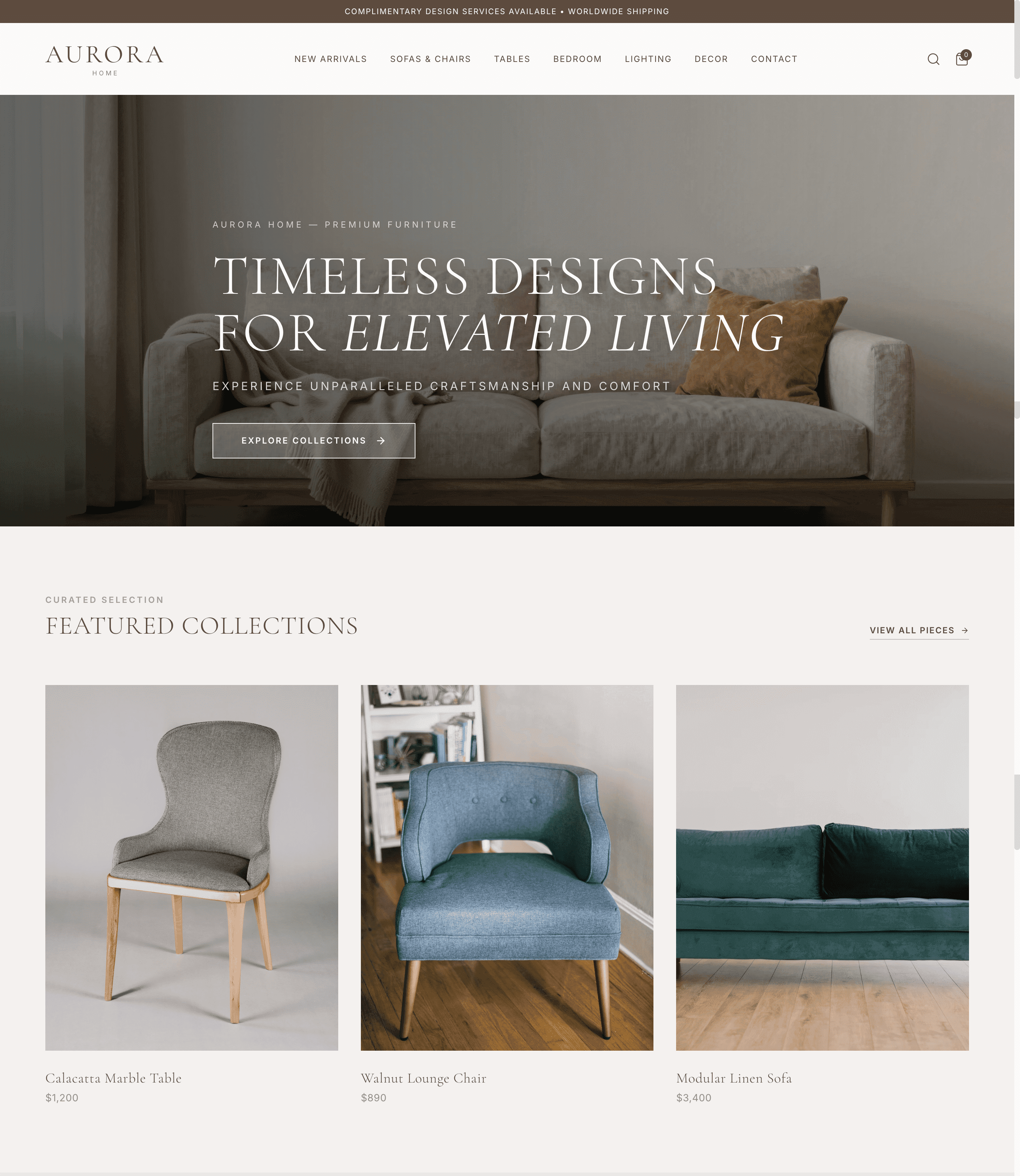
flexible multi-device responsive website template template desktop preview screenshot

Flexible Multi-Device Responsive Website Template

The Flexible Multi-Device Responsive Website Template, professionally designed by Wegic, an AI website builder, offers a scalable and structured layout logic, ensuring seamless adaptability across all devices. With a modern color palette and clean visual style, this template enhances branding strength and workflow efficiency, making the template ideal for businesses aiming to improve conversion rates through a cohesive and user-friendly online presence.
Danh mục
Academy
Conversion-ready
Festival
Fitness Centers
Google Slide
Modern Wedding
Lưu ý
Mẫu flexible multi-device responsive website template được thiết kế đẹp mắt này được tạo ra bởi AI và có thể tùy chỉnh trong vài phút để tạo ra một trang web chuyên nghiệp, nâng cao hiệu quả kinh doanh.

Các tính năng chính của mẫu này

About Us Page
Share your company story, mission, and team to build credibility and help visitors connect with your brand.
Service List
Present your offered services in a clear, organized layout to help visitors quickly understand what you provide and make informed decisions.
Social Media Integration
Connect your website with social platforms to expand brand visibility and encourage audience engagement.

Mẫu thiết kế dành riêng cho doanh nghiệp của bạn

Khám phá cách mẫu flexible multi-device responsive website template này có thể được tùy chỉnh để phù hợp với các ngành nghề và nhu cầu kinh doanh khác nhau. Xem các ví dụ thực tế, lấy cảm hứng và tạo một trang web chuyên nghiệp phù hợp với doanh nghiệp của bạn.

Các câu hỏi thường gặp

Why choose Wegic's Flexible Multi-Device Responsive Website Template template?

Wegic's template offers a versatile color palette and modern visual style, ideal for various usage scenarios. The template aligns with business needs, ensuring professional, scalable output via the Wegic AI website builder.

Is this Flexible Multi-Device Responsive Website Template template mobile friendly?

Yes, the template is fully mobile-friendly, designed to be responsive on all devices, including mobiles, ensuring consistent display across platforms.

Can I customize Flexible Multi-Device Responsive Website Template template?

Yes, the Wegic AI website builder allows conversational editing and fast customization, producing a professional, tailored website that meets specific user needs.

What types of businesses or projects suit the Flexible Multi-Device Responsive Website Template template?

The template suits a wide range of industries and project types, from e-commerce to portfolios. Wegic facilitates seamless customization, making the template adaptable to any business.

How quickly can I launch a website using the Flexible Multi-Device Responsive Website Template template?

A website can typically be launched within minutes, though actual time depends on editing and specific business requirements. The Wegic AI website builder enables rapid deployment.

Bạn cũng có thể thích

Xem tất cả
female profile picture
male profile picture
female profile picture
male profile picture
female profile picture

Xây dựng và khởi chạy trang web của bạn trong vài phút với Wegic AI

Bắt đầu với một mẫu đơn giản, tùy chỉnh dễ dàng mà không cần kỹ năng kỹ thuật, và tạo một trang web chuyên nghiệp được thiết kế để hỗ trợ doanh nghiệp của bạn ngay từ ngày đầu tiên.
Concrete Grey High-End Architecture & Construction Website
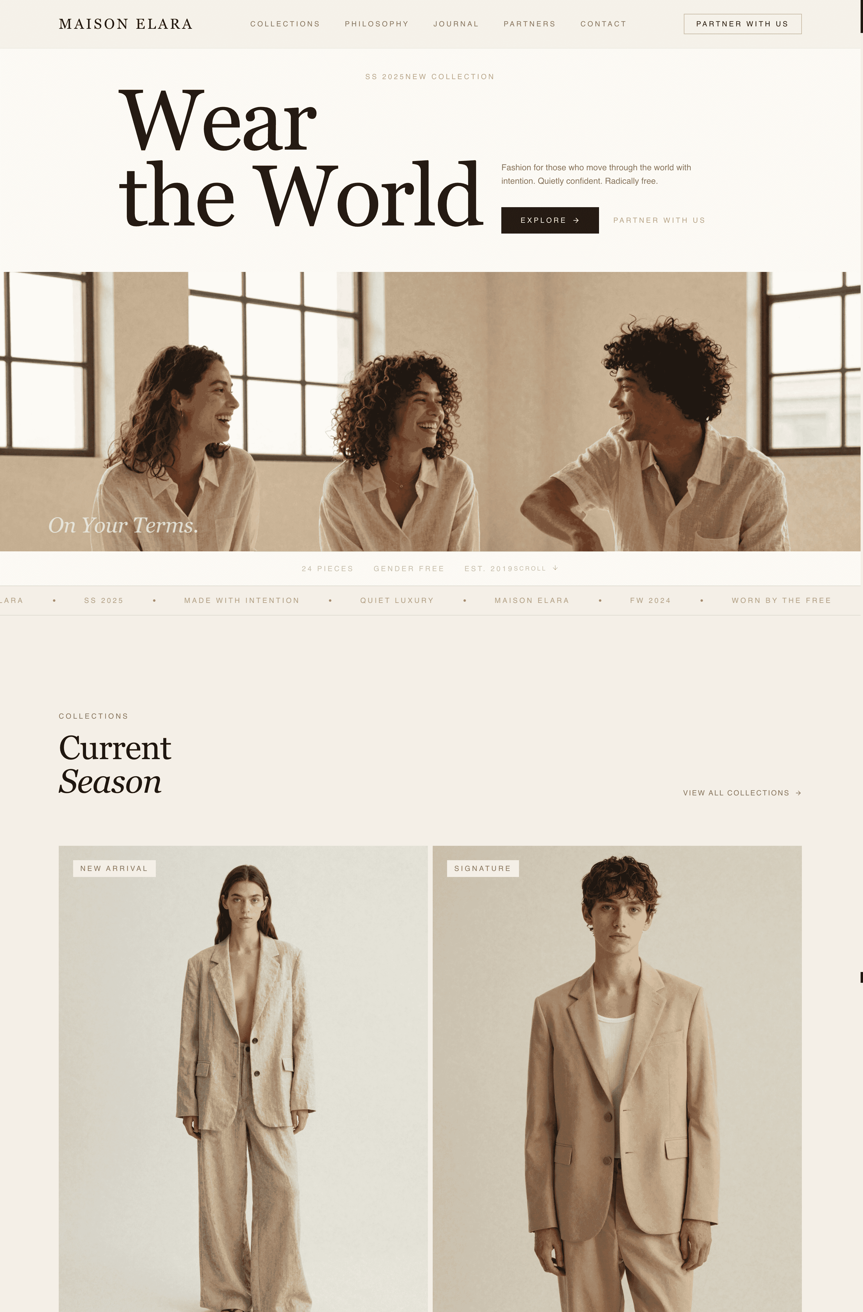
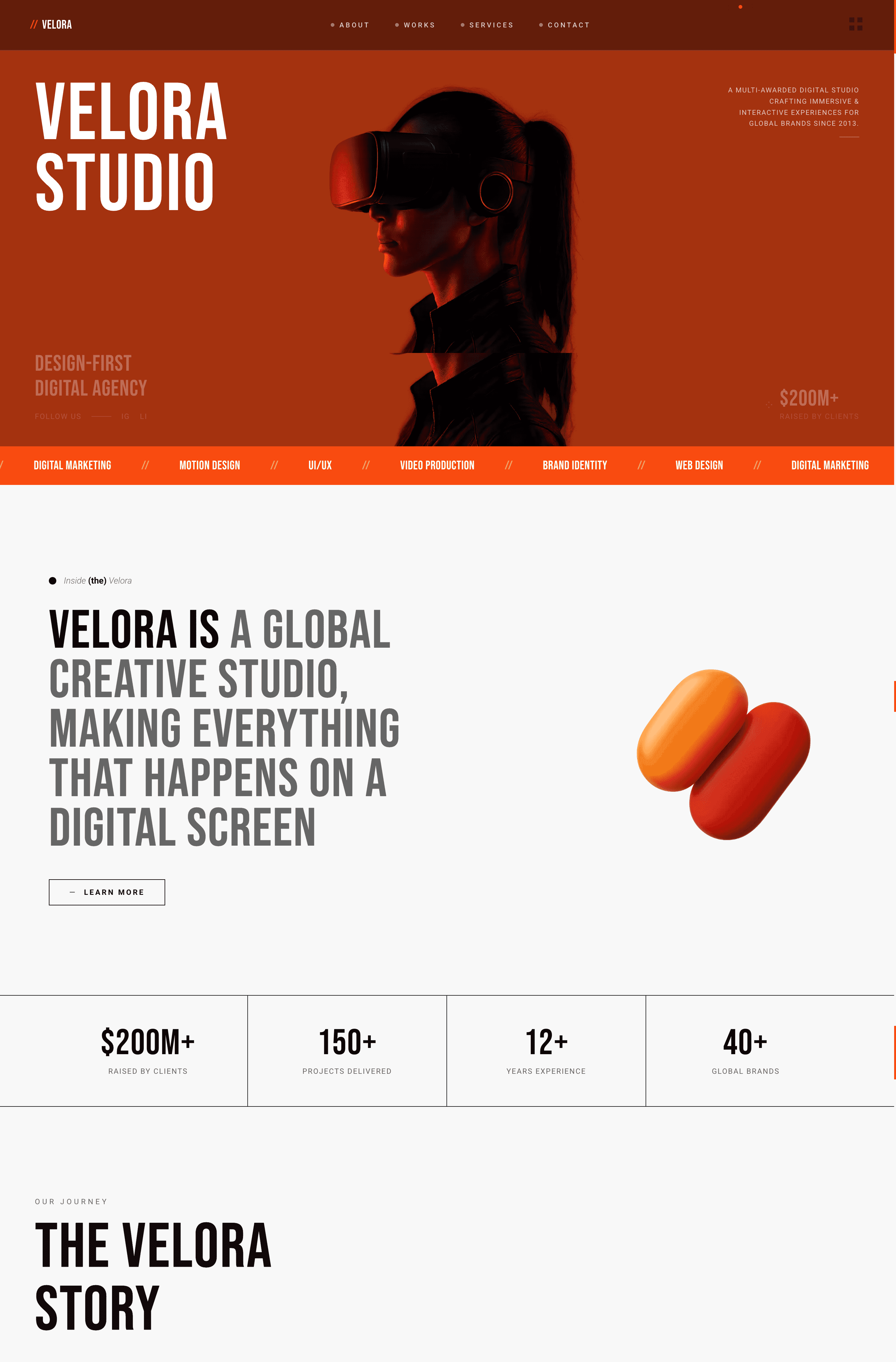
Charcoal Orange Modern Creative Agency Website
Warm Linen Minimalist Apparel & Brand Website
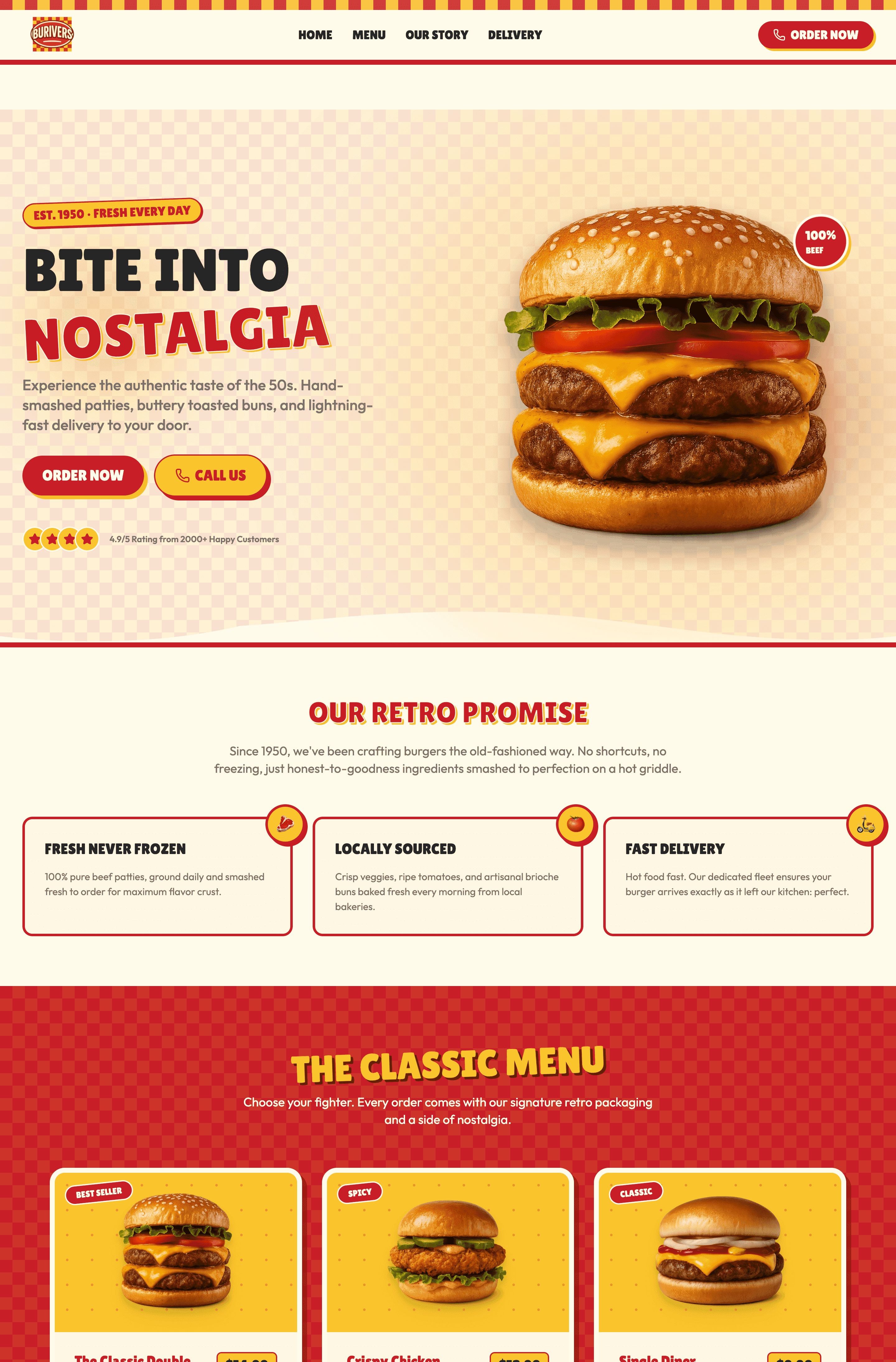
Crimson & Mustard Retro Burger Diner Website
Hãy mô tả trang web của bạn—lĩnh vực kinh doanh, mục tiêu và phong cách (ví dụ: một danh mục UX hiện đại với giao diện tối).