Explore the best website templates for
responsive
You may also like
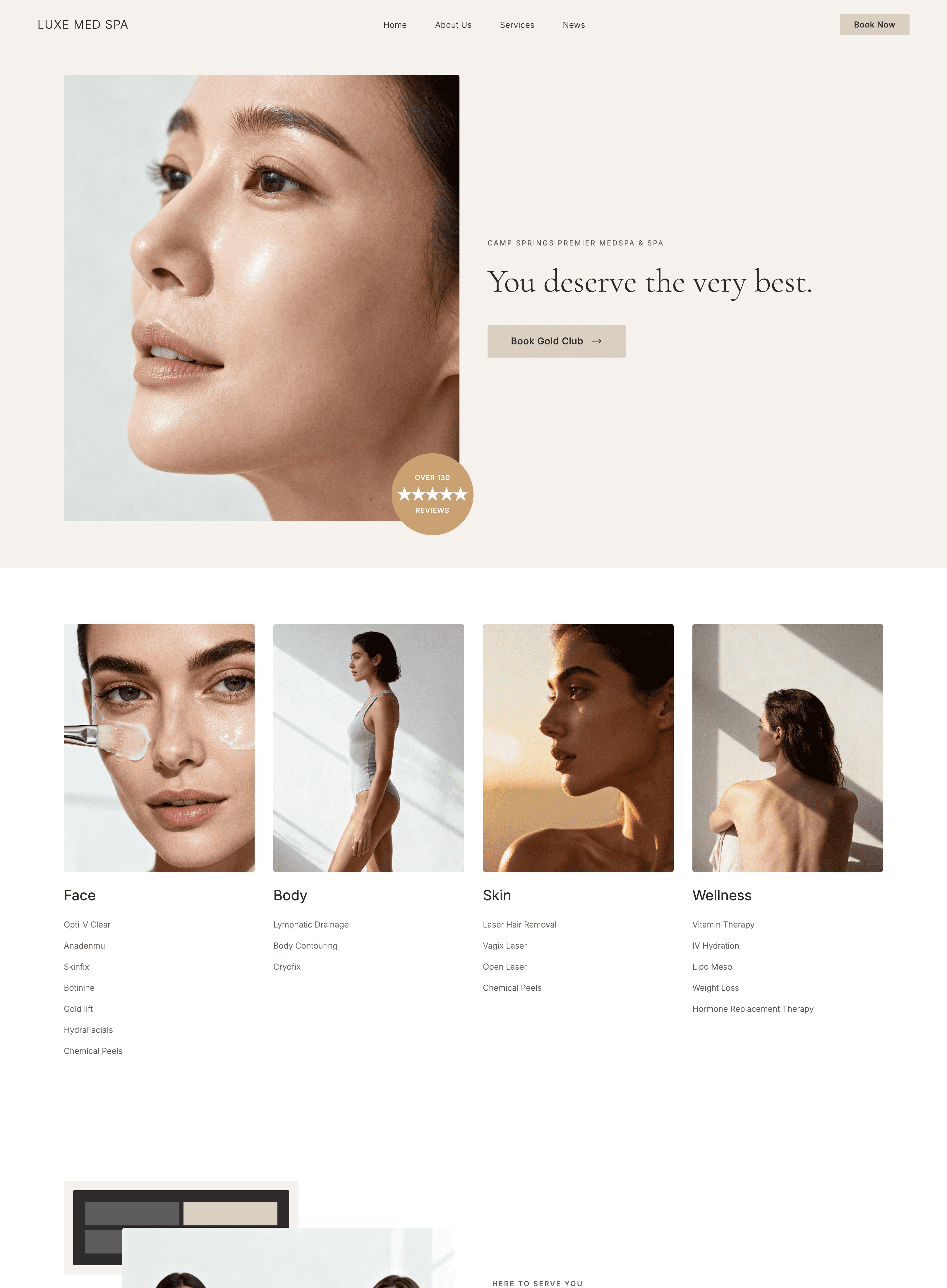
Wegic templates for all purposes


Get some responsive website design ideas
Frequently asked questions
Why choose Wegic's responsive templates?
Wegic offers an AI-powered, efficiency-focused solution for creating structured and professional websites. With AI generation, editing, and coding, Wegic ensures that each template delivers a polished and user-friendly experience. The result is a high-quality, responsive website that meets modern design standards and business needs.
What is the best responsive website builder?
Wegic is the best responsive website builder, providing professionally pre-designed templates that can be easily edited through conversation. This platform emphasizes speed and simplicity, allowing for quick and efficient creation of professional websites. The combination of advanced AI and user-friendly features ensures a seamless and productive web-building experience.
Are Wegic's responsive templates mobile friendly?
Yes, Wegic's responsive templates are fully mobile-friendly, supporting modern H5 standards. These templates ensure cross-device compatibility, maintaining performance consistency across all devices, from desktops to smartphones. This guarantees a seamless and optimized user experience regardless of the device used.


Find a responsive template and launch your own business-growth website in minutes!