Home > Sjablonen > Flexible Multi-Device Responsive Website Template
Preview
flexible multi-device responsive website template template desktop preview screenshot

Flexible Multi-Device Responsive Website Template

The Flexible Multi-Device Responsive Website Template, professionally designed by Wegic, an AI website builder, offers a scalable and structured layout logic, ensuring seamless adaptability across all devices. With a modern color palette and clean visual style, this template enhances branding strength and workflow efficiency, making the template ideal for businesses aiming to improve conversion rates through a cohesive and user-friendly online presence.
Categorieën
Academy
Conversion-ready
Festival
Fitness Centers
Google Slide
Modern Wedding
Opmerking
Deze prachtig ontworpen flexible multi-device responsive website template template is gegenereerd door AI en kan binnen enkele minuten worden aangepast om een professionele website te maken die uw bedrijf een boost geeft.

Belangrijkste kenmerken van dit sjabloon

About Us Page
Share your company story, mission, and team to build credibility and help visitors connect with your brand.
Service List
Present your offered services in a clear, organized layout to help visitors quickly understand what you provide and make informed decisions.
Social Media Integration
Connect your website with social platforms to expand brand visibility and encourage audience engagement.

Template ontworpen voor uw bedrijf

Ontdek hoe deze flexible multi-device responsive website template-template kan worden aangepast aan verschillende sectoren en zakelijke behoeften. Bekijk echte voorbeelden, laat u inspireren en creëer een professionele website die past bij uw bedrijf.

Veelgestelde vragen

Why choose Wegic's Flexible Multi-Device Responsive Website Template template?

Wegic's template offers a versatile color palette and modern visual style, ideal for various usage scenarios. The template aligns with business needs, ensuring professional, scalable output via the Wegic AI website builder.

Is this Flexible Multi-Device Responsive Website Template template mobile friendly?

Yes, the template is fully mobile-friendly, designed to be responsive on all devices, including mobiles, ensuring consistent display across platforms.

Can I customize Flexible Multi-Device Responsive Website Template template?

Yes, the Wegic AI website builder allows conversational editing and fast customization, producing a professional, tailored website that meets specific user needs.

What types of businesses or projects suit the Flexible Multi-Device Responsive Website Template template?

The template suits a wide range of industries and project types, from e-commerce to portfolios. Wegic facilitates seamless customization, making the template adaptable to any business.

How quickly can I launch a website using the Flexible Multi-Device Responsive Website Template template?

A website can typically be launched within minutes, though actual time depends on editing and specific business requirements. The Wegic AI website builder enables rapid deployment.

Misschien vind je dit ook leuk

Alles bekijken
female profile picture
male profile picture
female profile picture
male profile picture
female profile picture

Bouw en start uw website binnen enkele minuten met Wegic AI

Begin met een eenvoudig sjabloon, pas het aan zonder technische vaardigheden en creëer een professionele website die vanaf dag één uw bedrijf ondersteunt.
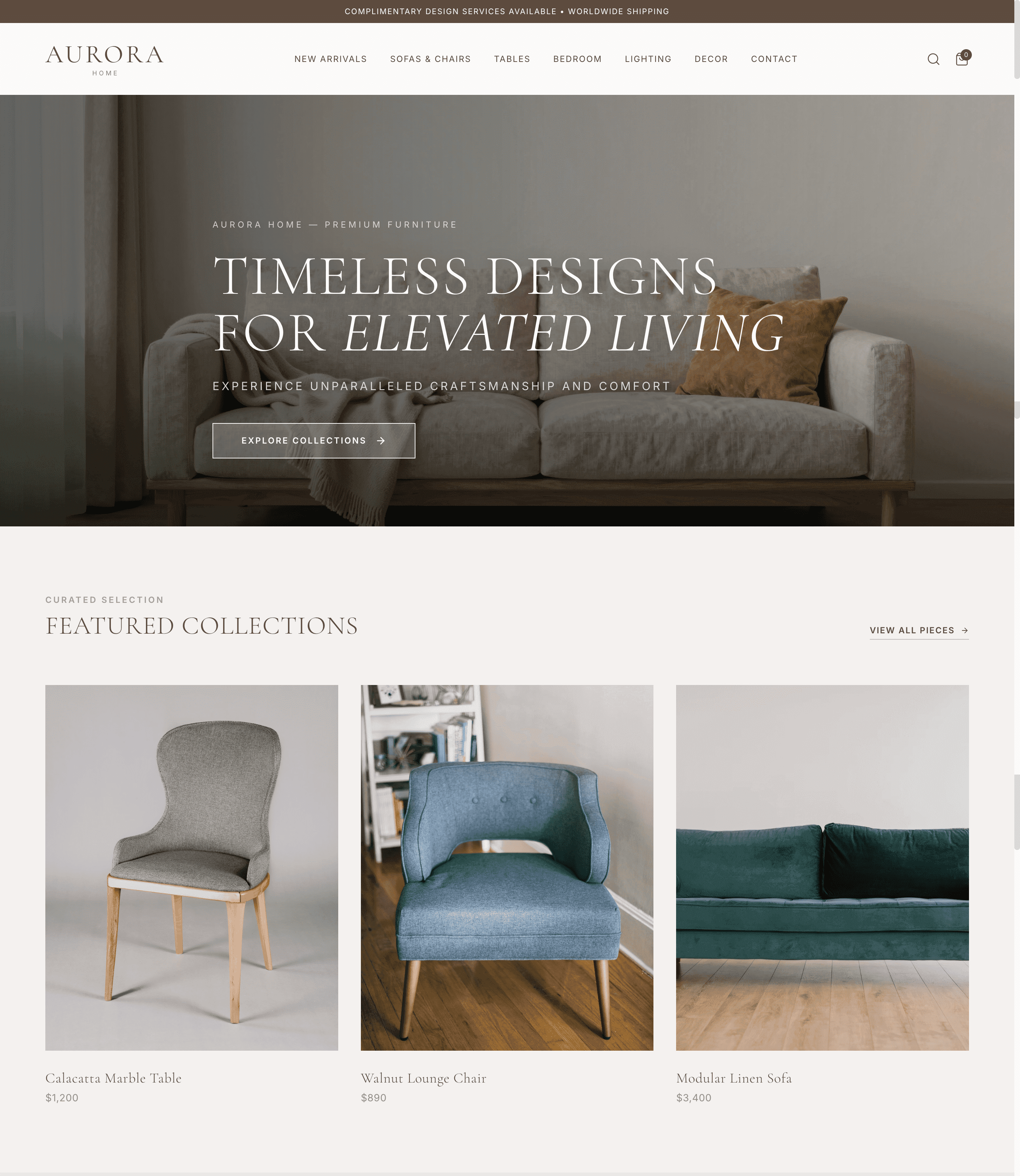
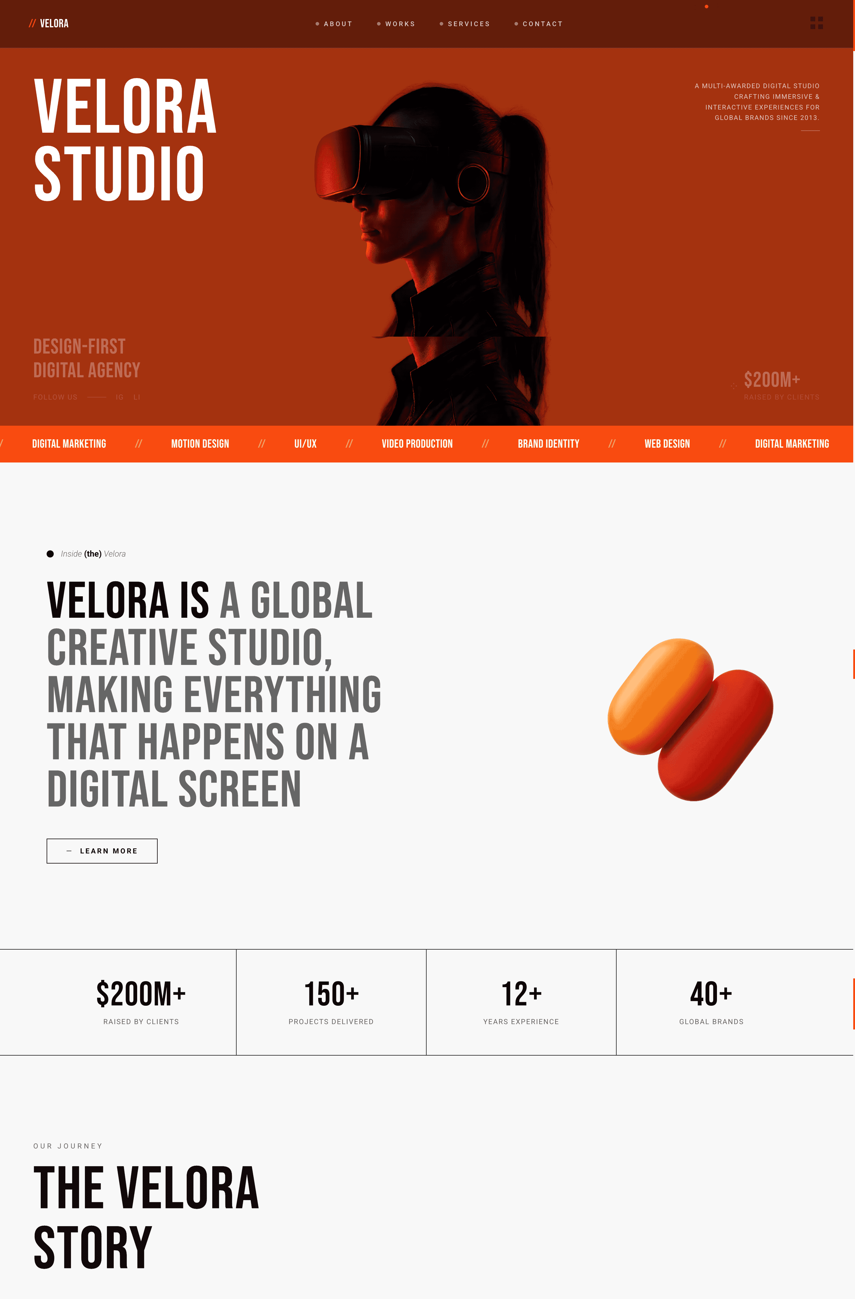
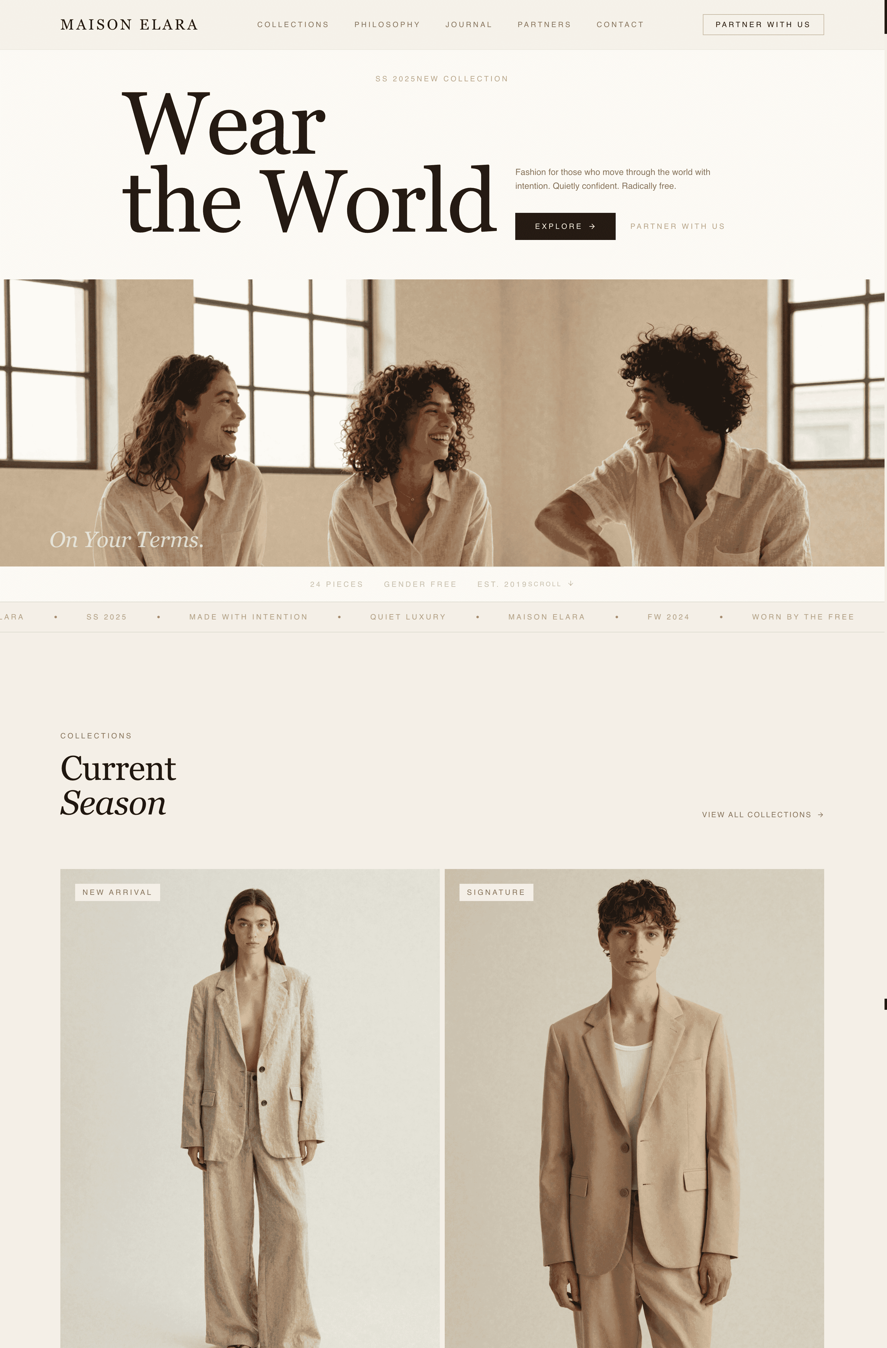
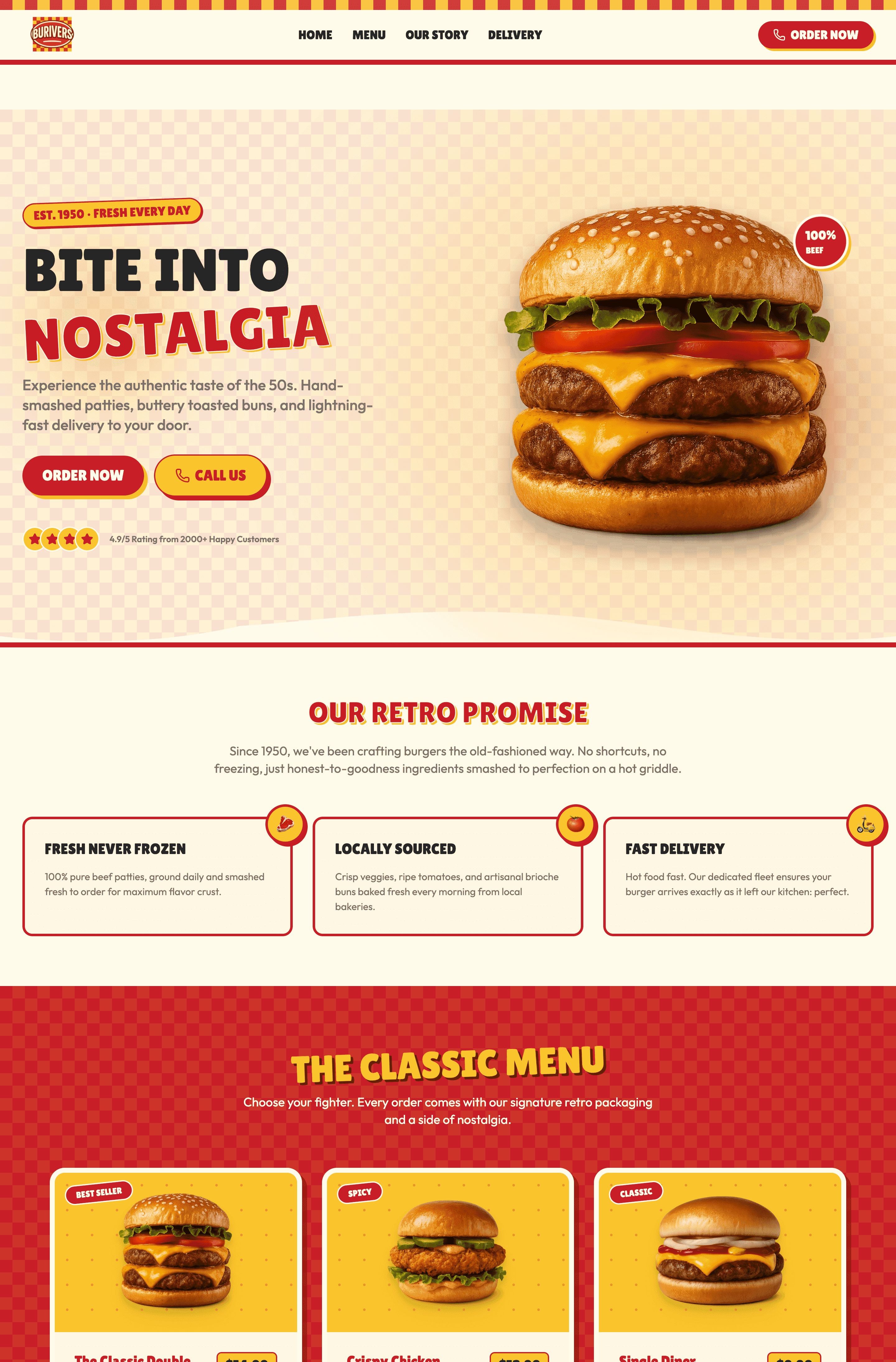
Concrete Grey High-End Architecture & Construction Website
Charcoal Orange Modern Creative Agency Website
Warm Linen Minimalist Apparel & Brand Website
Crimson & Mustard Retro Burger Diner Website
Beschrijf uw website: bedrijf, doelen en stijl (bijv. een modern donker UX-portfolio).