Log in
Build Your Site
Top 13 Industrial Design Portfolio Examples for Designers
Discover the top 13 industrial design portfolio examples to inspire and elevate your own design showcase, offering innovative ideas and creative solutions.
Your industrial portfolio is more than a showcase of projects—it tells the story of your career as an industrial designer. It draws attention to your originality, problem-solving abilities, and distinctive design style, making you stand out to prospective employers or clients. A strong portfolio might lead to opportunities by showcasing your abilities to potential employers.
But creating an industrial portfolio that truly resonates can be tricky. To help you get inspired, we’ve compiled 13 standout industrial design portfolios. Whether you're starting fresh or refining your existing work, these examples will guide you in crafting a portfolio that captures attention and showcases your best skills.
What Makes a Great Industrial Design Portfolio?
Clear Layout
A clean, organized layout isn’t just nice to look at—it makes sure your work stands out without distractions. If people can’t find their way around your portfolio, they might miss the very projects that show your true potential.
Project Variety
Showing a range of projects is key. It highlights your ability to handle different challenges and proves you’re adaptable. Whether it’s product design, furniture, or tech, variety shows you’re not a one-trick pony.
Storytelling Through Design
Every design has a story, and sharing yours draws people in. Walking viewers through your process lets them connect with your thinking and see how you solve problems creatively. It makes your portfolio more memorable.
Visual Quality
High-quality images and clean renders instantly give your portfolio a professional edge. Attention to detail here shows that you care about the quality of your work—both in design and presentation.
User-Friendly Navigation
No one wants to struggle to find your best projects. Easy navigation makes it simple for viewers to explore your portfolio, ensuring they see everything you have to offer without getting lost along the way.
Top 13 Industrial Design Portfolio Examples
1. Arthur Kenzo
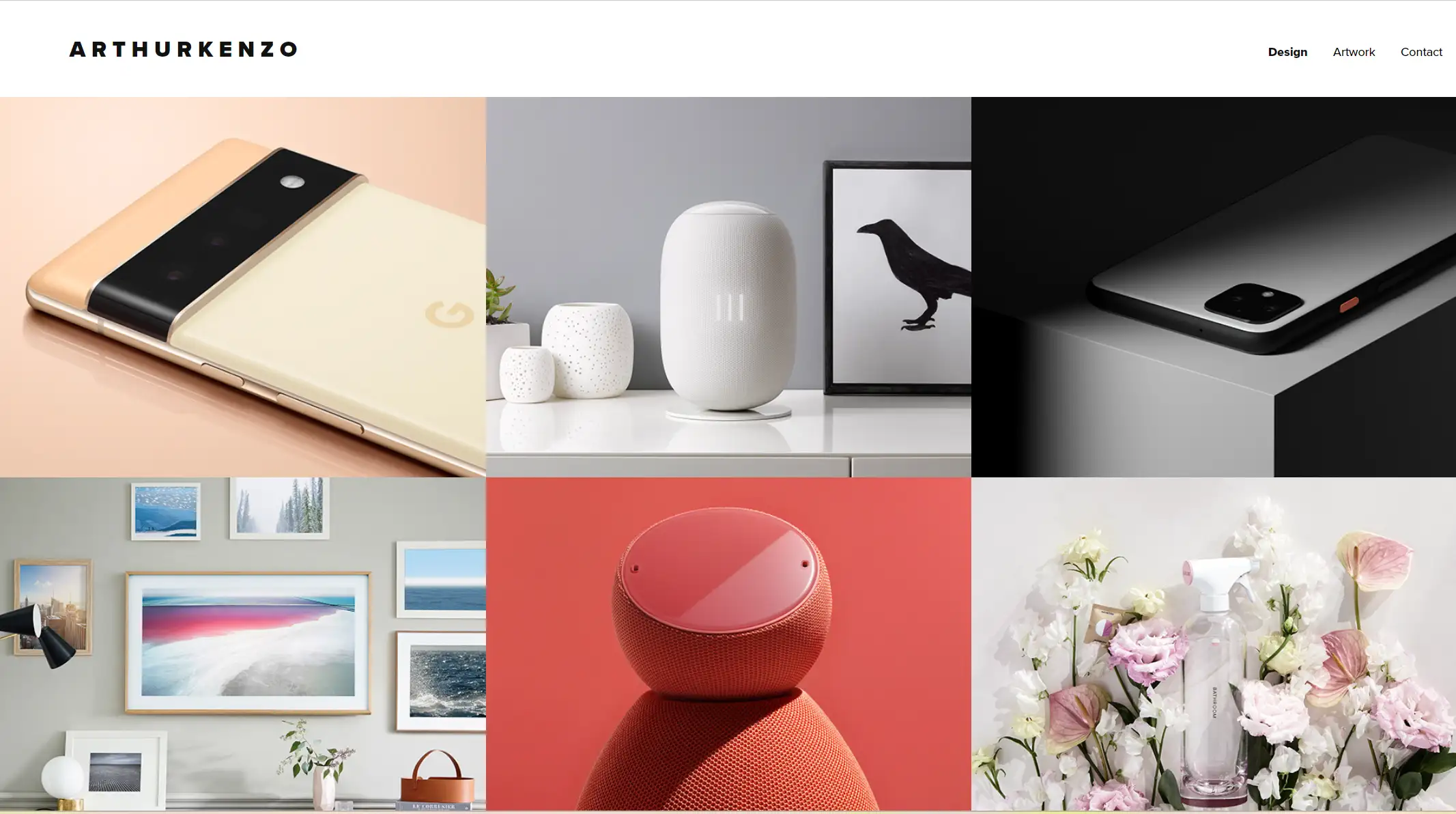
Arthur Kenzo’s portfolio is a masterclass in minimalism and simplicity. His website embraces a clean, understated design, allowing his creations to truly take the spotlight. By using a neutral color scheme and plenty of white space, Arthur ensures that all the attention is on the products he’s crafted.
Each project page is thoughtfully arranged, with brief yet impactful descriptions that complement the images perfectly. The result? A portfolio that exudes elegance and sophistication, echoing the care and precision he puts into his designs.
Key Takeaway
-
Embrace minimalism with neutral tones, white space, and concise project descriptions to let your designs shine.
2. Lina Patsiou
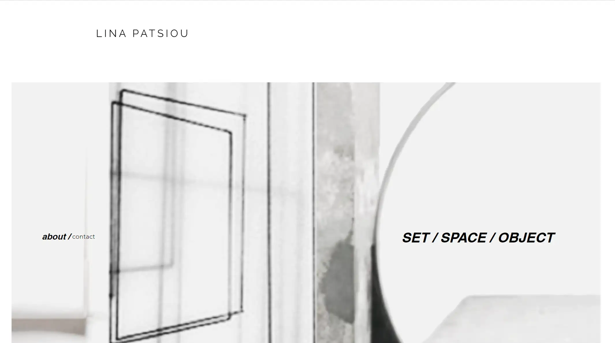
Lina Patsiou’s portfolio shines by putting the spotlight on her design process. Her site takes viewers on a creative journey, showcasing everything from early hand-drawn sketches to polished final products. She carefully includes concept art, digital renderings, and real-world photos of her designs, making her work feel alive and accessible. Lina’s portfolio is a brilliant example of how showing your process gives clients a deeper understanding of your problem-solving skills and thoughtful approach.
Key Takeaway
-
Showcase design journey with sketches, step-by-step visuals, and clear explanations.
3. Studio Bilge Nur Saltik
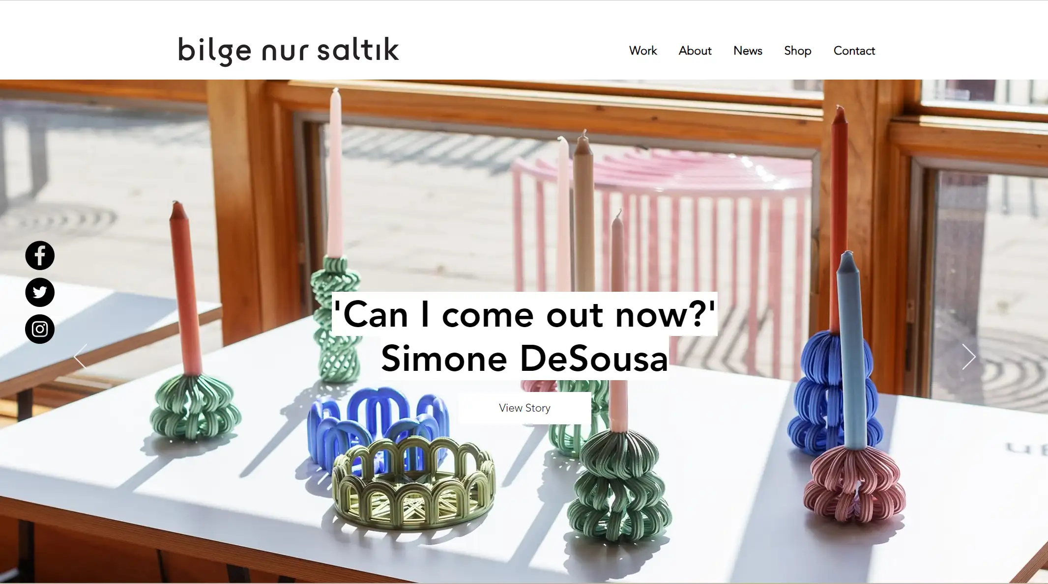
Studio Bilge Nur Saltik excels in offering industrial design services that blend cultural elements with modern aesthetics. Their portfolio is a visual delight, featuring high-quality images of past projects that instantly grab your attention.
One standout feature that greets visitors is an automated slideshow, showcasing the brand’s top designs right off the bat. The project section is equally impressive, with a sleek two-column layout where each image can be clicked for more details. This website is much praised for how intuitive and engaging it feels, making it easy for visitors to explore.
The news section adds an extra layer, offering insights into the studio’s latest activities and the unique factors that set it apart from other industrial design portfolios.
Key Takeaway
-
Combine creative visuals with intuitive design elements to create an engaging portfolio experience.
4. Rino Claessens
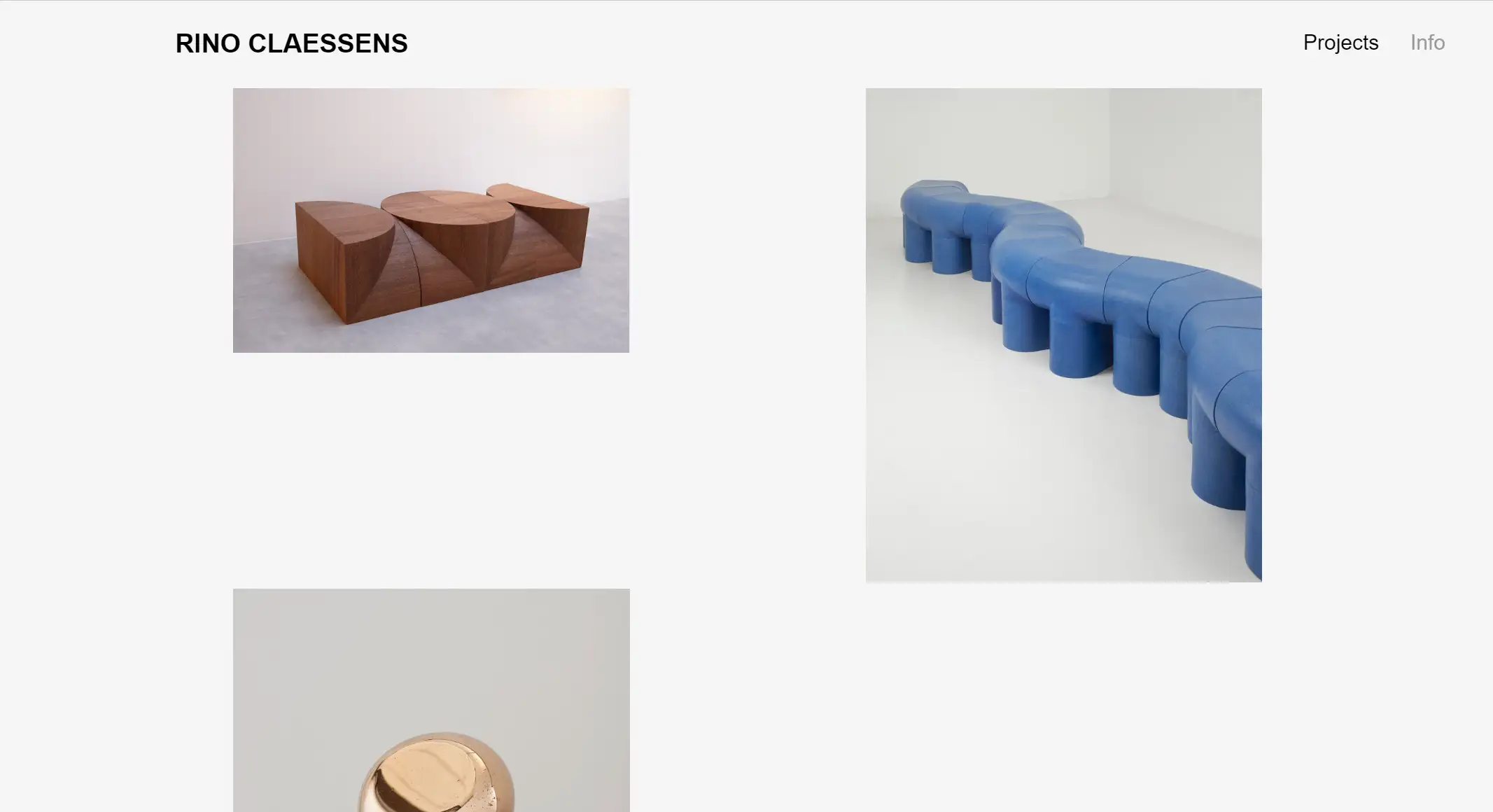
Rino Claessens, an Eindhoven-based designer, brings a material-driven and process-focused approach to his work, honed after graduating from the Design Academy Eindhoven’s Public & Private department.
His website’s gray-toned background gives it a distinctive look, perfectly complementing the blend of graphic design, furniture, and innovative ideas on display. Many projects include subtle motion elements, adding a dynamic touch that makes each design feel alive.
The sticky navigation bar makes it easy for visitors to dive into different sections, where they can learn all about Claessens’ creativity, career, skills, and inspirations in just a few clicks.
Key Takeaway
-
Blend thoughtful design with intuitive navigation to create an engaging, visually dynamic portfolio.
5. Nick Chubb
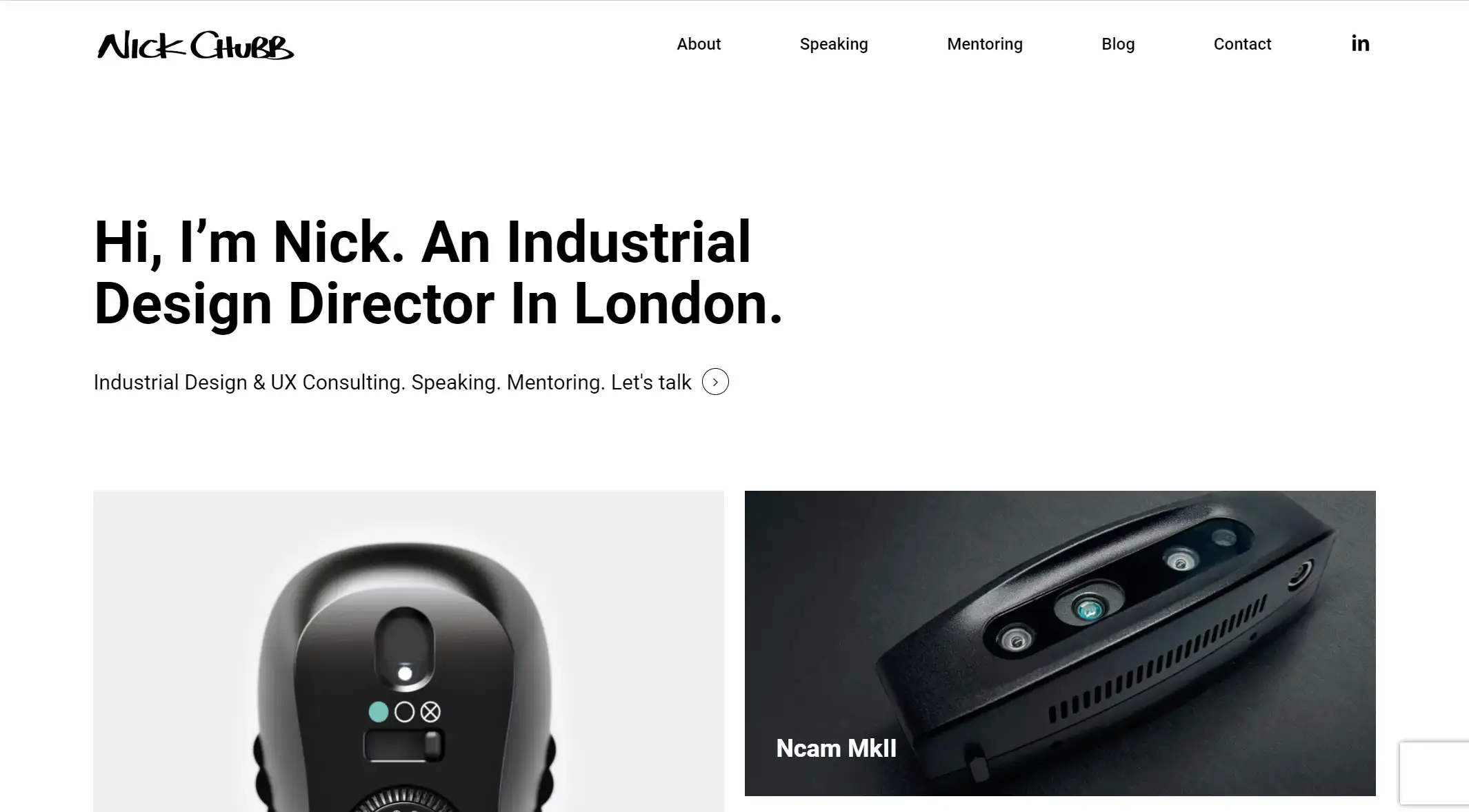
Nick Chubb’s portfolio is proof that simplicity speaks volumes. His minimalist design prioritizes clean visuals and effortless navigation, making it easy to explore. Nick’s projects span a wide variety, from consumer electronics to medical devices, all displayed with a consistent and polished layout. What really stands out is his clever use of icons and brief, to-the-point descriptions that showcase his skills and services. This straightforward approach ensures potential clients quickly grasp his expertise and understand how he can bring value to their projects.
Key Takeaway
-
Keep your portfolio clean, use icons effectively, and make navigation effortless for an impactful user experience.
6. Ridzert Ingenegeren
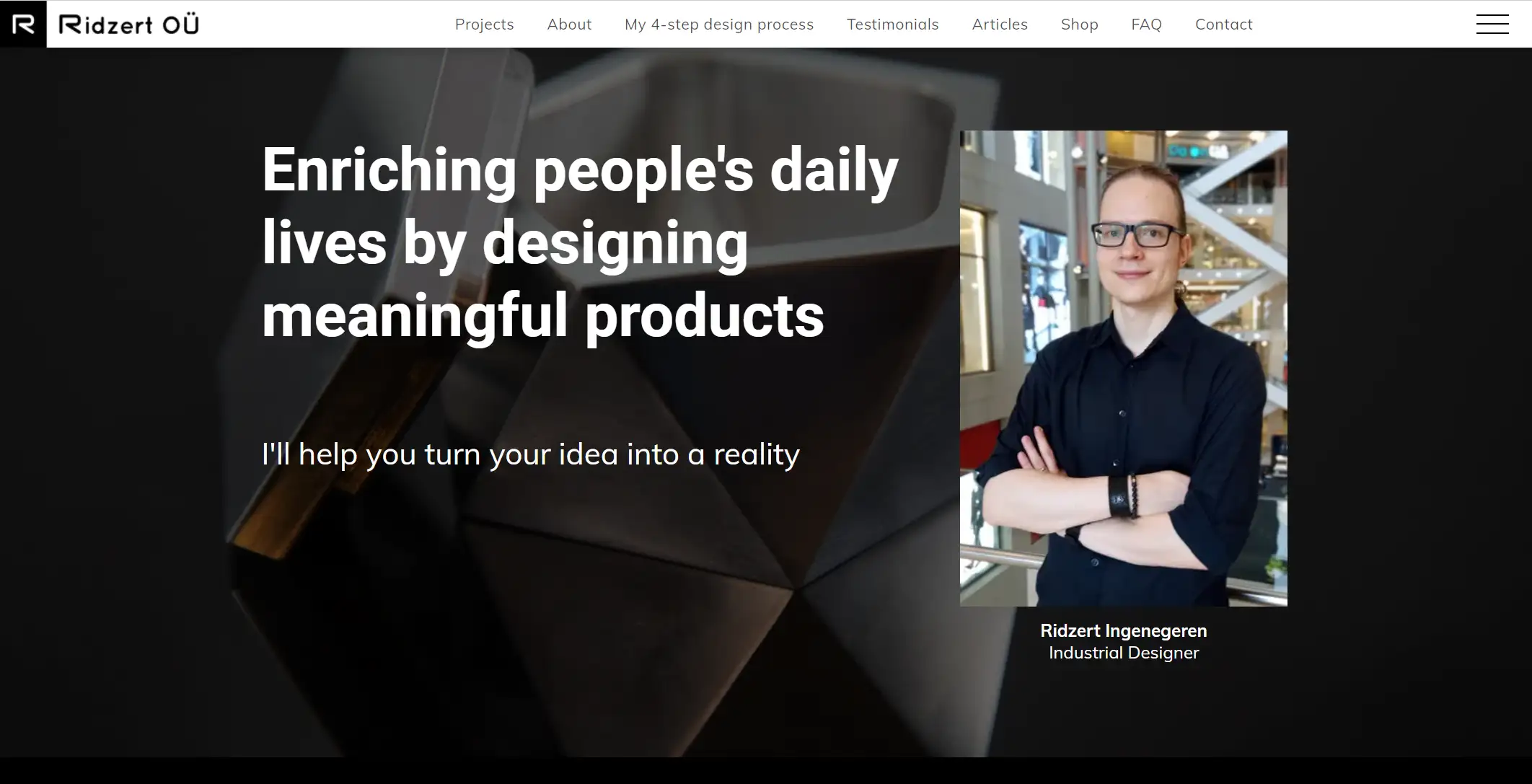
Product designer Ridzert Ingenegeren is a gifted individual who has gained recognition for assisting customers in ideation, concept development, and product refinement for both large-scale manufacturing and prototyping.
His sincere testimonial area, where previous clients provide positive comments about his work, underlining his skill and reliability, is what makes him stand out. In a crowded profession, this personal touch truly helps him stand out.
To get updates on new software releases, visitors may simply subscribe to his newsletter at the bottom of the website. This website stands out for the entire design that seems polished thanks to the dark color palette, which gives it a clean, elegant sense.
Key Takeaway
-
Combine personal testimonials with an elegant design to create a lasting impression on potential clients.
7. Satomi Minoshima
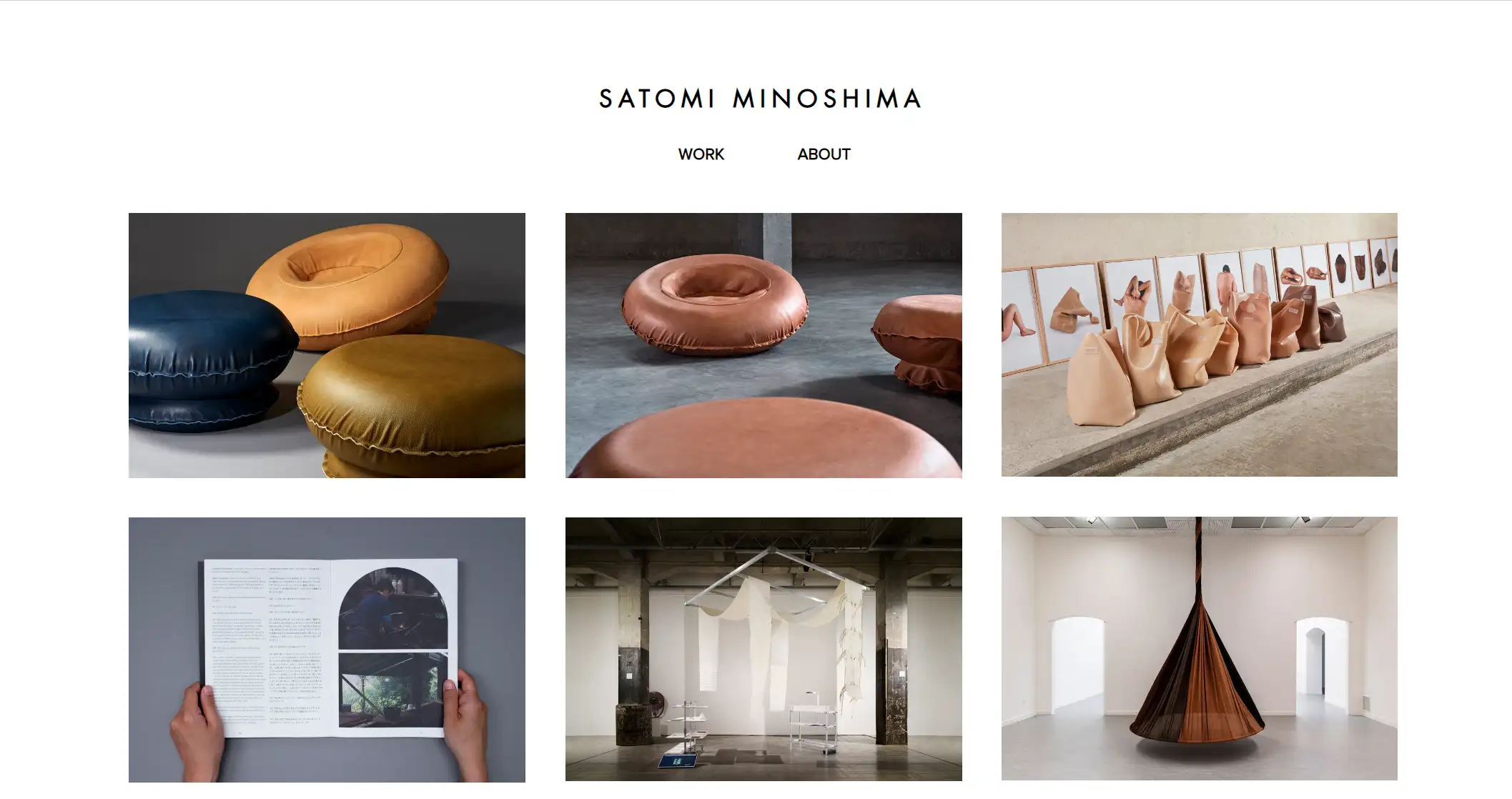
Japanese designer Satomi Minoshima explores the limitless possibilities of colors and materials with love.
Her clean, minimalist portfolio opens with eye-catching pictures of previous work, arranged in a stylish row of clickable thumbnails. With each click, a new window into the prototype process opens up, providing a behind-the-scenes glimpse into her artistic process. Even some of the pictures have a hint of motion, which, depending on how you look at them, gives them a dynamic vibe.
Key Takeaway
-
Use clean visuals and interactive elements to invite viewers into your creative process.
8. Lafeliz
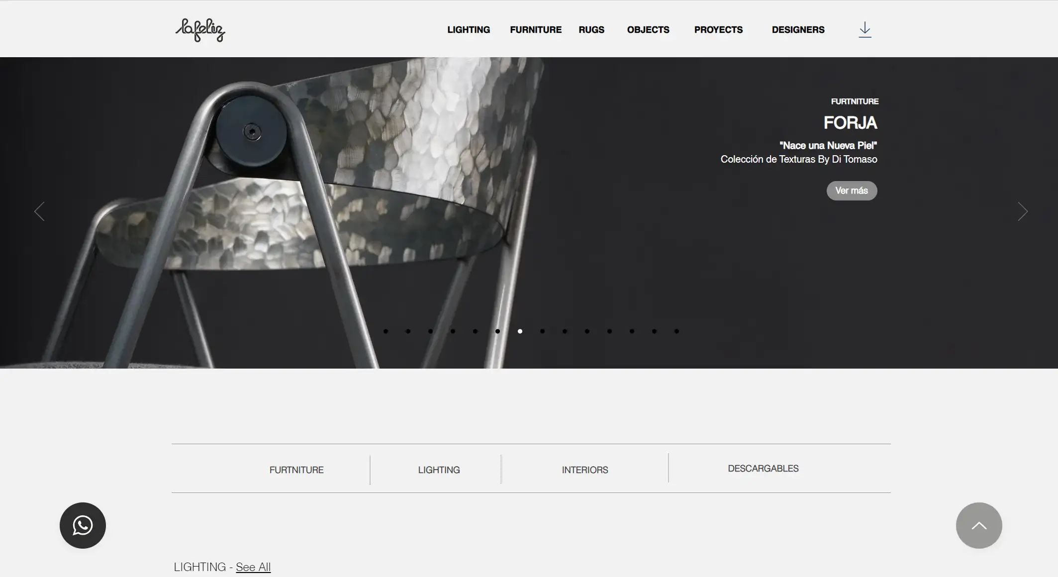
Lafeliz’s portfolio stands out with its captivating, high-quality content, designed to guide visitors toward the contact page.
At the top of the homepage, visitors are greeted by a large, eye-catching slideshow that highlights the brand's diverse range of products. The black WhatsApp live chat icon provides an easy way for users to ask questions and offer feedback, ensuring an interactive experience. Throughout the portfolio, the brand remains true to its identity, showcasing an impressive selection of furniture, lighting, and homeware through stunning photography.
Key Takeaway
-
Incorporate interactive elements and consistent branding to enhance user engagement and experience.
9. Simo Lahtinen
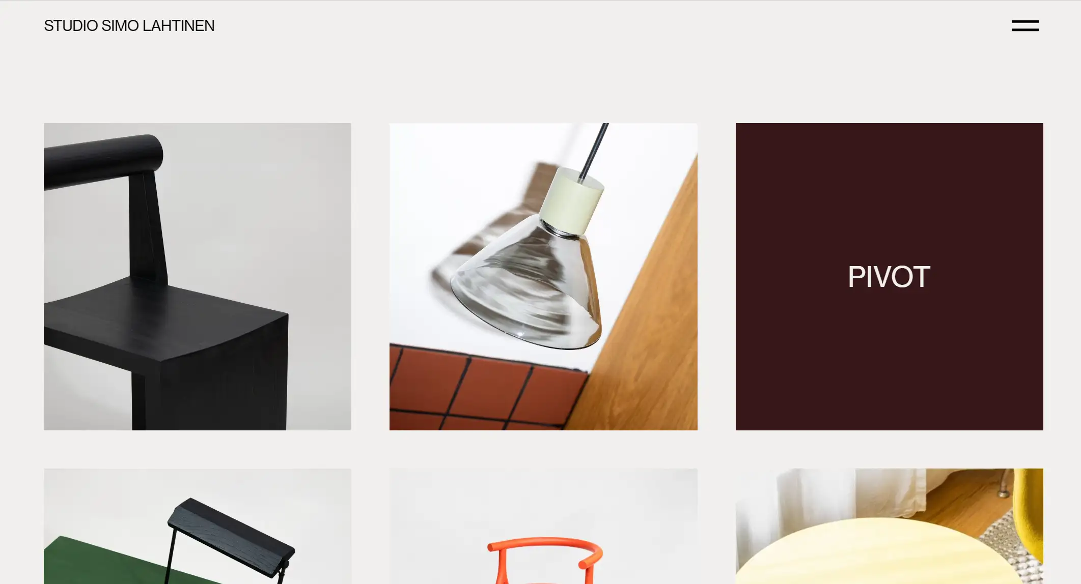
Simo Lahtinen’s portfolio makes a vibrant, bold statement, celebrating color and geometry with a playful, artistic flair. His diverse work spans product design, branding, and art direction, all unified by his distinctive style.
A standout feature is the use of animated GIFs and short videos, which bring his designs to life and add a dynamic, memorable touch. The portfolio is a perfect example of how to use bold colors and motion to captivate attention and leave a lasting impact.
Key Takeaway
Leverage color, geometry, and motion to create a bold, unforgettable portfolio.
10. Yanko Design
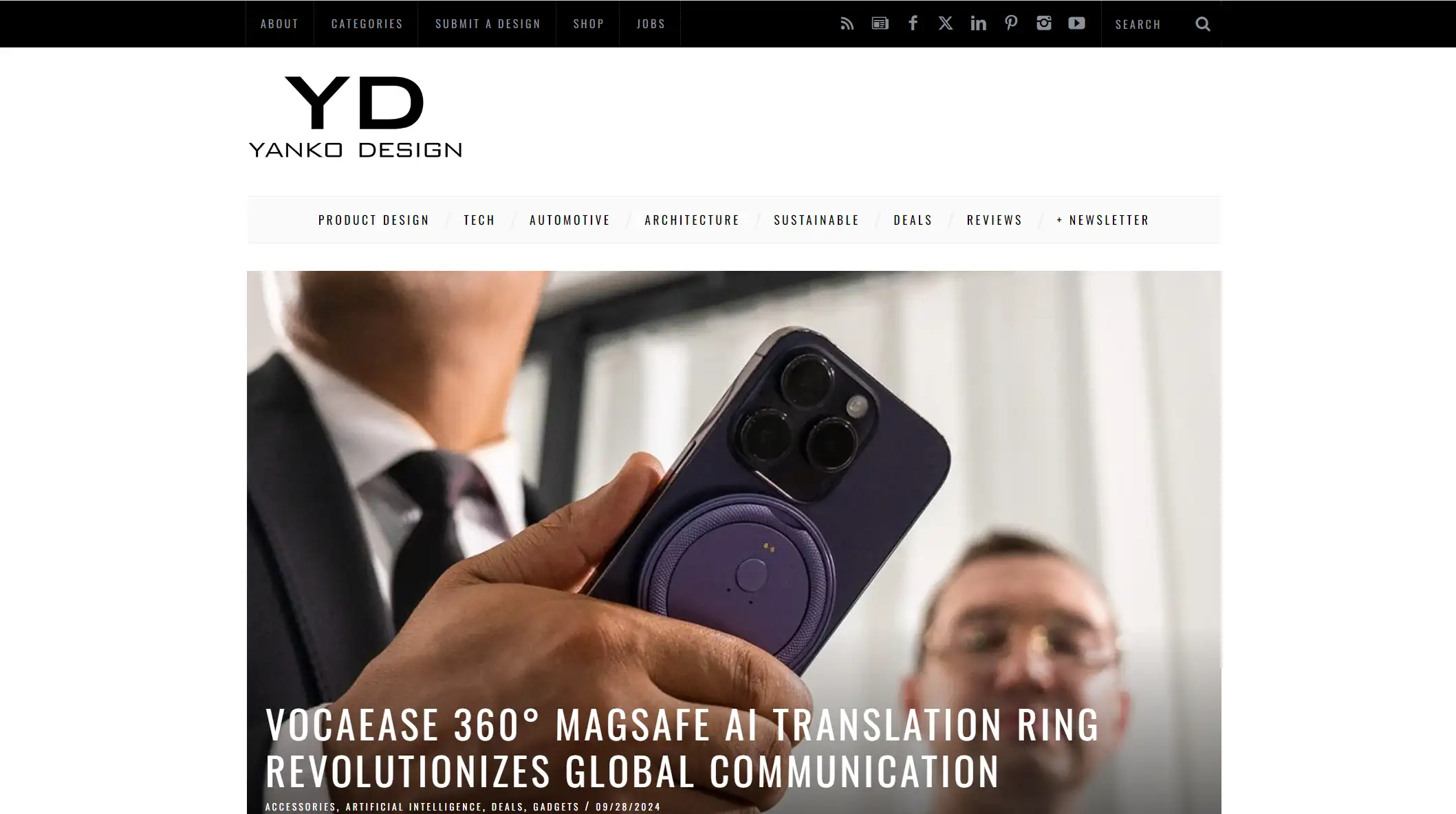
Yanko Design is a prominent online publication that highlights the finest in global product design. It is driven by an enthusiasm for creativity and the exploration of the unusual and uncharted.
Their multi-grid column style, which is visually appealing and engaging, provides material in a wonderful way in their industrial design portfolio. Users may quickly navigate through the site's many parts thanks to the sticky navigation bar, which also features a handy drop-down menu. In order to provide users a comprehensive experience, the elegant black footer at the bottom of the page includes connections to social media, collaborations, and a bio about the business.
Key Takeaway
-
Enhance user engagement with an organized layout, easy navigation, and informative footer sections.
11. Tunto Lighting
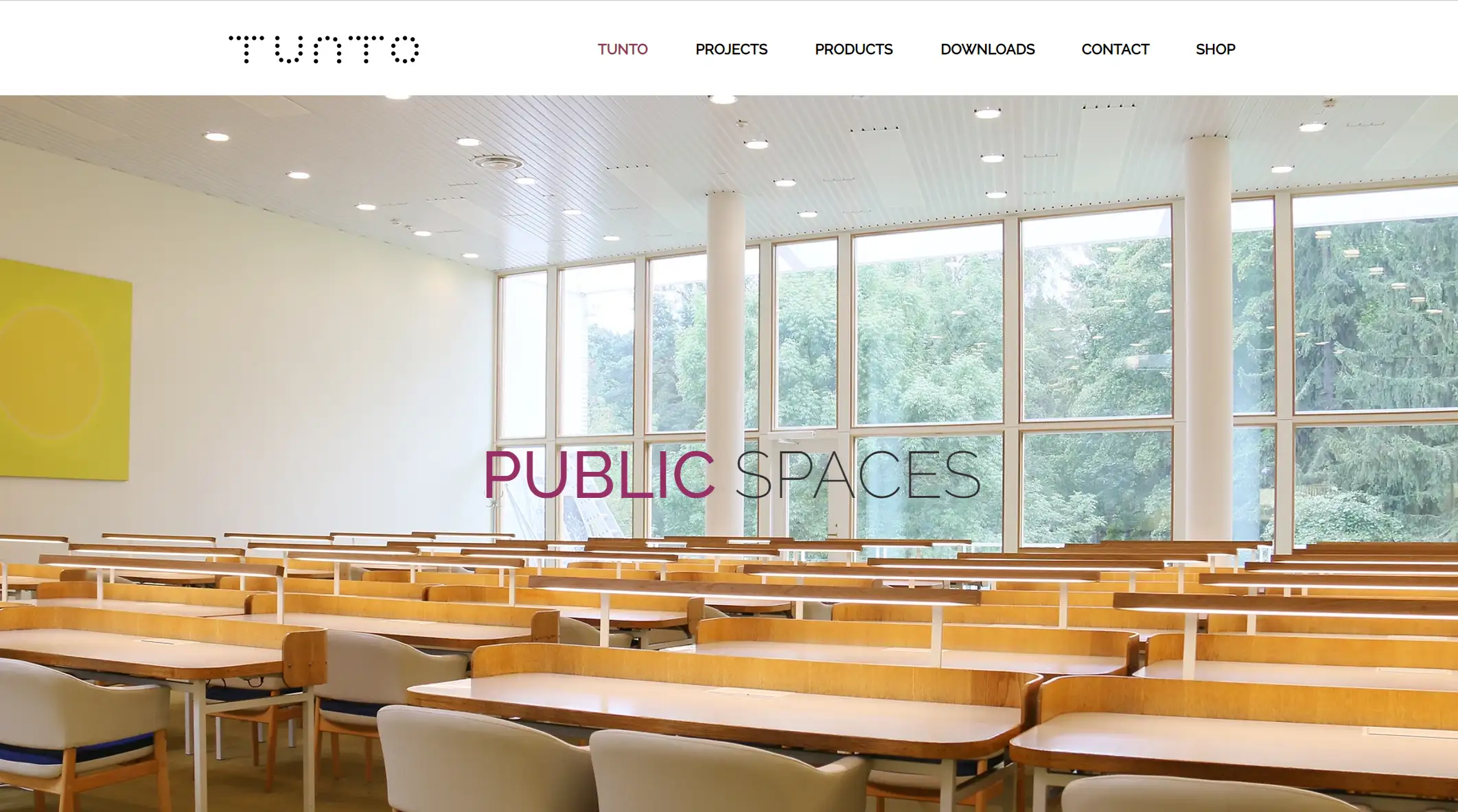
Tunto specializes in creating cutting-edge lighting concepts that seamlessly blend wooden materials with advanced technology.
Visitors are greeted by a sleek image slider showcasing the brand’s limited-edition projects, designed to build anticipation and excitement. As you scroll down, a striking purple "Discover" CTA button in the services section invites users to explore the craftsmanship behind Tunto’s creations. The "Featured Post" section highlights informative articles that delve into the brand’s innovative work and offerings, while social media icons at the bottom of the page allow easy access to Tunto's online presence.
Key Takeaway
-
Use striking visuals and clear CTAs to engage users and drive exploration.
12. Hannah Gribble
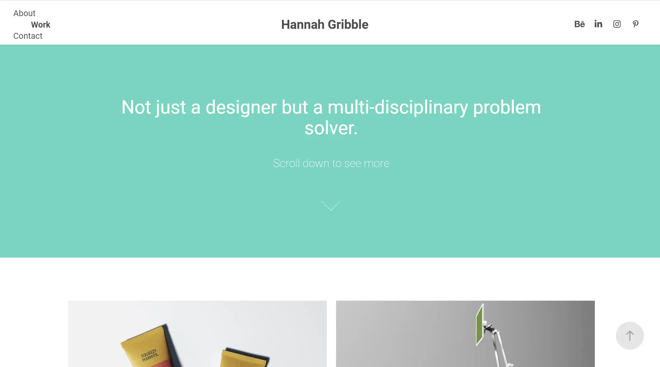
Hannah Gribble's portfolio highlights the handcrafted essence of her industrial designs, with each piece showcased through stunning, high-resolution photography that captures intricate details. Her work spans a variety of projects, from furniture to lighting and homeware, blending functionality with artistry. This portfolio resonates as a testament to the idea that industrial design can be both practical and aesthetically beautiful.
Key Takeaway
-
Highlight craftsmanship with detailed imagery, merging functionality and art in design.
13. Studio Högl Borowski
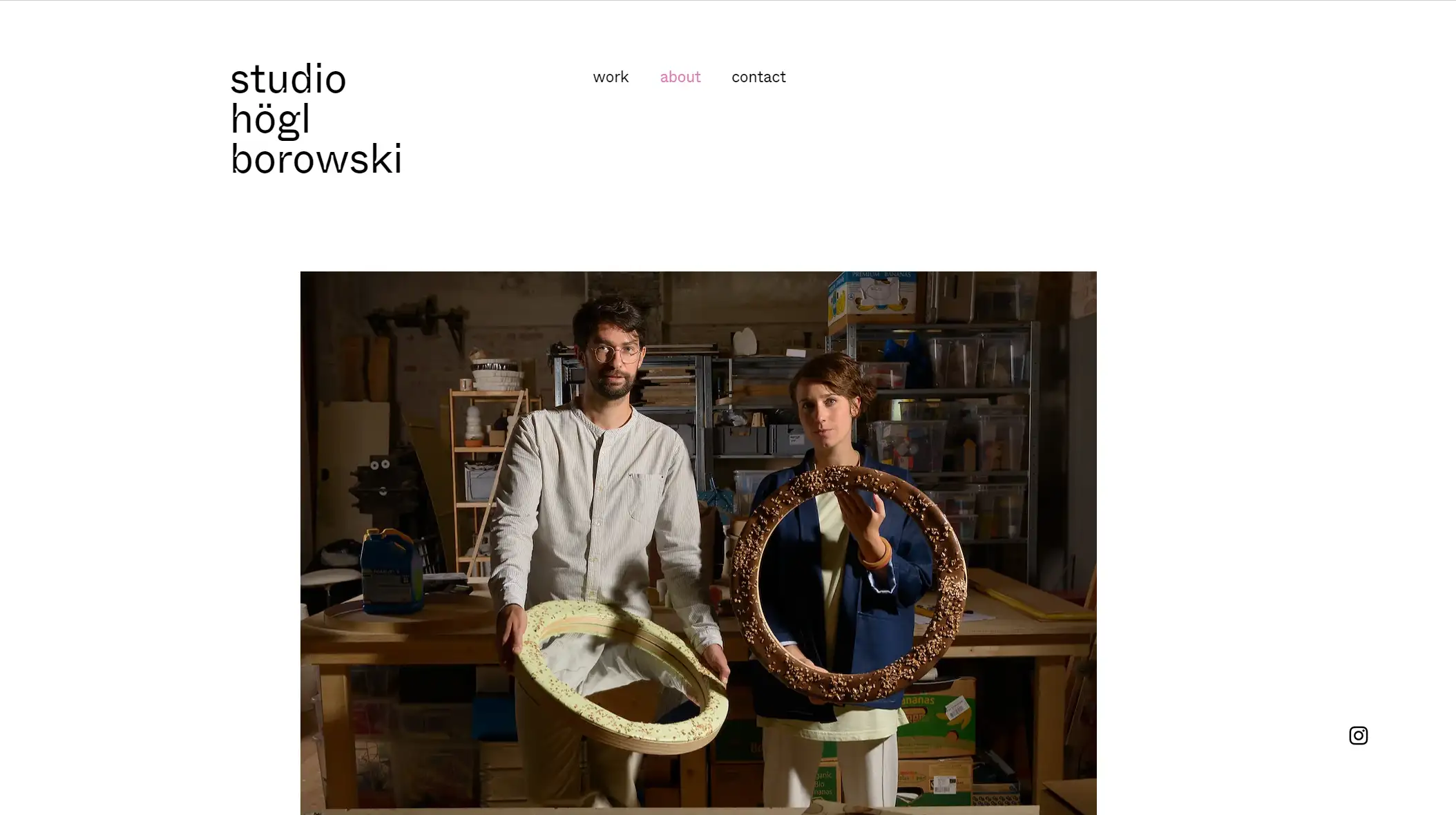
Stefanie Högl and Matthias Borowski, the dynamic duo behind Studio Högl Borowski, ensure their identity and purpose are clear from the start. Their portfolio greets visitors with a landing page that highlights their name, logo, and a succinct introduction. This welcoming approach sets the tone for the rest of the website, where their thoughtful design work takes center stage.
The ‘Works’ page adopts a magazine-like layout, featuring each project with a title, description, and ‘Read More’ button. The studio places great emphasis on detailed text, allowing visitors to grasp the full depth of their projects. Complementing the portfolio are professional product photos, an updated bio showcasing awards and exhibitions, a contact section, and a relatable photo of the designers themselves, creating a well-rounded and engaging portfolio experience.
Key Takeaway
-
Balance visual storytelling with text to create a comprehensive, approachable portfolio.
Design Your Industrial Portfolio Wisely with Wegic
Wegic: Your AI-Assisted Portfolio Builder
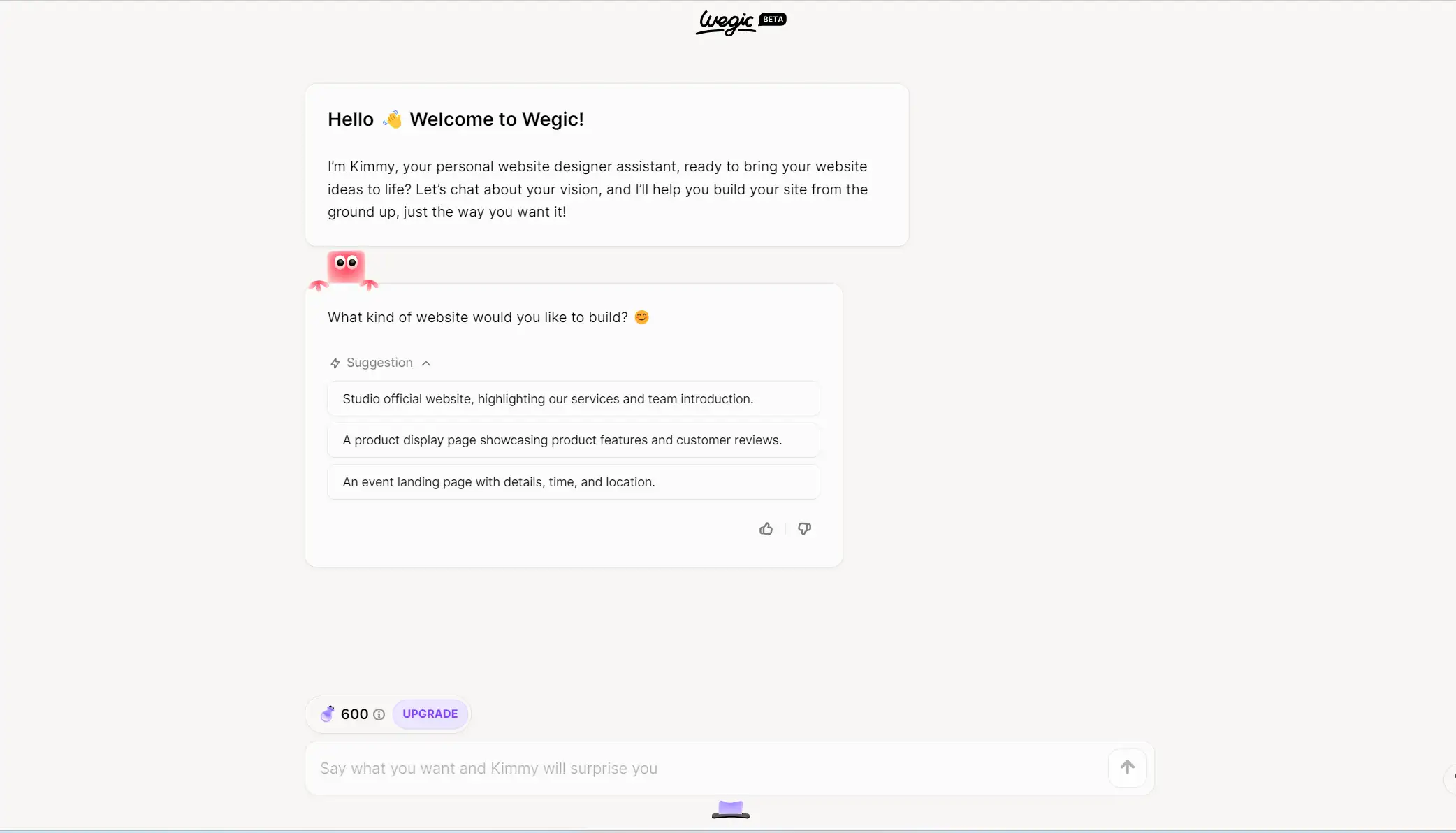
Still entangling yourself with the complicated knowledge of code-included website building? Let Wegic free your hands and mind! Wegic is a cutting-edge, AI-powered website builder designed for creative professionals like industrial designers who want to craft stunning portfolios with ease. Forget about complicated coding or spending countless hours on design—Wegic streamlines the entire process, helping you build a visually impressive portfolio chat by chat.
Click below to try the conversational-AI-incorporated website builder👇
https://wegic.ai/
Why Wegic for Industrial Designers?
Ease of Use
-
With Wegic, there’s no need for coding. Its intuitive chat interface, paired with AI-driven suggestions, allows you to focus on coming up with refreshing ideas and showcasing your designs without technical hurdles.
Customize Chat-by-Chat
-
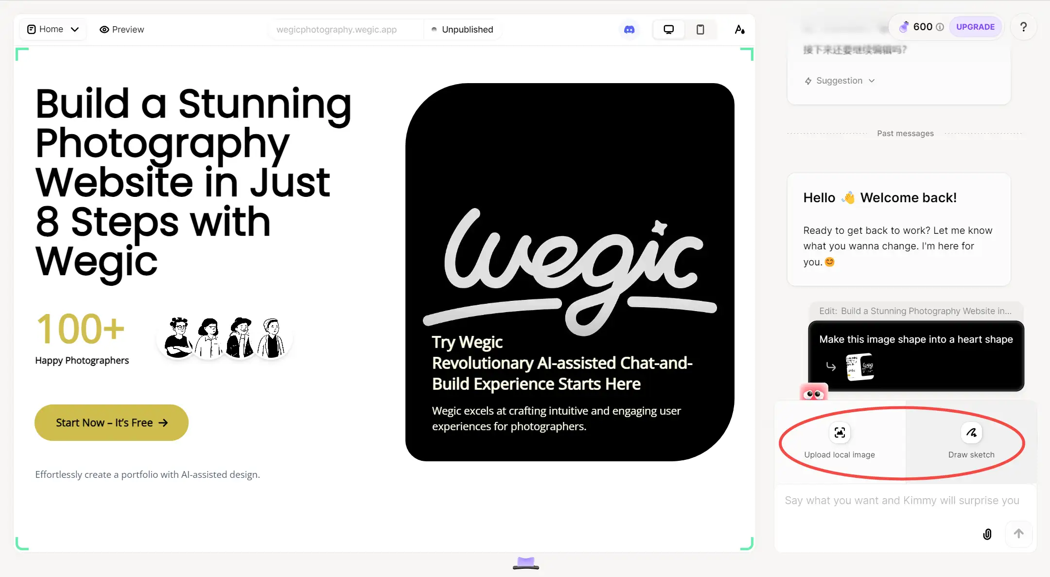
Once your portfolio is finished, you can always tell Wegic where you want to modify it through chatting! Simply click the area and tell what you want for it, all came in a breeze.
-
You can even customize your designs on web pages with reference links, pictures, or hand-drawn sketches! Upload the one design that inspires you or your simple art and let Wegic work the magic out for you based on what you provide.
-
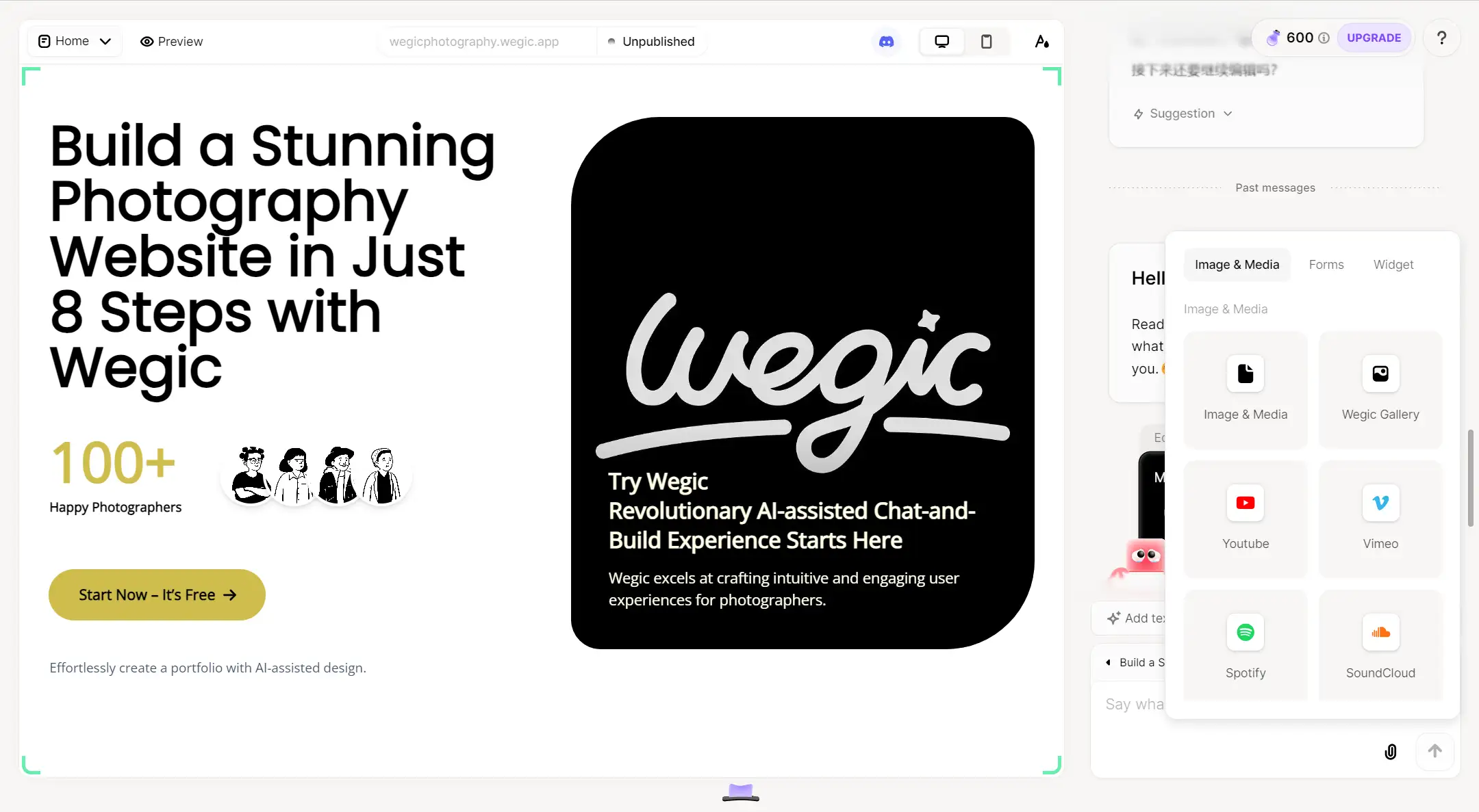
Don't forget to click the "link" button at the prompt bar to upload the audio or video that you like to make your website more stereo and multi-media. Get ready to see a layout that fits your aesthetic and make it uniquely yours with custom features!
Wegic offers 70 free credits upon registration, which is enough for three builds, with each modification costing 5 credits, making it perfect for startups or individual industrial designers who are looking for quick and cost-effective portfolio solutions.
Start your advanced journey on Wegic from $23.9/month now!
Tips for Building Your Industrial Design Portfolio
Pick the Perfect Platform
Choosing the right platform is essential. With tools like Wegic, you get AI-powered assistance to create a standout portfolio in minutes—no coding needed. A HubSpot report shows that 38% of users will stop engaging with a site if the content or layout is unattractive. That’s why having a portfolio that looks polished and professional is a must.
Let Your Visuals Do the Talking
When it comes to design, visuals are everything. High-quality images are proven to increase engagement rates by 94%, according to a study by Skyword. Use crisp photos that capture your design's intricate details, making sure each project is visually compelling and tells a story.
Blend Creativity with Ease
Achieving the balance between creativity and usability is critical. Data from Adobe reveals that 59% of people prefer a well-designed, user-friendly site over something highly creative but difficult to navigate. Ensure your portfolio not only showcases your creativity but is also intuitive and easy for visitors to explore.
Conclusion
Your portfolio is the gateway to your industrial design career, a powerful reflection of your skills, creativity, and vision, just like what Dieter Rams said, “Good design is as little design as possible.” A well-crafted portfolio embraces this idea—showcasing your work with clarity and purpose, without unnecessary distractions.
Let the inspiring examples from this guide fuel your own creativity, and with Wegic, building your industrial portfolio has never been easier. Start now, and let your designs tell your story.
Written by
Kimmy
Published on
Mar 17, 2026
Share article
Read more
Our latest blog
Webpages in a minute, powered by Wegic!
With Wegic, transform your needs into stunning, functional websites with advanced AI
Free trial with Wegic, build your site in a click!
What kind of website do you want to build?
