Log in
Build Your Site
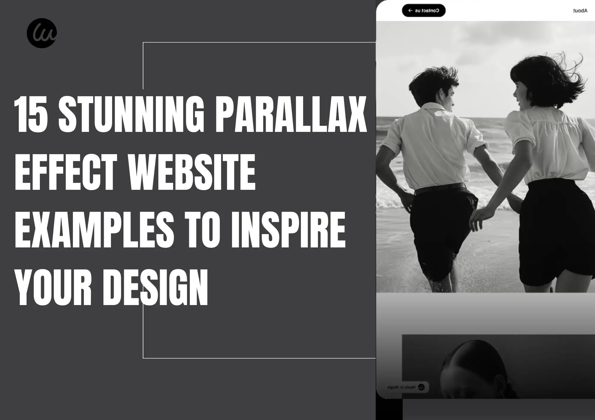
15 Stunning Parallax Effect Website Examples to Inspire Your Design
Can a parallax effect create a good website? You can check this guide to find the 15 stunning parallax effect website examples to give you inspiration!

Don't be too fast in judging parallax websites as being out of date! In 2025, when you scroll down a webpage and notice front content shifting gradually while the background shifts a bit slower, the experience remains stunning. Parallax effect websites were a trend in web design around 2011, and they never really fell out of favor. Rather, these websites transformed gradually into a powerful means of impressing and telling people about brands.
Why is parallax scrolling still trending? It is simple to use, visually appealing, and requires minimal setup. It can narrate a story and direct a user's attention to key content, creating a layered visual effect. You may term it "fancy," but if executed correctly, it will bring tons of style to your website, enhance user experience, keep users on your site for longer periods of time, and aid SEO and conversion rates as well. In this post, we will present to you 15 examples of websites that utilize the parallax effect. These designs will transform the way you view ordinary web pages and motivate you to attempt more innovative and creative concepts for your projects. Ready? Let us venture into this interesting world of visuals and creativity!
What is the parallax effect?
Parallax effect is a website design technique that gives the illusion that objects appear deeper and are in motion. This occurs when you have different speeds for the front and rear sections of a webpage, creating a 3D effect. The parallax effect first came about using animation technology in video gameplay, and web developers later applied it for storytelling and enhanced user experience.
On a parallax website, as you scroll down, the background moves more slowly than the text or picture in the foreground. This creates a visual spatial illusion. This effect grabs the user's attention and directs how they read, making the information easier to comprehend. Yet, parallax scrolling also has its issues. Excessive movement can cause dizziness or discomfort in some users, particularly those with balance problems.
Therefore, remember the following tips when designing such sites:
-
Moderate use:
Avoid using it extensively throughout the page to avoid overwhelming the main content.
-
Local implementation:
Utilize a parallax effect for ornamentation in certain regions
-
Disable option:
Provide users with an option to disable the parallax effect, making it more accessible. Properly utilizing the parallax effect can enhance a website's appearance and functionality. That is why, despite many years passing, the parallax effect remains a popular choice in web development.
Types of parallax effects
With an understanding of what parallax is, we can now examine some of its prevalent effects on web design. Each has its own way of appearing and functioning, and designers can apply them in various circumstances to enhance the user experience and make the site more intriguing and memorable.
-
Basic parallax scrolling
It is the most common parallax effect. When scrolling down, background movement is slower compared to the front part, creating a sense of depth, though mild. It is ideal for emphasizing images or telling a seamless story.
-
Horizontal parallax
Horizontal parallax scrolls content side to side rather than up and down like normal scrolling. Horizontal parallax is typically applied for wide images, product timelines, or interactive photo galleries. Horizontal parallax is effective in producing an unexpected visual impact as people shift their position.
-
Mouse-based parallax
The parallax effect takes effect instantly when you roll your mouse over them. Images on the page will shift slightly or tilt in response to the mouse, making it fun and easy to use. You needn’t scroll, and it is ideal for creating a pleasant and intriguing page setting.
-
Layered parallax
Each layer has its own speed, and the overlapping of front and back layers creates an effect of depth and vivid images. This pleasant and detailed effect is commonly employed in fiction or on beautiful homepages to create a sense of luxury within the overall web design.
Scrolling speed variations
The style alters one's usual way of scrolling through content, using various paces for various sections. This causes individuals to pay attention while scrolling due to changes in rhythm. For instance, words scroll quickly while images appear slowly, which draws attention to prime content.
Every parallax style has its use and is suited for particular use cases. You can choose one or several that will work for your website's content, the audience you're targeting, and the message of your brand. If done well, the parallax effect will enhance the appearance of the website, will provide a higher level of enjoyment for users while interacting, and will leave a good impression among people visiting your parallax website.
Image by Canva
15 Incredible parallax effect website examples
1. Web Design Art History
Art history and web design history were previously two distinct subjects. Still, this site cleverly brings them together in order to detail how web design has evolved into an art form. The website illustrates how webdesign has evolved through various art styles over the years. The website utilizes impressive parallax scrolling technology that captivates viewers as they scroll down the page, featuring numerous images and emotions. With touchable and playable animations and floating layers as you move your mouse around, all these elements bring you further into the narrative. This is an excellent parallax website.
2. The Qode Interactive Catalogue
This parallax effect website example begins well with a clean and simple parallax scroll. With a slow reveal, a clear menu appears while scrolling down the page. Qode Interactive Catalogue employs the parallax effect in an intelligent manner that is not overwhelming. It pairs this effect with animations such that navigation is easy and fluid. It provides an example of how one can enhance appearance without compromising functionality, and other corporate websites could benefit from such an example to improve their user experience.
3. Recap After Use
The webpage exhibits a pen, whose cap appears at one end and the pen's body at the other end of the screen. Upon scrolling downwards, the cap closes and opens in tandem with the pen's body, creating an intelligent "closed loop" concept for the entire webpage. Not only is this intelligent, but it is also a metaphor for the beginning, development, transformation, and completion of the project. The parallax design is aesthetically pleasing and presents content in a good manner. It balances the way the users feel and creativity well.
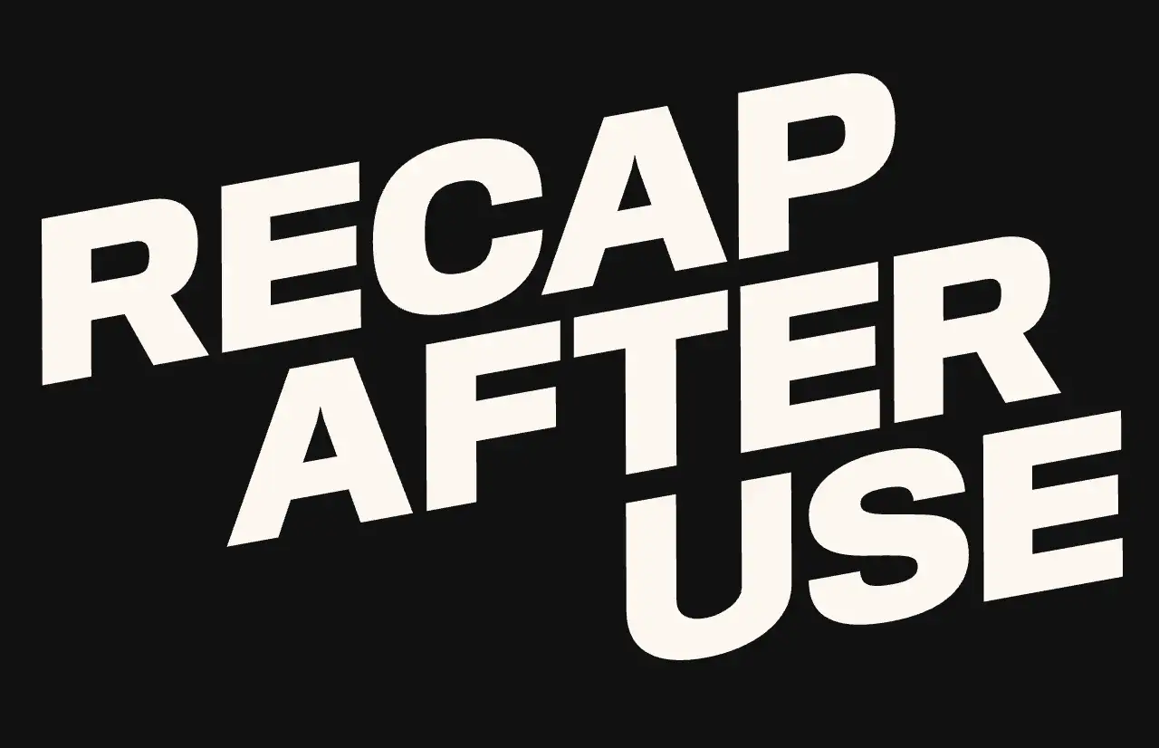
Image by Recap After Use
4. Jordan Gilroy
This parallax effect website example includes an enormous, sleek "G" as its centerpiece graphic. This displays his first letter from his surname and serves to establish who he is clearly. Navigation links are positioned in the top-left corner and remain visible when scrolled, ensuring that users can easily access any section of the site. The site further intelligently displays links to his most significant work, presenting a glimpse of his professionalism as a skillful worker. When you scroll down the page, the opening parallax effect is dramatic. The screen appears divided, and photographs of Jordan and his family mix together with the background copy.
5. The Goonies
The site is dedicated to The Goonies, an 80s cult classic created by designer Joseph Berry. The site has a really neat parallax effect that makes you feel as if you're emerging from behind bushes, then reveals where The Goonies was located along the Oregon coast. The parallax design itself is minimalist but clever. The site features a unique 3D-like effect that enhances the storytelling of The Goonies, making the site more appealing and engaging.
6. The Boat
The Boat provides a pleasant and dynamic story experience for its reader. The Boat offers nice illustrations, seamless page transitions, and an engrossing story. The Boat teaches us how parallax scrolling design can be applied well in real-world scenarios.
7. Delassus Group
Most websites use a picture gallery to present their products, but Delassus Group, an agricultural business based in Morocco, takes this concept a step further by incorporating intelligent parallax scrolling. Upon opening the homepage, users have the ability to scroll sideways in order to view their prime products, such as snack tomatoes, oranges, grapes, avocados, and even flowers.
8. NASA Prospect
This parallax websiteshowcases incredible phenomena in distant space, evoking amazement and curiosity in those who view it. Upon visiting the website, one is prompted to turn the volume up and begin scrolling. You then witness an astronaut standing before a starry background. Next, a space adventure begins. The robot and the astronaut fly around through space together, and as you continue reading, what's in the background and what's happening around them shifts, producing a lovely parallax effect.
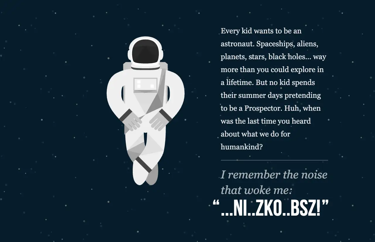
Image by NASA Prospect
9. Fluttuo
The animation is seamless, the user interface is intuitive, and it has fresh light and dark tones. The highlight is that it appliesa parallax effect in its packaging designs for online shopping, which makes online shopping look full and distinctive. The style is perfect for Fluttuo's concept of experimenting with new materials and innovative designs. It appears innovative and new.
10. Supernatural Kitchen
Supernatural Kitchen's website effectively utilizes parallax scrolling to enhance the visual narrative through subtle, yet significant, elements. Layers and high-quality content combine to allow page objects to glide effortlessly while users pan, producing an intriguing experience without excess showmanship.
11. Firewatch
The parallax website boasts a parallax effect. It provides an intense visual experience. Transporting players into an ethereal and eerie world as if they were there in person. The layered parallax technology provides an effect of depth in the forest environment. When users scroll downward from the page, every scene appears like a page from a book, progressively transporting them into such a secret world.
12. Hello Monday
Hello, Monday's website utilizes a split-screen 3D display effect to present designs and their descriptions simultaneously, side by side. On one side, there is an illustration for the work, and on the other side, there is a description. When you scroll down from below or from either side, you get a view of one case at a time in fragments, and all these projects are different in terms of style and feel. It is a perfect example of a parallax effect website.
13. Dogstudio
We absolutely adore the 3D animated canine creature on the Dogstudio website. It's not a photograph, but a companion who "trails" along behind you as you scroll, as if he's exploring along with you. When you scroll downward, he moves and behaves as if he is in three-dimensional space, with depth.
The interactivity is well considered here. If your cursor moves over the title for your project, the light for your dog does as well, linking them visually together. This is a good example of combining parallax and animation for an interplay between visual and interactive elements. This well-designed site illustrates an essential concept. Because a good parallax website not only looks good, but also creates an experience. It turns simple scrolling into a wonderful online experience.
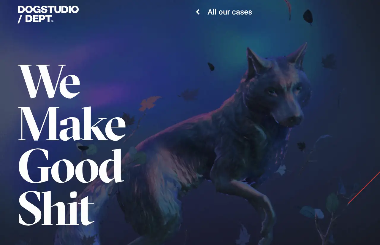
Image by Dogstudio
14. Another Escape
Another Escape, a magazine focused on outdoor living, is visually appealing and easy to navigate. It features an excellent scrolling function that distinguishes various sections of the site and announces the cover story for the latest edition. In turn, this makes you interested even when you don't have a magazine yet.
The website is clutter-free and clean, leaving ample room for lovely nature photography. Such incredible natural vistas remind us of how much we adore nature and want to escape the hustle and bustle of the city to indulge in its beauty. It provides us not only with information but also a lifestyle that speaks for itself and personally appeals to us. When we look at this website, we feel like we should just pack our bags, quit our jobs, and head out to the Bavarian forests and live a blissful existence away from everything!
15. Okalpha
Okalpha, one of the best parallax websites, created by Grant Campbell, founder of Okalpha, is a sensory challenge in every way. The large, bold font and bright color are quite powerful-looking. Parallax scrolling gives the entire page a lively feel.
Conclusion
These 15 incredible parallax effect websites demonstrate numerous ways to enhance visual design and user experience. They are not simply "pretty pages," though, but inspiring examples which entice and please viewers with layers, motion, and fascinating stories. Parallax scrolling is an excellent choice if you wish to bring your product into focus or engage in sharing your brand's story. You can use Wegicto create your next website project!
Check out the relevant website design article:
Written by
Kimmy
Published on
Mar 17, 2026
Share article
Read more
Our latest blog
Webpages in a minute, powered by Wegic!
With Wegic, transform your needs into stunning, functional websites with advanced AI
Free trial with Wegic, build your site in a click!
What kind of website do you want to build?