Log in
Build Your Site
10 Visually Stunning Account Web Page Examples for Inspiration
Discover 10 visually stunning account web page example designs to inspire your next project. Explore layouts, styles, and ideas that elevate user experience.

Have you ever stared at a bland account page and thought, “This could be so much better”? Or maybe you’ve struggled to find fresh sign-up page examples that balance creativity with usability? You’re not alone. As a business owner, I know how overwhelming it can feel to design a login page website that’s both secure and visually captivating, especially when you’re not sure where to start.
That’s why I’ve curated this list of 10 stunning account web page examples to spark your inspiration and guide your next project. Whether revamping an existing account page or building one from scratch, these designs prove that functionality and beauty coexist. Coding expertise is not necessary if you want to design an account web page. Don’t worry. I’ll also share how Wegic, our AI-powered website builder, lets you craft professional login web page examples in minutes—no design skills required.
The time has come to convert hypothetical thoughts into amazing results.
Key Components of a High-Performing Account Web Page Example
Designing an effective account web page example requires balancing user needs with technical precision. Let’s break down the six pillars that elevate a basic account page into a seamless, secure, and engaging hub for your audience.
User Authentication
Every login page website starts with a clear, intuitive authentication process. Users should only interact with fields containing email/username and password information, since additional elements create confusion about the account access process. For sign-up page examples, prioritise simplicity. Users are more likely to complete lengthy forms when they see visual indicators showing the form steps, such as "Step 1 of 3. The level of friction should always be considered because it directly affects customer retention rates.
Profile Control and Personalisation
Users who log in anticipate smooth control over all their account data. A well-structured account page provides dedicated sections for updating contact details, passwords, and payment methods. This isn’t just polite—it’s strategic. When personal interfaces contain information specifically for individual users, they create higher retention rates through enhancing users' feelings of importance.
Security Protocols
Security stands as an absolute necessity which must be provided to all users. To ensure data protection while it travels between devices, users should enable HTTPS encryption and CAPTCHA or rate-limiting features for brute-force attack prevention. Users must complete an authentication process involving multiple verification factors (MFA) for handling sensitive operations like password adjustments. Every customer needs to understand security protocols, so provide clear explanations using terms like this note: “Your information is protected by encryption standards used in banks.”
Task-Oriented Navigation
Users visit the account web page examples with specific goals—checking order status, updating billing info, or reviewing subscriptions. The page layout should group tasks that are connected to enhance how users navigate through the website. The user-friendly navigation design combines “Order History” with “Returns” under one “Purchases” category. Organise your menus at a single level because flat systems require less effort from your users. Analytics systems can detect common user behaviours, and these found links should be prominently featured to customers.
Visual Consistency
Your account page should mirror your brand’s visual identity. The entire account section should implement uniform typography as well as consistent colour schemes and iconography.
Responsive Design: Seamless Across Screens
Mobile devices account for more than half of all user account activities. Ensure your account web page example adapts flawlessly to all screen sizes. Everyone should be able to use thumb-centric buttons, forms that self-adjust, and images that retain natural proportions. Topic 1: Rigorous testing is essential since a broken mobile interface instantly undermines credibility, rather than simple typographical errors.
10 Visually Stunning Account Web Page Examples to Elevate Your Design Strategy
Crafting a standout account web page example requires balancing visual appeal with usability. To guide your design plan, the collection of ten unique design methods originates from Dribbble, alongside Instagram and WPForms. The examples fulfil different industry requirements through fintech security features while addressing universal user problems with streamlined onboarding and password recovery solutions.
1.Canva
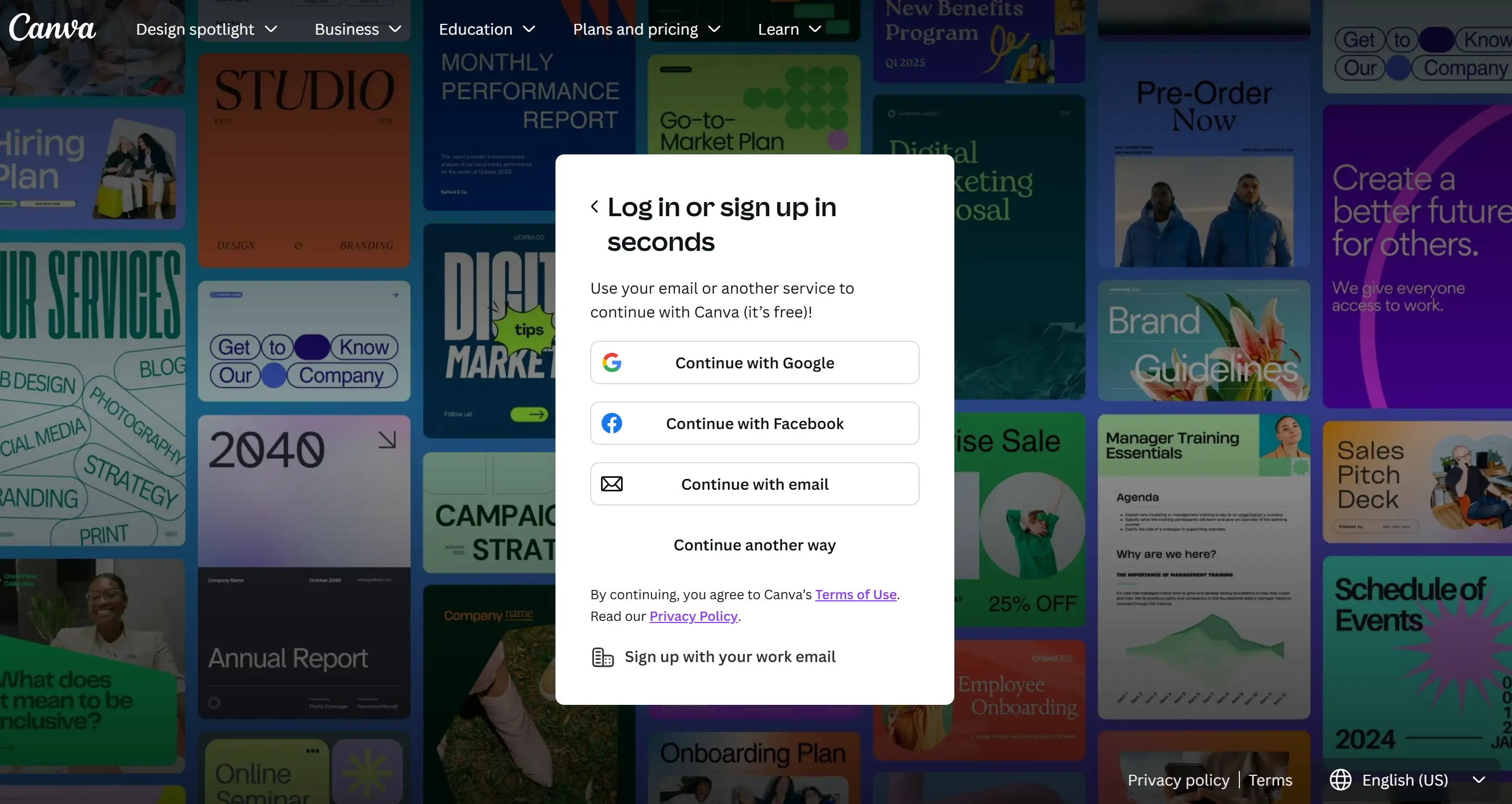
Canva’s account web page example caters to users prioritising simplicity. The platform now offers users two different options to authenticate their accounts through traditional login or using their Google profiles by dragging and dropping the preferred credentials. Users who hesitate about sharing social media data now have the option to sign up without Facebook authorisation. Account holders can easily switch between account access and design work as the interface features a minimal layout and gentle invitations to begin exploring template designs after logging in.
2.Dribbble
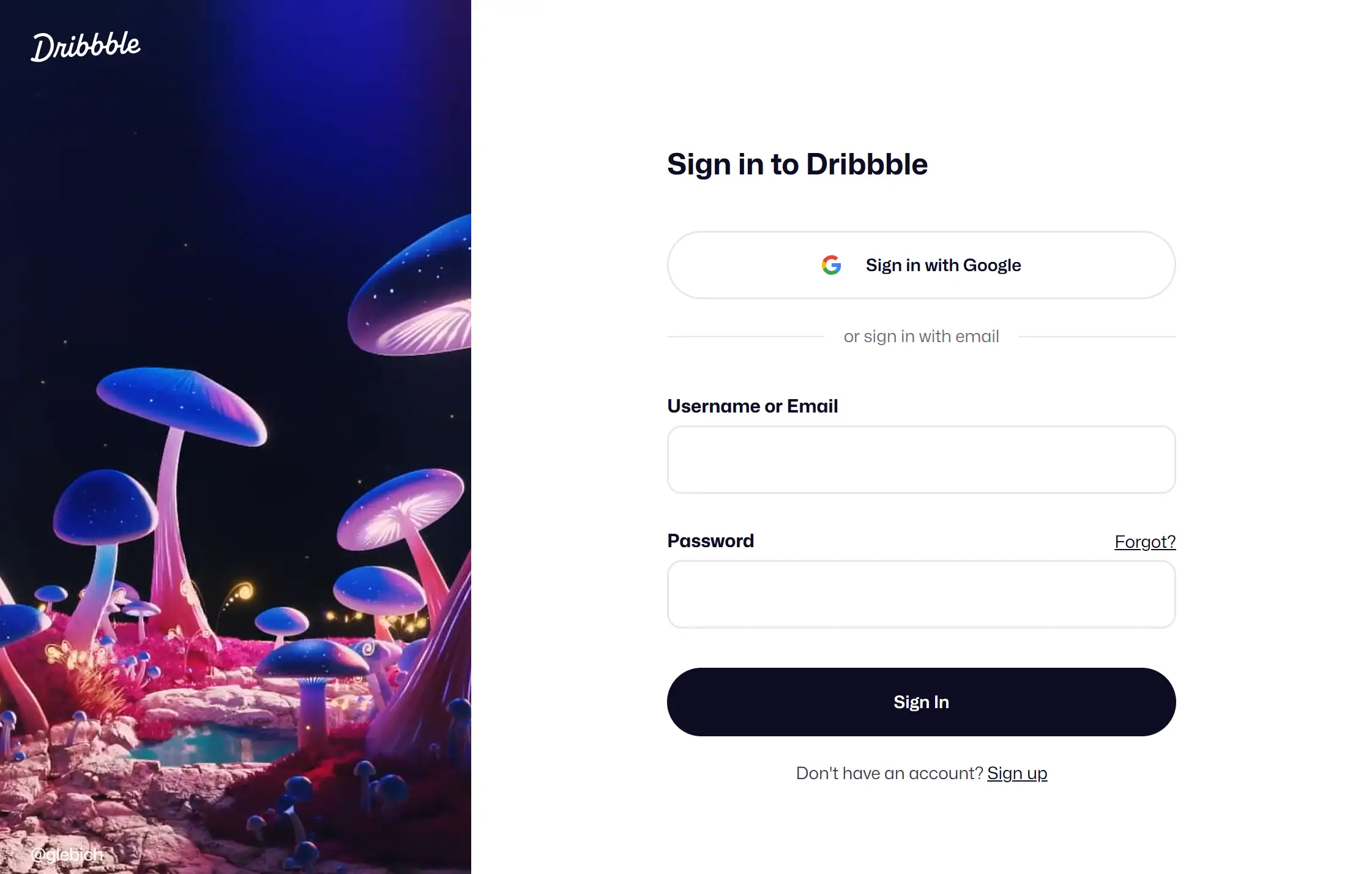
Dribbble’s login page strips away distractions with a monochromatic palette and collapsible sidebar. The mixture of pale colours and extensive space on the interface leads users to vital functions, including profile setup and message configurations. Micro-interactions with button hover effects make the website more personable, yet they never detract from the user navigation experience. This approach proves that a minimalist account page can still feel dynamic, especially when clarity is critical for creative professionals managing portfolios.
3.Bondroy

Bondroy’s sign-up page examples defy convention with bold diagonal stripes and a split-screen layout. The login area maintains easy-to-understand form elements on the right part of the interface, but the left section uses abstract art elements. Users find label-inputs for email and password, along with a "Remember me" selection and password reset link, maintain an edgy design in a user-friendly manner. The design method highlights that aesthetic audacity functions effectively alongside user-friendly operations, which appeal to people interested in design.
4.CubeFactory
CubeFactory’s account web page example prioritises efficiency. Users who log back in have the option to access their account through Google or email, while also having the chance to set automatic login for 30 days. A “Bring your ideas to life” message and a peaceful picture create a non-transacting atmosphere during the login process.
5.SeedProd
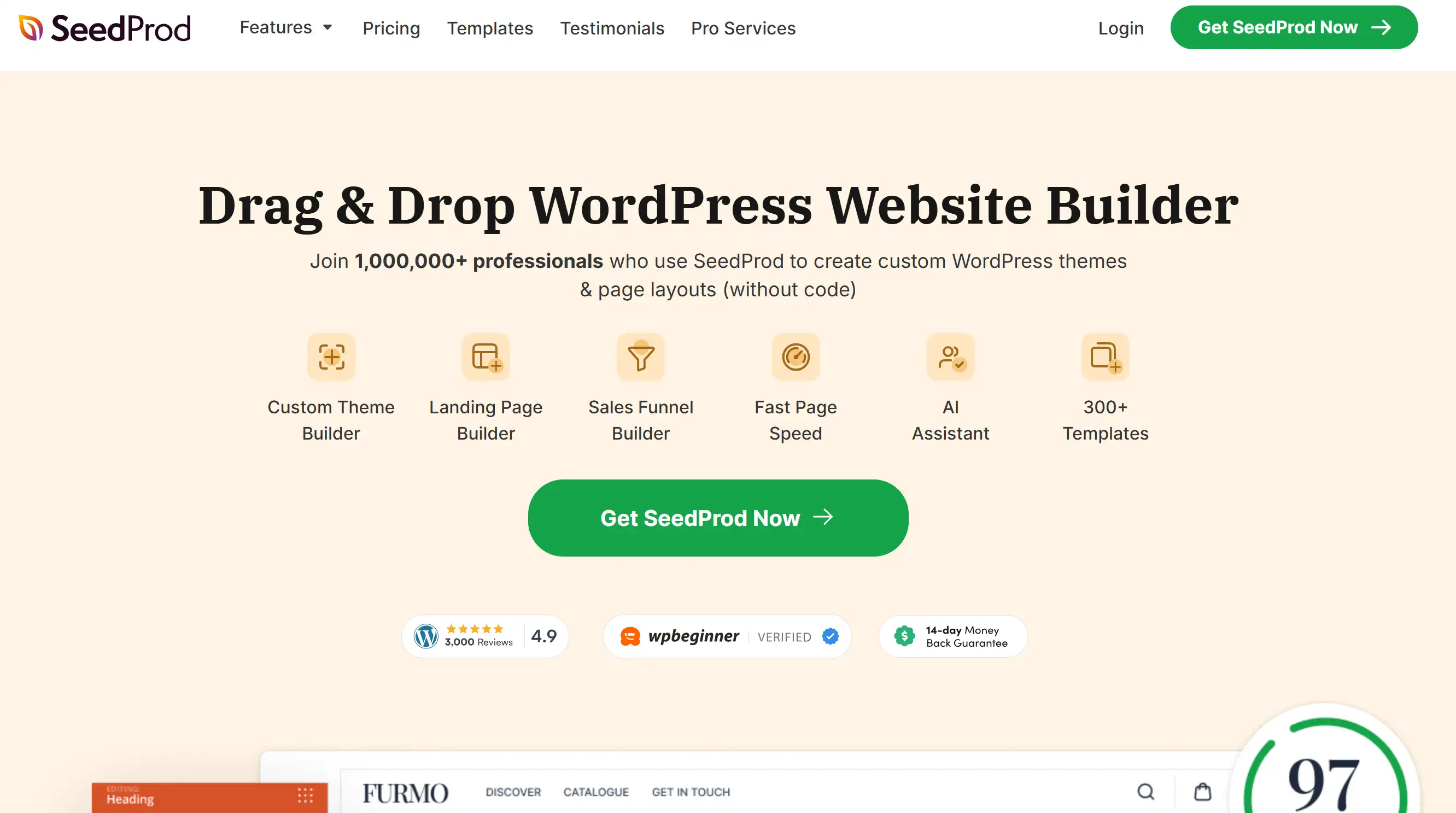
SeedProd’s login page website uses a two-panel layout to balance imagery and action. A vibrant background image on the right contrasts with a minimalist form on the left, directing attention to login fields and a prominent “Get SeedProd Now” CTA. Through its visual hierarchy, users quickly understand their possible actions regardless of their intent while using the platform—this demonstrates a principle of guiding decisions through contrast.
6.Instagram
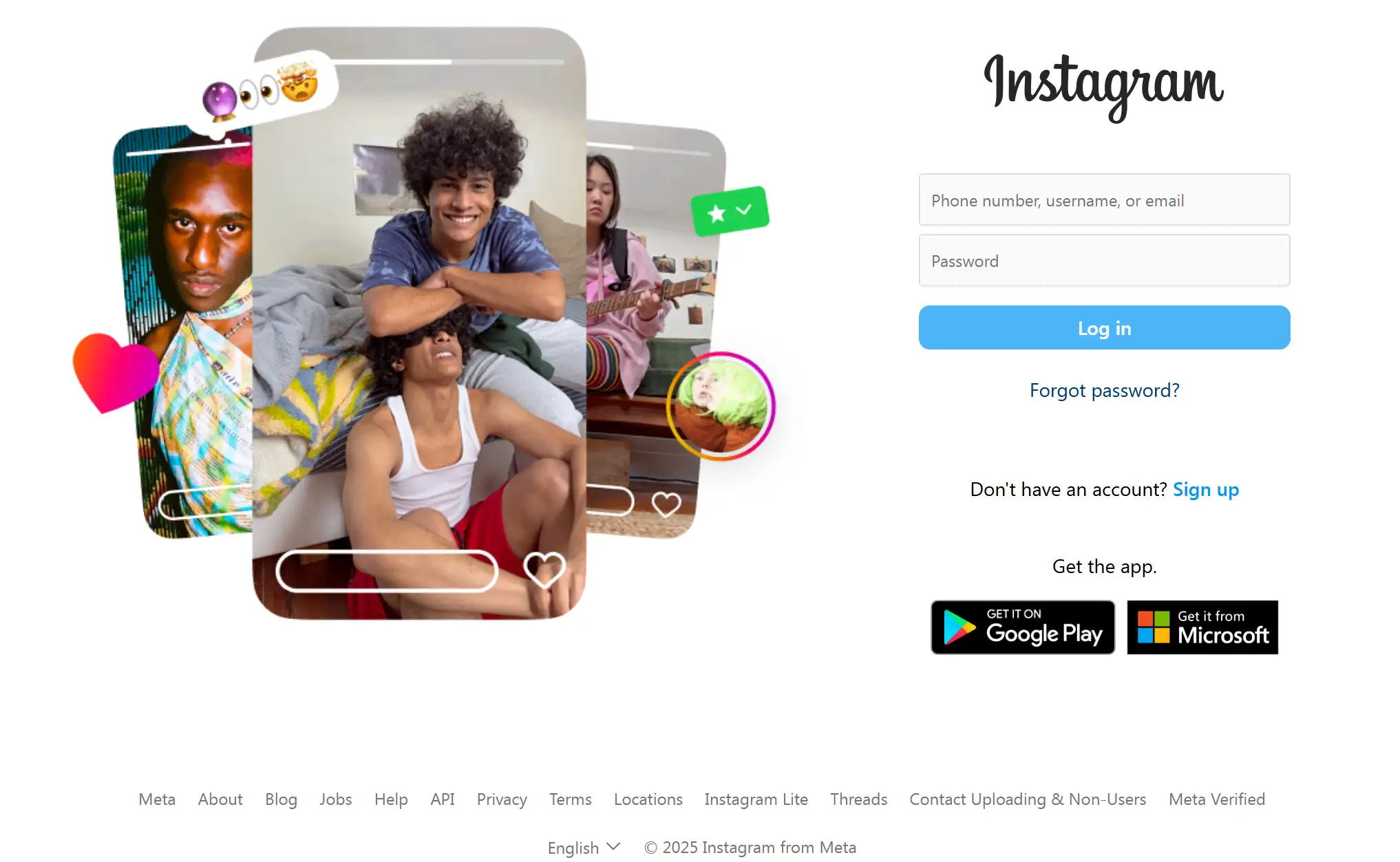
Instagram’s account page mirrors its app-centric ethos. The mobile login screen showcases only essential elements, which include a username text box alongside a password input and social media sign-in alternatives. No flashy graphics or redundant text—just a quick gateway to the user’s feed.
Wondering about inspiring IG accounts to follow in 2025? Check the post below:
7.BrightPay
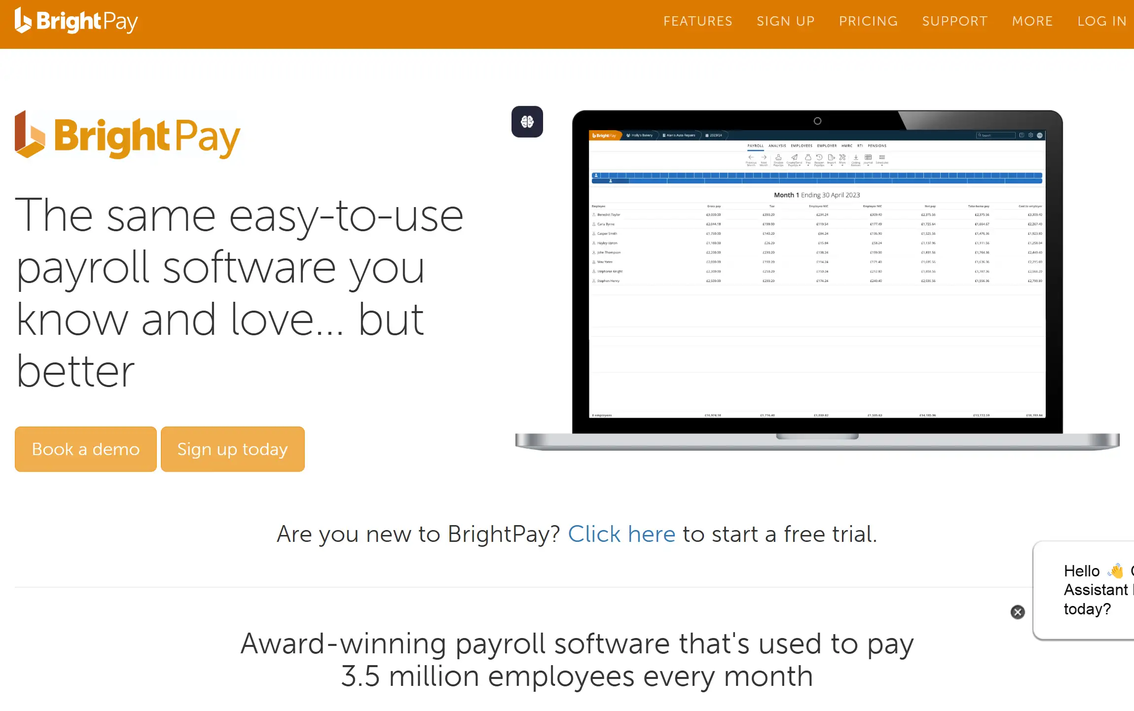
BrightPay’s account web page example leans into high contrast for clarity. A black background supports a white login form that showcases windows for email and password entry. Users find the “Keep me signed in” checkbox along with the password recovery link arranged in a clean group to prevent visual clutter. The design choice contributes to establishing trust with payment data security, which is essential for fintech tools processing payroll data.
8.Kryptonite
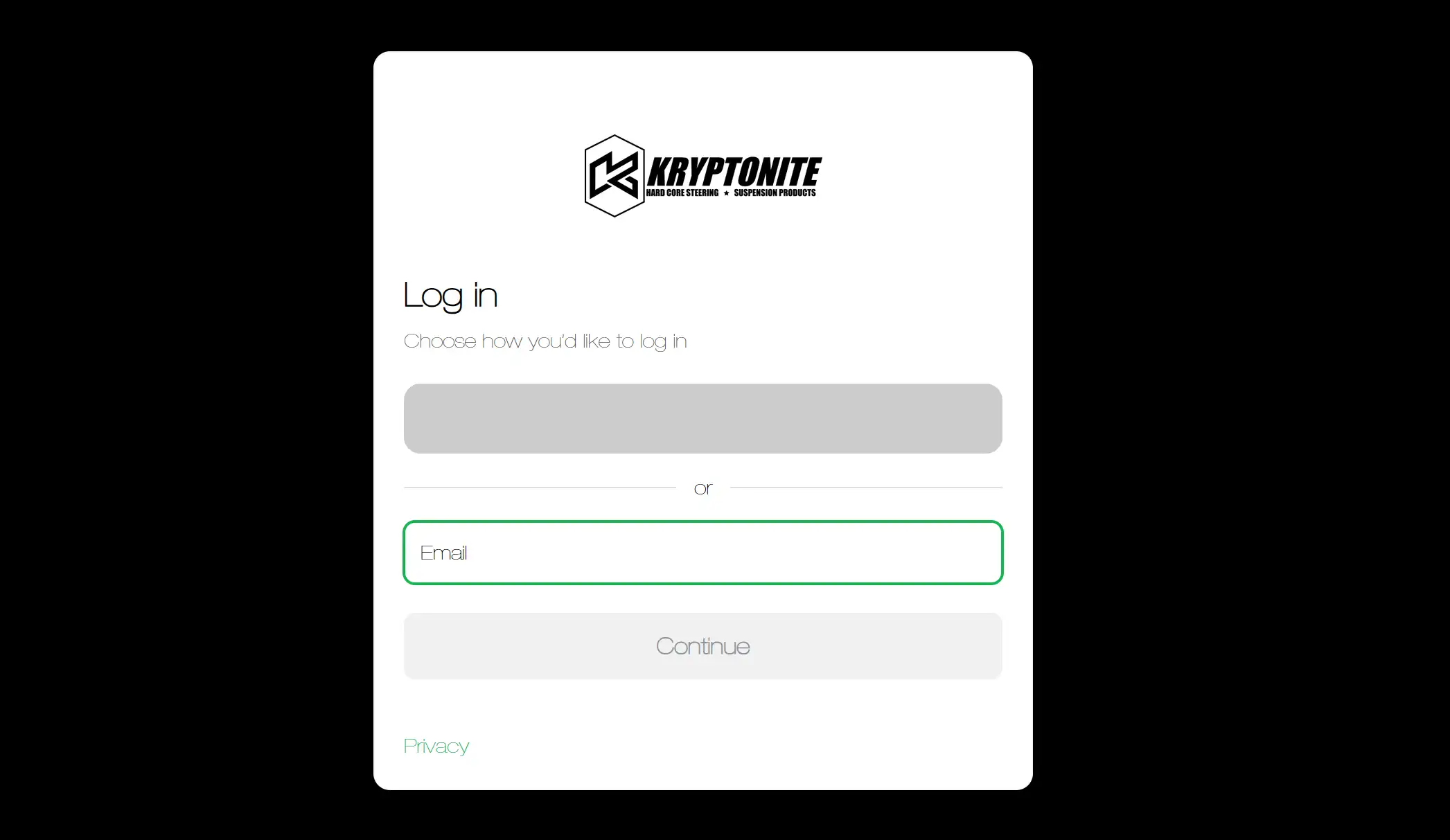
Kryptonite’s sign-up page examples emphasise security without sacrificing simplicity. The onscreen process of new user account creation requires only three simple online fields, which can be completed via one continuous scroll. The "Login" button used for registration is displayed prominently, but users can access the "Sign in" link easily for returning users. By avoiding unnecessary fields, this login page website reduces drop-offs, a crucial consideration for apps prioritising data protection.
9.WPForms

WPForms’ account page doubles as a communication tool. Following authentication, users get a notification about recent modifications with a link to obtain additional information. The method enables returning users to learn without creating interruptions since it incorporates educational content while showing product advancements. Educational components added to SaaS platform login procedures lead to higher user retention rates and satisfied customers.
10.Pinterest
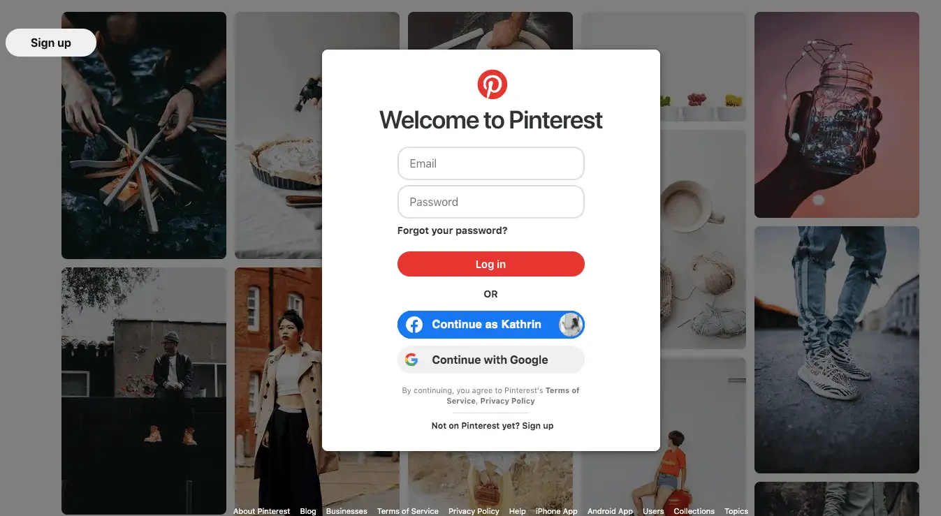
Pinterest’s account web page example stays true to its creative roots. Users can choose between social sign-in or entering their email and password through the basic login form while being surrounded by inspiring visual elements from Pinterest's platform. The website uses prospective exploration themes to transform routine logins into discovery pathways that match their audience’s inspirational needs.
Key Takeaways for Your Account Web Page Example
These ten account web page examples illustrate that effective design hinges on understanding user priorities. For your project, ask:
-
Does the login page website prioritise speed for frequent users?
-
Are the sign-up page examples tailored to reduce friction for newcomers?
-
Does the account page communicate trust and security?
How to Create an Account Web Page Using HTML and CSS
Building a functional account web page example from scratch involves two core languages: HTML for structure and CSS for styling. This text provides a detailed sequential method to build responsive, user-friendly interfaces. Whether you’re designing a login page website or refining sign-up page examples, these principles apply universally.
Define the HTML Structure
Start by outlining the page’s skeleton. HTML elements like
<form>, <input>, and <label> create the foundation for user interactions. A basic account page includes fields for email, password, and a submission button. Here’s a simplified template:<!DOCTYPE html>
<html>
<head>
<title>Account Page Example</title>
<link rel="stylesheet" href="styles.css">
</head>
<body>
<div class="account-container">
<h2>Welcome Back</h2>
<form>
<label for="email">Email</label>
<input type="email" id="email" required>
<label for="password">Password</label>
<input type="password" id="password" required>
<button type="submit">Sign In</button>
</form>
<p>New user? <a href="#signup">Create an account</a></p>
</div>
</body>
</html>
This code creates a form with email and password inputs, a submit button, and a link to a signup page example. The
required attribute ensures users fill these fields before submission.Style with CSS for Visual Appeal
CSS transforms the raw HTML into a polished interface. Target classes and IDs to adjust layout, colours, and responsiveness. For instance, to centre the form and add padding:
body {
    font-family: 'Arial', sans-serif;
    background: #f5f5f5;
    display: flex;
    justify-content: centre;
    align-items: centre;
    min-height: 100vh;
    margin: 0;
}
.account-container {
    background: white;
    padding: 2rem;
    border-radius: 8px;
    box-shadow: 0 2px 10px rgba(0,0,0,0.1);
    width: 90%;
    max-width: 400px;
}
input[type="email"], input[type="password"] {
    width: 100%;
    padding: 0.8rem;
    margin: 0.5rem 0;
    border: 1px solid #ddd;
    border-radius: 4px;
}
button {
    width: 100%;
    padding: 1rem;
    background: #007bff;
    color: white;
    border: none;
    border-radius: 4px;
    cursor: pointer;
    margin-top: 1rem;
}
button:hover {
    background: #0056b3;
}
This CSS styles the container with a clean white background, adds subtle shadows for depth, and ensures inputs scale smoothly across devices. The hover effect on the button enhances interactivity.
Enhance Usability with Form Validation
HTML5 offers built-in validation for inputs. Use attributes like
type="email" to trigger browser-level checks, ensuring users enter valid formats. For custom error messages, pair HTML with minimal JavaScript:<input type="email" id="email" required
oninvalid="this.setCustomValidity('Please enter a valid email)"
oninput="this.setCustomValidity('')">This snippet prompts users to correct errors without relying on complex code—ideal for a straightforward account web page example.
Prioritise Responsive Design
You should make sure your login page website adapts to mobile screens. Use media queries to adjust layouts for smaller devices:
@media (max-width: 480px) {
    .account-container {
        padding: 1rem;
        width: 85%;
    }
    button {
        padding: 0.8rem;
    }
}
Test across screen sizes to guarantee readability and touch-friendly interactions.
Link to Sign-Up and Recovery Pages
A well-designed account page guides users to related actions. Hyperlink phrases like “Forgot password?” or “Create account” to the corresponding pages. For instance:
<p><a href="#forgot-password">Forgot password?</a></p>
Style these links with subtle colours to avoid distractions from primary actions:
a {
    color: #007bff;
    text-decoration: none;
}

a:hover {
    text-decoration: underline;
}
Test and Iterate
BrowserStack provides a tool to simulate multiple software environments. Gather user reports to refine interface elements such as distances and visualisation contrasts, and button measurement rules according to observed problems.
By combining HTML’s structure with CSS’s styling, you create an account web page example that’s both functional and visually cohesive. The system operates without frameworks, which makes it perfect for beginner users and basic project requirements.
Let’s Talk About Your Whole Website!
You’ve just explored how a standout account web page example can transform user experiences, but what if building an entire site felt that effortless? Wegic represents an AI-driven website builder that assists customers in transforming their thoughts about coding abilities into actual program design products.
Imagine designing a login page website or sign-up page examples by simply chatting with a tool that understands plain English (or 15+ other languages). With Wegic AI tools, your straightforward descriptions become multi-page websites. Wegic provides you with web design functionality similar to having an expert developer operate at quick chatroom speeds.
Why wrestle with HTML when you can:
-
Talk it out: Describe your dream account page in casual conversation (“Add a neon login button!” → done).
-
Break language barriers: Build sites in any language while chatting in your native tongue.
-
Ditch the guesswork: Three smart assistants handle SEO, mobile optimisation, and accessibility checks behind the scenes.
Website builders during 30 years demanded either programming expertise or boundless project meetings to complete tasks. Wegic offers an innovation which guides your thoughts into a chat interface that produces a functioning and aesthetic website.
👉 Why not visit Wegic to enable your keyboard for performance-driven tasks?
Written by
Kimmy
Published on
Mar 17, 2026
Share article
Read more
Our latest blog
Webpages in a minute, powered by Wegic!
With Wegic, transform your needs into stunning, functional websites with advanced AI
Free trial with Wegic, build your site in a click!
What kind of website do you want to build?